
When to Use a Vertical Postcard and How to Lay Out the Address Side


Portrait cards win when the content is tall, when the message stacks, and when the card has to stand upright in a rack. The catch is the mailing side, which still has to read sideways for postal automation. Here is when to go vertical and how to build the address panel.
Use a vertical postcard when the hero image is taller than it is wide, when the message reads as a top to bottom ladder, or when the card will stand in a rack or display holder. Design the front upright, then rotate the entire mailing block 90 degrees so the delivery address, return address, and postage run parallel to the longest edge, and keep the strip along the resulting bottom edge clear for the postal barcode.
Start here
The short version before the details
A vertical postcard is the right choice when the content is taller than it is wide and the reader is meant to scan from top to bottom. The design decision is easy. The mailing decision is the one that trips people up, because postal automation still expects the delivery address to run along the longest edge of the piece. That means the front stays upright while the address block, return address, and postage all rotate together as one group on the back.
Why orientation decides whether your postcard gets read
A postcard gets somewhere between one and two seconds in a hand before it is kept or dropped. Orientation is the first thing the eye registers, before the headline and long before the offer. Turn a card to portrait and you change the reading path, the shape of the photograph, the length of the headline that fits, and the way the card behaves in a rack or a mailbox.
Most printers treat vertical as a checkbox next to horizontal and leave you to figure out the mailing side on your own. That is where portrait cards go wrong. The front can be upright, but the delivery address still has to satisfy postal automation, and on a taller card that panel behaves differently. This guide covers both halves: when portrait is the better layout, and exactly how to build the address side so a vertical postcard mails cleanly instead of falling out of automation.
What a vertical postcard actually is

A vertical postcard is simply a card that is taller than it is wide. The trim sizes are the same ones you already know, rotated. A 4 by 6 card becomes 4 inches across and 6 inches tall. A 5 by 7 becomes 5 across and 7 tall. Nothing about the paper, the press, or the cutting changes. What changes is the canvas shape you design into and the way the mailing side has to be arranged.
The word vertical also gets used loosely, so it helps to be precise about the two sides. The front, or graphic side, is the one you design in portrait. The back, or address side, is the one the post office reads, and it is normally laid out sideways relative to the front so the address runs along the long edge. A card can therefore be vertical to a reader and horizontal to a sorting machine at the same time, which is exactly what you want.
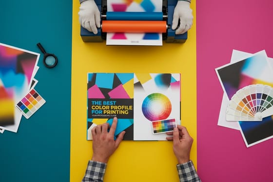
Once you separate those two sides in your head, portrait stops being risky. You are designing one upright face and one rotated panel, and the file setup rules that apply to any card still apply here, including the right color profile for printing and the usual bleed and safe margin discipline.
When a vertical postcard is the right call
Portrait wins whenever the content itself is tall. A full length product shot, a person standing, a bottle, a building, a dress, a dish photographed from above in a narrow crop: all of these lose their subject when squeezed into a wide frame. Give them the taller canvas and the image can run edge to edge without cropping the part that sells the thing.
It also wins when the message stacks. Announcement, headline, supporting line, offer, call to action, contact details: that is a vertical ladder, and a portrait card lets each rung sit under the last with clear space between. Wide cards force the same content into two columns or a cramped single line, which reads slower.
Then there is the physical life of the card. Counter racks, acrylic holders, table tents, bulletin boards, and refrigerator doors all favor upright pieces. If your card is meant to stand somewhere and keep working for weeks, portrait keeps the headline visible when the bottom half is hidden behind another card in the rack.
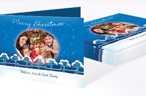
Menus, class schedules, price lists, event lineups, appointment reminders, real estate listings with one hero photo, and save the date cards are the formats that most often perform better in portrait. The same instinct applies across formats, which is why flat and folded greeting cards follow a similar logic about how the piece is meant to be held.
When you should stay horizontal instead

Horizontal is still the default for good reasons. Wide scenes, landscapes, interiors, group photos, and anything with lateral movement need the room. Before and after pairs, side by side comparisons, and three step sequences all want a wide frame so the reader can scan across rather than down.
Long headlines also argue for landscape. A seven word headline set large enough to read across a room needs horizontal space, and forcing it into a narrow column produces four cramped lines and awkward breaks. If your headline is the hero, measure it before you commit to portrait.
There is a practical argument too. On a horizontal card the mailing side needs no rotation, so proofing is simpler and there is one less thing to get wrong on a deadline. If the design does not gain anything from being upright, take the simpler path.
How to lay out the address panel on a portrait card

Here is the rule that most design guides skip. Postal automation reads a mailpiece with the delivery address running parallel to the longest edge. On a horizontal card that happens by default. On a portrait card it does not, so the entire mailing block turns 90 degrees relative to the front artwork.
Think of it as turning the card a quarter turn. Once turned, the piece reads like a normal landscape card and every familiar rule applies: the delivery address sits in the right half, the postage or indicia sits in the upper right corner, the return address sits in the upper left, and the strip along the bottom edge stays clear for the barcode the sorting equipment sprays on.
Practical setup in your file: build the mailing side as a portrait artboard to match the front, then place the address block, return address, and postage as a single rotated group. Keep them aligned to each other, because the sorting equipment expects them to sit in the same orientation. Do not rotate the address and leave the postage upright.
Four things to protect on that panel:
- The address block itself. Left aligned, flat sans serif type, dark ink on a light background, with clear margin on all four sides and nothing overlapping it.
- The postage area. Reserve the corner that becomes the upper right when the card is turned. Leave it empty if you are applying stamps, or place the indicia there for a permit mailing.
- The barcode clear zone. A clean band along the edge that becomes the bottom. No background image, no color wash, no text.
- The divider. Keep your message, logo, or artwork out of the address half entirely. A visible rule or a change of background is the easiest way to enforce it on press and in review.
Size and clearance requirements change from time to time, so check the current USPS specifications for the mail class you are using before a large run. If you use a mailing house, send them the layout before the print order rather than after.
Sizes, thickness, and what they do to postage
Turning a card to portrait does not change what postage it qualifies for. The dimensions do. USPS applies card rate pricing only to pieces that fall inside a defined size and thickness window. Go over on any dimension and the piece is priced as a letter, and go further over and it becomes a flat. Those steps up are significant across a full mailing list.
The most common portrait choices are 4 by 6 for card rate mailings, 5 by 7 when you want more presence in the mailbox, and 6 by 9 or 6 by 11 for oversized mailers where standing out matters more than the postage line. Each step buys attention and costs postage, so decide that tradeoff before you design rather than after.
Thickness matters just as much. Cards that are too thin flex and jam in automation, and cards that are too thick are handled manually. A 14pt or 16pt card stock sits comfortably in the usable range for mailers, which is why it is the standard recommendation for postcards that go through the mail rather than into a hand.
If you are weighing lighter sheets for a large drop, the guide to 80 lb gloss book paper explains what those weights feel like in practice and where they hold up.
Designing the front so the portrait shape works for you
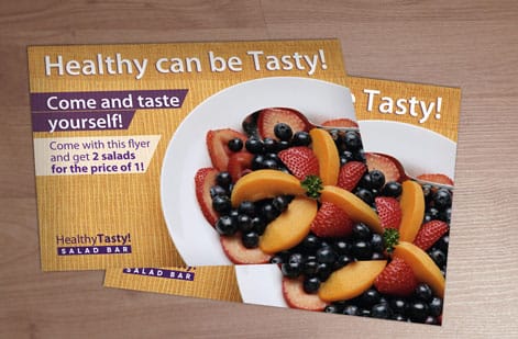
A taller canvas rewards a simple vertical hierarchy. Put the hero image or the single biggest idea in the upper two thirds, the offer in the middle, and the call to action with contact details at the base. The eye travels down naturally, so give it a straight path with no sideways detours.
Watch your headline width. Portrait cards are narrow, so type that looked confident in a wide comp can turn into a five line block. Set the headline at the real trim width early, count the line breaks, and cut words until it holds in two or three lines.
Full bleed images are where the portrait format earns its keep. A tall photo running the full height with the headline reversed out of a dark area of the image gives you a strong card with almost nothing on it. Keep type well inside the safe margin, since trimming tolerance does not care how good the photo is.
If the front carries a logo lockup, make sure it survives at the smaller width. The guide to types of logos and when to use each is a useful reference when a wide horizontal mark needs a stacked variant for narrow formats.
Stocks and finishes that keep a mailer readable
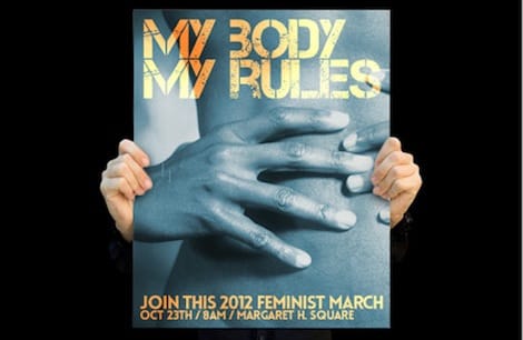
The front and the address side have different jobs, and finish is where that difference shows. A gloss coating makes photographs snap and colors look saturated, which is exactly what you want on the graphic side. On the address side, heavy gloss creates glare and resists ink, which is a problem if anyone writes on the card by hand or if a mailing house prints addresses directly onto it.
Matte and uncoated stocks solve that. Uncoated takes ballpoint and inkjet addressing cleanly and gives a tactile, honest feel that suits invitations, appointment reminders, and anything meant to feel personal. Matte sits between the two, holding photographic detail while staying easy to read under overhead light.
Soft touch, spot gloss, foil, and raised effects all work beautifully on portrait cards, with one caution. Keep them off the address panel and off the barcode strip. A raised or reflective finish in the reading area is one of the fastest ways to knock a piece out of automation.
If you are choosing between effects, the roundup of the best print finishes and when to use each compares them side by side, gold foil versus metallic gold ink covers the metallic decision specifically, and embossing versus debossing explains when a pressed effect is worth the extra pass.
Proof the rotated side before you print the run
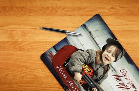
Rotated address panels fail in predictable ways, and every one of them is catchable on a proof. The address group ends up rotated the wrong direction. The postage corner lands on the wrong side. A background gradient creeps into the barcode strip. The message half spills past the divider. Each of those costs a reprint if it reaches press.
The fastest check takes one minute. Print the mailing side at actual size on plain paper, turn the sheet so the address reads normally, and look at it as a letter carrier would. Postage upper right, return address upper left, delivery address in the right half, bottom band empty. If any of those is off, fix it in the file, not on press.
Also proof at true trim size rather than on screen at 200 percent. Type that reads fine zoomed in can be too small in hand, and thin reversed type on a coated stock loses detail once ink spreads. Set your file to the correct profile first so the proof reflects the press, then send it. When it looks right, configure the run on the postcard product page and pick the stock, coating, and turnaround that match the campaign.
Wally explains the quarter turn
Upright for the reader, sideways for the sorting machine
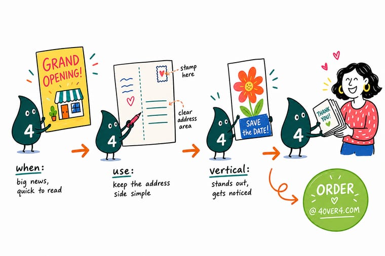
Wally keeps one habit with every portrait card. He designs the front the way it will be held, then turns the file a quarter turn and asks whether the address still reads like a normal letter. Postage in the upper right, return address upper left, delivery address in the right half, bottom strip empty. If that reads clean after the turn, the card will mail clean.
Design and print postcards →Diagram
The vertical postcard address panel at a glance
One frame showing the card as your reader holds it, the same card as the post office reads it, and the four zones you have to protect on the mailing side.
The front and the mailing side do not have to share an orientation. Design the front for the reader, rotate the mailing block for the machine, and both jobs get done on the same card.
Specs and pricing
Postcard specs and live pricing
Once the layout is settled, the rest is configuration. Compare sizes, stocks, coatings, and turnaround below, and watch the price move as you change quantity.
| Quantity | Price Per Unit | Total |
|---|---|---|
| 50 | 33.0¢ | $16.48 |
| 100 | 24.2¢ | $24.16 |
| 200 | 15.9¢ | $31.86 |
| 300 | 12.8¢ | $38.45 |
| 400 | 11.3¢ | $45.04 |
| 500 | 10.3¢ | $51.62 |
| 600 | 9.89¢ | $59.31 |
| 700 | 9.57¢ | $67.00 |
Print it
More products printed in house at 4OVER4
See it in use
Real postcard work, printed in house


Explore more
Where to go next


By the numbers
Printing you can count on at 4OVER4
Common Questions
Common questions about vertical postcards
What is a vertical postcard?
A vertical postcard is a card whose height is greater than its width, so it reads in portrait orientation like a phone screen or a paperback cover. The trim size is the same family of sizes used for horizontal cards, simply turned. A 4 by 6 inch card becomes 4 inches wide and 6 inches tall. The front is designed upright, while the mailing side is normally rotated so the delivery address still runs along the longest edge of the piece.
How do I choose between a vertical and a horizontal postcard?
Start with the content. A single tall photograph, a stacked headline and offer, a menu, a rate card, or a product shot with vertical proportions all sit naturally in portrait. Horizontal suits wide scenes, before and after pairs, side by side comparisons, and long headlines. Then check where the card ends up. Portrait cards stand better in counter racks and display holders. Horizontal cards read better lying flat on a desk or pinned in a wide space.
Where does the address go on a vertical postcard?
On the mailing side, in the half of the card that becomes the right side once the piece is turned to reading orientation. The address block, return address, and postage all rotate together as one unit, and the message or branding fills the other half. Keep the address block flush and left aligned inside its panel, leave a margin around it, and keep the strip along the bottom edge of the mailing orientation completely clear.
What does a vertical postcard cost and how are prices set?
Price is driven by quantity, trim size, paper stock, coating, and how fast you need it. Quantity moves the number the most, since press setup is spread across the run and the per card price drops steeply as you scale. Heavier stocks, soft touch or uncoated finishes, and rush turnaround each add to the total. The live price table on this page updates as you change those options, so you can compare configurations before ordering.
What sizes, stocks, and finishes are available for vertical postcards?
Common portrait trims run from 4 by 6 up through 5 by 7, 6 by 9, and 6 by 11 for oversized mailers. Stocks range from lighter book weights through 14pt and 16pt card, with 16pt being the popular choice for mailers that need to survive handling. Finishes include gloss, matte, uncoated, soft touch, and spot options. If you plan to write on the card by hand, choose uncoated or matte on the address side.
How long does printing and shipping take for a vertical postcard?
Production time depends on the stock and finish you pick, and it is shown per option at checkout, separate from transit time. Standard card stocks with gloss or matte coating move fastest. Specialty finishes, heavier stocks, and mailing services add days. Build in extra time for proofing, since a rotated address panel is worth checking on a physical or digital proof before the full run goes to press.
Can a vertical postcard be mailed at the postcard rate?
Yes, as long as the finished piece stays inside the USPS postcard dimensions and thickness limits and the address side follows the automation layout rules. Turning the card to portrait does not change the size limits. What changes is where your artwork can live, because the address block, the postage area, and the barcode clear zone all claim space on a narrower panel. Confirm current limits with USPS before a large mailing.
Get Started
Ready to print your vertical postcards?
Bring the upright design and the rotated address panel to 4OVER4.COM. Pick your size, stock, and coating, and we handle the press work in house.
Legal Disclaimer
Gold Standard guarantees apply to all standard orders placed through 4over4.com. Price match requires verifiable proof of a competitor's published price for an equivalent product with matching specifications and turnaround time. Satisfaction guarantee covers manufacturing defects and print quality issues. Contact support with order number and documentation. On-time delivery rate based on tracked orders 1999 to 2026. Individual results may vary based on shipping carrier performance.
