
The 7 Types of Logos and When to Use Each One


Wordmark, lettermark, logomark, abstract mark, mascot, combination mark, and emblem. Each type fits a different brand, and each prints differently on cards and signs.
There are seven core types of logos: wordmark, lettermark, logomark, abstract mark, mascot, combination mark, and emblem. Short names suit a wordmark, long names a lettermark, and most new businesses do best with a combination mark that can split into an icon. Whichever you choose, keep it as vector art so it prints sharp from a card corner to a full yard sign at 4OVER4.COM.
Start here
Wordmark to emblem, what separates them
A logo is the smallest repeatable piece of your brand, and it comes in seven core types. Wordmarks and lettermarks make the name itself the mark. Logomarks and abstract marks let a symbol carry the brand. Mascots add a friendly face, combination marks pair a symbol with the name for maximum flexibility, and emblems lock both into a single badge. The chart below maps each type to the brand it fits best.
What a logo actually is, and why the type matters

A logo is the smallest, most repeatable piece of a brand. It is the mark that has to work on a business card corner, a storefront sign, a website tab, and a shipping label without losing who you are. Because it appears everywhere and at every size, the shape of that mark, its type, decides how well your brand travels.
People often treat choosing a logo as a matter of taste, but the type is really a practical decision. A long name and a tiny card demand a different solution than a short name on a wide banner. Getting the type right early saves you from a mark that looks great in a design file and then falls apart the moment it is printed small.
This guide walks all seven types in the order most brands consider them, shows when each one fits, and ends where competitors stop short: how to print your logo sharply across business cards, yard signs, and every other product at 4OVER4.COM.
Wordmarks and lettermarks: when the name is the logo

A wordmark is your full business name drawn in a distinctive typeface, so the name and the logo are one and the same. It works best when the name is short, memorable, and worth spelling out every time, which is why so many well-known brands are simply their name in a carefully chosen font. If you are still building recognition, a wordmark makes people read and remember the actual name.
A lettermark takes the opposite path and uses initials only. It exists to rescue long, multi-word, or hard-to-say names that would never fit legibly in a card corner. Reduced to two or three letters, the mark stays clean at any size. The trade-off is that initials carry less meaning on their own, so a lettermark leans on repetition to build recognition over time.
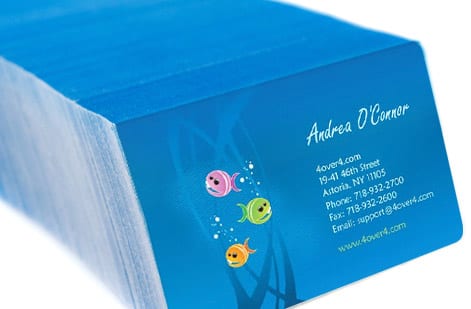
Both types live or die on typography, which makes them a natural fit for print. When you order your first stack of business cards or a set of premium cards, keep the letterforms in a solid ink so the fine strokes stay sharp. If you are refining the type itself, our guide on logo design best practices covers how to keep a name-based mark crisp on paper.
Logomarks and abstract marks: when a symbol carries the brand
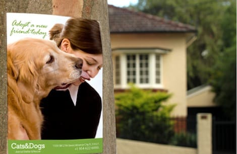
A logomark, sometimes called a brand mark or pictorial mark, is a recognizable image that stands in for your name. A logomark is powerful once people already know you, because a single symbol becomes instant shorthand. The risk for a young brand is that a bare symbol says nothing on its own, so most companies earn the right to a standalone logomark rather than start there.
An abstract mark is a symbol too, but instead of drawing a literal object it uses geometric form, color, and motion to suggest a feeling. This is the go-to for technology, finance, and companies that do many things at once, because no single picture could capture the whole business. A good abstract mark is unique and ownable in a way a literal icon rarely is.
Symbols shine at large scale, which is where signage comes in. A clean logomark reads across a parking lot on a yard sign or a rigid acrylic sign, and our free online design tool lets you place and scale that symbol on a product without wrestling with software.
What a mascot logo is: the friendly one

A mascot is an illustrated character that becomes the face of a brand, drawn once and then used everywhere the brand speaks. Mascots give a business personality and warmth, which is why they show up so often in food, family, and sports branding. The catch is complexity: a detailed character can lose its charm when it is shrunk down, so a mascot usually needs a simplified version for small print.
The fix is to draw the character twice. Keep the full illustration for pieces with room, a yard sign or a banner, where line weight, eyes, and hand-drawn texture still read from across a lawn or a lobby. Then cut a stripped-back head or silhouette for anything that prints smaller than the 3.5 by 2 inch face of a standard business card, and hold that small version to solid ink so the outlines stay sharp instead of filling in.
What a combination mark is: the flexible one
A combination mark is a symbol and your business name designed as one lockup, built so the two can travel together or apart. For most new businesses it is the smartest starting point. Because the two elements work together and apart, you get flexibility built in: the full lockup goes on a sign, and just the icon fits in a tiny corner. As your brand grows and the symbol earns recognition on its own, you can gradually let it stand alone.
That split-apart flexibility is exactly what print rewards. Use the full combination lockup on a wide vinyl banner where there is room, then drop to the icon alone on a business card. Design both versions once and you will never be caught without the right proportion for a product.
Build three files while the designer is still on the job: a horizontal lockup for wide pieces, a stacked lockup for square and vertical spaces, and the icon on its own. That set covers a banner, a card back, and a sign face without anyone rebuilding the logo the night before a print run, and it is the difference between a clean upload and a rushed crop at proof time.
What an emblem is: name and symbol locked into one badge
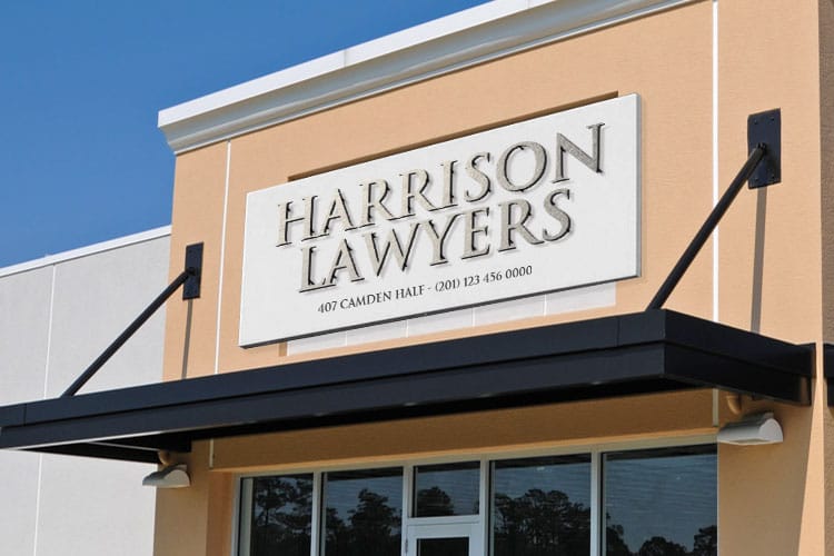
An emblem is a logo that fuses the name and a symbol into a single, self-contained badge, the way a school seal, a craft-beer crest, or a heritage automotive mark does. Emblems feel official, established, and traditional, which makes them a strong choice for institutions and brands that want to signal history and craft.
Their strength is also their limitation. Because the text is baked into the shape, an emblem carries fine detail that can clog up at small sizes, and it cannot split into a standalone icon the way a combination mark can. If you love the emblem look, plan a simplified secondary version for the smallest applications so the badge never turns to a smudge on a card.
Emblems reward products with room and presence. They look their best on a premium card with a heavier stock, a folded piece, or a rigid acrylic sign, where the detail has space to be read. A badge that still reads cleanly at 2 inches wide will read anywhere, so print a test at that size before the file is locked, and drop the thinnest ring of type if it closes up. When you order, keep the badge in a solid ink and confirm the fine lines at 100 percent zoom before it goes to press.
Printing your logo sharply on cards and signs
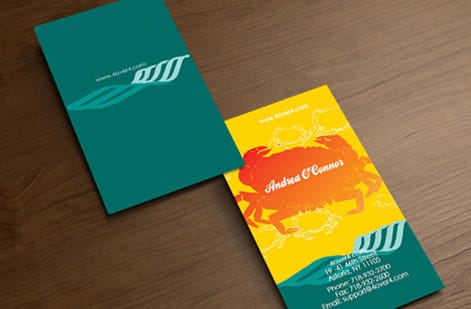
Every logo type has to survive the same journey to print, and this is the part most logo guides skip. The rules are simple and they protect your mark no matter which of the seven types you chose. Keep the final logo as vector art so it scales from a card corner to a full sign without a soft edge. Convert color to CMYK before you export so the mark prints the shade you designed rather than a duller version.
Then mind the small stuff that decides sharpness. Set fine logo detail in a solid ink instead of a four-color mix so the edges stay clean. Confirm the mark still reads as a plain black or a plain white, because a one-color version is what lets it print on colored stocks and specialty finishes. Give it a safe margin so no part of the logo sits close enough to the trim to get clipped.
When you order, your artwork runs through a free file check that catches these issues before the press does. From there it is just picking the product and specs: put the mark on business cards, scale it up to yard signs, or browse the full business card range. If you would rather not build the file yourself, the online design tool places your logo with the guides already in place.
Wally picks the logo type that prints best
The right type reads clearly at every size
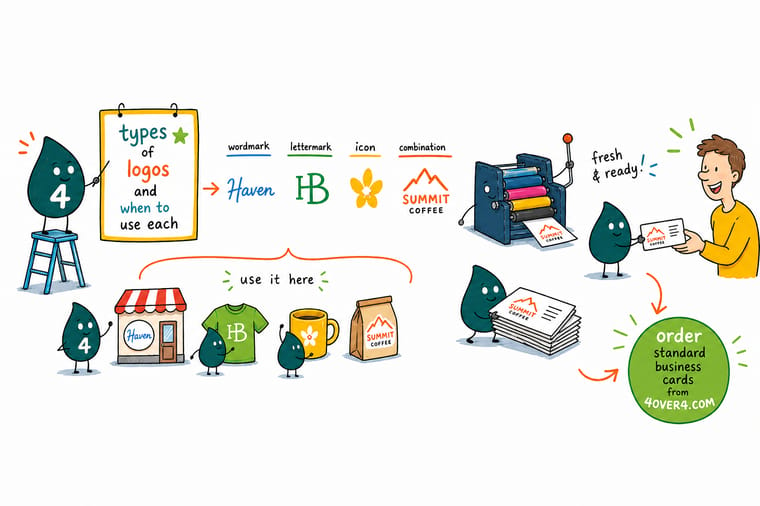
Wally treats logo choice as a print question first. A short name becomes a wordmark, a long one becomes a lettermark, and most new brands get a combination mark that can drop to just the icon. Then he keeps the mark in vector, sets fine detail in a solid ink, and prints it sharp from a card corner to a full yard sign. Pick the type, prepare it clean, and 4OVER4 puts it on paper exactly as drawn.
Print your logo on business cards →Quick reference
The seven logo types, at a glance
Match the type to your name, your stage, and the smallest size you will print. This table lines up each logo type with the brand it fits best.
| Logo type | Works best for | What it is |
|---|---|---|
| Wordmark | Short, distinctive names | The full name set in a custom typeface, so the brand and the mark are the same thing. |
| Lettermark | Long or multi-word names | Initials only, which keeps a mouthful of a name legible even in a card corner. |
| Logomark | Recognizable, memorable brands | A pictorial symbol that stands in for the name once people already know you. |
| Abstract mark | Modern, tech, and multi-service brands | A geometric symbol that carries a feeling rather than a literal picture. |
| Mascot | Family, sports, and food brands | An illustrated character that gives a brand a friendly, repeatable face. |
| Combination mark | Most new businesses | A symbol plus the name, flexible enough to split apart as your brand grows. |
| Emblem | Heritage, schools, and craft brands | Name and symbol locked into one badge for a classic, official look. |
Step by step
Choose and print-ready your logo in 6 steps
- Start from your name, not a picture Say your business name out loud. Short and punchy leans wordmark, long or generic leans lettermark or symbol. The name is the first filter for the type.
- Decide how much you need it to explain A brand-new company often benefits from a combination mark or mascot that hints at what it does, while an established name can lean on a bare logomark.
- Test the mark at its smallest print size Shrink your draft to the size of a business card corner. If the detail disappears or fills in, simplify the type before you commit.
- Build it in vector from the start Draw the final logo as vector art so it scales from a card to a yard sign without a single soft edge. Raster logos break the moment they grow.
- Check it in one color A logo that only works in full color is fragile. Confirm it still reads as a solid black or a solid white so it prints cleanly on any stock or finish.
- Prepare a print-ready file Export the logo in CMYK with the fonts outlined, then place it in your product artwork with bleed and a safe margin before you upload it to us.
Specs and pricing
Business card specs and live pricing for your logo
Once your logo type is set, the print decisions come down to size, stock, and finish. Here are the live specs and price-per-unit for standard business cards at 4OVER4.COM, straight from the configurator.

| Quantity | Price Per Unit | Total |
|---|---|---|
| 100 | 17.6¢ | $17.57 |
| 200 | 11.5¢ | $23.07 |
| 300 | 9.15¢ | $27.46 |
| 400 | 7.96¢ | $31.86 |
| 500 | 7.25¢ | $36.26 |
| 600 | 6.77¢ | $40.64 |
| 700 | 6.43¢ | $45.04 |
| 800 | 6.18¢ | $49.43 |
Print it
Put your logo on cards and signs at 4OVER4

Explore more
Where to go next


By the numbers
Stocks that carry each kind of logo mark
Common Questions
Common questions about types of logos
What are the types of logos?
There are seven core logo types, and the quickest way to tell them apart is asking whether the name, a symbol, or both are doing the work. A wordmark is the full business name in a custom typeface. A lettermark uses initials only, which is how a long or generic name gets short enough to sit in the corner of a card. A logomark is a pictorial symbol that stands in for the name. An abstract mark is a geometric symbol that carries a feeling rather than a literal image. A mascot is an illustrated character. A combination mark pairs a symbol with the name so the two can travel together or apart, which makes it the most forgiving type to print because a small version already exists. An emblem locks the name and symbol into a single badge, the way a school seal or a craft-beer crest does, so it cannot be broken out into a standalone icon. Almost every brand identity you see is a version of one of these seven.
Which logo type suits a new business name?
Start with your name and how established you are. A short, memorable name suits a wordmark, while a long or generic name reads better as a lettermark or a symbol. A new business that still has to explain itself often does best with a combination mark or a mascot, and an established name can carry a bare logomark. Then test the type at the smallest size you will print it: if a detailed emblem turns to mud on a business card corner, a simpler combination or word mark is the safer choice for print. The practical test takes a minute. Place the mark at 1 inch wide, print it in black on plain paper, and look at it from arm length. If the counters fill in or the initials merge, simplify the type before you commit to it, because every card, sticker and sign after that inherits the same problem.
What does printing a logo on cards and signs cost, and how are prices set?
Designing the logo yourself costs only your time, and placing it on a product is free. The print price then scales with the product and its options: quantity, where more pieces lower the unit price, plus size, paper stock, and finish. A run of standard business cards carrying your logo starts low and drops per unit as the quantity climbs, while a large yard sign is priced by size and material. You set each option in the configurator and the total updates live, so you can see exactly how stock or size changes the number before you order. The logo type itself never changes the price. A one-color wordmark and a full-color mascot on the same card, same stock and same quantity cost the same, so pick the mark that prints cleanest rather than the one you think is cheapest to run.
What sizes, stocks, and finishes work best for a printed logo?
For a logo on a business card, a standard 3.5 by 2 inch card on a heavier stock keeps the mark crisp, and a matte or soft-touch finish stops glare from washing out fine lines. On signage, larger substrates like coroplast or aluminum give a bold logo room to breathe. Across every product, keep small logo detail in a solid ink rather than a four-color build so the edges stay sharp, and use the live specs on each product page to match the finish to how much fine detail your logo type carries. Match the stock to the type as well: emblems and mascots carry the most fine detail, so they earn a heavier premium card stock and a matte finish, while a clean wordmark or lettermark holds up on a standard card and can take a gloss finish without losing anything. Outdoors, a bold logomark or abstract mark on coroplast reads from the street, and a rigid acrylic sign keeps a badge legible up close in a lobby or reception.
How long does it take to print products with my logo?
Turnaround depends on the product and the options you pick, not on the logo itself. Supplying the art print ready keeps it that way: vector artwork or 300 dpi at final size, CMYK rather than RGB, fonts converted to outlines, and any hairline detail in a mascot or emblem thickened so it survives the press. Many core products such as business cards and flyers move quickly once your artwork passes our free file check, and signage and large-format pieces follow their own production windows. Each product page shows the available turnaround and shipping choices at checkout, so you can line the delivery date up with a launch or an event before you place the order.
Should my logo be a vector or a raster file for printing?
Always keep the final logo as vector art. A vector logo is drawn from math rather than fixed pixels, so it scales from a card corner up to a full yard sign without ever going soft or blocky. A raster logo, like a JPG or PNG, is locked to the resolution it was saved at and falls apart when enlarged. Whatever logo type you choose, export the master as vector, then let it generate the right resolution for each printed size on our end.
Get Started
100 premium business cards cost $17.57, or 18 cents each
Bring your finished logo to 4OVER4.COM and print it on business cards, signs, and 1,000+ more products. Business cards ship in 3 business days, yard signs in 5.
Legal Disclaimer
Gold Standard guarantees apply to all standard orders placed through 4over4.com. Price match requires verifiable proof of a competitor's published price for an equivalent product with matching specifications and turnaround time. Satisfaction guarantee covers manufacturing defects and print quality issues. Contact support with order number and documentation. On-time delivery rate based on tracked orders 1999 to 2026. Individual results may vary based on shipping carrier performance.
