
What CMYK Stands For and Why Print Files Use It


Emma is our prepress and print production voice, built from the knowledge of our production team, with over 20 years in printing.
Four inks, one confusing letter, and one file setting that decides whether your printed color matches the screen you designed it on.
CMYK stands for cyan, magenta, yellow and key, the four inks a printing press lays down to build full color. K is key, not black: the black plate carries the type and the detail, and the other three plates are registered to it. Print files are set in CMYK because ink subtracts light while a screen adds it, so an RGB file has to be translated into ink percentages before it can reach a plate.
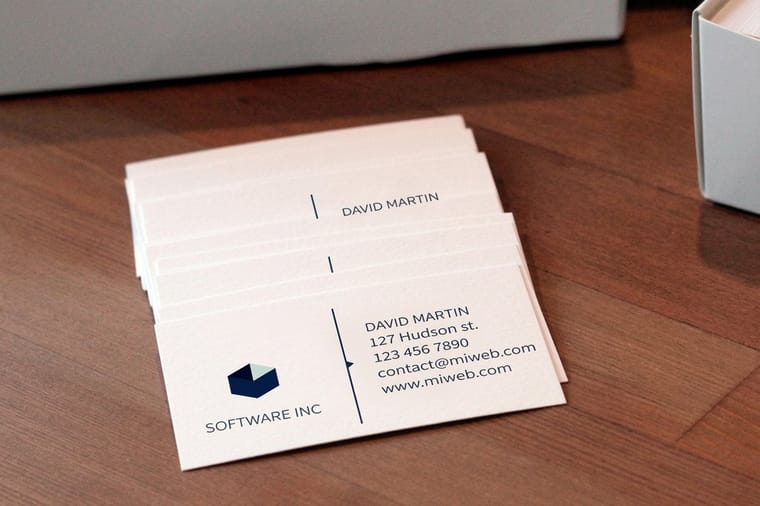
Quick answer
Four inks, and the fourth one is called key
Cyan, magenta, yellow and key. The press prints those four in sequence and mixes every other color from dots of them. The black plate is the key plate because it holds the type and the outlines, and the other three are registered against it. Cyan, magenta and yellow together do not make a usable black, they make a warm brown at 300 percent ink, which is exactly why the fourth plate exists. And because ink subtracts light while a monitor adds it, an RGB file must be converted to ink percentages before anything gets printed.
What Each Letter in CMYK Actually Stands For

Cyan, magenta, yellow, key. Four inks, applied one plate at a time, and every color on the finished sheet comes out of mixing dots of those four.
Cyan is the blue-green ink. On its own it prints as a bright sky tone. Magenta is the pink-red, closer to fuchsia than to the red most people picture. Yellow is straightforward. Overlap cyan and yellow and you get green; overlap magenta and yellow and you get red; overlap cyan and magenta and you get a violet blue. That is the whole color wheel of process printing.
K is key. It is the black plate, and it is called key because it carries the outlines, the type and the shadow detail, and because the other three plates are keyed to it during registration. The name predates desktop publishing by a long way. There is also a plain naming reason to keep it: B already means blue in RGB, and in a prepress conversation nobody wants to guess which one you meant.
So why carry a fourth ink at all when cyan, magenta and yellow theoretically mix to black? Because in practice they do not. Real inks are not perfectly pure, so all three at full strength produce a warm muddy brown, and getting there takes 300 percent ink coverage that the paper cannot absorb cleanly. Black type set that way would smear and lose its edges. The black plate solves both problems in one pass, which is why the press uses CMYK rather than three inks.
Why Your File Has to Be CMYK and Not RGB

A monitor makes color by adding light. Start with a black screen, fire red, green and blue at it, and the more you add the brighter it gets. All three at full strength gives white.
Ink does the opposite. The paper is already white, and every drop of ink you put down subtracts some of the light bouncing back off it. More ink means darker, never brighter. Because the two models work in opposite directions, they cover different ranges of color, and neither one contains the other.
| What differs | RGB on screen | CMYK on press |
|---|---|---|
| How color is made | Light is added. Nothing plus all three channels equals white. | Light is subtracted. White paper minus ink equals the color you see. |
| Channels | Three, each 0 to 255. | Four, each 0 to 100 percent. |
| Brightest possible color | Whatever the backlight can emit, which is a lot. | Limited by pigment. Neons and electric blues cannot be reached. |
| Black | 0/0/0, one value, always neutral. | 100K for type, or a four ink build for large solids. |
| Where it belongs | Web, email, social, video, anything viewed on a display. | Anything that gets printed with process inks. |
People miss one part. The conversion happens whether you do it or not. An RGB file sent to a press still gets translated to ink percentages somewhere in the workflow, so the real choice is whether you saw the translated version first. Convert it yourself and you get to fix the two or three colors that shifted. Leave it and you find out when the box arrives. Our walkthrough on converting RGB to CMYK in Photoshop and Illustrator covers the menu paths and the profile to pick.
Setting Up a CMYK File, Step by Step
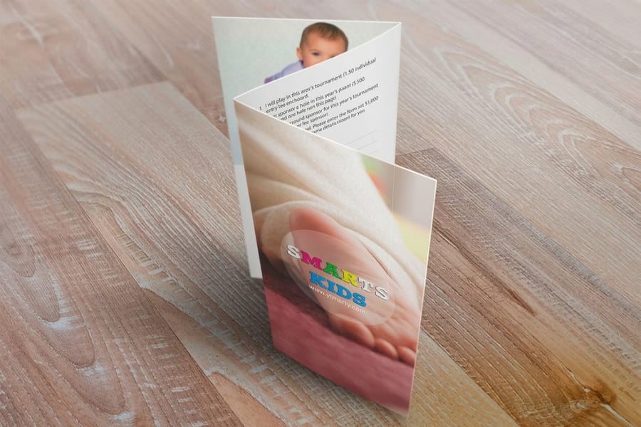
Five steps, and the order matters. Converting last, after the artwork is finished, causes fewer surprises than converting a half-built file and then editing inside it.
- Start the document in CMYK. In InDesign and Illustrator, set the document color mode to CMYK before you place anything. In Photoshop, work in RGB while you retouch, because several filters behave badly in CMYK, then convert at the end.
- Place CMYK images, or convert them. A photo dropped in as an RGB JPEG stays RGB inside your layout no matter what the document is set to. Check the links panel and convert the images themselves.
- Assign the right profile. US Web Coated SWOP is the common working space for coated commercial work in the United States. Picking a profile that matches the press and paper is what makes the on-screen preview mean anything, and the profile choice is worth getting right once rather than guessing per job.
- Fix the blacks. Set all small text and thin rules to 0/0/0/100. Search for any black that came in as 0/0/0 RGB, which converts to a weak four ink gray. That single mistake is behind most muddy black text complaints.
- Soft proof, then export. Turn on the proof preview so you can see which colors flattened, adjust those, then export a print ready PDF with bleed. Starting from a correctly sized blank template saves the trim and bleed argument entirely.
The CMYK file type for all of these is a print ready PDF, one page per printed side, built at the trim size plus bleed. The sizes and stocks below are the ones the configurator offers, so set the document to one of them before step one.
| Product | Trim sizes | Stocks | Starts at |
|---|---|---|---|
| Standard business cards | 2 x 3.5, 2 x 2, 1.5 x 3.5 or 2.125 x 3.375 in | 14pt or 16pt gloss and uncoated cover, 18pt linen and kraft | 100 for $17.57 |
| Flyers | 4.25 x 5.5 up to 11 x 25.5 in | 100# gloss text, 100# silk text or cover, 14pt gloss cover | 50 for $39.54 |
| Brochures | 5.5 x 8.5 up to 11 x 25.5 in | 100# gloss text, 100# silk text, 70# uncoated text, 14pt gloss cover | 50 for $57.11 |
| Postcards | 2.5 x 2.5 up to 6 x 11 in | 14pt and 16pt gloss cover, 24pt ultra thick gloss | 50 for $16.48 |
Do that once for a job and you can reuse the settings forever. When the file is ready, it goes straight onto standard business cards from $17.57 or standard flyers from $39.54 without a prepress query coming back at you.
Where CMYK Runs Out, and What to Do About It
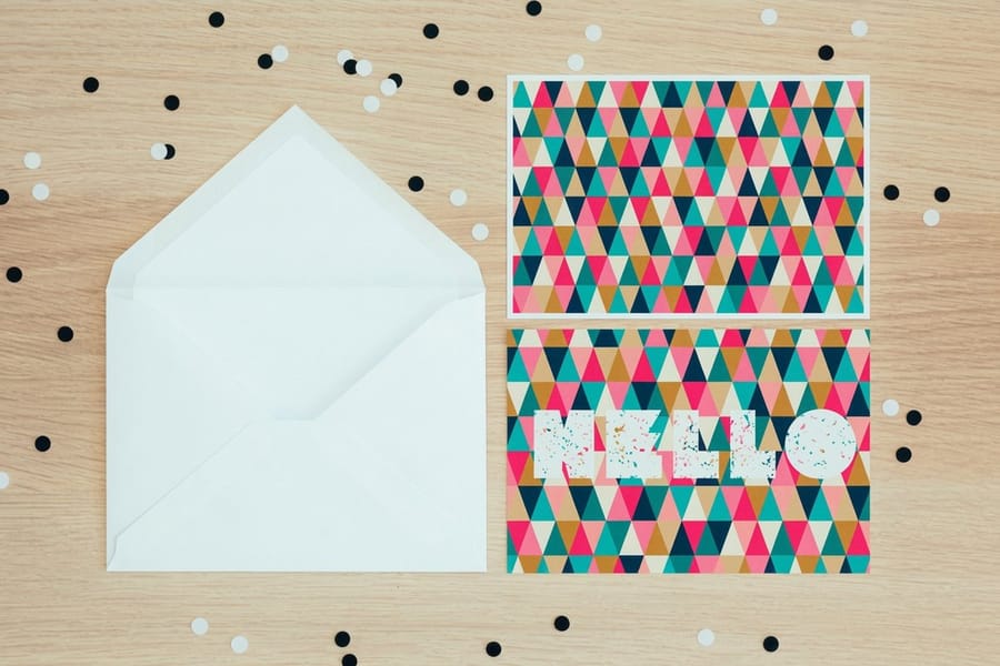
Four inks cover most colors, but not all, and knowing the gaps in advance is cheaper than discovering them on a printed sheet.
Bright saturated colors are the first casualty. Neon green, electric blue, hot orange and pure violet all sit outside what process inks can mix. They do not fail dramatically; they just come back a step duller than the screen promised. RGB blue is the notorious one, because it tends to drift toward purple as well as losing intensity. If your brand color is one of these, a Pantone spot color matched to your build is the honest fix, and on short digital runs it may not be an option at all, in which case you pick the closest process build and use it consistently.
Total ink coverage is the second limit. Add the four percentages at any point in your file and coated stock generally tolerates around 300 percent. Beyond that the ink cannot dry between sheets, so it offsets onto the back of the one stacked on top and heavy areas go blotchy. That constraint is why a rich black is built around 60/40/40/100 rather than 100 of everything, and it is explained fully in the rich black recipe.
The third limit is the one nobody can design around: your monitor. An uncalibrated screen is a poor witness. This is what a proof is for, and 4OVER4.COM includes a free proof so the color gets checked before the run rather than after. If you want to see how proofing fits the schedule, this guide walks through the stage. Then send the file to postcards from $16.48 or browse the full range of flyer printing options.
Wally explains CMYK
Cyan, magenta, yellow, and the plate everything else lines up to
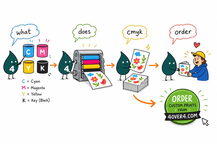
Wally runs the sheet through four times. Cyan, then magenta, then yellow, then key. He lays the key plate down first in his head, because that black plate carries the type and the edges, and the other three get keyed to it so nothing sits a hair off. Mix all three colors without it and you get a muddy brown, not black. Give Wally a CMYK file and he prints what you saw. Give him RGB and something converts it anyway, just without you watching.
Upload a CMYK file for business cards →
Specs and pricing
Full color products, sizes, and starting prices
Standard business cards start at 100 for $17.57 in four sizes, flyers at 50 for $39.54 from 4.25 x 5.5 up to 11 x 25.5 inches, and brochures at 50 for $57.11 on 100# gloss text, silk text or 14pt gloss cover. Every one prints from a CMYK file, and the cards below show the live sizes, stocks and quantities from the 4OVER4.COM configurator.



Print it
Send the converted file and see the color hold
Upload a CMYK PDF with bleed and black type at 0/0/0/100, and the same setup prints business cards from $17.57, flyers from $39.54 and postcards on 14pt or 16pt gloss cover from $16.48.




Explore more
Where to go next
Open the conversion walkthrough if your file is still RGB, the rich black recipe if large dark areas print gray, and the proofing guide before you sign off a bright brand color.


By the numbers
Everything we print on a four color press
Common Questions
Your CMYK questions, answered
What does CMYK stand for?
CMYK stands for cyan, magenta, yellow and key. Those are the four process inks that a printing press applies one after another to build a full color image. Cyan is the blue-green ink, magenta is the pink-red, yellow is yellow, and key is the black plate. Each color in your artwork is described as a percentage of each ink, so a strong red might read 0 cyan, 95 magenta, 90 yellow, 0 black, written as 0/95/90/0.
Why is the K in CMYK not B for black?
Two reasons, and both are practical. The black plate is the key plate: it holds the type, the outlines and the shadow detail, and the cyan, magenta and yellow plates are registered against it so the image lines up. Pressmen have called it the key plate since long before desktop publishing. The second reason is that B would collide with the B in RGB, and in a prepress conversation you cannot afford that ambiguity.
Why do print files have to be CMYK instead of RGB?
Because the press has four inks, not three lights. An RGB file describes color as emitted light, which a monitor can do and paper cannot. Somewhere between your file and the plate that description has to be translated into ink percentages. You can do that yourself and adjust anything that shifts, or you can leave it and accept whatever the conversion produces. Files that arrive in RGB are still printed, they just get converted without anyone checking the result.
Which colors change the most when I convert to CMYK?
Saturated colors that a screen produces with a single channel at full strength. Pure RGB blue, electric cyan, neon green and hot orange all lose intensity, and RGB blue in particular tends to slide toward purple. Reds, warm neutrals, skin tones, greys and most photographic subjects convert with very little visible change. If a brand color is one of the bright ones, check it against a printed reference before the job runs rather than judging it on a monitor.
What should I set black text to in CMYK?
Plain 0/0/0/100. Black text built from all four inks needs perfect registration to look sharp, and any tiny misregistration on press shows as a colored fringe around every letter. Reserve a rich black build, something in the range of 60 cyan, 40 magenta, 40 yellow and 100 black, for large solid areas where flat 100K would look washed out. Never use it under small type.
Is there a limit to how much ink I can stack?
Yes. Total area coverage is the sum of all four percentages at a given point, and coated stock generally tops out around 300 percent. Push past that and the ink cannot dry fast enough, so it offsets onto the back of the next sheet and the solids look mottled. Uncoated and newsprint tolerate less. This is the reason a rich black is built to roughly 240 rather than 400.
Can I check the color before you print the whole run?
Yes, and it costs nothing. 4OVER4.COM includes a free proof on orders so you can see how your file resolves before the run starts. A proof catches the two problems that account for most color complaints: an RGB file that was never converted, and a bright brand color that no combination of four inks can reach.
Get Started
Postcards run 50 for $16.48, printed in CMYK
Convert to CMYK, set your black text to 100K, upload the PDF, and check the free proof before the press run starts.
Legal Disclaimer
Gold Standard guarantees apply to all standard orders placed through 4over4.com. Price match requires verifiable proof of a competitor's published price for an equivalent product with matching specifications and turnaround time. Satisfaction guarantee covers manufacturing defects and print quality issues. Contact support with order number and documentation.
