
What Makes a Good Flyer and How to Design One That Gets Results


Sofia is our design and templates voice, built from the knowledge of our production team, with over 20 years in printing.
A copy framework, a layout framework, and the print settings that decide whether the sheet gets read or binned. Written from the press side, where we see what comes back.
A good flyer carries one message, one image, and one call to action, with a headline sized for the distance it is read from. Roughly one inch of capital-letter height stays readable at ten feet, so a flyer pinned to a board and passed at five feet needs a half-inch headline, about 48 to 60 point. Underneath that, the copy runs Hook, Promise, Proof, Path in under 90 words, and the stock is heavy enough that the sheet does not curl in a hand.
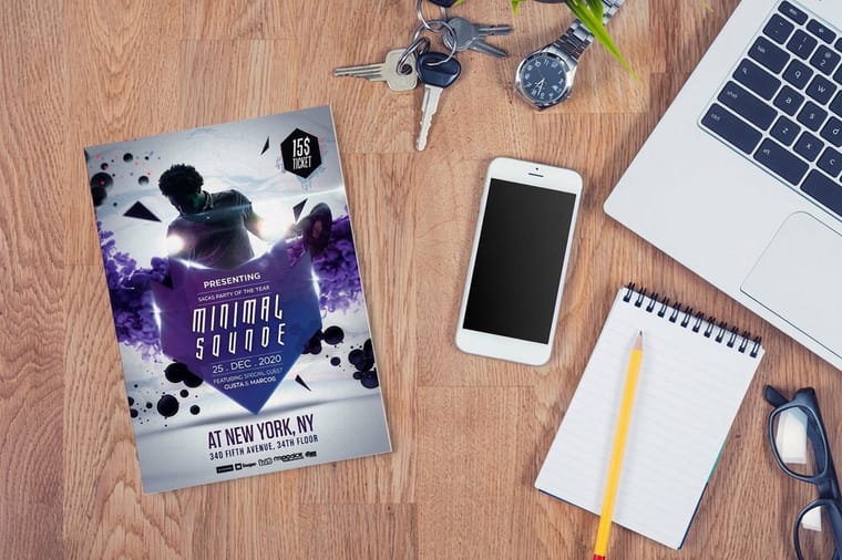
Quick answer
One message, sized for the distance it is read from
A flyer works when a stranger can repeat its message three seconds after glancing at it. That takes one headline, one supporting image or offer, one detail block, and nothing else. Size the headline against the viewing distance, keep the whole front under about 90 words, and print it on a stock that stays flat in a hand. The diagram below shows the scan path readers follow and the cap height each viewing distance demands.
What Makes a Good Flyer Work in Three Seconds
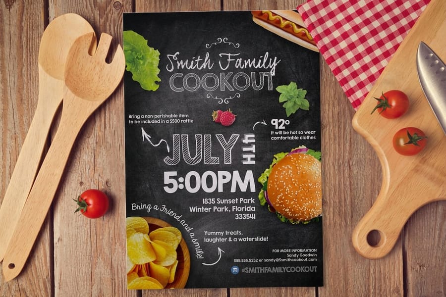
A flyer gets about three seconds on a community board and less than that in a hand. In those three seconds it has to deliver one message, and the reader has to be able to repeat that message afterward. Everything else on the sheet exists to support it.
Three levels of hierarchy is the working limit. Level one is the headline, the single thing you want remembered. Level two is the offer, or the photograph that proves the offer is real. Level three is the detail block: address, hours, phone, QR code, the small print. Add a fourth level, which usually happens when someone insists on a second offer, and the eye stops sorting and starts skipping.
The other half of the answer is physical, and it is the half designers forget. A flyer is paper that gets handled, pinned, folded into a pocket, and occasionally rained on. 70 lb text stock feels like a photocopy and curls in a warm hand within a day. 100 lb gloss text holds its shape on a board for weeks. The design did not change, but the reader decides whether you are serious before reading a word.
Where the flyer will live decides most of the rest.
| Where it lives | Size that fits | Stock that holds up | The mistake that kills it |
|---|---|---|---|
| Handed out on a street | 4 x 6 or 5.5 x 8.5 | 100 lb gloss text | Body copy under 8 point that nobody reads while walking. |
| Pinned to a community board | 8.5 x 11 | 100 lb gloss text or cover | A headline under half an inch tall, invisible from five feet. |
| Dropped through a door | 5.5 x 8.5 or 6 x 9 | 100 lb gloss cover | Ignoring the local rules on what may go in a mailbox. |
| Left on a counter | 4 x 6 | 14 pt cardstock | Light stock that curls flat and stops looking like a stack. |
Pick the row first, then design. Our breakdown of standard flyer sizes covers the trim dimensions in full, and if you are still deciding between formats, booklet against brochure against flyer settles it in a page. Door drops carry their own rules, which we cover in what you may legally put in a mailbox.
Copy That Converts, in Four Moves
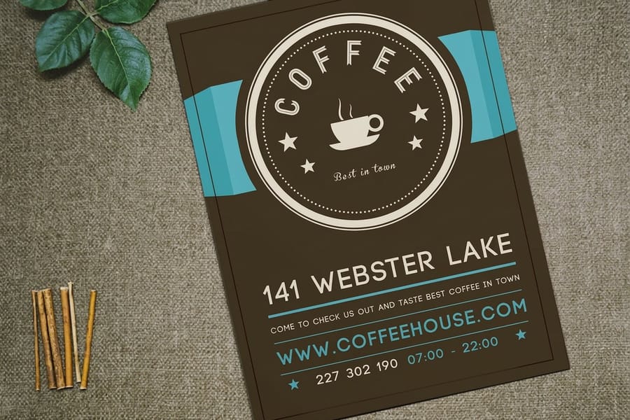
Flyer copy fails in a predictable way. It describes the business instead of naming what the reader gets. "Smith Landscaping, serving the area since 1998" is a fact about you. "Your lawn cut this Saturday, flat rate, no contract" is a fact about them. Only one of those makes somebody pull out a phone.
Four moves, in this order, on every flyer that works:
- Hook. Seven words or fewer, in ordinary words, aimed at one reader. It names a problem or a result, never the company. Read it aloud. If it sounds like a slogan, it is not a hook.
- Promise. One sentence saying exactly what they get and what it costs or takes. Specific beats impressive. "Two rooms painted in a day" carries more than "premium finishes, exceptional service".
- Proof. One real thing: a photograph of actual work, a named guarantee, a license number, the year you started. Never invent a percentage or a testimonial. A made-up number is the fastest way to look like everybody else.
- Path. One action, with the friction removed. A phone number in a size people can read across a table, or a QR code that lands on the exact page, not the homepage.
Keep the whole front under about 90 words including the detail block. That is not a style preference. A flyer competes with foot traffic and a phone in the reader's other hand, and every extra sentence buys attention from a budget you already spent.
One trade-off worth making on purpose: putting the price in the headline lowers the total number of calls and raises the share that turn into work. Leaving it out fills the phone with people who were never going to buy at your rate. If your team is small, print the price.
Flyer Design Tips That Hold Up in Print

Screen design and print design part ways at the trim line. These are the habits that survive the press.
One image, doing real work. Three photographs at equal size is a collage, and a collage has no subject. Pick the single strongest image, run it large, and let it carry the top third. If the only photograph you have is a stock handshake, drop the image and use type and color instead.
Contrast before decoration. The headline should still be readable when the flyer is photocopied in black and white. That is a fast, honest test of contrast, and it catches pale type over a busy photo before the press does.
Two typefaces, maximum. One for headlines, one for everything else, with weight doing the rest of the work. Our flyer font guide lists faces that stay legible at both 60 point and 9 point, which is a narrower set than it sounds.
Leave the margins alone. White space is not wasted paper, it is the thing that makes the headline look important. There is a full explanation in what white space actually does, and the ordering of elements is covered in our guide to visual hierarchy.
Respect bleed and safety. Extend the background 0.125 inch past the trim on every side, and keep type and logos at least 0.25 inch inside it. Cutting runs to a tolerance, so a thin decorative border sitting 2 mm from the trim will look centered on some sheets in the stack and off on others. The safest fix is to not use a thin border at all. The full setup is in bleeds, cut line and safety.
Here is the limit nobody mentions on a design blog: a full-bleed dark background looks superb on a monitor and shows every scuff, fingerprint and handling mark in a stack of 500. Heavy ink coverage on uncoated stock can also dry unevenly and go mottled. If you want the drama, order it on a coated stock and accept the slightly higher price, or pull the background back to a mid tone.
Scale and Distance, the Rule That Sizes Your Headline
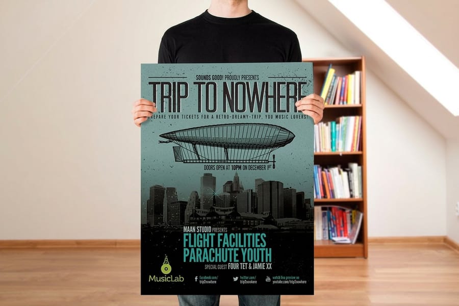
Most flyer headlines are too small, and the reason is that designers judge them on a screen at 100 percent while sitting 18 inches away. The flyer will not be read from 18 inches. It will be read from wherever the reader happens to be standing.
Use the sign trade's rule of thumb: roughly one inch of capital-letter height stays readable from about ten feet. Work backward from where the piece lives. A flyer on a corkboard is passed at four to six feet, so the headline wants a cap height around half an inch, which lands near 48 to 60 point depending on the typeface. A hand-out read at arm's length is fine with a 24 to 30 point headline. A poster across a lobby needs a full inch or more, which is a different product and a different budget, and the choice is laid out in flyer against poster.
Two checks take a minute each. Print the flyer at actual size on any office printer, pin it up, and walk backward until you cannot read the headline. If that happens closer than the real viewing distance, the type is too small. Then squint at it: whatever is still legible when your eyes are half shut is what the reader gets in three seconds. If that is your logo rather than your offer, the hierarchy is upside down.
The trade-off is real. A headline sized honestly for distance can eat a third of the sheet. The fix is to cut words, not point size. Seven words at 54 point beats fourteen at 30 point every time, and it is the reason the copy framework comes before the layout.
Layout, Fonts, and Paper Choices That Do Not Fight You
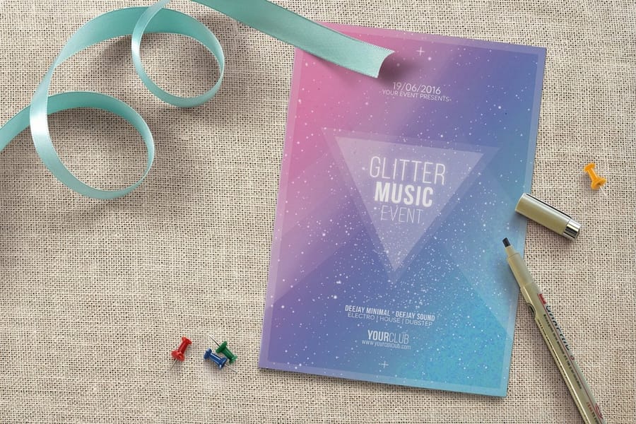
Start the layout with a margin, not with a logo. On an 8.5 by 11 flyer, a 0.375 to 0.5 inch outer margin plus the 0.25 inch safety zone gives type room to breathe and keeps everything clear of the blade. Align every block to the same left edge unless you have a reason not to, because ragged alignment reads as carelessness even to people who cannot name what is wrong.
Type sizes that behave in print: headlines from 36 point up, subheads 18 to 24, body 9 to 11, and nothing below 8 point on the front. Light and thin weights start to break up under 12 point, especially reversed out of a dark background, so reversed type wants a medium or bold weight and a little extra letter spacing.
Paper is where the flyer either feels professional or feels disposable.
| Stock | Feel in the hand | Where it fits | Watch out for |
|---|---|---|---|
| 70 lb text | Like a photocopy, floppy | Very large drops where cost per piece is everything | Curls in a hand, show-through from the back side |
| 80 lb gloss text | Light but crisp | Big hand-out runs, inserts | Still soft on a board after a week outdoors |
| 100 lb gloss text | Substantial, holds flat | The default for most flyers | Gloss shows fingerprints on dark solids |
| 100 lb gloss cover | Closer to a menu | Counter pieces, door drops, anything handled repeatedly | Costs more per piece, heavier to mail |
| 14 pt cardstock | Rigid, card-like | Tear-offs, coupons, small hand-outs | Overkill for a board flyer, and it will not fold cleanly |
Standard Flyers start at $39.54 and run on gloss text and cover weights, and Club Flyers start at $16.48 for the smaller, heavier hand-out format that nightlife and event promoters use. If you want the full weight comparison first, read the best paper weight for flyers and the deeper flyer stock and weight guide. When the piece needs more room than one sheet, step up to Standard Brochures from $57.11 rather than shrinking the type.
A Call to Action the Reader Can Actually Complete
Start the call to action with a verb, name one action, and give a reason to do it this week. "Call for a free estimate before 31 March" works. "Contact us for more information" is furniture.
One action only. A flyer offering a phone number, a website, an Instagram handle, a QR code and a walk-in address is offering nothing, because the reader has to choose and choosing is work. Pick the channel you can actually measure and answer, then make the others small.
If you use a QR code, print it at 0.8 inch square or larger, keep a clear quiet zone around it equal to about four modules of the pattern, and put it dark on light. A code sitting on a busy photograph or reversed to white often fails to scan, and you will not find out until the flyers are already on the street. Scale the code up for anything read from more than arm's length. Our walkthrough on generating QR codes in InDesign covers the file side.
A deadline outperforms a discount more often than people expect, and it costs nothing. Discount codes do give you clean tracking, but they also train customers to wait for the next flyer before booking. If you want the tracking without the training, use a dated offer with a code rather than a percentage off.
Where you leave the stack matters as much as what it says, and flyer distribution practice covers the placement side. Small formats like Standard Postcards from $16.48 double as hand-outs and as mailers, which lets one design carry two campaigns.
The Print-Ready Flyer Checklist
Run this list before you upload. It catches almost every reprint we see.
- Document set at final trim size, with 0.125 inch bleed on all four sides and artwork extended into it.
- Type and logos 0.25 inch inside the trim, further in if the design has a border.
- CMYK, not RGB. Bright screen blues and oranges shift when converted, so convert first and look at it. See the right color profile for printing.
- Images at 300 ppi at final placed size, not 300 ppi before you scaled them up. Our note on print resolution explains the difference.
- Rich black for large solids, not 100 percent K alone, which prints as a washed gray over a big area.
- Fonts outlined or fully embedded, so the file cannot substitute a face on our end.
- Single-page PDF per side, no crop marks inside the artwork, no spreads.
- Spell-check the phone number and the address, out loud, against the real thing. This is the single most common reprint.
- Print one at home at 100 percent and look at it at real distance before ordering 2,500.
Then match the file to what you order. Standard Flyers come in nine trim sizes, from 4.25 by 5.5 to 11 by 25.5 inches, or a custom size between them. The stocks run 70# uncoated text, 100# gloss or silk text, 80# gloss cover, 100# silk cover and 14pt gloss or uncoated cover, printed on one side or both, with a standard finish or a high gloss UV coating. A run of 100 costs $57.11 and 400 cost $97.76, so the price per sheet falls by more than half between the two.
Start from a correctly sized file rather than building one from scratch: the blank template library has the trim, bleed and safety already drawn, and the free online designer templates let you lay the flyer out in the browser and send it straight to press. When the file is ready, configure size, stock and quantity on Standard Flyers or browse the full range in flyer printing.
Wally explains the five-foot test
If the headline dies before you do, the type is too small
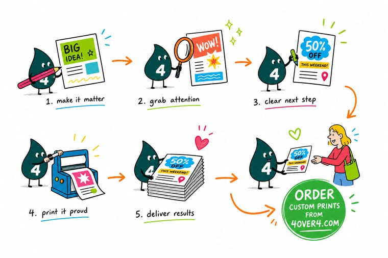
Wally pins the flyer to the board, walks backward, and stops when he can no longer read the headline. If that happens before five feet, the type goes up, not the word count. Then he squints. Whatever survives the squint is what a passer-by actually gets, and it had better be the offer rather than the logo. One message, one image, one thing to do next, printed on a stock that stays flat in a hand.
Order flyers that hold up →
Specs and pricing
Flyer sizes, stocks, and starting prices
Standard flyers start at $39.54 for 50 and club flyers at $16.48 for 50, with sizes and coatings set on each product page.



Print it
Print the flyer people stop for
Standard flyers cover the board and the street. Club flyers run from 2.5 by 2.5 to 6 by 11 inches on cover stocks up to 24pt, for a hand-out that stays stiff in a pocket. Brochures start at 5.5 by 8.5 inches with an optional half fold when one flat sheet leaves the offer no room.




Explore more
Where to go next
Read them in the order you decide a flyer: the trim size, then the paper weight, then the fonts, then where the stack goes.

By the numbers
Flyers on stock that holds up on a board
Common Questions
Your flyer questions, answered
What makes a good flyer?
One message a stranger can repeat after three seconds, a headline large enough for the distance it is read from, one image doing real work, and a single call to action. Underneath that sits a stock heavy enough that the sheet does not curl in a hand. Most weak flyers are not badly designed, they are overloaded: two offers, four fonts, and a paragraph nobody will stand still for.
What size should a flyer be?
8.5 by 11 inches is the default for a community board or a counter stack, because it reads from across a room and holds a real headline. Hand-outs work better at 5.5 by 8.5 or 4 by 6, which fit a pocket and cost less per piece, so you can print more of them. If the piece is going into a mailbox, check the size against postal rules before you design it rather than after.
How many words should be on a flyer?
Aim for under 90 words on the front, including the detail block. A seven-word headline, a one-sentence promise, one short proof line, and the contact details usually land between 55 and 80 words. If you need more than that, the piece is not a flyer any more and a folded brochure will serve it better.
What paper weight is best for flyers?
100 lb gloss text is the practical default. It is thick enough to stay flat on a board, takes photographic color well, and stays cheap enough for volume. Step up to 100 lb gloss cover when the flyer will be handled repeatedly or left on a counter, and step down to 80 lb only for large drops where cost per piece decides everything. Avoid 70 lb text for anything you want taken seriously.
Should a flyer be single or double sided?
Print one side unless the second side has a job. A board flyer is only ever seen from the front, so the back is wasted money. A hand-out or a counter piece gets flipped, and that back side is the right place for a map, hours, a short list of services, or a tear-off. The extra cost is small, but a back full of filler tells the reader the front was padded too.
How much does flyer printing cost at 4OVER4.COM?
Standard Flyers start at $39.54 and Club Flyers start at $16.48, with the per-piece cost dropping steeply as quantity rises because the press setup is spread across more sheets. Postcards, which many businesses use as a small hand-out flyer, start at $16.48. Configure the size, stock, and quantity on the product page to see the exact price before you order.
Get Started
Print 50 flyers on 100 lb gloss text from $39.54
Pick your size, choose a stock heavy enough to stay flat, and we print full color flyers that still read from across the room.
Legal Disclaimer
Gold Standard guarantees apply to all standard orders placed through 4over4.com. Price match requires verifiable proof of a competitor's published price for an equivalent product with matching specifications and turnaround time. Satisfaction guarantee covers manufacturing defects and print quality issues. Contact support with order number and documentation.
