
How to Design March Madness Flyers That Fill Every Seat


A tournament flyer has one job: get a stranger across the room to read a time and a place. Here is the zone layout, the type sizes, the color pairs and the stocks that do it.
Build a March Madness flyer in four stacked zones: a tip-off hook at 60 pt or larger that reads at 20 feet, a bracket block at 14 pt to 24 pt, the date and venue at 10 pt to 14 pt, and a booking action with a QR code. Use two colors plus the paper, one heavy condensed sans and one plain sans, 100 lb gloss text for posting and 14 pt or 16 pt cover for handouts. Keep the NCAA marks and school logos off it unless you are licensed.
Quick answer
Design each zone for the distance it is read from
A tournament flyer is read three times, from three distances, and each one needs its own type size. The hook has to work at about 20 feet, which means roughly one inch of cap height for every 10 feet of viewing. The bracket block works at 6 feet and is what stops the walk past. The date, address and QR code are read in the hand, and they must sit inside a 0.25 inch safety margin so the trim never clips a phone number. Get the order of those zones right and the color and font choices become easy.
Why Paper Still Fills a Room on Tip Off Day
A March Madness flyer works because it sits in the one place a social post cannot: physically inside the neighborhood where the game is being shown. The person who reads it is already walking past your door, already near your block, already deciding where to watch. That is a much shorter distance to a seat than an impression on a feed.
The tournament also has a shape that paper suits. It runs roughly three weeks, with a burst of games on the opening Thursday and Friday, then a slower rhythm through the second weekend and the Final Four. A flyer taped inside a window works every one of those days without a budget attached to it, and a bracket grid on that flyer quietly advertises the next round while people watch the current one.
Where flyers fail is when they are treated as a single mass drop. A thousand sheets on windshields in a parking garage will not move a Tuesday. Two hundred sheets placed in the dorm lobby, the gym entrance, the barber shop and the office break room a block from your bar will. Our flyer distribution practices cover the placement side, and flyer advertising for small businesses covers the offer that goes on the sheet.
Anatomy of a Basketball Flyer, Zone by Zone

A flyer is not one design, it is four blocks that get read at four different distances. Lay them out in that order and the rest of the decisions make themselves.
| Zone | What goes in it | Type size | Read from |
|---|---|---|---|
| 1. The hook | Tip-off time or a three word promise. One line, nothing else competing. | 60 pt and up | Across the room, about 20 feet |
| 2. The bracket | An empty round-by-round grid, or the matchups once the field is set. | 14 pt to 24 pt | Standing in front of it, 6 feet |
| 3. The logistics | Date, doors, venue name, street address, any cover charge. | 10 pt to 14 pt | In the hand |
| 4. The action | Reserve a table, QR code to the booking page, phone number. | 10 pt to 12 pt plus a solid button | In the hand |
The single most common mistake is inverting zones 1 and 2. A designer builds a beautiful bracket, floats the time above it at 24 pt, and the flyer becomes invisible from six feet away. Give the hook a solid color field and reverse the type out of it, because white on dark survives a dim bar better than dark type on a photograph of a basketball court.
The bracket block is worth building empty on purpose. Print the grid with blank lines, hand your bartender a marker, and the flyer updates itself for three weeks. If you would rather have the grid at full size behind the bar, print it as a standard poster and keep the handout simple. The QR code guide covers sizing the code so a phone actually reads it at arm length.
Color Schemes That Read as Sports, Not as a Sale
Two colors and one neutral. That is the whole rule, and most tournament flyers break it by trying to include every team in the field.
Pick the pair that means something locally: the home school colors if you are near a campus, or the venue brand colors if you are not. Then let the paper be the third value. A deep navy and a hot orange over white reads instantly as competition. Six pastel accents read as a spa menu. If you want a starting point that is already tested for print, our ten print color pairings lists combinations that hold their contrast on press.
Two things go wrong in the file rather than in the design. First, screen orange and screen red do not survive the conversion to CMYK; a vivid RGB orange usually lands duller and slightly browner on coated stock. Convert before you approve, not after, and read CMYK versus RGB for printing if you have never done the conversion yourself. Second, a large solid dark field looks rich on screen and can look patchy in a cheap build, so specify a rich black rather than 100 percent K when you are filling the top third of a flyer with color.
One more habit worth keeping: put the hook type on flat color, never on a photograph. Motion photography and heavy display type fight each other, and the flyer loses the fight at 20 feet.
Fonts That Still Work With the Lights Down
Use two typefaces. A heavy condensed sans for the hook and the numbers, and a plain workhorse sans for the address block. That combination is boring on a mood board and correct on a wall.
Condensed weights matter more than the style of the face. A tip-off time set in a condensed heavy sans fits at a much larger cap height in the same column width, which is exactly the trade you want when the whole point is distance. Athletic block and varsity faces are tempting, and they do belong on jerseys, but their outlined and layered versions lose legibility fast once the room is dark or the flyer is behind glass with a reflection on it.
Set numerals with care, since a tournament flyer is mostly numbers. Tabular figures keep a column of tip-off times aligned. Avoid oldstyle figures, which dip below the baseline and read as decorative rather than urgent. And check the ampersand and the slash if you are setting matchups, because those two characters are where cheap free fonts fall apart.
Whatever you choose, convert the type to outlines before you export, or embed the fonts in the PDF. A missing font substitution is the most common reason a flyer comes back looking nothing like the proof. Our flyer font guide lists specific faces that hold up in print, and Google Fonts licensing for print answers the question that comes next.
Sizes and Stocks for Indoor Posting Versus Handouts
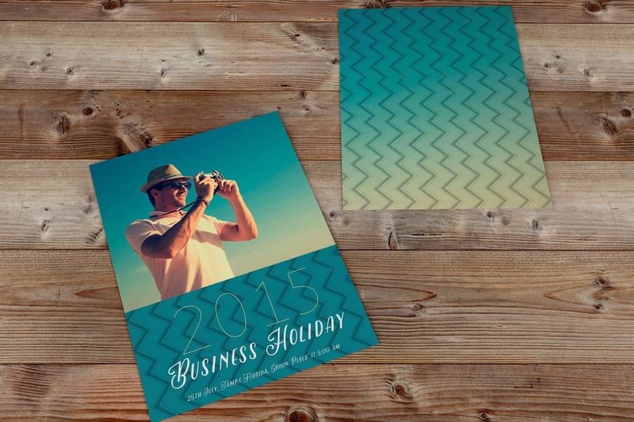
Match the format to how the piece gets used, not to what looks generous in a quote. Four formats cover the whole tournament.
| Format | Best for | Stock we would pick | Starts at |
|---|---|---|---|
| 8.5 x 11 flyer | Windows, corkboards, break rooms. Fits a full bracket grid. | 100 lb gloss text, or 14 pt cover for a window | $39.54 |
| 5.5 x 8.5 half sheet | Table drops and bulk handouts where cost per piece matters. | 100 lb gloss text | $39.54 |
| 4 x 6 club flyer | Door handouts at a bar. Stiff, pocket sized, low light friendly. | 14 pt or 16 pt cover, gloss or UV | $16.48 |
| 18 x 24 poster | The live bracket behind the bar or in a lobby window. | Poster stock, matte if staff will write on it | $108.75 |
The stock decision is where most people guess. Gloss text is thin, cheap and sharp, and it is the right answer for a sheet that gets taped up and thrown away in three weeks. It is the wrong answer for anything that goes in a pocket, because it creases at the first fold and the crease shows white through the gloss. Cover stock at 14 pt or 16 pt costs more per piece and returns it in how long the flyer survives.
Coating changes behavior too. UV gloss is the most durable and the most reflective, which is great in a doorway and awkward under a spotlight. Matte kills glare and takes marker ink, which is the reason a bracket poster should be matte if your staff are filling it in by hand. Flyer paper stocks and weights goes deeper on the choice, and best paper weight for flyers gives the short version.
If the venue also needs something bigger than paper, a vinyl banner starting at $79 outside the door does the job a flyer cannot, and table tents put the drink special in front of a seated customer who is already watching the game.
Editable Templates and a Print Ready File Checklist
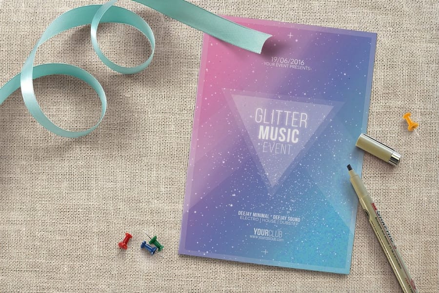
Start from a correctly sized artboard rather than fixing dimensions later. Our blank template library gives you the trim, bleed and safety guides already drawn for every flyer size we print, and the design template library has layouts you can edit in the browser without any design software at all. If you would rather build from scratch, how to create a flyer walks the whole process.
Before you upload, run this list. It is short because these are the five things that actually cause reprints.
- Bleed at 0.125 inches on all four sides. Any color that touches the edge must run past the trim, or a white hairline appears down one side of the stack. See bleeds, cut line and safety.
- Safety margin at 0.25 inches. Nothing you need to read sits closer than that to the trim. Cutting has a tolerance and the address block is the first casualty.
- 300 dpi at final size. A logo pulled off a website is 72 dpi and will look soft at 60 pt. Ask for the vector file instead.
- CMYK, not RGB. Convert and look at the result before approving, especially on saturated orange, red and purple.
- Fonts outlined or embedded. Export a press-ready PDF rather than sending a native file with linked assets.
One legal item belongs on this checklist as well. March Madness, Final Four and the official bracket artwork are registered NCAA trademarks, and school team logos are licensed separately by each university. A venue can factually advertise that it is showing the games. Reproducing the tournament logo, the bracket mark or a school logo on a promotional flyer is a different thing, and it is the kind of detail that gets a printed run wasted. Write around it: name the teams in plain text, draw your own grid, and lead with your venue.
Wally explains the game day flyer
Big time, empty bracket, clean address
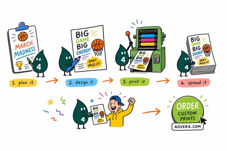
Wally puts the tip-off time at the top so big it reads from the sidewalk, draws the bracket grid empty so the bartender can fill it in with a marker as games finish, then drops the venue, address and a QR code at the bottom inside the safety margin. Two colors, one heavy condensed font, and nothing squeezed against the trim. He leaves the NCAA logos alone, because those are licensed, and lets the time and the address do the selling.
Print standard flyers →Specs and pricing
Flyer sizes, stocks and starting prices
Compare the three formats a tournament promotion actually needs, with live configuration options and starting prices from the 4OVER4.COM configurator.

Print it
Order the paper that fills the room


Explore more
Where to go next


By the numbers
Event printing you can count on at 4OVER4
Common Questions
Your tournament flyer questions, answered
What size should a March Madness flyer be?
Two sizes cover almost every tournament job. Use 8.5 by 11 inches for anything posted on a wall, a window or a community board, because the extra height carries a bracket grid without crushing the type. Use 5.5 by 8.5 inches for handouts and table drops, since it fits a jacket pocket and costs about half as much per piece. If you are handing flyers out at the door of a bar, the 4 by 6 club flyer format is stiffer, easier to hold, and reads better under low light.
Can I put the March Madness logo or the NCAA bracket on my flyer?
Not without a license. March Madness, Final Four, Elite Eight and the official bracket logo are registered NCAA trademarks, and the association actively polices commercial use by bars, restaurants and retailers. What you can do is describe the games factually and promote your own venue: the tip-off time, the teams playing, your drink specials, your address. Draw your own generic bracket grid rather than reproducing the official artwork, and keep team logos off the flyer too, since those are licensed separately by each school.
How far ahead should I print tournament flyers?
Print the venue flyer before Selection Sunday and leave the matchup line blank or generic, because you will not know the teams until the field is announced. Most venues run two prints: a long-lead flyer that promotes the whole tournament and a short-run reprint once the first round pairings are set. Standard turnaround at 4OVER4.COM is a few business days plus shipping, and rush options exist, so plan the reprint around a two to three day window rather than a same-day scramble.
Should the bracket actually go on the flyer?
On a wall flyer, yes. A bracket grid signals that the event runs for three weeks and gives someone a reason to come back on a Thursday. On a small handout, no. A 64-team grid at 5.5 by 8.5 inches turns into grey texture nobody can read, and it steals the space the tip-off time needs. Put the grid on a poster behind the bar and keep the handout to hook, date, venue and a QR code.
What paper should I use for a flyer people take home?
100 lb gloss text is the standard flyer stock and it looks sharp coming off the press, but it creases the moment it goes in a back pocket. If the flyer has to survive an evening, move to 14 pt or 16 pt cover, which holds its shape and feels like something worth keeping. For anything taped to a window facing the street, 16 pt cover or a poster stock resists curling in the sun far longer than text weight.
How do I make the tip-off time readable across a loud room?
Set it as the largest element on the sheet and give it a solid block of color behind it rather than sitting it on a photograph. Reversed white type on a dark field holds up better across a dim bar than dark type on a light field, and a single condensed sans at heavy weight beats a decorative sports face at that distance. Then test it: pin the proof to a wall, walk 20 feet back, and if you cannot read the time, the type is too small no matter how good the layout looks on screen.
Get Started
Ready to print the flyer before the field is announced?
Pick your size, choose gloss text for posting or 14 pt cover for handouts, upload a print-ready PDF, and we turn it around in time for the opening round.
Legal Disclaimer
Gold Standard guarantees apply to all standard orders placed through 4over4.com. Price match requires verifiable proof of a competitor's published price for an equivalent product with matching specifications and turnaround time. Satisfaction guarantee covers manufacturing defects and print quality issues. Contact support with order number and documentation. On-time delivery rate based on tracked orders 1999 to 2026. Individual results may vary based on shipping carrier performance.
