
How to Create a Brand Style Guide Your Small Business Will Actually Use


Marcus is our print marketing voice, built from the knowledge of our production team, with over 20 years in printing.
The fill in framework, the CMYK and Pantone values a printer needs, and a print test on a 2 by 3.5 inch business card, a brochure and a vinyl banner that shows whether the guide holds before you order in volume.
A brand style guide is a short document that fixes four things: your logo files and the rules for using them, your brand colors in HEX, RGB, CMYK and Pantone, your typefaces and weights, and how the brand sounds. For a small business, six to twelve pages is the right length, and the framework below fills in page by page. Write the color page carefully, because that is the one you paste into a print order.
Quick answer
Six pages, and only three of them leave your building
A brand style guide records the decisions somebody else would otherwise guess at. Logo files and usage rules, color values in four formats, typefaces and weights, imagery, voice and messaging. Three of those pages travel: a printer needs vector logo files, CMYK or Pantone values and the exact fonts. The rest stays with your own team. The diagram shows which is which, and the framework further down turns it into something you can fill in this afternoon.
Print test
Test the guide on three printed pieces before you order in volume
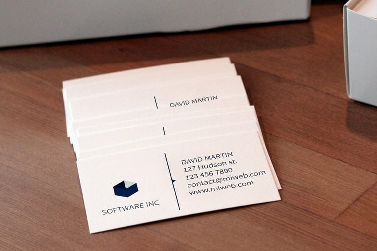
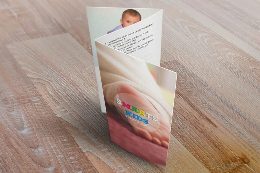
Once the color and type pages are written, print one small run of each format that stresses a different page. 100 standard business cards for $17.57 test the minimum logo width and the 7 to 8 point contact lines at 2 by 3.5 inches. 50 brochures for $57.11 test the full palette across panels and a fold.
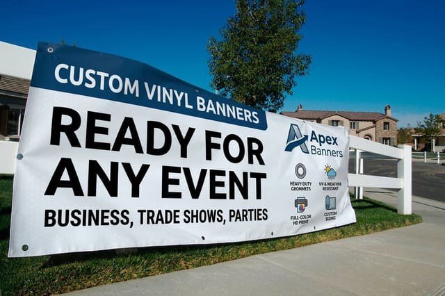
A vinyl banner from $79 tests the logo at several feet from vector artwork. Order all three on the stock you will keep ordering, compare the printed brand color with the CMYK build in the guide, correct the numbers, and file one printed card with the guide as the physical reference.
What Goes Inside a Brand Style Guide
Six pages carry almost all the value, and the table below is the whole framework. Write it in a document you already use, export it as a PDF, and keep the source files in a folder beside it.
| Page | What you write down | Finished when |
|---|---|---|
| Cover | Business name, version number, date, and who to ask when something is not covered. | Somebody can tell in two seconds whether their copy is current. |
| Logo | Primary lockup, a stacked or horizontal alternate, an icon only mark, and a one color version. | Every file exists as vector EPS or PDF and as PNG with a transparent background. |
| Logo rules | Clear space, minimum width, approved backgrounds, and five things nobody may do to it. | The misuse examples are shown, not just described in a sentence. |
| Color | Every brand color in HEX, RGB, CMYK and Pantone, with a note on where each color is used. | A printer could quote the job from this page alone. |
| Type | Display and body typefaces, the weights you use, the license you hold, and a web safe fallback. | Anyone can install the fonts without emailing you for a file. |
| Imagery | The kind of photography you use, the treatment applied to it, and what you never use. | Three example images sit on the page rather than three adjectives. |
| Voice | Three words you sound like, three you avoid, and one paragraph rewritten before and after. | A new writer produces something recognizable on the first attempt. |
| Messaging | Tagline, one sentence description, one paragraph boilerplate, and the proof points you repeat. | The boilerplate can be pasted straight into a press release or a directory listing. |
| Applications | Photos of the real business card, brochure, sign and email signature, laid out correctly. | The last page shows the brand in use, which is the page people copy from. |
The applications page is the one small businesses skip and the one everybody actually looks at. When somebody needs to lay out a flyer in a hurry, they do not read your clear space rule. They open the last page and imitate what is there, so put a well built example on it.
Why a Small Business Needs One Sooner Than It Thinks
The guide pays for itself the first time somebody who is not you produces something with your name on it. That happens earlier than most owners expect: a supplier building a co branded flyer, a trade show organizer asking for a logo at 300 dpi, a new employee putting together a quote template.
Without a written record, every one of those requests becomes a search through email for the least bad version of your logo. The versions drift. One flyer carries a slightly different green because it was picked off a screenshot, the sign company traces the mark because they were sent a 400 pixel PNG, and the letterhead uses a font that was on the old laptop. None of it is dramatic on its own, and together it is why a five year old small business often has four versions of itself in circulation.
There is a cost argument too. Print reruns are usually caused by files, not presses. A logo supplied at screen resolution, a color that was never converted for press, a font that reflowed because it was not outlined: those are the three that come back. Our print ready file guide covers the mechanics, and the brand guide is where the correct assets live so nobody has to go looking. If you are still shaping the story behind the visuals, the brand messaging guide is the companion piece to this one.
Logo Usage Rules That Prevent Real Damage

Most logo pages are a wall of prose when they should be two numbers and five pictures. Start with the numbers.
Clear space. Express it as a fraction of the logo, never in millimeters, so it scales with the mark. A common rule is the height of the capital letter in your wordmark, or half the height of the icon, kept free of text, edges and other logos on all four sides. Write it as a rule somebody can measure without asking you.
Minimum size. Print the mark at several widths, look at it flat on a desk rather than zoomed on a screen, and find the width where the smallest element starts to close up. On a standard 3.5 by 2 inch business card, an icon plus wordmark usually stops holding detail below about one inch wide. Record that number and a separate one for screen in pixels.
Then the pictures. Five crossed out examples do more than five paragraphs: do not stretch it, do not recolor it, do not add a drop shadow, do not place it on a busy photograph without the approved background panel, do not rebuild it in a different font. Show each one wrong, at the size people will see it. The logo design principles guide goes deeper on what makes a mark survive that treatment in the first place, and logo design best practices covers the build itself.
One practical note that saves a reprint. Keep a one color version in the guide, black and reversed white. Embroidery, engraving, single color stamps and some signage cannot take your full color mark, and if a one color version does not exist somebody will make one badly at the last minute.
Choosing a Brand Color Palette That Survives Print
A palette of one primary, one secondary and two or three neutrals is enough for a small business, and the discipline is in the recording rather than the choosing. Each color gets four values, because each one is read by a different machine. If you are still picking the colors, start with how to choose your brand color palette.
| Format | Looks like | Who uses it | What to watch |
|---|---|---|---|
| HEX | Six characters after a hash | Websites, email templates, social profiles | Screen only. A press cannot use it, so never supply it alone for print. |
| RGB | Three numbers from 0 to 255 | Screens, video, presentations, office software | Same value as HEX in a different notation. Office apps often only accept this one. |
| CMYK | Four percentages | Four color offset and digital printing | Convert it yourself and approve the result, or the conversion is made for you. |
| Pantone | A number plus C or U | Spot ink jobs, brand critical color, some signage | C is coated stock and U is uncoated, and the same number looks different on each. |
The gap between the first two rows and the last two is where brand color goes wrong. Screens make color with light and presses make it with ink, so the brightest greens, oranges and blues on a monitor sit outside what four color process can mix. Nobody warns you. The file simply prints duller and the guide never gets corrected.
Two habits close the gap. Convert the palette yourself rather than leaving it to whatever software opens the file, which is the whole subject of our CMYK and RGB guide and the reason to set a working profile as described in choosing a print color profile. Then, if a color has to be exact across many jobs, record a Pantone reference and consider running it as a spot ink, which spot color printing explains in cost terms. If you are still choosing the palette, brand color pairings that work in print is the place to start.
One more line worth adding to the color page: the same ink looks different on coated and uncoated paper. Uncoated stock absorbs more ink and reads flatter and slightly darker, which is why Pantone publishes coated and uncoated versions of the same number. If your business card is coated and your letterhead is uncoated, expect them to differ slightly, and note in the guide which one is the reference.
Brand Fonts and the Type Rules Worth Writing Down
Two typefaces are plenty. One for headings with some character, one for body text that stays readable in long paragraphs and at small sizes. A third only earns its place if it does a job the other two cannot, such as a monospace for figures.
The type page is short but it has to be exact, because a font that is nearly right is the fastest way to make a printed piece look wrong. Record the full family name including the foundry, the specific weights you use rather than the whole family, and the license you hold. Licences are the trap: a font that is free on a web font service is not automatically licensed for a printed job or for embedding in a logo, and finding that out after a sign is made is expensive.
Set four roles and give each a size and weight to start from. Display for the headline, subhead, body, and small print. In print, body copy at 9 to 11 point suits most stationery and brochures, while a business card usually runs 7 to 8 point for contact details and rarely goes below 6 point without becoming hard to read at arm's length. On screen you want body around 16 pixels. Add line spacing while you are there, since roughly 1.4 to 1.6 times the type size is a safe starting range for body text.
Finish with a fallback. Name a system font that stands in when a colleague opens the template without the licensed family installed, so the layout degrades predictably instead of defaulting to something unrecognisable. Fonts also need outlining before a print file goes out, which is covered in the print ready file guide, and you can build a correctly sized layout from the blank template library.
Voice and Messaging in Two Pages
Visual rules stop the brand from looking wrong. Voice rules stop it from sounding like a different company every time somebody writes a caption. This is the page most small businesses leave out, and it is the cheapest one to write.
Pick three words for how you sound and three for how you do not. Direct, warm, specific. Not corporate, not jokey, not salesy. Those six words do more work than a page of theory because they are usable in a decision: somebody reads a draft, checks it against the six words, and edits.
Then add the mechanical rules people genuinely need. Do you write your business name in caps. Is it a hyphen or an ampersand. Do you use the Oxford comma. How do you refer to customers, as clients, guests or members. Do you write prices with or without cents. Each of those gets decided fifty times a year by whoever is typing, and writing them down once ends the inconsistency.
Close with the messaging block: a tagline, a one sentence description of the business, and a paragraph of boilerplate. That boilerplate goes into directory listings, press mentions and the back of a brochure, so write it well once. If you want the full method behind the words, the brand messaging guide takes it further. And when a short piece has room for one sentence only, printed formats force the discipline: a postcard at $16.48 leaves space for a headline and an offer, and nothing else.
What to Take From Published Brand Guidelines

Reading a real guideline document is faster than reading advice about them. Three published ones are worth an hour, and each teaches something different.
- The NASA Graphics Standards Manual. Produced in 1975 by Danne and Blackburn and now widely available as a scan. It is the clearest demonstration of how a logo page should work: the mark drawn on a grid, clear space defined against the letterforms themselves, and page after page of the identity applied to real objects. Take the structure, not the length.
- The Mailchimp Content Style Guide. Published openly on the web and written for writers rather than designers. It is the model for the voice page, because it gives rules you can act on, including how to write about people respectfully and how to handle plain language. If your voice page feels vague, read theirs and copy the level of specificity.
- Any major consumer brand guideline page. Spotify, Slack and similar companies publish public asset pages that state exactly what outsiders may and may not do with the mark. The lesson is the tone: they name a small number of allowed uses and are direct about the rest. Your five misuse examples are the same idea at small business scale.
What none of them do is start with philosophy. They start with a file and a rule. That is the standard to hold your own guide to.
Carrying the Guide Onto Cards, Brochures and Signage
A brand guide is a theory until it is printed. Three formats test different parts of it, which is why they are worth ordering as a set once the guide is written.
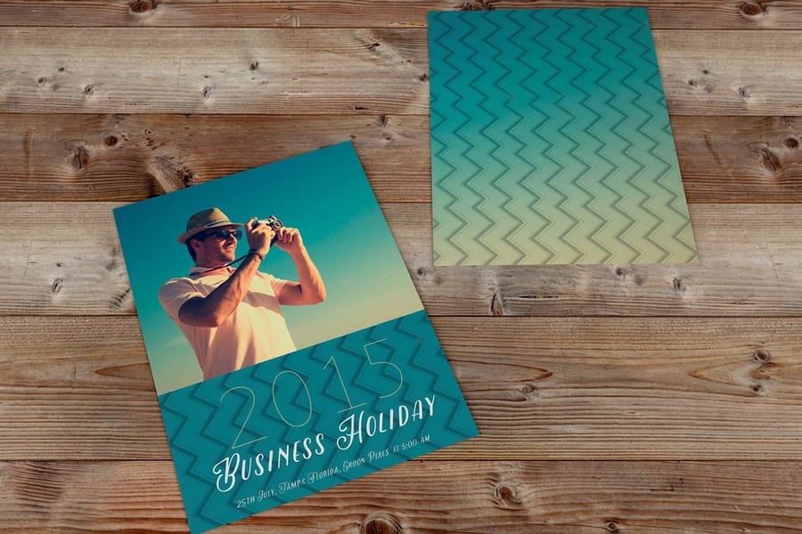
Business cards test small. A card is 3.5 by 2 inches, and everything about your identity has to survive at that size: the minimum logo width, the small print size, and whether your brand color still reads as itself in a thumbnail sized block. Standard business cards start at $17.57, which makes them the cheapest honest test of the whole guide. Build a 0.125 inch bleed and keep type at least 0.125 inch inside the trim, because a card trimmed slightly off is where a tight logo placement becomes obvious.
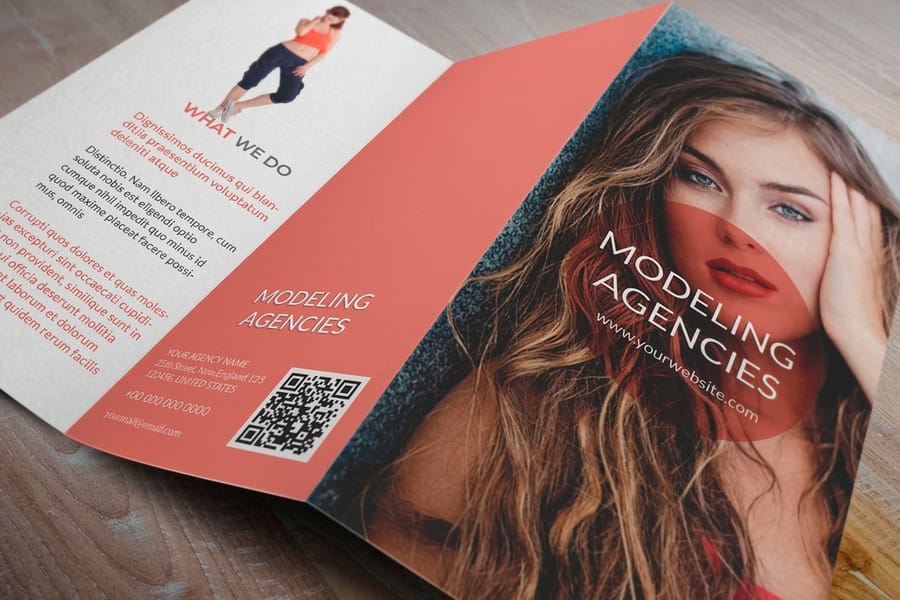
Brochures test the system. Panels, headings, body text, imagery and a second brand color all appear at once, and this is where a palette that was never tested on paper shows itself. Standard brochures start at $57.11. Watch the fold: a heavy brand color crossing a fold line can crack on coated stock, so keep solid blocks off the crease where you can. Our brochure printing category lists the fold and size options.
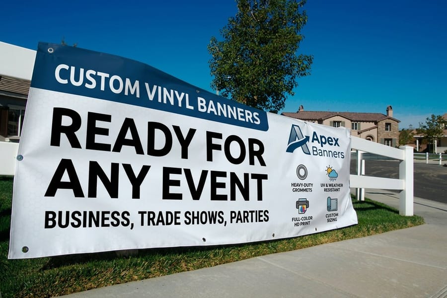
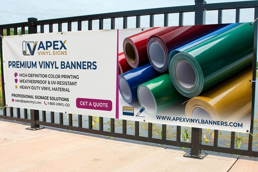
Signage tests scale and distance. Blown up to several feet, a logo built at low resolution falls apart, and a color that was approved on a card can look considerably heavier across a large area. Vinyl banners start at $79. Bring vector artwork, not a scaled up raster, and check the contrast between your brand color and your type at reading distance rather than on a monitor.
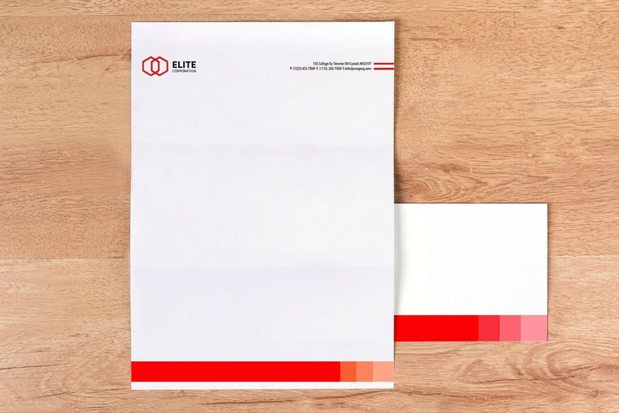
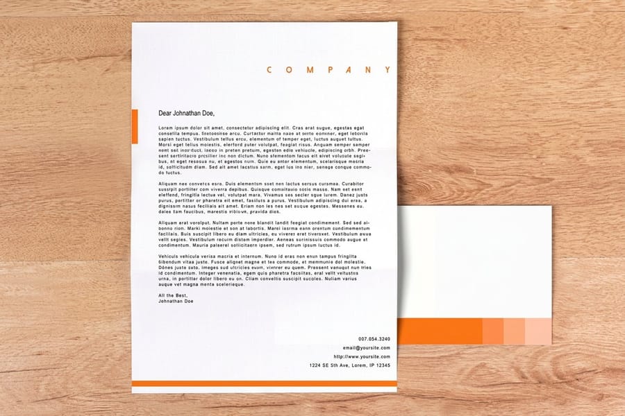
Stationery ties it together. Standard letterheads start at $99.95 and are usually uncoated, so this is where the coated and uncoated difference in your color page becomes visible. Pair them with printed envelopes if the brand goes out by mail. The branded stationery guide covers building the set as one family.
Print matching in practice is three habits. Convert and approve your CMYK build before the first job rather than after. Order on the stock you will keep ordering, since a color approved on gloss will not look identical on matte. And keep one printed piece as a physical reference, filed with the guide, because a printed sample settles a color argument that a screenshot never will.
Building the Guide and Keeping It Alive
Build it in whatever you already use. A slide deck exported to PDF is a perfectly good brand guide, and it beats a beautiful one that never gets finished. What matters is the delivery: one PDF plus one folder.
The folder is the part people forget, and it is what makes the guide usable rather than decorative. Inside it: logo files as vector EPS and PDF, plus PNG with transparent background at a couple of sizes, in full color, all black and reversed white. Font files or a link to where the license is held. A small text file with the color values, so nobody has to retype them out of a PDF. Put the whole thing in shared storage with a link that does not expire, and name the top level folder with the version number.
Version the guide the way you would version a price list. Cover page carries a version number and a date. When you change a color build after a print run, bump it and say what changed in one line. A guide with no version leads to three copies in circulation and an argument about which one is right.
Then use it. Load the assets into our free online designer and lay out the first card, brochure and sign there, or start from a correct print size in the blank templates library. The first time a new supplier asks for your logo and you send one link instead of digging through a folder, the guide has already paid for itself. If a printed piece comes back not quite right, fix the value in the guide first, then the file, so the correction sticks. For the wider picture of how business cards carry a brand, company business cards and branding picks up where this guide stops.
Wally explains the brand guide
Six pages, four color values, one folder
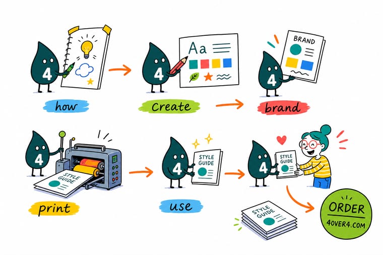
Wally writes the logo page first, with clear space measured against the letters and a minimum width he tested by printing it. Then the color page, and he fills all four boxes: HEX and RGB for screens, CMYK for the press, a Pantone number if the color has to be exact everywhere. Then the fonts with their weights and license. He proves the whole thing by ordering one business card, because a color that looked right on a monitor is only a guess until it is on paper.
Print your brand on business cards →
Specs and pricing
Test the guide on the three formats that matter
Cards test small, brochures test the whole palette, letterheads test uncoated stock. Live sizes, stocks and starting prices from the 4OVER4.COM configurator. Standard business cards start at 100 for $17.57 at 2 by 3.5 inches, brochures at 50 for $57.11 on 100# gloss or silk text, 70# uncoated text or 14pt gloss cover, and letterheads at 50 for $99.95 at 8.5 by 11 inches on 70# uncoated text or 24# Royal Laid. Cards and brochures take 3 business days of production, letterheads 5.


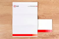
Print it
Put the guide on paper and see if it holds
Business cards from $17.57 for 100, brochures from $57.11 for 50 and vinyl banners from $79 in 24 sizes from 2 by 4 feet: small, system and scale, each with 3 business days of production.


%22%2F%3E%3Ccircle%20cx%3D%2240%22%20cy%3D%2249%22%20r%3D%2225%22%20fill%3D%22%232dd4bf%22%20opacity%3D%220.15%22%2F%3E%3Ccircle%20cx%3D%2278%22%20cy%3D%2258%22%20r%3D%2214%22%20fill%3D%22%232dd4bf%22%20opacity%3D%220.1%22%2F%3E%3Crect%20x%3D%2270%22%20y%3D%2228%22%20width%3D%2225%22%20height%3D%2234%22%20rx%3D%224%22%20fill%3D%22%232dd4bf%22%20opacity%3D%220.08%22%20transform%3D%22rotate(35%2080%2030)%22%2F%3E%3C%2Fsvg%3E)
Explore more
Where to go next





By the numbers
The three formats that test a brand guide
Common Questions
Your brand style guide questions, answered
What is a brand guide?
A brand guide, also called a brand style guide or brand guidelines, is a short document that fixes how your brand is allowed to look and sound. At minimum it holds your logo files and the rules for using them, your exact color values in every format, the typefaces and the weights you use, and a page on voice and messaging. It exists so that a designer, a printer and a new hire all produce the same brand without asking you. For a small business it is normally six to twelve pages, held as one PDF plus a folder of source files.
How long should a small business brand style guide be?
Six to twelve pages. The famous corporate manuals run to hundreds of pages because they govern aircraft liveries and thousands of staff. You are governing a business card, a brochure, a sign, a website and a few social profiles. Write one page each for logo, color, type, imagery, voice and messaging, add a page of correct and incorrect examples, and stop. Length is not the thing that makes a guide work. Being open on a second monitor while somebody builds a file is.
What color values does a printer actually need?
CMYK values for standard four color printing, or a Pantone number if the color must match across different jobs and stocks. A HEX code is a screen value and a press cannot use it directly, so if you supply only HEX somebody converts it for you and the result is whatever their software decided. Convert your brand colors to CMYK once, print them, adjust until the printed version looks like the brand, then write those corrected numbers in the guide.
Do I need a Pantone color in my brand guide?
Only if the color is doing real work and drifting would be noticed. Pantone is a spot ink mixed to a formula, so it lands the same on every job, and it reproduces bright oranges, deep blues and greens that four color process struggles with. It costs more because it adds an ink to the run. If your brand color is a mid tone that converts cleanly, CMYK is fine. If it is a saturated blue or a bright orange, record a Pantone reference and pick it from a printed fan book under daylight, never from a monitor.
Can I create a brand style guide without a designer?
Yes, for the parts that are a record rather than a design decision. Writing down clear space, minimum size, four color formats, font names and weights, and a voice page is administration, and you know your business better than anyone hired for a week. What is worth paying for is the logo itself in proper vector form, because a guide built around a JPEG logo will fail the first time somebody needs it on a banner. Build the layout in our free online designer once the assets exist.
How often should the guide be updated?
Touch it whenever a real decision gets made, and read it end to end once a year. New product line, new color introduced for a sub brand, a font license that expired, a printed job where the color came back wrong and you corrected the CMYK build. Each of those is a two minute edit. Put a version number and a date on the cover so nobody works from a copy that was downloaded eighteen months ago, and keep the live file in one place everyone can reach.
Get Started
Print the guide's three formats, starting at $17.57 for 100 cards
Load your logo, your approved CMYK values and your fonts into the free online designer, then print the card, brochure and banner that prove the guide works.
Legal Disclaimer
Gold Standard guarantees apply to all standard orders placed through 4over4.com. Price match requires verifiable proof of a competitor's published price for an equivalent product with matching specifications and turnaround time. Satisfaction guarantee covers manufacturing defects and print quality issues. Contact support with order number and documentation.
