
10 Vector Illustration Styles That Print Sharp at Any Size


What Vector Actually Buys You, and Where the Promise Runs Out
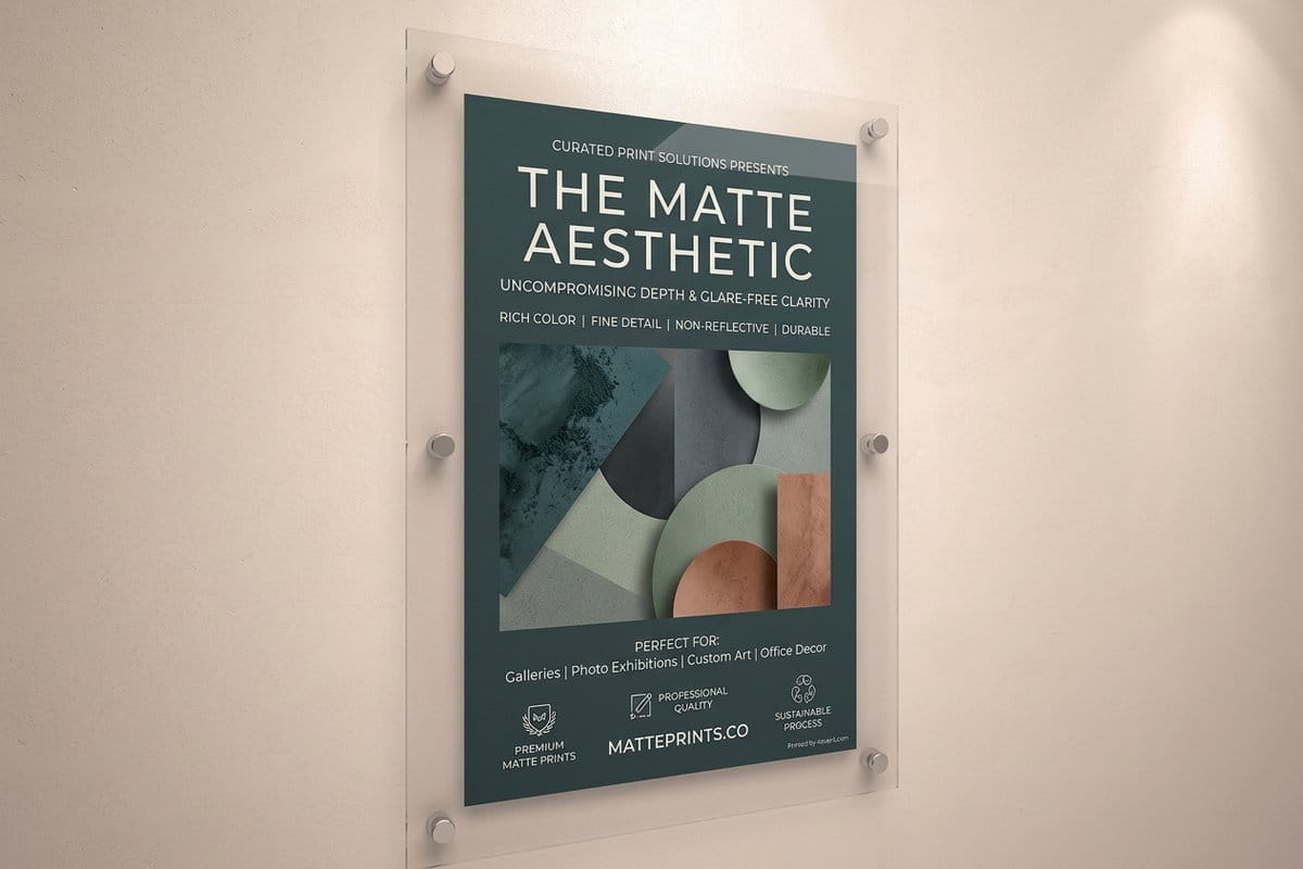
A vector file does not store a picture. It stores instructions: put an anchor point here, curve to there, fill the enclosed area with this color. Because the shapes are described mathematically rather than as a fixed grid of pixels, the same file can be output at any size and the edges are recalculated each time. That is why one logo file works on a business card and on the side of a van.
This is the part everyone knows. The part that catches people out is that resolution independence is a property of paths and fills, not of everything you can do in a vector application. The moment you add a gradient mesh, a drop shadow, a blur, a blend mode, or stacked transparency, the software has to rasterize that portion at some fixed resolution before it can be printed. You now have a file that is partly vector and partly pixels, and the pixel part carries all the usual size limits.
Nothing about that is forbidden. It just means the guarantee is conditional, and the illustration styles that hold up best in print are the ones that stay closest to the pure form: paths, flat fills, and hard edges. The ten styles below are ordered roughly from safest to most demanding, and each notes what it asks of the printing process. If you are building a mark rather than an illustration, our guide to creating a logo in Illustrator is the more specific starting point.
Five Flat Styles That Print Reliably Anywhere
These five are the workhorses. All of them are built from solid fills and clean paths, which means they reproduce predictably on coated stock, uncoated stock, vinyl, and fabric without special handling.
- 1. Flat design. Solid color shapes with no shading, no gradients, and no depth cues at all. It is the most print resilient style there is, since there is nothing in it that can be rasterized or misregister. The discipline is that form has to be communicated by silhouette alone.
- 2. Line art and monoline. Illustration built from strokes of consistent weight, usually in one color. Excellent for icons, diagrams, and anything that must survive being reproduced small, provided the stroke weight is heavy enough to hold at the final size.
- 3. Geometric and modular. Shapes constructed from circles, squares, and triangles on a grid, often with a strict angle set. It scales beautifully and, because it is systematic, it produces families of illustrations that visibly belong together.
- 4. Silhouette and cut paper. High contrast shapes with no interior detail, in the tradition of mid century poster design. The most legible style at distance and the most forgiving of poor printing conditions, which is why signage leans on it.
- 5. Limited palette screenprint style. Two to four flat colors, sometimes with deliberate overlap where colors meet to suggest a mixed tone. It imitates screenprinting and it suits concert posters and merch, where a restricted palette reads as a deliberate choice rather than a limitation.
If a job has to work from sticker size to poster size, pick from this group. Every one of these will look the same on a sticker as it does on a poster.
Print picks
Four formats that reward clean vector art
Live starting prices from the configurator, for the pieces where sharp edges and flat color do the work.
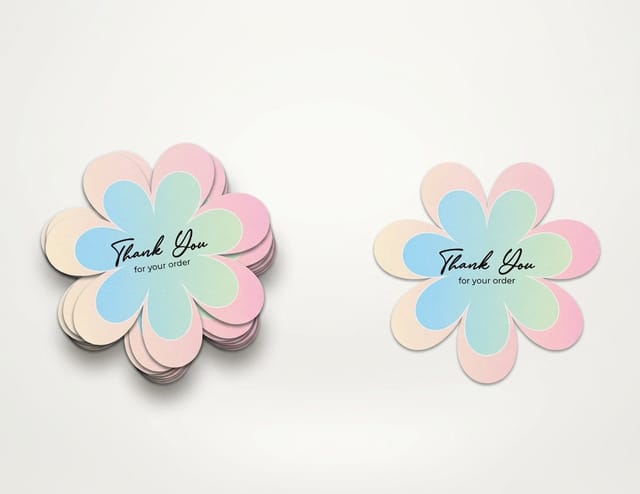 Die-Cut Stickers From $93.37 Cut to the outline of your artwork, which only works if the shape is a clean vector path.
 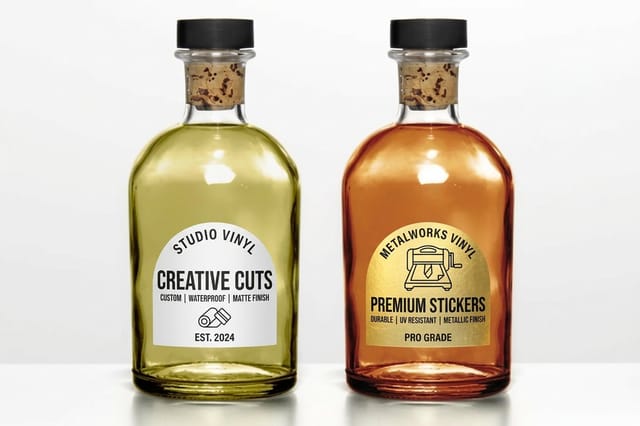 Vinyl Stickers From $25 Durable flat color that holds a hard edge outdoors and on curved surfaces.
 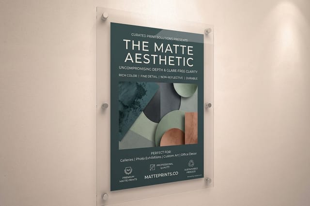 Matte Posters From $25 Scale a vector illustration up without a single soft edge or visible pixel.
 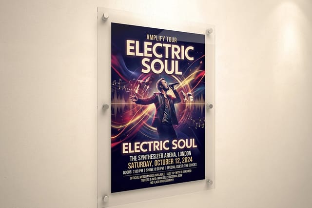 Concert Posters From $25 The tradition built on limited palettes and bold shapes, which is exactly what vector does best.
 Five Richer Styles and What They Ask of the Press
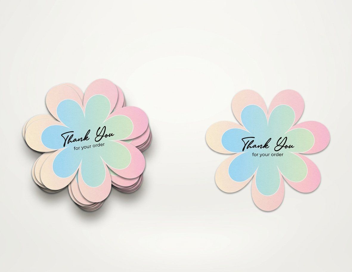
These five add depth, texture, or detail. All of them can print superbly, but each introduces something the flat styles avoid, and it is worth knowing what that something is before you commit a run to it.
- 6. Textured and grain overlay. Flat vector shapes with a noise or halftone texture laid over them to imitate print artifacts. It looks wonderful and it is usually raster underneath, so build it at the final output size rather than expecting to scale it later.
- 7. Isometric. Objects drawn on a fixed angled grid with no perspective convergence, common in technical and product illustration. Geometrically it is pure vector and prints perfectly, but the density of small parts means it needs to be checked at final size for detail that closes up.
- 8. Gradient and blend heavy. Smooth color transitions built with gradients or gradient meshes. This is where resolution independence genuinely breaks, since meshes rasterize on output, and it is also where banding shows up if the transition is long and the tonal steps are coarse.
- 9. Detailed vector portraiture. Faces and figures built from many stacked shapes to imitate shading, in the tradition of vectorised poster art. Beautiful at poster scale, unreadable on a sticker, and prone to visible edges where the tonal steps meet if the palette is not carefully chosen.
- 10. Brush and organic vector. Paths given expressive, variable width strokes to imitate a brush or pen. It combines a hand drawn feel with vector scalability, and the risk is that the thinnest points of a tapered stroke fall below what the press can reliably hold.
None of these are problems, they are tradeoffs. The rule of thumb is that anything relying on smooth tonal transition or very fine detail needs a proof on the actual stock before the full run, because that is where paper choice starts to matter more than file quality.
Designing for the Smallest Size You Will Print
The most common vector failure has nothing to do with software settings. It is that the illustration was designed at a comfortable size on a large monitor and then applied to something small, where half of it disappears.
Detail is not free. An illustration with fine interior linework, small text elements, and delicate tapered strokes might be genuinely excellent on a poster and completely illegible once reduced to a sticker or a corner of a business card. The maths scales perfectly, but ink, paper, and human eyes do not.
Checks worth running before you commit
- View at actual size. Not zoomed to fit. Set the zoom so the artwork is physically the size it will print and look at it from normal reading distance.
- Check the thinnest stroke. Find the lightest weight anywhere in the file and ask whether it will still be there after ink spreads slightly into the paper.
- Squint at it. If the illustration stops reading as a recognizable shape, it depends on detail rather than structure, which is fragile at small sizes.
- Build a simplified variant. The professional habit is to keep a reduced version of the artwork for small applications, with the fine detail removed rather than shrunk.
That last point is worth adopting as standard practice. A logo family usually has a detailed version and a simplified one for small use, and illustrations benefit from exactly the same treatment. Our guide to logo design principles covers the reasoning in more depth.
Small format test
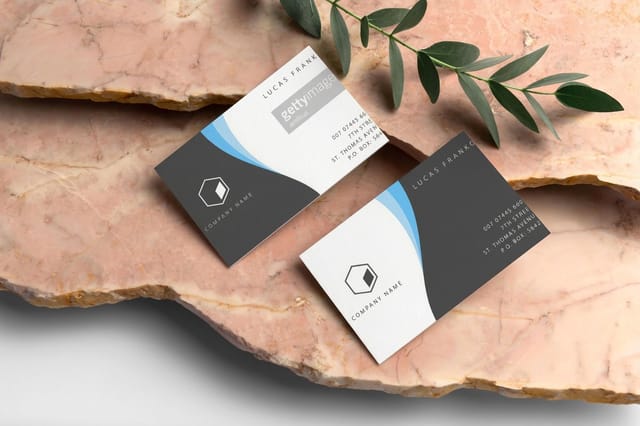
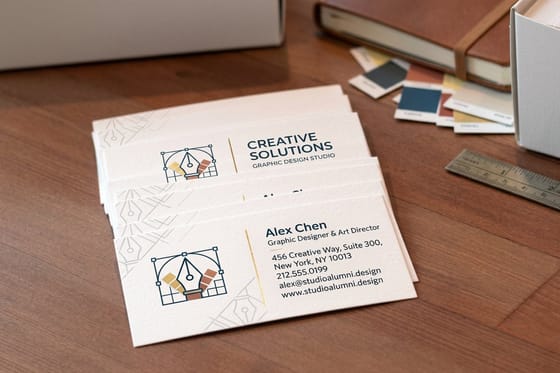
A business card is where over detailed vector art falls apart
Everything that looked intricate at screen size gets reduced to a few millimetres, and thin strokes either vanish or fill in.
Color, and Why Vector Files Still Surprise People
A frequent assumption is that because vector art uses defined color values rather than photographic tones, color will reproduce exactly. It does not, and the reason is physical rather than digital.
Screen color is emitted light mixing red, green, and blue. Printed color is reflected light bouncing off ink sitting on paper, mixing cyan, magenta, yellow, and black. The two do not cover the same range, and the colors furthest outside the printable range are exactly the ones flat vector illustration loves: intense saturated mid tones, electric blues, and vivid greens. Those arrive noticeably duller, and two adjacent flat colors that felt clearly distinct on screen can collapse into nearly the same printed value, which is far more visible in flat art than in a photograph.
Convert deliberately and then adjust the palette by eye rather than accepting an automatic conversion. If a specific brand color has to be exact, spot color is the answer rather than a CMYK approximation. Our walkthroughs of converting RGB to CMYK and the best color profile for printing cover the settings, and Pantone spot color printing covers locking an exact color.
Quantity and price
Die cut sticker pricing and specs, straight from the configurator
Real numbers on die cut stickers, the format where your vector outline literally becomes the cut line.
| Quantity | Price Per Unit | Total |
|---|---|---|
| 25 | $3.73 | $93.37 |
| 50 | $1.91 | $95.56 |
| 100 | 100.0¢ | $99.95 |
| 200 | 56.3¢ | $112.59 |
| 300 | 41.4¢ | $124.13 |
| 400 | 33.9¢ | $135.65 |
Preparing the File So It Arrives the Way You Drew It
Most vector print problems are file handling problems rather than design problems, and they cluster into a short, predictable list.
Outline your type, or embed the fonts properly. An unoutlined font that the printer does not have gets substituted, and a careful illustration arrives with the wrong typeface in it. Outlining converts letters into paths, which removes the risk entirely, though it also removes your ability to edit the text later, so keep an editable master.
Then handle the edges. Anything that touches the trim needs to extend past it into the bleed, because the cut moves fractionally and a shape that stops exactly at the trim line will show a white sliver on some copies. Keep important detail comfortably inside the safe margin for the same reason. For die cut stickers this matters more than usual, since your outline literally becomes the cut path and needs to be a single clean shape rather than a stack of overlapping fragments.
Finally, expand strokes where the weight matters, flatten transparency deliberately rather than leaving it to whatever the export does, and export with our guide to exporting a print ready PDF open beside you. Start from a correctly sized layout in the blank templates library so the trim, bleed, and safe zone are already drawn.
Wally scales a vector without breaking it
Maths instead of pixels, until you add a gradient mesh
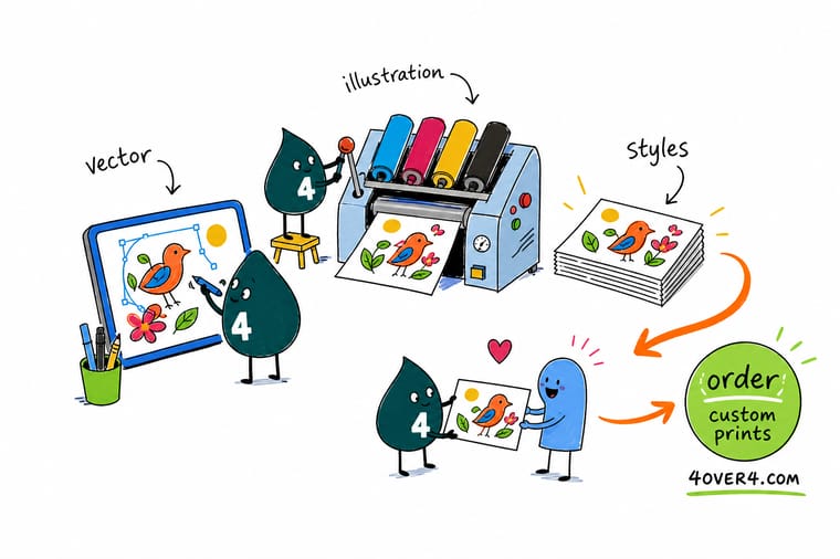
Vector art is stored as instructions rather than a grid of pixels, which is why the same file prints crisp on a card and on a banner. That promise holds right up until you add gradient meshes, stacked transparency, and hairline strokes, all of which get flattened into pixels somewhere before the press. Keep the color flat and well separated, keep the strokes thick enough to hold, and outline the type. 4OVER4 prints it on stickers, posters, cards, and more.
Print your illustration →Choosing a vector style that survives the press
Explore more
More on illustration, logos, and print files
The same vector file prints a 25-sticker run at $93.37 and a poster, with no change to the artwork.
 Article Canvas Prints Online That Turn Business Printing Into Art Canvas prints online for offices, lobbies, and storefronts. Compare wrap styles, sizes, and finishes, then pre
  Article Health Poster Design Ideas for Clinics, Schools, and Campaigns Health poster design ideas for clinics, schools, and awareness campaigns, with layout examples, readable type
  Article Graphic Design Blogs Worth Following for Print and Branding Ideas Graphic design blogs worth following for print and branding ideas, with what each one covers, how often it pos
  Guide Create a Logo in Illustrator A working sequence from sketch to vector mark.
  Guide Export a Print Ready PDF The settings that keep vector art intact.
  Guide DPI vs PPI Why raster effects reintroduce resolution limits.
  Guide Logo Design Principles Marks that hold up at every size.
  Guide Convert RGB to CMYK Getting screen color to survive the trip to ink.
  Guide Best Color Profile Which profile to work in and why it matters.
  Article Logo Sticker Ideas Where flat vector marks do the most work.
  Article Custom Logo Design Turning an idea into a usable brand mark.
  Article Facts About Logos History and quirks behind marks you know.
 Ready to print your vector work?
Keep the color flat, the strokes thick enough to hold, and the type outlined, and 4OVER4.COM prints it sharp on stickers, posters, and cards.
Vector illustration questions
Why is vector art better for printing than raster images?
Because a vector file stores instructions rather than pixels. Shapes are described as anchor points, curves, and fills, so the edges are recalculated at whatever size the file is output, which is why one logo file can print crisp on a business card and on the side of a van. A raster image is a fixed grid of pixels, so enlarging it beyond its native resolution softens edges and eventually shows the grid. The caveat is that the guarantee applies to paths and flat fills, not to effects such as gradient meshes, blurs, and transparency, which get rasterized before output.
Which vector illustration style prints most reliably?
Flat design, meaning solid color shapes with no shading or gradients at all. There is nothing in it that can be rasterized, nothing that can band, and nothing that depends on fine tonal transition, so it reproduces predictably on coated stock, uncoated stock, vinyl, and fabric alike. Line art, geometric styles, silhouette work, and limited palette screenprint styles are almost as safe for the same reason. Gradient heavy work, detailed vector portraiture, and textured overlays can all print superbly, but they ask more of the process and deserve a proof on the real stock first.
Does vector art really scale to any size without quality loss?
Paths and flat fills do. Effects do not. The moment you add a gradient mesh, a drop shadow, a blur, a blend mode, or stacked transparency, the software has to rasterize that portion at a fixed resolution in order to print it, which quietly reintroduces all the usual size limits to part of your file. Build anything containing those effects at close to the final output size rather than assuming you can scale it up later. There is also a human limit that maths ignores: detail that reads beautifully on a poster can be completely illegible on a sticker.
How thin can strokes be in a vector illustration for print?
Thinner than you think on screen, thicker than you think on paper. The reliable approach is not a fixed number but a check: view the artwork at actual physical size rather than zoomed to fit, find the lightest stroke weight anywhere in the file, and ask whether it will still be visible after ink spreads slightly into the paper. Uncoated stock absorbs ink and thickens strokes unevenly, while coated stock holds them sharper. If an illustration will be used small, build a simplified variant with the fine detail removed rather than simply shrinking the detailed one.
What should I do to a vector file before sending it to print?
Outline the type or embed the fonts properly, since an unoutlined font the printer does not have gets substituted and your careful illustration arrives in the wrong typeface. Extend anything touching the trim into the bleed, because the cut moves fractionally and a shape stopping exactly at the trim line leaves a white sliver on some copies. Keep important detail inside the safe margin. Expand strokes where the weight matters, flatten transparency deliberately rather than leaving it to the export defaults, and convert color to CMYK yourself so you can adjust the palette by eye.
