
Graphic Design Blogs Worth Following for Print and Branding Ideas


Six blogs cover print and branding properly: Brand New for identity criticism, Fonts In Use for typography you can search by typeface, The Dieline for packaging, Print Magazine for design history, It’s Nice That for daily range, and Creative Review for work that had a commercial brief. Read those six well rather than thirty badly, and note the typeface and the stock every time something stops you, because that is the part you can use next week.
The blogs at a glance
| Blog | What it covers | Posting rhythm | Why a print designer reads it | Where and what it costs |
|---|---|---|---|---|
| Brand New | Identity and logo redesigns, reviewed one at a time | A few reviews a week | It shows the full system, not just the mark | underconsideration.com, membership for full critiques |
| The Dieline | Packaging design, structure, labels, awards | Most weekdays | Structural and label ideas surface here first | thedieline.com, free |
| Fonts In Use | Real typography indexed by typeface, format and industry | Steady, submission driven | Search a typeface and see it set at real sizes | fontsinuse.com, free |
| Print Magazine | American design history, criticism, commentary | A few posts a week | Context for why a style keeps coming back | printmag.com, mixed free and paid |
| It’s Nice That | Illustration, publishing, identity, art direction | Several posts every weekday | Volume and range when the well is dry | itsnicethat.com, free |
| Creative Review | Advertising and design that had a commercial brief | Daily on weekdays | Work judged on whether it did a job | creativereview.co.uk, part paywalled |
| Design Observer | Long essays and interviews about design practice | Irregular, essay length | Sharpens how you argue for your own work | designobserver.com, free |
| Communication Arts | Juried annuals across design, advertising, illustration | Weekly features plus annual issues | A yearly benchmark of finished craft | commarts.com, subscription for the archive |
| Logo Design Love | One designer walking through identity work and process | Irregular, sometimes monthly | Process notes you can copy into your own workflow | logodesignlove.com, free |
Posting rhythms and paywalls change, so treat this as a starting shape rather than a fixed timetable. The useful sort is by what you are working on this month, not by how much each one publishes. When one of them gives you an idea, print it small before you scale it: graphic designer business cards start at $17.57.
The blogs that argue about identity work
Start with Brand New. It takes one identity at a time, shows the old system beside the new one, and says plainly whether the change was worth making. Nothing else covers rebrands at that resolution, and the applications it publishes, stationery, signage, packaging, vehicle liveries, are exactly the pieces that decide whether an identity works off the screen.
The catch is the business model. The work is posted free and the written critique sits behind an UnderConsideration membership, so the free version tells you what happened and the paid version tells you why it matters. If you only read one paid design site, that is the one worth the money, because the reasoning is the part you can reuse on your own projects.
Creative Review sits next to it and covers work that had a commercial brief behind it, advertising included. Design Observer runs longer: essays and interviews about practice rather than galleries of new marks. Read Design Observer when you need to argue for a decision in front of a client, not when you need a picture. Logo Design Love is one designer publishing process rather than news, so it is quiet for weeks and then posts something you actually use.
What to take from a rebrand post, and what to leave
Take the system: how the mark behaves when it shrinks, how the palette splits into primary and secondary, how the typography holds a hierarchy across a poster and a card. That thinking transfers to a two person studio as well as it does to an airline.
Leave the budget. The applications photographed in those posts often involve custom typefaces, spot inks and specialty finishes commissioned for one client. Copying the look without the budget produces a weaker version of somebody else’s idea. Our layout principles guide covers the structural half you can actually reuse.
Test the identity at card size before you believe it
The fastest reality check on any mark is to set it on a 3.5 by 2 inch card with a name, a role and a phone number, then print one. Detail that survives a screen at 400 pixels wide can close up at that size, thin strokes fill in, and counters in small type disappear.
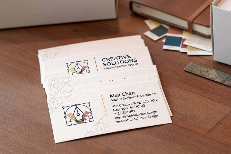
A short run of graphic designer business cards starts at $17.57, so this check costs less than an hour of your time. Print it, hand it to somebody, and watch whether they can read the role line without moving the card closer.
The blogs that show the craft
Fonts In Use is the most practical site on this list and the least fashionable. It catalogs real typography, indexed by typeface, by format and by industry, so you can search a font you are considering and see it set in a book, on a package and on a sign before you license it. That is a different question from whether a typeface looks good in a specimen.
The Dieline covers packaging almost exclusively, which is why structural ideas and label thinking show up there before they reach the general design press. It is also the clearest illustration of a trap: packaging shot in studio light with foil, emboss and soft touch lamination reads as design when a good part of it is finishing.
Print Magazine gives the history, which matters more than it sounds. Knowing that a style has cycled through three times already stops you presenting it as new. It’s Nice That posts several times a weekday across illustration, publishing and art direction, so it is the one to keep for range rather than depth. Communication Arts runs juried annuals, which is a yearly benchmark of finished craft rather than a feed.
Reading a type post like a print designer
When a blog shows typography you like, note three things before you close the tab: the typeface and weight, the size it was set at, and the surface it was printed on. The same face at 8 point on uncoated stock looks heavier than it does on gloss, because uncoated paper absorbs ink and the strokes gain slightly. That gain is why a specimen and a printed card disagree.
Pair that habit with a color note. A palette lifted from a backlit screen is an RGB palette, and bright greens, pure blues and neon oranges are the ones that go flat in CMYK. Our color combinations guide lists pairings that hold up after the conversion.
Save the source, not the screenshot
A folder of screenshots turns into mood soup within a month. Save the link, the typeface, the stock if the post names it, and one sentence about why you kept it. Six months later that sentence is the only part that still helps.
It also protects you from accidental copying. If you remember why a layout worked, you can rebuild the reason. If you only remember the picture, you rebuild the picture.
Turning what you read into printed work
Reading is cheap and printing is where the idea gets tested. The gap between the two is the reason so many designers have a beautiful feed and a portfolio of screen mockups, and clients can tell the difference. Work through it in the order the press does: format, stock, finish, then color.
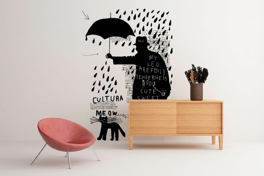
Format first, because it decides everything after it. A card, a poster and a wall graphic each carry a different amount of information at a different reading distance. A wall graphic from $25 is read from across a room, so it holds a mark and about four words. A card is read at arm’s length and can hold a hierarchy of six or seven elements before it clutters.
Then stock and finish, which is where most blog inspiration quietly costs money. Foil, emboss, spot gloss and soft touch each add a pass or a die, and each behaves differently: foil sits on the surface and catches light, emboss works by shadow and needs open space around it, soft touch mutes color slightly in exchange for the feel. Pick one of them per piece. Two competing finishes on the same card usually cancel each other out.
A cheap way to run the test
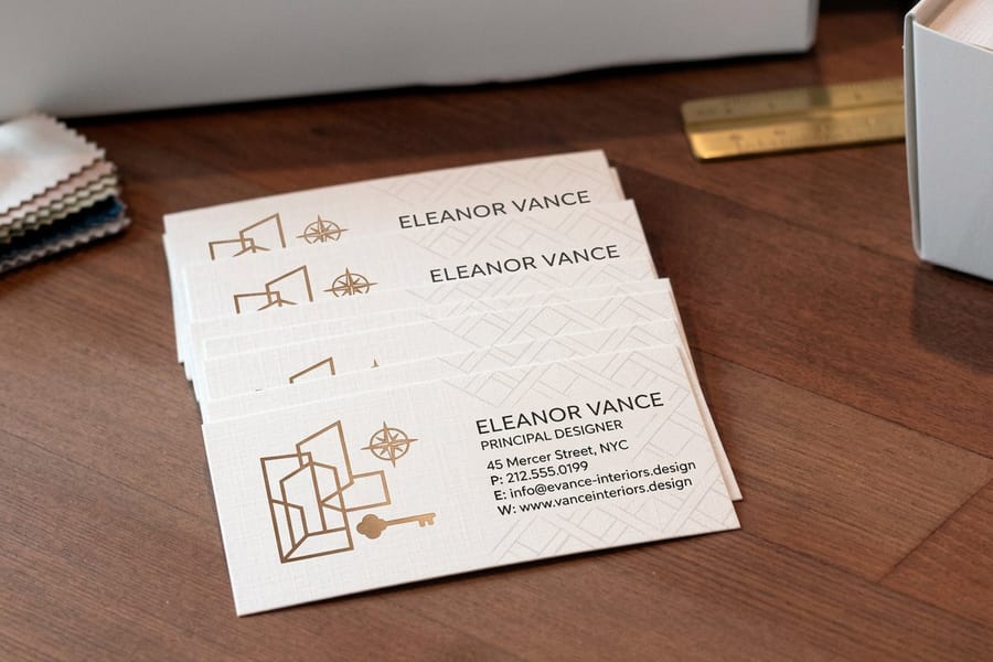
Take one idea from something you read this week, apply it to a real piece, and print a small run. Business cards are the usual test bed because the format is fixed, the price is low, and the constraints are honest. Interior design business cards also start at $17.57 if the work you are testing sits in that field.
Set up the file properly so the test measures your design and not your prepress. Full bleed art extends 0.125 inch past the trim on every side, keep type at least 0.125 inch inside the trim, build in CMYK at 300 DPI, and convert live type to outlines or embed the fonts. A print ready blank has the bleed and trim marked already.
When to stop reading and start selling
Following ten blogs will not bring in a client. At some point the input has to turn into portfolio pieces and outreach, and that is a separate skill from having taste. Our guide to getting design clients with online printing covers that side, and graphic design for small businesses is the version to hand a client who is starting from nothing.
If you are assembling the portfolio itself, the printed examples in five impressive print portfolios and ten portfolio examples are more useful than another feed to follow.
What a test run costs at 4OVER4.COM
Card pricing moves with stock, finish and quantity, and the per unit cost drops as the run grows. These are live configurator numbers, so you can price the test before you design it.
Quantity and price
Graphic designer business card pricing and specs
Real numbers from the configurator, including the stocks and finishes available on the format most designers use to test a mark.
| Quantity | Price Per Unit | Total |
|---|---|---|
| 100 | 17.6¢ | $17.57 |
| 200 | 11.5¢ | $23.07 |
| 300 | 9.15¢ | $27.46 |
| 400 | 7.96¢ | $31.86 |
| 500 | 7.25¢ | $36.26 |
| 600 | 6.77¢ | $40.64 |
You can also earn coins on every order and put them against the next run, which makes a monthly print test cost less than it looks.
A reading list by what you are working on
The right feed depends on the job in front of you, so sort by project rather than by popularity.
- Working on an identity. Brand New for the systems, Design Observer for the argument you will have to make, Fonts In Use to check the typeface at real sizes before you license it.
- Working on packaging. The Dieline daily, Communication Arts annually. Note which effects are structural and which are finishing, because the price gap between them is large.
- Working on posters and editorial. It’s Nice That for volume, Print Magazine for context, plus the printed examples in our own creative poster ideas and seasonal poster and flyer ideas.
- Working on type. Fonts In Use above everything else, because it is the only one indexed the way a working designer searches: by the typeface you are actually considering.
- Building a freelance practice. Logo Design Love for process, Creative Review for how commercial work is judged, and our guide to balance in design for the fundamentals that survive every trend.
Print it
Cards designers use to test a mark
Premium stocks and finishes on the format that tells you fastest whether an identity holds up.

One habit turns reading into work: when a post stops you, write down the typeface, the format and the finish, then apply one of those three to a live piece within the week. Ideas that never reach a press stay opinions. The poster ideas we print most often started as exactly that kind of note.
Blanks for the test print
If the point is to test an idea rather than to fight with a file, start from a blank that already has the bleed and trim marked. 4OVER4.COM sizes its templates to exact product specs, so your artwork lines up with the cut instead of drifting a sixteenth of an inch off it.
Start fast
Blanks for the test print
Card blanks with bleed and safe area marked, so a test run prints the way it was drawn.






Wally turns a blog post into a printed test
Six feeds, one note, one small run
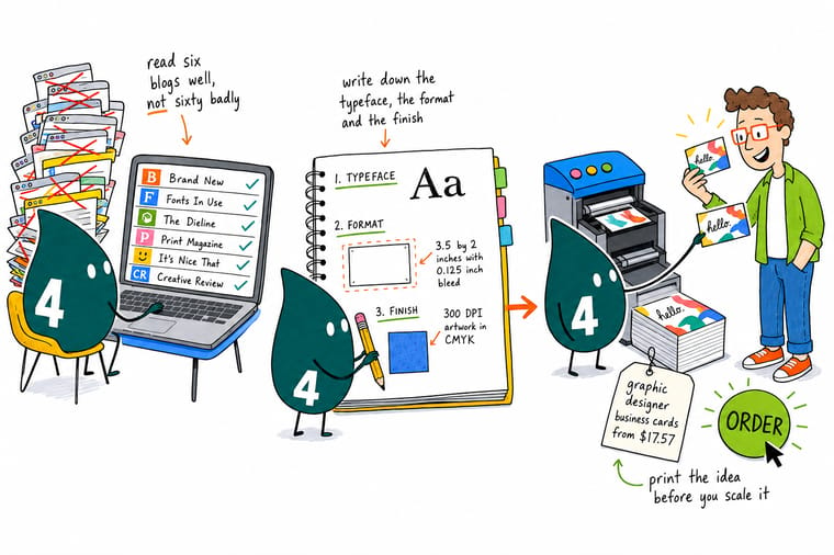
Follow six sources instead of sixty, and every time one stops you, note the typeface, the format and the finish. Rebuild the idea at 3.5 by 2 inches with 0.125 inch bleed, 300 DPI artwork in CMYK, and print a short run on premium stock. Handling the card tells you in five seconds what a screen never will.
Print a test run →What to remember
Habits that make the reading pay
- Follow six, not sixty. A feed you skim is worth nothing. Six sources you read properly will change your work; thirty you scroll past will not.
- Note the typeface every time. The single highest return habit. Six months of typeface notes beats six months of screenshots, because a name can be searched and an image cannot.
- Separate the finish from the design. Before you copy a look, decide which part is layout and which part is foil, emboss or soft touch. One is free and one is a line on the invoice.
- Check color after the CMYK conversion. Convert the palette and look again. If the greens and blues went muddy, fix them now rather than after the run is printed.
- Print one thing a month. A small run of cards or a poster keeps you honest about how your screen work behaves on paper. Reading alone never does.
Explore more
More ways to print and promote
A hundred graphic designer business cards cost $17.57, which is what testing a read idea costs.
 Product Graphic Designer Business Cards Test a mark at real size, from $17.57 a run.
 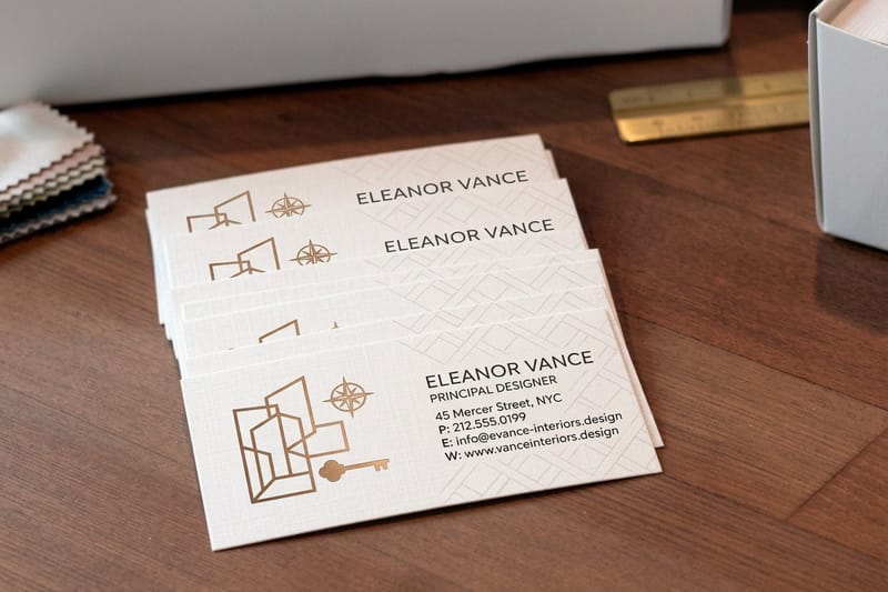 Product Interior Design Business Cards Premium stock for studios that sell on taste.
 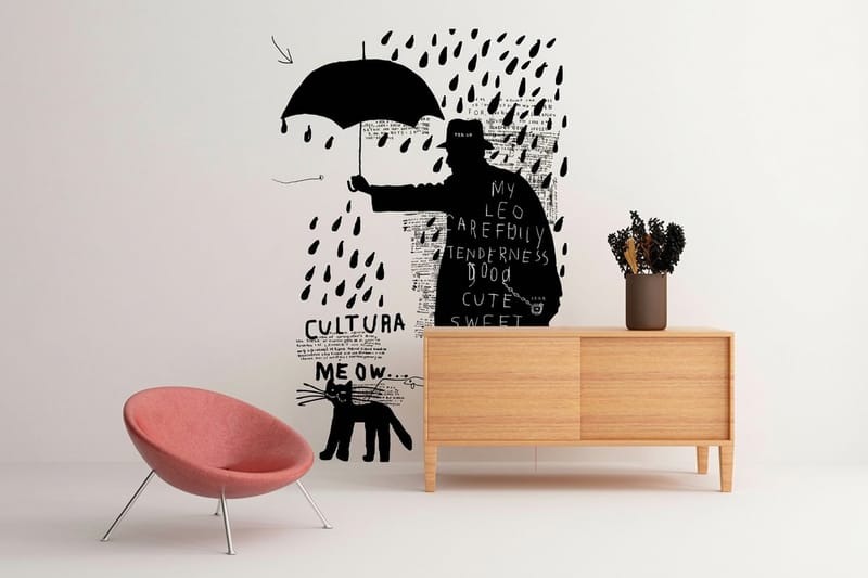 Product Wall Graphic Large format branding read from across a room, from $25.
  Guide Color Combinations That Work in Print Ten pairings that survive the CMYK conversion.
  Guide Graphic Design Layout Principles The structural half of what you admire online.
  Article 10 Graphic Design Portfolio Examples What a printed portfolio actually contains.
 Ready to print the idea you saved?
Pick the format, drop in your design or a free template, and 4OVER4.COM prints it sharp on premium stock, as fast as your deadline needs.
Common questions about design blogs
If I only have time for one design blog, which one should it be?
Brand New, if your work involves identity in any form. It is the only site that consistently shows a whole identity system rather than a single mark, and the applications it publishes are the pieces that decide whether the work survives contact with print: stationery, signage, packaging, vehicles. If your work is mostly typographic rather than brand led, swap it for Fonts In Use, which is indexed by typeface and answers a practical question every time you open it. Everything else on this page is an addition to one of those two, not a replacement.
Are any design blogs actually worth paying for?
Brand New is the clearest case, because the free version shows the work and the UnderConsideration membership carries the written critique, which is the part you can apply to your own projects. Creative Review paywalls a share of its features and is worth it if you work on commercial briefs and want to see how the industry judges them. Communication Arts is a subscription with a large juried archive behind it, which is more of a reference library than a feed. Everything else worth reading is free, so start free and pay only when you notice you are hitting the same paywall repeatedly.
How do I use design blogs without copying somebody else’s work?
Record the reason, not the image. When you save a piece, write one sentence about what it is doing: a hierarchy trick, a color split, a way of handling a long name in a small space. A folder of screenshots pushes you toward reproducing surfaces, while a folder of reasons pushes you toward reproducing decisions, and decisions are what transfer across projects. The other half is to strip out the money. If the piece relies on a custom typeface, a spot ink and a foil pass, work out what remains without those three, and design that.
Do design blogs cover printing techniques or only screen work?
It varies, and it is the main gap in most feeds. The Dieline and Communication Arts show finished physical work regularly, and Print Magazine covers process and history, but even those tend to photograph the result rather than explain the press decisions behind it. You will see foil, emboss, spot gloss and soft touch constantly without being told which one is which or what each adds to the cost. Fill that gap with product specification pages and a small test run of your own, because handling the stock teaches you more in five minutes than a month of scrolling.
Why does a color palette I found online look wrong when I print it?
Because a screen makes color with light and a press makes it with ink, and the two gamuts do not overlap completely. RGB can produce saturated greens, pure blues and neon oranges that CMYK simply cannot mix, so the conversion lands on the nearest printable color and the result reads duller than the version you saved. Convert the palette to CMYK early, look at it, and adjust while it is still cheap to do. If a specific color has to be exact across everything you print, that is the argument for a spot ink rather than a process build.
