
Health Poster Design Ideas for Clinics, Schools, and Campaigns


A health poster works when it carries one message, sized to be read from where people actually stand: roughly one inch of capital letter height for every ten feet of viewing distance. That puts handwashing sequences at 11 x 17 in above the sink, corridor signposting at 18 x 24 in, and lobby or cafeteria campaigns at 24 x 36 in with a two inch headline.
Health poster sizes, distances and headline heights
| Poster size | Read from | Headline cap height | Where it goes | What actually fits |
|---|---|---|---|---|
| 11 x 17 in | 3 to 6 ft | 0.5 to 0.75 in | Exam room, staff room, back of a door | One message, a short numbered sequence, a contact line |
| 12 x 18 in | 4 to 8 ft | 0.75 in | Reception desk, clinic noticeboard | Headline, three steps, a QR code |
| 18 x 24 in | 6 to 12 ft | 1 to 1.25 in | Corridors, school hallways, waiting rooms | Headline, one image, a crisis or booking number |
| 24 x 36 in | 10 to 20 ft | 2 in | Lobby, gym wall, cafeteria | Headline plus one supporting line |
| 27 x 40 in | 15 to 25 ft | 2.5 in | Campaign wall, atrium, event backdrop | Headline, logo, a date. Nothing else |
Pick the row that matches the room before you open the file, because the size decides how many words you are allowed. If you are printing a series, keep one layout across all of the sizes so the set reads as one campaign. Start from a print ready poster template with bleed and trim already marked.
Health posters are read at a distance, or not at all
Nobody stops walking to read a poster. They read it from six feet away while heading somewhere else, and they give it about two seconds. That single fact should drive every layout decision, and it is the one most health posters get wrong by treating a wall like a page.
The practical version of that is a cap height rule. Roughly one inch of capital letter height carries about ten feet of viewing distance, so a headline meant to be read across a school corridor needs letters near two inches tall. On an 18 by 24 inch sheet that leaves room for a headline, one image, and a phone number. It does not leave room for a paragraph, which is why the paragraph has to go.
The second thing to fix is the number of messages. A poster with eight hygiene tips is a poster nobody finishes. Split it into three posters, or pick the one behaviour you actually want changed and print that. Our step by step poster design guide walks the same discipline through a full layout.
Hang it at eye level, not at ceiling level
Center the poster between 57 and 60 inches from the floor. That is roughly average standing eye level for an adult, and it is the height galleries and signage installers use. Posters hung above door frames look tidy on the wall and get read by nobody, because people scan horizontally, not upward.
In a paediatric clinic or a primary school, drop the center to around 48 inches so the poster meets the audience it is aimed at. If the same message needs to reach parents and children, run two sizes at two heights rather than compromising on one.
Contrast does more work than colour choice
Dark type on a light field, or the reverse, beats any palette decision you can make. Health posters fail most often not because the colours are wrong but because the headline sits on a photograph and loses its edges. If type has to go over an image, put it on a solid block or darken the image behind it until the letters have somewhere clean to sit.
Watch out for red and green as the only way you signal a difference. Around one in twelve men has some form of red green colour deficiency, so a chart that codes safe and unsafe purely by those two hues loses meaning for part of the audience. Add a shape, a label, or a position difference alongside the colour.
What each piece on a healthcare wall is actually for
A wall usually carries four jobs and one sheet cannot do them all. Signposting tells a stranger where to go and who to call, so it needs the largest type and the least copy. Instruction shows a sequence at close range, which is the sink, the exam room and the dispensary shelf.
Campaign work carries one behaviour for a fixed period and should be dated and taken down when it expires. Reference is the material people take away with them, and it belongs in a leaflet rather than on the wall, because anything a reader has to stand and study becomes a queue.
Decide which job a sheet is doing before you size it. A signpost printed at instruction size is the most common wasted poster in any building, and an instruction sheet blown up to lobby size just wastes the paper. The job sets the distance, the distance sets the type, and the type decides how much you are allowed to say.
Poster ideas by subject, from mental health to hygiene
The subject changes what belongs on the sheet more than most people expect. A hygiene poster is instructional and lives at arm’s length. A mental health poster is a signpost and lives at corridor distance. A nutrition poster is a reference and gets read by someone standing still. Treat them the same and two of the three underperform.
What follows are directions that hold up in real waiting rooms and hallways, grouped by subject. Each one names the size and the place it belongs.
Mental health and crisis signposting
Make the number the second largest thing on the poster. After the headline, the phone number or text line is the whole point. In the United States the 988 Suicide and Crisis Lifeline is three digits, which is a gift to a designer: set it big, set it clean, and give it space. A crisis poster where the helpline is smaller than the illustration has failed at its only job.
Write in the second person and keep it plain. "Talk to someone tonight" outperforms "Mental health resources are available." Aim for language a stressed fourteen year old reads without effort, which in practice means short words and short sentences, not a lower opinion of the reader.
Choose calm over alarm. Muted blues, greens and warm neutrals suit this subject. Red and heavy black read as emergency and can push away the person who most needs to stop and look. Save the high contrast alarm palette for evacuation and safety notices where urgency is the message.
Run a series, not a one off. Four posters sharing one layout and one accent colour, rotated through a term or a quarter, keep a subject visible without becoming invisible. Our campaign poster guide covers building that kind of series so the pieces read as one voice.
Hygiene, handwashing and infection control
Sequence posters belong at the sink, at 11 by 17 in. A handwashing poster is read from two feet by someone with wet hands, so it is the one case where small type and numbered steps are correct. Number the steps, keep them to five or six, and put the whole thing directly above the basin rather than on the opposite wall.
Assume it will get wiped down. Anything within splash range of a sink or a cleaning trolley needs a laminate or a synthetic stock. An uncoated poster near a basin curls at the corners within a month and then reads as a neglected room, which quietly undoes the message it is carrying.
Show the hands, not a cartoon. Illustration works for children. For staff and adult patients, a clear photographic or line diagram of the actual motion, thumb, fingertips, between the fingers, is what gets copied. Diagrams beat adjectives here.
Pair the poster with the product it points at. If a poster tells people to use sanitiser, the dispenser needs to be in the same eye line. A poster on the far wall pointing at a dispenser round a corner is a poster that generates guilt instead of behaviour.
Nutrition, wellness and patient education
Nutrition posters get read standing still, so 18 by 24 in is the working size. Cafeterias, waiting rooms and staff kitchens are the places people have thirty spare seconds. That is the one health subject where a small table or a portion comparison earns its space.
Anchor to a public reference rather than inventing one. The USDA MyPlate model is free, recognisable, and saves you from making claims you cannot support. Build your layout around it and spend your design effort on the local part, the actual menu, the actual programme, the actual sign up.
Portion posters work better as comparisons than as numbers. A serving shown next to a familiar object communicates faster than a gram count, because the reader does not have to convert anything.
Retail and dispensary corners need labels, not just posters. Clinics that sell supplements, skincare or wellness products can print matching standard health and beauty labels from $23.88, so the shelf and the wall look like the same practice.
School campaigns, safety and awareness weeks
Go bigger than feels necessary. School corridors are long and busy. A 24 by 36 in poster with a two inch headline is read while walking. An 11 by 17 in poster in the same corridor is decoration.
Date every campaign piece. An awareness week poster with no date stays up until June and stops meaning anything. Print the date, and make taking it down somebody’s job.
Give students something to do in the next ten seconds. Scan, text, turn up at this room at lunchtime. An awareness poster that ends without an action is a mood, not a campaign.
Reuse the frame, change the sheet. A Wood Poster Hanger Frame at $32.75 lets a department swap posters each half term without new hardware or fresh tape marks on the paint. If you want more layout inspiration before you start, these creative poster ideas and the Earth Day campaign set both work as structural references, not just visual ones.
Icons that still read from across a corridor
The symbols that survive distance are the ones with a strong outer silhouette. A cross, a heart, a drop, a hand, a pair of lungs, a pill. They work because the eye recognises the outline before it resolves any of the detail inside.
What fails is the icon built from internal line work. A stethoscope, a DNA helix, a clipboard with writing on it, a magnifying glass over a chart, all of them collapse into a grey smudge somewhere past twenty feet, and a smudge tells the reader nothing at all.
Test an icon the way you would test a logo. Fill it solid black at the size it will print, pin it up, and stand where the reader will stand. If you cannot name the thing you drew, redraw it simpler. Keep one icon per poster, give it real space, and never let it replace the word, because an icon confirms a message and rarely carries one alone.
Printing, mounting and keeping posters readable

Set the file up at final size with 0.125 inch of bleed on every edge and keep anything you care about at least 0.25 inch inside the trim. Build in CMYK, not RGB, or the vivid screen blue in your health campaign comes back a shade duller than the one you approved.
Resolution follows viewing distance, same as type. An 11 by 17 in poster read from three feet wants 300 DPI at full size. A 24 by 36 in poster read from across a lobby holds up perfectly well at 150 DPI at full size, which keeps the file manageable and makes very little visible difference at that range.
Finish is where clinics and schools most often choose wrong. Gloss looks best on a desk and worst on a wall lit by ceiling fluorescents, because it mirrors the tubes straight back at anyone standing in front of it. Satin or matte holds colour nearly as well and stays readable from an angle.
Mounting choices and what each one costs you
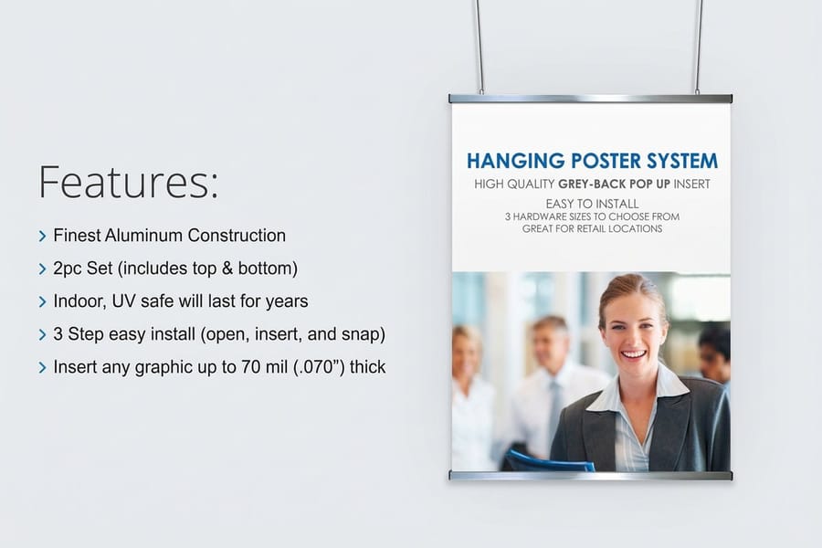
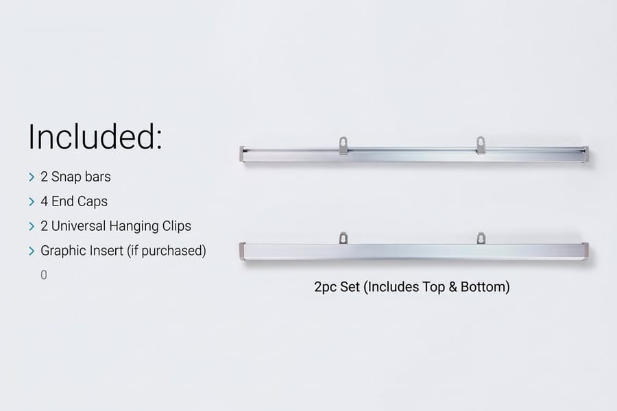
Tape is free and it damages paint, curls corners, and makes a wall look temporary. A wood hanger frame holds the top and bottom edge flat and turns a paper sheet into something that looks intentional, which matters in a room where people are already anxious. For a lobby or an atrium wall, a hanging poster display at $53.83 takes the poster off the wall entirely and lets you place it where the sight lines actually are.
The trade off is real. Frames and displays cost more up front and pay it back only if you change the poster regularly. If a message is going up once and staying for two years, mount it once and spend the money on stock and lamination instead.
Where posters go stale, and what to do about it
A poster stops being seen after about six weeks in a space people pass daily. Not because it faded, but because the eye files it as part of the wall. Rotating the same message through two or three different layouts keeps it visible far more cheaply than shouting louder.
Set a review date when you print, not when you notice. The cheapest quality control in the whole process is walking your own corridor once a month and pulling down anything out of date, curled, or covered by a noticeboard someone moved.
Poster display pricing and specs at 4OVER4.COM
Display pricing moves with size, material and quantity, and the per unit cost drops as the run grows. The numbers below come from the live configurator, so a department can size a budget before raising the order.
Quantity and price
Hanging poster display pricing and specs
Real configurator numbers, where ordering the whole corridor at once costs meaningfully less per unit than ordering one wall at a time.
| Quantity | Price Per Unit | Total |
|---|---|---|
| 1 | $53.83 | $53.83 |
| 2 | $53.82 | $107.64 |
| 3 | $53.82 | $161.47 |
| 4 | $49.16 | $196.62 |
| 5 | $49.43 | $247.15 |
| 6 | $49.25 | $295.47 |

You can also earn coins on every order and redeem them against the next print run, which helps when a campaign is funded once and has to last a school year.
Frames that let you change the message
The decision most clinics and schools get wrong is spending the whole budget on printing and none on mounting. A poster taped to a corridor wall curls within weeks and reads as temporary, which quietly reduces how seriously the message is taken. A frame that lets someone swap the sheet in thirty seconds changes the economics of a campaign, because the expensive part stops being the hardware and becomes the paper.
Print it
A frame you refill instead of replace
Wood hanger frames hold the top and bottom edge flat, so a paper poster hangs like it was meant to be there.

The trade off is straightforward. A frame or a hanging display only pays for itself if the message changes, so a permanent notice is better served by heavier stock and a laminate than by hardware. A campaign wall that turns over every half term is the opposite case, and there the frame is the cheaper decision within a year. If your posters carry a practice logo, getting the logo right first saves reprinting the whole set later.
What fits each setting
Different rooms have different traffic, lighting and dwell time, so here is the short version by setting.
- Primary care and dental clinics. One 11 x 17 in sequence poster per sink, one 18 x 24 in signposting poster per corridor, and nothing at all in the exam room except the thing you want discussed during the appointment.
- Hospitals and outpatient units. Lobby posters at 24 x 36 in on hanging displays, corridor sets at 18 x 24 in, and a strict removal date on every campaign piece so the walls do not silently accumulate.
- Schools and universities. Go large and go serial. Corridor traffic is fast, so a two inch headline and one action per sheet, swapped in a reusable frame each half term.
- Public health campaigns. One layout, one accent colour, several sizes. The recognition comes from repetition across locations, not from a different design in each venue.
- Pharmacies and wellness retail. Posters above the counter for the service, matching product labels on the shelf below. Premium health and beauty labels at $29.16 keep the shelf looking like it belongs to the same practice.
Getting the file right before you print
Build the artwork at final size, add 0.125 inch of bleed on every edge, and keep type and logos at least 0.25 inch inside the trim line. Work in CMYK so the colour you approve is the colour that arrives. Grab a print ready blank from the blank template library if you would rather not set the document up from scratch, or browse the design templates for a layout to start from.
Wally sizes the headline before he picks the picture
Distance decides the type, and the type decides the layout
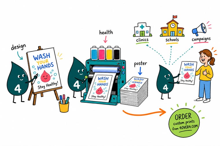
Divide the reading distance in feet by ten and that is your capital letter height in inches. Set that headline first, then see what space is left. Build at final size in CMYK with 0.125 inch bleed, keep type 0.25 inch inside the trim, and choose satin or matte for any wall lit by ceiling fluorescents. 4OVER4.COM prints the sheet and the frame that holds it.
Order poster displays →What to remember about health posters
Design tips that hold at every size
- Set the headline by distance. Measure how far away the reader will actually stand, divide by ten, and that is your capital letter height in inches. Design to that number before you choose a typeface.
- One message per sheet. If the poster carries two ideas, print two posters. Splitting costs almost nothing at these sizes and roughly doubles what gets remembered.
- Give the action the second largest type. The phone number, the room, the date, the QR. Whatever you want the reader to do next should be the second thing they see, never a footnote.
- Print one and stand where the reader stands. Tape up a single proof, walk to the far end of the corridor, and look. Everything wrong with a poster shows up in that ten second test and nowhere on the screen.
- Kill the glare before you kill the colour. Under fluorescent lighting, satin or matte on a well contrasted layout beats gloss on a beautiful one. Check the room lighting before you pick the finish.
Explore more
More ways to print and mount your campaign
Related products and guides on 4OVER4.COM, one card each, so you can keep planning the wall.
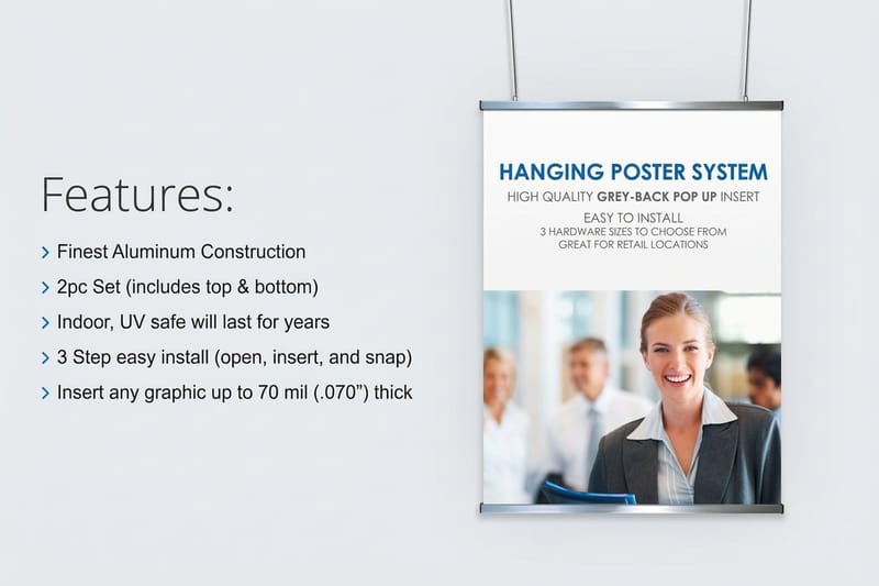 Product Hanging Poster Displays Take a lobby poster off the wall and into the sight line.
  Product Wood Poster Hanger Frame Swap the sheet each term without new hardware.
  Product Premium Health and Beauty Labels Shelf labels that match the posters above the counter.
  Product Standard Health and Beauty Labels A cheap first run for clinic retail and dispensary shelves.
  Guide How to Design a Poster in 8 Steps The full layout process from brief to print ready file.
  Guide Free Poster Templates That Print Sharp Blank sizes with bleed and trim already marked.
 Ready to print the corridor?
Pick the size that matches the room, drop in your design or a free template, and 4OVER4.COM prints it sharp on stock that survives a school year.
Common questions about health posters
How do I attract people to my clinic?
Print does two different jobs here. Outside, the task is being found and looking open, which means a clear exterior sign, a window notice carrying the hours and the services, and a leaflet in the nearby pharmacy or library. Inside, the task is keeping the people you already have, which is why the corridor posters that work carry a booking line or a QR code. A poster that only raises awareness gives the reader nothing to do next.
What are the 5 C's in health care?
They come from Sister Simone Roach's model of caring and are usually listed as compassion, competence, confidence, conscience and commitment, with some versions swapping one for communication. They matter on a wall because they describe the tone a health message should carry. A signposting or crisis poster written with compassion and plain words outperforms the same information written in policy language every time.
What size should a health poster be for a clinic corridor?
18 by 24 inches is the working size for a corridor or a waiting room, because it is read from roughly six to twelve feet and it gives a headline about a one and a quarter inch cap height without crowding. Drop to 11 by 17 inches for exam rooms and anything read at arm’s length, such as a handwashing sequence above a sink. Go up to 24 by 36 inches for a lobby, a cafeteria or a school hallway where people are moving and the sight lines are longer. If you are unsure, print a cheap proof at each size and tape it where it will hang.
How big does the type need to be on a health poster?
Use the signage rule of thumb: about one inch of capital letter height for every ten feet a reader will stand away. A poster read from twenty feet across a school hall needs a two inch headline, which on a 24 by 36 inch sheet leaves room for a headline and one supporting line, nothing more. Body text follows the same logic at a shorter distance, so a poster meant to be read while walking should not have body text at all. Set the headline size first and let it decide how much else fits.
Should a mental health poster look different from a hygiene poster?
Yes, and treating them the same is the most common mistake. A hygiene poster is instructional, read from two feet at a sink, so numbered steps and small clear diagrams are correct. A mental health poster is a signpost read from across a corridor, so the headline and the helpline number carry it and everything else gets cut. The palettes differ too: calm blues, greens and warm neutrals suit signposting, while high contrast red and black belong on safety and evacuation notices where urgency is the actual message.
Do health posters need lamination?
Anything within splash range of a sink, a cleaning trolley or a school corridor full of hands does. A laminate or a synthetic stock takes the wiping and the abrasion instead of the print, and it stops the corners curling, which is what makes a room look neglected long before the message goes out of date. A lobby poster hanging three feet above head height and changed every quarter does not need it, and paying for lamination there is money better spent on the mounting.
How often should posters be replaced?
Plan on six weeks for anything in a space people walk past daily. Not because the print fails, but because the eye stops registering it as information and files it as part of the wall. Rotating one message through two or three layouts keeps it visible far more cheaply than printing bigger. Set a removal date at the moment you place the order, and give one person the job of walking the corridor monthly to pull anything expired, curled or half hidden behind a noticeboard.
More frequently asked questions →
Keep reading: seasonal poster and flyer layouts, calendar design ideas for the waiting room wall, and t-shirt design sizes if your campaign runs to staff shirts as well.
