
Warping Text to Fit Into Shapes With Illustrator


Tobias is our voice for cutting, binding and large format, built from the knowledge of our production team, with over 20 years in printing.
Two techniques, one goal: bend a headline along a curve, or pour a paragraph inside a shape. Vector type stays crisp at any size, which is why the same path works on a card and on a wall. Build it once and the file prints as a custom die-cut, a large format poster or a custom shaped business card.
To make text fill a shape in Illustrator, pick one of two paths: for readable copy, draw a closed shape, click its edge with the Type tool, and let the words flow inside as Area Type. For text that takes the exact silhouette, place the shape over your type, select both, and choose Object > Envelope Distort > Make with Top Object. Outline the fonts before you export, then send the vector art to print.
Quick tips
Quick tips for shaping text in Illustrator
Decide the effect before you open the tools. Use Object > Envelope Distort > Make with Warp to bend a headline along a curve, and Area Type to flow readable copy inside a closed shape. Choose Make with Top Object when the text must take an exact silhouette. Keep everything vector, outline the fonts, and expand the envelope before you export. Then send a CMYK PDF with bleed to 4OVER4.COM and your shaped art prints as a die-cut, poster, or sticker.
Warping text versus fitting text: two different jobs
People search for one thing and mean two. "Making text fit a shape" in Illustrator splits into two techniques that look similar but behave very differently, and picking the wrong one is why a headline ends up either mangled or floating in empty space.
Warping distorts the letterforms themselves. The word bends, stretches, and follows a curve or an outline, so it reads like the type was printed on something and then wrapped around it. It is a display effect for logos, banners, and bold headlines. Fitting text inside a shape with Area Type does the opposite: every letter stays upright and perfectly readable while the paragraph simply flows to fill the interior of a closed path.
Use warp when the shape of the words is the point. Use Area Type when the words need to be read and the shape is just the frame. This guide walks through both, then shows how to hand the finished art to a custom die-cut or a large format poster so the effect leaves your screen and lands in print. A logo mark filled with words also works as custom shaped business cards or die-cut flyers, where the shape you drew sets the trim.
Warp text to a shape, step 1: apply the envelope
Start with plain type, then bend it non-destructively so you can always come back and edit.
- Set your text. Grab the Type tool, click once, and type your headline. Pick a heavy, simple typeface because bold shapes survive warping far better than thin, delicate ones.
- Select the type object with the Selection tool (the black arrow). One click on the words selects the whole block.
- Open the warp. Choose Object > Envelope Distort > Make with Warp, or press Option Shift Command W on a Mac or Alt Shift Control W on Windows.
- Choose a style and bend. In the dialog, pick a Style such as Arc, Arch, Flag, Wave, or Bulge. Drag the Bend slider for the overall curve, then use Horizontal and Vertical Distortion to lean the effect. Turn on Preview so you can see it live.
Click OK and the text is now wrapped in an envelope. Nothing is destroyed, the original letters live inside, which is exactly what makes the next step painless.
Build yourself a practice file before you touch real artwork. Open a new CMYK document at 8.5 by 11 inches and lay out four artboards so both techniques sit side by side: artboard one holds a single bold headline in a heavy typeface, untouched, as your control; artboard two holds a copy of that headline with Object > Envelope Distort > Make with Warp applied at Arc, so you can push the Bend slider and see how far letterforms stretch before they stop reading; artboard three holds a closed circle with a paragraph flowed inside it using Area Type, every letter upright; artboard four holds that same headline with a silhouette sitting on top of it and Object > Envelope Distort > Make with Top Object applied, so the words fill the outline. Save it as practice-warp.ai with the type still live and the fonts not yet outlined. Every step below runs on that one file, and because the envelopes stay editable you can rewrite the words, swap the typeface, and watch the same warp reapply instead of starting from a blank artboard.
Warp text to a shape, step 2: refine and lock it in
The first pass is rarely right. Fine-tuning the warp and preparing it for print takes a few steps.
Reopen the settings. With the warped object selected, the Control bar at the top shows the warp options, or return to Object > Envelope Distort > Warp Options to nudge the Bend and Distortion until the curve sits right.
Edit the words. Need a different headline? Choose Object > Envelope Distort > Edit Contents, retype with the Type tool, then switch back to Edit Envelope. The new text inherits the same warp instantly.
Reshape by hand. For total control, use Make with Mesh instead of a preset, then drag the mesh points with the Direct Selection tool to push and pull the type into a custom curve.
When the look is final, choose Object > Envelope Distort > Expand. That converts the effect into clean, editable vector outlines, which is the format a printer wants. If you plan to print it large, staying vector means the edges stay razor sharp at any size.
Fit text inside a shape, step 1: turn a path into a container
Area Type is the readable option. The letters never distort, they just settle inside the boundary you draw.
- Draw your shape. Use the Ellipse, Star, Polygon, or Pen tool to make a closed path. A circle, a shield, or a custom silhouette all work.
- Hover with the Type tool. Move the Type tool over the edge of the path until the cursor changes to the Area Type icon, an I-beam wrapped in a dotted circle. That icon is the signal that a click will convert the path into a text area.
- Click and add copy. Click the path edge and start typing, or paste your text. The words flow and wrap to fill the inside of the shape automatically.
- Tune the fit. Open Type > Area Type Options to set Inset Spacing so the text is not jammed against the edge, and adjust the First Baseline offset so the top line sits where you want it.
If you would rather force the words to take the exact outline of a silhouette, place the shape on top of the text, select both, and choose Object > Envelope Distort > Make with Top Object. That bends the type to fill the form, a favorite trick for filling a state, a logo mark, or a heart with words.
Fit text inside a shape, step 2: balance and finalize
A shape filled with awkward gaps or an overflow icon looks amateur. Spend a minute balancing it.
Watch for overflow. A small red plus icon on the shape means more text exists than the container can hold. Shrink the font, tighten the leading, or enlarge the shape until the icon disappears.
Adjust size, tracking, and leading. Nudge the font size and letter spacing so the copy hugs the boundary evenly. Justifying the paragraph often makes text hug an irregular outline more cleanly than left alignment.
Refine the inset. A little breathing room reads as intentional, so revisit Area Type Options and set an inset that keeps letters off the cut edge, which matters a great deal for a die-cut piece.
Outline the fonts. When it looks right, select the type and choose Type > Create Outlines (Command or Control plus Shift plus O). That freezes the letters as vector shapes so nothing reflows and no font goes missing at the printer. Keep an editable copy on a hidden layer in case the wording changes later. The full walkthrough of how to create outlines in Illustrator and send a print-ready file covers expanding strokes and checking the result before upload.
Using the effect for print: from artboard to product
A shaped headline that only lives on your screen is half a project. Getting it out cleanly takes a short checklist, and every item on it is something our prepress team catches on real files every week.
- Expand and outline everything. Expand any envelopes and run Create Outlines on the type so there are no live effects or fonts to break. Do it on a duplicate and park one live copy on a spare artboard, because once the letters are outlined a typo means redrawing.
- Work in CMYK. Set the document color mode to CMYK from the start so screen color matches ink. Designing in RGB and converting at the end is what turns a bright warped headline flat and muddy. Our guide to CMYK versus RGB color mode for printing explains why this one setting saves reprints.
- Add bleed and respect the safe area. Extend any background 0.125 inch past the trim and keep critical letters inside the safe margin, especially on a die-cut where the outline is the cut. A warped descender that wanders across the cut line comes back sliced. The guide to bleed and trim on die-cut artwork covers the exact numbers.
- Save the right file. Export a print-ready PDF, or package the AI file so linked images and swatches travel with it. Anything raster sitting behind the type needs to be 300 ppi at final printed size. Not sure which format to send? The file setup guide on choosing the right file type for printing lays it out.
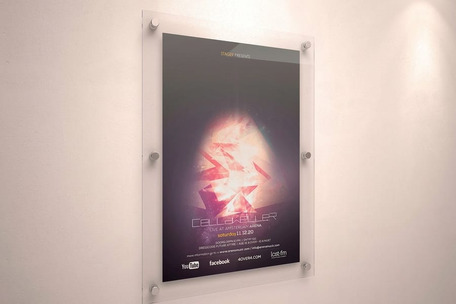
From there the artwork drops straight onto a product. A silhouette filled with words is made for a custom shape or die-cut print cut to the outline you drew, where your path literally becomes the cut. A bold warped headline holds its edge at wall scale on a large format poster, because vector type stays crisp however far you enlarge it, and the same shape works in the hand as a die-cut flyer with the headline shape as the trim when it has to be stacked, mailed, and handed across a counter. If a term in the export dialog trips you up, the printing terms glossary defines it.
Mistakes that ruin shaped text before it ever prints
Even designers who know the tools trip on the same handful of details. Sidestep these and your shaped text prints exactly as designed.
Forgetting to outline fonts. If the printer does not have your typeface, unoutlined type reflows or substitutes. Always Create Outlines on the final copy, and keep an editable version elsewhere.
Rasterizing vector type. Warped text stays vector and scales forever. Flatten it to pixels at low resolution and a big poster turns fuzzy. Keep it vector, and if you must rasterize, use 300 ppi.
Over-bending thin fonts. Delicate serifs snap and pinch under heavy warp. Reach for a bold, sturdy typeface when the bend is dramatic.
Ignoring the safe area on a die-cut. Letters that crowd the outline get clipped by the cut. Pull important text in, because on a shaped product the edge is a blade, not a suggestion. See how die-cut stickers work for how close is too close.
Designing in RGB. Bright screen colors dull in CMYK ink. Set CMYK before you build so the shaped headline you approve is the one that prints. 4OVER4.COM stocks 60-plus paper types across its whole catalog, and the custom die-cut alone offers 32 of them, from 14pt Gloss Cover to 18pt Rigid Vinyl, so a clean vector file is all it takes to make it real.
Wally explains shaped text
Bend it or pour it, then cut it out for real
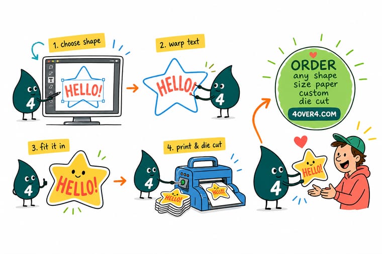
Wally thinks of it like two moves: warp bends the whole word so it hugs a curve, and Area Type simply pours the letters inside a shape without touching a single glyph. Get the look right on the artboard, outline the fonts, and the same vector art becomes a custom die-cut where your outline is the cut line. Draw the shape, fill it with words, and let 4OVER4 turn it into something you can hold.
Print your shaped design →
Specs and pricing
Custom die-cut specs and pricing
Custom die-cut paper prints come in 16 preset sizes from 2 by 2 inches to 11 by 11 inches, on 32 stocks, with a Basic Shape or Complex Shape cut and an optional High Gloss UV coating. Fifty pieces start at $87.00, about $1.74 each, on a 5 business day turnaround. Your Illustrator outline becomes the exact cut line.
| Quantity | Price Per Unit | Total |
|---|---|---|
| 50 | $1.74 | $87.00 |
| 100 | 91.0¢ | $91.00 |
| 200 | 51.2¢ | $102.50 |
| 300 | 37.7¢ | $113.00 |
| 400 | 30.9¢ | $123.50 |
| 500 | 26.6¢ | $133.00 |
| 600 | 24.0¢ | $144.00 |
| 700 | 22.1¢ | $155.00 |
Print it
Products made for shaped and warped type
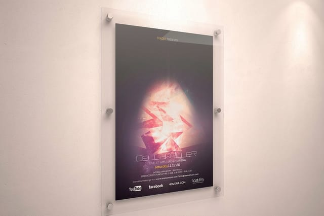
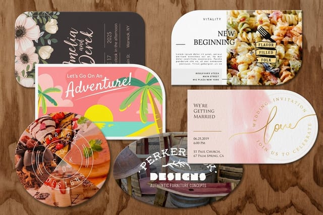
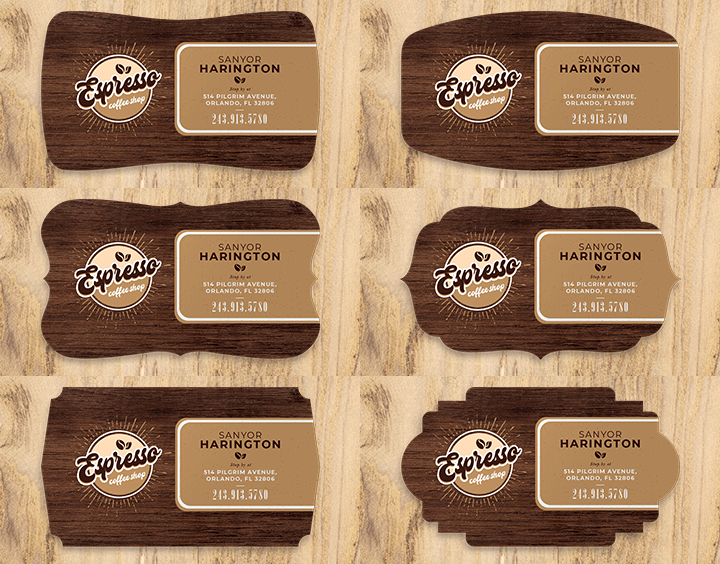
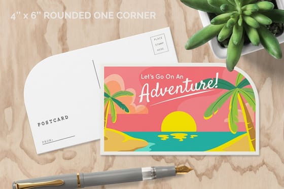
A warped headline holds its edge on a large format poster in sizes from 11 by 17 inches up to 48 by 96 inches, one 11 by 17 print from $25.00. Die-cut flyers arrive pre-cut as a 4 inch circle, an oval, a leaf or a rounded 4 by 6, 50 for $34.05, and custom shaped business cards cut a 2 by 3.5 inch card to one of 80 trim shapes, 50 for $95.56.
See it in use
Paths that became cut lines
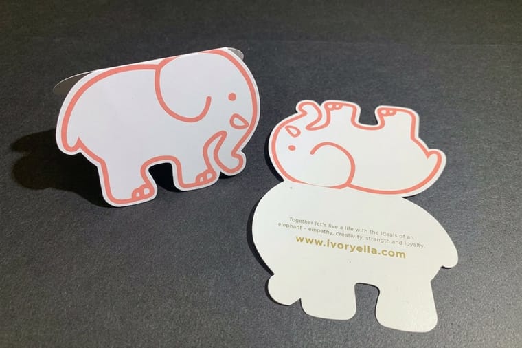
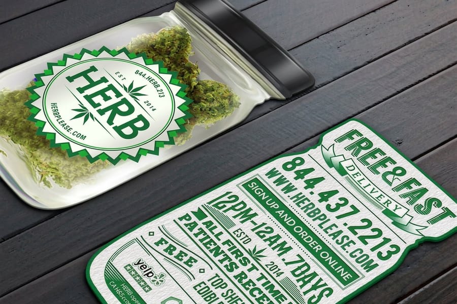
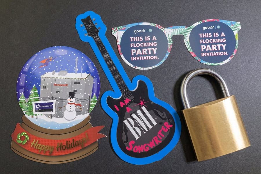
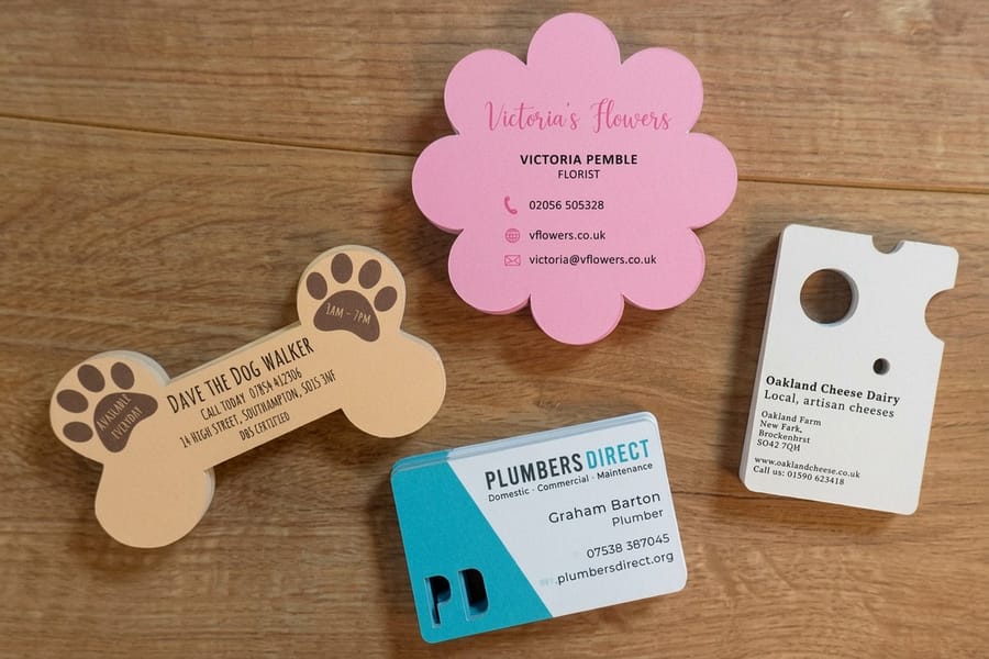
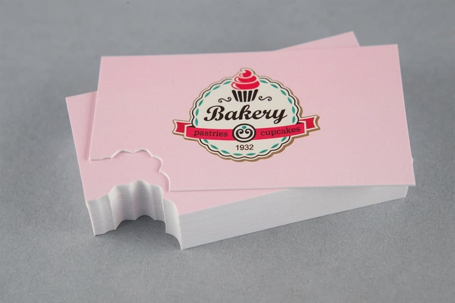
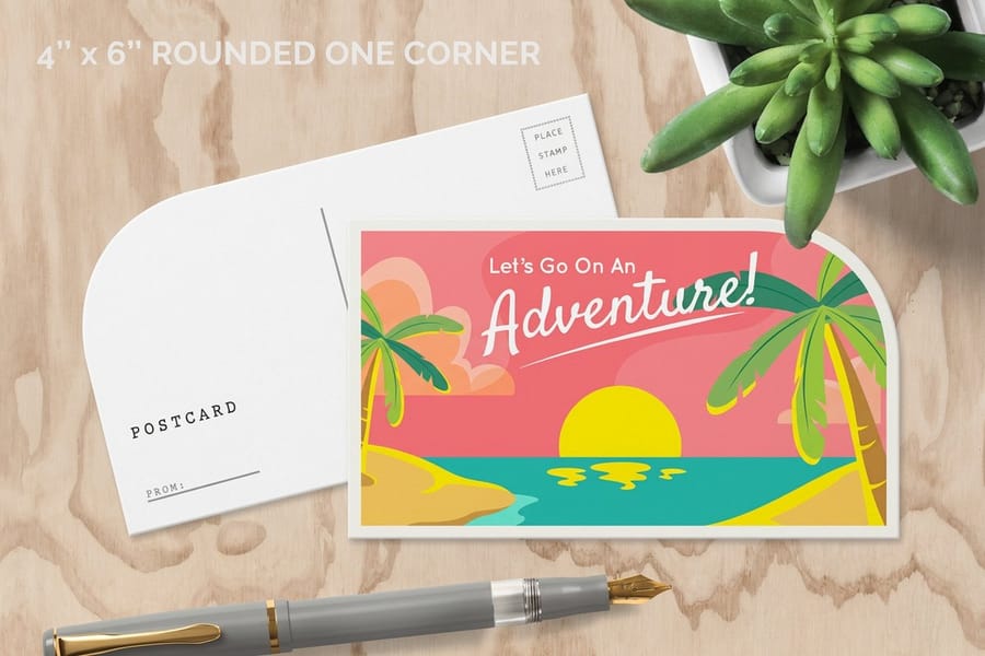
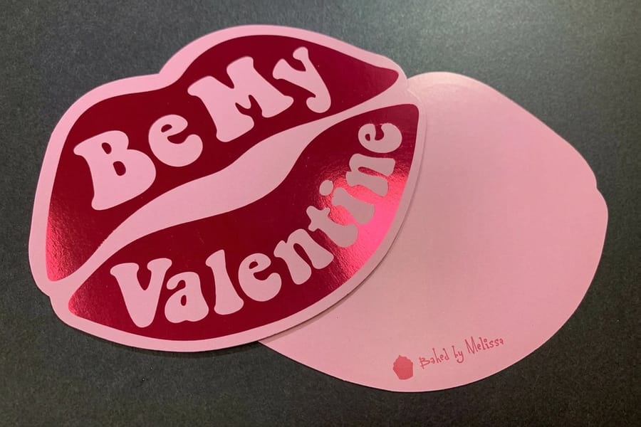
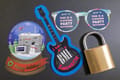
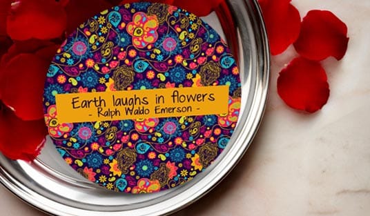
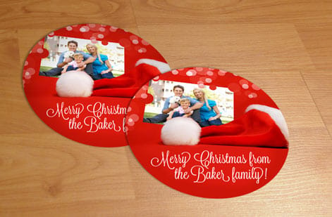
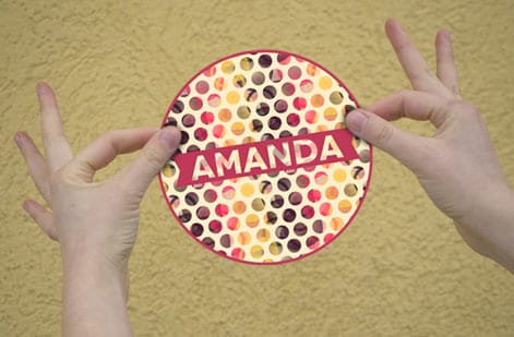
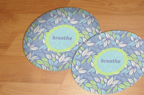
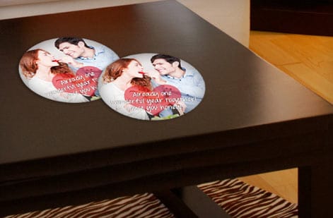
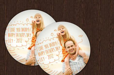
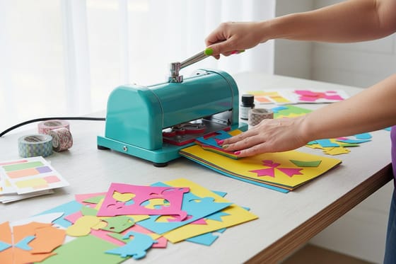
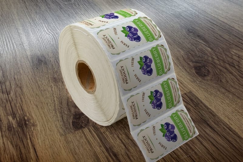
The pieces below were cut to a closed vector path, the same kind you build with Area Type or Make with Top Object, then trimmed on a Basic Shape or Complex Shape die. Keep your letters inside the safe area and the blade stays clear of them.



Explore more
Where to go next
Die-cutting explained shows how your outline turns into a cut line, the poster guide takes a shaped headline through 8 design steps, and the online designer shapes type in the browser if Illustrator is not on your machine.


By the numbers
Any-shape die-cut at $1.74 a piece
Common Questions
Common questions about fitting text to a shape in Illustrator
How do I make text fill a shape in Illustrator?
Place the shape on top of your type, select both with the Selection tool, then choose Object > Envelope Distort > Make with Top Object. The letters bend and fill the exact outline of that silhouette. For a readable block instead, draw a closed path, switch to the Type tool, hover over the path edge until the Area Type cursor appears, then click and type so the words flow inside the shape. Choose Make with Top Object when the shape of the words is the point, Area Type when the words have to be read at paragraph size. Both stay live and editable, so you can rewrite the copy after the fact.
What is the difference between warping text and fitting text into a shape?
Warping distorts the letterforms so the whole word bends to follow a curve, arc, or silhouette, which is why a warped headline reads like it has been stretched over an object. Fitting text into a shape uses Area Type, where the letters stay perfectly upright and undistorted while the paragraph simply flows to fill the inside of a closed path. Warp is for bold display effects, Area Type is for readable blocks of copy inside a container. In practice, a short headline in a heavy typeface survives warping, while body copy pushed through an envelope closes up and stops being legible, so send that to Area Type every time.
Can I still edit the words after I warp the text?
Yes. Warped type made with Envelope Distort stays live. Select the object and choose Object > Envelope Distort > Edit Contents, then use the Type tool to rewrite the words, change the font, or recolor. When you switch back to Edit Envelope the new text takes on the same warp. Only after you Expand the envelope does the text become fixed vector artwork, so keep one live copy on a spare artboard before you expand anything for print.
Should I outline the fonts before sending warped text to print?
Yes. Choose Type > Create Outlines, or select the type and press Command or Control plus Shift plus O, before you hand the file off. Outlining turns the letters into vector shapes so the printer never has to load your font, which means the warp and spacing you see on screen are exactly what prints. Expand the envelope first, then outline, then check that no letter drifted outside the trim. Keep a separate editable copy in case you need to change the wording later.
Why does my warped text look jagged or pixelated?
Type warped with Envelope Distort stays vector, so it should never pixelate. If it looks rough, you probably applied a raster-based effect or rasterized the artwork at a low resolution. Undo, keep the type as vector, and if you must rasterize set the resolution to 300 ppi for print. On a large format poster the difference shows up the moment someone stands close, so vector is worth the extra minute. Sending a clean vector PDF is always the safest route.
How do I turn my shaped design into a printed product?
Save your finished artwork as a print-ready vector PDF in CMYK with a 0.125 inch bleed, fonts outlined and envelopes expanded, then upload it to a matching product. A silhouette works beautifully as a custom die-cut where the shape becomes the cut line, a warped headline shines on a large format poster, and a shaped block prints cleanly on a custom shaped card or sticker at 4OVER4.COM.
Get Started
Order 50 custom shaped business cards from $95.56
Outline your Illustrator art, drop in the vector file, and we cut and print it as a custom die-cut, poster, or sticker that matches your shape exactly.
Legal Disclaimer
Gold Standard guarantees apply to all standard orders placed through 4over4.com. Price match requires verifiable proof of a competitor's published price for an equivalent product with matching specifications and turnaround time. Satisfaction guarantee covers manufacturing defects and print quality issues. Contact support with order number and documentation.
