
Business Card Typography Ideas That Work in Print, Not Just on Screen


Emma is our prepress and print production voice, built from the knowledge of our production team, with over 20 years in printing.
Set the name at 10 to 12 point, the role at 7 to 8, and treat 7 point as the floor for everything else, then keep all type at least 0.125 inch inside the trim. One typeface in two or three weights, separated by size and space rather than by color, beats any decorative idea you can fit on 3.5 by 2 inches. The ten directions further down, from an 18 to 24 point name that fills the front to a foiled wordmark on a plain black and white card, show that hierarchy once it is printed.
Typesetting a business card for the press
A typography business card lets the letters carry the whole design: no photograph, often no symbol, only a name, a role and a contact block set in one family on a 3.5 by 2 inch card. You upload a 3.75 by 2.25 inch file with any background color running into the bleed, keep every letter at least 0.125 inch inside the trim, and hold the smallest line at 7 point.
The stock decides how that type lands. A 14pt or 16pt uncoated cover keeps small letters crisp and takes a pen, 16pt uncoated with soft touch gives a type only front a velvet surface, and 14pt White Linen puts a woven texture under the letters. Order a first run of 100, hold one at arm’s length, and fix the scale before you print the box you will hand out all year.
The type scale that fits a business card
| Element | Point size | Treatment | Spacing | Why |
|---|---|---|---|---|
| Name | 10 to 12 pt | Regular or medium, sentence case | Largest gap sits under it | The one thing a person reads first |
| Role or title | 7 to 8 pt | Caps, tracked 80 to 120 units | Tight to the name, 2 to 3 pt | Caps at small sizes need tracking or they clot |
| Phone and email | 7 to 8 pt | Regular, aligned on one edge | Leading 1.3x the point size | Never center these under a left aligned name |
| Address block | 7 pt | Regular, two lines maximum | Group as one block, not four lines | Cut it before you shrink it |
| URL or handle | 6.5 to 7 pt | Lighter gray, or the accent color | Its own line, bottom of the block | The only item that can safely go quiet |
These are starting points, not rules. Print the card at 100 percent, cut it out and hold it before you commit, because small type looks generous on a monitor and tight in the hand. You can order standard business cards straight from the configurator to test a scale on real stock.
Why type does the heavy lifting on a business card

Set the name at 10 to 12 point, the role at 7 to 8, and nothing below 7 point, then leave at least 0.125 inch of quiet space inside the trim. That single hierarchy, held with one typeface in two or three weights, does more for a card than any decorative idea you can put on it.
A business card is a 3.5 by 2 inch surface that gets looked at for about three seconds, usually at arm’s length, often in bad light. There is no scroll, no hover, no second screen. Everything the card has to say is set in type, so the type is the design whether or not you treat it that way.
That is also why typographic cards keep winning design awards while photographic ones age badly. A photo dates, compresses oddly on uncoated stock, and fights the contact details for attention. Words set well do none of those things. If you want the full layout mechanics behind this, our business card layout guide covers the grid and the margins in detail.
What the card actually has to do in three seconds
It has to answer who, what and how to reach you, in that order, without the reader hunting. If someone has to scan the card twice to find the phone number, the layout failed regardless of how good the typeface is.
Test it the honest way. Print one, hand it to somebody who has never seen it, and watch where their eyes land first. If they land on the logo rather than the name, the logo is too big or the name is too small.
The trade-off nobody mentions
Expressive display type looks brilliant in a portfolio shot at 2000 pixels wide and can be unreadable at 7 point on a card. Thin hairline serifs, high contrast didones and tightly drawn geometric sans faces all lose their thin strokes when ink spreads on coated stock.
The compromise most studios land on is a display face for the name only, and a plain text face for everything else. You keep the personality where it is visible and you keep the contact details readable where it matters.
Hierarchy, emphasis and the three second read
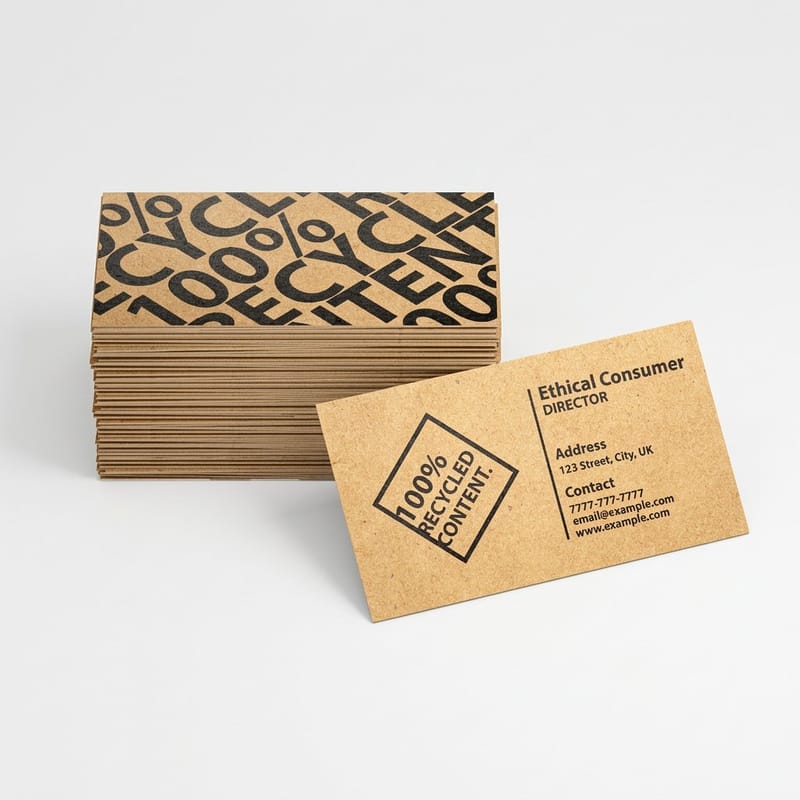
Hierarchy on a card is four levels at most: name, role, contact, and one quiet item such as a URL. Add a fifth level and the eye stops ranking anything, which is the real reason busy cards feel cheap.
Build the separation with size and space first. Reach for weight second. Reach for color last, and only once. A card that separates its levels with three different colors, three weights and three sizes at the same time is doing the same job three times over.
The size steps that hold up in print
A reliable set is 11 point name, 8 point role in caps with tracking, 7.5 point contact lines, and 6.5 point for a URL that can afford to sit back. The steps between levels need to be visible: 11 next to 10 reads as a mistake, 11 next to 8 reads as a decision.
Caps need tracking at these sizes. Set 8 point caps at default spacing and the letters clot together; open them 80 to 120 units and the line turns into a clean band. Our note on leading, kerning and tracking explains which control does what, because mixing them up is the most common small type mistake we see in uploaded files.
Emphasis without shouting
Bold everything and nothing is emphasised. A single bold word on a card of regular weight carries more force than a whole line set in black. The same applies to color: one accent, used once, on the item you most want remembered.
If the company name and the person’s name both need to be prominent, split them across the two sides of the card rather than competing on one. A back side costs nothing extra on most stocks, and the ideas in our piece on back of card design are mostly typographic anyway.
Spacing, margins and the white space nobody regrets
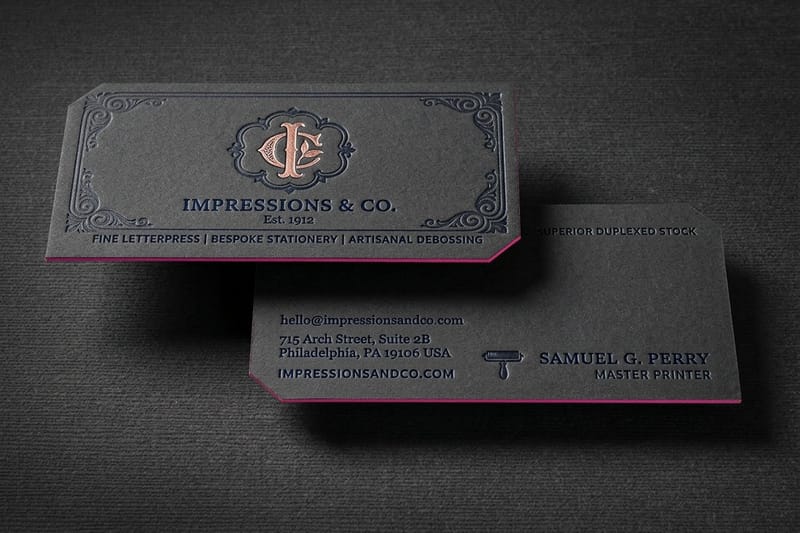
The safety margin and the design margin are not the same thing. Safety is 0.125 inch from the trim, and it exists so a cutting drift of a hair does not clip your type. Design margin is how much air you actually want, and on a good card it is usually double the safety minimum.
Most amateur cards fail on this one thing. Type is pushed out toward the edges to fill the space, the card looks crowded, and the trim variance eats a letter on one copy in fifty. Pull everything in, let the empty area become part of the composition, and the card immediately reads as considered.
Group the contact block, do not spread it
Phone, email and address belong to one another, so set them as one tight block with consistent leading rather than four evenly spaced lines drifting down the card. Line spacing around 1.3 times the point size keeps a 7.5 point line from touching the one above without opening a hole in the middle of the block.
One alignment edge for the whole block. Left aligned name over centered contact details is the most frequent layout error in the files we receive, and it is visible from across a room even to people who could not name what is wrong.
Where the bleed and the trim change your spacing
If the card has a colored background, that color must extend 0.125 inch past the trim on every side, which makes the working artboard 3.75 by 2.25 inches. Type never enters that zone. Set the file up once correctly and this stops being a thing you think about, which is exactly what our business card outline and file setup guide is for.
For a card with a full bleed dark background, add a little more inset than you think you need. Dark fields make a tight margin look tighter, and the eye reads the trim edge as closer than it measures.
Choosing a typeface that still works at 7 point
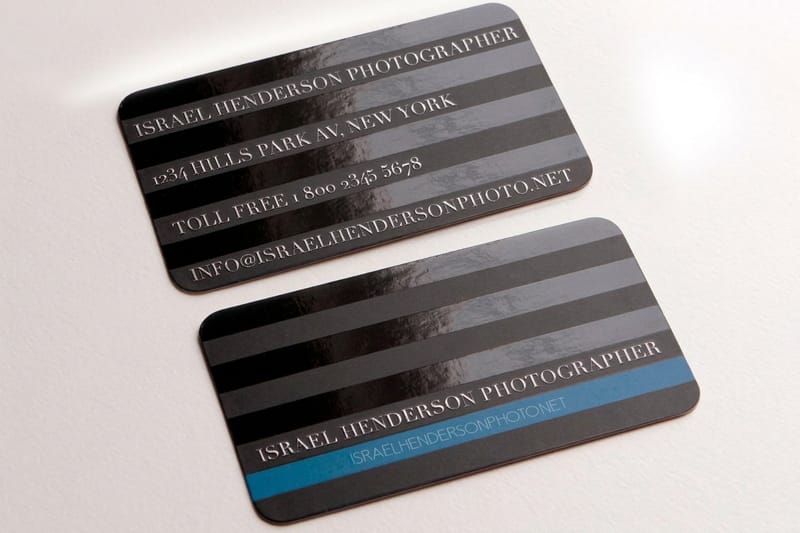
The question is not which typeface is beautiful. It is which typeface still has open counters, distinguishable letterforms and enough stroke weight when it is printed at 7 point and pressed into paper. Those are different questions and only the second one matters for the contact block.
Faces with generous x-heights and low stroke contrast survive small sizes best. Faces with very fine hairlines, extremely tight apertures, or an a and an o that look alike at a glance will cost you legibility. Test on paper, never on a retina display at 400 percent.
One family, two or three weights
The safest typographic card in the world uses a single family and changes only weight and size. It is also, consistently, one of the best looking. A superfamily with a matching serif and sans gives you contrast without a clash if you want two voices.
If you do pair two families, make the contrast obvious rather than subtle. Two similar sans faces read as an accident. A high contrast serif name over a neutral sans contact block reads as intentional. Our list of free fonts for business cards is a reasonable starting shelf if you are not buying a license yet.
Licensing and outlining before you upload
Check the license covers commercial print. Many free faces are personal use only, and a few Google Fonts entries carry conditions worth reading before a client pays for a run. We cover the specifics in are Google Fonts free for commercial print use.
Convert type to outlines before you send the file, or embed the fonts in the PDF. A missing font substitutes silently at the press and you find out when the box arrives. The steps are in converting text to shapes in Illustrator. Once type is outlined it cannot be edited, so keep a live copy of the file.
Ten typographic directions worth printing
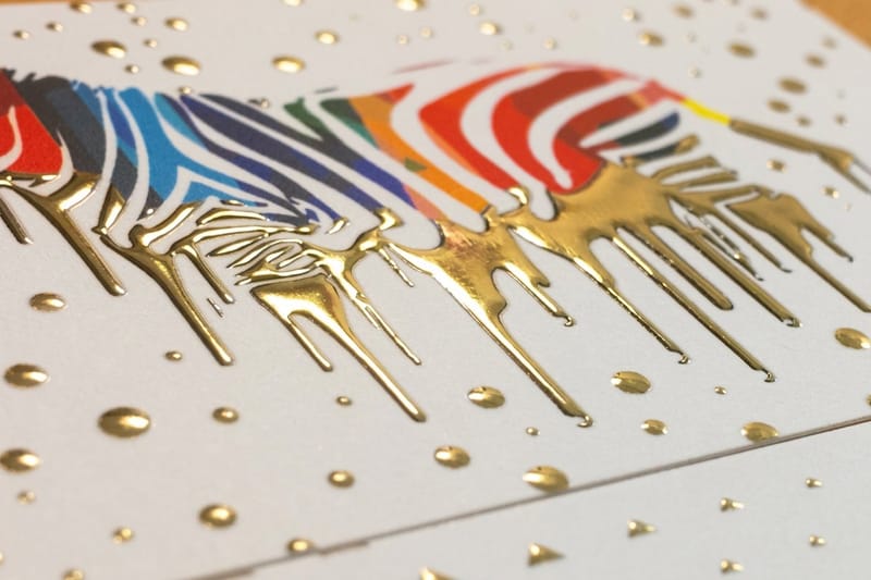
These are directions rather than templates, ordered from the easiest to execute to the most involved. Every one of them can be printed on standard business cards at $17.57, so testing three of them costs less than a single afternoon of design time.
Pick one idea per card. Two typographic gimmicks on the same 3.5 by 2 inches cancel each other out.
Ideas one to five: what you can print today
1. The oversized name. Set the name at 18 to 24 point, fill most of the front with it, and move every contact detail to the back. It works because it commits, and it fails the moment you also try to fit a logo, a role and a tagline around it.
2. Type as the whole logo. A wordmark set in one carefully spaced face, with no symbol at all. Cheaper than a logo commission, and it never looks dated the way a 2014 geometric icon does.
3. The single rule line. One hairline rule separating the name from the contact block. It is the least expensive way to introduce structure, and at 0.25 point it prints crisply on premium business cards.
4. Vertical orientation. Turning the card portrait forces a stacked type layout and instantly separates you from the horizontal cards either side of it in a wallet. Check the 14pt against 16pt stock question here, because portrait cards get bent more often.
5. Extreme tracking. One line of caps opened up to 300 or 400 units, running the full width of the card, used once. It reads as fashion or architecture rather than as a small business, which is either exactly what you want or exactly what you do not.
Ideas six to ten: where finishing joins in
6. Blind emboss or deboss on the name. No ink at all, just the letterforms pressed into the sheet. It only works on thick uncoated stock, and it needs type with enough weight to hold an impression.
7. Foil the name, print nothing else in color. Raised foil business cards at $86.78 put a metallic, slightly raised name on an otherwise black and white card. The restraint is what makes it read expensive.
8. Spot gloss over matte type. Spot UV business cards at $76.88 let you gloss a wordmark on a matte field, so the type is invisible until the card catches the light. The walkthrough is in designing a spot gloss card in Illustrator.
9. Letterpress on cotton stock. Letterpress business cards start at $251.36 because the type is pressed one color at a time into a thick soft sheet. Solid type and heavy weights hold the impression best. Fine hairlines and large solid areas do not.
10. Painted edge with a type only face. A color on the edge of the stock, nothing on the front but the wordmark. The edge carries the brand color so the type never has to.
What a typographic card costs at 4OVER4.COM
A type only card is the cheapest kind to print, because it uses less ink and rarely needs a heavier stock to hold a photograph. You still choose a size, the standard 3.5 by 2 inch, a 2 by 2 inch square or a 1.5 by 3.5 inch slim card, and an ink setup: 4/0 leaves the back blank, and 4/1 prints the back in black ink only, which suits a contact block moved to the reverse. For small type, pick the next day hardcopy proof over the free online proof, because a printed sheet shows you whether 7 point holds on the stock you picked. The numbers below come straight from the live configurator, so you can size the run before you commit the artwork.
Quantity and price
Business card pricing and specs
Real configurator numbers, where the per unit cost drops as the run grows. Print a short first run, hold the card, then reorder.
| Quantity | Price Per Unit | Total |
|---|---|---|
| 100 | 17.6¢ | $17.57 |
| 200 | 11.5¢ | $23.07 |
| 300 | 9.15¢ | $27.46 |
| 400 | 7.96¢ | $31.86 |
| 500 | 7.25¢ | $36.26 |
| 600 | 6.77¢ | $40.64 |

You can also earn coins on every order and redeem them against future printing, which makes proofing two versions of a layout less painful than it sounds.
Finishes that make plain type look expensive
Finishing is where a type only card stops looking plain and starts looking deliberate. The rule is the same as the typography: use one finish, on one element, usually the name. Three finishes on one card is a sample book, not a business card.
Print it
Premium business cards
Heavier stock and the finish options that suit a type only front.
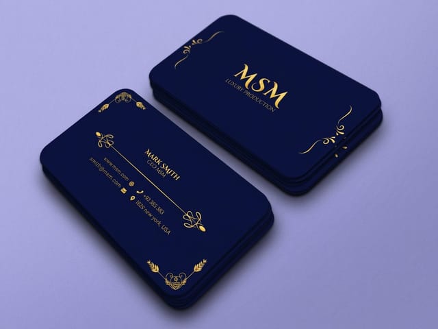
Foil puts a metallic name on an otherwise plain card, and raised foil adds a slight height you can feel with a thumb. Spot gloss works the opposite way: the type disappears into a matte field until the card tilts into the light. Emboss and deboss use no ink at all, so they need thick uncoated stock and a typeface with enough weight to hold an impression. Letterpress presses the type into a soft cotton sheet one color at a time, which is why it costs the most and why nothing else feels like it.
Each one has a limit worth knowing before you design around it. Foil does not hold very fine hairlines. Spot gloss needs a separate mask layer in the file. Deboss on a thin card shows through to the other side, so a debossed front usually means the back stays blank. And letterpress dislikes large solid areas, which press unevenly and look blotchy next to crisp type. Our comparison of matte against gloss business cards covers the base coating decision that sits under all of this, and what a foil accent actually is explains where foil sits in the process.
What this looks like by profession
The same typographic principles land differently depending on who is handing the card over.
- Architects and studios. Type only, one family, heavy white space. The card is a sample of how you handle space, which is what a client is buying.
- Law, finance and consulting. A serif name with a tracked caps role line reads as established without needing a crest. Keep the accent to one rule or one color.
- Restaurants and bars. A display face for the name and a plain face for the address. The card usually ends up on a fridge, so the phone number has to survive a glance.
- Creative freelancers. This is where an oversized name or extreme tracking earns its place. Move the contact details to the back and let the front commit to one idea.
- Trades and field services. Legibility beats fashion. Phone number at 9 point or larger, high contrast, matte stock so a number can be written on it at a job site.
Blanks to change the type on
If you would rather not build the file from scratch, start on a blank sized to the exact product spec so your type lands inside the cut line without arithmetic. For the standard card that means a 3.75 by 2.25 inch artboard, a 3.5 by 2 inch trim and a safety line 0.125 inch inside it, and the square and slim cards each get their own blank. 4OVER4.COM marks bleed, trim and safety on every blank. Grab one from the blank template library, or start from a layout in the design template library and change the type.
Start fast
Blanks to change the type on
Business card design templates and exact size blanks with bleed, trim and safety already marked.














Wally sets a card in one typeface
Four levels, 7 point floor, 0.125 inch of quiet
Name at 10 to 12 point, role at 7 to 8 in tracked caps, contact block at 7 to 8 with leading around 1.3 times the size, and one quiet item at 6.5. Keep every letter 0.125 inch inside the trim, outline the fonts before you upload, and 4OVER4.COM prints it sharp on 14pt or 16pt stock.
Order business cards →What 3.5 by 2 inches will actually hold
Type rules that hold up on press
- Nothing below 7 point. Ink spreads slightly on coated stock and closes the counters of small letters. If the block does not fit at 7 point, cut a line rather than dropping to 6.
- One alignment edge. Left aligned name over centered contact details is the most common layout error we see in uploaded files, and it is visible across a room.
- Track your caps. Caps at 8 point clot together at default spacing. Open them 80 to 120 units and the line turns into a clean band instead of a smudge.
- Double the safety margin. Safety is 0.125 inch from the trim. Design margin should usually be twice that, or the card reads as crowded even when nothing is clipped.
- Outline or embed the fonts. A missing font substitutes silently at the press. Convert to outlines or embed in the PDF, and keep a live editable copy of the file.
- Proof on paper, not on screen. Print at 100 percent, cut it out, and hold it. Small type looks generous on a monitor and tight in the hand, every time.
Explore more
More ways to print and promote
Spot UV cards run 500 for $76.88 in 5 business days and letterpress 250 for $251.36 in 15.
Product Standard Business Cards The cheapest way to test a type layout on real stock. 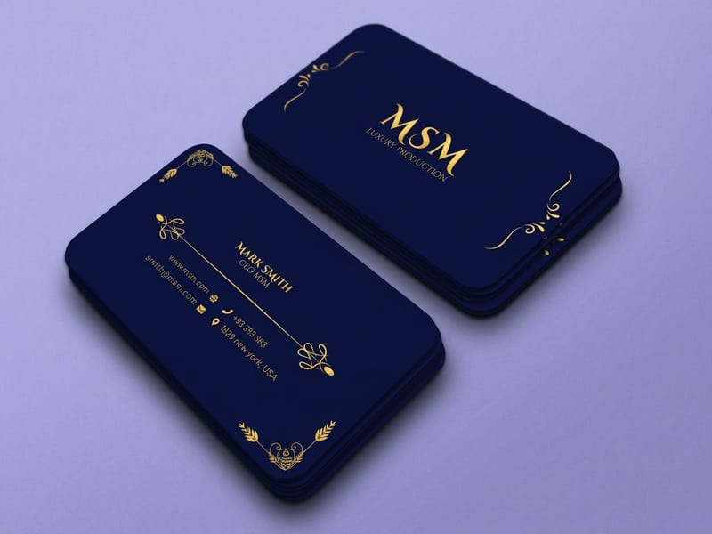 Product Premium Business Cards Heavier stock and finishes for a type only front. Product Raised Foil Business Cards A metallic name that stands off the surface. Product Spot UV Business Cards Gloss the wordmark, leave the rest matte. Product Letterpress Business Cards Type pressed into thick uncoated stock.
  Category Business Card Printing Every stock, size and finish in one place.
 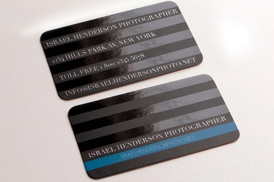 Article 20 Free Fonts for Business Cards A starting shelf when you are not buying a license yet.
 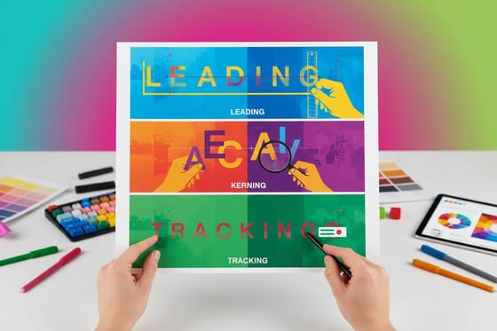 Guide Leading, Kerning and Tracking Which spacing control does what, and when.
 Ready to print your card?
Pick your stock, upload your outlined file or start from a free blank, and 4OVER4.COM prints your type sharp to the edge of the trim.
Common questions about business card typography
What font size should business card text be?
Set the name at 10 to 12 point, the role and contact lines at 7 to 8 point, and treat 7 point as the floor for anything a person has to read. Below that, ink spread on coated stock starts closing the counters of letters like a, e and s, and the block turns gray rather than legible. If the information does not fit at 7 point, remove a line instead of shrinking the type. A second address, a fax number and a tagline are the three things most often cut, and no card has ever been worse for losing them.
How many fonts should a business card use?
One family is the safest answer and often the best looking one, changing only weight and size to build the hierarchy. Two families work when the contrast between them is obvious, such as a high contrast serif name over a neutral sans contact block. Two similar sans faces read as a mistake rather than a decision. Three families on a 3.5 by 2 inch surface is always too many, because there is not enough space for a reader to understand what each one is meant to signal.
Do I have to outline the text before sending a card to print?
Either outline the type or embed the fonts in the PDF. If you do neither, a font that is not installed at the press substitutes silently, and the first you know about it is when the box arrives with the wrong letterforms and different line breaks. Converting to outlines turns the letters into vector shapes, which removes the risk entirely but also removes your ability to edit the text, so always keep a live copy of the file alongside the print ready one.
Which typefaces hold up best in foil or letterpress?
Weight is what survives both processes. Foil and letterpress both need enough stroke to carry, so a medium or bold weight with reasonably even stroke thickness reproduces cleanly, while hairline serifs and very high contrast display faces lose their thin strokes. Letterpress adds a second constraint: large solid areas press unevenly and can look blotchy, so it favours type and rules over filled shapes. Raised foil business cards start at $86.78 and letterpress at $251.36 at 4OVER4.COM, and both are worth a proof before a full run.
Should the person’s name or the company name be biggest?
It depends on which one the recipient will search for later. A freelancer, a consultant or an agent is the brand, so the person’s name goes largest. A staff member at a known company is easier to find through the company, so the company mark leads and the person sits below it. What does not work is making both the same size, because then the reader has to decide which matters and most will not bother. If both genuinely need prominence, put one on each side of the card.
Does a typographic card work on matte or gloss stock?
Matte and uncoated stocks suit type better, because gloss coating throws highlights across a page of small letters and makes a contact block harder to read at an angle. Gloss earns its place when the card carries photography or heavy color. There is a middle option worth knowing about: a matte or soft touch card with spot gloss applied only to the wordmark, which keeps the reading surface calm and gives the name a shift in the light. The comparison is set out in our guide to matte against gloss business cards.
