
15 Best Fonts for Posters and Poster Boards That Read From Across the Room


Tobias is our voice for cutting, binding and large format, built from the knowledge of our production team, with over 20 years in printing.
How to Choose a Poster Font That Survives Real Size
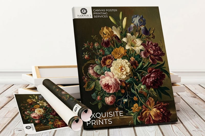
The best fonts for posters and poster boards are heavy, open faces such as Helvetica Neue, Futura, Montserrat, Bebas Neue and Playfair Display, sized for the distance your reader stands from the printed poster. Poster type is a different craft from page type: on a screen the reader is a foot away and every letterform gets studied, while on a poster board the reader is walking past at eight feet, or scanning a hallway from thirty, and your typeface has about two seconds to hand over the headline. That single difference explains why fonts that look elegant in a design file can collapse into mush once they are printed at 24 by 36 inches and taped to a wall.
The fifteen fonts below are grouped by what they actually do on a poster rather than by what is trendy. Sans serifs carry the load when clarity matters most. Display faces do the shouting for events, sales, and anything competing with visual noise. Serifs bring authority and craft, which is why they own gallery prints, conference boards, and academic work.
Before you fall in love with a typeface, run the four checks below. They take about ten minutes and they will save you a reprint. If you are still deciding on the physical format, the complete poster board sizes guide covers the standard dimensions and where each one is normally used.
Step 1: measure the reading distance
Stand where your audience will stand. A trade show board is read from ten to fifteen feet, a classroom science board from three to six, a retail window from twenty or more. Write that number down, because it sets the minimum cap height for your headline and every other decision follows from it.
Step 2: decide what the poster has to feel like
A geometric sans reads modern and neutral. A slab or heavy display face reads urgent and loud. A high contrast serif reads refined and expensive. Say the adjective out loud before you open the font menu, then only audition faces that already carry it.
Step 3: cut the typeface count to two
One face for the headline, one for supporting text, and let weight do the rest of the work. Most amateur poster boards fail because four typefaces are competing for the same eye instead of one typeface using four weights with intent.
Step 4: proof it at full scale before you print
Print a single tile of your headline at one hundred percent on letter paper, tape it to a wall, and walk back to your real viewing distance. Thin strokes disappear, tight letter spacing closes up, and light gray text vanishes. You will see all three failures in five seconds, long before they cost you a print run.
Shop the format
Posters printing
Every poster size, stock, and finish, ready for the type you just picked.

The Best Fonts for Poster Boards at a Glance
Good poster fonts hold their shape from across a room, so the short list leans on heavy, open letterforms. Pick one family by the job, then size it by the distance your readers stand from the board. The full notes on all fifteen faces follow below.
- Sans serif, for clarity. Helvetica Neue, Futura, Gotham, Inter, Montserrat and Franklin Gothic. Use one family for the whole board and change only the weight.
- Display, for sales and events. Bebas Neue, Anton, Archivo Black, Alfa Slab One and Bungee, for short headlines, big numbers and one loud offer.
- Serif, for galleries and academic boards. Playfair Display, Merriweather, Bodoni Moda and Abril Fatface, set large enough that the thin strokes survive.
Minimum letter size by reading distance
- Three to six feet. A one inch headline, body text at 24 to 30 point, the classroom and science fair range.
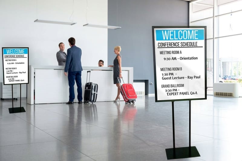
- Eight to twelve feet. About one and a half inches of cap height, subheads above 48 point, the conference and lobby range.
- Fifteen to twenty five feet. Two to three inch caps and seven words or fewer in the main line.
- Thirty feet and beyond. Three inch caps minimum in a heavy weight, for storefronts and stage backdrops.
Most boards print at 18 x 24 in or 24 x 36 in. Canvas Posters run from 11 x 14 in to 40 x 60 in at $25 for one, and Black Friday Posters add 10mil gloss, uncoated and weatherproof polypropylene stocks for heavy display type.
Reading Distance Is the First Number You Need
Signage designers work from a simple proportion that transfers cleanly to posters. Roughly one inch of cap height reads comfortably at about ten feet, so a headline meant to land at thirty feet wants around three inches of cap height. That is a floor, not a target. Add height when the room is busy, when lighting is poor, or when the reader is moving.
Substrate changes the math too. A matte or canvas surface diffuses light and softens edges slightly, so give thin faces a little more weight. A glossy stock holds crisp edges but throws glare under spotlights, which eats fine hairlines. Our Canvas Posters handle warm gallery lighting well, while Black Friday Posters are built for the kind of high contrast type that survives a crowded storefront.
- Three to six feet. Classroom and science fair boards. A one inch headline is plenty, and body text can drop to 24 or 30 point.
- Eight to twelve feet. Conference and lobby posters. Aim for a one and a half inch cap height on the headline and keep subheads above 48 point.
- Fifteen to twenty five feet. Event and hallway boards. Two to three inch caps, short lines, and no more than seven words in the main statement.
- Thirty feet and beyond. Storefront and stage backdrops. Three inch caps minimum, heavy weights only, and drop everything that is not the offer or the name.
- Moving readers. Anyone walking or driving past needs one size up from the chart plus wider letter spacing, because motion steals reading time.
Once the size floor is set, weight becomes your safety margin. A regular weight at three inches can still read weak from thirty feet if the strokes are thin, while a bold at two inches reads instantly. When in doubt, go heavier before you go bigger.
Print picks
Three poster formats worth a look
Live prices, each one suited to a different kind of headline type.
Matching Font Personality to the Message
Typefaces carry tone whether you plan for it or not. A grocery clearance poster set in a delicate fashion serif such as Bodoni Moda feels wrong even to someone who cannot name why, and a museum exhibition poster set in a condensed sale face such as Anton feels cheap. Name the intended feeling first, then audition only the two or three faces from the lists below that already carry it.
If you want a shortcut, look at how other categories solve the same problem. The typographic thinking in these creative poster ideas transfers directly, and the tone matching in seasonal font picks shows how far a single typeface swap moves the mood of an identical layout.
- Trustworthy and institutional. Neutral grotesques and traditional serifs. Universities, hospitals, government notices, and research boards.
- Modern and premium. Geometric sans faces with generous spacing, or a high contrast serif paired with plenty of white space.
- Urgent and promotional. Heavy condensed display type, large numerals, and short lines that let the price do the talking.
- Handmade and local. Slab serifs and rounded faces that feel drawn rather than engineered, good for markets, cafes, and community events.
- Editorial and cultural. A refined serif for the headline and a quiet sans for details, the pairing most gallery and festival posters rely on.
Six Sans Serif Fonts That Never Miss on a Poster
Sans serifs are the default for poster work because they hold their shape at distance. Without serifs to soften the ends of strokes, the letterforms stay open and the counters stay clear even when the print is viewed at an angle or under uneven light. These six cover almost every neutral or modern brief; set in a bold weight at two inches of cap height, any of them reads from about twenty feet.
Use one of these for the headline and the same family for the supporting text, changing only the weight. A poster set entirely in one strong sans family reads as deliberate, while a poster mixing three unrelated sans faces just reads as unfinished.
- Helvetica Neue. The neutral standard. Tight, even color across a line and a bold weight that holds up at any size. Track it out slightly in all caps so the letters do not collide.
- Futura. Geometric circles and sharp points give it a confident, designed feel. Beautiful for short headlines, but its lowercase runs small, so size it up compared to other faces at the same point size.
- Gotham. American, broad, and friendly without being casual. Excellent for civic and campaign posters where the message needs to feel open and approachable.
- Inter. Drawn for screens but excellent in print thanks to tall x-height and open apertures. The best free choice when you need many weights in one family.
- Montserrat. Wide, urban, and free. Works hard on event and community posters, especially in the semibold and bold weights. Give it room, because it takes horizontal space.
- Franklin Gothic. Condensed news style weight that packs long headlines into narrow columns without losing punch. The classic answer when your headline is longer than it should be.
A working note on setting these: in all caps, add letter spacing. In lowercase, remove a little. Default spacing is optimized for paragraph sizes, and at poster scale the gaps look uneven unless you adjust by hand.
Quantity and price
Canvas poster pricing and specs
Real configurator numbers. Per unit cost drops as the quantity climbs.
| Quantity | Price Per Unit | Total |
|---|---|---|
| 1 | $25.00 | $25.00 |
Five Display Fonts for Posters That Need to Shout
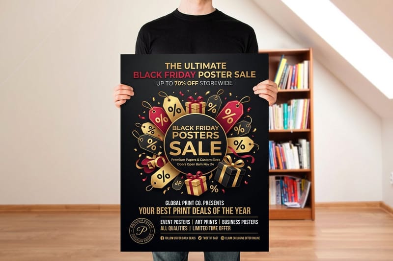
Display faces exist for exactly one job on a poster, which is winning the first two seconds. They are drawn to be big, so they fall apart at body size and should never be used for anything but the headline, a price, or a single word. Used correctly they carry a whole board on their own.
These five give you weight without novelty. Every one of them stays legible at scale, which is more than can be said for most free display downloads. If your poster is competing with other signage in the same space, this is the group to pick from.
- Bebas Neue. Tall, condensed, caps only. Fits long headlines in a narrow space and reads cleanly from far away. The standard pick for event posters.
- Anton. Extremely heavy condensed sans that turns a single word into a graphic element. Use it at one size, never in a paragraph.
- Archivo Black. Wide and blunt with generous counters, so it stays readable at sizes where other heavy faces close up. Great for numbers and percentages.
- Alfa Slab One. A thick slab serif with a poster-era feel. Adds warmth and nostalgia to markets, festivals, and food events without looking novelty.
- Bungee. Purpose built for signage, including vertical and stacked styles. The right answer when your layout runs up a narrow board rather than across it.
One display face per poster. If the headline and the subhead are both display type, neither one wins, and the eye bounces instead of reading. Pair the display face with a quiet sans from the list above and let contrast do the work.
Motion format
3D lenticular posters
Two to four images that flip as people walk past, which rewards heavy display type and high contrast color.

Four Serif Fonts That Add Weight and Credibility
Serifs are not a poster liability, they are a tone choice. The risk is only in the thin strokes, so the rule is simple. If the serif has high contrast between thick and thin, print it large and keep it dark on light. If it is a slab or a low contrast text serif, it will hold at almost any size.
These four cover the range from gallery refinement to editorial solidity. Printed on a textured surface they gain character, which is why serif headlines and canvas stock are such a common pairing in art and photography prints.
- Playfair Display. High contrast, elegant, and free. Superb for exhibition, wedding, and boutique posters. Keep it above two inches of cap height so the hairlines survive.
- Merriweather. Sturdy, low contrast, and built for legibility. The safest serif when your poster carries real reading matter under the headline.
- Bodoni Moda. Fashion house drama with razor thin strokes. Stunning at very large sizes on a smooth stock, risky anywhere else.
- Abril Fatface. A heavy didone display serif that reads as loud and refined at the same time. The compromise choice when a sale needs to feel upscale.
Loud and seasonal
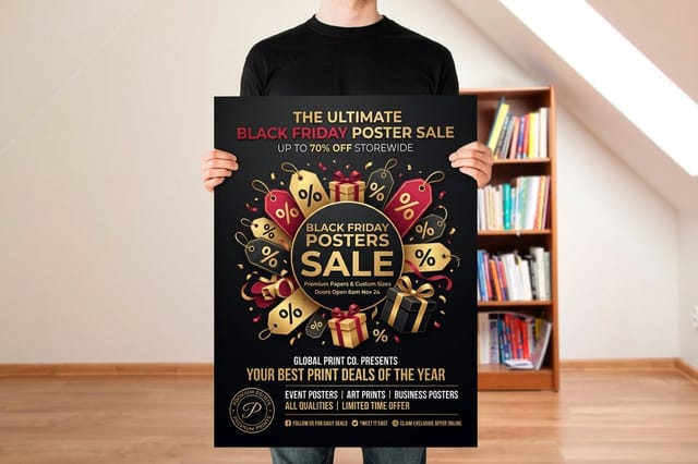
Black Friday posters
A promotional format built for one big number, one short line, and the heaviest weight in your family.
Pairing Fonts and Building Hierarchy on a Poster Board
A poster has three levels and no more. Level one is the thing you want remembered, usually five words or fewer. Level two is the qualifier, the date, the price, or the subtitle. Level three is the detail nobody reads until they are already interested, which is the address, the schedule, or the fine print.
The jump between levels should be obvious from across the room. If level one is not at least twice the size of level two, the hierarchy is not doing its job. That single ratio fixes more failing poster boards than any font swap. For the numbers behind each level, see our guide to poster font size and typography.
- Pair by contrast, not similarity. A heavy display face with a light neutral sans works. Two mid weight sans faces just look like a mistake.
- Left align by default. Centered type is harder to scan at distance because the eye has to hunt for the start of each line.
- Keep lines short. Six to eight words maximum on the headline, and break lines by meaning rather than by where the text box ends.
- Respect the margins. Keep type at least an inch inside the trim on a standard board, more if the poster will be framed or mounted.
- Contrast beats color. Dark type on a light field, or light type on a genuinely dark field. Mid tone type on a mid tone photo disappears at ten feet.
If you are comparing print shops as well as typefaces, the tradeoffs are laid out in our Staples poster printing alternative breakdown and the Vistaprint poster sizes alternative comparison.
Compare formats
Popular posters, side by side
Stock, finish, size, quantity, turnaround, and price in one table.
 Large Format Posters |  Standard Posters |  Dry Erase Posters |  Mounted Posters | |
|---|---|---|---|---|
| Min price | $25.00 | $108.75 | $29.00 | $39.99 |
| Paper / stock | 10mil Semi Gloss | 100# Gloss Text | Dry Erase Face/ Adhesive Vinyl Backer | 10.4 mil Semi Gloss |
| Finish | - | Standard Finish | - | - |
| Size | 11" x 17" | 11" x 17" | 11" x 17" | 8" x 10" |
| Default qty | 1 | 50 | 1 | 1 |
| Turnaround | 2 business days | 5 business days | 4 business days | 4 business days |
| Rating | ||||
| View & customize | View & customize | View & customize | View & customize |
Getting Your Type Print Ready
Everything above is design. This part is production, and it is where good typography quietly goes wrong. Fonts that are not embedded get substituted, thin strokes set in rich black go muddy, and type placed too close to the trim gets clipped on the cutter. None of it shows on your screen.
Start from a correctly sized layout rather than guessing at dimensions, then check the file against the list below before you upload. If you also print smaller collateral to match the poster, the type advice in our free business card fonts roundup keeps the family consistent across formats.
The pre-upload checklist
- Outline or embed every font. Convert headline type to outlines, or export a PDF with fonts embedded. Never assume the printer owns your licensed face.
- Set small black type to 100 percent K. Rich black on fine text invites registration shift and fuzzy edges.
- Keep type inside a safe margin. Half an inch minimum from the trim, and add bleed to any background that runs to the edge.
- Check effective resolution at final size. Vector type is safe, but any rasterized or effects-heavy text needs to hit 300 dpi at print dimensions.
- Proof one tile at full scale. The wall test from step four catches spacing and weight problems that no on-screen zoom will show you.
Start fast
Poster templates and print-ready blanks
Free layouts plus exact-size blanks so your type lands inside the safe margin.

Wally sizes your poster type
Pick the face, then prove it works from where people will stand
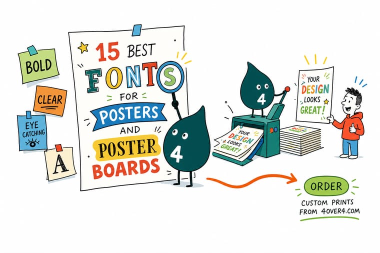
Choose your typeface in three moves. First, measure the viewing distance and set a cap height of about one inch for every ten feet. Second, pick the group that matches the tone, sans for clarity, display for volume, serif for authority. Third, print one headline tile at full scale, tape it to a wall, and walk back. If it reads instantly, the file is ready to send.
Print your poster →Poster Font Takeaways
Keep reading
More typography and poster guides
Poster board sizes, fifteen creative poster ideas, St. Patrick's Day layouts, and Mother's Day font picks.
 Guide Poster Board Sizes Guide Every standard size and what each one is normally used for.
 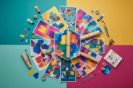 Article 15 Creative Poster Ideas Layout and concept starting points for your next print run.
 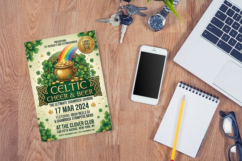 Article St Patrick’s Day Poster Ideas Seasonal poster and flyer designs with strong headline type.
 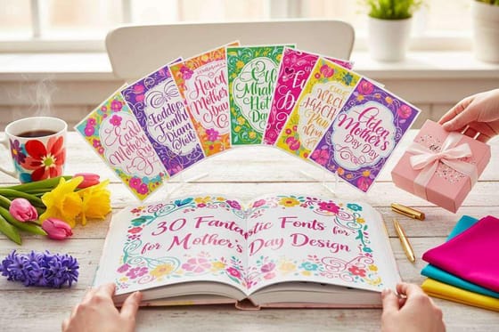 Article 30 Fonts for Mother’s Day Design How a single typeface swap changes the tone of a layout.
 Explore more
More ways to plan and print a poster
Canvas posters at $25 for one, Black Friday and lenticular posters, poster board sizes, and business card fonts.
 Shop Posters Printing Every poster format, stock, and size in one place. Product Canvas Posters Textured canvas that flatters serif headlines. Product Black Friday Posters Built for heavy display type and one loud offer.
 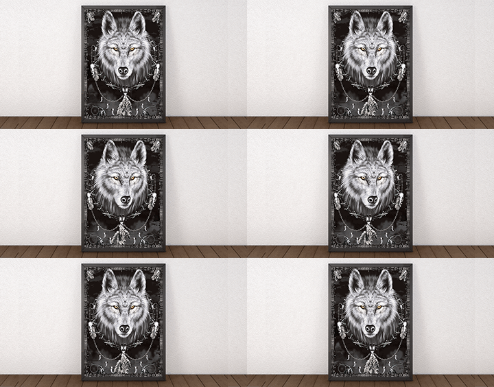 Product 3D Lenticular Posters Flip prints that need chunky, high contrast letterforms. Guide Poster Board Sizes The complete guide to standard poster dimensions. Article 15 Creative Poster Ideas Concepts worth stealing for your next board. Article St Patrick’s Day Designs Seasonal poster and flyer layouts that pop.
  Article 20 Free Business Card Fonts Keep the type family consistent across formats. Article 30 Mother’s Day Fonts Tone matching in practice, one layout at a time.
  Alternative 4OVER4 vs Staples Posters How the two compare on poster stocks and turnaround. Alternative 4OVER4 vs Vistaprint Sizes Custom poster sizes without the template limits.
  Alternative 4OVER4 vs MOO Prints Stock quality and pricing, side by side.
 Ready to print type that reads from across the room?
Set your headline in one of the fifteen faces above, size it for the real viewing distance, and send it to a poster stock that suits the tone.
Poster Font Questions, Answered
How do I choose a good poster font?
Start with viewing distance rather than style. Measure where people will actually stand, then set a minimum cap height of roughly one inch for every ten feet of that distance. Once the size floor is set, pick a category based on tone. Sans serifs for clarity, display faces for urgency, serifs for authority and craft. Then narrow to a single family, use weight instead of extra typefaces for contrast, and print one full scale tile to check it on a wall before committing to the run. For dimensions, see the poster board sizes guide.
What are the best font ideas for posters?
The fifteen in this article cover almost every brief. For sans serif clarity use Helvetica Neue, Futura, Gotham, Inter, Montserrat, or Franklin Gothic. For display volume use Bebas Neue, Anton, Archivo Black, Alfa Slab One, or Bungee. For serif credibility use Playfair Display, Merriweather, Bodoni Moda, or Abril Fatface. Choose one display or serif face for the headline, then support it with a neutral sans in two weights.
What fonts work best on poster boards specifically?
Poster boards are usually read from three to twelve feet in bright indoor light, which favors low to medium contrast faces with open counters. Inter, Montserrat, Franklin Gothic, and Merriweather all perform well at that range because their strokes stay even. Avoid very high contrast serifs and ultra light weights on boards, since hairlines thin out under fluorescent lighting and against textured surfaces. Bold headline, medium subhead, regular body is a reliable three level structure.
How many fonts should a single poster use?
Two is the practical maximum, and one is often better. Use a single family across the whole poster and create hierarchy with weight and size instead of new typefaces. If you do pair, pair by strong contrast rather than similarity, for example a heavy display face for the headline with a light neutral sans for details. Three or more faces on one board almost always reads as unplanned, because nothing clearly wins the reader’s attention first. For the layout and placement side, see Poster Marketing Strategies That Win Attention.
What does poster printing cost and how is the price set?
Price is driven by size, stock, quantity, finish, and turnaround, not by the fonts you choose. At 4OVER4.COM Canvas Posters cost $25 for one, Black Friday Posters start at $25 for one, and 3D Lenticular Posters run 10 for $823.78, with the lenticular per unit cost dropping as quantity rises. Configure your size and quantity on the product page to see live pricing before you order, and remember that a larger poster usually needs heavier type weights rather than a different typeface.
