
Typography Poster Ideas That Stay Readable From 30 Feet Away


Tobias is our voice for cutting, binding and large format, built from the knowledge of our production team, with over 20 years in printing.
Poster typography starts with distance: one inch of capital-letter height for every ten feet, so a headline read from 30 feet needs letters about 3 inches tall. Below are six typography tips for posters that hold up in print, with font pairing recipes, the numbers behind spacing, and a cap-height chart that sizes your headline for the distance people will actually stand.
Poster typography works when one message clearly dominates and its capital-letter height matches the viewing distance, at roughly one inch of cap height for every ten feet a reader stands away. Everything else supports that: three levels of hierarchy rather than five, no more than two typefaces paired for structural contrast, value contrast instead of color contrast, and more space between groups than inside them. Set the size first, then choose the fonts.
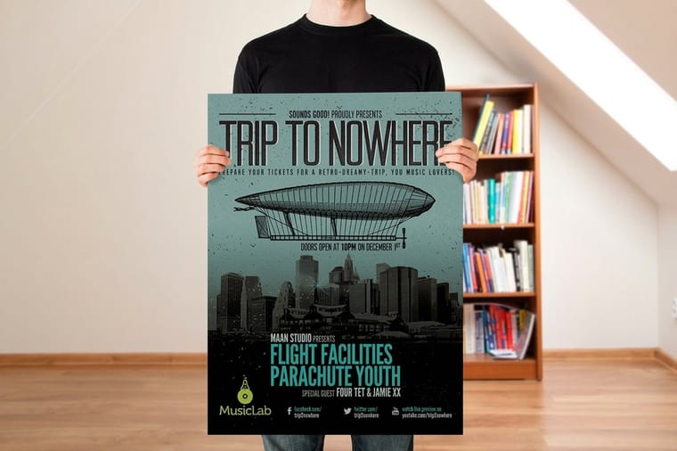
Quick answer
Distance decides the size, hierarchy decides the rest
Start with one inch of capital-letter height for every ten feet of viewing distance, which lands near 100 point at 10 feet and near 200 point at 20 feet. Then give the poster exactly three levels of information, each at least 1.6 times the size of the one below. Keep to two typefaces paired for structural contrast, judge contrast in grayscale rather than by hue, and leave more space between groups than inside them. The chart below turns the distance rule into working numbers.
Why Typography Makes or Breaks a Poster
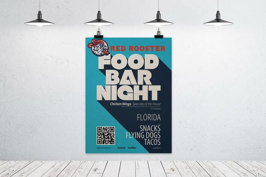
A poster gets one glance from somebody who is already walking somewhere else. Typography decides whether that glance lands on the thing you needed it to land on.
Color and image pull the eye toward the sheet. Type is what pays that attention back, and it pays it in a fixed order: the largest, heaviest element first, then the next, then the small print for anyone who steps closer. When two elements sit at similar size and weight, the eye has to pick one, and picking costs a beat that nobody spends on a wall.
So most poster problems are not font problems. They are size-relationship problems. A poster set entirely in one plain sans at three obviously different sizes beats a poster carrying four fashionable typefaces that all compete at roughly the same scale, every time.
Print raises the stakes, because there is no zoom. On screen you lean in. On a corridor wall at 20 feet, a 24 point subhead is a gray smear, and the sheet you approved at 30 percent on a laptop is not the sheet on the wall. That is the whole argument for sizing type against distance before you fuss over anything else, and it is why the six tips below run in the order they do. If you want the wider build order first, our step-by-step poster design guide covers message and layout, and the poster printing range shows the sheet sizes those decisions have to fit.
Tip 1: Build a Clear Visual Hierarchy

Give the poster three levels and stop. A hook, a qualifier, and a detail block.
Level one is the hook. One line, four to six words, the largest thing on the sheet. It is the only element that has to work at full viewing distance.
Level two is the qualifier. What, when, where. It reads once the person has decided to look, from perhaps half the distance.
Level three is the detail block. Address, price, times, QR code, legal line. Nobody reads this from across a room and nobody needs to.
Make the gaps between levels obvious. A workable ratio is at least 1.6 times from one level to the next, and doubling is cleaner still: a 240 point hook over a 120 point qualifier over a 48 point detail block on a 24 by 36 sheet. Two elements within 20 percent of each other in size read as a tie, and a tie is the failure state.
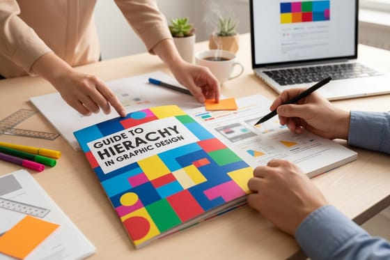
Nobody mentions that trade-off. Hierarchy costs space. You cannot have a three-line headline at 240 point and a paragraph of body copy on the same poster, so the moment you commit to a big hook you are committing to cutting words. That is usually the right cut. The test is simple: blur the layout, or step back until it goes soft, and check that exactly one thing is still legible. If two things survive, one of them is too big or the other is too small. The hierarchy in graphic design guide goes deeper on the principle itself.
Tip 2: Limit and Pair Your Fonts
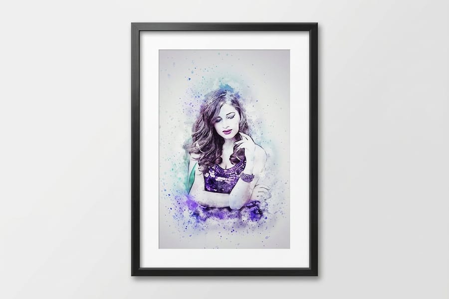
Two families is the ceiling. Pair them for contrast in structure and agreement in mood, which is the opposite of pairing two faces that merely look different.
The pairings below are ones that survive being printed large. Each one puts a face with personality at the top and a face with stamina underneath.
| Recipe | Headline face | Supporting text | Why it holds up in print |
|---|---|---|---|
| Condensed over humanist | Oswald | Lato | The condensed caps pack a long headline into one line. Lato keeps open apertures so the detail block stays readable small. |
| Display serif over neutral sans | Playfair Display | Source Sans 3 | High thick-to-thin contrast reads as formal at large size. Keep Playfair display only, because its hairlines thin out below roughly 30 point. |
| One superfamily, two weights | Archivo Black | Archivo Regular | Same skeleton, only the weight changes, so nothing clashes. The safest pairing there is and the fastest to set. |
| Caps display over text face | Bebas Neue | Roboto | Bebas has no lowercase, which forces a short hook. That constraint is the point on a retail or event poster. |
| Slab over grotesque | Roboto Slab | Inter | Slab serifs keep their weight when reversed white out of a dark panel, where a hairline serif would close up. |
Two habits keep any pairing honest. First, set both faces at the same size side by side and look at the x-heights. If they match closely and the moods match too, you have not made a pair, you have made a muddle. Second, check the license before the file goes to press: plenty of free display faces are personal-use only, and a commercial poster run is not personal use.
The limit worth naming is that a great pairing cannot rescue a weak hierarchy. If the two faces are set at similar sizes, all the pairing has done is make the tie prettier. For the family-level decision behind these recipes, read serif vs sans serif, and when the file is ready, follow how to create outlines in Illustrator so your line breaks cannot shift on a 36 inch sheet.
Tip 3: Use Contrast and Weight
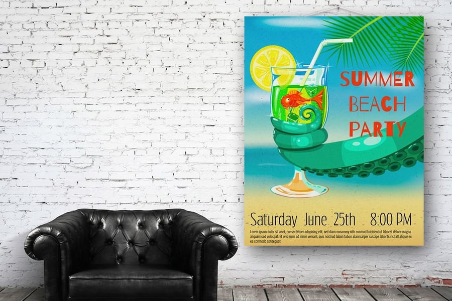
Contrast at distance is mostly value contrast, meaning light against dark. Hue barely helps until the reader is close enough to have already read the poster.
Black on white is still the most legible combination you can print, and there is no clever alternative that beats it. Gray type is where posters quietly fail: a tint is not solid ink, it is a screen of dots, so type set below roughly 50 percent black on white loses edge definition at distance and shows its dot pattern up close. If you want a softer headline, drop the weight rather than the density.
Reversed type, white out of a dark panel, needs a correction. Ink spreads slightly into the sheet, which grows the dark field and pinches the white letterforms inside it, so reversed text prints thinner than the screen preview implied. Set it a weight heavier, add a little tracking, and keep it above about 14 point on a poster. For the dark panel itself, a rich black build carries more depth on a wide-format press than 100 percent black alone, while small text is best kept in solid black so it stays crisp if the plates shift a hair.
The failure to avoid is two saturated colors of similar value touching each other, red on green being the classic. They vibrate at close range and turn into one gray shape at distance. Check by converting a flattened copy to grayscale: if the headline disappears, no amount of color choice will save it. Our colors for advertising signs guide covers the combinations that survive a corridor, and CMYK vs RGB explains why the screen version always looks brighter than the sheet.
Tip 4: Mind Spacing and Alignment

Spacing is the part people skip and the part that makes a poster look professionally set. One rule does most of the work: leave more space between groups than inside them.
If the date sits closer to the venue line than to its own label, the reader has to reassemble the information. Push the groups apart, tighten the lines within each group, and the poster reads in the order you intended without a single change of typeface.
The numbers worth keeping to hand:
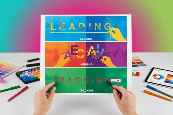
- Leading. Display type wants tight leading, roughly 88 to 100 percent of the point size, because large letters already create their own separation. Body copy wants 130 to 145 percent.
- Tracking. Large display type usually needs negative tracking, around minus 10 to minus 25 thousandths of an em, since the spacing built into a font is tuned for text sizes. Reversed and small caps text needs the opposite, a little positive tracking.
- Line length. Keep any paragraph between 45 and 75 characters per line. Wider than that and the eye loses the return.
- Margins. Hold all type at least half an inch inside the trim on a standard poster. On framed posters push it to a full inch, because the frame lip covers roughly a quarter inch on each edge, and hanging displays clamp a strip at the top and bottom.
Alignment is simpler than it looks. Pick one axis and commit: flush left scans faster and suits information-heavy posters, centered is calmer and suits announcements, and mixing the two in one layout is what makes a poster feel assembled rather than designed. Watch punctuation and quote marks at the start of a big headline, since they need pulling slightly outside the margin to look aligned.
For the mechanics behind those settings, read leading, kerning and tracking explained, and check your margins against the bleed, cut line and safety checklist before you export.
Tip 5: Size Text for Viewing Distance
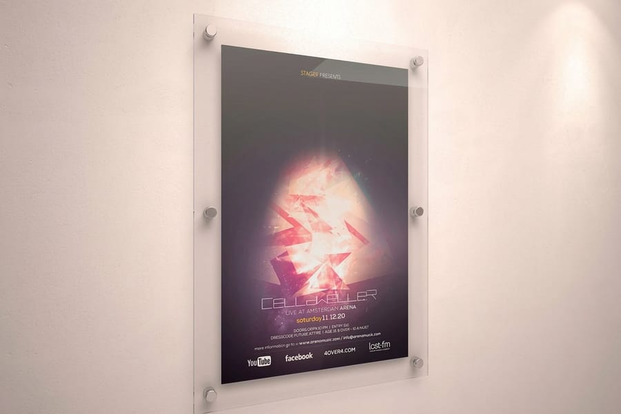
This is the tip that turns poster typography from opinion into arithmetic. Allow one inch of capital-letter height for every ten feet a reader will stand away.
To move from inches to point size, use the fact that a typical sans serif puts its capitals at about 70 percent of the em. One inch is 72 points, so the point size you need is close to the cap height in inches multiplied by 100. Set the type, then measure a capital letter with the ruler in your layout software rather than trusting the point size, because cap height varies noticeably between faces.
| Reader stands | Minimum cap height | Approx point size | What that leaves room for on 24 by 36 |
|---|---|---|---|
| 3 ft | 0.3 in | about 30 pt | A full paragraph. This is a counter card or a table tent, not really a poster. |
| 6 ft | 0.6 in | about 60 pt | Headline, subhead and a complete detail block with room to spare. |
| 10 ft | 1 in | about 100 pt | A four to six word hook, a qualifier line and a short detail block. |
| 20 ft | 2 in | about 200 pt | A three or four word hook and very little else. Details drop to a step-in size. |
| 30 ft | 3 in | about 300 pt | Two or three words. Anything more will not be read at that range. |
| 50 ft | 5 in | about 500 pt | One word, and a 24 by 36 sheet is now the wrong format. Go large format or use a banner. |
The far end of that table is where honest limits matter. A short, high-contrast word can be recognized at more like 25 feet per inch of cap height, but recognizing a word and reading a message are different jobs, and planning a sentence on the aggressive number is how posters end up ignored. Plan on ten feet per inch and you will be right.
Two habits stop the arithmetic going wrong. If you are designing at half size to keep the file light, double every type size at the end, and note the scale factor in the file name so nobody forgets. Then print one letter-size slice of the poster at 100 percent, tape it up, and walk back to the real distance. That five minute check has saved more reprints than any preview.
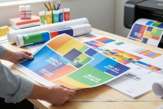
When the distance pushes past 30 feet, change the format rather than the font. Large format posters start at $25 and run to sizes a standard sheet cannot reach, and for a trade-show aisle a retractable banner stand at $139 puts the message at eye level instead of on a wall. Pick the sheet first using the large format poster sizes guide or the complete poster sizes guide, then set the type to match.
Tip 6: Keep It Readable and On Brand
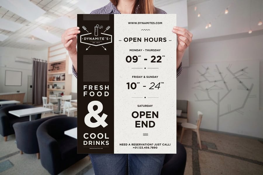
Brand guidelines are written for screens and letterheads far more often than for a 36 inch sheet, so treat them as a starting point that needs a poster-sized translation.
The usual conflict is a delicate brand face. If the display font is a thin script or a high-contrast serif, use it where it belongs, on the logo and perhaps on a single short line, and set the message in the brand's secondary sans. Nobody has ever noticed that a poster used the support face for the hook. Plenty of people have failed to read a thin script from 20 feet.
A short list of limits that hold across almost every poster job:
- All caps for one to four words only. Capitals flatten every word into the same rectangle, which removes the outline readers use to recognize words at speed.
- Nothing below 8 point. On a poster that is already smaller than anyone will read from standing distance. Reserve 6 point for a legal line on a piece people hold.
- Rules and strokes above 0.25 point. Thinner hairlines can break up or drop out entirely on a coated poster stock.
- One consistent size set. Three type sizes used repeatedly look intentional. Seven sizes look like the file grew by accident.
- Check the fine print in grayscale. Brand colors that pass on a screen often fail as small text once they are printed as a tint.
Finish with a proof pass. Convert text to outlines or embed the fonts, confirm nothing has reflowed, and view the file at a zoom level that matches the real distance, which for a 24 by 36 poster viewed at 10 feet is roughly 25 percent on a laptop. If the poster is going into a lobby where people study it, mounted posters start at $39.99 and hold flat so the type does not distort across a curl, and the stock choice itself changes how crisp the type looks, which the poster material breakdown covers. Starting from a correctly built file removes most of the risk, so pull a sheet from the blank poster templates or follow the free poster templates guide before you set a single word.
Wally sizes the headline
One inch of cap height for every ten feet back
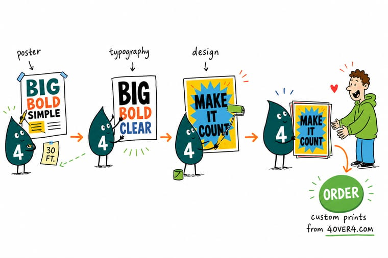
Wally does not argue about fonts first. He walks to where people will actually stand, counts the feet, and divides by ten. Ten feet back means a one inch capital, which is about 100 point. Twenty feet means two inches, about 200 point, and now the headline has to lose words. Then he sets three sizes, never five, keeps to two typefaces, and leaves more air between the groups than inside them. Last job before printing is a letter-size slice taped to the wall, checked from the real distance.
Print large format posters →
Specs and pricing
Poster sizes, stocks and starting prices
Standard posters print from 11x17 to 22x28 on nine stocks, $108.75 for 50, in 5 business days. Large format posters print from 11x17 up to 48x96 or any size you enter, from $25 each in 2 business days, and mounted posters put the print on 3/16 in foam core from $39.99. Pick the sheet before you lock the type sizes: a 3 inch headline fits a 24x36 far better than an 11x17.



Print it
Print a poster your type was sized for
Standard posters at $108.75 for 50 for a run of the same design, large format posters from $25 for one big sheet read across a room, or a 16x24 framed poster in a matte black frame for $87.86.


Explore more
Where to go next
Next reads by the type problem in front of you: the full poster build order, hierarchy between sizes, serif against sans serif at display size, spacing controls, and the sheet sizes and materials your type will sit on.

By the numbers
Type-led posters, framed, mounted or large format
Common Questions
Your poster typography questions, answered
What font size should poster text be?
Work back from where the reader stands. A comfortable rule is one inch of capital-letter height for every ten feet of viewing distance, and for a typical sans serif the point size is roughly the cap height in inches multiplied by 100. So a poster read at 10 feet wants a headline near 100 point, at 20 feet near 200 point, and at 30 feet near 300 point. Body detail can sit far smaller because people step in to read it, but keep it above 8 point on any poster and above 12 point if it matters.
How many fonts should a poster use?
Two families, and often one. Every additional typeface asks the reader to learn another visual rule while they are walking past. If you need more separation, take it from weight and size inside a single family rather than from a third face. The exception most designers allow themselves is a numeral or price face on a retail poster, where a distinct figure style genuinely helps a discount read fast.
What is the best font for a poster?
There is no single best face, but there is a reliable shape: a condensed or bold sans with open counters and clear letter spacing for the headline, because it packs long words into one line and holds its edge at distance. Faces with hairline strokes, tight apertures, or very high thick-to-thin contrast lose definition as the viewing distance grows and as ink spreads on coated poster stock. If your brand face is a thin script, use it on the logo and set the message in something sturdier.
Should poster text be all caps?
For one to four words, yes, caps are compact and read cleanly at a distance. For a sentence, no. Readers recognize words partly by their outline, and capitals flatten every word into the same rectangle, which slows reading measurably at exactly the moment you have the least of a person's attention. A common compromise is a caps hook and mixed-case supporting lines.
Why does my poster text look thinner in print than on screen?
Two things happen at once. A screen backlights white letters so they bloom and look heavier than they are, and on press the ink spreads slightly into the paper, which fattens dark areas and pinches the white shapes sitting inside them. The result is that reversed white type prints noticeably lighter than the on-screen preview suggested. Set reversed type one weight heavier, add a little tracking, and check a real proof before running a large quantity.
Do I need to convert poster text to outlines before sending the file?
Outlining is the safest route and it is what we recommend, because it removes any chance of a font substitution changing your line breaks on a 36 inch sheet. Keep an editable copy first, since outlined text cannot be corrected later. If you would rather keep live text, export a PDF with fonts fully embedded and confirm the embedding in the PDF properties. Our guide on creating outlines in Illustrator walks through both routes.
Get Started
Standard posters run 50 for $108.75, or $2.18 each
Pick your size and stock, upload the file with your type already sized for the room, and we print posters that stay sharp from the back wall.
Legal Disclaimer
Gold Standard guarantees apply to all standard orders placed through 4over4.com. Price match requires verifiable proof of a competitor's published price for an equivalent product with matching specifications and turnaround time. Satisfaction guarantee covers manufacturing defects and print quality issues. Contact support with order number and documentation.
