
Wedding Color Palette Ideas and How to Choose a Scheme That Prints True


Palette ideas that work on paper, the four moves for picking your own, and the print details that decide whether the color you approved is the color that arrives.
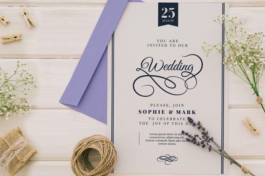
Choose a base color that covers most of the piece, a secondary for type and motifs, and one accent that appears in about a tenth of the design, then pick your paper white before you finalize any of them. Test the scheme on a printed sample rather than a screen, because CMYK ink cannot reach fluorescent shades and warm venue lighting pulls cool colors toward grey. Keep the whole suite on one stock so the save the dates, invitations and thank you cards still match a year later.
Quick answer
Two colors, one accent, and the paper underneath all of it
A wedding palette that works in print is three colors with clear jobs, sitting on a stock you chose deliberately. The base covers the largest area and is usually the sheet itself. The secondary carries the type and the motifs. The accent shows up once, in foil or on an envelope liner, and stops. Where schemes go wrong is the step after the mood board: a shade picked on a backlit screen that CMYK ink cannot reach, or a suite printed across three separate orders on three slightly different papers.
Your Palette Is a Paper Decision Before It Is a Design One
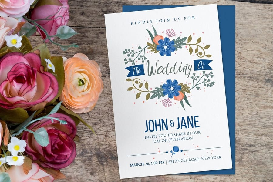
The colors you pick decide three things that cost money: the stock you print on, whether any element needs foil or a metallic sheet, and how much solid ink coverage sits on each card. Everything else about the palette is taste, and taste is the easy part.
Here is the part most palette articles leave out. A deep saturated background looks stunning in photographs and is the least forgiving thing you can put in the mail. Matte ink over a large dark field shows fingerprints, and a fold scored through heavy coverage can crack along the crease and reveal the white core of the sheet. That is not a reason to avoid a navy or a black invitation, it is a reason to choose a coated stock for it, or to keep the dark color on a flat card and let the folded piece stay light. Folded and flat invitations behave differently under the same ink, which is worth knowing before you commit.
The second thing to accept early is that print and screen are different media. A monitor emits light, so a color can be as bright as the backlight allows. Paper reflects light, and CMYK ink can only subtract from whatever white the sheet gives it. Our guide on CMYK and RGB color modes goes through the conversion, but the working rule is short: if a shade glows on screen, expect it calmer on wedding invitations.
Wedding Color Palettes That Hold Up on Paper
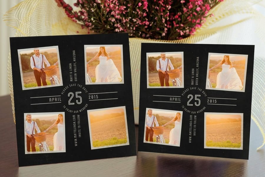
These five combinations come up constantly, and each one behaves in a specific way once it hits a press. The last column is the part that matters when you order.
| Palette | Colors | Where it fits | What print does to it |
|---|---|---|---|
| Garden neutral | Ivory, sage green, antique gold | Vineyard, garden and daytime weddings | Sage sits comfortably inside the CMYK range. Take the gold as foil, not ink. |
| Modern warm | Soft white, mocha brown, camel | Minimal, contemporary, city venues | Deep brown goes flat on uncoated stock unless it is built as a rich mix rather than pure black plus yellow. |
| Winter blue | Dusty blue, slate, silver | Cold months, evening receptions | Blues are the shade most likely to drift toward purple in conversion. Proof it or run it as a spot ink. |
| Desert warm | Terracotta, ochre, cream | Autumn, outdoor and destination weddings | The most forgiving family in print. Earth tones reproduce almost exactly as designed. |
| Black tie | Black, bone, warm gold | Formal evening and ballroom weddings | Heavy black coverage needs a coated sheet, or it scuffs on the way through the mail. |
What does not survive the trip to paper is the fluorescent end of the spectrum. Neon coral, electric fuchsia and acid lime are outside what four process inks can mix, so they arrive as their duller cousins. If one of those shades is genuinely the idea behind the whole wedding, buy it as a spot ink or find it as a colored stock instead of trying to build it out of CMYK.
For the wider gallery, our article on wedding color palettes shown on real invite mockups lays the combinations out on printed pieces rather than as flat swatch strips, which is a much better way to judge them.
How to Choose Your Wedding Color Palette in Four Moves
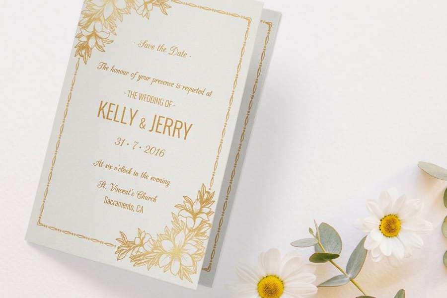
Palette paralysis usually comes from starting with a screen full of hex codes. Start with an object instead.
- Anchor on something physical. The stone of the venue, the wood of the reception hall, a flower that is actually in season on your date. A color that already exists at the wedding is a color that cannot clash with the wedding.
- Pick the paper white second. Bright white and natural ivory are two different starting points, and every ink you print sits on top of that choice. Ivory warms a cool grey blue into something softer and slightly muddier. Bright white keeps it crisp and makes warm tones look cleaner.
- Cap it at three inks. One base, one secondary, one accent. The paper is your fourth color, so you have more range than the number suggests.
- Give each color a job before you draw anything. Which one covers the most area, which one carries the type, which one appears once and stops. That is the 60-30-10 split, and it is the section below.
One limit worth naming: do not try to match a bridesmaid dress swatch exactly. Fabric dye and printing ink respond to light differently, so a pair that matches perfectly by a window can separate under warm reception bulbs. Get into the same family, then let a shared accent do the connecting. If the theme itself is still open, our roundup of popular wedding theme ideas is a faster way in than a color wheel, and designing the invitation is where the palette gets its first real test.
What Is Actually New in 2026 Wedding Colors
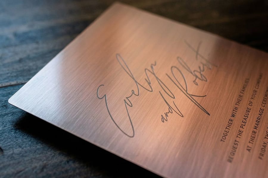
Pantone named Cloud Dancer, a soft warm white, its Color of the Year for 2026. For a wedding suite that is unusually convenient, because a soft white is not really an ink at all, it is a paper choice, and it slots straight into the largest share of the palette without adding a single press cost. Our piece on the Pantone Color of the Year covers where the shade came from.
Around that base, four directions keep showing up in stationery briefs: butter yellow, which prints cleanly and reads warm without going into gold territory; chocolate and mocha browns carried over from the previous cycle, which need a properly built rich mix or they go dull on uncoated stock; olive and sage greens, which are the most reliable performers in the whole trend list; and dusty blue, which is the one that most often needs a proof because blue is where CMYK conversion is least predictable.
The honest caveat about any trend: your photographs outlive the trend by decades. Keep the fashionable color in the 10 percent accent, where a foil monogram or an envelope liner carries it, and let the base and secondary be quieter shades you will still like at the anniversary. That is also the cheaper structure, because the accent is the smallest area on the sheet. Something like metallic invitations makes sense as one statement piece rather than as the treatment for every card in the suite.
Print and Design Considerations Before You Send the File

Five things decide whether the printed piece matches what you approved on screen.
- Build in CMYK, not RGB. A file left in RGB gets converted somewhere in the chain, and if you are not the one choosing the profile, you do not get to see the shift before it happens. Our guide to the best color profile for printing walks through the settings.
- Know when to pay for a spot color. Large flat fields, one exact brand shade, or a color that has to repeat across pieces ordered months apart. Two color printing with spot inks covers the economics, and matching Pantone to CMYK shows how close conversion gets when you skip it.
- Coated or uncoated changes the result. An uncoated sheet absorbs more ink, so colors read softer and slightly lighter. Coated stock holds saturation and makes deep tones look deeper. See cardstock and paper stock explained for the weights that go with each.
- Do not reverse hairline type out of a dark field. White script at a very light weight over four color coverage is where any tiny registration movement shows up as a colored fringe along the letters. Keep reversed text at a solid weight, and give delicate scripts a light background.
- Metallics are a finish. Gold mixed from process inks prints as mustard brown, every time. Foil, metallic ink or a metallic sheet is the only way to get actual shine, and it is a separate line on the order.
One more that saves reprints: a deep black background looks richer when it is built with other inks under the black rather than as black alone. Ask for a rich black build if a piece has large solid black areas, and keep small black type as plain black so it stays sharp.
Test the Colors on Paper, Under the Right Light
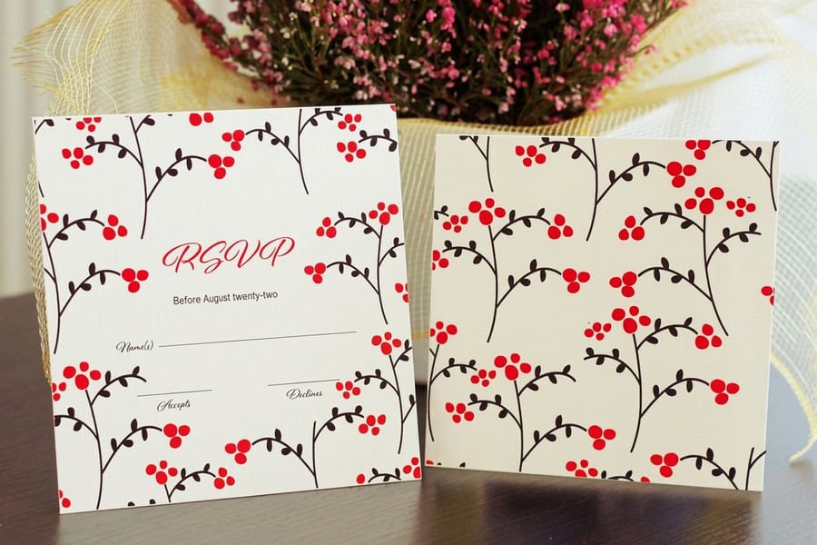
Two pieces of paper printed with the same file can look like two different colors under two different lights. The effect has a name in the trade, metamerism, and weddings run straight into it because the invitation gets opened in a kitchen at noon and the menu gets read by candlelight at nine.
Warm light is the one that moves things. Candles, tungsten bulbs and warm LEDs push cool colors toward grey and turn a bright white sheet cream. Grey blues suffer the most. Warm palettes, terracotta, ochre, camel, are almost immune, which is part of why they photograph so consistently at evening receptions.
The practical routine takes a day and settles the argument. Get a printed sample in your hands, look at it by a window in daylight, then look at it again in the room where the wedding happens if you can get in. Hold it next to the flower or the fabric rather than against a white desk, because a color sitting on white looks different from the same color sitting next to sage green. Ordering free wedding stationery samples is how you get the stock in hand before the full run, and printing a short run of RSVP cards from $19.77 is a low cost way to see your actual file on your actual paper.
The 60-30-10 Rule, Translated to a Wedding Suite
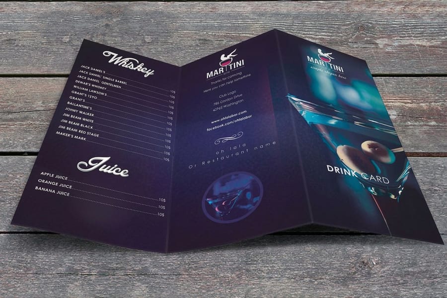
The rule says one color covers about 60 percent of the design, a second covers 30, and a third appears in 10. It came out of interior design, and it survives the trip to stationery with one important adjustment.
On paper the 60 is usually not an ink at all. It is the sheet. Choose ivory and your dominant color is ivory, whether or not you wrote it down as part of the palette. The 30 is the ink doing most of the visible work, the type, the rules, the motifs, the block of text on the menu. The 10 is the thing that appears once and stops: a foil monogram, an envelope liner, a painted edge, a single band of color across the top of the card.
The rule inverts cleanly if you want a dark invitation. A full bleed navy card makes ink the 60 and the paper disappears, which works, but then the white has to reappear somewhere else in the suite or the whole set feels heavy in the envelope. Print the reply card and the menus light against a dark invitation and the balance comes back. Same logic applies if you are building a monogram to carry across pieces, and our wedding monogram ideas show how a single accent mark ties a suite together without adding another color.
Carrying the Palette Across Every Piece You Print
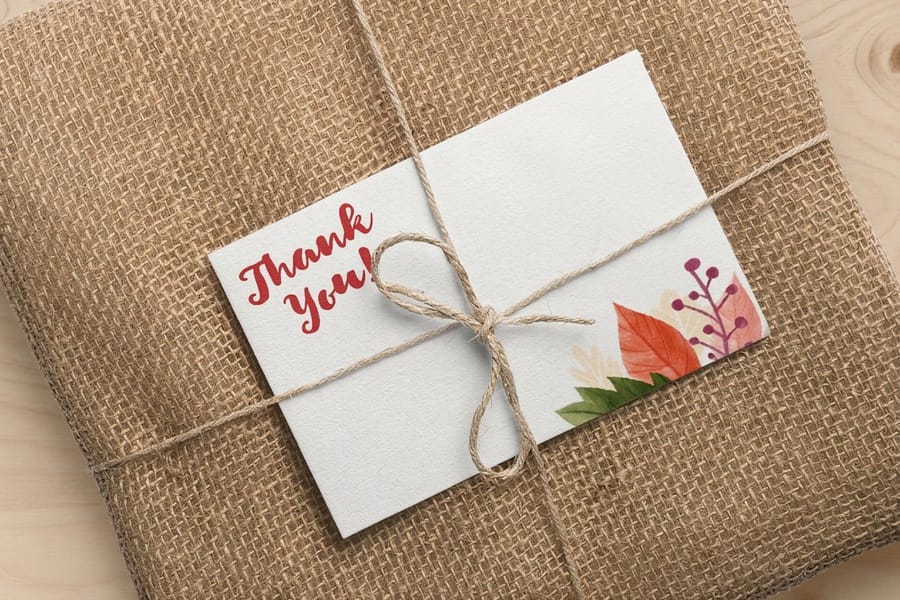
A wedding palette has to survive six or seven pieces printed across a year, which is where most schemes quietly fall apart. The failure is rarely the design. It is the paper changing between orders.
The sequence usually runs like this. Save the date cards from $19.77 go out six to twelve months ahead. Flat wedding invitations from $19.77, or folded wedding invitations from $38.22 when there is more to say, follow six to eight weeks before the day, usually with RSVP cards tucked in. Menus land at the reception. Flat thank you cards from $19.77 go out afterward, often months later.
Two habits keep those pieces looking like one family. First, lock the stock, not just the file: order every piece on the same paper even if the runs are separated by months, because the sheet is doing part of the color. Second, order together wherever you can, so pieces share a run and land within the same press conditions. If the budget only stretches to grouping some of them, group the ones that will be seen side by side, invitation, RSVP and details card, and let the thank you cards be the flexible one.
Everything for the suite sits in the wedding printing collection. For budgeting the whole set before you commit, what wedding invitations cost breaks down the quantity math, making save the dates covers the first piece, and writing thank you cards handles the last one.
Wally explains wedding palettes
Three colors, one paper, checked in real light

Wally picks the sheet first, because ivory and bright white are already a color decision. Then a base, a secondary for the type, and one accent he saves for a foil monogram. He builds the file in CMYK so nothing shifts on the way to the press, and he never tries to mix gold out of process inks. Last step is the one people skip: hold the printed sample by a window, then under the reception lighting, before ordering the whole suite.
Print your wedding invitations →Specs and pricing
Suite pieces, sizes, and starting prices
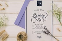
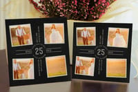
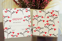
Configure the three pieces that carry most of the palette, with live options and starting prices straight from the 4OVER4.COM configurator.
Print it
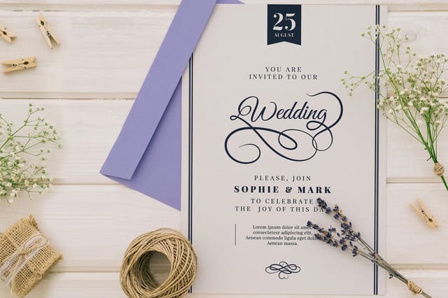
Order the suite in one palette

Explore more
Where to go next

By the numbers
Wedding printing you can count on at 4OVER4
Common Questions
Your wedding color questions, answered
How many colors should a wedding color palette have?
Three printed colors is the practical ceiling, and the paper counts as one more. A base that covers most of the piece, a secondary for type and motifs, and a small accent gives you enough range for a save the date, an invitation, an RSVP card, a menu and a thank you card without any of them looking busy. Four or five inks start to fight each other on a 5 by 7 card, and every extra color is one more thing that has to match across pieces printed weeks apart.
Will my wedding colors print exactly the way they look on my screen?
No, and the gap is largest with bright saturated shades. A monitor makes color by emitting light, paper makes it by absorbing some wavelengths and reflecting the rest, so a fluorescent coral or an electric blue that glows on screen comes back noticeably calmer in CMYK ink. Muted and earthy families reproduce closely. Build the file in CMYK rather than RGB, and order a printed sample before the full run if the exact shade is the point of the whole design.
Should I use Pantone spot colors or CMYK for wedding invitations?
CMYK is right for most suites. Spot color earns its cost in three situations: you need one exact shade that CMYK cannot hold, the design has a large flat field of a single color where any variation shows, or the same color has to repeat across pieces ordered months apart. Spot ink is mixed to a formula, so it lands the same every time. Our guide to two color printing with spot inks covers when the switch is worth paying for.
Do my invitation colors have to match the bridesmaid dresses exactly?
They cannot, so aim for the same family instead. Fabric dye and printing ink are different systems and they respond to light differently, which means a swatch that matches perfectly by a window can drift apart under a reception chandelier. Get close on the base color, then let a shared accent, a foil, an envelope liner, do the visible connecting work. Nobody at the wedding holds the card up against a dress.
Why do my save the dates look slightly different from my invitations?
Almost always the paper. Two runs weeks apart can sit within normal press tolerance and still read differently if the stock is not identical, because the sheet underneath is doing part of the color. A warm natural stock pushes a cool grey toward brown. Order both pieces in the same stock, and where budget allows order them at the same time.
What is the cheapest way to get metallic gold into a wedding palette?
Print the gold as a foil accent on one piece rather than across the whole suite. Flat wedding invitations start at $19.77 in standard ink, and adding a metallic effect on every piece multiplies that quickly, with metallic invitations starting at $317.44. Putting the metal in the 10 percent, a monogram, a border, an envelope liner, gives you the shine at the smallest possible footprint, and the rest of the suite stays in ordinary ink.
Get Started
Ready to see your palette on paper?
Pick your stock, set your colors in CMYK, and print the invitations, RSVP cards and thank you cards as one matching suite.
Legal Disclaimer
Gold Standard guarantees apply to all standard orders placed through 4over4.com. Price match requires verifiable proof of a competitor's published price for an equivalent product with matching specifications and turnaround time. Satisfaction guarantee covers manufacturing defects and print quality issues. Contact support with order number and documentation. On-time delivery rate based on tracked orders 1999 to 2026. Individual results may vary based on shipping carrier performance.
