
What the Pantone Color of the Year Is and How to Print It


Emma is our prepress and print production voice, built from the knowledge of our production team, with over 20 years in printing.
One shade, named every December by the Pantone Color Institute. Someone decides it each year, the number will not match an ink book, and 2026 Cloud Dancer behaves in a particular way on paper. This guide shows which stock, which product and which setting to pick on the order form so the shade prints the way you expect.
The Pantone Color of the Year is a single shade the Pantone Color Institute names each December for the year ahead, chosen from a year of tracking design, materials, film, travel and mood. For 2026 it is PANTONE 11-4201 Cloud Dancer, a soft warm white at #F0EEE9, announced on 4 December 2025 and the first white in a program that has run since 2000. It is a forecast, not a printing standard, and the number is a dyed cotton chip with no matching ink on a coated shelf. For layouts and palettes built around this year's shade, read our take on the Pantone Color of the Year 2026 in print.
Quick answer
A forecast with a number that no ink can match
Every December the Pantone Color Institute names one color for the coming year, and for 2026 it is PANTONE 11-4201 Cloud Dancer. Pantone publishes that value in its textile system, as a chip of dyed cotton, and no coated ink shelf carries a can with that number. To get it onto paper you either convert it to a process build, mix a custom spot ink, or choose a stock already in that tone. With a near-white like Cloud Dancer the stock route wins almost every time, because a six percent tint is the least reliable thing you can ask a press to hold evenly.
Who Picks It, When, and What It Is Actually For

The choice belongs to the Pantone Color Institute, the consulting arm of Pantone rather than the part that sells ink books. A small group meets privately, usually somewhere in Europe, and argues from a year of collected evidence: product and runway launches, film and television art direction, new materials, textile mills, travel, art shows, and the general mood people are in.
They announce in early December, which is the part that matters commercially. A paint company, a phone case manufacturer and a paper mill all need lead time to have stock on shelves by spring, so the color has to be public before the year it names begins. Cloud Dancer went out on 4 December 2025.
Read it as a forecast with a marketing engine attached. Pantone is not inventing the shade; it is naming one that is already gathering speed, then giving the industry a common word for it. That is genuinely useful if you sell into design-led categories and genuinely irrelevant if you print safety signage. Nothing about the announcement changes ink chemistry, press behavior or any printing standard, and no press runs differently on 2 January because of it.
The one place it does touch production is the vocabulary. A client who says make it Cloud Dancer is handing you a chip number from a system that has no printing-ink twin, which is where most of the confusion starts. Our guide to 2-color printing with Pantone and spot inks covers what a real spot ink is and what it costs to add one.
The Recent Picks, and What Each One Does on Paper

The program started in 2000 with PANTONE 15-4020 Cerulean Blue and has produced one color a year since, with a single exception: 2021 got two, Ultimate Gray 17-5104 paired with Illuminating 13-0647. Looking at the last few in a row tells you more than any one of them alone, because the difficulty of printing them varies enormously.
| Year | Color | Character | How it behaves in print |
|---|---|---|---|
| 2026 | Cloud Dancer 11-4201 | Soft warm white, #F0EEE9 | The hard one. Too light to hold as a tint, so it wants to come from the stock or a flood. |
| 2025 | Mocha Mousse 17-1230 | Mid warm brown | Comfortable. Sits well inside CMYK and stays consistent across coated and uncoated. |
| 2024 | Peach Fuzz 13-1023 | Pale warm peach | Prints easily but shifts noticeably on uncoated stock, which drinks it and cools it down. |
| 2023 | Viva Magenta 18-1750 | Deep saturated red-pink | Sits near the edge of the CMYK gamut. A four-color build reads duller than the chip. |
| 2022 | Very Peri 17-3938 | Blue-leaning violet | The classic gamut problem. Vivid violets need a spot ink to look like the swatch. |
The pattern in the last column is the useful part. Anything deep and saturated, like Viva Magenta or Very Peri, loses energy when it is built from four process inks, because those colors live outside what cyan, magenta, yellow and black can reach together. Anything mid-tone and earthy reproduces almost exactly. Anything very pale is a different problem entirely, which is what 2026 hands us. If you want the mechanics behind that, choosing the right color profile explains what your file is actually promising the press.
Printing Cloud Dancer, the First White Pick

The announcement coverage never mentions that. In four-color printing, white is not an ink. White is the paper. So a white Color of the Year is not something you print, it is something you buy.
The numbers make the order form decision for you. Cloud Dancer is #F0EEE9, RGB 240, 238, 233, roughly six percent down from a bright sheet, and a process build of it comes out near a 4 to 6 percent dot, mostly black with a whisper of yellow. On a proof that dot can break up, ghost, or drift between the front and back of the run, and across a large flat area the gap between 4 and 6 percent shows as mottle, so before you pick a stock, decide whether the shade will come from paper or from ink.
Then there is the edge. Put a Cloud Dancer panel on a white sheet and the boundary between tint and bare paper reads as a faint gray rectangle, which is the opposite of the calm, unbroken effect anyone choosing this color was after. Three routes actually work:
- Buy it as stock. A warm uncoated or natural sheet gives you the tone at zero coverage cost, with no dot to go inconsistent. This is the honest answer for most jobs.
- Flood the whole panel. If it must be ink, run it edge to edge so there is no boundary against raw paper. Bleed it fully rather than leaving a border.
- Mix a custom spot ink. Solid, even, repeatable, and it needs its own unit on press, so it earns its keep on long runs and not on a box of 250 cards.
On our order forms the stock route comes down to a handful of warm or textured sheets, all offered on standard postcards and standard business cards:
| Stock on the order form | What it does for Cloud Dancer | Where to order it |
|---|---|---|
| 14pt Cream Uncoated Cover (30% PCW) | Gives the warm white at zero ink coverage on a standard weight card | Postcards, from 50 |
| 18pt Cream Uncoated Cover | The same warm tone on a stiffer sheet for a card you hand over | Business cards, from 100 |
| 14pt White Linen, 18pt Premium White Linen | Adds texture, so a near-white reads as a choice and not as blank paper | Postcards and business cards |
| 16pt Gloss Cover with a full flood | The ink route: bleed the tone edge to edge so no border shows | Postcards and business cards |
One more practical note: send the file in the right mode. A near-white that looks correct on your monitor can land somewhere else once it converts, and the CMYK and RGB difference is where most of that surprise comes from. Set the tone in a correctly sized layout from our blank template library, then proof it on the actual stock. Standard postcards start at $16.48 and standard business cards at $17.57, which makes a short proof run cheap enough that guessing is the expensive option.
Using a Trend Color Without Dating Your Print
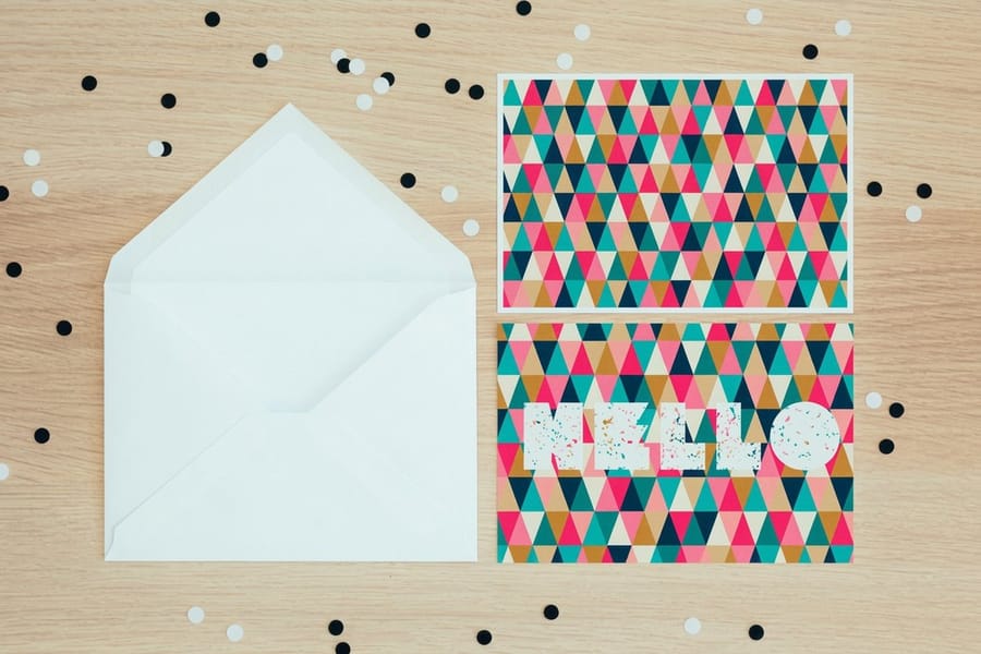
The failure mode is predictable. A business hears the announcement in December, repaints the logo, reprints everything, and by the following autumn every piece it owns looks like a specific twelve-month window. Trend color belongs in the parts of your printing you reorder anyway.
That means seasonal campaigns rather than permanent identity. Postcard drops, event posters, a booth backdrop, retail packaging, the interior spreads of a brochure you refresh each year. Those are all pieces with a natural expiry, so a color with a shelf life fits them. Standard brochures start at $57.11 and standard posters at $108.75, which is the right kind of money to attach to a twelve-month idea.
Proportion is the other half. A trend shade works best carrying perhaps ten to fifteen percent of the piece, or acting as the ground everything else sits on, rather than shouting from the middle. Cloud Dancer is unusually well suited to the second job precisely because it is nearly white: it is a room, not a piece of furniture. Pair it with something that has actual contrast, since a near-white next to a light gray gives a reader nothing to focus on. The pairings in our guide to color combinations that work in print are a better starting point than a mood board, and if you are planning a seasonal run, the holiday color palettes collection gives you thirty tested sets.
Keep it away from anything that has to be read at distance or matched years later. Signage, vehicle graphics, safety marking and your primary logo color should be chosen for contrast and legibility, and then left alone. If you want the trend on something people hold, put it on a card stock instead and let the tone do the work. The full range of options is on the business card printing page.
Wally explains the Color of the Year
One shade a year, and 2026 picked the one you cannot print
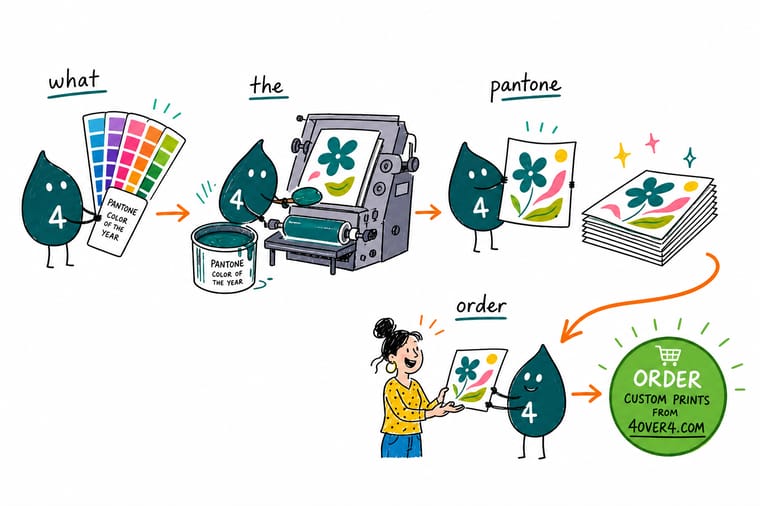
Every December Pantone names a color for the next year. Wally holds up the 2026 chip, Cloud Dancer, and finds a soft warm white. On a press white is not an ink, white is the paper, and this one sits only about six percent below a bright sheet. Build it in CMYK and you get a 4 percent dot that mottles and shows a gray edge where it meets bare stock. So Wally puts the ink can down and picks a warm paper instead. Same color, none of the trouble, and the sheet never goes streaky.
Order postcards and proof the tone →
Specs and pricing
Stocks, sizes, and starting prices for a color test
The cheapest way to settle a color argument is to print it. Postcards come in 14 sizes from 50 pieces, business cards in 4 sizes from 100, both with cream uncoated and linen stocks for a warm white, and brochures in 6 sizes from 50 on gloss, silk or uncoated text. Each widget reads the live 4OVER4.COM configurator.



Print it
Put the palette on paper
Test the shade small, then scale it: a run of 50 postcards on cream uncoated stock, 100 business cards on 18pt cream, then posters from 11 by 17 to 22 by 28 inches for the seasonal wall.




Explore more
Where to go next
The spot ink guide explains when a custom ink pays for its press unit, the CMYK and RGB guide covers why a near-white shifts on export, and the color pairing guide gives contrasts that hold up next to Cloud Dancer.




By the numbers
Who matches your color, in numbers
Common Questions
Your Color of the Year questions, answered
What is the Pantone Color of the Year?
It is one shade the Pantone Color Institute selects and announces each December for the following calendar year. The program began in 2000 with PANTONE 15-4020 Cerulean Blue and has run every year since. The pick is a trend forecast aimed at fashion, product, interiors and graphic design, not a technical specification. Nothing in it changes ink chemistry, press behavior or any printing standard.
What is the Pantone Color of the Year for 2026?
PANTONE 11-4201 Cloud Dancer, announced on 4 December 2025. It is a soft, slightly warm white with a hex value of #F0EEE9 and RGB of 240, 238, 233. It is the first white Pantone has chosen since the program began in 2000, following Mocha Mousse in 2025 and Peach Fuzz in 2024.
How does Pantone choose the Color of the Year?
A small group inside the Pantone Color Institute meets privately, usually in a European city, and works from what its color analysts have been collecting all year: runway and product launches, film and television art direction, materials and textiles, travel destinations, art exhibitions, even socio-economic mood. They are not inventing a color so much as noticing which one is already gathering momentum, then naming it early enough for manufacturers to build stock around it.
Can a printer match the Color of the Year exactly?
Not from the published number alone. Color of the Year values are issued as TCX chips in the Fashion, Home and Interiors system, which is dyed cotton, and coated printing inks live in a different book with different numbers. A print shop either converts the value to a CMYK build, mixes a custom spot ink to match the chip, or picks a paper stock already in that tone. Which route makes sense depends on run length and how much of the sheet the color has to cover.
Why is a white Color of the Year hard to print?
Because on white paper it is barely there. Cloud Dancer is about six percent darker than a bright sheet, so building it in CMYK produces a very light tint, roughly a 4 to 6 percent dot. Dots that small are the first thing to go inconsistent on press, and any edge where the tint meets bare paper reads as a faint gray box. Either flood the whole panel so there is no edge to see, or buy the tone in the stock instead of laying it down as ink.
Should I redesign my brand around the Color of the Year?
No. A brand palette has to survive a decade of reprints, and a trend color is designed to feel current for about twelve months. Use it in the things you reorder anyway: postcard campaigns, seasonal packaging, event posters, one wall of a booth. Keep your permanent marks, signage and vehicle graphics on colors you chose for legibility and contrast, not for the calendar.
Get Started
Postcards run 50 for $16.48, enough to proof a palette
Pick your stock, upload the artwork, and print a short run before you commit a whole campaign to a shade you have only seen on a screen.
Legal Disclaimer
Gold Standard guarantees apply to all standard orders placed through 4over4.com. Price match requires verifiable proof of a competitor's published price for an equivalent product with matching specifications and turnaround time. Satisfaction guarantee covers manufacturing defects and print quality issues. Contact support with order number and documentation.
