
25 Wedding Invitation Ideas for Every Theme and Style


Sofia is our design and templates voice, built from the knowledge of our production team, with over 20 years in printing.
What Goes on a Wedding Invitation Before You Pick a Style
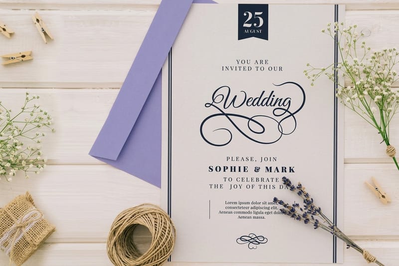
The 25 wedding invitation ideas below sort by theme, classic, rustic, modern, seasonal and finish-led, and each one prints as one of three types of wedding invitation: a flat card, an embossed card or a foil card. Before it has a style, an invitation has a job: it has to say who is marrying, who is hosting, what date and time to arrive, where to go, and how formal the day will be. Get those five answers right and the design can go anywhere you want it to. Get them wrong and the loveliest paper in the world still triggers a hundred clarifying text messages.
Most couples start with a picture in their head: a color, a script font, a photo saved months ago. That is a fine place to begin. But the practical pieces underneath decide how the suite prints, how many cards you order, what envelope size fits, and whether the finish you fell for survives a mailbox in July.
4OVER4.COM has printed 10 billion+ cards and print pieces since 1999, and invitation suites are among the steadiest things we run. That shows up in small ways: the sheet weight that keeps a 5 x 7 card from bowing in the envelope, the coating that keeps a deep navy background from scuffing in transit, the trim tolerance that keeps a foil border even on all four sides. Every idea below is tied to a stock and a finish we actually print, so you can move from a picture you like to a card you can order without guessing.
Settle the hosting line first
Who is hosting sets the voice of the entire card. Parents hosting reads formal and third person. A couple hosting themselves can be warmer and more direct. Blended families usually need one carefully built line rather than a stack of names, so write that line before anyone opens a design file.
Decide which pieces the suite needs
A minimum suite is the invitation plus a reply card and its envelope. Add a details card when parking, hotel blocks, or a shuttle need explaining. If you are collecting replies on paper, our wedding RSVP wording examples will save you a round of edits.
Lock the size and the envelope together
5 x 7 is the standard because A7 envelopes are everywhere and postage stays predictable. Square cards and oversized panels look wonderful and cost more to mail. Choose the shape knowing the envelope, not the other way around, and order a few extra of both for calligraphy mistakes.
Choose the finish last
Finish is the final decision, not the first. Once wording, size, and color are set, you can tell whether the design wants pressed texture, metallic shine, or clean flat ink. Picking finish first tends to force the layout into a look it was never designed for.
Shop the day
Wedding printing collection
Invitations, save the dates, menus, programs, and signage built for the whole celebration.
Types of Wedding Invitation and What Each One Costs
Every idea on this page prints as one of three types of wedding invitation. The type sets the size range, the stock, the smallest order and the starting price, so pick it before you fall for a layout.
- Flat wedding invitations. A single printed card in 4.25" x 5.5", 5" x 7" or 6" x 6", on ten stocks from 14pt Gloss Cover to 24pt Ultra Thick Gloss Cover and 18pt Cream Uncoated Cover. From $19.77 for 25, and 100 cost $42.84, which suits most guest lists.
- Embossed wedding invitations. The design pressed into 16pt Silk, Gloss or Velvet Laminated stock, in sizes from 4" x 6" to 5" x 7" and larger. From $220.20 for 100, the right type for ideas 1 and 22 on this page.
- Foil wedding invitations. Metallic leaf on 16 Point Silk Laminated or 14pt Uncoated Cover, in 4" x 6", 4.25" x 5.5", 4.25" x 6" or 5" x 7". From $421.91 for 500, built for ideas 15, 21 and 25.
Each type prints full color on the front, and flat and foil cards can carry black or full color on the back for a pattern or a line of your vows. Upload your finished artwork, or start from a design template and set your own wording.
Classic and Elegant Wedding Invitation Ideas
Classic does not mean plain. It means restraint used on purpose: generous margins, one serif face doing the heavy lifting, and ink colors you could describe in a single word. The elegance comes from spacing and paper quality rather than ornament, which is why a classic card is unforgiving of a rushed layout and gorgeous when the layout is right.
These ideas suit ballrooms, cathedrals, country clubs, and any evening wedding with a dress code. Print them on Embossed Wedding Invitations when you want the type to sit up off the sheet, or keep costs level with Flat Wedding Invitations on a heavy uncoated stock that still feels substantial in hand. Both start from our custom wedding invitations, where you set the size and paper.
- 1. The engraved-look monogram crest. A two-letter monogram centered above the hosting line, embossed so it catches light before anyone reads a word.
- 2. Ivory and charcoal only. Warm ivory stock, charcoal ink, no third color anywhere in the suite. Quiet, expensive-looking, and impossible to date.
- 3. A thin double border. Two hairline rules framing the text block, one slightly heavier than the other. Old stationery houses have used this trick for a century.
- 4. Centered script over small caps. Names in a formal script at twice the body size, everything else in letterspaced small caps for calm contrast.
- 5. A vellum overlay with a wax seal. Translucent sheet over the printed card, sealed at the fold so guests unwrap the invitation instead of just opening it.
If you want one upgrade rather than five, spend it on the paper. A classic layout on a thin sheet reads as a template, while the same layout on a heavy cotton-feel stock reads as a keepsake. Order a printed sample before committing the full guest count, then hand it to someone who is not in the wedding and watch what they touch first.
Print picks
Three wedding invitation formats worth comparing
Live prices, ready to customize with your wording, stock, and finish.
 Flat Wedding Invitations 25 for $19.77 The workhorse single-panel card that suits almost any theme or budget.
 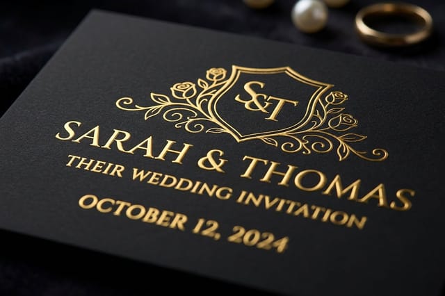 Embossed Wedding Invitations 100 for $220.20 Raised type and motifs pressed into the sheet for a heirloom feel.
 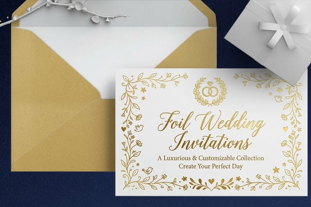 Foil Wedding Invitations 500 for $421.91 Real metallic leaf in gold, silver, or rose for a black-tie entrance.
 Rustic Wedding Invitation Ideas
Rustic wedding invitations work when the paper does part of the storytelling. Natural kraft tones, uncoated surfaces, and hand-drawn elements set the expectation of a barn, an orchard, a lakeside lawn, or a backyard with string lights. The trap is clutter, because every rustic motif tempts you to add one more sprig.
Keep the type simple and let texture carry the theme. A warm uncoated stock printed with one deep ink color does more for a farm wedding than four illustrations fighting for the same corner.
- 6. Kraft stock with white ink. Reverse the usual contrast. White type on a natural brown sheet feels handmade without a single illustration.
- 7. Pressed wildflower border. Scanned real stems arranged loosely around three edges, leaving the fourth open so the card can breathe.
- 8. Hand-lettered names, typeset details. One artist-lettered element at the top, clean typography everywhere else, so the card stays legible for older guests.
- 9. Torn-edge deckle look. A soft irregular edge on a heavy sheet that suggests handmade paper while still feeding cleanly through the mail.
- 10. Twine and tag suite. Invitation, details card, and reply card bundled with twine and a small printed tag carrying the couple's names and date.
Modern and Chic Wedding Invitation Ideas
Modern invitations trade ornament for confidence. Big type, asymmetric layouts, unexpected color, and a lot of empty space. They photograph beautifully in flat-lay shots and they suit city venues, rooftops, museums, and any celebration where the aesthetic is deliberate rather than traditional.
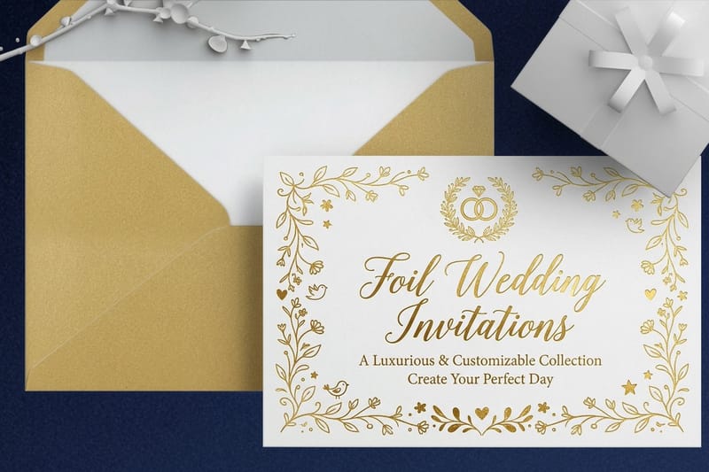
Bold looks need bold production. A saturated background wants a stock that holds heavy coverage without cracking at the fold, and a metallic accent on a dark card is exactly what Foil Wedding Invitations are built for.
- 11. Oversized names, tiny details. Two first names filling most of the card, ceremony details set small and neat in one bottom corner.
- 12. Full-bleed color block. A single saturated field of terracotta, olive, or ink blue with the type reversed out in white.
- 13. Editorial grid layout. Text aligned hard left in two columns like a magazine spread, with one rule dividing ceremony from reception.
- 14. Duotone photograph. An engagement photo reduced to two colors so it reads as graphic art rather than a snapshot.
- 15. Metallic foil on matte black. Gold or rose leaf on a deep matte sheet, the highest-contrast pairing in the entire invitation world.
Three small modern touches that cost almost nothing to add:
- Print the back. A repeating pattern, the wedding date, or a single line of the vows turns a blank reverse into part of the design.
- Change one word's weight. Setting only the date in a heavier cut gives the eye somewhere to land without adding color.
- Letterspace the venue line. Wide tracking on a single line of small caps instantly reads as considered rather than default.
Seasonal and Destination Invitation Ideas
Season and location are the easiest themes to design around because guests already have a mental picture. A winter wedding invitation can lean deep and jewel-toned. A coastal ceremony can go pale and airy. Destination weddings carry an extra job, which is convincing people to book flights, so the card has to feel like an invitation and a small brochure at once.
Timing matters more than style here. Local weddings usually mail six to eight weeks out, and destination weddings need three months or more so guests can arrange travel. If you are still that far ahead, pair the suite with a teaser mailing and borrow a concept from these save the date ideas before the formal invitation goes out.
- 16. Evergreen and cranberry winter suite. Deep green stock cues, warm red accents, and a heavier sheet that suits a candlelit December ceremony.
- 17. Pale bloom spring card. Washed watercolor petals in the top corner only, with the rest of the card left generously white.
- 18. Coastal sand and sea glass. Sand-toned paper, soft aqua ink, and a single hand-drawn shoreline rule under the names.
- 19. Illustrated venue map. A simple line drawing of the island, town, or vineyard printed on the details card so travel feels planned rather than assumed.
- 20. Passport-style folded suite. A folded piece that opens like a travel document, with ceremony, reception, and lodging revealed panel by panel.
Quantity and price
Flat wedding invitation pricing and specs
Real configurator numbers. Order by household and the per-card price falls as the count rises.
| Quantity | Price Per Unit | Total |
|---|---|---|
| 25 | 79.1¢ | $19.77 |
| 50 | 50.5¢ | $25.27 |
| 100 | 42.8¢ | $42.84 |
| 200 | 25.8¢ | $51.62 |
| 300 | 20.1¢ | $60.42 |
| 400 | 17.3¢ | $69.20 |
Foil, Letterpress, and Embossed Finish Ideas
Finish is where an invitation stops being a printed page and starts being an object. Foil adds metallic shine that changes with the light. Letterpress presses ink into the sheet so the type sits below the surface. Embossing raises the design without ink at all. Each one asks something different of the artwork, and each one is worth choosing deliberately.
A useful rule: pick one finish and let it dominate. Foil names plus embossed border plus a heavy texture is three ideas competing on a 5 x 7 card. Choose the one that matches your headline element and print the rest clean on Embossed Wedding Invitations or a flat sheet.
- 21. Foil names only. Metallic leaf reserved for the two names, every other line in flat ink, so the shine has a clear job.
- 22. Blind embossed monogram. No ink at all, just the raised shape of your monogram catching a shadow in the top center of the card.
- 23. Letterpress on cotton. Deep impression into a thick soft sheet, the finish guests instinctively run a thumb across.
- 24. Foil-edge painting. Metallic applied to the four cut edges of a thick card so the suite glints when it sits in a stack.
- 25. Two-tone metallic. Gold for the names and a soft rose for the flourish, a pairing that reads rich without turning costume.
Premium finish
Foil wedding invitations
Real metallic leaf that shifts with the light, at its best on deep matte stock with restrained type.
Paper Stocks That Change How an Invitation Feels
Guests judge an invitation with their hands before they read a line of it. Two suites with identical artwork can feel entirely different depending on the sheet underneath, and stock is usually the cheapest upgrade available to a couple who wants the card to feel expensive. Here is what the common choices actually do.
If you are torn between two, order a printed sample of each on the same artwork. Screens flatter everything equally, and a stock decision made on a monitor is a coin flip.
- Heavy uncoated. Matte, slightly toothy, and easy to write on. The safest choice for classic and rustic themes alike.
- Cotton-feel soft stock. Plush and absorbent, the natural partner for letterpress because it takes a deep impression.
- Kraft. Natural brown fiber that darkens light inks, so design for white and metallic rather than pastels.
- Silk matte coated. Smooth with almost no glare, ideal when the card carries photography or heavy color coverage.
- Double-thick board. Two sheets bonded for a card that stands on its own edge and signals formality instantly.
Feel the difference
Embossed wedding invitations
Type and motifs pressed into a heavy sheet, so guests register the texture before they read a word of it.
Wording, Fonts, and Monograms That Tie the Suite Together
The theme survives or dies in the typography. A rustic card set in a cold geometric face fights itself, and a black-tie card set in a casual script never quite lands. Pick two typefaces at most, give one of them all the emphasis, and use size and spacing rather than extra fonts to build hierarchy.
Wording follows the same logic. Formal suites keep dates and times spelled out, drop abbreviations, and name hosts in full. Relaxed suites can use numerals and a warmer voice. Whichever register you choose, use it across every piece in the suite so the reply card sounds like it came from the same wedding.
- One script, one serif. Script for names only, serif for everything else. Two families is plenty for any invitation.
- Letterspace the small stuff. Venue and date lines in tracked small caps read as intentional instead of leftover.
- Build a monogram you can reuse. The same mark belongs on the invitation, the menu, the napkins, and the thank you notes. See these wedding monogram ideas for shapes that scale.
- Test the script at final size. Many wedding faces look beautiful at 60 point and turn illegible at 11. Compare candidates in these wedding font picks.
- Proof the numbers out loud. Read the date, the time, and the street number to someone else. Almost every reprint we see traces back to one of those three.
Compare finishes
Popular wedding print pieces, side by side
Stock, finish, size, quantity, turnaround, and price in one view so the suite stays consistent.
| Flat Wedding Invitations | 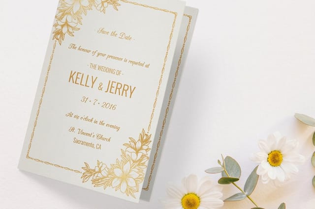 Folded Wedding Invitations | 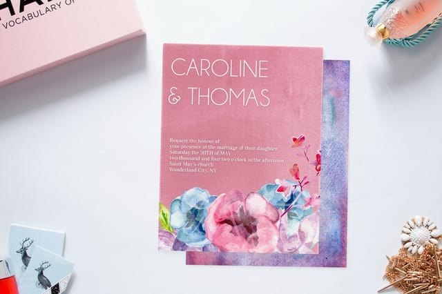 Velvet Wedding Invitations | 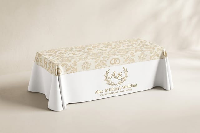 Wedding Table Covers | |
|---|---|---|---|---|
| Min price | $19.77 | $38.22 | $251.36 | $225.00 |
| Paper / stock | 14pt Gloss Cover | 14pt Gloss Cover | 16 Point Soft Velvet Laminated | 9oz Premium Polyester |
| Finish | Standard Finish | Standard Finish | - | - |
| Size | 4.25" x 5.5" | 8.5" x 5.5" fold to 4.25" x 5.5" | 4.25" x 5.5" | 84" x 126.5" (6ft Table) |
| Default qty | 25 | 25 | 500 | 1 |
| Turnaround | 3 business days | 5 business days | 7 business days | 4 business days |
| Rating | ||||
| View & customize | View & customize | View & customize | View & customize |
Sizes, Suite Counts, and Printing It in Time
Order by household, not by guest. A couple sharing an address receives one invitation, which usually means the quantity you need is closer to sixty percent of your guest list. Then add ten to fifteen extras for calligraphy errors, keepsakes, the photographer, and the late additions every wedding produces.
Give yourself a real calendar. Design and proofing take a week or two of back and forth, printing and shipping take days, and addressing takes longer than anyone expects. Mail six to eight weeks before a local wedding and twelve weeks or more for a destination, then set the reply deadline three weeks before the caterer needs a final count. The showers and parties before the wedding get their own cards, and these cute shower and party invitation ideas cover them.
Match the format to the theme
- Formal evening. 5 x 7 flat card on double-thick stock with an embossed or foil accent and a lined envelope.
- Rustic daytime. 5 x 7 kraft or uncoated card, one ink color, twine wrap optional.
- Modern city. Square or oversized panel with a full-bleed color field, priced for the extra postage before you commit.
- Destination. Folded suite that carries travel details inside so one mailing answers everything.
Start fast
Invitation templates and print-ready blanks
Free layouts plus exact-size blanks so your artwork lands inside the trim on the first proof.

Wally helps you narrow 25 ideas down to one card
Pick the theme, then the stock, then the finish
Stuck between styles? Work in that order and the choice gets easy. The venue and time of day set the formality, the stock decides how the card feels in a guest's hand, and the finish is the last flourish you add to a layout that already works. Order printed samples of your final two, judge them in daylight, then print the suite once with confidence.
Design your wedding invitations →What to Remember Before You Order the Suite
Explore more
More wedding print planning across 4OVER4.COM
Twelve pages for the rest of the suite: the three invitation finishes, RSVP wording, save the dates, wedding fonts and monograms.
Collection Wedding Printing Collection Invitations, save the dates, menus, programs, and signage. Product Flat Wedding Invitations The single-panel card that fits nearly every theme and budget. Product Foil Wedding Invitations Real metallic leaf in gold, silver, or rose for evening weddings. 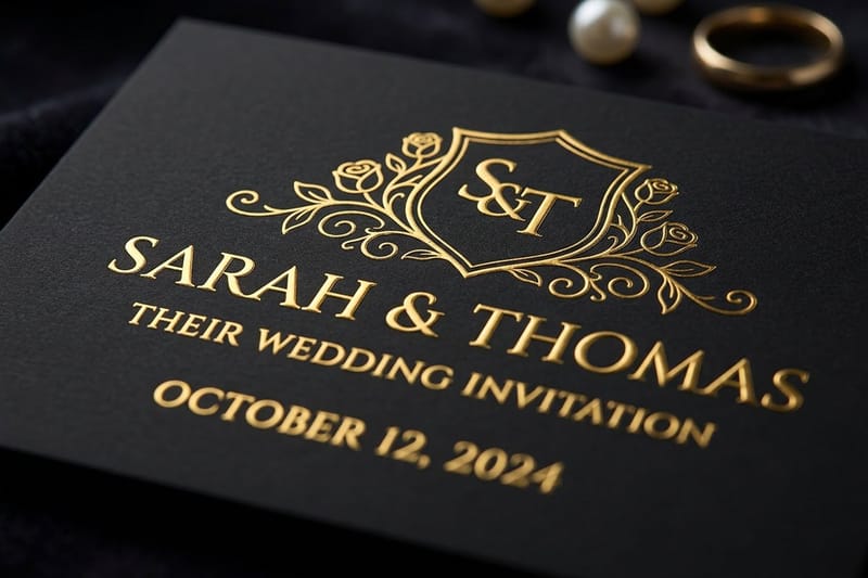 Product Embossed Wedding Invitations Raised type and motifs pressed into a heavy sheet. Article Wedding RSVP Wording Reply card wording that actually gets returned on time.
 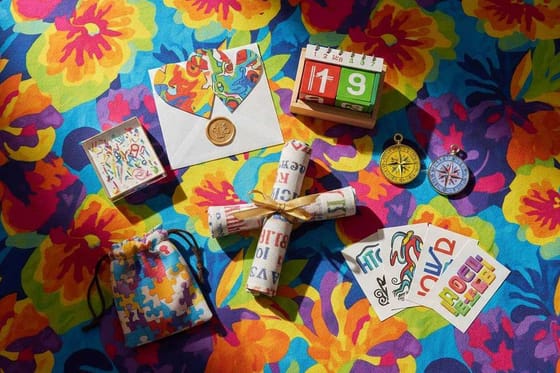 Article Save the Date Ideas Seven teaser mailings guests keep on the refrigerator.
 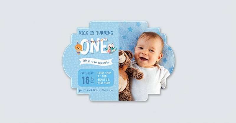 Article Best Wedding Fonts Typefaces that stay legible at invitation size.
 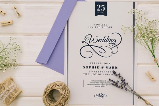 Article Wedding Monogram Ideas One mark that carries across the whole stationery suite.
 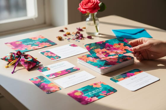 Alternative 4OVER4 vs MOO Invitations How the two compare on stocks, finishes, and quantities.
  Article What to Write in a Card Fifty message ideas for the notes that follow the wedding. Article Print Marketing Ideas How small studios and vendors use print to fill a calendar. Articles Events and Seasonal Printing Every guide we publish for weddings, parties, and holidays.
 Turn one of these 25 ideas into your invitation
Choose your theme, set the wording, then pick the stock and finish that match the venue. Configure the size and quantity you need and see live pricing before you order.
Wedding Invitation Questions, Answered
What should a wedding invitation include?
Every invitation needs five things: who is hosting, who is marrying, the date and time, the venue with its city, and a signal about dress code or formality. Anything else belongs on a details card. Reply instructions go on the reply card with its own addressed envelope, or on a single line pointing guests to your wedding site. For complete sample lines, copy from these traditional wedding invitation wording examples. Keep the invitation itself uncluttered and let the supporting pieces answer the logistics, and see our RSVP wording examples for the reply card language.
What are the most popular wedding invitation styles?
Four families cover almost every wedding. Classic and elegant leans on serif type, ivory stock, and thin borders. Rustic uses kraft or uncoated paper with botanical or hand-lettered elements. Modern and chic goes big on type, color blocks, and empty space. Formal luxe adds foil, letterpress, or embossing to a restrained layout. Most couples end up blending two, usually a classic layout with one modern or textural upgrade, which is a reliable place to land.
How much do custom wedding invitations cost?
It depends on finish and quantity more than design. At 4OVER4.COM, Flat Wedding Invitations start at $19.77, Embossed Wedding Invitations start at $220.20, and Foil Wedding Invitations start at $421.91, with per-card pricing dropping as quantity climbs. Because you order by household rather than by guest, the count is usually smaller than couples expect. Configure your size, stock, and quantity on the product page to see the live price before you commit to a finish.
How do I choose the right invitation style for my wedding?
Start with the venue and the time of day, because those set formality faster than any color palette. An evening ballroom supports foil, embossing, and heavy stock. A daytime farm or garden reads better on uncoated or kraft paper. Then match typography to that decision and pick a single finish to carry the whole look. If two options still tie, order printed samples of both and judge them in your hand rather than on a screen.
How long does printing and shipping take for wedding invitations?
Production time depends on the product, the finish, and the turnaround you select at checkout, and specialty finishes like foil and embossing take longer than flat printing. Build in a week or two for design and proofing before that, plus real time for addressing and stuffing envelopes. A safe plan mails six to eight weeks before a local wedding and twelve weeks or more for a destination, with the reply deadline set three weeks before your final headcount is due.
