
Pantone Spot Color Printing for Brand Accurate Business Cards


Emma is our prepress and print production voice, built from the knowledge of our production team, with over 20 years in printing.
A Pantone number is an ink recipe, and CMYK is four screens of dots pretending to be it. The pretense drifts for a measurable reason, some colors are out of reach entirely, and a correctly built file prints your brand color exactly.
Pantone spot color prints your brand color as one pre-mixed ink from its own plate, so it lands on the published recipe every time. CMYK builds an approximation of that color from four screens of dots, and dot gain, ink density and paper absorbency move the approximation slightly on every run. Use spot when the color is written into brand guidelines by number, when it sits outside the process gamut, or when the job is one or two colors. Use CMYK when the card carries photographs, or when the run is too short to pay for a plate.
Quick answer
One mixed ink, or four screens guessing at it
Spot color removes the guesswork by removing the simulation. Your brand color arrives at the press already mixed and prints from a single plate, so the third reprint matches the first box; on our metallic ink cards that means PMS 877 silver or PMS 872 gold, alone or alongside CMYK. A process build assembles the same color from cyan, magenta, yellow and black dots, and each of those four screens carries its own small variation, which stacks into a shift you can see on a flat field. Fluorescents and metallics have no process equivalent at all, and colors at the edge of the gamut, including bright orange and reflex blue, come back dull. The trade is plates against run length, and the diagram below shows exactly where the drift comes from.
What a Pantone Color Actually Is

A Pantone color is an ink recipe, not a description. The Pantone Matching System publishes a fixed set of base inks and, for every numbered color, the proportions used to mix them. A printer weighs those bases, mixes the ink, and puts that one ink on the press. Nothing is simulated and nothing is approximated.
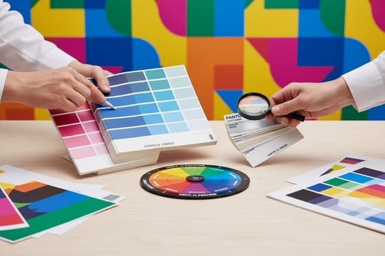
The number is only half the specification. The letter after it matters just as much. PANTONE 286 C and PANTONE 286 U are the same mixed ink printed on two different papers. Coated stock holds the ink on the surface, so it reads deep. Uncoated stock drinks it, so the identical ink comes back lighter and flatter. Designers choose from a coated fan deck, order uncoated cards, and are then baffled that the card looks washed out. The ink was right. The suffix was wrong.
Two families never behave like the rest. The fluorescents, 801 through 814, glow because they contain pigments that process ink simply does not have. The 8000 series metallics carry real metal flake. Neither can be built from cyan, magenta, yellow and black on any press at any quality level, which is worth knowing before a brand book commits to one. Our guide to spot color printing covers the wider family of non process inks.
Pantone Spot Color Against CMYK Process
CMYK does not mix your brand color. It builds an illusion of it from four screens of dots, one per ink, each rotated to a different angle so the pattern does not moire. Put a loupe on a process printed logo and the dots are right there. That construction is where the drift comes from.
Every variable on the press nudges those dots. Dot gain spreads each halftone dot as ink meets paper, and it is heavier on uncoated stock than on coated. Ink density wanders across a run. Water balance on a litho press shifts the tone. None of that moves far enough to look wrong on a photograph, because your eye has no reference for what the photograph should be. All of it is visible on a large flat area of one corporate color, which is exactly what a logo is.
| Attribute | CMYK process | Pantone spot |
|---|---|---|
| How the color is made | Four screens of halftone dots, angled and overlaid. | One ink, mixed to a published recipe before it reaches the press. |
| Run to run consistency | Moves with dot gain, ink density and stock. Close, rarely identical. | The same recipe every time, so the reprint matches the first box. |
| Colors it can reach | Everything inside the process gamut. Bright oranges, vivid greens and reflex blue fall short. | Fluorescents, metallics and out of gamut brand colors, exactly as specified. |
| Plates on press | Four, whether the artwork uses one color or forty. | One per spot ink, plus a wash up between jobs. |
| Best for | Photographs, gradients, illustration, anything with many colors. | Logos, flat brand fields, one and two color identity work. |
| Cost shape | Flat setup, so short runs are cheap. | Setup per ink, which spreads thin over a long run and stings on a short one. |
Neither one wins outright. A photograph printed in two spot inks looks like a concert poster from 1974. A logo printed in process across three separate orders can come back as three slightly different shades of the same blue, and the person holding all three will notice. If you want the arithmetic behind the conversion, matching Pantone to CMYK walks through it, and which Pantone colors shift most names the ones that fail hardest.
When Brand Color Justifies a Spot Plate
Spot color earns its setup in three situations, and it is money badly spent outside them.
The first is a color your brand guidelines specify by PMS number. Franchise agreements, university identities and corporate rebrands usually carry a tolerance clause, and the person checking your cards against it is holding a fan deck rather than an opinion. The second is any color the process gamut cannot reach, where no amount of profile tuning recovers what the four inks never had. The third is a one or two color job, because two spot plates cost less than four process plates and give you a cleaner solid at the same time.
Where it does not pay is just as clear. A card carrying a photograph or a full color illustration needs process anyway, so adding a spot plate on top is a fifth ink for a detail nobody isolates. A run of 250 puts almost the whole plate cost on a handful of cards. And a design where the brand color appears only as small type or a hairline rule gains nothing, because at 6 point nobody has ever compared a phone number against a swatch book.
If the palette is still being decided, the cheapest fix is to choose colors that survive process printing and skip the problem entirely. Choosing a brand color palette covers picking for paper rather than for a backlit screen.
Pantone Runs on a Litho Offset Press
Spot ink needs a plate, and plates mean offset lithography. A litho press carries one unit per ink, so a four unit press can run CMYK, or it can run two spot inks and leave two units idle. A six unit press runs CMYK plus two spots on the same sheet, which is how a card that has both a photograph and an exact corporate blue gets printed in a single pass. If the press side is new to you, what printing plates are in offset and CMYK printing covers it from the plate up.
Digital presses work on a different principle, and this is the part that catches people ordering short runs online. A digital press has toner or inkjet heads in fixed process colors. It cannot load your mixed ink, and no setting changes that. When a digital job calls for PANTONE 286 C, the press builds the closest process equivalent it can, which is a conversion rather than a match. That is not a fault in the machine, it is the reason spot color and short digital runs do not overlap.
So there is a threshold rather than a rule. Below a few thousand pieces the plate and wash up cost per card is high enough that most buyers accept the process build and set expectations accordingly. Above it, spot quietly becomes the cheaper way to get the color you wanted in the first place. Offset lithography explained covers the press itself, digital printing against offset covers where the crossover sits, and our team will quote your quantity if you ask the print desk.
How the Stock Changes a Pantone Color
The paper changes the color after you have done everything else right, and most brand guidelines say nothing about it.
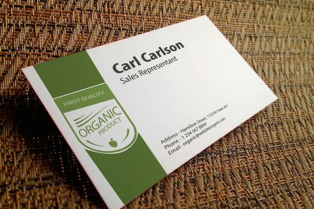
Uncoated stock pulls ink into the fiber, so a spot color prints lighter, softer and a shade greyer than the coated chip suggests. That is precisely what the U column of the fan deck is showing you. Cotton business cards push it further still, because the surface is soft and thirsty. They start at $328.42 and they feel superb in the hand, but choose your Pantone from an uncoated reference or the card will look like a faded version of your brand.
Coated stock keeps ink on the surface and gives the deepest, closest result. Silk lamination then sits on top of the ink and mutes it a fraction, which is usually a fair trade for a card that survives a wallet. Silk laminated business cards start at $74.53 and hold a large solid field cleanly without showing the fingerprints that gloss collects. Soft touch coating mutes more than silk does, so if the brand color is the loudest thing on the card, see it on the real stock first.
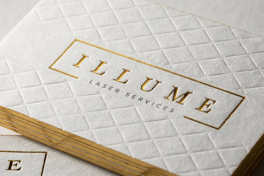
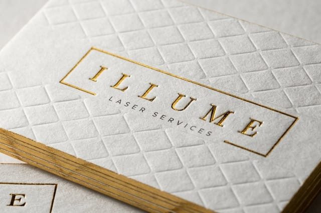
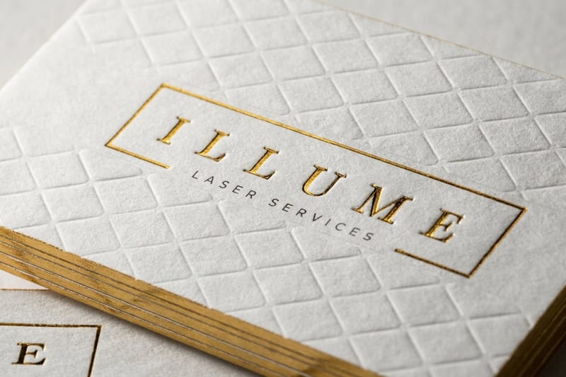
Two finishes are not Pantone, whatever a supplier calls them. Foil is metallized film stamped on with heat, and its color comes from the foil roll, not from an ink recipe. Metallic ink business cards at $126.32 do use genuine metallic ink, which is the closest a card gets to the 8000 series, and our metallic ink business cards story shows them finished. Gold foil against metallic gold ink shows how differently the two read in daylight. Before a brand color is signed off, get free paper samples and hold the stocks against your fan deck.
How to Supply Pantone Colors in Your File

Supplying a spot color correctly takes about two minutes. Getting it wrong costs a reprint, because a spot that quietly became process still returns a perfectly valid PDF. A prepress operator checks a short list when your file lands.
- Define it as a spot swatch, not a process one. In Illustrator or InDesign, open the Pantone Solid Coated or Solid Uncoated library and pull the color from there. A swatch you made by typing CMYK values is a process color wearing a Pantone name.
- Name it exactly, and only once. To a RIP, "PANTONE 286 C" and "PANTONE 286 C 2" are two separate plates. Duplicates usually creep in when artwork is pasted between documents, so merge them before you export.
- Match the suffix to the stock. Coated stock takes the C library, uncoated takes U. Mixing both in one file produces two separations for what should be one ink.
- Keep effects off the spot artwork. Drop shadows, transparency and blend modes force a rasterize on export, and rasterized spot color comes out as process. Apply the color to flat vector shapes and outline the type.
- Export PDF/X and read the separations. Output Preview in Acrobat lists every plate in the file. That list, not your swatch panel, is what we make plates from.
- Write the numbers in the order notes. It takes a second, and it catches the file that got flattened somewhere between your machine and ours.
If your artwork is already a process build and you need to work backwards, converting Pantone spot color to CMYK in Illustrator covers the reverse trip, and color management in prepress explains the profiles underneath it all. Start from a correctly sized layout in the blank template library, and check trim and bleed against our business card file setup guide before you export.
Wally explains Pantone spot color
One mixed ink beats four screens guessing
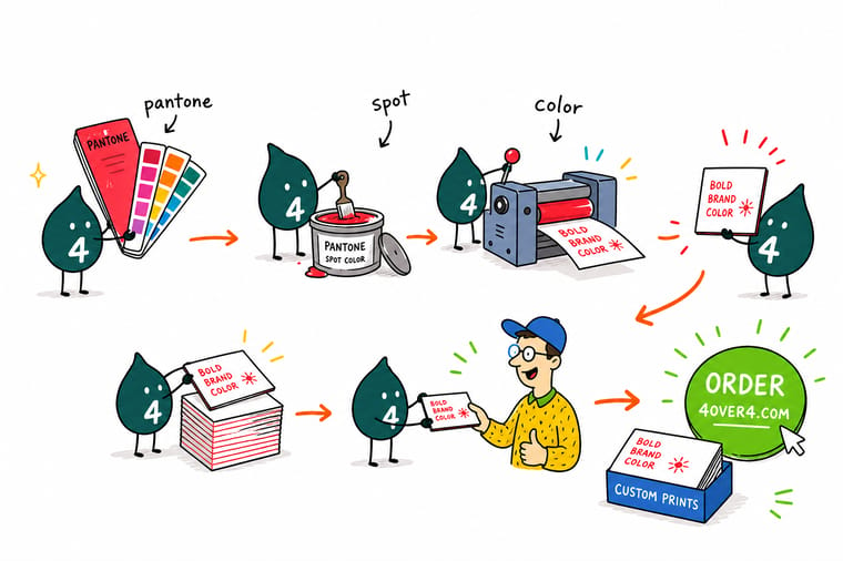
Wally weighs the base inks, mixes your PMS number, and runs it from a single plate. The card comes back on the recipe, and so does the reprint next spring. Do it in CMYK instead and four screens of dots have to agree with each other while dot gain, ink density and the paper all pull in different directions. Check the letter after the number too. Wally has watched a lot of people pick 286 C from a coated deck and then order soft uncoated cotton stock.
Order premium prestige business cards →
Specs and pricing
Card stocks that hold a brand color, with starting prices
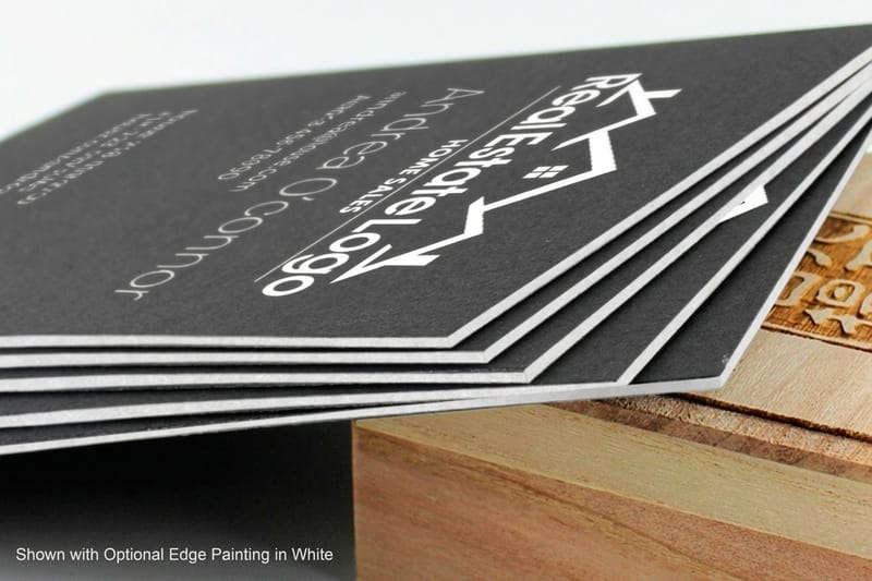
Coated stock keeps a solid field deep, uncoated softens it, and metallic ink is the closest a card gets to the Pantone 8000 series. Configure each one and see live pricing straight from the 4OVER4.COM configurator. Standard cards run from 100 for $17.57. Premium prestige cards come on 32pt to 80pt UltraWhite uncoated or 40pt to 72pt gloss cover, from 50 for $36.62. Metallic ink cards print on 16pt gloss cover with PMS 877 silver or PMS 872 gold, from 500 for $126.32 with 7 business days of production.


Print it
Order Pantone matched business cards at 4OVER4.COM
Send the PMS numbers with the suffix that matches your stock, C for coated or U for uncoated, tell us the quantity, and we will tell you honestly whether a spot plate or a tuned process build is the better buy for that run. Premium prestige cards start at 50 for $36.62, 45pt cotton cards at 250 for $328.42, and silk laminated cards at 250 for $74.53.

Explore more
Where to go next
See the wider family of spot inks, find the Pantone colors that shift most in CMYK, weigh two plates against four, get the rich black recipe right, and pick a stock that holds your brand color.



By the numbers
Cotton, metallic and prestige stocks for brand color
Common Questions
Your Pantone printing questions, answered
Do you print Pantone colors?
Yes, on litho offset runs, where your mixed ink gets its own plate and its own press unit. That path suits identity work at volume, and the quantity is what decides whether it makes financial sense, so send us the PMS numbers, the stock and the run length and we will quote it. On short digital runs the press physically cannot load a mixed ink, so we print the closest process build instead and tell you which colors in your palette are likely to move.
What is the difference between Pantone C and Pantone U?
The suffix names the paper, not the ink. C is the coated chip and U is the uncoated chip, and both show the same mixed ink printed on the two surfaces. Coated stock keeps ink on the surface, so the color reads deep and saturated. Uncoated stock pulls ink into the fiber, so the same number comes back lighter, softer and slightly greyer. On some colors the two chips look like different colors entirely, which is why you pick from the deck that matches the stock you actually ordered.
Can a Pantone color be matched in CMYK?
Many can be approximated well enough that nobody notices, and some cannot be approximated at all. The Color Bridge deck exists precisely to show you the answer per color, printing the spot ink beside its process simulation on the same chip. Fluorescents and metallics have no process equivalent. Colors sitting at the edge of the process gamut, including bright oranges, reflex blue and the more vivid greens, come back noticeably duller no matter how the file is profiled.
Which Pantone colors shift the most when converted to CMYK?
Saturated colors outside the four ink gamut shift hardest. Bright orange in the 021 family loses its heat, reflex blue drifts toward purple, and the brighter greens flatten out. Deep navies and rich burgundies convert well, and so do most greys, browns and muted corporate blues. If your identity is built on one of the difficult families, that is the strongest argument for a spot plate rather than a conversion.
Does spot color printing cost more than CMYK?
Per plate, yes, and per card it depends entirely on the run. Four process plates cover any number of colors in the artwork, so CMYK has a flat setup no matter how busy the design is. A spot job pays for a plate and a wash up for each ink, which is why a two color identity piece at volume can land cheaper than process while the same job at 250 pieces lands dearer. For context on the base cost, standard business cards start at $17.57 and premium prestige business cards start at $36.62 at 4OVER4.COM.
How do I send you my Pantone color?
Apply it in Illustrator or InDesign from the Pantone Solid Coated or Solid Uncoated library so it stays a spot swatch, keep one swatch per ink with no duplicate names, outline the type, avoid transparency and drop shadows on the spot artwork, and export a PDF/X file. Open Output Preview in Acrobat before you send it, because that separations list is exactly what we make plates from. Then write the PMS numbers into the order notes as a second check.
Get Started
Metallic ink business cards run 500 for $126.32
Send us the PMS numbers, the stock and the quantity. We will quote the spot plate, or tell you where a tuned process build gets you close enough to save the setup.
Legal Disclaimer
Gold Standard guarantees apply to all standard orders placed through 4over4.com. Price match requires verifiable proof of a competitor's published price for an equivalent product with matching specifications and turnaround time. Satisfaction guarantee covers manufacturing defects and print quality issues. Contact support with order number and documentation.
