
How to Convert Pantone (Spot) Color to CMYK in Illustrator


Spot colors print from one pre-mixed ink, but most full-color jobs run process CMYK. Bright blues, greens and oranges are the swatches that move most in the conversion.
To convert a Pantone spot color to CMYK in Illustrator, set the document to CMYK, then change the swatch Color Type to Process. Open File then Document Color Mode and choose CMYK Color. Double-click a spot swatch, set Color Type to Process Color, or select all and use Edit then Edit Colors then Convert to CMYK. Proof reds and blues, which shift most, then export a press-ready PDF.
Start here
One ink becomes four
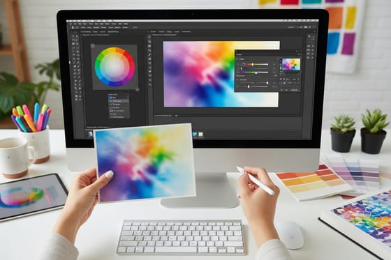
A Pantone spot color is one pre-mixed ink, and CMYK rebuilds it from cyan, magenta, yellow, and black. In Illustrator, set the document to CMYK under File then Document Color Mode, then either switch each swatch Color Type to Process in Swatch Options or select all and choose Edit then Edit Colors then Convert to CMYK. Proof the colors that shift, fix your blacks, and export a press-ready PDF. The diagram below shows the swatch panel path from spot to process.
Why you convert spot colors to CMYK before printing
A Pantone spot color is a single ink, pre-mixed to an exact recipe and printed from its own plate. It is how a brand keeps one signature color perfectly consistent from job to job. A CMYK, or process, color is built instead from percentages of cyan, magenta, yellow, and black layered on press. Almost every full-color print job runs process, because four inks can simulate a huge range of colors without a separate plate for each one.
That is why conversion matters. If you leave a spot swatch in a file headed for a standard full-color press, it can trigger an extra plate, an unexpected charge, or a color that shifts anyway when the press treats it as process. Converting the swatch yourself in Illustrator puts you in control of the exact CMYK values and lets you see the shift before it prints, whether the piece is a stack of brochures or a run of business cards.
This guide walks the exact steps in Adobe Illustrator, then covers the colors that shift most and how to proof them. If you would rather not build the file by hand, our online design tool keeps you in process color from the start, and every order you place gets a free file check before it goes to press.
Set the document to CMYK before you touch a swatch
This is the step most people skip, and it quietly changes every value you are about to create. Before converting anything, open File, then Document Color Mode, and choose CMYK Color. If the document is still in RGB, Illustrator builds process values against a screen color space, and the numbers you get will not match what a press produces.
With the mode set correctly, you can see the CMYK title in the document tab, and any conversion from here forward lands on print-accurate values. This single setting is the difference between colors that hold on paper and colors that drift, so make it the first move on any file destined for a full-color product like flyers or brochures.
If your artwork also arrived from a camera or the web, it may carry RGB images alongside the spot swatches. Our companion guide on converting RGB to CMYK covers that side, so the whole file speaks the same color language before export.
The two ways to convert spot to process in Illustrator
Illustrator gives you two clean paths. The first works one swatch at a time. Open Window, then Swatches, and find the spot colors, which are marked by a small triangle in the lower corner with a dot inside it. Double-click a spot swatch to open Swatch Options, change Color Type from Spot Color to Process Color, and leave Global unchecked. That swatch now prints from four inks instead of a fifth plate.
The second path converts everything at once, which is faster on a busy layout. Select all the artwork, then choose Edit, Edit Colors, Convert to CMYK. Illustrator rebuilds every spot color across the selection in a single pass. Whichever path you take, reopen a converted swatch afterward and confirm it now reads as a four-number CMYK build rather than a named Pantone.
Watch one trap: converting a swatch does not touch a spot color you saved into a gradient or a linked graphic style, so scan those separately. Steady color discipline like this is the same habit behind a clean, reproducible logo design.
Expect a shift, and proof the colors that move most

Conversion is not always a perfect match, and that is physics, not a mistake. A Pantone ink can sit outside the range four process inks can reach, so Illustrator lands on the closest build it can. The colors that move most are vivid oranges, bright greens, certain purples, and the famous Reflex Blue, which tends to drift toward purple in CMYK.
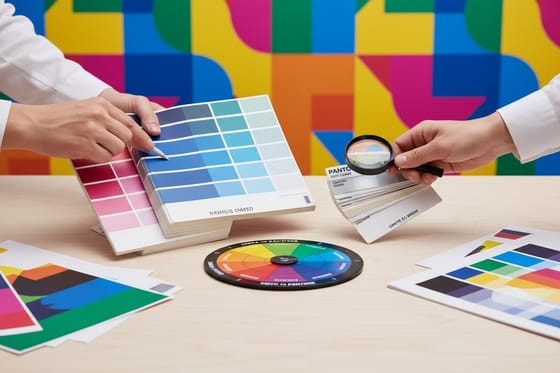
So proof the shift with your eyes, not your monitor. A screen makes color with light and always looks more vivid than ink on paper. Judge a converted brand color against a printed reference, a swatch book, or a proof, and adjust the CMYK values by hand if the automatic build lands off. If a signature color absolutely must be exact across a big campaign, that is the case where keeping it as a spot ink can be worth the extra plate.
For the deeper theory on why these two systems never overlap completely, our guide on spot color printing and our reference on matching Pantone to CMYK both go further into picking the closest build.
Handle blacks and small text before you export

Once the color swatches are process, two black-related fixes keep the file clean. For small text and fine lines, use 100 percent K only. A four-ink black on tiny type can look fuzzy or slightly off-register, while pure black stays sharp and crisp at print scale.
For large solid black areas, do the opposite and use a rich black build, around C60 M40 Y40 K100, so the ink lays down deep and even instead of looking thin and streaky. A single 100 percent K on a big panel often reads as washed gray, which is rarely what a designer intends.
These two rules travel with every print file, not just color conversions, and they pair naturally with the resolution and bleed checks in our guide to creating print-ready files. Get color, black, resolution, and bleed right together and the file is genuinely press-ready.
Export a press-ready PDF and check the file
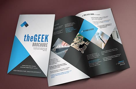
With every swatch converted and the blacks handled, package it into one file the press can print without touching. Choose File, Save As, Adobe PDF, and use the PDF/X-1a preset. That preset is built for commercial printing, forces CMYK, embeds fonts, and strips out anything a press cannot use, including stray spot data if you missed a swatch.
Include bleed and crop marks in the export so any art that reaches the edge is protected during the cut. A flattened PDF freezes your design in place, so nothing relinks or re-interprets on our end. If you are weighing formats for a specific job, our guide on choosing the right file type lays out when each one fits.
Before you upload, run one last pass: confirm the document is CMYK, no spot swatches remain, small text is 100 percent K, and bleed is present. When you order with us, that artwork also goes through a free file check, so a second set of eyes catches anything before the press does. Then it comes down to picking the product and specs, which you can see live below.
Wally turns one ink into four before the press does
Spot to process, without the color surprise
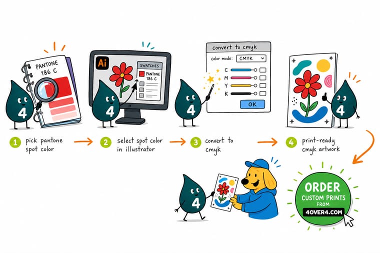
Wally treats every Pantone swatch like a translation job: set the document to CMYK, switch each spot swatch to Process, then proof the reds and blues that always move. Once every color reads as a four-ink build, export one press-ready PDF and let 4OVER4 print it in true process color, exactly as you rebuilt it.
Print your CMYK files →Quick reference
The spot-to-CMYK setup, at a glance
Match these settings in Illustrator and your file outputs process color a press can print without editing.
| Setting | Get it to | Why it matters |
|---|---|---|
| Document color mode | CMYK Color | Set it under File then Document Color Mode before converting so swatches build against process, not RGB. |
| Swatch color type | Process Color | A spot swatch shows a corner triangle with a dot. Switch it to Process so it prints from four inks, not a fifth plate. |
| Convert-all shortcut | Edit, Edit Colors, Convert to CMYK | Recolors selected artwork in one pass instead of editing swatches one at a time. |
| Rich black | C60 M40 Y40 K100 | For large solid black areas so the ink lays down deep and even instead of thin. |
| Small black text | 100 percent K only | Keeps fine type crisp and on-register instead of fuzzy from a four-ink mix. |
| Export format | Flattened PDF (PDF/X-1a) | Locks the process color, fonts, and images into one press-ready file. |
Step by step
Convert spot color to CMYK in 7 steps
- Set the document to CMYK color mode Open File then Document Color Mode and choose CMYK Color. This is the step most people skip, and it changes the process values you get from every conversion.
- Open the Swatches panel Go to Window then Swatches. Spot colors are the swatches marked with a small triangle in the lower corner and a dot inside it, which sets them apart from process swatches.
- Convert one swatch through Swatch Options Double-click a spot swatch to open Swatch Options, then change Color Type from Spot Color to Process Color and leave Global unchecked. The swatch now prints from cyan, magenta, yellow, and black.
- Or convert everything at once Select all the artwork, choose Edit then Edit Colors then Convert to CMYK. Illustrator rebuilds every spot color across the file in a single pass, which is faster on busy layouts.
- Check the values and the shift Reopen a converted swatch and confirm it reads as a four-number CMYK build. Then look hard at reds, oranges, greens, and Reflex Blue, since those move the most when a single ink becomes four.
- Fix small black text and large blacks Set fine black text to 100 percent K only so it stays sharp, and switch large solid black areas to a rich black build so they print deep rather than washed out.
- Export a press-ready PDF Save As Adobe PDF using the PDF/X-1a preset with bleed and crop marks, then upload it or run it through our free file check before you order.
Infographic
The spot-to-CMYK checklist
Six checks that take a Pantone-heavy Illustrator file to a clean, press-ready CMYK export.
A file that clears all six checks prints in true process color. Every order run through our free file check gets a second look, so no stray spot swatch slips past on its way to press.
Specs and pricing
Full-color brochure specs and live pricing
Once your colors are process CMYK, size, stock and finish are what is left. Brochures run 50 for $57.11, which is $1.14 each.

| Quantity | Price Per Unit | Total |
|---|---|---|
| 50 | $1.14 | $57.11 |
| 100 | 82.4¢ | $82.38 |
| 200 | 53.3¢ | $106.55 |
| 300 | 41.0¢ | $123.02 |
| 400 | 34.9¢ | $139.49 |
| 500 | 31.2¢ | $155.97 |
| 600 | 26.7¢ | $160.36 |
| 700 | 23.5¢ | $164.75 |
Print it
Print your CMYK-ready files with 4OVER4


See it in use
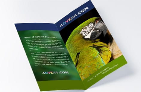
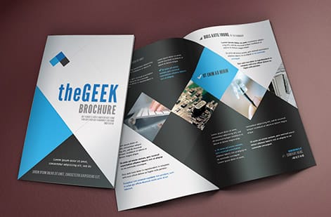
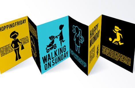
Full color brochures off our press




Explore more
Where to go next





By the numbers
The stocks CMYK gets printed on here
Common Questions
Common questions about spot to CMYK conversion
How do I convert a Pantone spot color to CMYK in Illustrator?
First set the document to CMYK under File then Document Color Mode. To convert a single swatch, double-click it in the Swatches panel to open Swatch Options and change Color Type from Spot Color to Process Color. To convert everything at once, select the artwork and choose Edit then Edit Colors then Convert to CMYK. Either way, the color that was one pre-mixed Pantone ink is rebuilt from cyan, magenta, yellow, and black so it can print on a standard four-color press.
Why does my Pantone color look different after converting to CMYK?
A Pantone spot color is a single ink mixed to an exact recipe, while CMYK reproduces color by layering four process inks. Some Pantone colors sit outside the range that four inks can reach, so the conversion lands on the closest possible mix rather than a perfect match. Vivid oranges, bright greens, and Reflex Blue shift the most. This is normal and expected. If a brand color is critical, check the converted build against a printed reference or order a proof before running the full job.
What is the difference between a spot color and a process color?
A spot color is one pre-mixed ink, like a Pantone, that prints from its own plate and stays perfectly consistent across every run, which is why brands use it for a signature color. A process color is built from percentages of cyan, magenta, yellow, and black, layered on press to simulate a huge range of colors from just four inks. Most full-color printing is process. Spot inks add cost and plates, so unless a job specifically calls for spot, you convert those swatches to process CMYK before printing.
Should I convert to CMYK before sending files to a printer?
Yes, for standard full-color printing. Sending a file with leftover spot swatches can trigger an extra plate, an unexpected charge, or a color surprise if the press interprets it as process anyway. Converting the swatches yourself in Illustrator keeps you in control of the exact CMYK values and lets you proof the shift before it prints. When you order with 4OVER4.COM, your artwork also runs through a free file check, so a second set of eyes catches any stray spot colors before the press does.
What does it cost to print full-color CMYK work, and how are prices set?
Converting your colors in Illustrator costs nothing beyond your design time, and running the file through our free file check is included. Printing cost then scales with a few levers: quantity, where a larger run lowers the unit price, plus size, paper stock, and finish. You set each option in the configurator and the price updates live as you adjust it, so you can see exactly what a heavier stock or a bigger quantity does to the number before you commit.
Can I keep a Pantone color as spot for a special finish?
Sometimes, yes. Certain finishes and specialty jobs are built around a spot ink on its own plate, and there the spot swatch stays. But for everyday full-color pieces like business cards, flyers, and brochures, the swatch should be converted to process CMYK. When in doubt, follow the product setup notes for the specific item and convert any color that is meant to print as part of the standard four-ink build.
Get Started
Order 50 flyers at $0.79 each and check the shift
Convert your swatches to process CMYK, then bring the press-ready PDF to 4OVER4.COM and print it on the size, stock, and finish your project calls for. Classic business cards run 100 for $17.57, which is $0.18 each.
Legal Disclaimer
Gold Standard guarantees apply to all standard orders placed through 4over4.com. Price match requires verifiable proof of a competitor's published price for an equivalent product with matching specifications and turnaround time. Satisfaction guarantee covers manufacturing defects and print quality issues. Contact support with order number and documentation. On-time delivery rate based on tracked orders 1999 to 2026. Individual results may vary based on shipping carrier performance.
