
How to Set Fonts, Type Size, and Spacing for Booklets That Print Clean


The numbers a printer would give you across the counter: point sizes, leading, column widths, binding-edge margins, and the font handling that survives the export.
Set booklet body text between 9 and 11 point, give it leading two to three points larger than the type size, and keep each line to 55 to 75 characters. Give the binding edge a wider margin than the outside edge: 0.375 inch inside for saddle stitch, 0.625 inch for perfect bound, because glue swallows about a quarter inch of every page. Pick a typeface with moderate stroke contrast so hairlines survive at small sizes, keep small black text on the K plate alone, and embed fonts through a PDF/X-1a export instead of outlining them.
Quick answer
Three numbers set together, and one margin that is never symmetrical
Type size, leading, and line length are one decision, not three. Nine to eleven point body text, leading two to three points above the size, and 55 to 75 characters per line will carry any booklet. The margin rule is separate and depends on binding: saddle stitch opens flat and needs 0.375 inch inside, perfect binding hides about a quarter inch in the glue and needs 0.625 inch. Everything after that is damage control on press, which means moderate stroke contrast so hairlines hold at 9 point, 100 percent K for small text, and reversed type kept at 8 point and bolder.
Choosing a Typeface That Holds Up at 9 Point
The question is not serif or sans. It is stroke contrast: how much thinner the thin strokes are than the thick ones. That single property decides whether your booklet reads cleanly or looks patchy.
High-contrast faces such as Bodoni, Didot and their revivals were drawn for large sizes on smooth paper. Set them at 9 point on an uncoated text stock and the hairlines partly drop out where ink spreads unevenly, so the page looks grey and blotchy rather than crisp. Low and moderate contrast faces hold their weight all the way down. Old-style serifs like Garamond, Caslon and Minion, transitional faces like Baskerville, and slab or humanist sans faces all keep enough ink in every stroke to survive a small size.
Two more properties matter more than the serif question. X-height, the height of a lowercase x against the cap height, controls how big the type looks at a given point size. A large x-height face at 9 point reads like a small x-height face at 10, and it wastes less space. Then check the family has a real italic and a real bold, not a slanted roman and a machine-thickened weight, because those are what carry emphasis through 32 pages.
Pair a display face for headings with a text face for body, and stop there. Two families across a booklet is plenty, three is where pages stop looking like the same document. If you want a single family, take one with a wide weight range and let 700 weight headings do the contrast work. Before you commit, check the license: most families on Google Fonts allow print embedding, and our guide on whether Google Fonts are free for commercial and print use covers the exceptions.
Point Size, Leading, and How Wide a Line Can Get
Three numbers set together, not one at a time. Type size, leading, and measure, which is the width of the text column. Change one and the other two have to move.
The target for measure is 55 to 75 characters per line, counting spaces. Under 45 characters the eye returns so often that reading feels choppy and justification starts producing rivers. Over 80 characters the eye loses its place on the return sweep and readers skip lines. A quick check with no ruler: set a line of your lowercase alphabet twice at your chosen size, and that width is roughly 52 characters.
| Booklet layout | Body size | Leading | Column measure | Roughly |
|---|---|---|---|---|
| 5.5 x 8.5, one column | 9.5 to 10 pt | 13 pt | 4.25 in | 60 to 65 characters |
| 8.5 x 11, one column | 10.5 to 11 pt | 14 to 15 pt | 5.5 in | 70 to 75 characters |
| 8.5 x 11, two columns | 9 to 9.5 pt | 12 to 12.5 pt | 3.1 in each, 0.25 in gutter | 45 to 50 characters |
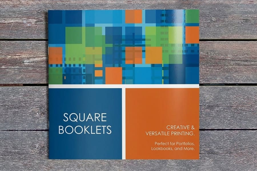
| 6 x 6 square, one column | 9.5 pt | 13 pt | 4.5 in | 62 to 68 characters |
Notice what the second row is really saying. An 8.5 by 11 inch page will happily hold a 6.5 inch column, and that column is a mistake. Either bring the text block in and let the outside margin carry the extra width, or split into two columns and drop the size. Catalogs almost always go two or three columns for this reason, which is one of the differences covered in our comparison of booklets and catalogs.
Set headings by ratio rather than by feel. If body is 10 point, a subhead at 13 or 14 and a section head at 18 or 20 gives clear steps without shouting. Add space above a heading and slightly less below it, so the heading sits with the text it introduces instead of floating between two blocks.
Margins, Gutters, and the Binding Edge
Booklet margins are asymmetric on purpose. The inside edge disappears into the binding, so it needs more room than the outside edge, and how much more depends entirely on how the booklet is bound.
Saddle stitch folds the sheets and staples through the fold. The book opens flat, nothing is swallowed, and 0.375 inch on the inside is comfortable. Perfect binding glues the spine to a wrapped cover, and about a quarter inch of each page curves down into the glue where text is physically unreadable even when it is printed. That is why the inside margin goes to 0.625 inch, and on a book past roughly 150 pages you push it further still. The full trade-off between the two, including minimum page counts, is in our guide to booklet binding methods.
The other margin surprise is creep, sometimes called push out. On a saddle-stitch booklet the inner sheets wrap around more paper than the outer sheets, so their outer edges stick out and get trimmed off. On a 40 page booklet the center spread can lose a couple of millimeters from the outside edge. Printers compensate by shifting pages inward in the imposition, but that shift only works if you left the standard 0.25 inch safety line inside the trim. Page numbers set 0.125 inch from the trim edge are the classic casualty. The mechanics are explained in booklet page counts, multiples of four, and creep.
Keep folios and running heads inside the live text block, not floating in the margin, and mirror your master pages so left and right pages are true mirrors rather than copies. Start from a correctly sized layout in our blank template library, and check the trim and safety rules in the bleed, cut line and safety checklist before you export.
Alignment, Hyphenation, and Rivers
Justified text looks orderly on a wide measure and falls apart on a narrow one. Justification works by stretching and squeezing word spaces until every line reaches the same width, so the fewer words on a line, the more violent the stretch.
Rivers are what you get when those stretched spaces line up vertically across several lines and a pale channel runs down the column. They are invisible on screen at 60 percent zoom and obvious on paper under a desk lamp, which is why so many booklets go to press with them. Three fixes, in order of how much they help: widen the column, enable hyphenation, or switch to ragged right.
If you justify, turn hyphenation on and constrain it. Sensible settings are a minimum word length of six letters, at least three characters before the break and three after, and no more than two hyphens in a row. Without that last limit you get hyphen ladders down the right edge, and with hyphenation off entirely on a narrow justified column you get the worst rivers of all.
Then hunt the leftovers. A widow is a single word alone on the last line of a paragraph, an orphan is a single line of a paragraph stranded at the top or bottom of a page, and both are worth fixing with a keep setting rather than by hand, because hand fixes break the moment the text reflows. Avoid centering more than three lines at a time, and never center body copy in a booklet: a ragged left edge gives the eye nothing to return to.
Black Text, Reversed Type, and Contrast on Press
Body text should be 100 percent K and nothing else. If your black is built from all four plates, every one of those plates has to land in exactly the same place, and at 9 point a hair of misregistration shows as a colored fringe along the letters.
Rich black, usually something like 60C 40M 40Y 100K, is for large solid panels and display type where a single black plate would look washed out. Keep it above roughly 24 point and off anything small. The counterpart habit is overprint: fine black text is normally set to overprint so it prints on top of the background rather than knocking a hole in it, which removes the registration risk entirely. If you are unsure how your file converts, read RGB versus CMYK for printing before you export, because a pure screen black converts to a four-color build by default.
Reversed type, meaning white text on a dark field, is where booklets lose legibility fastest. Ink spreads slightly on paper, and that spread eats into the white letterforms from every side, closing counters and thinning hairlines. Keep reversed text at 8 point and above, choose a medium or bold weight, and choose a face with sturdy strokes rather than a fine serif. Reversing a whole page of body copy is a design decision that costs readers, so reserve it for pull quotes, section openers and captions.
Paper does the rest. An uncoated stock absorbs more ink, so strokes gain a little weight and fine detail softens, which suits a text face with open counters. A coated stock holds detail and lets a slightly lighter weight survive. It is the same choice covered in our guide to the best paper types for brochure printing, and it applies to every bound page too.
Embedding, Outlining, and Proofing the Type
Embed the fonts. Outlining every piece of text is a habit from an era of unreliable font handling, and today it costs more than it saves.
| Approach | Text stays searchable | Small type renders as drawn | Use it when |
|---|---|---|---|
| Embed in a PDF/X-1a export | Yes, and taggable for accessibility | Yes, hinting is preserved | Every job, unless a license blocks it. This is the default. |
| Convert to outlines | No, letters become vector shapes | Slightly heavier at 8 to 9 pt, hinting is discarded | One logo, or the single face whose license forbids embedding. |
| Package and send the fonts | Yes, in the native file | Yes, if the printer has the same version | You need an editable native file archived alongside the PDF. |
A PDF/X-1a:2001 export requires every font to be embedded, so a successful export is itself the check. If a face refuses to embed, the license blocks it, and your options are to outline that element or swap the face. Also watch for Type 1 PostScript fonts: Adobe removed support for them in current versions of Illustrator and InDesign, so an old library file can silently substitute a different face and reflow your carefully set columns. The export settings are in our guide to exporting a print-ready PDF from Illustrator or InDesign, and if you do need to outline, how to create outlines in Illustrator covers doing it without breaking the file.
Proof on paper, at full size, never on a screen. Print one spread on your office printer at 100 percent scale, hold it at arm's length, and read a full page rather than scanning it. You will catch the two things a screen hides: type that is a half point too small, and rivers. Then read the last line of every paragraph for widows, and check that page numbers and running heads sit clear of the trim. For a real material check before a long run, order a set of free paper samples and look at your body size printed on the exact stock you plan to use.
When the file is right, saddle stitch booklet printing and standard booklets both start at $240.55, and standard catalogs match that at $240.55. A shorter piece that never justified a bound page count is better served by standard brochures at $57.11, and the format decision itself is worked through in booklet versus brochure versus flyer.
Wally explains booklet type
Nine to eleven point, leading plus two, and a fatter margin at the spine
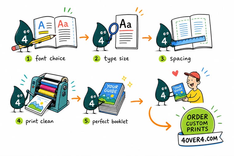
Wally sets the body at 10 point with 13 point leading, then pulls the column in until a line holds about 65 characters. He gives the binding edge more room than the outside edge, because a glued spine eats a quarter inch of every page and a stapled fold does not. He keeps the small text on the black plate alone so nothing fringes, and he embeds the fonts rather than outlining them, so the file stays searchable and a typo is still fixable. Then he prints one spread at full size and reads it on paper, because rivers never show up on a screen.
Order saddle stitch booklet printing →Specs and pricing
Booklet sizes, page counts, and starting prices
Check the trim sizes and page-count options before you lock the type, because measure and margin both follow from the page. These are live configuration choices and starting prices from the 4OVER4.COM configurator.

Print it
Print the booklet you just set
Explore more
Where to go next


By the numbers
Booklet printing you can count on at 4OVER4
Common Questions
Your booklet typography questions, answered
What is the best font size for a printed booklet?
Between 9 and 11 point for body copy, decided by trim size and column width. A 5.5 by 8.5 inch booklet reads well at 9.5 or 10 point on a single column. An 8.5 by 11 inch page set in two columns drops to 9 or 9.5 point because each column is only about 3.1 inches wide. A single column across a full 8.5 by 11 inch page needs 10.5 or 11 point, and it still needs generous outside margins so the line does not run past 75 characters. Captions and footnotes sit one to two points below the body, and running heads can go smaller still because nobody reads them in sequence.
How much line spacing should booklet text have?
Add two to three points to the type size. 9 point text takes 12 point leading, 10 point takes 13, 11 point takes 14 or 15. Push toward the top of that range when the measure is long, when the typeface has a large x-height, or when the paper is bright white and the contrast is high. Pull it back toward the bottom when the column is narrow, because a short line already gives the eye a fast return. Setting type solid, meaning 10 on 10, is a display trick and it makes multi-page reading tiring.
What margins does a booklet need at the binding edge?
It depends on how the booklet is bound. Saddle stitch folds and staples through the spine, so the pages lie flat and 0.375 inch on the inside edge is enough. Perfect binding glues the spine, and roughly a quarter inch of each page curves into the glue where nothing can be read, so the inside margin goes to 0.625 inch and higher on thick books. Outside and top margins of 0.5 inch work for both, and every layout keeps a 0.25 inch safety line inside the trim so nothing important sits where the cutter lands.
Should I embed fonts or convert text to outlines?
Embed. A PDF/X-1a:2001 export embeds every face automatically and keeps the file searchable, taggable for accessibility, and correctable if a typo turns up before plates. Outlining converts letters to vector shapes, which discards hinting and can make 8 or 9 point text render a shade heavier than you designed. Outline only the specific element whose font license forbids embedding, or a logo you never want reflowed, and keep a live-text version of the file for the next revision.
Can I use Google Fonts in a booklet I sell?
Almost always yes. The overwhelming majority of families on Google Fonts ship under the SIL Open Font License, which permits embedding in a print PDF and commercial use without a fee. The practical caution is that some families were drawn for screens and have hairlines that thin out at 9 point on uncoated paper, and a few families on the service carry different licenses. Our guide on whether Google Fonts are free for commercial and print use walks through the checks before you commit a whole book to one family.
Why does my justified booklet text have white gaps running down the page?
Those are rivers, and they come from justifying a measure that is too narrow for the words in it. Justification stretches word spaces to force each line to the same width, and when only six or seven words fit, the stretch becomes visible and the gaps stack up between lines. Fix it in three moves: widen the column, turn on hyphenation with a limit of two consecutive hyphens, or set the column ragged right. Any column under about 45 characters should be ragged right by default.
How many pages does a booklet have to be?
Saddle stitch works in multiples of four because one folded sheet makes four pages, so 8, 12, 16, 20 and up. If your content lands on 14 pages you either cut to 12 or add a blank or a notes page to reach 16. Perfect binding works in multiples of two but needs enough bulk to hold glue, usually around 40 pages on text weight stock. Page count also drives creep on saddle stitch, which pushes the inner spreads outward and is the reason for that 0.25 inch safety line.
Get Started
Ready to print a booklet people can actually read?
Pick your trim size and page count, upload the PDF with the fonts embedded, and we print booklets with the margins and imposition already worked out for your binding.
Legal Disclaimer
Gold Standard guarantees apply to all standard orders placed through 4over4.com. Price match requires verifiable proof of a competitor's published price for an equivalent product with matching specifications and turnaround time. Satisfaction guarantee covers manufacturing defects and print quality issues. Contact support with order number and documentation. On-time delivery rate based on tracked orders 1999 to 2026. Individual results may vary based on shipping carrier performance.
