
Why Coral Prints Duller Than It Looks on Screen


Emma is our prepress and print production voice, built from the knowledge of our production team, with over 20 years in printing.
Coral sits at the outer edge of the CMYK gamut, so the printed version always comes back slightly calmer than the screen version, and the job is to choose which calmer version you approve. Build it from magenta and yellow with black at zero, pick the finish before you pick the swatch, and proof it on the real stock rather than on glass.
Coral in five printing situations
| Situation | What you specify | What comes off the press | Best for | Product at 4OVER4 |
|---|---|---|---|---|
| Coral as a CMYK build | Heavy magenta and yellow, zero black | A slightly softer, less luminous coral | Digital runs, short quantities, most cards | Premium Business Cards |
| Coral as a spot ink | A Formula Guide coated or uncoated number | The tone you picked, repeatable across reprints | Offset runs where the brand color is the brand | Ask for a spot quote |
| Coral under gloss | Same build, gloss aqueous or UV coating | A visible lift in saturation and depth | Postcards, flyers, anything photographed | Standard Postcards |
| Coral under soft touch | Same build, soft touch laminate | A dusty, powdery coral, one step quieter | Beauty, wellness, considered brands | Soft Touch Business Cards |
| Coral on uncoated | Same build, no coating at all | The dullest result of the four, closer to salmon | Writable cards, letterpress-adjacent looks | Standard Business Cards |
The last three rows run the same magenta and yellow build at zero black, and only the finish changes: gloss lifts it, soft touch mutes it one step, uncoated drops it closest to salmon. When a proof looks wrong, check the finish before you touch the CMYK values. You can order premium business cards in any of these finishes straight from the configurator.
Why coral is one of the hardest tones to print
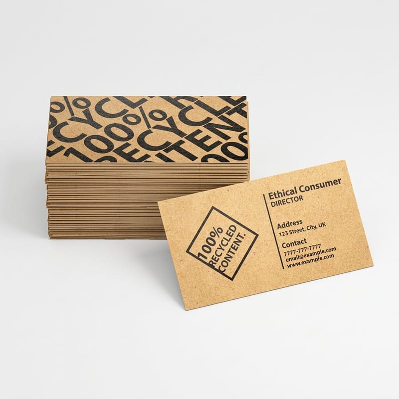
Coral is a saturated orange-pink that lives right at the boundary of what four-color process can reach. Screens show it lit from behind at full strength, and paper cannot do that, so the printed version almost always comes back a shade calmer than the file looked at midnight in Illustrator.
The mechanics are simple once you see them. Coral is built from magenta and yellow with almost nothing else, so its intensity depends entirely on how much magenta the press can lay down. Every variable that weakens magenta, an absorbent sheet, a matte laminate, a heavier black in the build, pulls the whole tone toward salmon or terracotta.
That is not a reason to avoid coral. It is a reason to decide, before the file leaves your machine, which version of coral you are approving. Our guide on which Pantone colors shift most when converted to CMYK covers the whole family of tones that behave this way.
Living Coral was 2019, and that is fine
Pantone named Living Coral, PANTONE 16-1546, its Color of the Year for 2019. It is not the current pick, and treating it as this year’s trend color dates a design instantly. What has happened instead is more useful: coral outlived its year and settled into the general palette, the way a good tone usually does.
So use it because it does a job, not because a press release said so. Coral reads warm without reading corporate orange, it photographs well, and it sits happily next to the deep neutrals most brands already own. If you want the history behind how these picks are made, we wrote about what the Pantone Color of the Year actually is and about the history behind Pantone colors.
The number on the chip is not a printing ink
This is the mistake that costs the most money. The 16-1546 code belongs to the TCX system, which is dyed cotton for fashion and interiors. A printing press does not use TCX. It uses the Formula Guide, where each ink carries a coated or uncoated designation, and it uses process builds on digital equipment.
Hand a printer a TCX number and somebody has to translate it, and if that somebody is not you, the translation happens without your eyes on it. Pick the printing equivalent yourself, look at both the spot chip and the process simulation, and send the one you approved. The walkthrough is in how to match Pantone to CMYK color.
Specifying coral so the press gets what you meant

There are only two honest ways to specify coral, and they cost different amounts. Build it in CMYK and accept the process version, or run it as a spot ink and pay for the extra plate.
For most jobs the CMYK build is the right answer, and the trick is what you leave out. Build coral from magenta and yellow and keep black at zero. Designers add a few percent of black trying to give the tone body, and it does the opposite, because black in a mid-tone orange-pink reads as dirt rather than depth. If you are working from a spot swatch, convert the Pantone spot color to CMYK in Illustrator deliberately rather than letting the export do it silently.
Spot ink earns its cost in one situation: a long offset run where the coral is the brand and a visible drift between reprints would be noticed. Then the ink is mixed to a formula, and every run matches the last. On digital presses that option does not exist at all, so a short run of premium business cards gets the process simulation whatever the file says. There is more on the mechanics in what spot color printing is and in Pantone spot color printing for brand-accurate cards.
Set the document up before you pick the swatch
Work in CMYK from the first artboard, with a US commercial press profile assigned, so what you see is already the constrained version. Designing coral in RGB and converting at the end is how people get attached to a color the press was never going to produce. Our note on the best color profile for printing covers which one to assign and why.
Then check the file for the second-most common coral failure: the same coral appearing three times as three slightly different swatches, because one came from a logo file, one from a stock illustration, and one from an eyedropper. Name one swatch, apply it everywhere, and delete the strays before you export.
Proof on paper, not on glass
A screen proof of coral tells you almost nothing, because the screen is the medium that flatters it. Ask for a hard-copy proof on the exact stock and finish you have ordered, and look at it in daylight and again under the warm indoor light where the piece will actually be handed over. Coral shifts noticeably between the two.
Order the proof before the run, not as part of it. On a card job the difference between approving a proof and reprinting three thousand pieces is the entire margin on the project.
Stock and finish decide how bright coral reads
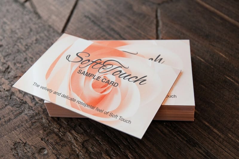
Identical artwork, four different finishes, four visibly different corals. This is the part of the process designers control most and think about least.
Coated stock keeps ink sitting on the surface, so the magenta stays where you put it and coral holds its strength. Uncoated absorbs, the ink spreads into the fibers, and the tone lands quieter and slightly greyer. Pantone publishes separate C and U chips for exactly this reason, and the U version of any coral is visibly the calmer of the two. If uncoated is the look you want, our comparison of matte versus uncoated paper explains what each surface does to color.
Coating on top then moves the tone again. A gloss aqueous or UV coating deepens and lifts coral, which is why it suits postcards and anything that gets photographed. A soft touch laminate does the reverse and produces a dusty, powdery coral that beauty and wellness brands often prefer. Neither is wrong. Just pick one before you approve the proof, because the proof is only valid for the finish it was made on.
What coral does on kraft and colored stock
Coral on brown kraft goes muddy fast. The substrate is already warm and mid-toned, the ink is not opaque, and the two mix into something closer to rust than coral. If the brand is committed to both, print the coral areas as a solid block over a white underprint rather than trusting the ink alone, and see how color prints on kraft paper before committing a run.
On any tinted stock the rule is the same. Every sheet that is not white becomes part of the mix, and coral has too little pigment density to override it.
Spot gloss as a way to get the intensity back
If the process coral came back a little flat, raised or spot gloss over the coral shapes restores some of the punch by changing how light leaves the surface rather than by changing the ink. It works particularly well on a matte card where the coral areas are geometric rather than photographic.
It is a finishing cost, so weigh it against the spot ink you did not buy. On spot UV business cards the effect is doing something a stronger ink could not: it makes the color move as the card tilts.
Pairing coral so it does not shout
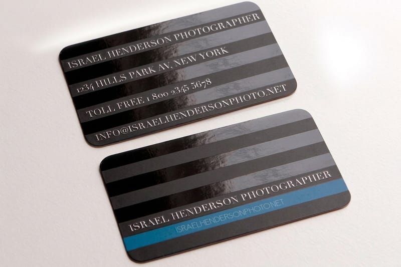
Coral fails more often from bad company than from bad printing. It is a warm mid-tone with a lot of energy, so it needs something to push against, and the wrong partner turns a confident palette into a beach towel.
The pairing that works almost every time is coral against a deep cool neutral. Navy, charcoal, or a dark teal give coral something to sit on, and the value gap does the work that the hue alone cannot. Coral with a warm sand or bone neutral is the quieter version of the same idea, and it suits printed pieces meant to feel expensive rather than loud.
Where it goes wrong is coral against another warm mid-tone. Coral and a mid-orange, or coral and a terracotta, sit too close in both hue and value, and printed at small sizes the eye reads them as a printing error rather than a choice. For more combinations that survive the press, see our roundup of color combinations for brand and print design.
The contrast number nobody checks
Living Coral sits at roughly #FF6F61. Against white that measures about 2.7 to 1, which is well under the 4.5 to 1 that accessibility guidance asks for on body text. Against black it measures about 7.7 to 1. The practical translation: coral is a fill color, a rule, a shape, a large display word. It is not a color for eight-point type on a white card.
This matters more in print than on the web, because a printed card gets read in bad light, at arm’s length, by somebody who is also talking to you. If the phone number is coral on white, it will be read wrong. Put the small type in the dark neutral and let coral carry the shapes.
How much coral is the right amount
A coral panel on the reverse of a card, with the front kept quiet, does more than coral spread across both sides. Saturated warm tones read as more, not less, when they are rationed, and a full-bleed coral card is a commitment that a lot of brands regret by the second reprint.
Our article on the best colors for business cards and the piece on what the color of your business cards means both go further into how a color reads once it is in somebody’s hand.
Card pricing and specs at 4OVER4.COM
A coral proof costs less than a coral reprint. Premium business cards start at $17.57, 50 soft touch postcards on 32pt run $29.44, and 500 spot UV cards cost $76.88. Order the smallest quantity in the table below on the finish you plan to use, hold it next to your 16-1546 chip under daylight, and commit to the full run only when the printed coral passes.
Quantity and price
Premium business card pricing and specs
Real configurator numbers on coated premium stock, the surface that holds a saturated coral best.
| Quantity | Price Per Unit | Total |
|---|---|---|
| 100 | 17.6¢ | $17.57 |
| 200 | 11.5¢ | $23.07 |
| 300 | 9.15¢ | $27.46 |
| 400 | 7.96¢ | $31.86 |
| 500 | 7.25¢ | $36.26 |
| 600 | 6.77¢ | $40.64 |
You can also earn coins on every order and put them toward the next run, which makes a small proof quantity easier to justify.
Printing coral on postcards and larger pieces
Coral behaves differently at scale. On a 3.5 by 2 inch business card it is an accent and the eye forgives a slight shift. On a postcard a coral field can occupy half the piece, and any unevenness across a large flat area of a magenta and yellow build with zero black becomes visible in a way it never is at card size. Break large coral fields with type, imagery or a second color rather than running a full-bleed flat, and ask for the press sheet to be checked across the run rather than only at the front.
Print it
Postcards, coral and all
Gloss finishes that lift warm tones, in preset sizes ready for a mailing.

The quieter route is the opposite finish. Soft touch postcards take the same coral down to a dusty, chalky version that feels deliberate rather than dulled, and the laminate hides the small inconsistencies a gloss coating would highlight. Choose between them on the brand, not on the price, because the two produce genuinely different colors from one file.
Who coral suits, and who it does not
Coral is a warm, energetic mid-tone. It works where warmth is on brand and it fights anything trying to look institutional, so here is the honest breakdown by business type.
- Beauty and skincare. Coral under a soft touch laminate reads as considered rather than loud, and it photographs well against the pale packaging most of the category already uses.
- Hospitality and cafes. A coral panel on a gloss postcard survives being pinned to a board in a bright room, which is where most of these pieces end up.
- Fitness and studios. Coral against charcoal gives the energy without the shouting of a pure orange, and it holds up at the small sizes a schedule card demands.
- Creative studios and agencies. Coral as the single accent on an otherwise neutral card is a low-risk way to look current without dating the identity to one year.
- Real estate and events. Use coral for the shapes and a deep navy for every line of type, because these pieces are read at arm’s length in poor light.
Blanks to drop a swatch into
If you are testing a coral palette rather than building an identity from scratch, start from a 3.5 by 2 inch card template with the trim and the 0.125 inch bleed already marked, and run the coral panel all the way to the bleed line so no white shows after the cut. 4OVER4.COM sizes its blanks to exact product specs, so a coral panel that should run to the edge actually does. Grab one from the blank template library and drop your swatch in.
Start fast
Blanks to drop a swatch into
Card blanks at the real trim, so a coral field prints right out to the edge.














Wally checks coral against the chip, not the screen
The proof on paper is the only coral that counts
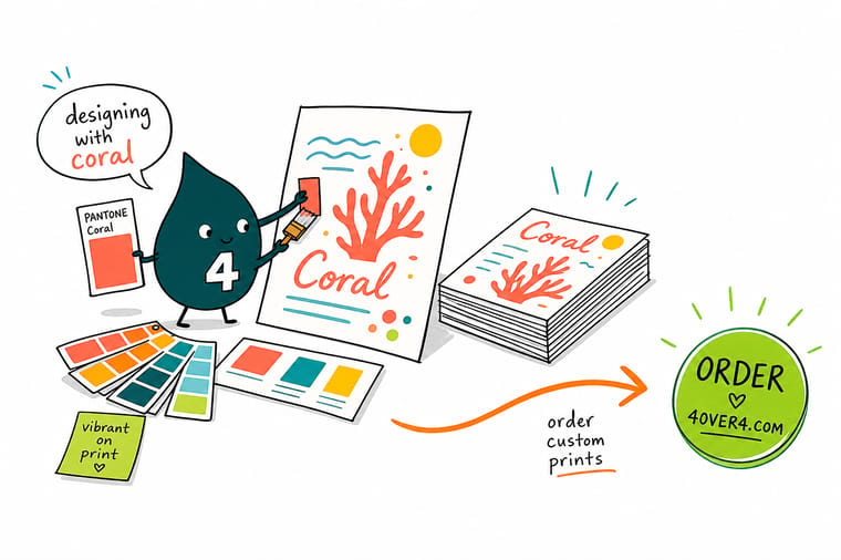
Build coral from magenta and yellow with black at zero, work in CMYK from the first artboard, and pick the finish before you pick the swatch. Gloss lifts it, soft touch quiets it, uncoated drops it again. Approve a printed proof on the exact stock, and 4OVER4.COM runs the job on coated premium card that holds the tone.
Order premium business cards →What to remember about printing coral
Design tips that hold at every size
- Keep black out of the build. Coral is magenta and yellow. Adding black to give it body turns it brick, and it is the single most common reason a coral proof disappoints.
- Approve a printed proof, not a screen. A monitor flatters coral more than any other tone in the palette. Proof on the exact stock and finish you ordered, in the light the piece will live in.
- One swatch, applied everywhere. Three near-identical corals from three source files will print as three different colors. Name one swatch and delete the strays before export.
- Let a dark neutral carry the type. At about 2.7 to 1 against white, coral is a shape color rather than a text color. Navy or charcoal takes the small type.
- Decide the finish before the color. Gloss lifts coral, soft touch quiets it, uncoated dulls it. The finish is part of the color decision, not a separate one made later.
Explore more
More ways to print and promote
Soft touch postcards run 50 for $29.44 on 32pt uncoated and spot UV cards 500 for $76.88.
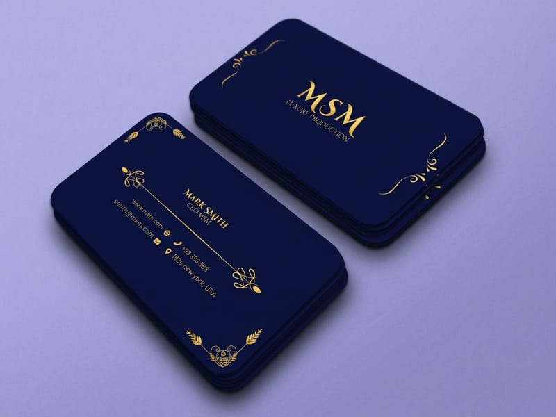 Product Premium Business Cards Coated stock that holds a saturated coral at full strength. Product Standard Postcards Gloss finishes that lift warm tones instead of flattening them. Product Soft Touch Business Cards The dusty, powdery version of coral, in a laminate you can feel. Product Spot UV Business Cards Gloss shapes over matte, to get intensity back without a spot ink.
 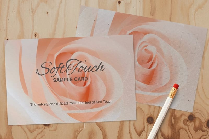 Product Soft Touch Postcards A quieter coral on a larger canvas, for brands avoiding shine.
  Category Business Card Printing Every stock, finish and size in one place.
 Ready to see your coral on paper?
Pick the stock and the finish, upload your CMYK file or start from a free template, and 4OVER4.COM prints it sharp on premium stock, as fast as your deadline needs.
Common questions about coral in print
Is coral the Pantone Color of the Year?
Not currently. Living Coral, PANTONE 16-1546, was Pantone’s Color of the Year for 2019, and it has not held the title since. That is not a reason to skip it. Colors that survive past their year tend to be the ones with a real use, and coral has settled into the general palette as a warm accent that avoids reading as corporate orange. If you want a color specifically because it is the current pick, check the year you are in rather than reusing a coral from an old moodboard.
Why did my coral print darker and duller than the file?
Three causes, in order of how often we see them. First, black in the build: coral is magenta and yellow, and a few percent of black reads as dirt rather than depth. Second, an uncoated or matte stock, which absorbs ink and drops the chroma. Third, an RGB file converted at export, where the coral you fell in love with was never inside the printable gamut in the first place. Work in CMYK from the start, keep black at zero, and approve a printed proof on the stock you ordered.
Can I get an exact Pantone coral rather than a CMYK approximation?
On an offset run, yes, by specifying the coral as a spot ink from the Formula Guide, which is mixed to a formula and repeats accurately across reprints. It costs an extra plate and a setup, so it makes sense when the run is long and the color is genuinely load-bearing for the brand. On digital printing, spot inks are not available, so the press produces the closest process build. For short runs of cards and postcards, that process version is what you get, which is why the honest approach is to approve it deliberately rather than hope.
What colors go with coral on a business card?
Deep cool neutrals. Navy, charcoal and dark teal all give coral something to push against, and the value difference does the work that hue alone cannot. Warm sand or bone is the quieter alternative and suits brands aiming at expensive rather than energetic. The pairing to avoid is coral against another warm mid-tone such as terracotta or mid-orange, because at card size the two read as a printing error rather than a decision.
Can I use coral for the text on a card?
For large display type, yes. For contact details, no. Living Coral at roughly #FF6F61 measures about 2.7 to 1 against white, well below the 4.5 to 1 that accessibility guidance asks for on body copy, and a printed card gets read in worse light than a screen ever does. Put the phone number and the email in a dark neutral, and let coral carry the panels, rules and shapes where its energy is an asset rather than a legibility problem.
