
The Weirdest Color Names and What They Look Like in Print


Emma is our prepress and print production voice, built from the knowledge of our production team, with over 20 years in printing.
The weirdest color names in common use are mummy brown, puce, gamboge, isabelline, eigengrau, Vantablack, falu red, drunk-tank pink, coquelicot and glaucous, and only eight of the ten can be printed at all. To get any of them onto paper you convert the name into a Pantone number, a CMYK build or a Lab reading taken off a physical sample, then approve a proof printed on the same stock as the run.
Ten weird color names and how each one prints
| Color name | Where the name came from | What it actually looks like | How it behaves on press |
|---|---|---|---|
| Mummy brown | Ground Egyptian mummies, sold by European colourmen into the twentieth century | A warm mid brown, between raw umber and burnt sienna | Browns sit deep inside CMYK. A four color build hits it exactly, no spot ink needed |
| Puce | French for flea, after the insect and the mark it leaves | Brownish purple, or pinkish brown, depending on which reference you open | Put a Pantone number on the file or you will be sent somebody else’s puce |
| Gamboge | Resin tapped from Garcinia trees, named after Cambodia | Deep saffron, an orange yellow with real punch | Sits outside CMYK. A build comes back muted, so use a spot orange if the color is the brand |
| Isabelline | A laundry legend about a queen and a siege that the word predates | Off white with a gray yellow cast | Trivial to build, but the paper decides it. Cream uncoated reads warmer than gloss coated from the same file |
| Eigengrau | German for intrinsic gray, from nineteenth century vision research | The dark gray you see with your eyes shut in a black room | Not printable. It is produced inside the eye, not by any surface |
| Vantablack | A vertically aligned nanotube array grown by Surrey NanoSystems | Absorbs almost all visible light, so a shape wearing it reads as a hole | Not printable. It is a coating, not an ink. Rich black on coated stock is the ceiling |
| Falu red | Tailings from the copper mine at Falun, Sweden | Earthy oxide red, the color of Swedish cottages | Holds on uncoated stock, which is where most bright reds go chalky |
| Drunk-tank pink | Baker-Miller pink, named for the two officers who allowed the 1979 holding cell test | Bubblegum pink with a gray edge | Pale tints move most between proof and press. A small magenta shift is a big change here |
| Coquelicot | French for the corn poppy | Hot orange red, the poppy in a wheat field | Near the CMYK edge. A spot red such as Warm Red gets there, a build does not |
| Glaucous | Greek glaukos, for the dusty bloom on a plum or a cabbage leaf | Gray blue with the chalk still on it | A small cyan and black balance. Ink density drift pushes it green, so ask for a press check on long runs |
Eight of these ten print without drama. Gamboge and coquelicot need a spot ink to reach full intensity, and the two blacks at the bottom of the list are not inks at all. You can order standard brochures in coated or uncoated stock and see the difference on the same file.
A color name is not a color
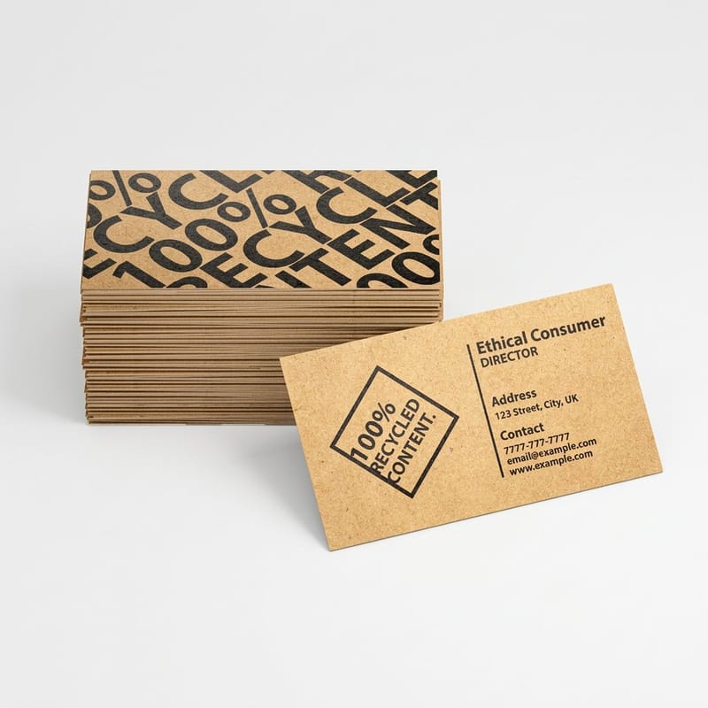
Names are stories. Presses need numbers. Every argument about color between a designer and a printer starts in the same place, which is a file that says the color should be puce and a press that has no idea what that means. Ask five people for puce and you get a brownish purple, a pinkish brown, a grape, and two people reaching for a phone.
Pantone launched its matching system in 1963 for that reason. Instead of naming a color, you point at a numbered ink that a mixer anywhere in the world makes from the same recipe. That number is a contract. The name is a mood.
So the working rule is simple. Whatever a color is called, before it goes to a press it becomes one of three things: a Pantone reference, a CMYK build, or a Lab reading taken off a physical sample. Our explainer on spot color printing covers how a numbered ink is actually mixed and put on the sheet.
The three numbers a printer can act on
A Pantone number means a premixed ink. The color arrives in a can already the right color, so it does not depend on four inks landing in register at the right densities. It is the most repeatable option and the most expensive.
A CMYK build means four process inks stacked to imitate the color. Cheap, flexible, prints alongside photographs, and limited to what those four inks can reach together. Most colors are fine here. A handful are not, and the ones that are not tend to be the loud ones.
A Lab reading means somebody put a spectrophotometer on a physical sample and wrote down what it measured. This is how you specify a color that exists in the world but has no ink number yet, such as a fabric swatch or a painted panel.
Why the argument keeps happening
Screen and paper are not the same medium and never were. A monitor throws light at your eye. A sheet absorbs most of the light in the room and sends the rest back, and it can only send back what the room gave it. That is why a color that glows on a laptop can look flat in a printed piece even though nothing went wrong. We went through the whole mechanism in why colors look dull when printed.
The fix is not a better monitor. It is a proof on the stock you are actually ordering, looked at in daylight rather than under an office fitting.
The ten weirdest color names, and what each one really is

These are the ten in the table above, in the order they usually surprise people. Some are grim, some are French, one of them only exists inside your own eye. Eight of the ten will print.
None of these need an expensive test. Premium business cards start at $17.57 and standard flyers at $39.54, which makes a short run the cheapest way to see what a color does on paper rather than on a screen.
The five with the worst backstories
1. Mummy brown. For centuries the pigment was made by grinding up Egyptian mummies with white pitch and myrrh. Painters used it happily until enough of them worked out what was in the tube, and the London colourmen who sold it are reported to have used up their last mummy in the 1960s. The color itself is unremarkable, a warm mid brown that any press prints without complaint.
2. Puce. French for flea. Eighteenth century French court fashion had both puce and a paler shade attributed to the same insect, and two hundred years later nobody agrees on the value. Treat puce as a starting point for a conversation, never as an instruction.
3. Gamboge. A deep saffron made from tree resin tapped in Southeast Asia. It is also a purgative, which watercolorists who pointed their brushes with their lips discovered the hard way. It is the one color on this list most likely to disappoint you in four color process, because that intensity of orange yellow sits outside what CMYK reaches.
4. Drunk-tank pink. Properly Baker-Miller pink, named for the two naval officers who let a researcher paint a holding cell in 1979. The calming effect it became famous for has not held up well in later work, but the shade stuck around. It is a pale tint, which makes it one of the harder colors to hold consistent across a long run.
5. Isabelline. A pale gray yellow, tied to a story about a queen who swore not to change her shift until a siege ended. The story is good and the dates are wrong: the color name shows up in an English wardrobe inventory before that siege started. On press it is barely a color at all, which is exactly why the paper you choose decides how it looks.
The five you will actually specify
6. Falu red. The red on Swedish barns and cottages, made from the tailings of the copper mine at Falun. It is an iron oxide, so it is muted, and muted reds are the ones that survive uncoated stock. Bright reds on uncoated go chalky. This one does not.
7. Coquelicot. The corn poppy. A hot orange red that looks superb on a poster and lands duller than expected in a plain CMYK build, because it sits right at the edge of the process gamut.
8. Glaucous. The blue gray bloom on a plum or a red cabbage leaf. It is mostly a small amount of cyan with black doing the rest, so it is sensitive: a press running slightly heavy pulls it toward green. Worth a press check if it is a brand color on a long run.
9. Eigengrau. German for intrinsic gray, and the gray you see with your eyes closed in a completely dark room. It is generated by your visual system rather than reflected off anything, which makes it the one entry here that cannot exist on a sheet of paper.
10. Vantablack. Not a name for a shade but for a forest of carbon nanotubes grown on a surface, which traps almost all the light that hits it. It reads as absence rather than as a color. It is also not an ink, so nothing you order from any printer is Vantablack.
The two on this list you cannot print
Eigengrau and Vantablack are the useful pair, because both mark a real boundary. Ink works by absorbing some wavelengths and bouncing the rest back. Even the deepest black on the deepest stock bounces a little, and that little is what your eye reads as a surface rather than a hole.
So when a design calls for a black that swallows light, the honest answer is to change what you are aiming at. The deepest result on a press is a rich black, which is a heavy black plate supported by cyan, magenta and yellow underneath, typically somewhere near 60 cyan, 40 magenta, 40 yellow and 100 black. Straight 100 black on its own dries to a flat charcoal that looks gray next to a photograph. The rich black recipe goes through the build and where it fails.
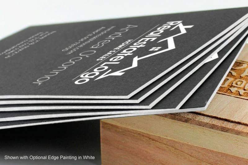
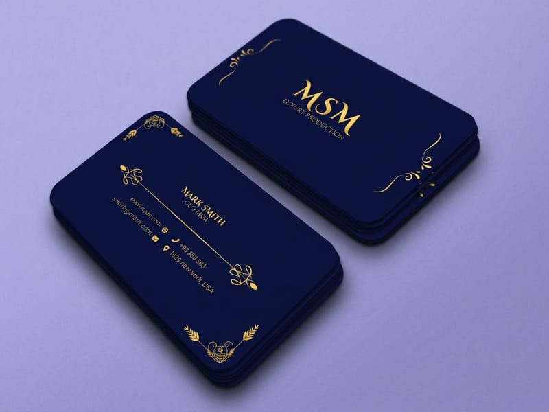
After that, the depth comes from the material, not the file. A soft touch laminate kills reflection and makes the same ink read darker. A black core stock like our black business cards at $40.62 puts black all the way through the sheet, so the edge is black too, which is the detail people actually notice when they hold the card. A product overview video of black business cards runs under three minutes if you want to see that core before you order.
What to do when a brand color sits outside CMYK
You have three moves. Pay for a spot ink and get the color exactly. Accept the closest CMYK build and adjust everything around it so the piece still looks deliberate. Or change the design so the out of gamut color is a small accent, where the eye forgives a lot more than it does across a large flat area.
Which one to pick depends on how often the color repeats. A brand color that appears on every piece you print all year earns a spot ink. A single poster does not. Our list of the Pantone colors that shift most in CMYK tells you in advance whether your color is one of the troublesome ones, and how to match Pantone to CMYK covers the conversion itself.
One limit worth knowing before you commit: a spot ink cannot appear inside a photograph. Photographs are built from process inks. If your out of gamut color has to sit inside an image rather than beside it, the spot ink option is gone and you are choosing between a build and a different image.
Stock and finish change the color more than the file

Take one file, print it on gloss coated and on uncoated, and you get two visibly different colors from identical numbers. Coated stock keeps the ink sitting on the surface, so it stays saturated. Uncoated stock drinks it, the dot spreads, and everything comes back softer and slightly darker. This is why Pantone publishes separate coated and uncoated values for the same ink.
Isabelline is the clearest example on this list. It is close enough to the paper that the paper wins: on a cream uncoated sheet it reads warm and almost invisible, on gloss coated it reads cooler and cleaner, from the same build. Any color with a lot of white in it behaves this way.
Finish does its own work. Gloss lifts saturation and gives you depth in dark areas. Matte cuts glare and reads calmer, but it flattens the deepest tones slightly. Soft touch goes further in both directions, killing reflection and deepening blacks while muting bright colors a little. If color accuracy is the point of the job, decide the stock before you tune the file, not after. Our prepress color management walkthrough covers profiles for each.
Proof on the stock you are ordering
A proof printed on a different substrate than your run tells you about your file and not about your job. Ask for the proof on the actual stock, look at it in daylight, and compare it against a physical sample rather than a screen. What proofing is in printing explains the difference between a soft proof and a hard proof and when each one is worth waiting for.
For a color that carries a brand, print a short run before the real one. On premium stickers at $29.16 or a small set of cards, that is a small price for finding out that the green you approved on screen goes olive on uncoated.
What color accurate printing costs at 4OVER4.COM
A color test costs less than one reprint. A hundred premium business cards on coated stock start at $17.57, 25 premium stickers at $29.16, 50 standard flyers at $39.54, and 50 black business cards on 32pt Midnite Black at $40.62, so you can see puce or glaucous on the paper you plan to use before the campaign run. Price moves with size, stock, finish and quantity, and the per unit cost drops as the run grows: 1,000 premium cards cost $65.91, under 7 cents a card against about 18 cents at 100. The numbers below come from the live configurator, so you can budget a color test and the real run at the same time.
Quantity and price
Business card pricing and specs
Real configurator numbers on premium stock, where a short color test run costs very little before you commit the campaign.
| Quantity | Price Per Unit | Total |
|---|---|---|
| 100 | 17.6¢ | $17.57 |
| 200 | 11.5¢ | $23.07 |
| 300 | 9.15¢ | $27.46 |
| 400 | 7.96¢ | $31.86 |
| 500 | 7.25¢ | $36.26 |
| 600 | 6.77¢ | $40.64 |

You can also earn coins on every order and redeem them against future printing, which takes some of the sting out of a test run.
Where a named color causes real trouble
Some industries invent color names for a living, and the handover between the people who name them and the people who print them is where jobs go wrong. The fix is two lines in the handover file: the Pantone number or CMYK build, and the stock it has to land on, such as 16pt gloss cover or 14pt uncoated for a card, because those two stocks give two different colors from the same numbers.
- Fashion and interiors brands. The industries that invent color names in the first place. Every seasonal palette needs a Pantone number attached before it reaches a printer, or the lookbook and the swing tags will not match each other.
- Paint and coatings. A color that only exists as a painted panel needs a Lab reading taken off the panel itself. Nothing else transfers accurately from a physical finish to ink on paper.
- Food and drink packaging. Appetite colors live in the saturated orange and red band where CMYK is weakest. Budget for a spot ink on the hero color and build everything else in process.
- Wineries and spirits. Deep bottle greens and metallic accents are the classic out of gamut pair. Metallics are not CMYK at all, so they need a metallic ink or a foil.
- Agencies and design studios. The value you add is turning a client word into a number before the file leaves. A named color in a handover file is an unresolved decision passed to somebody with a press running.
Print it
Cards that hold the color
Premium stock and coated finishes, the fastest way to see a brand color on paper.
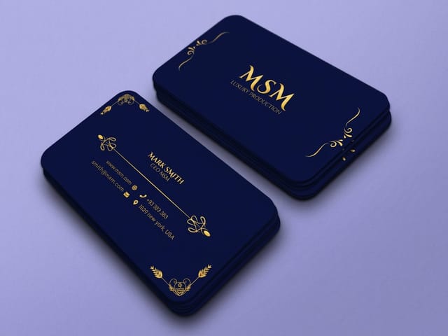
Two more places worth reading before you commit a palette. Two color printing with spot inks is often cheaper than four color on a long run, and it gives you exact color on both inks. The history behind Pantone colors explains why a numbered system replaced named colors in the first place, which is the same problem this page is about.
Blanks that remove one variable
Starting from a correctly sized file removes one variable from a color job. 4OVER4.COM sizes its blanks to exact product specs, so a 2 by 3.5 inch business card blank has its cut lines and bleed in place, your artwork lines up with them and nothing gets rescaled on the way to press. That leaves the color as the only thing you check on the proof. Grab one from the blank template library with bleed and trim already marked.
Start fast
Blanks that remove one variable
Blanks at the exact size, so one variable leaves a color job before it starts.














Wally turns a color name into a number
Puce is a story, PMS is an instruction
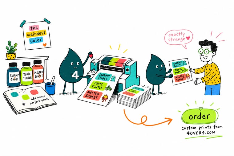
Pick a Pantone reference, a CMYK build or a Lab reading off a physical sample, decide coated or uncoated before you tune the file, and check the proof in daylight rather than on a screen. Saturated oranges, vivid greens, metallics and fluorescents sit outside CMYK, so those need a spot ink. 4OVER4.COM proofs it before the run.
Print a color test →What to remember about strange color names
Rules that hold for any color, however it is named
- Name it, then number it. Call it whatever you like in the deck. In the print file it is a Pantone reference, a CMYK build or a Lab value. Anything else is a request for a surprise.
- Check the gamut before the concept. Find out whether the color is reachable in process before you build a campaign on it. Late is when a color problem becomes a budget problem.
- One spot ink, not three. If a color earns a spot ink, it is usually one color. Two or three spots on top of process turns a routine job into a specialist one and the cost follows.
- Decide the stock first. Coated and uncoated give different colors from the same numbers. Pick the paper, then tune the file to it, never the reverse.
- Compare against something physical. A printed proof against a printed sample tells the truth. A proof held up next to a monitor tells you about the monitor.
Explore more
More ways to get the color right
Black business cards run 50 for $40.62 on 32pt Midnite Black uncoated and take 6 business days.
 Product Premium Business Cards Coated stock that holds saturated brand color. Product Standard Posters Large flat color fields, where gamut problems show first. Product Black Business Cards Black through the core, so even the edge is black. Product Standard Brochures Coated and uncoated options for color critical work.
  Product Premium Stickers A cheap way to test a color on real stock.
  Category Business Card Printing Every stock, finish and ink option in one place.
 If you came here for the names rather than the press, keep going with unusual color names and how to use them in design and funny and interesting color names, then come back for Pantone spot color printing for brand accurate cards when you are ready to order.
Ready to see the color on paper?
Send the Pantone number or the CMYK build, pick your stock, and 4OVER4.COM proofs it before the run so nothing surprises you at delivery.
Common questions about printing named colors
Can a printer match any color I name?
Only if you turn the name into a number first. A printer can match a Pantone reference precisely, can build a close CMYK version of most colors, and can measure a physical sample with a spectrophotometer and work from that. What no printer can do is guess which of the several published values for a name like puce or ecru you meant. Send a Pantone number, a CMYK build, or a physical swatch in the post. If you send only a word, whatever comes back is a coin toss, and reprints are the expensive way to settle it.
Why does the same color look different on my screen and on the printed piece?
A screen emits light and paper reflects it, so they are not doing the same thing. Your monitor makes color by firing red, green and blue light directly at your eye, which lets it produce intensities no reflective surface can reach. A printed sheet can only bounce back part of the light the room gives it, and ink works by subtracting wavelengths from that light. Bright saturated colors are where the two diverge most. This is normal rather than a fault, and the fix is to judge color from a proof on your actual stock in daylight instead of from a screen.
When is a spot ink worth paying for instead of a CMYK build?
When the color repeats and the accuracy is worth money. A brand color that appears on every card, brochure and sign you print through the year earns a premixed ink, because a spot ink lands the same on every run instead of depending on four inks hitting the right densities. A single poster or a one off flyer almost never earns it. The other trigger is position in the gamut: if your color is a saturated orange, a vivid green or anything fluorescent or metallic, a build will not get you there at any budget, so it is spot ink or a redesign. Metallic has a third route, foil: our Metallic Flyers add a metallic foil accent to the front of a 16pt gloss sheet, from 500 for $317.44.
Can you print neon or fluorescent colors?
Not from CMYK. Fluorescent pigments work by absorbing ultraviolet light and re emitting it as visible light, which is why they look brighter than the paper around them. The four process inks cannot do that, so a neon specified as a CMYK build always returns as a fairly ordinary bright color. Getting real fluorescence needs a fluorescent spot ink run as an extra unit on press. It is a specialist job with a real cost attached, so it is worth deciding early whether the piece genuinely needs the glow or whether a strong process color does the work.
Which colors shift the most between the proof and the finished run?
Pale tints and colors built from small amounts of ink. A pastel pink like Baker-Miller pink is mostly paper with a light magenta tint on it, so a small change in ink density on press is a large proportional change in the color you see. Grays and gray blues such as glaucous behave the same way, and they tend to drift toward green or purple depending on which way the press runs. Deep solid colors are far more stable. If a light tint matters to the job, ask for a press check or accept a wider tolerance in advance.
