
Bauhaus Inspired Logo Design Principles and Ideas That Still Work


Sofia is our design and templates voice, built from the knowledge of our production team, with over 20 years in printing.
Bauhaus logo design is geometry on a grid: a mark built from circles, squares and triangles, set in a lowercase geometric sans, and filled with flat red, yellow or blue instead of shading. It still works because a shape drawn to a fixed unit survives every reduction, from a poster down to a 12 mm mark on the corner of a business card. On paper it lives on business cards, letterheads and circle stickers, where flat color prints at its cleanest.
A Bauhaus logo, sized for print
A Bauhaus logo has to hold at three sizes: about 12 mm on the corner of a 3.5" x 2" business card, the width of a letterhead header, and 11" x 17" to 22" x 28" on a poster. Draw it solid in black at 60 mm first, then print it at 12 mm and check that the counters stay open. Standard business cards print from 100 cards on 14pt or 16pt gloss or uncoated stock in 3 business days, which makes the small-size test cheap before a letterhead or poster run.
The Bauhaus toolkit at a glance
| Element | Where it comes from | What it does in a logo | Where it breaks | What it means in print |
|---|---|---|---|---|
| Modular grid | Itten and Moholy-Nagy’s preliminary course | Ties every proportion to one unit, so the mark scales without redrawing | Pure grid maths looks lopsided until you correct it by eye | Grid units convert cleanly to picas, so nothing lands off the trim |
| Three primitives | Kandinsky and Klee’s form teaching | One shape becomes the engine of the whole identity | All three in one mark reads as a costume rather than a logo | Solid shapes hold at 12 mm; hairline outlines close up on press |
| Primary color | Kandinsky’s 1923 questionnaire | Color is assigned to shape instead of chosen by taste | Three saturated primaries get loud on anything bigger than a card | Bauhaus red and blue sit outside CMYK, so specify a spot ink |
| Geometric sans type | Herbert Bayer’s Universal alphabet, 1925 | Letterforms built from the same circles and lines as the mark | A small x-height makes the wordmark vanish at card size | Keep the wordmark at 7 pt or larger, heavier if it reverses out |
| No ornament | Gropius’s 1919 manifesto | Everything still on the page is doing a job | Nothing is left to hide a weak idea behind | Flat areas show every press flaw, so ask for a proof before the run |
Borrow one element at a time. A logo that takes the grid and the reduction but leaves the primaries alone is still recognisably in the tradition, and it will not look like the last five identities your customer saw. When the drawing is settled, print it on standard business cards and judge it at real size.
What the Bauhaus was, and what it was not

The Bauhaus was a German art and design school, opened by the architect Walter Gropius in Weimar in 1919, moved to Dessau in 1925, moved again to Berlin in 1932, and closed in 1933. Fourteen years, three directors, a few hundred students. It was never a style guide, which is the first thing worth knowing if you are about to design a logo in its name.
What the school produced was a method. Students spent their first months on a preliminary course studying material, color and form before they were allowed near a workshop, and the workshops themselves were built around making things that could be manufactured. That is why the output looks the way it does: geometry, flat color and no ornament are what survive when a design has to be reproduced by machine rather than drawn by hand.
A correction worth making early. Designers routinely credit the Bauhaus with “form follows function”, but Louis Sullivan wrote that in 1896, and he was talking about tall buildings in Chicago. The motto the school itself put on the 1923 exhibition was “Art and Technology, a New Unity”. The difference matters for a logo brief: Sullivan’s line invites you to strip everything out, and the Bauhaus line asks you to make something that industry can actually reproduce. Those are not the same instruction.
Why the look outlived the school
A mark built from a circle, a square and a straight line reduces well, reverses well and separates well. Those three properties decide whether a logo survives contact with production. Ornament fails at small sizes, gradients fail on a one color job, and hand drawn detail fails the moment it is embroidered, etched or foil stamped.
The geometry is also cheap to reproduce. A two color flat mark can be printed as spot ink, cut in vinyl, stamped in foil or embroidered without a single redraw, and that portability is worth more to a small brand than any amount of illustration. The six key principles of logo design arrive at the same place from a different direction.
Where the style is a bad fit
Bauhaus geometry is cold on purpose. If your brand sells warmth, craft, heritage or personal service, a flat red square is fighting you, and no amount of careful spacing fixes it. Look at a drawn or lettered mark instead.
It is also crowded. Geometric sans type in lowercase over a primary colored shape has been the default for start-up branding for a decade. You can still use it well, but you will differentiate on proportion and restraint rather than on the palette, because the palette is not yours alone any more.
The three principles that make a mark look Bauhaus

Strip the history away and three working rules remain: build on a grid, reduce to primitives, and assign color rather than choose it. Everything else on a Bauhaus inspired logo is a consequence of those three.
The grid comes first. Pick a unit, draw a field of six or twelve of them, and let every measurement in the mark be a whole number of units: the stroke weight, the gap between shapes, the height of the wordmark. It sounds mechanical, and it is, which is the point. A mark whose proportions are all multiples of one number stays coherent when someone else scales it for a poster or an app icon two years from now.
Then the correction the grid cannot give you. A circle and a square drawn to the same measure do not look the same size, because the circle only touches the boundary at four points. Push the circle out by roughly two percent, and do the same for pointed shapes such as triangles. Every typeface in the world does this to its round letters, and a logo built on maths alone with no optical pass always looks slightly wrong without anyone being able to say why.
Color assigned, not picked
In 1923 Kandinsky circulated a questionnaire at the school asking students to fill a triangle, a square and a circle with yellow, red and blue. The pairing that came back, yellow triangle, red square, blue circle, is the color logic behind almost every Bauhaus inspired identity since. Use it as a rule for your own system: the shape decides the color, and the same shape keeps that color everywhere.
Hold the count down. Two colors plus black is a system; three saturated primaries plus black is a poster. On a business card the whole mark is about 12 mm wide, and three fighting hues at that size turn into noise. Our notes on color combinations that work in print go into which pairs hold up on paper.
There is a print catch here that designers hit late. The saturated red and blue people associate with the Bauhaus are outside what CMYK can build, so a four color job renders them duller and slightly muddy. If those exact colors carry the brand, specify them as spot inks and print the identity pieces as a two color spot job, or accept the process build and choose a red that is achievable rather than one you have to apologize for.
Reduce until it hurts, then stop
Take the mark to gray, then to one color, then to 12 mm wide, and look at it after each step. Whatever disappears was decoration. Whatever is still legible is the logo. This is the same discipline behind every black and white logo that still works, and it is far more useful than any amount of moodboarding.
The stopping point is when removing one more element changes what the mark means. Push past that and you get a shape with no memory in it, which is the common failure of geometric logos: technically clean, entirely forgettable. A useful check before you start is running through the questions worth asking before a logo project, because most reductions fail for a brief reason rather than a drawing reason.
The designers behind the style, and what each one gave it
Five names carry most of what people mean by Bauhaus design, and each contributed a different piece of the logo toolkit. Knowing which piece came from where makes it much easier to borrow deliberately instead of copying a mood.
Herbert Bayer ran the printing and advertising workshop at Dessau and drew the Universal alphabet in 1925: a single case, geometric sans built from circles and straight lines, with no capitals at all. His argument was practical rather than aesthetic, that German printed two alphabets for one spoken language and one of them was redundant. That is why lowercase only wordmarks read as Bauhaus, and it is also why they need care in print, because a geometric sans has a small x-height relative to its cap height and goes weak at card size.
Laszlo Moholy-Nagy took over the preliminary course and pushed photography, photograms and what he called typophoto, the deliberate combination of type and image as one unit rather than a caption sitting under a picture. If your identity pairs a mark with a cropped photograph, that idea is his. Josef Albers came up through the glass workshop and spent the rest of his life on how colors change each other, published as Interaction of Color in 1963, which is the single best answer to why your red logo looks different on a gray letterhead than on a white one.
Marcel Breuer worked in furniture and built the tubular steel chair now known as the Wassily in 1925 and 1926, the clearest example of the school’s real method: take an industrial material, bend it with existing machinery, and let the manufacturing process draw the object. Gropius supplied the frame around all of it, an architect running a school on the belief that art and manufacture should stop being separate trades.
Borrowing Bayer without losing legibility
A lowercase geometric wordmark is the easiest Bauhaus move to make and the easiest to get wrong on paper. The round letters are close to true circles, which means tight counters, and tight counters fill with ink when the mark is small or reversed out of a dark panel. Set the wordmark at 7 pt or larger on a business card, and step up a weight whenever it reverses.
Letterspacing does most of the work. Geometric sans faces are drawn tight and need opening up for a wordmark, especially between a round letter and a straight one. If you are choosing a face rather than drawing one, our roundup of easy to read fonts for brands and print covers the ones that survive small sizes.
What Albers tells you about your letterhead
Albers demonstrated that a color never appears alone: it takes its reading from whatever surrounds it. Your red square on a bright white 70 lb text sheet is not the red on an uncoated cream stock or the red on a matte poster, even from identical ink.
The practical response is to proof the mark on every stock the identity will actually live on, not just the one the designer likes. A letterhead, a card and a poster are three different backgrounds, and the brand color has to hold across all three.
How to apply Bauhaus ideas to your own logo
Work in this order and the mark tends to come out right. Set a unit and draw a twelve by twelve field. Choose one primitive as the engine of the identity, not three. Draw the mark solid, in black, at 60 mm wide. Correct the optics so circles and points overshoot the flat edges. Add one color, assigned to the shape rather than picked from a palette. Then reduce to 12 mm and print it, because that is the size at which the decision is actually made.
The step people skip is the last one. A mark approved on a screen at 400 percent has not been tested, and the failures that show up on paper are always the same three: counters closing, a wordmark going illegible, and two flat colors meeting along an edge where the smallest press shift leaves a white sliver. Give the shapes a hair of overlap where they butt together and that last one disappears.
Printing a Bauhaus style logo on cards and materials
Flat geometry is one of the easiest things to print well and one of the least forgiving. Large solid areas mean any inconsistency in coverage is visible, so a proof matters more here than on a photographic design. On a 3.5" x 2" card, keep the mark at least 12 mm wide and every solid shape at least 0.125 inch inside the trim. The upside is that the same artwork travels intact across every process you might want later.
Quantity and price
Business card pricing and specs
Live configurator numbers for standard business cards, where the per unit cost drops as the run grows.
| Quantity | Price Per Unit | Total |
|---|---|---|
| 100 | 17.6¢ | $17.57 |
| 200 | 11.5¢ | $23.07 |
| 300 | 9.15¢ | $27.46 |
| 400 | 7.96¢ | $31.86 |
| 500 | 7.25¢ | $36.26 |
| 600 | 6.77¢ | $40.64 |

You can also earn coins on every order and put them against the next print run, which helps when an identity rolls out across cards, letterheads and signage in stages.
Stock and finish for a flat geometric mark
Stock changes the mark more than most designers expect. On a coated gloss stock, flat color sits bright and sharp on the surface. On an uncoated sheet, the ink sinks in and the same red reads softer and about a tone darker, which often suits a geometric identity better than the gloss does. Thickness is a separate decision: 14 pt is the working default, and 16 pt is noticeably more rigid in the hand, which reads as considered on a card with almost nothing printed on it. Our business card stock guide lays out the weights side by side, and the full business card printing range shows which stocks pair with which finish. For a minimal mark, try ultra thick velvet laminated business cards, where the stock carries the weight.
Print it
Business cards, ready for a flat mark
Preset sizes and stocks, the fastest way to see the logo at the size people actually meet it.

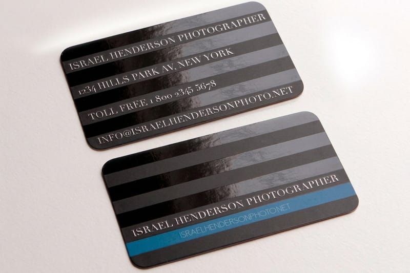
Finish is where a minimal mark earns its keep. Spot UV gloss on the shape alone, against an untouched matte field, gives you a second visual layer without a second color, which is exactly the trade a restrained identity wants. Raised foil is the other strong option: generous, solid geometric shapes stamp cleanly, where fine hairlines and tight serifs tend to fill. Both cost more than plain ink, and both are wasted on a busy design, which is why they suit this style specifically. Balance is doing the work in either case, and the thinking behind that is covered in our guide to balance in graphic design.
Where the style fits, by business type
The same mark does different work in different categories. A quick read by business type before you commit.
- Architecture and design studios. The most natural fit, because the audience reads the reference. Keep it to one primitive and one color, and let the paper stock carry the rest of the signal.
- Coffee shops and small hospitality. A flat geometric mark cuts through on cups, stickers and signage where a detailed illustration turns to mud. Circle stickers at $23.88 make the cheapest test of whether the mark holds at small size.
- Studios, galleries and museums. Posters are where the style earned its reputation. Large flat areas, a strict grid and type set as a structural element rather than a caption.
- Fitness and wellness brands. Geometry reads as discipline, which suits the category. Watch the palette, because primary red and blue on a supplement label collide with the regulatory panel.
- Software and technical services. The most crowded corner of this style. Differentiate on proportion and one unexpected color, not on the shape, because everyone already owns the shapes.
Beyond cards, the style belongs on large flat surfaces. A geometric identity on standard posters at $108.75 is the closest a small brand gets to the 1923 exhibition work, and the poster printing range covers matte and framed options. For type choices at that scale, see the best fonts for posters.
Blanks that keep a circle off the trim
Starting from an exact size blank saves the most common mistake with a geometric mark, which is a shape that touches the trim and comes back cut unevenly. On a 3.5" x 2" card the safe area sits 0.125 inch inside the trim, so a circle meant to touch the edge has to cross it by the full 0.125 inch bleed, and one meant to float has to stay inside the safe line. 4OVER4.COM sizes its blanks to real product specs, with bleed and trim marked, so a mark placed against the edge stays where you put it. Grab one from the blank template library.
Start fast
Blanks that keep a circle off the trim
Card blanks at exact trim, so a geometric shape never ends up touching the cut.






Wally builds the mark on the grid, then breaks it on purpose
One unit, one primitive, one assigned colour
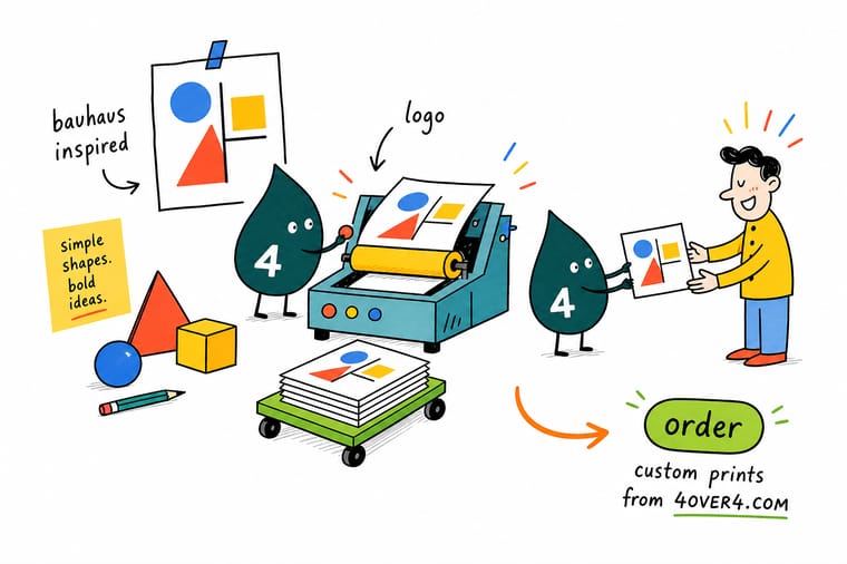
Draw a twelve by twelve field and make every stroke and gap a whole number of units. Pick one primitive as the engine, push circles out about two percent so they stop reading small, and assign the color to the shape rather than choosing it. Then reduce the mark to 12 mm, print it on real stock, and check the counters are still open before the identity is signed off.
Print your logo on business cards →What the method still gets right
Five rules that hold at every size
- Draw it on a 12 unit grid. Every stroke weight, gap and letter height should be a whole number of units. Coherence at scale comes from that constraint, not from a style guide written afterwards.
- Overshoot your circles. A circle drawn to the same measure as a square reads smaller. Push it out about two percent and the pair finally looks equal.
- Two colors plus black. Three saturated primaries in one mark is a poster, not a logo. Assign a color to each shape and keep the assignment fixed across the identity.
- Test at 12 mm before you fall in love. Reduce the mark to business card width and print it. Counters that look generous on screen close up under real ink on real stock.
- Check the ink is reachable. Bauhaus red and blue are outside CMYK. Decide early whether you are paying for a spot ink or picking a color the process can actually build.
Explore more
Where a geometric mark goes next
Circle stickers run 25 for $23.88 and standard letterheads 50 for $99.95 on 70# uncoated text.
Product Standard Business Cards The cheapest honest test of a mark at 12 mm. 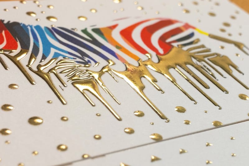 Product Raised Foil Business Cards Flat geometry stamps cleanly where fine detail fills in.
  Product Spot UV Business Cards Gloss one shape, leave the rest matte, skip the extra ink. Product Letterheads Where the grid and the wordmark do the whole job.
 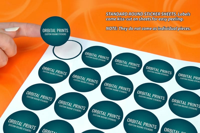 Product Round Stickers A primitive that is already the shape of the sticker.
  Category Business Card Printing Every stock, finish and size in one place.
 Ready to see the mark at real size?
Pick your stock, drop in the artwork or a free template, and 4OVER4.COM prints flat color clean and sharp, with a proof before the run.
Common questions about Bauhaus logo design
What is the actual Bauhaus logo?
The profile head in flat black that most people picture was drawn by Oskar Schlemmer in 1922, and it was used as the school signet from the Weimar years onward. The school also used a lowercase geometric wordmark set in Herbert Bayer’s letterforms, which is what people copy when they talk about a Bauhaus logo today. There was never one fixed mark applied consistently the way a modern brand would apply one, because the school changed cities and directors twice in fourteen years. If you want the reference to read clearly, the Schlemmer head is the recognisable one and the Bayer lowercase type is the reusable one.
Which font should I use for a Bauhaus style logo?
The historically correct answer is Herbert Bayer’s Universal alphabet from 1925, a lowercase only geometric sans, available today through several digital revivals. The practical answer is any geometric sans with circular bowls and a single storey a, set in lowercase and letterspaced open. Note that Futura, which people reach for first, is Paul Renner from 1927 and was not a Bauhaus typeface, though it comes out of the same geometric thinking. Whatever you pick, check the x-height, because these faces run small and a wordmark that reads well on a poster can disappear on a business card.
Can I print Bauhaus primary colors in CMYK?
You can print something close, but not the saturated red and blue people have in their heads, because those sit outside the CMYK gamut. A four color build gives you a slightly duller, slightly warmer red and a blue that leans toward navy. If those exact colors are the brand, specify Pantone spot inks and print the core identity pieces as a two color job, which also gives you flatter, cleaner solids than a process build. If the budget is fixed on four color, choose a red and blue that the process can actually reach and approve them on a printed proof rather than on a monitor.
How small can a geometric logo go on a business card?
A solid geometric mark holds down to around 10 to 12 mm wide on a standard 3.5 by 2 inch card. Below that, the shapes are still legible but the wordmark stops being readable and the mark starts to look like an icon rather than a logo. Outlined versions are the ones that fail first, because any stroke under about half a point fills with ink and turns the shape solid. Draw the solid version as the master, keep an outline version only for large applications, and check both on a printed proof rather than a screen zoom.
Is a Bauhaus inspired logo still a good idea, or is it overused?
It is overused in the specific combination of lowercase geometric sans plus one primary colored shape, which has been the default look for new brands for years. The underlying method is not overused at all, and it is what actually carries the value: one grid, one primitive as the engine, color assigned rather than chosen, and everything tested at reduction. If you want the discipline without the cliche, keep the grid and the reduction, then break expectation somewhere specific, in the proportion, in an unusual second color, or in the printing finish rather than in the drawing.
