
22 Logo Questions Designers Wish Clients Would Ask


Sofia is our design and templates voice, built from the knowledge of our production team, with over 20 years in printing.
How to Write a Logo Brief That Survives the Print Room
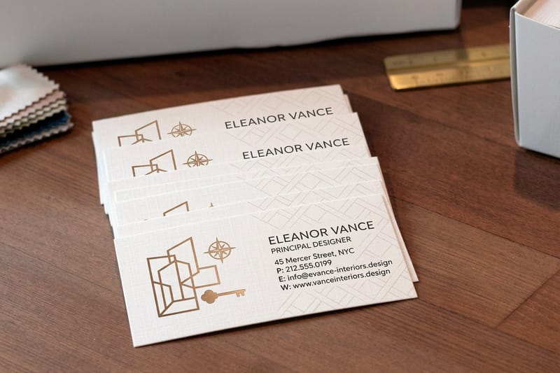
Most logo projects go sideways for one reason. Somebody starts sketching before anybody agreed what the mark actually has to do. A brief is not paperwork and it is not a mood board. It is the short list of constraints that turns personal taste into a decision you can still defend a year later, when the same mark has to sit on a card, a banner and a giveaway at the same trade show. In print those three are business cards at 2 by 3.5 inches, a 2 sided blockout banner on 15oz vinyl from 2 by 3 up to 4 by 10 feet, and a small promo item with a tight branding area; pair them with a ready-made gift such as a 3 in 1 foldable wireless charger.
The 22 questions below are the ones worth settling before the first sketch. A few dig into the story behind the business, a few are pure production, and each one removes a revision round that would otherwise happen after you have already paid for it.
4OVER4.COM prints the pieces those answers eventually land on, so the production questions here are written from the press bed backward. What happens to a logo when it drops to a quarter of an inch on a card corner, when it is knocked out in white on a heavy vinyl banner, or when it has to be a single flat color on a molded plastic product. Answer those before the design phase and you never have to redraw the mark to fit the job.
Answer in writing, not in a meeting
Verbal agreement evaporates the moment someone sees a concept they dislike. Type the answers into one document, circulate it, and get the person with final approval to confirm it in writing. That document becomes the scoring sheet you judge concepts against, which is how you avoid choosing a logo by whoever spoke last.
Bring examples, not adjectives
Words like modern, clean and premium mean something different to every person in the room. Pair every adjective with two marks you admire and one you would hate to be compared to, and say why. Ten minutes of collecting examples replaces an entire round of guessing.
Test the mark
Interior design business cards
The cheapest honest check on whether your new logo holds at real reading size.

Questions to Settle Before You Open Any Design Tool
Start with the boring questions. They set the scope, name the decision maker and pin the deadline, which between them cause most of the friction in a logo project. If these four are vague, everything after them is guesswork.
- 1. What does this business actually sell, and to whom? One sentence, plain language, no mission statement. A mark for a wholesale parts supplier and a mark for a boutique studio are different jobs.
- 2. Why are we doing this now? A brand new company, a merger, a new market, or a mark that has quietly stopped working. The reason shapes how far the design is allowed to travel from what exists.
- 3. Who gives final approval, and what does approval look like? Name one person. Decide whether approval means a signature, an email, or a vote, and decide it before concepts exist.
- 4. What is the first thing that gets printed, and when? A card handed out at a conference in three weeks is a completely different brief from a rebrand that rolls out over a year.
Write the first printed piece into the brief by name. It gives the designer a real target instead of an abstract one, and it tells you exactly which technical questions further down this list matter most.
Print picks
Three pieces that stress test a new logo
Small scale, large scale and single color, with live prices ready to configure.
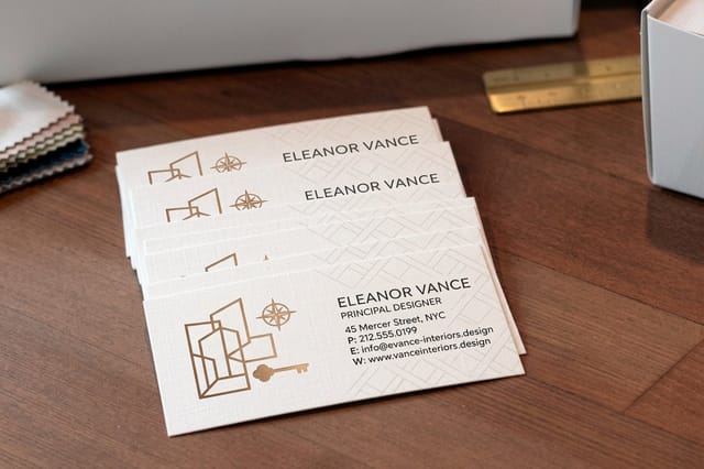 Interior Design Business Cards 100 for $17.57 The small-scale test. If the mark survives here, it survives anywhere.
 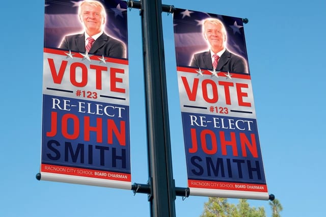 2 Sided Blockout Banners $108.75 each Large format with an opaque core, so neither side bleeds through the other.
 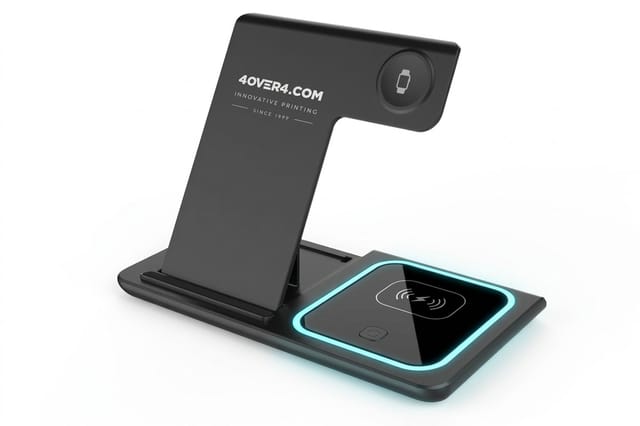 3 in 1 Foldable Wireless Charger $15.00 each A ready-made giveaway to pair with your printed pieces.
 Brand Story and Values Questions
These five pull out the raw material a designer draws from. You are not asking for poetry. You are asking for the specific, ownable details that make one mark belong to your business and no other.
- 5. What is the origin story in one sentence? Founders started in a garage, a family shop went into its third generation, two engineers got tired of a bad tool. Real detail beats invented heritage every time.
- 6. Which three words should a stranger use after seeing the mark? Pick three and rank them. If you cannot rank them, you have not decided yet.
- 7. What do we do differently from the competitors we respect? Name them, and name the difference. Distinctiveness in a logo comes from knowing what you are standing apart from.
- 8. What must the mark never suggest? Cheap, corporate, medical, clinical, childish. The exclusions narrow the field faster than the inclusions do.
- 9. Does the name carry an image worth drawing? Literal names invite a symbol, abstract names usually push you toward a wordmark. Deciding this early saves weeks of sketching in the wrong direction.
A good answer to question seven is often the whole concept. If you are the only supplier in your region that runs same day, that fact belongs in the brief, because it changes the mark from decorative to meaningful. For more of the thinking behind that, the 6 key principles of logo design break down what makes a mark hold up over time. Our guide to writing a logo design brief has a fillable template for those answers.
Logo Type Questions, From Wordmark to Combination Mark
Now decide what kind of object you are actually commissioning. A wordmark, a lettermark, a standalone symbol and a combination mark all behave differently in print, and the choice determines how many versions you will need to have built.
- 10. Wordmark, lettermark, symbol or combination mark? New businesses usually need the name visible, which argues for a wordmark or a combination. Symbols alone take years of recognition to earn.
- 11. Can the symbol ever stand alone? If yes, it must be drawn to work without the words next to it, and it needs its own clear space rules and its own minimum size.
- 12. Do we need a stacked version and a horizontal version? Almost always yes. A wide horizontal lockup dies inside a square avatar, and a stacked lockup wastes a letterhead.
- 13. Is custom lettering justified? Custom drawing gives you something nobody can copy in an afternoon. A well licensed typeface, adjusted properly, costs far less and is often the right call.
Whatever you choose, test it early at the smallest size it will ever appear. A card is the cheapest honest test there is, because the trim, the ink spread and the reading distance are all real rather than simulated on a screen.
Quantity and price
Business card pricing and specs
Real configurator numbers, plus the stocks and finishes your logo has to survive.
| Quantity | Price Per Unit | Total |
|---|---|---|
| 100 | 17.6¢ | $17.57 |
| 200 | 11.5¢ | $23.07 |
| 300 | 9.15¢ | $27.46 |
| 400 | 7.96¢ | $31.86 |
| 500 | 7.25¢ | $36.26 |
| 600 | 6.77¢ | $40.64 |

Questions About Fitting the Logo Into a Whole Identity
A logo alone is not an identity. These four questions decide whether the mark can be handed to a printer, a sign shop and a web developer in the same week without three different results coming back.
- 14. What are the exact color values? You need CMYK for print, a Pantone reference where color has to match across suppliers, hex for screen, and RGB for video. Guessing a conversion is how a brand blue turns purple.
- 15. What typefaces sit alongside the mark, and do we own the licenses? Desktop, web and app licensing are separate. Sort this before the fonts are baked into artwork you cannot legally send out.
- 16. How much clear space, and what is the minimum size? Define clear space as a fraction of the mark itself so it scales, and set a hard minimum width in inches for print and pixels for screen.
- 17. What happens over photography and on dark backgrounds? You will need a reversed version and a rule for the busy backgrounds where a logo usually goes to die.
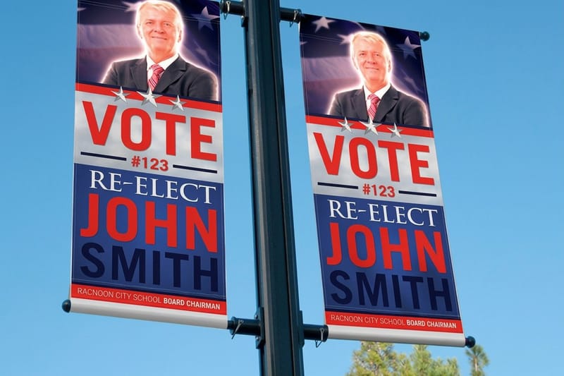
Large format is where a weak answer to question sixteen shows up first. A banner enlarges every flaw, including the ones nobody noticed at card size, so run the enlarged artwork past a designer before the file goes to press.
Large format
2 sided blockout banners
An opaque core keeps each side clean, so the enlarged mark reads without ghosting.

How the Logo Must Reproduce in Print
One color test
Branded merchandise
A small imprint area and a limited color count is where a weak one-color version fails first.
This is the section most briefs skip, and it is the one that costs money later. Five questions, all of them about what physically happens to your mark once it leaves the screen.
- 18. Is there a one-color version and a reversed version? Embossing, foil, engraving, screen printing on merchandise and single color stamps all need flat art with no gradients and no thin trapped shapes.
- 19. Does the mark hold at a quarter inch and at eight feet? Print it at both extremes on plain paper before you approve anything. Hairlines vanish small, and rough edges become obvious large.
- 20. Are the files vector, and are the fonts outlined? Ask for AI or EPS plus PDF, with type converted to outlines. A logo that only exists as a PNG will fail the first time a printer needs to scale it.
- 21. Will any part of the mark need a special finish? Foil, spot UV and embossing need their own separate art layers. Decide now and the designer builds them in rather than rebuilding later.
- 22. What are the deliverables, and who owns them? Get the full file package, the usage guide and a written transfer of rights. Ownership disputes surface at the worst possible moment, usually mid launch.
Branded merchandise is the strictest judge of all. A small imprint area with a fixed number of colors will tell you within a day whether question eighteen was ever really answered.
Reviewing the Answers and Choosing a Direction
Once concepts arrive, judge them against the brief rather than against your mood that morning. Read out the three ranked words from question six and ask whether the mark delivers them. Check it at minimum size. Check it in one color. Check it reversed. Anything that only works in the presentation deck is not finished.
Give feedback in terms of the brief too. Saying that a concept reads as clinical when the brief ruled clinical out is useful. Saying that you do not love it is not. Collect all comments into one voice before they reach the designer, so you never send two contradictory notes on the same day.
- Print it, do not just view it. A screen is backlit and forgiving. Paper is neither, and paper is where your customers meet the mark.
- Look at it after a day away. First reactions favor novelty. Second reactions favor the mark you can live with for a decade.
- Show it to a customer, not the whole office. Two or three people in your actual market are worth more than a company wide vote.
Compare formats
Popular business cards, side by side
Stock, finish, size, quantity, turnaround and price in one view before you commit.
 free business cards |  Standard Business Cards |  3D Lenticular Business Cards |  Metallic Foil Business Cards | |
|---|---|---|---|---|
| Min price | Free | $17.57 | $690.88 | $222.13 |
| Paper / stock | 14pt Gloss Cover | 14pt Gloss Cover | 31pt Lenticular Lens | 16 Point Silk Laminated |
| Finish | - | Standard Finish | - | - |
| Size | 2" x 3.5" | 2" x 3.5" | 2" x 3.5" - Vertical | 2" x 3.5" |
| Default qty | 200 | 100 | 500 | 500 |
| Turnaround | 5 business days | 3 business days | 22 business days | 7 business days |
| Rating | ||||
| View & customize | View & customize | View & customize | View & customize |
Taking the Approved Logo to Print
The moment the mark is approved, put it on something physical. Cards first, because they are cheap and they force every scaling decision into the open. Then whatever your business actually needs next, whether that is signage, stationery or something you hand out at an event.
Set your files up in CMYK at 300 dpi, add a bleed, keep the mark clear of the trim edge by at least the clear space you defined in question sixteen, and send vector artwork rather than a flattened image. If you want more depth on getting the mark itself right first, the full walkthrough in how to design a logo covers the design phase end to end.
Match the test to the risk
- Small scale risk. Print business cards. If the symbol fills in or the tagline turns to mush, you found it for a few dollars.
- Large scale risk. Print a banner. Enlargement exposes uneven curves, awkward spacing and a color that looked fine on a monitor.
- Single color risk. Put the mark on branded merchandise. One flat color and a small imprint area is the toughest test a logo faces.
- Finish risk. Order a sample with the foil or spot UV you plan to use, because a metallic surface changes how the whole mark reads.
Start fast
Card templates and print-ready blanks
Free layouts plus exact-size blanks so your approved logo lands inside the safe area.




Wally walks you through the brief
Answer the 22 questions once, then print the mark with confidence
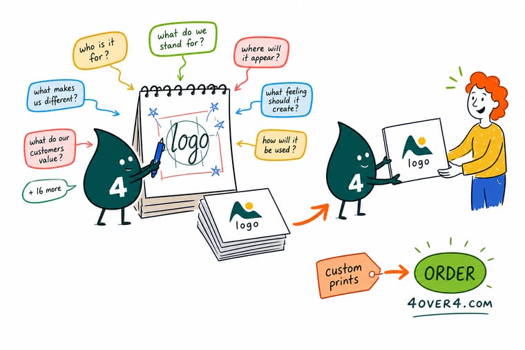
A logo brief is really two lists. One is about the business, what it sells, what it stands apart from and what it must never look like. The other is about physics, whether the mark holds at a quarter inch, whether there is a one-color version, and whether the files are vector. Answer both before design starts and the same mark will work on a card, a banner and a giveaway without a single redraw.
Print your logo on business cards →What to Remember Before the First Sketch
Keep reading
Guides that take the brief further
Four guides, from the six principles a mark has to satisfy to locking a tagline beside it, before the brief meets paper on a 2 by 3.5 inch card that runs 100 for $17.57.
 Guide 6 Key Principles of Logo Design The fundamentals a mark has to satisfy to last.
  Guide Best Practices for Logo Design Working habits that keep a logo project on the rails.
  Guide How to Design a Logo The complete walkthrough from first sketch to final files.
  Guide Logo With a Tagline or Slogan How to lock a tagline to the mark without crowding it.
 Explore more
More on logos, branding and getting them printed
Related pages across 4OVER4.COM, one card each, from first sketch to finished print run.
Guide How to Design a Logo Sketch to final files, the complete process. Guide 6 Key Principles of Logo Design What separates a mark that lasts from one that dates. Guide Logo Design Best Practices Habits that keep the project moving and the files clean. Guide Logos With a Tagline Locking a slogan to the mark without crowding it.  Article Custom Logo Design for Your Brand What a custom mark involves and when it pays off.
  Article Where to Find Logo Inspiration Better places to look than the first page of search results.
  Article 15 Facts About Logos Backstories behind marks you see every single day.
  Article 10 Ways to Use Logo Stickers Cheap, high mileage placements for a finished mark. Product Interior Design Business Cards The small scale test your new logo has to pass. Product 2 Sided Blockout Banners Large format with an opaque core for two clean sides.
 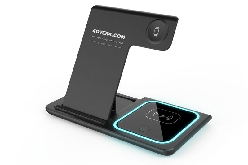 Product 3 in 1 Foldable Wireless Charger Merchandise that demands one-color artwork.
 Logo approved? Put it on something people can hold.
Cards first, because they expose every scaling decision for a few dollars. Pick a stock, upload your vector artwork and see the finished mark in print.
Logo Design Questions FAQ
What questions should I answer before I start designing a logo?
Start with scope and ownership. What the business sells and to whom, why the logo is being made now, who has final approval, and what the first printed piece is. Those four answers set the direction and the deadline. After that come the story questions that give a designer raw material, and the production questions that decide whether the finished mark can actually be printed at every size you need. If you want the design process itself laid out step by step, the complete logo design guide picks up where the brief ends.
What are the most important questions to ask for logo design?
Three carry the most weight. What must the mark never suggest, because exclusions narrow the field faster than inspiration does. Is there a one-color and a reversed version, because those decide whether the logo works on merchandise, signage and single color printing. And what are the deliverables and who owns them, because file formats and rights become urgent exactly when you have no time to argue about them. Everything else on the list supports those three.
How do I choose the right questions to ask for logo design?
Work backward from the first thing you will print. A business heading to a trade show in a month needs the scale questions answered hard, because the same mark will appear on a card in someone’s hand and on a banner across the aisle. For the banner side of that test, these fixed and scrolling outdoor banner design ideas show how a mark reads at booth distance. A business rebuilding an identity over a year should spend more time on story and typography. Keep every question that changes a design decision, and drop anything that only produces a nice sounding sentence for a deck.
What does logo design cost and how are prices set?
Logo pricing tracks scope rather than hours. A single wordmark with two lockups sits at the low end, while a full identity with custom lettering, a usage guide and multiple file packages sits far higher. Printing the finished mark is where the numbers get concrete. Interior Design Business Cards start at $17.57, 2 Sided Blockout Banners start at $108.75 and ready-made 3 in 1 Foldable Wireless Chargers start at $15.00, with per unit costs on the printed pieces dropping as the quantity climbs.
What sizes, stocks and finishes are available when printing a new logo?
Business cards run in standard and custom trims across stocks from uncoated writable sheets to heavy silk and soft touch, with gloss, matte, spot UV and foil finishes available. Banners print on heavy vinyl with hemming and grommets for outdoor hanging. Promotional items carry a fixed imprint area with a limited color count. Pick the stock and finish once you know how the mark behaves in one color, since a metallic or textured surface changes how it reads.
