
23 Black and White Logos That Are Anything but Boring


Sofia is our design and templates voice, built from the knowledge of our production team, with over 20 years in printing.
Why a Two-Tone Mark Still Owns the Room
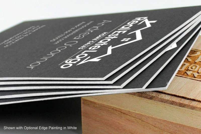
Simple black and white logos work because contrast is the only tool they have, and they print cleanly on everything from a black business card to a white plastic card or a banner. Strip the color out of a logo and you remove the easiest place to hide: no gradient to carry the mood, no brand blue doing the recognition work, no glow covering a shape that never quite resolved. What is left is silhouette, weight, spacing, and the relationship between the mark and the air around it. That is why designers keep sketching in black before they ever open a swatch panel.
The 23 marks below are grouped by how they solve that problem: wordmarks that make typography do everything, monograms that fold letters into a single object, pictorial marks with a readable silhouette, and abstract shapes that turn contrast itself into the idea. Every one of them survives a fax, an embroidery hoop, and a favicon.
There is a practical reason to care beyond taste. A logo that only works in color becomes a problem the first time it meets a one-color process: a foil stamp, a spot UV pass, an embossed seal, a white ink hit on a black stock. If your mark already lives comfortably in black and white, printing it on Black Business Cards or a rigid white plastic card is a production detail rather than a redesign.
Contrast is the fastest signal a brand has
The eye resolves luminance before it resolves hue. A high contrast mark registers at a glance, at distance, and in peripheral vision, which is exactly the condition most logos are actually seen in: a scrolling feed, a passing van, a shelf at the far end of an aisle.
It survives every surface your logo lands on
Stitched into a cap, etched on glass, stamped in foil, screened on a tote, cut from vinyl. Every one of those processes is essentially one-color. A mark designed in two tones needs no special version for any of them.
The idea has to carry the weight
Without color, a logo is judged on shape alone. That pressure is useful. It forces the counters to open up, the strokes to balance, and the negative space to earn its keep, and it kills concepts that were only ever held together by a palette.
It ages slower than any palette
Color trends move on a five year cycle. Gradients, then flat, then soft duotones, then back again. Marks built on pure contrast tend to sit out those cycles entirely, which is why so many of the ones below have gone thirty years without a real redraw.
Closest match
Print your mark reversed on black
The fastest way to see whether a two-tone logo has real presence in the hand.
Wordmarks That Carry a Whole Brand on Letterforms
A wordmark has no symbol to fall back on. The name is the logo, so the typography has to do all of the work: proportion, spacing, weight, and the small deliberate quirks that make it impossible to mistake for a font someone downloaded. These six are set entirely in black on white and still read as owned.
Wordmarks also print beautifully, which is not an accident. Type is the one thing every press is engineered to reproduce accurately. If you want to see how yours behaves at business card scale before you commit, the fastest test is a real proof: 30mil White Plastic Cards hold thin strokes with almost no spread, so any weakness in your letterforms shows up immediately rather than after the run.
- 1. Vogue. A high contrast Didone with hairline serifs so fine they nearly disappear. The thick to thin swing does what a color palette would do elsewhere: it sets the register instantly as luxury and editorial.
- 2. Prada. Tight, classical, slightly condensed capitals with a restraint that borders on austere. The logo refuses to perform, and that refusal is the whole positioning.
- 3. Zara. The 2019 redraw pushed the letters into each other until the counters nearly close. It divided opinion on day one and became instantly recognizable at thumbnail size, which was the point.
- 4. Calvin Klein. Wide-tracked capitals in a plain grotesque, locked up as two lines or one. Nothing decorative survives, so the name reads as a label rather than a logo.
- 5. Sony. A quiet slab-influenced wordmark that has barely moved in decades. It works black on white, white on black, and molded into plastic without a single adjustment.
- 6. The New York Times. Blackletter, the least fashionable choice available, held so long it became an asset. On newsprint it is pure contrast, and it signals authority before you read a word of it.
The lesson for a small brand is not to copy any of these, it is to notice how little each one does. One typographic decision, executed without hedging, repeated everywhere. That is far easier to reproduce across print, embroidery, and signage than a mark with six moving parts.
Print picks
Three surfaces that suit a black and white mark
Live prices, ready to configure with your own artwork.
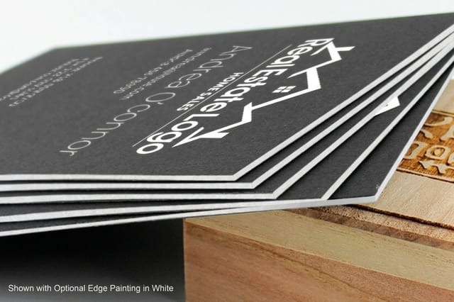 Black Business Cards 50 for $40.62 Flip the contrast: a white or foil mark burning out of a solid black card.
 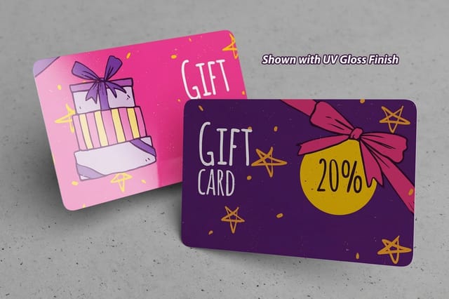 30mil White Plastic Cards 250 for $226.11 A rigid white surface that keeps thin black line work sharp and clean.
 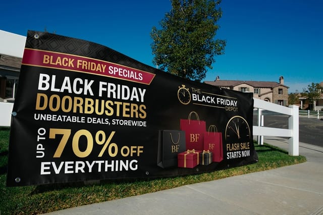 Black Friday Banners $79 each Scale the same two-tone mark up to booth and storefront size.
 Monograms That Fold Letters Into a Single Object
A monogram compresses a name into a mark you can read in a second, which is why the fashion houses have leaned on them for a century. The craft is in the overlap. Where two letters cross, the shape either becomes one object or turns into a knot, and in black and white there is no shading available to fake the difference.
Monograms are also the friendliest logo type for finishing effects. A compact, closed shape is exactly what foil dies, embossing, and spot gloss want, so a monogram on a dark stock tends to look expensive with very little effort.
- 7. Chanel. Two interlocking Cs, one facing each way, with the overlap treated as a single continuous ribbon. Perfect symmetry means it never needs a right way up.
- 8. Yves Saint Laurent. Three letters stacked into a cursive puzzle that reads as one glyph. It looks handwritten and is in fact engineered to the millimeter.
- 9. Louis Vuitton. The L and V share a stem, so the mark works as a standalone object and as a repeating pattern without redrawing anything.
- 10. Gucci. Two mirrored Gs, one inverted, locked at the center. The negative space between them is as considered as the strokes themselves.
- 11. Fendi. A double F, one flipped, forming a squared-off shape with strong vertical rhythm. It tiles, it stamps, and it survives being shrunk to a hardware fitting.
Pictorial Marks With a Silhouette You Can Read Anywhere
A pictorial mark shows a recognizable thing, simplified until only the identifying edges remain. The test is brutal and simple: shrink it to sixteen pixels, or print it at a quarter inch on a foil stamp, and see whether anyone still knows what it is. These six pass.
Notice how many of them are built from solid black shapes rather than outlines. Solid fills hold up when ink spreads slightly on uncoated stock, while a thin outline of the same drawing can close up and turn into a blob. It is one of the few places where print behavior should influence the design itself.
- 12. WWF panda. A panda described entirely in black patches, with the white of the page doing the rest of the animal. It is the textbook example of negative space carrying half the drawing.
- 13. Penguin Books. A small standing bird in an oval, unchanged in spirit since the 1930s. It reads at spine width, which is roughly the hardest size a logo ever has to work at.
- 14. Apple. One silhouette with a bite taken out. The bite is not decoration, it fixes the scale so the shape cannot be mistaken for a cherry, and it has been monochrome far longer than it was striped.
- 15. Jumpman. A traced pose, nothing else. No face, no logo on the jersey, no ball detail beyond the outline, and it is still identifiable across a gym.
Two more that push the same idea about as far as it can go:
- 16. Playboy bunny. A rabbit head in profile with a bow tie, drawn with maybe eight decisions total. Reduce it any further and it stops being a rabbit.
- 17. Puma. A leaping cat in mid-air, all momentum in the arc of the back and the tail. Frozen motion, no color required.
Abstract Marks That Turn Contrast Into the Idea
Abstract marks have the hardest job. They mean nothing on their own, so the shape has to be distinctive enough to hold a meaning once the brand gives it one. In two tones, that means a memorable edge, honest geometry, and enough weight to survive being small: print it at half an inch wide on a business card and at three feet on a banner, and keep the version that still reads at both.
They are also the group that benefits most from being tested in print early. A geometric mark that looks perfectly balanced on a backlit screen can read heavy on paper, where ink sits on the surface and the whites are never as bright. Print a sheet, walk away, look at it from six feet, and the imbalance shows up in a second.
- 18. Nike swoosh. A single tapered curve with one sharp point, drawn to imply direction. It has been shrinking on products for years and loses nothing.
- 19. Adidas three bars. Three angled stripes rising into a slope. The shape doubles as a mountain, which is a rare case of an abstract mark quietly holding a second reading.
- 20. Mercedes-Benz star. Three points in a ring, absolutely symmetrical. It works as an outline, a solid, a chrome badge, or a flat black icon with no change to the geometry.
- 21. Uber. A flat black wordmark set in a bespoke grotesque, deliberately unremarkable so it disappears into every interface it appears in. Neutral by design.
- 22. Vercel triangle. One solid equilateral triangle. There is almost nothing to it, which is exactly why it holds at favicon size and in a terminal window.
- 23. The North Face half dome. Three curved lines describing a cliff face. Abstract enough to be a graphic, specific enough that anyone who has seen the rock recognizes it.
Count them up and the pattern is consistent across all four groups. Not one of these marks needs more than a couple of shapes, and not one of them depends on a gradient, a shadow, or a highlight to be understood.
Quantity and price
Black business card pricing and specs
Real configurator numbers. The per-card cost drops as the quantity climbs.
| Quantity | Price Per Unit | Total |
|---|---|---|
| 50 | 81.2¢ | $40.62 |
| 100 | 75.8¢ | $75.78 |
| 200 | 56.6¢ | $113.11 |
| 300 | 51.3¢ | $153.77 |
| 400 | 42.4¢ | $169.69 |
| 500 | 36.2¢ | $181.22 |
What Changes When Your Logo Moves From Screen to Paper
Screens emit light and paper reflects it, so the same file behaves differently in each place. On a display, black is the absence of emitted light and white is the panel at full brightness. On press, black is ink laid on a surface that is already slightly off-white, and every fine white gap between strokes is at the mercy of how much that ink spreads.
Three things go wrong most often. Hairlines set below about a quarter point vanish or break up. Reversed type in a small size fills in as ink creeps into the counters. And large solid areas printed with black ink alone come out looking washed and slightly brown instead of dense, which is why a rich black build exists in the first place.
Build your blacks on purpose
For any solid area larger than a thumbnail, a rich black of roughly 60C 40M 40Y 100K gives you depth without soaking the sheet. Keep small text and thin rules at 100K only, because four plates of ink under six point type is how you get fuzzy edges from tiny registration shifts.
Choose the substrate to match the mark
Fine line work and tight counters want a hard, non-porous surface. That is where 30mil White Plastic Cards earn their price: the ink sits on the surface instead of wicking into fibers, so a delicate monogram stays delicate. Bold silhouettes are far more forgiving and look excellent on uncoated stocks.
Detail holder
30mil white plastic cards
A hard, non-porous surface that keeps hairlines and tight counters exactly as drawn.
Print-Ready Stationery for a Black and White Brand
The reward for designing in two tones is that your stationery gets simple. One logo file, no color-matching argument, no version that only works on the light background. Business cards, letterheads, envelopes, thank you cards, and packaging stickers all take the same artwork with only scale changing between them.
The most interesting move available is inversion. Instead of printing your black mark on white, print it white on black and let the stock be the ink. Black Business Cards start at $40.62 and do exactly that, and a mark you designed as solid black reads with even more authority when it is burned out of a dark surface. Watch the black on black business cards video to see how a mark sits on that stock.
A stationery set that stays consistent
- Business cards. The one piece that gets handled, so it carries the most weight. Reversed white ink on 32pt Midnite Black, from 50 cards for $40.62 in 2 x 3.5, 2 x 2 or 1.75 x 3.5 inches, for impact, or black on a heavy uncoated sheet for restraint.
- Letterhead and envelopes. Small logo, generous margin, nothing else competing. Restraint here makes the card look more considered by association.
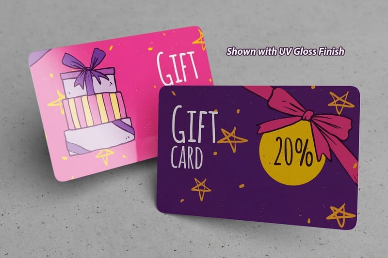
- Plastic cards. Loyalty, membership, and gift cards where the surface has to survive a wallet. 30mil white plastic at credit card size, 2.125 x 3.375 inches, from 250 cards for $226.11, keeps fine detail intact for years.
- Large format. The same mark blown up for a booth or a storefront. Black Friday Banners start at $79 and are a cheap, honest way to check that your logo still reads at distance.
Go large
The same mark at banner scale
If your logo still reads from across a parking lot, the drawing is doing its job.
The File Set Your Printer Actually Wants
Almost every problem that shows up on a proof traces back to the file, not the press. A black and white logo is easy to prepare correctly, and getting it right once means every future job goes through without a query from prepress.
Keep the master as vector artwork in AI, EPS, SVG, or a press-ready PDF, with all type converted to outlines so nobody needs your font. Export a one-color version and a reversed version alongside it, and store a flat PNG with a transparent background for anyone who only needs to drop it into a slide.
- Vector master. Outlined type, no live effects, no linked images. It scales from a favicon to a banner with zero loss.
- Two color builds. One version at 100K for type and fine detail, one rich black build for large solid areas.
- A true reversed file. Not the black file with a box behind it. Draw the white version so you control the stroke weights that need thickening.
- A minimum size rule. Write down the smallest width your mark is allowed to be printed at and put it in the brand file. It prevents the majority of bad reproductions.
Compare stocks
Popular business cards, side by side
Black cards at 50 for $40.62 next to 30mil white plastic at 250 for $226.11.
 free business cards |  Standard Business Cards |  3D Lenticular Business Cards |  Metallic Foil Business Cards | |
|---|---|---|---|---|
| Min price | Free | $17.57 | $690.88 | $222.13 |
| Paper / stock | 14pt Gloss Cover | 14pt Gloss Cover | 31pt Lenticular Lens | 16 Point Silk Laminated |
| Finish | - | Standard Finish | - | - |
| Size | 2" x 3.5" | 2" x 3.5" | 2" x 3.5" - Vertical | 2" x 3.5" |
| Default qty | 200 | 100 | 500 | 500 |
| Turnaround | 5 business days | 3 business days | 22 business days | 7 business days |
| Rating | ||||
| View & customize | View & customize | View & customize | View & customize |
Mistakes That Flatten a Two-Tone Logo
Most black and white logos that fail do not fail because the concept was weak. They fail on execution details that never came up on screen, and every one of them is preventable before the file leaves your desk.
Start from a print-ready layout rather than an empty canvas and half of these disappear on their own, because the trim, bleed, and safe area are already correct and you can focus on the mark itself.
The five to check before you send the job
- Detail that dies at small size. If a stroke disappears at one inch wide, it does not belong in the logo. Simplify rather than hoping the press is kind.
- A grayscale conversion nobody redrew. Two brand colors with the same luminance turn into one flat gray. Redraw the mono version deliberately instead of desaturating.
- Registration black under small type. Four heavy plates under fine text produce soft, doubled edges. Keep small elements on the black plate only.
- Counters that fill in when reversed. Open the counters and thicken the strokes in the white version. It is a different drawing, and it should be.
- Raster art standing in for vector. A PNG scaled up gives you a soft, stepped edge that no press can fix. Only vector goes to print.
Start fast
Card templates and print-ready blanks
Free layouts plus exact-size blanks so trim, bleed, and safe area are correct before you place the logo.

Wally on why the color comes out last
Design it in black, then decide where the contrast lands
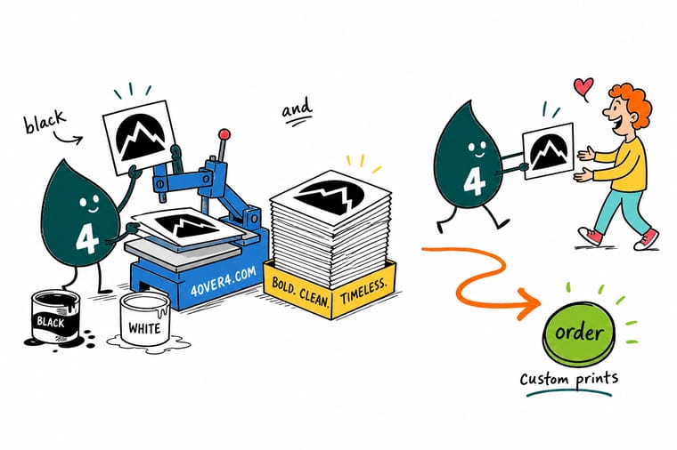
Every mark on this page passes the same test: cover the color, shrink it to a fingernail, and see if you still know what it is. Draw yours in solid black first, then draw the reversed white version separately so the strokes stay open. Once both files exist, printing is the easy part, whether it lands on a black card, a white plastic card, or a banner at ten feet.
Print your logo on black cards →Where to Take a Two-Tone Brand Next
Keep reading
Compare where you print your black and white brand
Canva against MOO, and alternatives to GotPrint, 48HourPrint and FastPrinting for black and white stationery.
 Compare Canva vs MOO Compared Where each tool helps and where it limits a two-tone brand.
  Compare A GotPrint Alternative How the stock, finish, and proofing options line up.
  Compare A 48HourPrint Alternative Turnaround and quality compared for rush stationery.
  Compare A FastPrinting Alternative What to look for when speed cannot cost you detail.
 Explore more
More ways to put a black and white mark in print
Black business cards run 50 for $40.62 on 32pt Midnite Black uncoated stock.
Product Black Business Cards White or foil ink reversed out of a solid black stock. Product 30mil White Plastic Cards A rigid surface that keeps hairline black detail crisp. 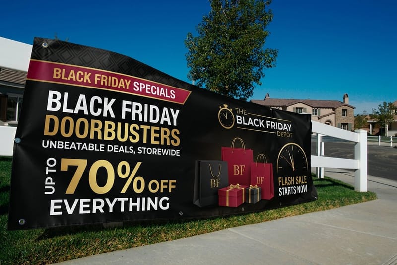 Product Black Friday Banners Take the same mark up to storefront scale.
  Alternative FedEx Sales Sheets Alternative One-color sell sheets compared on stock and price.
  Alternative Avery 5164 Label Alternative Custom labels when a template sheet stops being enough.
  Alternative GotPrint Promo Code Alternative What the discounted price really covers on each side. Alternative GotPrint Support Alternative Proofing help when a logo needs a human to look at it.
 Ready to see your logo in ink instead of pixels?
Upload the vector file, pick a stock, and hold the mark at final size. A black and white logo tells you the truth about itself the moment it leaves the screen.
Black and White Logo FAQ
What makes a black and white logo work?
Three things: a silhouette you can recognize at a glance, stroke weights that hold up when the mark is small, and negative space that is drawn as carefully as the black. Because there is no color doing the identification work, the shape has to be distinctive on its own. The practical test is to print the mark at one inch wide, put it across the room, and see whether you still know what it is. If it survives that and a reversed version on a dark stock like Black Business Cards, it will survive anything else you throw at it.
How do I choose the right style for my brand?
Match the format to the problem. If your name is short and worth saying, a wordmark puts every ounce of the design into the letterforms. If the name is long or awkward, a monogram compresses it into something usable at small sizes. If you want instant recognition without reading, a pictorial mark of a real object is the shortest route. Abstract shapes give you the most room to build meaning over time, but they carry no meaning on day one, so they need consistent use to pay off.
What does it cost to print a black and white logo on cards?
Pricing scales with quantity, stock, size, and finish rather than with the number of colors, so a two-tone design is not automatically cheaper on a digital or offset run. Black Business Cards at 4OVER4.COM start at $40.62, 30mil White Plastic Cards start at $226.11 for a rigid card that holds fine detail, and Black Friday Banners start at $79 if you want the same mark at large format. Every configuration shows a live price before you order, and the per-piece cost drops sharply as the quantity climbs.
What files and color builds should I send to the printer?
Send vector artwork as AI, EPS, SVG, or a press-ready PDF with all type converted to outlines, so nothing depends on a font we do not have. Include a reversed version drawn separately rather than the black file with a box behind it. For color, use a rich black of roughly 60C 40M 40Y 100K on large solid areas so they print dense rather than washed, and keep small text and thin rules at 100K only to avoid soft edges from registration shift.
Will my logo look the same on screen and in print?
Not exactly, and planning for the difference is what separates a clean job from a disappointing one. A screen emits light, so whites are brighter and thin strokes look crisper than they will on paper, where ink spreads slightly into the fibers. Coated and plastic surfaces stay closest to what you see on a display, while uncoated stocks soften fine detail and slightly thicken every line. Order a single card at final size before a big run and judge the mark on the actual substrate.
