
30 Holiday Color Palettes for Your Designs


How to Build a Holiday Color Palette That Actually Prints Well
Every holiday has a color it wears like a uniform. Red for Christmas, orange for Halloween, red-white-and-blue for the Fourth. The trouble is that the obvious version has been done to death, and the interesting version is one you have to build on purpose. That is what the 30 palettes below are for. Each one is a four-color set with the hex codes ready to paste, so you can skip the swatch-picking spiral and get straight to designing.
A palette is not just a mood board, though. It has to survive the trip from your screen to a printed card, banner, or postcard, and that is where a lot of holiday designs fall apart. Screens glow, paper does not, so the neon green that looked electric on your monitor can turn muddy on stock. 4OVER4.COM has printed 10 billion+ pieces across 1,000+ product types since 1999, and the palettes here are chosen because they hold up in CMYK, not just on a laptop.
Before you scroll, four rules make any of these palettes land. Follow them and even the boldest holiday scheme stays balanced instead of loud.
Step 1: pick one anchor color
Choose the single color the design lives on, usually the deepest one in the set. It carries the mood and fills the most space. Everything else exists to support it.
Step 2: use a 60-30-10 split
Give the anchor roughly 60 percent of the layout, a second color 30 percent, and the accent 10 percent. That ratio is why professional holiday designs feel calm instead of chaotic.
Step 3: add a neutral so the color can breathe
A cream, a charcoal, or an off-white gives the eye a place to rest. Every palette below includes one on purpose. Strip it out and the design starts to shout.
Step 4: convert and proof in CMYK before you commit
Your hex codes are RGB, but print is CMYK. Convert first, and if a color has to match exactly, plan for Pantone spot color. The best color profile for printing guide walks through the setup so nothing shifts on press.
Shop the season
Holiday banners, printed to order
Big-format color that reads across a room. A great first place to watch a palette come to life on real material.
Christmas and Winter Wonderland Palettes
Christmas is where color habits are hardest to break, which makes it the most rewarding place to try something new. The six palettes here range from the timeless red-and-pine everyone recognizes to the muted sage-and-blush look that has taken over modern holiday branding. Each one is built to print cleanly on card stock and hold its richness on a banner.
If you are printing a run of cards or a storefront banner, drop your favorite of these into a layout and see it on real stock. A bold, saturated set like Candy Cane Pop sings on gloss, while Sage and Blush Noel wants an uncoated or soft-touch finish. You can start from a print-ready layout in the online design templates and swap the colors straight in.
Print picks
Three formats to test a palette on
Live prices, ready to customize with your holiday colors and artwork.
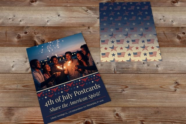 4th of July Postcards From $16.48 Full-bleed color on a mailable card, the cheapest way to test a bold palette.
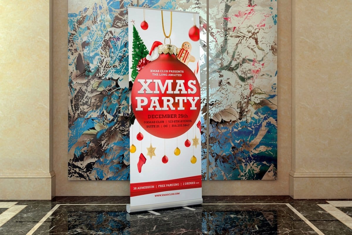
  Holiday Banners From $43.92 Big-format color that has to read across a room, where palette accuracy matters most.
  4th of July Invitations From $19.77 Small runs and rich color, perfect for a party palette you want to feel premium. 4th of July Postcards From $16.48 See how a festive palette lands in print before the season hits.
 Halloween, Autumn, and Thanksgiving Palettes
The fall stretch has its own logic. Halloween wants contrast and a little menace, Thanksgiving wants warmth and abundance, and the weeks in between belong to every shade of amber and rust. These six palettes cover the whole run, so a single seasonal campaign can shift mood without switching color families.
Autumn colors are forgiving in print because they lean earthy, but the near-blacks still need a proper conversion so they do not turn flat. If you are running a Halloween banner or a Thanksgiving menu card, price it out below, then check the CMYK vs RGB guide before you export.
Quantity and price
Holiday banner pricing and specs
Real configurator numbers. The more you order, the lower the per-piece cost drops.
| Quantity | Price Per Unit | Total |
|---|---|---|
| 1 | $43.92 | $43.92 |
| 2 | $43.93 | $87.85 |
| 3 | $43.92 | $131.77 |
| 4 | $41.73 | $166.90 |
| 5 | $41.73 | $208.64 |
| 6 | $41.73 | $250.37 |
New Year, Valentine’s, and Spring Palettes
Once the calendar turns, the holiday palette gets a facelift. New Year runs on black-tie metallics, Valentine's on every register of pink and red, and by spring the whole thing softens into Easter pastels. These six carry a design from the champagne toast to the first warm morning.
Metallic-look palettes like Midnight Countdown and Champagne Toast are worth pairing with a real foil or spot finish so the gold reads as gold, not as tan. Pastels, on the other hand, ask for a bright uncoated stock so they stay clean. For colors that have to match a brand exactly, spot color printing keeps them locked from proof to press.
Patriotic and Cultural Celebration Palettes
Holidays are bigger than a single tradition, and so is this list. The twelve palettes here cover the Fourth of July, St. Patrick's Day, Hanukkah, Diwali, Lunar New Year, Kwanzaa, Mardi Gras, and more, each drawn from the colors those celebrations actually carry. They are especially useful when you are printing for a diverse audience and want the design to feel authentic rather than borrowed.
A few of these, like the flag-based sets, have exact official colors, so a Pantone match is the safe call when accuracy matters. The Fourth of July, for one, has a defined federal blue and red. When you print with soy-based inks, these brights stay vivid while the run stays kinder to the planet.
Getting Your Holiday Colors to Print Exactly Right
A palette that looks perfect on screen can still disappoint on paper, and it is almost always a color-mode issue. Monitors mix light in RGB, and that gamut is wider than what CMYK ink can reproduce. The fix is not complicated, it just has to happen before you export, not after the proof arrives.
Convert your file to CMYK early so you are designing in the space it will print in. When a shade absolutely has to match, a brand red or a specific metallic gold, choose Pantone spot color and 4OVER4.COM mixes that ink to the reference instead of building it from process dots. The Pantone to CMYK matching guide shows how the two systems line up.
Match the palette to the piece
- Banners and signs. Go bold and high-contrast, the color has to read from across a room.
- Cards and invitations. Favor refined, layered palettes, and consider foil or spot finishes for the metallics.
- Postcards and flyers. Full-bleed brights print beautifully and cost little, so they are the perfect palette test.
- Anything on kraft or uncoated. Expect colors to read a shade warmer and softer, and lean into it.
Not sure a palette will survive the jump to print? Order it small first. A short run of postcards is a low-cost proof of the whole scheme before you commit to a large banner. Start from a layout in the design templates library and drop your hex codes straight in.
Start fast
Print-ready templates for your palette
Free layouts sized to the cut and bleed lines, so you drop in your hex codes and export clean.




Wally turns a palette into a printed piece
Pick your colors, then print them true to screen
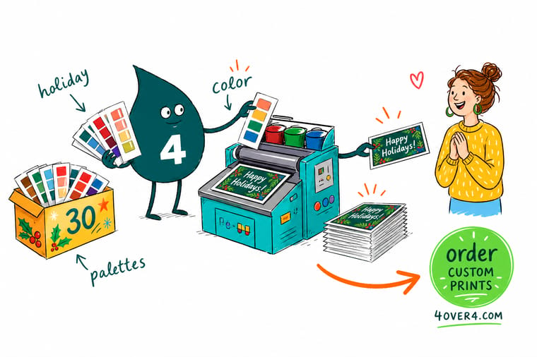
A palette only counts once it is on paper. Wally's rule: choose an anchor color, add a partner and an accent, then ground it all with a neutral. Convert from RGB to CMYK, ask for Pantone spot color when a shade has to match exactly, and proof before the full run. 4OVER4.COM prints every one of these 30 palettes sharp and consistent, from a single postcard to a room-sized banner.
Print your holiday colors →Putting these palettes to work this season
Explore more
More ways to get color right in print
The cards below open the color profile guide, the Pantone history, and the spot color printing page.
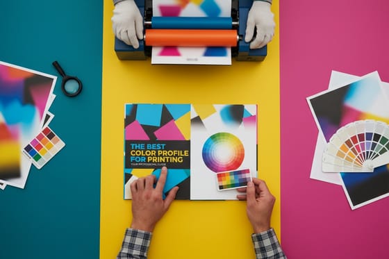 Guide Best Color Profile for Printing Get CMYK and RGB right before you export.
  Article The History Behind Pantone How the world got a shared language for color.
  Article Business Card Color Meaning What each color signals about your brand.
 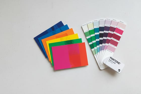 Benefit Pantone Spot Color Printing Lock an exact shade from proof to press.
  Benefit Soy-Based Inks Vivid color with a lighter footprint.
  Shop Holiday Banners Big-format color for the whole season.
  Shop Christmas Posters Print a palette at wall-size scale.
  Guide 2-Color Spot Printing A striking, budget-friendly two-ink look.
  Showcase Design and Finish Gallery Real customer designs and finish ideas.
  Articles Seasonal Printing Ideas Print inspiration for every event and holiday.
 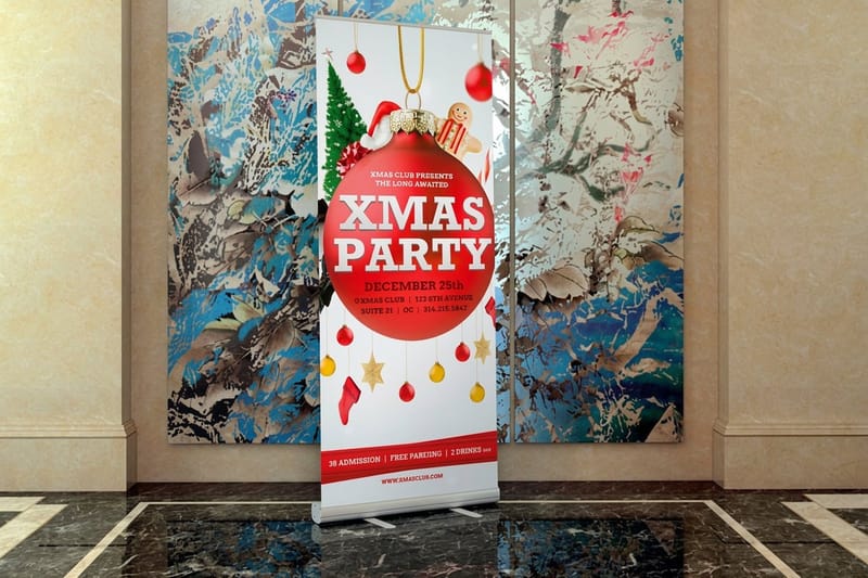 Product Holiday Banners From $43.92, printed to order in full color.
  Guides All Printing Guides Every how-to across design and print.
 Found your palette? Put it on paper.
Copy the hex codes, convert to CMYK, and 4OVER4.COM prints your holiday colors sharp and true, from a test run of postcards to a full-size banner.
Holiday color questions from designers
What are the best holiday color palettes for print designs?
The best palette depends on the holiday and the piece, but the 30 sets in this guide cover the full calendar, from Classic Christmas and Sage and Blush Noel to Firework Night, Diwali Glow, and Lunar Red and Gold. Each one is built as a four-color set with an anchor, a partner, an accent, and a neutral, and every color is chosen to hold up in CMYK rather than only on screen. Copy the hex codes straight into your layout and you have a balanced scheme in seconds.
Does this palette have to read from across a room?
Start with the holiday, then narrow by mood and by the piece you are printing. Bold, high-contrast palettes like Candy Cane Pop suit banners and signs that must read from a distance, while layered sets like Champagne Toast fit cards and invitations. Pick one anchor color, use a 60-30-10 ratio, and always keep the neutral so the brights have room to breathe. When you are unsure, order a short postcard run first to see the palette on real stock.
How do I make sure my holiday colors print exactly the way they look on screen?
Screens display color in RGB, which is a wider range than CMYK ink can reproduce, so convert your file to CMYK before you export and proof it in that mode. For a shade that has to match precisely, such as a brand red or a metallic gold, choose Pantone spot color so the ink is mixed to a reference instead of built from process dots. The best color profile guide and the CMYK vs RGB guide walk through the exact setup.
Can I use these hex codes directly in my print files?
Yes, the hex codes give you the design starting point in any tool, from Canva to Illustrator. Just remember hex is an RGB value, so convert to CMYK before printing and expect a small, natural shift on uncoated or kraft stock, where colors read a touch warmer and softer. If a color is critical, note its closest Pantone and request a spot-color match at checkout so it stays locked across every piece in the campaign.
How much does it cost to print holiday cards, postcards, and banners?
Pricing scales with the product, stock, size, and quantity. At 4OVER4.COM, holiday postcards start at $16.48, holiday invitations at $19.77, and holiday banners at $43.92, and the per-piece cost drops as the run grows. Specialty finishes like foil or spot UV cost a little more, while full-bleed brights on standard stock stay budget-friendly, which is why postcards make such an affordable way to test a palette before a larger order.
