
Understanding OSHA Safety Colors and ANSI Color Codes for Workplace Safety


Emma is our prepress and print production voice, built from the knowledge of our production team, with over 20 years in printing.
Red for danger, orange for warning, yellow for caution, green for safety. This is the full OSHA and ANSI Z535 color code, color by color, with a reference table, an infographic, and how to get the exact shade onto a durable printed sign. The same code runs on machine and equipment labels under ANSI Z535.4, and this guide shows which sign, banner, floor decal or label to print for each color, at what size.
Safety colors are a standardized code that gives each color a fixed meaning, so a hazard or a safe area reads at a glance. OSHA names red for danger and yellow for caution. ANSI Z535 fills in orange for warning, green for safety and first aid, blue for notices, purple with yellow for radiation, and fluorescent orange for biohazards. Each color pairs with a signal word (DANGER, WARNING, CAUTION, NOTICE) so the message is never guessed. Gray is not one of the colors in the code, so a gray sign or marking carries no safety meaning; aisles and boundaries use black and white instead.
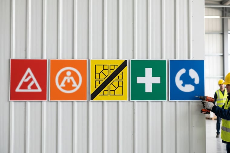
Start here
What each safety color signals
Safety colors are a standardized code that gives each color a fixed meaning. OSHA names red for danger and yellow for caution. ANSI Z535 adds orange for warning, green for safety and first aid, blue for notices, purple with yellow for radiation, and fluorescent orange for biohazards. On a printed sign each one maps to a Pantone reference: PMS 186 for red, PMS 152 for orange, PMS 108 for yellow, PMS 356 for green and PMS 285 for blue.
OSHA sets the rule and ANSI Z535 supplies the exact colors and the signal words that ride with them. Learn the code, apply it consistently, and print it in the exact shade, and your facility communicates a hazard before anyone reads a word. The table below gives you every color in one screen, and the infographic further down sums the whole system up in one frame.
Safety Colors

Safety colors and meanings at a glance. Seven colors, seven fixed jobs. OSHA names red and yellow in 29 CFR 1910.144, and ANSI Z535 fills in the rest along with the signal word that rides with each one. Read the row, print the shade, and a hazard is understood before anyone gets close enough to read the words.
Jump to a color: Red, Orange, Yellow, Green, Blue, Purple, Fluorescent orange.
| Color | Signal word | What it means | Where you see it |
|---|---|---|---|
| Red | Danger | Immediate hazard that will cause death or serious injury, plus stop and fire equipment | Danger signs, emergency stops, fire protection |
| Orange | Warning | Hazard that could cause death or serious injury | Machine guarding, exposed moving parts |
| Yellow | Caution | Hazard that may cause minor or moderate injury | Trips, slips, low clearance, physical hazards |
| Green | Safety | Safety, first aid, safe conditions and emergency egress | Exits, first-aid stations, eyewash, safety gear |
| Blue | Notice | Notices and mandatory instructions that are not hazards | Policy notices, required-PPE reminders |
| Purple | Radiation | Radiation hazards, paired with yellow | Radiation areas, X-ray rooms |
| Fluorescent Orange | Biohazard | Biological hazards and infectious material | Biohazard labels, sharps containers |
| Black and White | Traffic | Boundaries, aisles, and general housekeeping markings | Floor striping, traffic lanes, walkways |
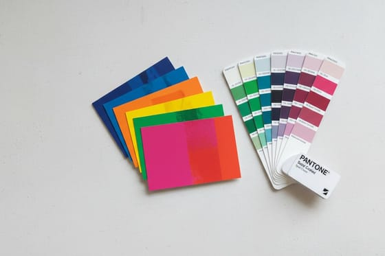
The swatches are there so you can scan the table, not to match ink. The printed shade is set by the Pantone value: OSHA safety red maps to a specific Pantone close to PMS 186, which is why signs that have to agree across a whole facility get printed as spot color. The rest of this guide takes the same code color by color, then covers how to hold that exact shade on a sign, banner, or label for years rather than weeks.
Why safety colors work before anyone reads the sign

On a busy floor nobody stops to read a paragraph. A forklift driver, a new hire, and a visitor borrowing a hard hat all make split-second decisions off one thing first: color. A block of red registers as danger before the brain has processed a single word. That instant, wordless reaction is the whole point of a safety color system. It turns a hazard into something people feel across the room. It is also why ANSI Z535.2 gives a danger sign a red header panel with the word DANGER, and why that red, close to PMS 186, has to match on every sign in the building.
Two standards decide which color carries which meaning. OSHA sets the federal rules employers have to follow, and ANSI Z535 is the voluntary consensus standard OSHA leans on for the details. Between them, red, orange, yellow, green, blue, and a couple of specials get fixed jobs, so a sign in a Miami warehouse says the same thing as one in a Seattle plant.
This guide walks the full code, color by color, then shows how to get the exact shade onto a durable sign, banner, or label. If you already know your palette and just need it printed sharp, jump straight to the color reference table or the infographic.
OSHA color-coding requirements
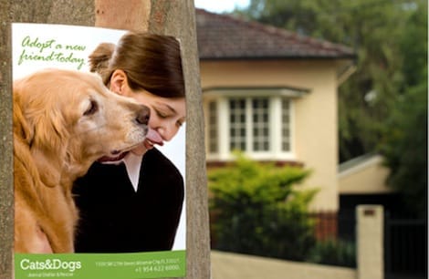
OSHA’s core color rule lives in 29 CFR 1910.144, and it is short by design. It assigns two colors by name. Red identifies danger and marks fire protection equipment, stop buttons, and emergency switches. Yellow designates caution and flags the physical hazards you might strike against, stumble over, or get caught in. That is the federal floor, and it is deliberately minimal so it is easy to comply with.
The companion rule, 1910.145, covers the signs and tags themselves: the danger, caution, and safety-instruction formats, and the principle that a danger header has to be red so it cannot be mistaken for a milder message. OSHA does not spell out every shade in the regulation. Instead it points employers toward the national consensus standard, which is where ANSI Z535 takes over.
Because red and yellow have to mean the same thing on every sign, the exact ink matters. OSHA safety red maps to a specific Pantone value close to PMS 186, and the only dependable way to hit it batch after batch is Pantone spot color printing rather than a four-color approximation that drifts. For the story behind the swatch book, read who owns Pantone and why Pantone color matching matters in printing. If you are converting between systems, our notes on matching Pantone to CMYK and on what spot color printing is explain why the difference shows up on a finished sign.
The full ANSI safety colors guide

ANSI Z535 takes OSHA’s two colors and fills in the rest, pairing each color with a signal word so the meaning is never left to guesswork. The severity hierarchy runs from most to least urgent: DANGER, then WARNING, then CAUTION, then NOTICE, and finally a general safety message.
Red with the word DANGER marks an immediate hazard that will cause death or serious injury if it is not avoided. Orange with WARNING marks a hazard that could cause death or serious injury. Yellow with CAUTION marks a hazard that may cause minor or moderate injury. Those three do most of the work on any hazard sign, and keeping them distinct is what stops a color code from going numb.
Green marks safety itself: first-aid stations, emergency exits, eyewash, and safe conditions. Blue carries notices and mandatory instructions that are not hazards, like a required-PPE reminder. Purple paired with yellow flags radiation, and fluorescent orange-red flags biohazards. The complete breakdown, with approximate Pantone values, is in the table below.
Whichever colors your site needs, they have to survive daylight, washdowns, and years on a wall. Printed on durable stock, custom banners and rigid signs hold their color far longer than a desktop printout, and soy-based inks keep the reds and greens vivid without the environmental cost of solvent inks. For the color-management side, start with the best color profile for printing.
What hard hat colors mean

Hard hat color is the one part of the system OSHA does not mandate. There is no federal rule that a supervisor wears white or an electrician wears blue. It is industry convention, reinforced by ANSI/ISEA Z89.1, which governs the hat’s impact protection class rather than its color. Even so, most sites follow a common code so you can read a crew at a glance.
White usually means site managers, engineers, supervisors, and foremen. Green marks safety officers and, on many sites, brand-new workers still in their first weeks. Yellow is the default for general laborers and earth-moving crews. Blue tends to mean electricians, carpenters, and technical operators. Orange is common for road crews, traffic marshals, and visitors. Red flags fire marshals, and brown is often reserved for welders and high-heat work.
Because the code varies by company and country, the safest move is to publish your own key on a notice banner at every entrance, so a contractor from another site is never guessing. The same logic applies to color-coded ID and access badges: when a clearance level reads as a color, a checkpoint decision takes a second instead of a conversation.
Effectively implementing safety colors in your facility

A color code only works if it is applied consistently, so start with an audit. Walk the floor and list every hazard, exit, and piece of safety equipment, then assign each the correct color and signal word before you print a thing. Mixed messages, like a caution-yellow sign on a lethal hazard, are worse than no sign at all, because they quietly train people to under-react to everything.
Match the format to the location. Rigid signs suit fixed hazards and doorways. Large-format banners carry a policy or a zone rule where you need it readable from a distance. Durable stickers and labels handle machines, pipes, bins, and floor markings where a full sign will not fit. Aisles, boundaries, and traffic lanes use black-and-white or black-and-yellow striping.
Then pick the size and stock for each spot. A fixed hazard or a doorway takes an aluminum sign on .040" aluminum, in 12" x 18", 18" x 24" or 24" x 36", with 0.75" rounded corners. A zone rule read from across a bay takes a 15oz blackout vinyl banner from 2' x 3' up to 4' x 10', with grommets at the corners or every 2 feet. Aisle and boundary marks go on floor decals in flexible floor vinyl, from 9" x 18" rectangles to 48" circles. Pipes, bins and machines take custom labels, which come in stocks such as white vinyl permanent, fluorescent red, fluorescent orange and fluorescent yellow, from 2" x 3.5" to 5" x 7" or any size. Lock the artwork with the right signal word and Pantone value first, then order one of each size and check it on the wall before the full run.
Keep contrast high and text short. The danger header stays red, safe zones stay green, and every sign follows the same layout so the eye learns the pattern fast. If you are laying out the artwork yourself, the guide to the best colors for outdoor signage and this construction-signage case study are useful references. Order free paper samples first so you can check the printed color against the standard before a full run.
Safety colors beyond signs: apparel and medical codes
The same color language shows up on people, not just walls. High-visibility apparel follows ANSI/ISEA 107, which uses fluorescent yellow-green, orange-red, and red backgrounds with retroreflective tape so a worker stands out against any background. When people search for OSHA safety colors for shirts, this is usually what they mean: hi-vis yellow-green for general visibility, orange for road and rail work. There is no rule that a plain company shirt must be a safety color, but a printed logo or slogan in your brand’s exact Pantone keeps a crew looking consistent.
Healthcare runs a parallel, separate system. Hospital code colors, such as code blue for cardiac arrest, code red for fire, and code silver for a weapon, are spoken announcements rather than signage, and they are set locally instead of by OSHA. Patient wristband colors are more standardized: red for an allergy, yellow for fall risk, and purple for do-not-resuscitate. When you print those, exact color matching is not optional, which again is a job for spot color printing.
Customize your safety signs today
Once your colors and wording are locked, printing them is the easy part, and the cost is simple to reason about. Price scales with quantity (more pieces lower the unit price), size, material, and finish. A run of 2-sided blockout banners starts around $109, and the per-unit price drops as the quantity climbs, with the number updating live in the configurator as you change each option. Those banners print on 15oz blackout vinyl in 13 sizes from 2' x 3' to 4' x 10', with grommets at the corners or every 2 feet, in 4 business days. For fixed hazards, .040" aluminum signs come in 12" x 18", 18" x 24" and 24" x 36", and floor decals on flexible floor vinyl run from 9" x 18" to 48" circles.
Pick a material that matches the environment: heavier stock and weatherproof coatings for outdoor and washdown areas, lighter stock for interior notices. Use the specs and pricing panel below to compare combinations, and match your safety red or green to the standard with Pantone spot color instead of trusting how it looks on a screen. When it is right, our 2-color spot printing keeps a simple, high-contrast safety sign both cheaper and sharper than full color.
Wally explains safety colors
Every color has exactly one job, and that is the whole trick
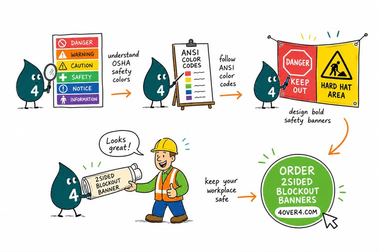
Wally sees a safety color code the way a traffic light works: red stops you, and each color earns its power by never being used for anything else. Danger stays red, caution stays yellow, safe zones stay green, so a glance is enough. Lock your palette to the standard, then let 4OVER4 print it in the exact Pantone shade on stock that holds its color for years, not weeks.
Print your safety signs →Reference table
Safety colors and meanings at a glance
The full OSHA and ANSI Z535 color code in one place, with the signal word, the meaning, a typical use, and the approximate Pantone value so you can match it in print.
| Color | Signal word | What it means | Typical use | Approx. Pantone |
|---|---|---|---|---|
| Red | Danger | Immediate hazard that will cause death or serious injury, plus stop and fire equipment | Danger signs, emergency stops, fire protection | PMS 186 |
| Orange | Warning | Hazard that could cause death or serious injury | Machine guarding, exposed moving parts | PMS 152 |
| Yellow | Caution | Hazard that may cause minor or moderate injury | Trips, slips, low clearance, physical hazards | PMS 108 |
| Green | Safety | Safety, first aid, safe conditions and emergency egress | Exits, first-aid stations, eyewash, safety gear | PMS 356 |
| Blue | Notice | Notices and mandatory instructions that are not hazards | Policy notices, required-PPE reminders | PMS 285 |
| Purple | Radiation | Radiation hazards, paired with yellow | Radiation areas, X-ray rooms | PMS 259 |
| Fluorescent Orange | Biohazard | Biological hazards and infectious material | Biohazard labels, sharps containers | Fluor. orange-red |
| Black and White | Traffic | Boundaries, aisles, and general housekeeping markings | Floor striping, traffic lanes, walkways | Neutral |
Pantone values are close references, not exact standard specifications. To match a safety color precisely, print it as a Pantone spot color and confirm it against a physical swatch before a full run.

Infographic
The workplace safety color code at a glance
One frame, the whole code. Save it, share it, and use it as a checklist the next time you lay out a hazard sign, a banner, or a floor marking.
Red, orange, and yellow rank a hazard from highest to lowest. Green marks safety, blue carries instructions, and the specials cover radiation and biohazards. Keep each color exclusive to its meaning and the code stays trustworthy.
Specs and pricing
Blockout banner specs and live pricing
When the wording and colors are ready, the printing decisions come down to size, material, and finish. Below are the live specs and price-per-unit for 2-sided blockout banners at 4OVER4.COM, straight from the configurator: 15oz blackout vinyl, 13 sizes from 2' x 3' to 4' x 10', grommets at the corners or every 2 feet, and $108.75 for a single 2' x 3' banner.

| Quantity | Price Per Unit | Total |
|---|---|---|
| 1 | $108.75 | $108.75 |
| 2 | $108.74 | $217.47 |
| 3 | $108.74 | $326.22 |
| 4 | $97.76 | $391.02 |
| 5 | $97.76 | $488.78 |
| 6 | $97.76 | $586.53 |
| 7 | $89.28 | $624.98 |
| 8 | $86.77 | $694.18 |
Print it
Print your safety materials at 4OVER4

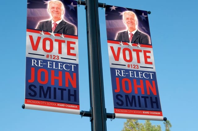
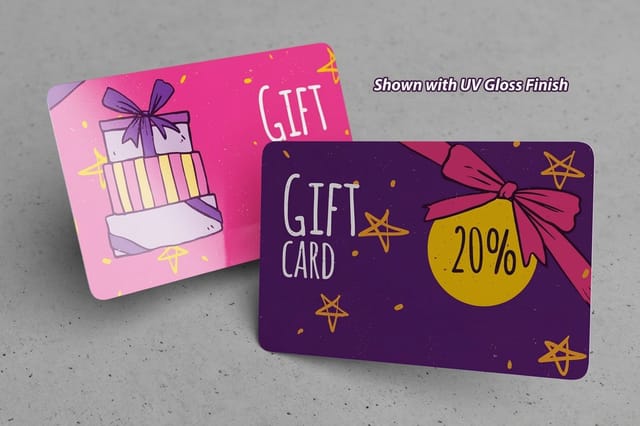
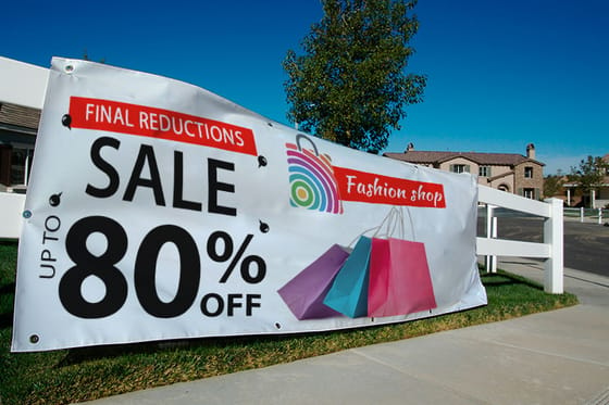
See it in use
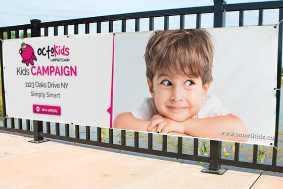
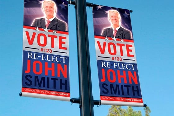
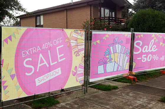
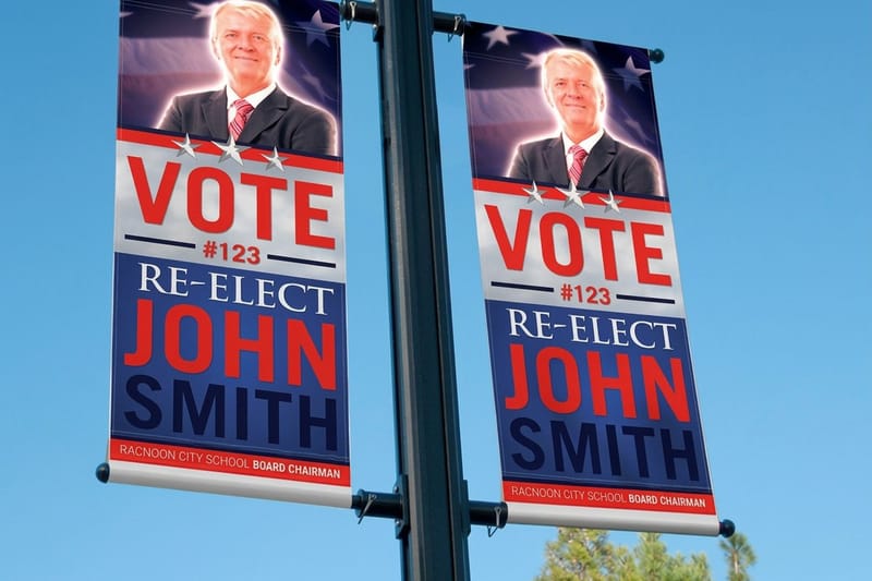
Safety color banners from customer orders





Explore more
Where to go next



By the numbers
The material count behind an OSHA color sign order
Common Questions
Common questions about safety colors and meanings
What are safety colors and what do they mean?
Safety colors are a standardized visual code that assigns a fixed meaning to each color so a hazard, a rule, or a safe area can be understood at a glance, before anyone reads a word. In North American workplaces the code is set by OSHA and detailed by the ANSI Z535 standard. Red means danger and stop, orange means warning, yellow means caution, green marks safety and first aid, blue carries notices and mandatory instructions, purple with yellow flags radiation, and fluorescent orange flags biohazards. The colors that most often represent safety are green (for safe conditions and equipment) and, for hazards, the red-orange-yellow trio that ranks severity from highest to lowest.
What are OSHA's color-coding requirements?
OSHA sets its core color rule in 29 CFR 1910.144, which is deliberately short. It assigns red to identify danger, stop, and fire protection equipment, and yellow to designate caution and physical hazards you might strike against, stumble over, or be caught in. A companion rule, 1910.145, governs the danger, caution, and safety-instruction signs and tags themselves. OSHA does not spell out every shade in the regulation. Instead it points employers toward the national consensus standard, ANSI Z535, for the exact colors and formats.
What is the ANSI safety color standard?
ANSI Z535 is the American National Standard that turns OSHA’s two named colors into a complete system. It pairs each color with a signal word so meaning is never guessed. The severity hierarchy runs DANGER (red), WARNING (orange), CAUTION (yellow), NOTICE (blue), and a general safety message (green). Z535 also defines the exact color values, so that safety red on one sign matches safety red on the next. The standard is voluntary, but because OSHA references it, following Z535 is how most facilities meet the federal rule in practice.
What color means safety, and what color represents warning?
Green is the color that means safety: safe conditions, first-aid stations, emergency exits, eyewash, and the location of safety equipment. For hazards, the warning colors rank by severity. Orange carries the WARNING signal word for a hazard that could cause death or serious injury. Yellow carries CAUTION for a hazard that may cause minor or moderate injury, which is what safety-color yellow means in practice. Red sits above both as DANGER, for an immediate, life-threatening hazard.
Does a danger sign have to have red as its dominant color?
Yes. Under ANSI Z535.2, a danger sign uses a red header panel with the word DANGER, and red has to be the dominant color of that safety alert so it cannot be confused with a milder warning or caution message. Keeping red exclusive to genuine danger is what preserves its meaning. If you print every hazard in red, people stop reacting to it. Warning signs lead with orange and caution signs with yellow for exactly that reason.
What do hard hat colors mean?
Hard hat color is the one part of the system OSHA does not mandate. It is industry convention, and it varies by company and country. A common code runs like this: white for managers, engineers, and supervisors, green for safety officers and often brand-new workers, yellow for general laborers and earth-moving crews, blue for electricians, carpenters, and technical operators, orange for road crews, traffic marshals, and visitors, red for fire marshals, and brown for welders and high-heat work. Because it is not standardized, the safest move is to post your own key at every site entrance.
What are the safety colors for shirts and for medical settings?
High-visibility apparel follows ANSI/ISEA 107, which uses fluorescent yellow-green, orange-red, and red backgrounds with retroreflective tape so workers stand out against any background. That is what "OSHA safety colors for shirts" usually refers to. Healthcare runs a separate, locally set system: hospital code colors (such as code blue for cardiac arrest or code red for fire) are announcements, not signage, while patient wristband colors are more standardized, with red for allergy, yellow for fall risk, and purple for do-not-resuscitate.
How do I print the exact OSHA or ANSI safety color?
The standards define specific color values (safety red is close to Pantone 186, safety green to Pantone 356, safety orange to Pantone 152), so eyeballing a red on screen is not enough. The reliable way to hit and repeat an exact safety color is Pantone spot color printing, which uses a pre-mixed ink rather than a four-color approximation that drifts from batch to batch. Printing on durable, weather-resistant stock then keeps that color true through daylight, washdowns, and years of use.
What does it cost to print safety signs and banners, and how is pricing set?
Print pricing scales with a few simple levers: quantity (more pieces lower the unit price), size, material, and finish. A run of 2-sided blockout banners at 4OVER4.COM starts around $109, and the per-unit price drops as the quantity climbs, with the total updating live in the configurator as you change each option. Heavier stock and weatherproof coatings cost a little more but are worth it for outdoor and washdown areas where an interior-grade sign would fade.
Get Started
Print a 2-sided blockout banner from $108.75
Bring your signs, banners, and labels to 4OVER4.COM and print them in the exact OSHA or ANSI shade on the material and finish your site needs. A 2-sided blockout banner runs 4 business days in production.
Legal Disclaimer
Gold Standard guarantees apply to all standard orders placed through 4over4.com. Price match requires verifiable proof of a competitor's published price for an equivalent product with matching specifications and turnaround time. Satisfaction guarantee covers manufacturing defects and print quality issues. Contact support with order number and documentation.
