
Who Owns Pantone and Why Pantone Color Matching Matters in Printing


Emma is our prepress and print production voice, built from the knowledge of our production team, with over 20 years in printing.
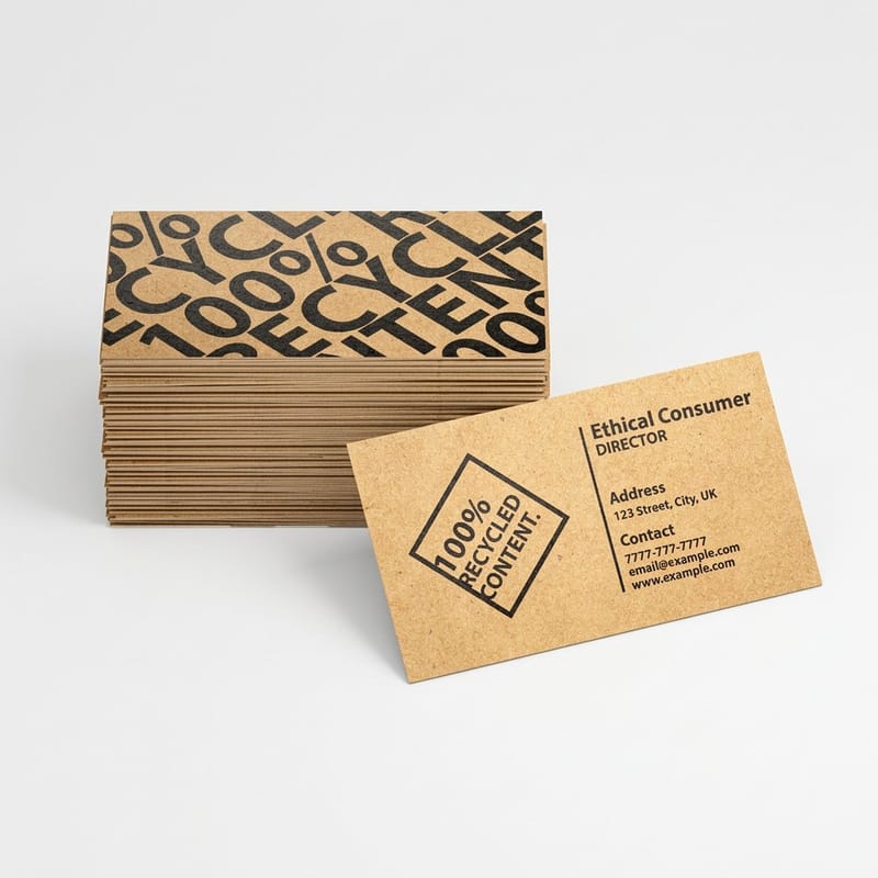
Pantone is owned by Veralto Corporation, which holds it through the color measurement company X-Rite. Danaher owned it from 2012 until Veralto was spun off as a separate listed company on 1 October 2023, so any article still naming Danaher as the owner is out of date. The part that changes your printing is not the parent company. It is that a Pantone number is a mixed ink recipe, and four color process can only imitate it. You can see that for yourself on a small order: print your brand color on 100 premium business cards on 16pt Gloss Cover and 100 on 16pt Uncoated Cover, and you hold the C and U difference in two hands before a letterhead run commits to either.
Ways a brand color reaches the sheet
| Method | How the color is made | Consistency | What it costs | Best used for |
|---|---|---|---|---|
| Pantone spot ink | Base inks mixed to a published formula, then one plate lays it down solid | Highest. The sheet carries the ink itself | A press unit and a wash up per color | One or two color letterhead, envelopes, packaging |
| CMYK process | Four halftone screens overprinted so the eye reads one color | Good inside a run, small drift between runs | Flat. Four colors is the standard sheet | Photography, full color cards, brochures, folders |
| CMYK plus a spot | Process for the imagery, one extra unit for the brand color | High on the brand mark, normal everywhere else | A fifth unit, so an offset run and a real quantity | Brands whose color sits outside process gamut |
| Digital toner or inkjet | Four or more toners fired straight onto the sheet, no plates | Tight within a job, worth a proof between jobs | Low at short quantities | Reprints, short runs, proofing a layout |
| Foil or metallic | A metal die stamps foil onto the sheet, no ink involved | Exact, because the foil is a fixed material | A die plus a stamping pass | Metallic Pantone numbers that CMYK cannot reach |
Most online printing, ours included, runs four color process on a shared press sheet, which is what keeps short runs affordable. A run of 100 premium business cards goes on that shared sheet in four color process and ships in 3 business days on the standard option, on stocks from 14pt Gloss Cover to 80pt UltraWhite Uncoated Cover. Spot ink belongs to offset work with quantity behind it. If your color sits outside process gamut, decide that at the identity stage rather than at the reprint, and browse business card printing to see which stocks hold saturated color best.
Who owns Pantone today
Pantone LLC sits inside Veralto Corporation, a company that listed on the New York Stock Exchange on 1 October 2023 when Danaher spun off its environmental and applied solutions businesses. Veralto owns X-Rite, and X-Rite owns Pantone. Plenty of articles still name Danaher, and a few still name X-Rite as though it were independent. Both were true once.
The chain is short and worth having straight. Lawrence Herbert took over a small commercial printing operation in the early 1960s, published the first Pantone Matching System guide in 1963, and ran the company for more than four decades. He sold it to X-Rite in 2007 for around $180 million. Danaher bought X-Rite in 2012, and the whole color unit moved to Veralto in the 2023 separation.
That is the trivia answered. The part that changes what you do is what a Pantone number is, and why two printers can both hit it and still hand you sheets that do not match. Our history of Pantone colors covers the founding years in more detail.
Why a corporate owner shows up in your design software
Pantone is a licensing business. The numbers, the guide books and the digital libraries are its product, which is why the libraries you once got free inside Creative Cloud stopped being free. In November 2022 Adobe removed the bundled Pantone books from Photoshop, Illustrator and InDesign, and the current libraries moved behind the Pantone Connect plugin and its own subscription.
The practical fallout is small but real. Files built before that change can open with Pantone swatches showing as black or as an unresolved name, and designers on newer installs sometimes cannot see the swatch a client is asking for. If a logo file arrives with a swatch called PANTONE 186 C and no color attached, that is what happened. Ask for the number in writing rather than trusting the file.
What you are allowed to do with a Pantone number
You can specify a number in your brand guidelines, print it, and tell suppliers to match it. That is what the system is for. What the license does not give you is the right to republish the guide values as your own color chart or to bundle the libraries into a product you sell.
A color itself can be protected separately from Pantone. Tiffany blue is a custom Pantone color kept out of the public guides, and UPS holds trademark protection on its brown. Those are trademark positions on the use of a color in a trade, not ownership of a number in a book.
What a Pantone number actually buys you
A Pantone number is a recipe. It tells an ink technician which base inks to weigh out and in what proportion, so that a printer in Queens and a printer in Lisbon mix the same physical ink. Nothing about it is a screen value, and nothing about it is a CMYK build. That is the whole point of it, and it is also the source of most of the confusion.
Because it is a mixed ink, a spot color lays down solid at full strength through one press unit. There is no dot pattern to look at under a loupe, so the color does not shift as the press balances the four process inks against each other. On a long letterhead run, starting at $99.95, that is the difference between the first box and the tenth box looking the same.
The cost is a press unit and a wash up. That only makes sense on an offset run with real quantity behind it, which is why most online print, including the gang run sheets that keep premium business cards at $17.57, is four color process instead.
C, U, and why the same number looks like two colors
Coated stock holds ink on the surface, so the color stays saturated. Uncoated stock drinks it, so the same ink dries duller and slightly darker in feel. Pantone publishes both, which is what the C and U suffixes mean, and the two chips for one number can look startlingly far apart when you hold the books side by side.
This catches brands out on stationery sets more than anywhere else. A business card on coated 16pt and a letterhead on uncoated 70lb text carry the same number and will never look identical. Decide which one is the reference piece, match the rest to it as closely as the stock allows, and tell your team that is the intent rather than letting somebody flag it as an error every year.
Guide books fade, and so does your reference
A Pantone book is printed matter. The chips shift with light and handling, and Pantone tells you to replace guides annually for that reason. A studio comparing a press sheet against a book from six years ago is arguing with a faded reference and usually blaming the printer.
Keep the book in its sleeve, away from a window, and view under a consistent light source. Two people can look at the same sheet under a warm office lamp and a north window and reach opposite conclusions, which is one of the things color management in prepress exists to remove.
Pantone against CMYK on a real press

Four color process cannot reach every Pantone color, and this is where brands get hurt. CMYK simulates a color by overprinting four halftone screens. Colors that sit near the edge of a process gamut, or outside it, come back close but not right. Saturated oranges such as 021, Reflex Blue, the bright 300 series blues, most clean greens, every neon and every metallic are the usual casualties.
A softer number in the mid tones converts almost invisibly. A brand built on Reflex Blue does not, and no amount of pressing the printer will change that, because the ink set on the press does not contain the pigment the color needs. Our guide to which Pantone colors shift most in conversion lists the families that move furthest.
The honest sequence is to check the conversion before you commit the identity, not after the first print run disappoints somebody. A Color Bridge guide shows the spot chip and its process simulation on the same page, which is the fastest way to see what you are actually going to receive.
Convert deliberately, never automatically
Letting Illustrator convert a spot swatch on export takes whatever number the current library holds, and those values have been revised across editions. Two designers on two software versions can produce two different CMYK builds from one Pantone number, both technically correct, and neither one matching the sheet you approved last year.
Set the build yourself, record it in the brand guidelines next to the Pantone number, and use it everywhere. The steps are in our walkthrough on converting Pantone spot color to CMYK in Illustrator, and the reasoning behind picking the values sits in how to match Pantone to CMYK.
When a spot ink is worth paying for
Spot ink earns its cost in three situations. The brand color is outside process gamut and the difference is visible to a customer. The piece is a long run where drift between reprints would be noticed, such as packaging or stationery. Or the design is one or two colors anyway, in which case two color printing with spot inks can cost less than a four color sheet rather than more.
Everything else is better served by a controlled CMYK build. Full color brochures at $57.11 carry photography, and photography needs process ink regardless, so a spot unit on top rarely repays itself on a marketing piece.
What to send your printer
A color complaint is nearly always a specification problem rather than a press problem. Send the Pantone number, the CMYK build you have agreed on, the stock, and one line saying which of those three wins if they disagree. That single line settles most arguments before they start. Then pick the stock that matches the chip you named: a C number belongs on a coated stock such as 16pt Gloss Cover, and a U number on an uncoated one such as 16pt Uncoated Cover.
Then ask for a proof and judge it on paper. A monitor is a lit surface and a printed sheet is a reflective one, so they will never agree, which is the whole reason a proof can look duller than the screen without anything being wrong.
Quantity and price
Business card pricing and specs
Live configurator numbers on premium stock, where the per unit cost falls as the run grows.
| Quantity | Price Per Unit | Total |
|---|---|---|
| 100 | 17.6¢ | $17.57 |
| 200 | 11.5¢ | $23.07 |
| 300 | 9.15¢ | $27.46 |
| 400 | 7.96¢ | $31.86 |
| 500 | 7.25¢ | $36.26 |
| 600 | 6.77¢ | $40.64 |

You can also earn coins on every order and spend them against future printing, which helps when a rebrand means reprinting a whole stationery set at once.
Matching color across a stationery set
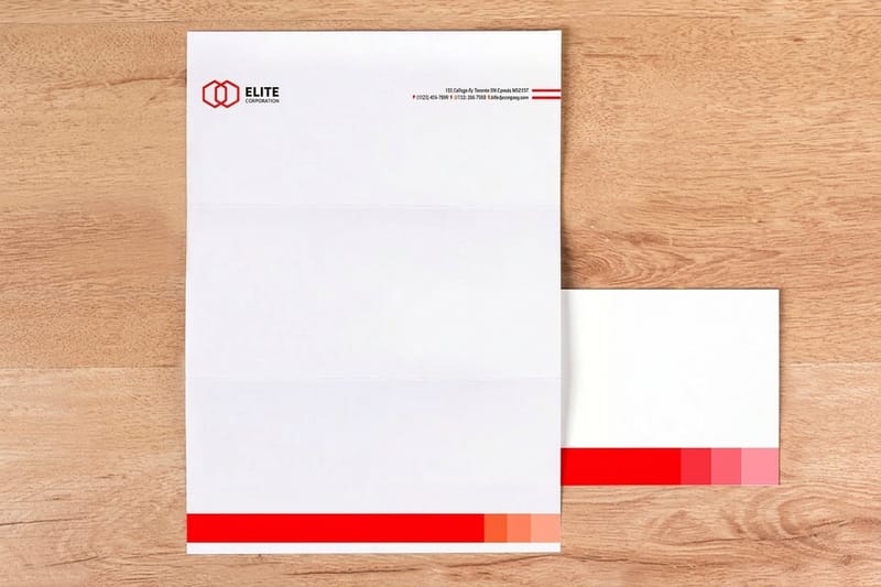
Cards, letterhead and envelopes rarely run on the same stock, and that is where a brand color visibly splits. Coated card holds ink on the surface. Uncoated text paper absorbs it. The ink is identical and the result is not, which is exactly what the C and U chips in the guide are showing you.
Print it
Letterheads that repeat, box after box
The piece where run to run consistency shows first, from $99.95.
Order the set together where you can, so one press period covers all of it and the sheets are judged side by side before anything ships. If the pieces have to be ordered apart, keep a signed reference sheet from the first run and send it with the next order. Matching printed envelopes to a letterhead already in the drawer is far easier when the printer can see the target rather than read a number. For a fuller picture of what a set contains, our checklist on what goes in a brand kit lists the pieces most brands forget.
How different businesses handle brand color
The right approach depends on how often you reprint and how closely anyone compares two pieces.
- Professional services. One color across cards, letterhead and envelopes, on stocks that hold ink differently. Set the coated piece as the reference and match the uncoated to it.
- Retail and consumer brands. Packaging drives the color, and shelf comparison is unforgiving. If the pack runs spot ink, expect the process printed collateral to sit slightly behind it.
- Restaurants and hospitality. Menus reprint often, so lock the CMYK build rather than the Pantone number. Consistency across reprints matters more than hitting the chip exactly.
- Agencies handing off artwork. Ship the Pantone number, the agreed CMYK build and the stock in one document. A file with unresolved spot swatches lands on the printer and stalls the job.
- Nonprofits and campaigns. Volume and speed beat perfection. Pick a color that survives conversion, and check it against a bridge guide before the identity is signed off.
Files sized before the color conversation
Starting from a correctly sized file removes one variable from the color conversation. Our blanks carry the bleed and trim already marked, so the only thing left to argue about is the ink. For a 2 x 3.5 inch business card that means a 2.25 x 3.75 inch document, with 0.125 inch of bleed on each side and type kept 0.125 inch inside the trim. Pull one from the blank template library before you build the artwork.
Start fast
Files sized before the color conversation
Blanks that carry the bleed and the trim, so only the ink is still in question.














Wally checks the number against the sheet
A Pantone number is an ink recipe, not a screen color
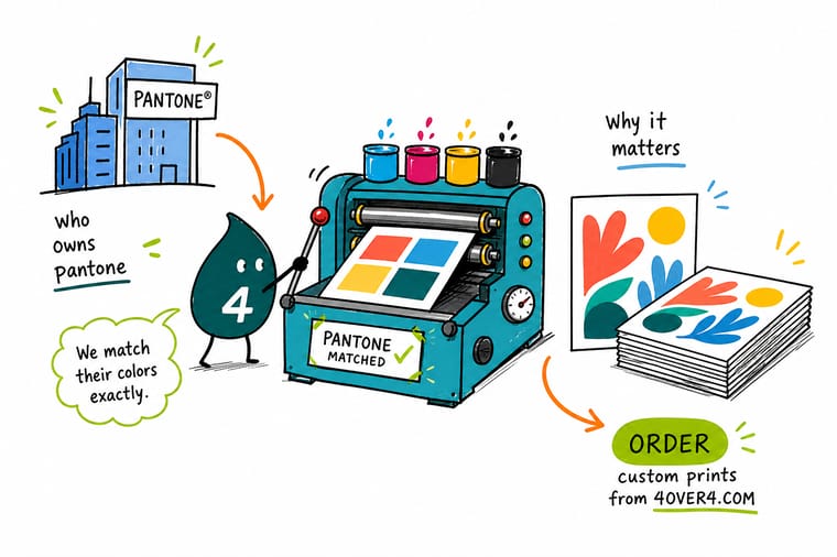
Write the Pantone number and your agreed CMYK build into the brand guidelines together, name which piece is the reference, and replace the guide book before its chips fade. Then send the file, the numbers and the stock in one message, and 4OVER4.COM prints your set with a proof before the run.
Order business cards →What a Pantone number actually buys
Habits that keep a brand color steady
- Write the number and the build. Brand guidelines that carry only a Pantone number force every supplier to invent a CMYK value. Publish both, plus the RGB and hex, and the arguments stop.
- Name the reference piece. Across a stationery set, one item is the standard and the rest match it as closely as their stock allows. Decide which one before the first proof.
- Replace the guide book. Chips fade. A book kept in a drawer for six years is not a reference, and comparing a fresh press sheet to it produces a complaint the printer cannot fix.
- Check gamut before signing the identity. Reflex Blue and 021 Orange look superb on screen and never arrive that way in process. Find out at the logo stage, not at the reprint.
- View under one light. Judge every proof and press sheet under the same light source. Warm office lighting and daylight will give two people two verdicts on the same sheet.
Explore more
More on color and brand printing
Printed envelopes run 250 for $142.99 in 7 business days and letterheads 50 for $99.95 in 5.
 Product Premium Business Cards Full color cards on heavy stock, from $17.57. Product Letterheads Long runs where brand color has to repeat, from $99.95.
  Product Printed Envelopes Match the envelope to the letterhead it carries. Product Standard Brochures Photography and brand color across a full spread.
  Guide What Is Spot Color Printing How a mixed ink reaches the sheet, and when it pays.
  Article Designing With Coral Pantone Colors A worked example of a color that fights conversion.
 Ready to print your brand color?
Send the number, the build and the stock, and 4OVER4.COM prints your set on premium paper with a proof before the run.
Common questions about Pantone and color matching
Who owns Pantone now?
Pantone LLC is owned by Veralto Corporation, which holds it through X-Rite. Danaher acquired X-Rite in 2012 and separated Veralto as an independent listed company on 1 October 2023, taking the color businesses with it. Before Danaher, X-Rite bought Pantone from its founder Lawrence Herbert in 2007 for around $180 million. Herbert had published the first Pantone Matching System guide in 1963 and ran the company for more than forty years, which is why so many older references treat the name and the man as the same thing.
Is Pantone free to use in my brand guidelines?
Naming a Pantone number in your guidelines and asking suppliers to match it is exactly what the system is for, and it costs nothing. What is licensed is the reference material: the guide books, and the digital libraries that Adobe stopped bundling with Creative Cloud in November 2022. If you want the current libraries inside Illustrator or InDesign you go through the Pantone Connect plugin and its subscription. Buy one physical guide for the studio as well, because a screen swatch is not a color reference.
Can a printer match a Pantone color exactly in CMYK?
Not always, and any printer promising otherwise is guessing. CMYK builds a color from four overprinted screens, so anything that needs a pigment outside that set lands short. Saturated oranges such as 021, Reflex Blue, the bright 300 series blues, clean greens, neons and metallics are the ones that visibly miss. Mid tone and muted colors convert well enough that most people never notice. Check the number against a Color Bridge guide, which prints the spot chip beside its process simulation, before you decide whether the difference matters for your piece.
Why does my brand color look different on my letterhead than on my business card?
Almost always the stock. Coated paper holds ink on the surface and keeps it saturated, while uncoated paper absorbs it and dries duller. Pantone publishes both results as the C and U versions of the same number for that reason. Add different presses, one digital and one offset, and the gap widens further. Pick one piece as the reference for the set, match the others to it as closely as their stock allows, and write that intent into the brand guidelines so it does not get raised as a defect on every reorder.
What should I send a printer if I want my brand color matched?
Send the Pantone number, the CMYK build you have agreed on, the stock and finish, and a note saying which of those wins if they conflict. Convert spot swatches deliberately rather than letting the software do it on export, because library values have been revised between editions and two software versions can produce two different builds from one number. If the color is critical, ask for a printed proof on the actual stock and judge it under a single consistent light source, not on a monitor.
