
Best Business Fonts for Cards, Logos and Every Printed Brand Piece


The face that wins your logo sketch is rarely the face that can set a phone number at 8pt. Here is how to pick a business type system that survives the press, the licence, and the smallest line on the card.
The best business fonts are one text face with at least four weights, plus one display face used only for your name. For the contact block, humanist sans faces with a tall x-height, such as Inter, Source Sans 3, IBM Plex Sans, Lato or Libre Franklin, stay legible at the 8pt to 9pt sizes a business card demands. For a heritage tone, choose a transitional or old-style serif such as EB Garamond or Source Serif 4 rather than a hairline Didone. Pick the face at its smallest size, confirm the licence covers desktop printing, and outline or embed the type before you upload.

Start here
The whole decision in one paragraph
Choose one text face that still reads at 8pt and one display face for your name, then check the licence and outline the type before you send the file. Everything else on this page is detail underneath those four moves. The diagram shows the size ladder a business card has to respect and the order the four decisions come in.
What counts as a business font

A business font is any typeface you commit to across your printed and digital identity, which in practice means two of them: a text face that sets every contact line, caption and paragraph, and a display face used for the name or the logotype. The text face does ninety percent of the work and gets almost none of the attention.
That split matters because the two jobs have opposite requirements. A display face is chosen at 40pt or larger, where personality is visible and technical weaknesses are not. A text face is chosen at 8pt, where personality disappears and only the engineering shows: x-height, counter size, stroke contrast, and how much space the designer left between letters. A face that is charming on a poster can be unreadable on the back of a card, and nothing about the way you pick fonts on screen will warn you.
The families that survive both jobs are the ones built as systems. Source Sans 3 pairs with Source Serif 4, IBM Plex Sans pairs with IBM Plex Serif and IBM Plex Mono, and Inter ships with a full weight range plus a display cut. Choosing inside one of those systems solves the pairing problem before you start. If you want the longer argument for each side of the serif question, our guide on serif vs sans serif takes it apart properly.
How to choose your business fonts, step by step

Choose from the bottom of the size ladder upward. The mistake almost everyone makes is picking the face that looks best in the logo and then discovering it cannot set a phone number. Reverse that order and the decision usually makes itself.
- Set your real content, not lorem ipsum. Your actual name, title, phone number and email, in the candidate face, at the sizes they will print: name 10 to 12pt, title 8 to 10pt, contact 8 to 9pt.
- Print it at 100 percent and read it at arm's length. A home printer is a harsher test than a commercial press, which is exactly why it is useful. If the 8pt line is a struggle, the face is out.
- Check the weight range before you fall in love. You want at least light, regular, semibold and bold, plus real italics. Families with two weights force you into fake bold and fake italic, and both look wrong in print.
- Add one display face, and only for the name. This is where the brand personality lives. Test it against your logo, not on its own.
- Read the licence, specifically the desktop rights. A webfont subscription does not authorise a print run. This is the step people skip and then discover at the worst moment.
- Prove it on the real stock. Order a printed sample or run a short quantity before you roll the system out to letterheads, pocket folders and everything else.
Working through those six in order takes an afternoon and it settles the question for years. Skipping to step four takes ten minutes and gets revisited every time you print something new. For the file mechanics that follow the choice, our guide on choosing and setting up fonts for printing picks up where this list ends.
The sizes that decide everything: what survives at 7pt
Never drop below 7pt for anything on a business card. Below that, ink fills in the fine parts of a letterform and ordinary indoor lighting stops being enough for a lot of readers. Above it, you have a hierarchy to build, and the ladder is short enough to memorise.
| Element | Recommended size | What breaks it |
|---|---|---|
| Your name | 10 to 12pt | Script and Didone faces are fine here, and only here |
| Job title or company | 8 to 10pt | Tight tracking closes the gaps between letters |
| Phone, email, address | 8 to 9pt | Light weights on uncoated stock, which absorbs more ink |
| Legal or fine print | 7pt absolute minimum | Anything with hairline strokes or low x-height |
Raised finishes move the floor up rather than down. Raised Spot UV sits above the surface, so the coating builds height and the strokes spread as they rise. Regular fonts need 6pt minimum on that process, and bold or thick-stroke fonts need 9pt so the strokes do not merge into a blob. The same logic applies to foil. If your identity depends on a very light weight, a raised finish is not the place to prove it, and Raised Spot UV cards will look better with a semibold than with a hairline.
One more physical detail worth knowing: reversing type, printing white letters out of a dark field, effectively makes the letters thinner, because ink spreads into the counters from all sides. Go one weight heavier than the version that looked right in black on white, and keep the point size at the upper end of the range. The precise limits for tiny type are covered in our note on the smallest font size you can print.
Pairing two faces without building a ransom note
The easiest good pairing is not a pairing at all. Take one family with a wide weight range and build the entire hierarchy from weight and size: semibold for the name, regular for the title, regular at a smaller size for the contact block. It looks deliberate because it is, and it is impossible to get wrong.
When you do want two faces, the reliable rule is strong contrast in structure and agreement in mood. A high-contrast serif next to a plain humanist sans reads as one voice with two registers. Two sans faces that are almost the same, say Helvetica beside Arial or Inter beside Roboto, read as a mistake, because the eye notices the difference without being able to justify it. Superfamilies remove the guesswork entirely, which is the whole point of pairs like Source Sans with Source Serif or Lora with Lato.
Whatever you choose, repeat it everywhere. The same two faces on your business cards, your letterheads and your postcards is what makes a pile of separate print jobs read as one company. Our guide on choosing the right logo fonts covers the display half of the pair, and the roundup of easy-to-read fonts for brands and print covers the text half.
Licensing: what you are actually allowed to print
Font licences separate rights by use, and the two that matter to a print buyer are desktop and web. A desktop licence lets you install the font, set type in it, and produce printed output. A webfont licence lets a browser render it on your site. Holding the second does not give you the first, and that is where most businesses accidentally end up out of compliance.
Google Fonts released under the SIL Open Font License are the clean case: free for commercial use, print included, no fee, no attribution needed on the piece. You cannot sell the font file itself, which is not something you were going to do anyway. That covers a very large slice of the library, and it is why open-licence faces have become the default for small business identities. The detail is worth reading once in our guide on whether Google Fonts are free for commercial and print use.
Subscription libraries work differently. Adobe Fonts, for example, covers print output for an active subscriber, but you cannot hand the font file to anyone else, including your printer. Foundry licences are usually priced per workstation and sometimes cap the number of impressions. None of this is a problem as long as you check before the run, and as long as you never solve a licence question by emailing the .otf to a supplier.
Getting the fonts to the press intact
Once the faces are chosen, the last job is making sure the press sees the same letterforms you approved. There are exactly two acceptable ways to do that: convert the type to outlines, which turns each letter into a vector shape, or embed the font inside a print PDF. Both remove any dependency on our system having your font installed.
Outlining is the safest and the least reversible. After you outline, the text is artwork, so nothing can substitute or reflow, but you also cannot fix a typo without going back to the original file. Keep an editable master, outline a copy, and send the copy. Illustrator users can follow the steps in converting text to shapes in Illustrator, and if you would rather keep live text, embedding fonts for print walks through that path. The short definition lives in our FAQ on what it means to outline fonts.
Two habits prevent almost every font-related reprint. First, start from a correctly sized file: our blank templates already carry the right dimensions, bleed and safe margin, so your 7pt fine print does not end up sitting on the trim line. Second, open the exported PDF, zoom to 400 percent, and read the smallest line on the page. If it is crisp there, it will be crisp on paper.
How the choice changes piece by piece
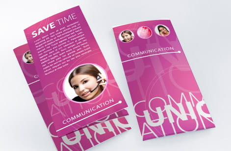
One type system, four different jobs. The face stays the same across your identity, but the size, the weight and the amount of it change with the format and with how far away the reader is standing.
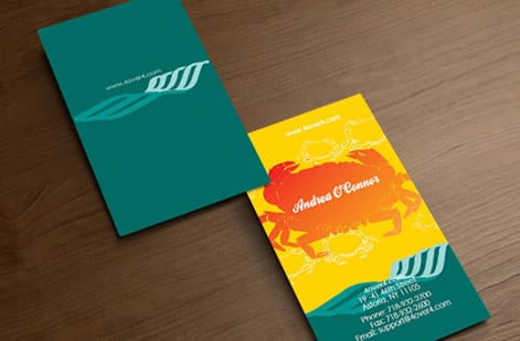
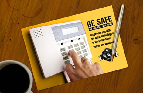
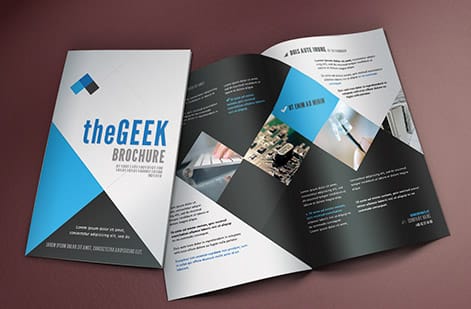
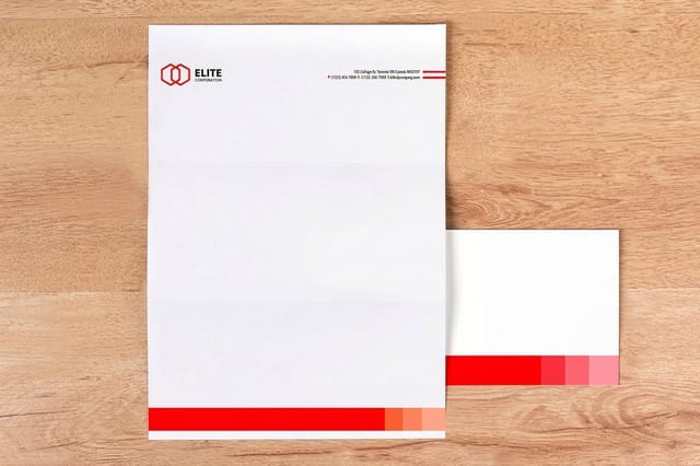
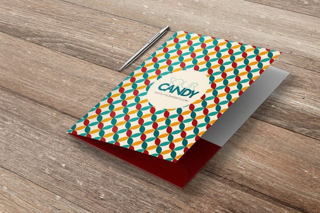
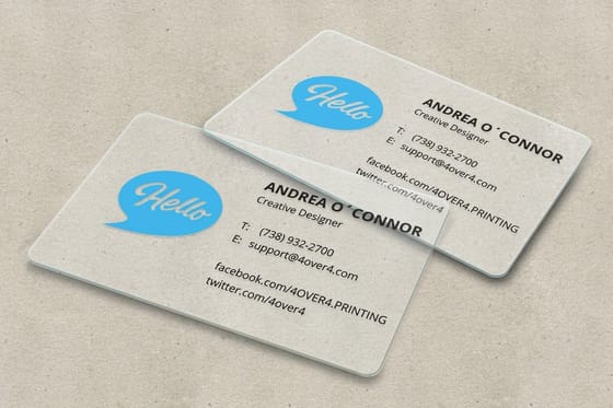
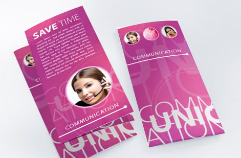
On a business card, the constraint is size: 3.5 by 2 inches, read at arm's length, with a 7pt floor. On a letterhead, the constraint is the opposite, because body copy is set at 10 to 11pt and the type has to stay comfortable for a full page, which rewards a face with generous spacing and real italics. On a pocket folder, the type is mostly a wordmark seen across a desk, so the display face finally gets to lead. On a postcard or a flyer, the headline has to work at a glance from several feet away, which puts weight and contrast ahead of refinement.
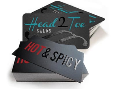
Print them together and the system becomes obvious. A brand launch set is the fastest way to see whether your two faces actually hold up across formats, and the card styles and finishes gallery shows what different stocks do to the same type.
The font mistakes that cost a reprint
Most failed type on print is one of five things, and none of them are visible on a monitor.
- A geometric sans in the contact block. Futura and its descendants have small x-heights and perfectly round counters that close up below about 8pt. Beautiful at 40pt on a folder, unreadable at 8pt on a card.
- A Didone anywhere small. Bodoni, Didot and Playfair Display have hairline thin strokes by design. At 8pt on uncoated stock the thins break up and the letters look moth-eaten. Keep them at 12pt and up.
- Light weights reversed out of dark. Ink spreads into the counters, so white type on a dark field prints visibly thinner than the same weight in black on white. Step up one weight.
- Three or more families on one piece. Every extra family adds a decision the reader has to process. Two is the ceiling for an identity, and one family with four weights usually beats two families.
- Sending the font file instead of fixing the file. Loose fonts push the job into prepress, and prepress adds a round trip before anything is imaged. Outline or embed, then upload.
The cheapest insurance against all five is a physical proof. Print your candidate layout, hold it, and look at the smallest line. It takes five minutes and it catches things no amount of zooming on screen will.
What it costs to print your type system
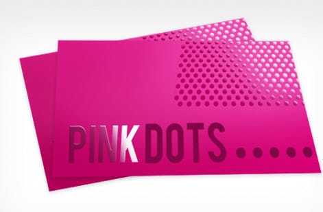
Standard business cards start around $17.57 at 4OVER4.COM, and the price moves with four levers: quantity, stock, finish and turnaround. Quantity does the most work, because setup is spread across the run, so the per-card cost falls steadily as the count climbs. Stock and finish are the levers a customer can feel, which makes them the ones worth spending on.
Finish also changes how your type reads. A gloss coating holds a crisp edge and makes fine strokes look sharper. Uncoated stock absorbs slightly more ink, which closes up light weights and thin serifs, so a face that looked delicate on screen wants one step more weight. Soft touch mutes contrast a little and flatters larger display type more than tiny contact type. Raised finishes such as Spot UV and raised foil add height, and with it the 6pt and 9pt minimums covered above. Our guide on choosing a business card finish compares them side by side.
Turnaround is the lever to buy last. A rush fee buys nothing the recipient will ever see, and it is the one line on the invoice with no effect on how good the card looks. Set each option in the configurator below and watch the price update as you go, or start from a design template if you would rather see the type system in place before you commit.
Wally explains business fonts
Pick the font your smallest line can survive
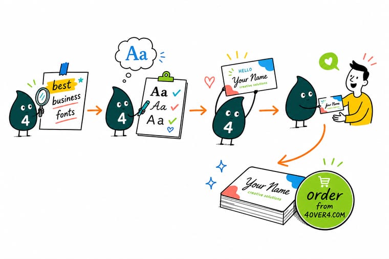
Wally sets the phone number first. If the 8pt line reads cleanly on paper, the face is worth keeping, and the name can borrow something with more personality on top. Two families, four weights, a licence that covers desktop printing, and type outlined before it is uploaded. Do that and 4OVER4 prints exactly the letterforms you approved.
Design and print business cards →Specs and pricing
Standard business card specs and live pricing
Type decides how the card reads. Stock and finish decide how it feels, and both change the price. Here are the live specs and price-per-unit for standard business cards at 4OVER4.COM, straight from the configurator.

| Quantity | Price Per Unit | Total |
|---|---|---|
| 100 | 17.6¢ | $17.57 |
| 200 | 11.5¢ | $23.07 |
| 300 | 9.15¢ | $27.46 |
| 400 | 7.96¢ | $31.86 |
| 500 | 7.25¢ | $36.26 |
| 600 | 6.77¢ | $40.64 |
| 700 | 6.43¢ | $45.04 |
| 800 | 6.18¢ | $49.43 |
Print it
Put your type system into print at 4OVER4

See it in use
Real card designs, printed in-house








Explore more
Where to go next




By the numbers
Printing you can count on at 4OVER4
Common Questions
Common questions about business fonts
What are the best fonts for a business card?
A humanist sans with a tall x-height and at least four weights, such as Inter, Source Sans 3, IBM Plex Sans, Lato or Libre Franklin, for the contact block, plus one face with more personality for the name. Those workhorse sans faces are the safest choice because the contact block is set between 8pt and 9pt, and a tall x-height with open counters is exactly what survives at that size once ink spreads slightly on paper. If your brand needs a serif, choose a transitional or old-style face such as EB Garamond, Source Serif 4 or Libre Baskerville rather than a Didone like Bodoni, whose hairlines thin out at small sizes.
How do I choose a font for my brand?
Work backwards from the smallest thing you print. Set your real phone number and email in the candidate face at 8pt, print it on a home printer, and read it at arm's length. Anything that turns to mush is out, no matter how good it looked in the logo. Then check three things: does the family have a light, regular, semibold and bold, does the licence cover desktop print, and does it still look like you next to your logo. A family that passes all three is worth more than a fashionable face you have to fight at every size.
How many fonts should a business use?
Two, and one of them is optional. One text family with four or more weights gives you every level of hierarchy you need through weight and size alone, which is why a single well-built family almost always looks more expensive than two families mixed together. Add a second face only where it earns its place, usually the name on a card or the wordmark itself. Three or more families on one piece is the fastest way to make a printed identity look assembled rather than designed.
What is the smallest font size that still prints cleanly on a business card?
Never drop below 7pt on a business card. Below that, ink fills in fine letterforms and normal indoor lighting stops being enough for most readers. The working ladder is your name at 10 to 12pt, job title or company at 8 to 10pt, phone, email and address at 8 to 9pt, and legal or fine print at 7pt as an absolute floor. Sans-serif faces hold up better at those sizes than script or heavily decorative ones, and strong contrast between the text and the background matters as much as the size does.
What is the minimum font size for raised finishes like Spot UV?
Raised Spot UV sits up off the surface, so the coating builds height and small type loses definition. Keep regular fonts at 6pt minimum and bold or thick-stroke fonts at 9pt minimum, so the strokes do not merge as the raised layer spreads. Thin lines and small icons need extra breathing room around them for the same reason. When a line sits right on the limit, size it up slightly rather than trusting it to hold.
Are Google Fonts free to use on printed business cards?
Yes for the ones released under the SIL Open Font License, which covers the large majority of the Google Fonts library. That licence allows commercial use in print, needs no fee, and does not require you to credit the designer on the piece itself. What it does not allow is selling the font file on its own. The practical catch is different: a font served to your website through a webfont licence from a commercial foundry is not automatically licensed for print, so check the desktop rights before the file reaches a press.
What does it cost to print business cards, and how is the price set?
Standard business cards start around $17.57 at 4OVER4.COM, and the price moves with four levers: quantity, stock thickness, coating or finish, and turnaround. Quantity does the most work, because the plate and setup cost is spread across the run, so the per-card price drops sharply as the count climbs. Finish is the second lever, and it is the one you can actually see and feel. Turnaround is the one worth buying last, since a rush fee buys nothing the customer will ever notice. Set each option in the configurator and the price updates live as you go.
What sizes, stocks and finishes can I print my typography on?
Business cards run from everyday 14pt stock up to heavy uncoated and specialty stocks, with coatings from matte and soft touch to high gloss, plus raised finishes such as Spot UV and foil. Each one changes how type reads: gloss holds a crisp edge and makes fine strokes look sharper, uncoated absorbs slightly more ink and closes up light weights, and soft touch mutes contrast a little. Use the specs and pricing panel on this page for the exact combinations, or order printed samples so you can hold the stock before your type is locked.
How long does business card printing take?
Turnaround is an option you choose in the configurator alongside quantity, stock and finish, and the estimate updates with your selection plus the shipping method you pick at checkout. The part that decides your real timeline is usually not the press, it is the file: type that was never outlined or embedded, or fonts sent as loose files, sends the job to prepress and adds a round trip before anything is imaged. Supply a print-ready PDF with the type already fixed and the schedule you see in the cart is the schedule you get.
Get Started
Ready to print the type system you just chose?
Bring your outlined file to 4OVER4.COM and print it on the stock and finish that suits your face. Adjust quantity, stock and finish and watch your price update live.
Legal Disclaimer
Gold Standard guarantees apply to all standard orders placed through 4over4.com. Price match requires verifiable proof of a competitor's published price for an equivalent product with matching specifications and turnaround time. Satisfaction guarantee covers manufacturing defects and print quality issues. Contact support with order number and documentation. On-time delivery rate based on tracked orders 1999 to 2026. Individual results may vary based on shipping carrier performance.
