
The Real Value of Graphic Design for Print Marketing


Marcus is our print marketing voice, built from the knowledge of our production team, with over 20 years in printing.
Graphic design is the smallest cost in a print campaign and the one that decides whether the rest of the money works. Paper, press time and postage are locked in the moment you approve the job, so the layout is the only variable left that changes how many people read the piece and act on it. You feel that most on the pieces you reorder, like premium business cards, mailed postcards and folded brochures, where one layout decision gets printed again on every run.
What design decides on each printed piece
| Piece | Read from | What design has to get right | Where it usually fails | Product at 4OVER4 |
|---|---|---|---|---|
| Business cards | About 12 to 18 inches, in a hand | Decide which of the six lines a stranger reads first | Logo largest, name and number smallest | Premium business cards |
| Mailed postcards | Arm length, over a recycling bin | Carry the offer on the side that faces up | Offer hidden on the back, address side left blank | Standard postcards |
| Handout flyers | 3 to 5 feet, often while walking | One message legible without stopping | Six messages at the same weight | Standard flyers |
| Brochures | Arm length, unfolded panel by panel | Control the order the panels are opened in | Panels designed flat, then folded through a headline | Standard brochures |
| Posters | 6 to 20 feet, across a room | Size type against the depth of the room | Body copy set for a page, hung on a wall | Standard posters |
Reading distance is the fastest way to catch a layout problem before it costs a run. Print the artwork at actual size, stand where the reader will stand, and see whether the offer still reads. You can order standard postcards or standard flyers straight from the configurator once the layout holds up.
Why the value of design gets underestimated
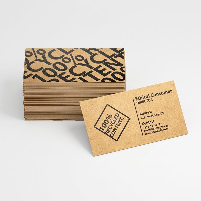
Design is the only part of a print job that arrives without an invoice attached to the damage. Paper, ink, cutting, shipping and postage all show up as line items. A layout that buried the offer shows up as a quiet week at the phone, which nobody files under design.
The second reason is that print is judged by taste and paid for by results. People look at a proof and say whether they like it. That is a different test from whether a stranger, holding the piece for two seconds beside a recycling bin, understands what is being offered and what to do next.
The third reason is the one printers see every day. Print has no undo. A website headline gets fixed in a minute, but a typo on 5,000 postcards is a reprint plus a second round of postage. That asymmetry is exactly why the cheap hours spent on layout are worth more than they look. Our explanation of bleed and trim covers the mechanical half of that.
The costs that never appear as design costs
A file that misses bleed comes back for a corrected version, which pushes the mail date past a dated offer. An image dropped in at 72 DPI and scaled up prints soft, and soft printing gets blamed on the printer. A 100 percent black background sitting next to a photograph reads gray once it is on paper, and the reorder is charged as a new job.
None of these arrive labeled as design. They arrive as delays, as reprints, and as a run of paper that did nothing. That is the real bill, and it is paid by the people who skipped the cheapest step.
What design is not responsible for
A well set postcard sent to the wrong ZIP codes still fails. So does a beautiful flyer for an offer nobody wants. Design multiplies whatever the offer already is, and multiplying zero gives zero.
Say plainly what you want the reader to do before anyone opens a design tool. If that sentence is weak, no amount of layout will rescue it, and you will have paid twice to find out.
What good print design actually returns

Four returns, and each one is checkable. Hierarchy, so the piece is read in the order you chose. Legibility at the real distance. Files that pass without a reprint. Consistency, so the fourth thing a customer sees connects to the first three.
Hierarchy is the one that moves numbers. A reader gives a printed piece one glance and takes away exactly one thing. Design decides what that thing is. Make the offer the biggest element and the logo the smallest, then check by squinting: whatever survives is the message you actually sent.
Reading distance is where most homemade artwork goes wrong. Cards are read at roughly a foot and a half, handout flyers at three to five feet, posters across a room. Type set comfortably on a laptop screen is often two sizes too small once the piece is at its working distance. Print one, tape it up, and walk away from it. See our notes on fonts that stay readable in print for the typefaces that hold up at small sizes.
Files that pass the first time
A print-ready file has 0.125 inch bleed on every side, keeps live text at least 0.125 inch inside the trim, uses images at 300 DPI at final size, and is built in CMYK rather than RGB. That is most of the craft, and it is the part that gets a job on press instead of back in your inbox.
This is also where a designer pays for themselves fastest on a first order. Cutting tolerance is around 1/16 inch, so a thin frame drawn right at the edge will look thicker on one side than the other on some sheets. A designer knows to move it in. A template user usually finds out after the box arrives. If you are building the file yourself, read how to create commercial print-ready files before you export.
Consistency is a return, not a preference
One typeface family, one color pair, one logo position across the card, the postcard and the brochure. It is not about tidiness. It is that recognition is cumulative, and a customer who has seen three pieces that look related has met your business three times instead of once.
Lock the colors as CMYK values or Pantone references and give those numbers to everyone who prints for you. RGB values sent to a press are converted by somebody else, and their conversion will not match yours. Our CMYK and RGB conversion guide shows what shifts and why.
Signs your print design is costing you work

Take the last piece you printed and run it against this list. Every item is something a printer sees weekly, and every one of them is fixable before the next run.
If you have to explain the piece before somebody understands it, the piece is not finished. That single test catches more problems than any critique.
Nine things to check on your current artwork
1. The logo is the largest element. Nobody is looking for your logo. They are looking for what is in it for them.
2. Body copy under 8pt. Fine on a screen at 200 percent zoom, unreadable on paper for anyone over about fifty.
3. Everything is bold. If every element shouts, the reader hears nothing and moves on.
4. Photos placed below 300 DPI. A web image stretched to full bleed prints visibly soft at arm length, and no press setting fixes it.
5. No bleed in the file. A white sliver appears on one edge after trimming, on some sheets and not others.
6. Text inside the 1/8 inch safe margin. It survives on most of the run and gets clipped on the rest.
7. Flat 100 percent black over a large area. It reads washed out next to a photograph. A rich black build is what looks solid on paper.
8. A QR code pointing at your homepage. Send it to the exact offer. A code that dumps people on a homepage teaches them not to scan the next one.
9. No single action. Call, scan, visit and follow, all at equal weight, means the reader picks none of them.
The two minute test before you order
Print the artwork at actual size on your office printer, hold it at the distance it will really be read from, and hand it to somebody who has never seen it. Ask what it is offering and what they would do next. If either answer takes longer than a couple of seconds, fix the layout rather than the paper stock.
Then order a proof. 4OVER4.COM includes free proofs before the run, and the proof is the last point where a change costs minutes instead of a second print bill.
DIY design versus hiring a designer

There is no single right answer, and anybody who tells you to always hire is selling design. The honest split is by how long the piece has to live and how hard it has to work.
A flyer for one weekend event, using a logo you already have, is a template job. A brand identity that will sit on business cards, brochures and vehicle signage for the next five years is not. Between those two, the decision is mostly about how much of the outcome depends on the piece.
Where each route breaks down
Templates fail when the content does not fit the shape they were drawn for. Editing a template with four times as much copy as its layout expects gives you a worse result than starting from a blank page, because you end up shrinking type to fit rather than cutting words.
Designers fail when the brief is thin. The revision rounds people complain about are usually the cost of the client deciding what they wanted while the designer was working. Write the copy first and approve it before layout starts, and most of that expense disappears.
How to brief a designer so you pay once

Hand over eight things and the job usually lands in one or two rounds instead of five. Final approved copy. The trim size and quantity. The product and stock it will print on. The single action you want. The deadline, including the mail date if it is going in the post. Your logo as vector artwork. Your brand colors as CMYK or Pantone values. The name of the one person who signs it off.
The most useful line you can add is where the piece will be seen and from how far. A designer sizing type for a poster hung above head height makes different choices from one laying out a card that sits in a wallet, and nobody can guess that from a size in inches.
What to ask for back
Ask for a print-ready PDF with bleed and marks, and for the packaged native files with the fonts and links. The PDF gets the job printed. The packaged files are what let anyone edit it next year, including a different designer, without rebuilding the layout from scratch.
Agree ownership in writing before the work starts. Commissioned artwork does not automatically transfer, and the time to sort that out is at the start, not when you want to reuse a layout on a new product. Also ask which fonts were used and whether the license covers your own use of them.
Words that cost you money
Make it pop. Make it modern. Something clean but bold. Each of these buys a revision round, because they describe a feeling instead of a job. Replace them with the outcome: this postcard has to get a homeowner to call for a quote before spring, and the phone number has to be readable from arm length in a hallway.
If you genuinely cannot describe the outcome, that is a signal to fix the offer before you fix the artwork.
Four ways to get the design done
Two of the four routes cost nothing up front. A blank template or the online designer gets a card, postcard or flyer done in one sitting, and you pay only for the printed product. A freelance designer takes days plus your review rounds, and a studio takes weeks, so match the route to how long the piece has to live and how hard it has to work.
| Route | What it costs | Speed | Best for | Where it breaks down |
|---|---|---|---|---|
| Blank template, your own file | Free to download, you supply the artwork | As fast as you can work | A layout you already have and only need to resize | It gives you the cut lines, not the judgement |
| Online designer in the browser | Free, you pay only for the printed product | One sitting | Cards, postcards and flyers with a logo and a short offer | It cannot invent a brand you have not decided on yet |
| Freelance designer | Paid per project or per hour | Days, plus your review rounds | A piece that has to work harder than the last one | A vague brief turns into revisions you pay for |
| Studio or agency | Project fee or retainer | Weeks | A full identity used across many printed pieces | Overkill for a single flyer with a two week life |
Most businesses end up using two of these at once: a designer for the identity and the first layout, then the online designer for every seasonal edit after that.
What the printing itself costs
Design decisions are easier once you can see how small the print bill is next to the effort. The table below prices premium business cards from the live configurator, starting at 100 cards on 14pt gloss cover in 3 business days. Five hundred cards cost about twice what 100 do, so the per card price drops as the run grows, and the same layout can move up to 16pt, 24pt Ultra Thick or linen stock without a redesign.
Quantity and price
Business card pricing and specs
Real configurator numbers for premium business cards, where a longer run lowers the cost of every card in it.
| Quantity | Price Per Unit | Total |
|---|---|---|
| 100 | 17.6¢ | $17.57 |
| 200 | 11.5¢ | $23.07 |
| 300 | 9.15¢ | $27.46 |
| 400 | 7.96¢ | $31.86 |
| 500 | 7.25¢ | $36.26 |
| 600 | 6.77¢ | $40.64 |

Every order also earns coins you can put against future printing, which is worth knowing about when you are budgeting a series of pieces rather than one.
Stock and finish are design decisions too
Paper is part of the layout, not a separate purchase made afterwards. A 16pt card feels deliberate in a way a 14pt card does not, and the difference is obvious the second somebody picks it up. Matte cuts glare and stays writable with a ballpoint, which matters on anything a customer will scribble a date on. Gloss lifts photography and color, and it resists fingerprints on a piece that gets handled a lot. Silk sits between the two and is the safest default when a piece carries both photographs and a block of text.
Print it
Premium business cards
Heavier stocks and finishes for the one printed piece people actually keep.
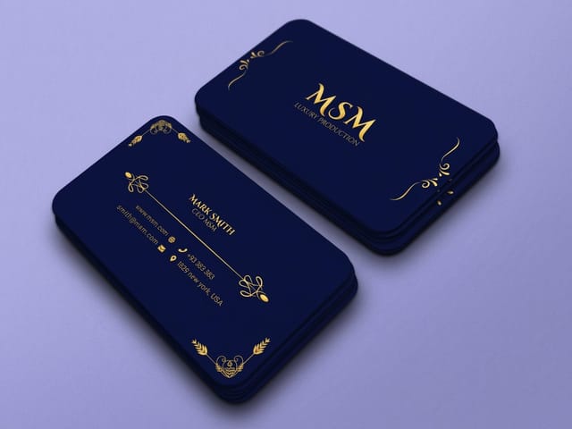
Finish also changes what your design can do. Spot gloss needs its own mask file built at 100 percent black, so it has to be planned during layout rather than added at checkout. Foil and raised effects want simple shapes and clear space around them, because fine detail closes up. Read how raised foil builds height and what it asks of your artwork before you draw a logo meant for it. If you are choosing between families rather than finishes, the business cards category lists every stock side by side, and brochure printing does the same for folded pieces. For the artwork rules behind all of it, logo design best practices covers what survives being printed small.
Design by business type
Where the design money is best spent changes with what you print most, so the answer changes by trade.
- Local service businesses. One strong postcard layout, reused with the offer swapped each season. Pay a designer once for the grid and the type, then edit the copy yourself in the online designer.
- Restaurants and cafes. Menus, table pieces and flyers all read at different distances. Set the type sizes for each distance first, and photograph the food properly before anyone starts laying out.
- Retail and e-commerce. Insert cards and stickers carry the brand into the box. A template is fine here, provided the logo is vector and the colors match the packaging.
- Professional services. Business cards and folders do most of the work, and both are judged on restraint. Fewer elements, better paper, and a designer for the identity is money well spent.
- Events and venues. Posters and handout flyers, short life, high volume. Template the layout, change the date and the headline per event, and keep one recognisable element fixed across all of them.
Files that already have the geometry right
If you are designing it yourself, start from a file that already has the geometry right. 4OVER4.COM builds its blanks to exact product specs, so the bleed, trim and safe margin are drawn for you and your artwork lands inside the cut line. Pick a layout from the design template library, or take an empty one from the blank template library and build on it.
Start fast
Files that already have the geometry right
Editable layouts and exact size blanks, with bleed and safe margins already marked.














Wally checks the layout before the press does
Squint at the proof and see what survives
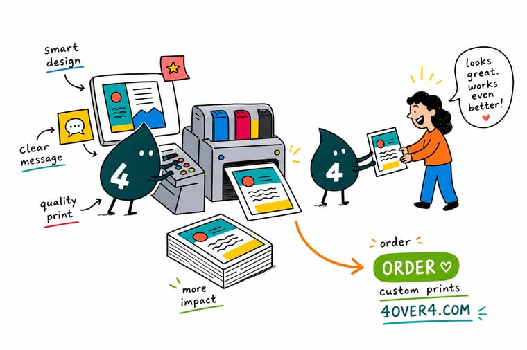
Make the offer the largest element and the logo the smallest, set type for the distance the piece is really read at, keep live text 0.125 inch inside the trim, add 0.125 inch bleed on all four sides, and build color in CMYK at 300 DPI. Then order a free proof, because that is the last moment a change costs minutes instead of a second print run.
Start in the online designer →What to remember about design and print
Checks that work on any printed piece
- Squint at the proof. Whatever is still legible when you half close your eyes is the message you actually sent. If that is the logo rather than the offer, the hierarchy is wrong.
- Set type for the real distance. Print at actual size, hold it where it will be read, and adjust. Screen zoom lies about size more than any other part of the process.
- Cut the copy before shrinking the type. Type made smaller to fit is the most common failure on homemade artwork. Take out sentences instead.
- Keep live text out of the safe margin. Everything important stays at least 0.125 inch inside the trim, because the cut moves by roughly 1/16 inch across a run.
- Fix colors as CMYK or Pantone. Write the values down and give them to every printer and designer you use, so your blue stays one blue across every piece.
Explore more
More ways to print and promote
Standard brochures run 50 for $57.11 and flyers 50 for $39.54, both out in 3 business days.
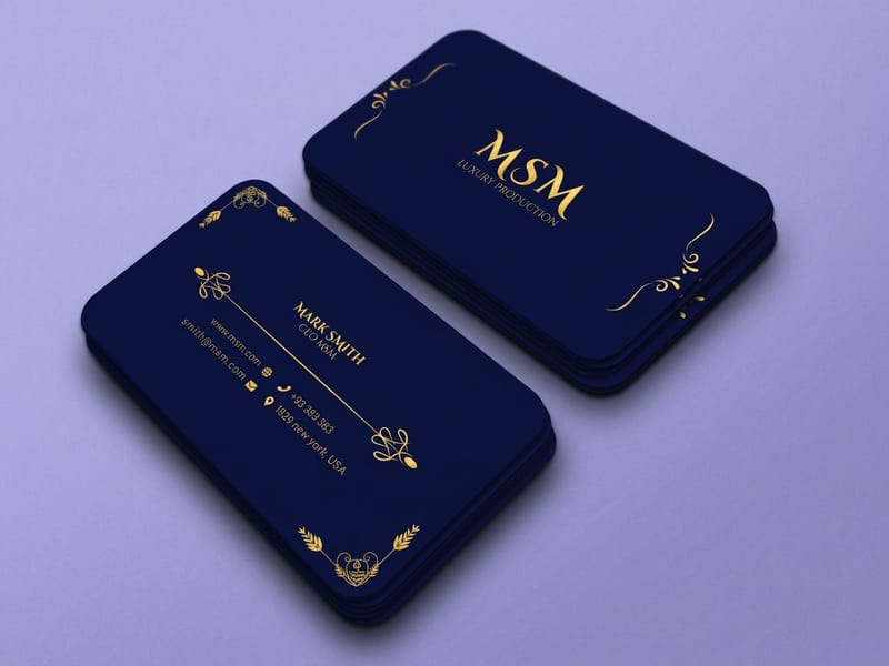 Product Premium Business Cards Heavier stocks and finishes for the piece people keep. Product Standard Postcards The workhorse of local print marketing, from $16.48. Product Standard Flyers One message, printed in quantity, read on the move. Product Standard Brochures Folded panels that open in the order you design for.
  Guide Six Principles of Logo Design What makes a mark survive being printed small.
  Article 15 Print Marketing Examples Printed pieces that still bring in work, and why.
 Ready to print the design?
Pick the product, drop in your file or start from a free template, and 4OVER4.COM prints it sharp on premium stock, as fast as your deadline needs.
Common questions about design for print
Is graphic design worth paying for on a small print run?
It depends on how long the artwork will live rather than how many copies you are ordering. Paying a designer for 250 flyers advertising one weekend event rarely makes sense, because a template plus your own logo gets you there. Mailed advertising flyers sit in between: they start at 500 pieces, so a layout you plan to mail every season is worth paying for once. Paying a designer for 250 business cards usually does make sense, because that layout will be reused for years and reprinted many times, and the cost is spread across every one of those runs. The other case for paying is when the file itself is the risk. A designer who knows bleed, safe margins and CMYK stops the reprint that costs more than the design did.
How much of a print marketing budget should go to design?
There is no honest percentage, because design is usually a one-off cost while printing and postage repeat. The better way to think about it is that printing and postage are fixed the moment you commit, and design is the only lever left that changes the response. On a mailed campaign the postage is often the largest single line, and it is spent whether or not anyone reads the card. Spending a little more on the layout protects the money already committed to the run. Standard postcards start at $16.48 at 4OVER4.COM, which tells you how little of a campaign the printing itself accounts for.
Can I use a free template instead of hiring a designer?
Yes, and for a lot of pieces it is the right call. A template gives you the correct trim size, the bleed, and the safe margin already drawn, which removes the most common reasons a file gets sent back. Where templates fall down is content that does not match the shape they were built for. If you have four times as much copy as the layout expects, you will end up shrinking type to fit and the result will be worse than a plain page. Cut the copy to the layout instead. The 4OVER4 design templates and blank templates are both free to start from, and you pay only for the printed product.
What files should a designer hand back to me?
Two sets. A print-ready PDF with bleed and trim marks, which is what the printer needs, and the packaged native files with fonts and linked images, which is what any future designer needs to edit the layout without rebuilding it. Ask for both at the point you commission the work, not afterwards. Agree in writing who owns the artwork, because commissioned design does not automatically transfer to the client, and check whether the font license covers you using those typefaces yourself.
Why does my design look different printed than it did on screen?
A screen makes color with light and paper makes it with ink, so bright RGB blues, greens and oranges have no exact CMYK equivalent and land duller on paper. Convert to CMYK yourself and judge the file in that mode rather than letting an automatic conversion decide for you. Large areas of flat 100 percent black are the other common surprise, since they print noticeably lighter than the black in a photograph and need a rich black build instead. Order a proof before the full run and judge the color on the actual stock, in ordinary daylight.
