
Unique QR Code Design Ideas That Still Scan Every Time


Sofia is our design and templates voice, built from the knowledge of our production team, with over 20 years in printing.
Color, module shape, custom eyes and a center logo are all fair game. Each one goes a certain distance, error correction buys a known margin, and only some print sizes hold up in a customer’s hand.
Three things on a QR code are safe to brand: the color of the modules, the shape of the modules and corner eyes, and a logo placed dead center at error correction level H. Three things are structural and break the scan if you touch them: the 1:1:3:1:1 proportions inside the three corner eyes, the alternating timing rows that run between them, and the four blank modules of quiet zone around the outside. Contrast is judged in grayscale, not in color.
Quick answer
Style the modules, protect the corners and the margin
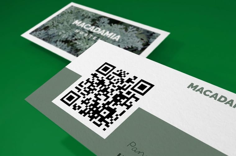
A QR code tolerates a great deal of design and almost no structural change. Recolour the modules, round them, restyle the corner eyes, drop a logo in the middle at error correction H, and it still scans. Crowd the four-module quiet zone, invert the contrast, alter the proportions inside the corner eyes or pick two colors that match in lightness, and it stops. The grayscale test settles most arguments in ten seconds: strip the saturation, and if you cannot read the pattern comfortably, neither can a phone. For QR code designs on a printed card, that means a code at least 1 inch square, level H when it carries a logo, on a 2" x 3.5" card with Standard Finish rather than High Gloss UV Coating.
What You Can Restyle, and What Is Structural
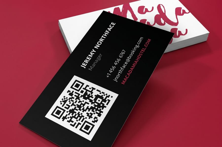
A QR code is not a picture with a message hidden in it. It is a grid with three fixed jobs running through it, and a designer who knows which squares do which job can push the styling much further than the plain black grid most generators hand over.
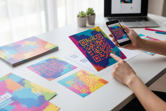
Free to change. Module color, module shape, the corner-eye shape, the background, and a mark in the center. Rounded modules, dots, connected modules that flow into each other, gradient fills, a duotone that shifts across the grid: all of these read fine as long as the contrast rule below holds.
Not free to change. Three things carry the scan. The corner eyes are found by a scan line that measures dark, light, dark, light, dark in a 1:1:3:1:1 ratio, so you can restyle their outline and color but not their internal proportions. The alternating single-module row and column that run between the eyes act as a ruler for the decoder. And the four-module blank margin around the whole code is part of the specification, not white space you can crop into.
Contrast is where most branded codes quietly die. Readers convert the image to grayscale, so two colors can look strongly different on your monitor and merge into one gray once the saturation is stripped. Keep the dark modules dark, keep the field light, and check the code in grayscale before it goes near a press. If you want the mechanics behind every part of the grid, our complete guide to QR codes covers the structure module by module.
Error Correction Is the Setting That Pays for Your Logo
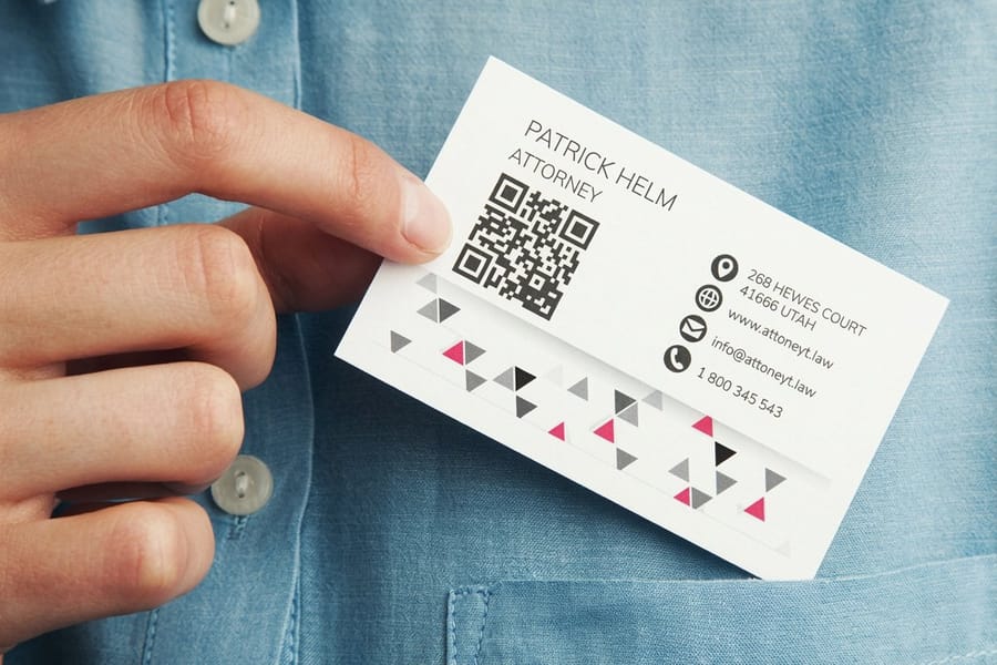
Every QR code carries spare data so it can still be read when part of it is missing. That spare capacity is what a center logo spends, and picking the level is the single most useful decision in the whole design.
| Level | Roughly how much it can rebuild | What it is good for | The cost |
|---|---|---|---|
| L | About 7 percent | Clean digital use, screens, nothing printed over it. | No room for a logo at all. |
| M | About 15 percent | The default on most generators. Plain printed codes on coated stock. | A logo will push it past its limit. |
| Q | About 25 percent | A small center mark, or a code printed on textured or uncoated stock. | The grid gains modules, so each one prints smaller. |
| H | About 30 percent | A full center logo, outdoor signage, anything that will get scuffed. | The densest grid of the four at the same physical size. |
Nobody mentions that trade-off when they tell you to just use H. Raising the correction level adds modules to the grid, and a denser grid printed at the same physical size means every module is physically smaller. Push a long tracking URL through level H at 0.8 inches and you can end up with a code that is harder to scan than a plain M-level code would have been.
The order that works: shorten the destination URL first, then raise the correction level, then increase the printed size if you still need headroom. Aim for a logo that covers around 20 percent of the code area at level H, not the full 30 percent, because the difference is your margin for print variation, a fingerprint and a bad angle. Our free QR code generator produces the file, and generating codes in InDesign covers the workflow when the code has to live inside a layout you are already building.
Eight Design Directions That Survive a Real Scan
These are the approaches we see come back from press looking sharp and still scanning at arm’s length. Each one names what to watch.
- Brand-color modules on white. The simplest upgrade and the safest. Pick your darkest brand color, not the primary one, and put it on an unprinted white field.
- Rounded or dot modules. Softens the code so it stops looking like a barcode. Dots shrink the printed area of each module, so go one size up on the finished code.
- Custom eyes in an accent color. Recolouring the three corners in a second brand color is the fastest way to make a code look designed. Keep the internal proportions.
- Center logo at level H. Put a light pad behind the mark so no module is half-covered, and keep the pad square to the grid rather than tilted.
- A framed call to action. A frame sitting outside the quiet zone with two or three words in it. Scan for the menu beats a bare code every time, because a code with no promise attached gets ignored.
- Duotone or gradient across the grid. Works if the lightest point of the gradient is still clearly darker than the background. Run the grayscale check on the lightest corner, not the middle.
- The code as the artwork. Building the code into an illustration, a product silhouette or a photograph edge, with the quiet zone preserved as a clean panel. Ambitious, and the one that most often needs a second proof.
- Two codes, two destinations. On a rack card at $42.84 or a table tent, one code for the menu and one for booking, each labeled. Splitting them tells you which offer people actually wanted.
Whatever direction you take, print one before you print a thousand. Scan the proof under warm indoor light, outdoors, and at the angle a real person holds a card, not flat on a desk. If you are still deciding where the code sits on the piece, how to make QR code cards walks through placement, and the blank template library gives you a correctly sized layout to start from.
Each of these QR code design ideas comes with its own settings. On a 2" x 3.5" card, read at about 10 inches, the numbers look like this.
| Design idea | Error correction | Code size on the card | What to order |
|---|---|---|---|
| Brand-color modules on white | M | 1 inch square, 0.8 inches at the smallest | 14pt Gloss Cover, Standard Finish |
| Rounded or dot modules | M | One size up from 1 inch | 14pt Gloss Cover, Standard Finish |
| Center logo on a light pad | H, logo at about 20 percent of the area | 1 inch or more, with a short URL | 14pt Gloss Cover, Standard Finish |
| Code on a textured or kraft card | Q | One size step up from the coated version | 18pt Kraft Uncoated Cover (100% PCW) or 14pt White Linen |
| Code on the back of a dark card | M or H | 1 inch, inside a light panel | 4/4 printing, so the back carries the code |
For unique QR code designs on cards, order QR code business cards at 2" x 3.5", 100 for $17.57, and choose Standard Finish rather than High Gloss UV Coating so the code does not throw a highlight back at the camera. Generate the code at the size and correction level in the table, place it in the blank template with the four-module quiet zone clear, and the order runs on a 3 business day default turnaround.
Size, Stock and Finish: What Changes on Press
A code that scans on a monitor can fail on paper for reasons that have nothing to do with the design. Three of them account for almost every case.
Size versus scan distance. Work at roughly ten to one. A code read from about 10 inches, which is how people hold a card, is fine at 1 inch. A flyer pinned on a noticeboard and scanned from 3 feet wants about 3.5 inches. A yard sign read from 10 feet away needs a code around 12 inches across, which is why small codes on signage almost never get used.
| Piece | Typical scan distance | Minimum code size | Starting price |
|---|---|---|---|
| Business card | Around 10 inches | 1 inch square | $17.57 |
| Postcard | 12 to 18 inches | 1.5 inches square | $16.48 |
| Rack card | 12 to 18 inches | 1.5 inches square | $42.84 |
| Flyer on a wall | 2 to 3 feet | 3 to 3.5 inches square | $39.54 |
| Yard sign | 8 to 10 feet | 10 to 12 inches square | $25.00 |
Stock. Uncoated and textured stocks let ink spread slightly, which thickens the dark modules and narrows the light gaps between them. That drift is small, and it is exactly the thing that tips a marginal code over. On uncoated stock, go up one size step or one correction level rather than trusting the on-screen preview.
Finish. Matte lamination is the right answer over a code. Gloss and UV coating both bounce a hard highlight back at the camera, which makes scanning depend on the angle a customer happens to hold the piece at. Keep foil and spot UV off the code entirely. For the wider campaign thinking behind where codes belong on printed pieces, using QR codes to grow a small business covers what to link and how to track it, and the business card printing range lists every stock and finish we run.
Wally explains branded QR codes
Paint the middle, leave the corners and the margin alone
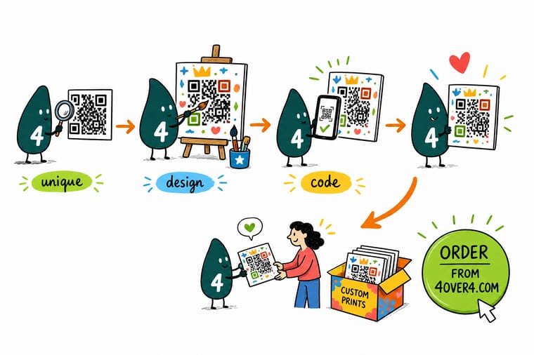
Wally will happily recolour every module, round the squares into dots and drop your logo in the center. What he will not do is touch the three corner eyes, crowd the four blank modules around the edge, or pick a color that turns the same gray as the background once the camera strips the saturation. Set the code to error correction H, keep the logo to about a fifth of the area, print a proof, and scan it in the light your customers will actually stand in.
Order QR code business cards →
Specs and pricing
Sizes and starting prices for the pieces a code goes on
Configure the piece first, then size the code to the distance it will be scanned from. QR code business cards come in 2" x 3.5" at 100 for $17.57, with 4/4 printing for a code on the back. Flyers start at 50 for $39.54 in nine sizes from 4.25" x 5.5" to 11" x 25.5", room for the 3 to 3.5 inch code a wall read needs. Postcards start at 50 for $16.48 in 14 sizes up to 6" x 11", enough for a 1.5 inch code.
Print it
Print a code people can actually scan
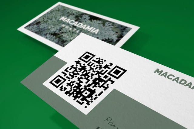
Three pieces at three scan distances: a QR code business card read at about 10 inches with a 1 inch code, a flyer on a wall read from 2 to 3 feet with a 3 to 3.5 inch code, and a 3.5" x 8.5" or 4" x 9" rack card with room for two labeled codes.

Explore more
Where to go next
Four guides that pick up where the design ends: making QR code cards, placing codes on flyers and postcards, printing QR code stickers and building a Google reviews code. Then the business card range and the printing FAQs.



By the numbers
Cards, rack cards and yard signs that carry a code
Common Questions
Your QR code design questions, answered
Can I put my logo in the middle of a QR code?
Yes, if you generate the code at error correction level H and keep the logo dead center. H lets a reader rebuild roughly 30 percent of the pattern, and a center mark that covers around 20 percent of the area leaves headroom for print variation and a scuffed card. Two rules make it work. Put a small white or light pad behind the logo rather than dropping the mark straight onto the modules, because a partly covered module is worse for the decoder than a cleanly missing one. And never let the logo creep towards a corner, since the three corner eyes and the alternating timing rows between them are what the reader uses to find and square up the code in the first place.
Do colored QR codes still scan?
They do, as long as the dark parts stay genuinely dark and the light parts stay genuinely light. Readers work in grayscale, so the test is not whether the two colors look different, it is whether they still look different once the color is removed. Deep navy, forest green, burgundy and charcoal all work on white or cream. Pastels, mid-tone oranges and anything neon usually fail, because in grayscale they land in the same middle band as the background. Take a screenshot of your code, drop the saturation to zero, and if you can still read the pattern comfortably a phone can too.
How small can a printed QR code be on a business card?
About 0.8 inches square is the practical floor for a short URL at error correction M, and 1 inch is the size we would rather see. Below that the individual modules get so fine that ordinary indoor light and a slightly shaky hand start to matter. The length of the encoded URL matters as much as the physical size: a long link with campaign tracking parameters packs far more modules into the same square, so each module prints smaller. Shorten the destination before you generate, then decide the size.
Should the QR code go on the front or the back of a business card?
The back, in most cases, with a short line of text telling people what happens when they scan. The front of a card is doing a different job, and a code competing with a logo for the same corner usually loses the quiet zone it needs. The exception is a card where the scan is the whole point, a menu, a booking page or a review link, in which case give the code the front and drop the rest to the back. QR code business cards start at $17.57 for a full box, so testing both layouts costs very little.
Can I invert a QR code, light modules on a dark background?
Modern phone cameras handle inverted codes, plenty of older phones and most fixed scanners at counters and gates do not. If your brand is built on a dark card, the safe move is to keep the code the right way round inside a light panel, and let the panel become part of the design rather than an apology for it. A cream or pale-gray block sitting on a black card looks intentional and reads on everything.
Does gloss lamination stop a QR code from scanning?
Not on its own, but it makes scanning conditional on the angle. A high-gloss or UV-coated surface throws a specular highlight straight back at the lens, and under a ceiling light that highlight can sit right across the code. Matte lamination scatters the same light and is the finish we recommend on anything carrying a scannable code, especially menus, table tents and outdoor pieces. Spot UV or foil directly over the code is the one combination to avoid outright.
Get Started
QR code business cards run 100 for $17.57
Pick your stock, keep the finish matte over the code, and we print cards, flyers and postcards that work in a customer's hand rather than only on a screen.
Legal Disclaimer
Gold Standard guarantees apply to all standard orders placed through 4over4.com. Price match requires verifiable proof of a competitor's published price for an equivalent product with matching specifications and turnaround time. Satisfaction guarantee covers manufacturing defects and print quality issues. Contact support with order number and documentation.
