
Photoshop Layers and Panel Symbols Explained for Print Design


Layers keep a print file editable and keep the type sharp. Here is what each symbol in the panel means, how masks and adjustment layers behave, and how to export without wrecking any of it.
In Photoshop every part of a layout sits on its own layer, and the small symbols down the Layers panel tell you what each one is doing. The eye toggles visibility, the chain link ties a mask to its layer, a half filled circle marks an adjustment layer, a corner badge marks a smart object, a bent arrow means the layer is clipped to the one below, and a T marks live type. For print the payoff is concrete: type layers and placed vector logos stay resolution independent until you rasterize or flatten them.

Quick answer
Read the symbols, keep the stack, flatten only a copy
Layers hold a print file in separate, editable parts, and the panel symbols tell you which parts are still safe to change. Adjustment layers correct color without touching a pixel. Masks hide instead of delete. Smart objects keep a placed logo vector. All of that survives right up to the moment you rasterize or flatten, which is why the master PSD stays layered and the press file is a separate export.
Why Layers Matter More in Print Than on Screen

A flattened Photoshop file is a photograph of a design. A layered one is the design itself, still in movable parts. That gap decides whether a late change takes two minutes or an evening.
Print raises the stakes. On a website you can push a correction and forget about it. Once a job is on press, the sheet is the sheet. So the real value of layers in print work is not creative freedom, it is being able to answer the three things a printer will ask you: can you pull the phone number away from the trim edge, can you send that logo without the white box behind it, and can you supply the file in CMYK. All three are quick in a layered file and close to impossible in a flat one.
The second reason is resolution. Type layers, shape layers and placed vector logos stay resolution independent while they remain their own layers, and they only become pixels when you rasterize or flatten. A headline printed from a live type layer holds a crisp edge on a business card. The same headline, flattened at 300 ppi and then scaled up, does not. Our guide to the right resolution for printing covers the numbers, and layers are what let you keep hitting them.
Every Symbol in the Layers Panel and What It Means for Print
The column of small icons down the Layers panel is the fastest status report in Photoshop. Each symbol tells you what a layer is and how it will behave when the file goes to press.
| Symbol | What it is | What it means for a print file |
|---|---|---|
| Eye | Visibility toggle on the far left of the row. | A hidden layer does not print. It stays in the file, though, so a template layer you switched off is still there for the next person to switch back on. |
| Chain link | Sits between a layer thumbnail and its mask. | Layer and mask move together. Break the link and you can slide the photo behind a fixed cutout, which is how you reframe an image without redrawing the mask. |
| Half filled circle | Adjustment layer, and the button that creates one. | A live color correction sitting above the artwork. It changes nothing underneath until the file is flattened, so you can undo it days later. |
| Corner badge on the thumbnail | Smart object. | The original placed file is stored intact inside the document. A logo placed from Illustrator keeps its vector data and can be scaled up without going soft. |
| Bent arrow | Clipping mask. | The layer only shows through the shape of the layer below it. Use it to hold a photo inside a panel or to keep a Curves layer off everything else in the stack. |
| fx | Layer style, expandable with the small arrow. | Strokes, shadows and glows applied live. They render into the artwork on export, so a hairline stroke set below about half a point can vanish on press. |
| Padlock | Lock transparent pixels, image, position, or all. | Stops a finished background from being nudged while you work on top of it. A fully locked Background layer is why the move tool sometimes refuses to do anything. |
| T | Type layer. | Still editable text and still vector. This is the single most valuable symbol in a print file, and the one people destroy first by rasterizing. |
Two shortcuts pay for themselves. Alt click or Option click the eye to hide every other layer at once, which is the fastest way to find what is causing a stray mark near the trim. And the grey checkerboard in a thumbnail means transparency, so if you expected a white background there, you do not have one.
Building and Organizing a Layer Stack You Can Still Read Tomorrow
Order in the panel equals order on the page. The top layer sits in front, the Background sits behind everything, and a piece of type that has disappeared is usually just underneath a photo rather than missing.
- Start from the right canvas. Set the document to the final trim size plus an eighth of an inch on every side, at 300 ppi, before you draw anything. Resizing a finished layout is where soft images come from.
- Group by role, not by order of creation. Select the related layers and press Command G or Control G. Background, Images, Type and Logo as four groups is enough for a card or a flyer.
- Name everything as you go. Double click the layer name and type. Layer 14 copy 3 tells you nothing when the client comes back in March.
- Keep a guides group at the very top and switch it off. Trim lines, safety margins and any template overlay belong on their own layers so a single click removes them from the export.
- Color label the layers you must not touch. Right click the row and pick a color. A red label on the locked background is a cheap reminder.
If you would rather not calculate the canvas at all, our blank template library gives you the trim size and bleed already set for each product, and the design template gallery is a starting point when the layout itself is what you are stuck on. For a card specifically, business card dimensions in Photoshop walks through the exact document setup.
Layer Masks and Adjustment Layers, the Two Habits That Save Jobs
A layer mask hides pixels instead of deleting them. Click the rectangle with a circle in it at the bottom of the panel, then paint on the mask: black hides, white reveals, grey gives you partial transparency. The eraser tool does the same job visually and removes the pixels for good, which is why experienced retouchers rarely use it.
There is a print limit worth knowing before you feather anything. A press cannot hold a tint much below three to five percent, because the dot is too small to stay on the plate and simply drops off. A mask that fades a photo smoothly to nothing looks perfect on a backlit monitor and can end in a visible hard edge on paper, exactly where the tint fell away. Fade into a solid color instead, or keep the light end of the gradient above about five percent.
Adjustment layers work the same way for color. A Curves or Levels layer corrects everything below it in the stack without altering a single pixel, and you can dial it back at any point. Clip it to one layer by holding Alt or Option and clicking the boundary between the two rows, and the bent arrow appears to confirm it. Do your final corrections after the document is in CMYK, because a Curves move made in RGB will not land the same once the file is converted. The RGB to CMYK conversion guide covers which profile to use.
Resolution and Color Mode, Decided Before You Design

Two settings in File, New decide most of what a Photoshop file can do later, and neither is comfortable to change afterwards. Resolution comes first. The working rule is 300 pixels per inch at final size for anything a person holds, and less for anything they stand back from.
| Piece | Typical viewing distance | Working resolution |
|---|---|---|
| Business cards, postcards | In the hand, roughly a foot away. | 300 ppi at trim size, no exceptions. Small type shows every shortcut. |
| Flyers, brochures | Arm's length, often read closely. | 300 ppi. Drop lower only on a full bleed photo that carries no fine detail. |
| Posters, large signage | Several feet or more. | 150 to 200 ppi at full size is normally fine, and it keeps the file workable. |
When you change resolution in Image, Image Size, uncheck Resample first. With resampling off you are redistributing the pixels you already have, which is honest. With it on, Photoshop invents pixels that were never captured, and an upscaled photo prints soft no matter what the ppi field says.
Color mode is the second decision. If the job is photo heavy, work in RGB and convert once at the end, because Photoshop switches off a long list of filters in CMYK mode and RGB documents stay smaller. If the layout is mostly type, flat color and a logo, build it in CMYK from the start and pick your colors there, so nothing shifts under you. Either way convert once, deliberately, and check the result with View, Proof Colors. Our notes on choosing a color profile for printing explain which one to pick.
Flattening and Exporting a Print Ready File
Here is the part beginners get wrong most often: you almost never need to flatten. Saving the layered document as a Photoshop PDF already produces one file a press can read, and it keeps type and shape layers as vector so the letterforms rip at the platesetter resolution rather than at your document ppi.
The sequence that works: save the layered PSD as the master, switch off the guides and template group, then File, Save As, Photoshop PDF, and pick a press preset such as PDF/X-1a for CMYK work. Turn off Preserve Photoshop Editing Capabilities to keep the file small, since it stores a second full copy of your layers inside the PDF. Open the finished PDF and look at it before you upload, because that is the file the press sees.
Use Layer, Flatten Image only on a duplicate, and only when a printer has specifically asked for flat art. It converts type to pixels at the document resolution, bakes every adjustment layer in permanently, and discards masks and smart objects. Flattening the file you were working in and saving over it is one of the few mistakes in Photoshop that cannot be undone the next morning. If you are unsure which format a particular job wants, choosing the right file type for printing lays out the options, and creating commercial print ready files covers the wider checklist.
The Layer Mistakes That Reach Our Prepress Desk
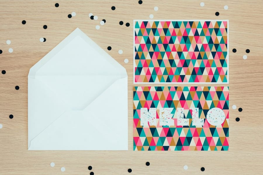
Most files that come back for a fix fail on one of the same handful of things, and every one of them is a layer decision made earlier.
- Type rasterized too early. Someone rasterizes a headline to apply a filter, then edits nothing else for a week. The text is now pixels and every later scale change softens it.
- The template layer left visible. Trim lines and safety guides sit in the export and print as thin marks across the artwork. Switch the group off, then check the exported PDF rather than trusting the click.
- Web images scaled up. A logo grabbed from a website is 72 ppi and a few hundred pixels wide. Enlarging it to fill a card produces soft edges no amount of sharpening repairs. Ask for the vector file instead and place it as a smart object.
- A white box behind a logo. A JPEG carries no transparency, so it drops a white rectangle onto a colored background. Use a PNG with alpha, or mask the background out on its own layer.
- No bleed on a full bleed design. The background stops exactly at the trim line, so the smallest cutting shift leaves a white sliver down one edge. Extend the background an eighth of an inch past the trim on every side, as bleed and trim explained sets out.
- Text sitting on the trim line. Keep type at least an eighth of an inch inside the cut, further on anything that gets folded or drilled.
- Colors picked in RGB and never checked. A neon blue chosen with the RGB sliders has no CMYK equivalent, and it comes back several shades duller. Pick the color in CMYK or proof it before you sign it off.
None of these are difficult to avoid. They are simply invisible on a monitor and obvious on paper, which is what makes a proof and a set of samples worth the wait.
From Layer Stack to Printed Piece

Once the stack is clean and the PDF looks right, ordering is the short part. Upload the file, pick the stock and the quantity, and the price updates as you go.
Business cards are where most people test a new Photoshop workflow, because the piece is small, the type is small, and any mistake in resolution shows up immediately. Standard business cards start at $17.57, so a proof run is cheap. Standard postcards start at $16.48 and give you a bigger canvas for photographic work with a mailing side to lay out. For a longer piece of copy, standard flyers start at $39.54 and standard brochures at $57.11, where layer groups per panel keep a fold from turning into guesswork. Standard posters start at $108.75 and are the one product where you can safely work below 300 ppi.
Browse the wider ranges through business card printing and flyer printing when you want to compare stocks and finishes side by side. If you are new to sending files out at all, our print ready file guide is the checklist to run before you upload.
Wally explains layers
One design, held as a stack of clear sheets
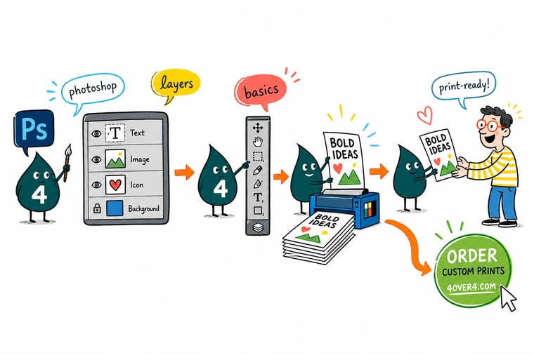
Wally builds a card the way Photoshop does. Background on the bottom sheet, photo above it, logo above that, type on top. Every sheet lifts out on its own, so moving the phone number away from the cut takes a second. The eye switches a sheet off, a mask hides part of one without cutting it, and a smart object keeps the logo sharp at any size. Then he glues the whole pile down and nothing moves again. That is Flatten Image, so he only ever does it to a copy.
Print your business cards →Specs and pricing
Sizes, stocks and starting prices for the pieces you design first
Live configuration options and starting prices straight from the 4OVER4.COM configurator, so you can set your Photoshop canvas to a size we actually print.



Print it
Send the file and see it on paper



Explore more
Where to go next

By the numbers
Files we print every day at 4OVER4
Common Questions
Your Photoshop layer questions, answered
What do the symbols in the Photoshop Layers panel mean?
The eye on the far left switches a layer on and off, and a hidden layer does not print. A chain between two thumbnails means the layer and its mask move together. A circle that is half black and half white marks an adjustment layer, and the same symbol at the bottom of the panel is the button that creates one. A small badge in the corner of a thumbnail marks a smart object, whose original content is stored intact inside the file. A bent arrow pointing down and left means the layer is clipped, so it only shows through the shape of the layer underneath. The letters fx mean a live layer style is attached, and a padlock means part or all of the layer is locked against editing.
Should I flatten my file before sending it to a printer?
Flatten a copy if the printer has asked for flat artwork, and keep the layered original either way. In most cases you do not need to flatten at all, because saving the layered document as a Photoshop PDF produces a single file the press can read while keeping type and shapes as vector. Flatten Image is destructive: the type turns into pixels at the document resolution, adjustment layers are permanently baked in, and masks and smart objects disappear. If you flatten the file you were working in and save over it, that work is gone.
Do type layers stay sharp when I export from Photoshop?
They do, as long as the layer is still live type and you export to a format that carries vector data. A Photoshop PDF holds vector text, so an 8 point phone number rips at the platesetter resolution and prints with a clean edge. Rasterize that type layer, or flatten the file, and the same text is now pixels at your document resolution. On a business card at 300 ppi, small text is where you notice the difference first, particularly on serifs and thin strokes.
Should I build print files in RGB or CMYK in Photoshop?
Start in RGB if the job involves heavy photo work, then convert to CMYK once, near the end. Photoshop disables a number of filters in CMYK mode, and RGB files are smaller and faster to edit. Converting more than once compounds the color shift, so do it deliberately rather than flipping back and forth. If the layout is mostly type, logos and flat color, set the document to CMYK from the start and pick your colors there. Our guide on converting files covers the settings in detail.
Why does my Photoshop file look different when it is printed?
Two causes account for most of it. A monitor emits light and paper reflects it, so bright saturated blues, greens and oranges that glow on screen sit outside what four process inks can reach and come back duller. The second is the stock. The same ink on an uncoated sheet soaks in and reads softer than on a gloss sheet. Use View, Proof Colors with a CMYK profile to preview the shift before you commit, and order paper samples if the color is critical.
How do I add bleed to a Photoshop file?
Photoshop has no bleed setting like InDesign does, so you build it into the canvas. Make the document larger than the trim size by an eighth of an inch on each side, then push any background that touches the edge out into that extra area. Add guides at the trim line and again inside it for a safety margin, and keep text inside the inner guide. The simplest route is to start from a template already built at the right size rather than doing the arithmetic each time.
Get Started
Ready to print the file you just built?
Upload your PDF, pick the stock and the quantity, and we print it. Start with a small run of cards if you want to check how your type holds up on paper.
Legal Disclaimer
Gold Standard guarantees apply to all standard orders placed through 4over4.com. Price match requires verifiable proof of a competitor's published price for an equivalent product with matching specifications and turnaround time. Satisfaction guarantee covers manufacturing defects and print quality issues. Contact support with order number and documentation. On-time delivery rate based on tracked orders 1999 to 2026. Individual results may vary based on shipping carrier performance.
