
How to Choose Paper for Your Printed Marketing Materials


Sofia is our design and templates voice, built from the knowledge of our production team, with over 20 years in printing.
The stock is the one thing your customer actually touches. Cards want thickness, brochures want foldability, postcards want a coating that survives a mail sort.
To choose paper for marketing materials, match the stock to the job: business cards want a firm 14pt to 32pt cover that feels substantial in hand, brochures need a lighter text weight that folds without cracking, and postcards need a rigid 14pt or 16pt cover that survives the mail. Then pick a finish: gloss for photos and color, matte or uncoated for text and writing, and specialty coatings like kraft, cotton, or soft-touch when texture is part of the message. Order a free sample first, because a stock feels nothing like it looks on screen.
Quick tips
Quick tips for choosing marketing paper
Let the job pick the paper. Handed-over pieces like business cards want a firm cover weight, folded pieces like brochures want a lighter stock that creases cleanly, and mailed postcards want a rigid cover that arrives crisp. Choose gloss when photos carry the message and matte or uncoated when text and writeability matter. Add a specialty coating like kraft, cotton, or soft-touch when you want the piece to be memorable by touch. 4OVER4.COM prints on more than 60 stocks, and a free sample pack settles any weight-and-finish debate in seconds.
Why paper is the first decision, not the last

Most people choose their design for weeks and their paper in the last thirty seconds before checkout, often clicking between 14pt and 16pt cover without having held either. That is backwards. The stock is the one thing a person actually touches, and touch is what a screen can never fake. A card can carry a beautiful logo and still feel flimsy, or a brochure can look sharp on a monitor and crack down the fold because the paper was too heavy to bend.
Choosing paper well is really about matching the stock to the job the piece has to do. A card gets handed across a table and slid into a wallet. A brochure gets folded, opened, and folded again. A postcard rides through the mail and lands face up on a counter. Each of those uses points to a different weight and a different finish, and once you learn to read the job, the paper choice stops feeling like guesswork.
This guide walks through the stocks 4OVER4.COM prints on for the three pieces a marketing kit starts with: business cards, brochures and postcards, with a note on catalogs and calendars at the end. If you want the deep version on stock families, our paper stocks explained guide covers matte, gloss, linen, and kraft side by side.
The three words that decide everything: weight, finish, coating
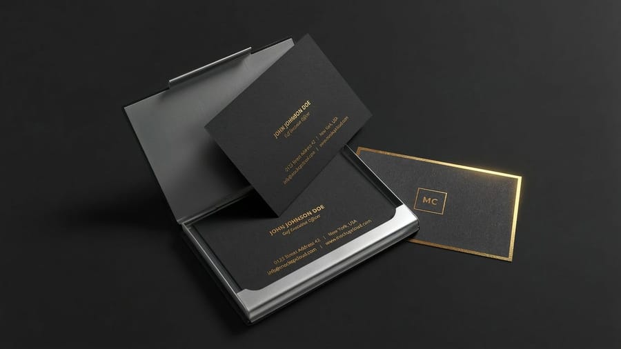
Before you can pick a paper, it helps to speak its language. Nearly every stock in the catalog is described by three things, and once you know them the spec sheets stop looking like a foreign menu.
Weight is how thick and sturdy the sheet is. Cards use points, or "pt," where 14pt is a solid everyday card and 32pt feels like a small tile. Brochures and postcards use pounds, or "lb," split into lighter text weights that fold easily and firmer cover weights that stay rigid. Our paper weight guide maps the whole scale if you want the numbers.
Finish is the surface texture, from smooth gloss to flat matte to natural uncoated. Coating is an added layer such as gloss, silk, or soft-touch that changes how the paper feels and how ink sits on it. The rest of this guide is really just those three words applied to each kind of piece.
Choosing business card paper
The card is the piece people judge with their fingers, so weight matters more here than anywhere else. A limp card undercuts a strong design, while a card with heft says the business takes itself seriously before a word is read.
- 14pt gloss or matte cover is the reliable everyday choice. It feels professional, prints color cleanly, and keeps the price low for big runs.
- 16pt cover is the upgrade most brands should make. The extra thickness reads as premium, and the cost bump is small. For most companies this is the sweet spot.
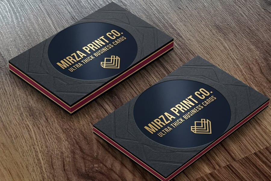
- 32pt ultra-thick and specialty stocks turn the card itself into the statement. Reach for these when the card needs to be memorable on contact.
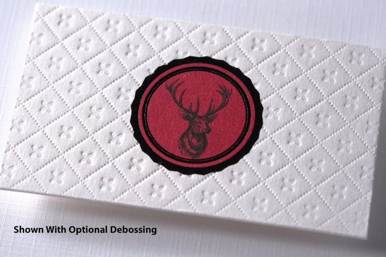
Finish is the second lever. Gloss pushes color and photos forward, matte and uncoated keep things clean and let you jot a note on the back, and textured stocks like kraft, cotton, and suede add a tactile signature. If you are torn between weights, our cardstock guide for business cards and the deeper dive on card thickness both spell out how each option feels in hand. When you are ready, the full lineup lives on business card printing.
Choosing brochure paper
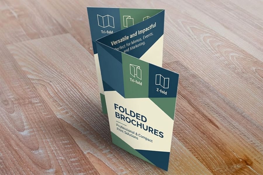
Brochures flip the priority. Here the paper has to fold, so a lighter, more pliable stock beats a heavy one that fights the crease and cracks along the spine. The goal is a sheet that turns cleanly and still feels substantial when it opens.
100lb gloss book is the classic brochure stock. It folds without cracking, prints photos with real depth, and gives the piece a smooth, retail-ready feel. For a heavier, more luxurious brochure that still folds, step up to a 100lb cover, which our 100lb gloss cover guide breaks down. Uncoated text weights suit brochures that need to be written on or want a softer, editorial look.
Finish is a real decision on brochures because they carry both images and blocks of text. Gloss makes photography sing but can glare under bright light, while matte keeps long copy comfortable to read. Our comparison of matte versus glossy brochures settles that call. For the full stock rundown see the best brochure paper types and the ultimate brochure paper glossary, and once your art is ready, learn how to fold a brochure so the file lines up with the crease.
Postcard paper that survives the mail
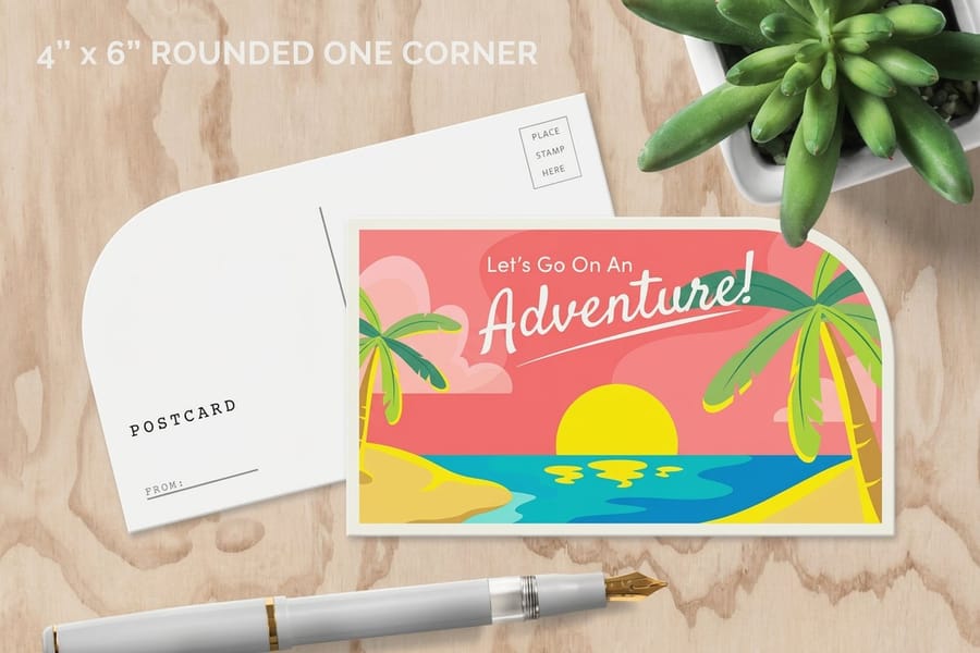
Postcards face a challenge the other pieces do not: they travel unprotected through the mail. That means rigidity is the first requirement. A flimsy card curls, dog-ears, and arrives looking tired, so postcards start at a firmer weight than you might expect.
14pt cover is the practical floor for a direct mail postcard, and 16pt cover is the safer bet when the piece has to look crisp on arrival. Both carry through automated mail equipment without buckling. If the postcard is a leave-behind or a table handout rather than a mailer, you have more freedom to play with weight and specialty finishes.
Coating deserves special care on postcards. A full gloss finish photographs beautifully but repels pen ink, which is a problem if the recipient needs to write on it or if you print a handwritten-style note. The fix is a common one: gloss the image side and leave the address side uncoated so a ballpoint still works. Browse the full range on postcard printing, and if you mail cards, our note on the best paper for printing covers the durability trade-offs.
Catalogs and calendars: two papers in one piece
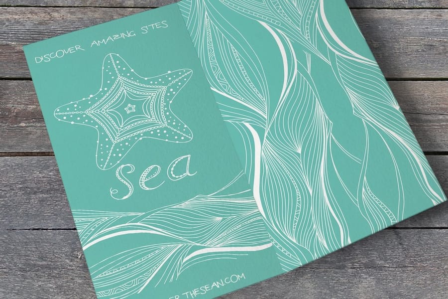
Bound pieces like catalogs and calendars are where paper choice gets genuinely interesting, because they usually use two stocks at once. A sturdy cover protects the piece and takes the wear, while a lighter inside stock keeps the page count manageable and the whole thing easy to flip.
A typical catalog pairs a 100lb gloss cover with a lighter gloss or matte book stock inside. The cover feels solid in the hand and resists scuffing on a shelf, and the inside pages turn easily while still showing product photography with punch. Calendars follow the same logic, with a cover strong enough to hang and inside sheets light enough to flip month to month. Our catalog printing guide covers binding and page specs, and the custom catalog printing showcase shows finished pieces.
The rule of thumb: spend your weight on the cover, where it is felt and seen first, and keep the interior light enough to stay practical. If a bound piece is on your roadmap, our broader paper weight and stock guide covers how to balance cover and text weights, and the marketing materials collection shows the pieces that pair well in a full kit.
Matte, gloss, or uncoated: matching finish to the job
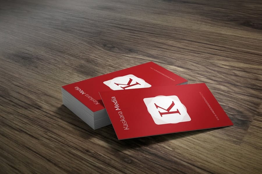
Once the weight is settled, finish is the choice that changes how a piece is perceived. It is also the one people get wrong most often, because a finish that flatters a photo can sabotage a page of text.
Gloss deepens color and contrast, so it is the default for image-heavy pieces, retail flyers, and product cards. The trade-off is glare and fingerprints, and it resists pen ink. Matte and uncoated stocks cut glare, read easily under any light, and take a pen, which makes them ideal for text-forward pieces and anything a customer writes on. Specialty coatings like silk and soft-touch sit in between, adding a smooth, memorable texture that people notice the moment they hold it.
When two finishes feel close on screen, decide with your hands. Our matte versus gloss comparison and the card-specific matte versus glossy business cards guide both lay out the trade-offs, and a free sample pack lets you feel them side by side.
Recycled and specialty stocks worth knowing
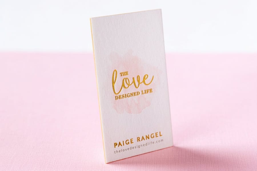
Beyond the standard glossy and matte cards, a set of specialty and recycled stocks can make a piece feel deliberate rather than default. These are the papers people remember, and several of them are kinder to the planet too.
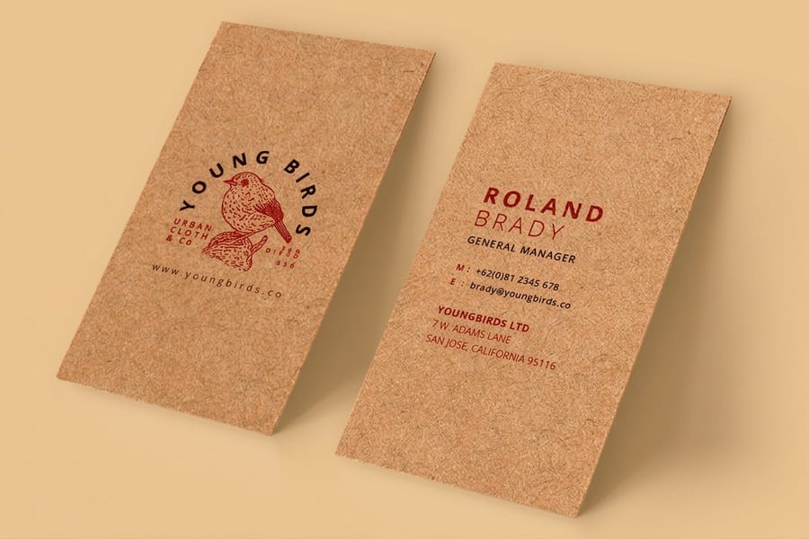
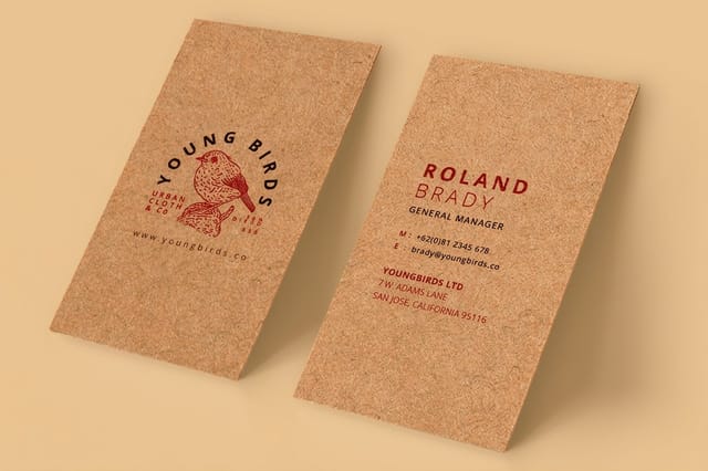
- Kraft is a natural, uncoated brown stock made largely from recycled fiber. It signals craft, sustainability, and a handmade sensibility, and it pairs beautifully with simple one-color designs.
- Cotton is a soft, luxurious stock with a distinctive feel and a bright, clean surface that ink sits into rather than on top of.
- Suede and soft-touch add a velvety coating that turns an ordinary card into a tactile experience.
Recycled and specialty stocks are proof that paper is part of the message, not just its carrier. If sustainability is part of your brand, choosing a recycled kraft or cotton stock says so before anyone reads a word, and you can even check whether your cards are recyclable at end of life. For definitions of any term you hit along the way, our printing terms glossary keeps the vocabulary handy.
A quick way to match paper to your marketing goal
If you remember nothing else, remember this: let the job pick the paper. Run your piece through three quick questions and the stock almost chooses itself.
How is it handled? Handed over and pocketed points to a firmer cover weight. Folded points to a lighter, foldable text stock. Mailed points to a rigid postcard cover.
What carries the message, image or text? Image-led work wants gloss. Text-led or write-on work wants matte or uncoated. A mix can use different finishes front and back.
What should it feel like? Everyday and efficient stays with standard stocks. Premium and memorable steps up to 16pt, 32pt, or a specialty coating like cotton, kraft, or soft-touch.
Answer those three and you have your weight, your finish, and your stock. When you want to see options laid out by piece, our business card size guide and the full guide library cover the rest, and the online designer lets you build the file and pick the stock in one place. Still unsure between two? Order both as samples and let your hands make the call.
Wally explains paper choice
The stock is the part your customer actually feels
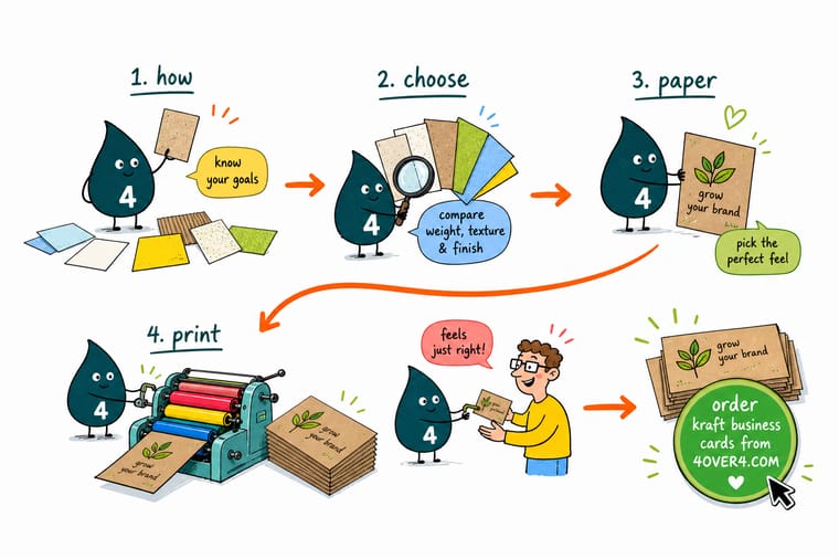
Wally thinks of paper like a handshake: your design is what you say, but the stock is how firmly you say it. Match the weight to the job, pick a finish that fits the message, and never guess from a screen. Wally always grabs a free sample first, feels the weight, runs a pen across it, and only then orders the full run at 4OVER4.
Order business cards →
Specs and pricing
Kraft business card specs and live pricing
Kraft is a natural, recycled stock and a favorite when paper is part of the brand. Kraft business cards run 100 for $24.75 on 18pt Kraft Uncoated, with live specs and price-per-unit showing how quantity and turnaround move the total.
| Quantity | Price Per Unit | Total |
|---|---|---|
| 100 | 24.8¢ | $24.75 |
| 250 | 14.2¢ | $35.57 |
| 500 | 13.1¢ | $65.60 |
| 1,000 | 13.3¢ | $132.55 |
Print it
Popular stocks for a full marketing kit
Kraft business cards run 100 for $24.75 on 18pt kraft uncoated. Brochures start at 50 for $57.11 on 100# gloss or silk text, 70# uncoated text or 14pt gloss cover. Postcards start at 50 for $16.48, with 14pt and 16pt gloss cover among 22 stocks. Brochures and postcards carry 3 business days of production, kraft cards 5.


See it in use
Kit pieces we printed on matched stock









Explore more
Where to go next





By the numbers
Kraft at $0.25, postcards at $0.33
Common Questions
Common questions about choosing marketing paper
What is the best paper for business cards, brochures, and postcards?
There is no single winner because each piece asks the paper to do a different job. Business cards want a firm cover stock in the 14pt to 32pt range so they survive a wallet and feel substantial in a handshake. Brochures fold cleanly on lighter text weights like 100lb gloss book, which is why a fold does not crack the surface. Postcards need a stiff 14pt or 16pt cover so they carry through the mail without curling. Match the stock to how the piece is held and used, and the paper answers itself.
How do I choose business card paper?
Pick the weight first, then the finish. Standard cards start around 14pt, premium cards move to 16pt, and ultra-thick stocks reach 32pt and up for a card that feels like a small object. After weight, choose a finish that matches the brand: gloss for punchy photos and color, matte or uncoated for a clean readable look and a surface you can write on, and specialty coatings like soft-touch, silk, kraft, or cotton when texture is part of the message. Ordering a free sample pack is the fastest way to feel the difference before you commit.
What is the best paper for business cards specifically?
For most businesses a 16pt cover stock is the sweet spot. It feels premium without the cost of ultra-thick options, prints color faithfully, and holds up to daily handling. If you want the card itself to make an impression, step up to a 32pt ultra-thick stock or a textured option such as cotton, kraft, or suede. If budget is the priority, a 14pt card still looks and feels professional. The best paper is the lightest stock that still says what you want your brand to say.
How do I pick the right paper weight and finish for a marketing piece?
Weight controls how sturdy and premium the piece feels, and finish controls how it looks and behaves. Heavier stocks resist bending and signal quality, so they suit cards and postcards that get handled. Lighter text weights fold without cracking, so they suit brochures and booklets. For finish, use gloss when images carry the message, matte or uncoated when readability and writeability matter, and a specialty coating when you want the piece to be memorable by touch. When two options feel close, order both as samples and decide with your hands.
What does business card paper cost and how is the price set?
Price at 4OVER4.COM is driven by the stock, the quantity, the finish, and the turnaround you select in the product configurator. Everyday stocks like a 14pt card start low and drop further per unit as the quantity climbs, while premium and specialty papers such as ultra-thick, cotton, or silk-laminated cost more because the material and finishing steps are more involved. The live price table on each product page updates as you change those choices, so you can see exactly how a heavier stock or a rush turnaround moves the total before you order.
Should marketing materials use gloss or matte paper?
Use gloss when the design leans on photography, bold color, or a bright retail feel, because the coating deepens contrast and makes images snap. Use matte or uncoated when the piece carries a lot of text, needs to be written on, or should feel understated and modern, because those surfaces cut glare and read easily under any light. Many campaigns mix the two, printing a glossy postcard front with an uncoated back for the address and note. Our matte versus gloss finish comparison guide walks through the trade-offs in detail.
Can I get a paper sample before I place a full order?
Yes, and it is the smartest step you can take. Screens cannot show weight, texture, or the way a coating catches light, so a physical sample removes the guesswork. 4OVER4.COM offers free samples so you can hold the stock, flex it, and even run a pen across it before committing to a run. Ten seconds with the real paper prevents the most common regret in print, which is discovering the finished piece feels lighter or shinier than you pictured.
Get Started
Order 100 kraft business cards from $24.75 and feel the stock
Pick your stock, drop in your design, and we print business cards, brochures, and postcards that feel as sharp as they look.
Legal Disclaimer
Gold Standard guarantees apply to all standard orders placed through 4over4.com. Price match requires verifiable proof of a competitor's published price for an equivalent product with matching specifications and turnaround time. Satisfaction guarantee covers manufacturing defects and print quality issues. Contact support with order number and documentation.
