
Filling Text With Images and Creating Duotones in Photoshop


Sofia is our design and templates voice, built from the knowledge of our production team, with over 20 years in printing.
Clip a photo into your headline, then reduce it to two bold inks. A duotone that glows in RGB goes muddy on press, so the color mode switch happens before you admire it. The finished file is built for print: a poster, a concert poster or an artist business card.
To fill text with an image in Photoshop, set your headline, place the image on the layer directly above it, then create a clipping mask so the photo shows only inside the letters. To create a duotone, convert the image to Grayscale, switch to Duotone mode, and assign two ink colors. Design in CMYK at 300 dpi so the effect prints crisp, then send it to a poster or business card at 4OVER4.COM.
Quick answer
The short version
Set your headline in a bold font, drop your photo on the layer above, and create a clipping mask so the image fills the letters. For a duotone, convert the image to grayscale, switch to Duotone mode, and assign two inks. Work in CMYK at 300 dpi so the effect survives the jump from screen to paper, then print it on a poster or business card at 4OVER4.COM.
Where image-filled text and duotones earn their keep
A headline set in a solid color says what it says. A headline filled with a photograph says it and shows it at the same time. Fill the word "OCEAN" with a wave, "DESERT" with dunes, or a band name with a crowd shot, and the type stops being a label and becomes the image.
Duotones do something similar with a whole picture. By reducing a photo to two bold inks, you get the punchy, screen-printed feel of a gig poster from a plain source image. Both effects are quick to build in Photoshop, and both want to be printed large, where the detail reads.
This guide walks through each technique step by step, shows you how to stack them into one image-filled duotone headline, and covers the print setup that keeps the effect crisp when it lands on paper. If you would rather build the whole layout in the browser, the Online Designer handles type over imagery too.
Pick an image that survives being clipped into type
Not every photo works inside letters. The image gets chopped into narrow strips the width of each stroke, so busy, low-contrast pictures turn to mush. Reach for shots with clear shapes, strong color, and obvious light and dark areas. Skies, water, textures, close-up patterns, and bold landscapes all hold up well.
Resolution matters more than usual here. Because you are cropping down to thin slivers, any softness in the file shows up bigger. Start with a high-resolution image, ideally something that is at least 300 dpi at the final print size. Our DPI vs PPI guide and the Photoshop resolution setup walk through the numbers so you are not guessing.
Building art from scratch instead of starting with a stock photo? The 4OVER4.COM Online Designer lets you lay type over uploaded imagery in the browser and send it to print without opening a single design app.
How to fill text with an image in Photoshop
This is the whole trick, and it takes about a minute once you know the steps.
- Set your headline. Grab the Type tool, type your word or short phrase, and pick a heavy display font. Bold, wide letters give the image room to show. Size it large and center it on the canvas.
- Place your image above the text. Drag your photo in as a new layer and position it directly above the text layer in the Layers panel. Scale it so the interesting part of the picture sits over the letters.
- Create the clipping mask. Hover the line between the image layer and the text layer, hold Alt (Option on Mac), and click, or right-click the image layer and choose Create Clipping Mask. The photo instantly fills the letters and nothing spills outside them.
- Reposition and refine. With the image layer selected, use the Move tool to slide the photo around inside the type until the framing looks right. Add a subtle drop shadow or stroke to the text layer if you want the words to lift off the background.
Because the text layer stays editable, you can retype the word or swap the font and the image re-clips automatically. When you are happy with it, that same file drops straight onto a poster or a stack of business cards.
How to create a duotone in Photoshop
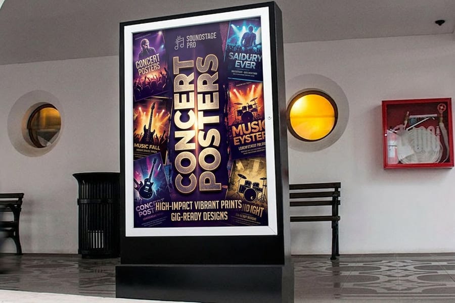
A duotone reduces a photograph to two inks, one carrying the shadows and one the highlights. It is how concert posters and album covers get that bold, printed-graphic look from an ordinary photo.
- Convert to Grayscale. Open Image > Mode > Grayscale and flatten if Photoshop asks. Duotone only works from a grayscale starting point, so this step is required.
- Switch to Duotone mode. Go to Image > Mode > Duotone. In the dialog, change Type from Monotone to Duotone so you get two ink slots.
- Choose your two colors. Click each color swatch and pick your inks. A dark color for Ink 1 and a brighter one for Ink 2 gives the most contrast. For print, choose from a Pantone or process library so the colors are actually printable.
- Adjust the curves. Click the curve box next to each ink to control where that color falls across the shadows and highlights. Nudging those curves is what separates a flat two-tone from a rich, punchy duotone.
Save the result and you have a headline-ready graphic. Not sure whether to build your colors as spot ink or full process? Our 2-color printing guide and the CMYK vs RGB explainer break down which to pick.
Combine the two: an image-filled duotone headline
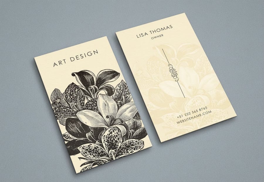
The two techniques stack beautifully. Run your photo through a duotone first, then clip that duotone into your headline. Now the letters are filled with a two-color, high-contrast image instead of a full-color one, and the whole thing reads with the graphic punch of a screen print.
Order is what matters. Convert and duotone the image on its own layer, place it above the text, then create the clipping mask. Keeping the duotone on its own layer means you can still slide it around inside the letters and fine-tune the framing.
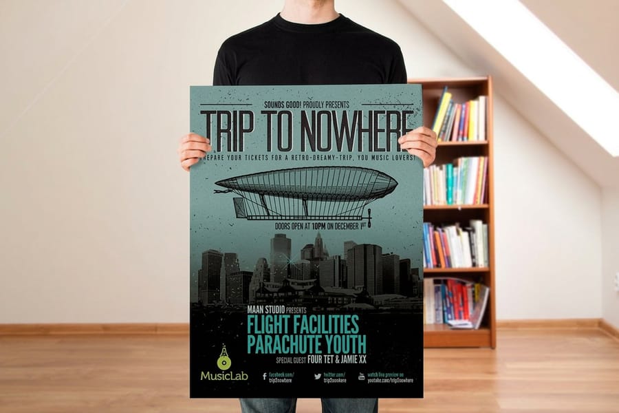
This is the look behind a lot of festival concert posters and gig flyers, where one striking image and two loud inks do all the work. Shrink the same idea down and it makes a memorable artist business card too.
Set the effect up so it prints as sharp as it looks
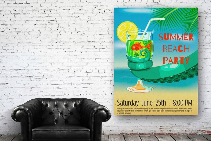
Screens glow, paper reflects. A duotone that looks electric in RGB can go muddy on press if you never switch color modes. Before you export, set the document to CMYK (Image > Mode > CMYK Color) and check that your colors still look the way you want. If a Pantone was doing the heavy lifting, decide whether you are printing it as a true spot ink or letting it convert to process.
Three settings carry most of the quality:
- Resolution: 300 dpi at final size. Image-filled type is unforgiving of soft files.
- Color mode: CMYK for full-color fills, or spot inks if you are printing a true two-color duotone.
- Bleed and flattening: extend the background past the trim line, then flatten or rasterize a copy so the clipping mask and duotone render exactly as you see them.
When in doubt, order free paper samples first, or read bleed and trim explained and the best color profile for printing before you upload.
Where image-filled text and duotones look best
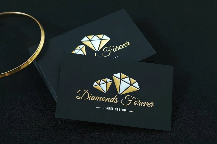
This is a headline effect. It rewards scale and simplicity, so it belongs on the pieces people look at from across a room or hold up close as a statement.
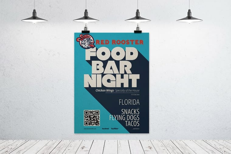
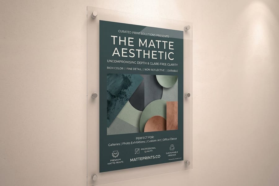
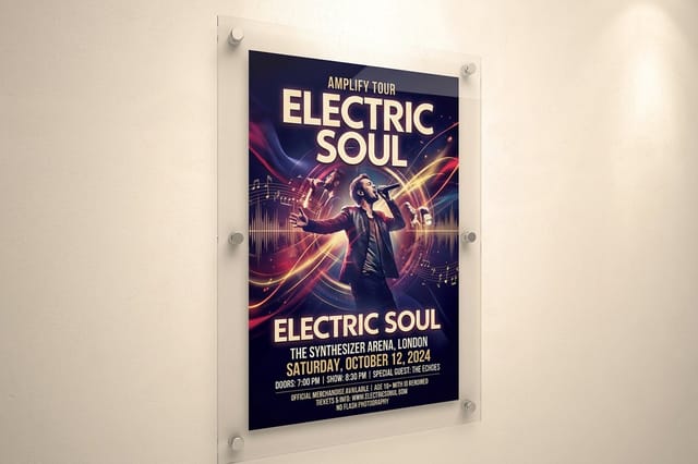
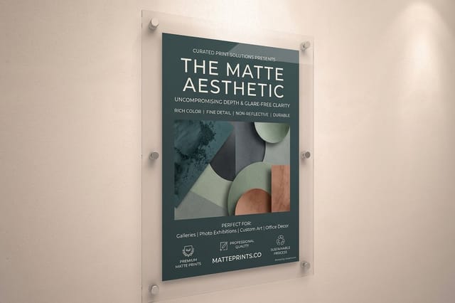
Posters are the obvious home. One giant image-filled word on a standard poster or a duotone photo on a matte poster turns a wall into a graphic, and for events a duotone on a concert poster nails the printed-gig aesthetic.
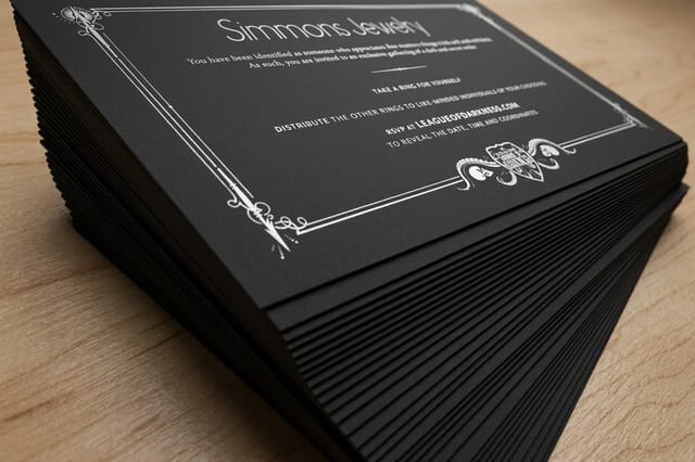
Business cards are the surprise. A name set in image-filled type on an artist business card, or a duotone portrait on a foil business card, makes a tiny piece of paper feel designed. Browse the full range in business card printing and poster printing.
The effect travels well beyond both. It carries a single bold image onto postcards, covers, and packaging anywhere one strong picture needs to deliver the whole message.
Mistakes that flatten the effect in print
The technique is simple, but a few habits kill it on paper. Avoid these and the file you built in Photoshop lands exactly as you designed it.
- Thin fonts. Light or condensed type hides the image. If the photo is the point, use a heavy display face with wide strokes.
- Low-resolution images. Clipping crops the picture into slivers, so a soft file only looks softer. Start at 300 dpi at the final print size, the same setting the print setup section above calls for.
- Leaving it in RGB. Bright screen colors shift on press. Convert to CMYK, or set true spot inks, before you export.
- Too much detail. Busy photos disappear inside letters. Pick images with clear shapes and strong contrast.
- Forgetting bleed. If the background touches the edge, extend it past the trim so you do not get a thin white sliver after cutting.
Get those right and 4OVER4.COM prints your headline on posters, cards, and more, across 60+ paper stocks with same-day shipping options from our Queens, NY facility.
Wally explains the effect
Two Photoshop tricks, one bold printed headline
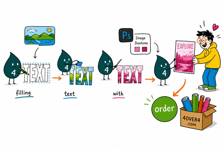
Wally thinks of a clipping mask like a stencil: cut your headline out of a heavy font, hold a photo behind it, and only the picture inside the letters shows. A duotone is the same idea in reverse, squeezing a whole photo down to two bold inks so it reads like a printed graphic. Stack the two and one image plus two colors carry the entire design. Build it in CMYK at 300 dpi, then let 4OVER4 put it on a poster or a card that people actually keep.
Design your poster →
Specs and pricing
Poster and business card specs and pricing
Standard posters come in six sizes from 11 by 17 to 22 by 28 inches on text, cover or synthetic stock, and artist business cards in 2 by 3.5, 2 by 2, 1.5 by 3.5 or 2.125 by 3.375 inches from 100 cards, full color on one or both sides with a standard or high gloss UV finish. The panels show the live specs and price per unit for your finished file.
| Quantity | Price Per Unit | Total |
|---|---|---|
| 50 | $2.18 | $108.75 |
| 100 | $1.64 | $163.67 |
| 200 | $1.01 | $202.11 |
| 300 | 80.2¢ | $240.55 |
| 400 | 69.7¢ | $278.99 |
| 500 | 63.5¢ | $317.44 |
| 600 | 55.8¢ | $335.02 |
| 700 | 50.4¢ | $352.59 |
| Quantity | Price Per Unit | Total |
|---|---|---|
| 100 | 17.6¢ | $17.57 |
| 200 | 11.5¢ | $23.07 |
| 300 | 9.15¢ | $27.46 |
| 400 | 7.96¢ | $31.86 |
| 500 | 7.25¢ | $36.26 |
| 600 | 6.77¢ | $40.64 |
| 700 | 6.43¢ | $45.04 |
| 800 | 6.18¢ | $49.43 |
Print it
Print your image-filled headline at 4OVER4
Concert and matte posters print from 11 by 17 up to 48 by 96 inches or any size on semi gloss, hi gloss, canvas or vinyl, with gloss or matte lamination. Black postcards print CMYK plus white ink on 32pt to 80pt Midnite Black stock from 50, which is where a duotone in two light inks stands out.
See it in use
Type effects we printed at full size
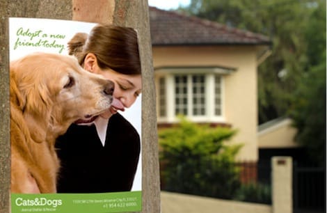
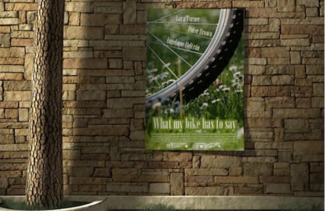
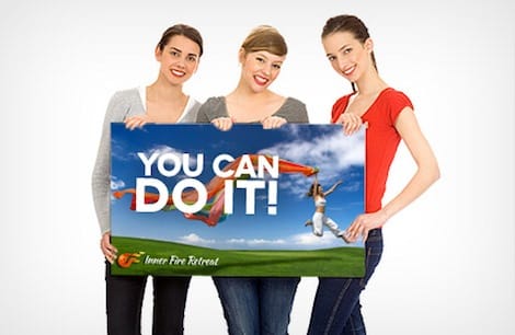
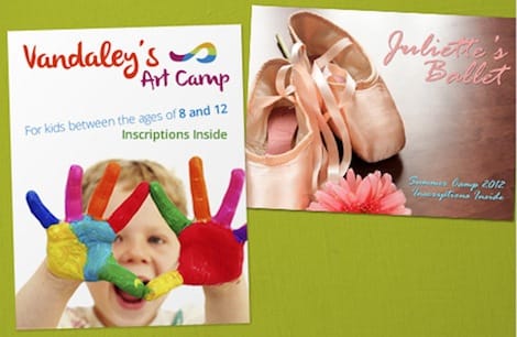
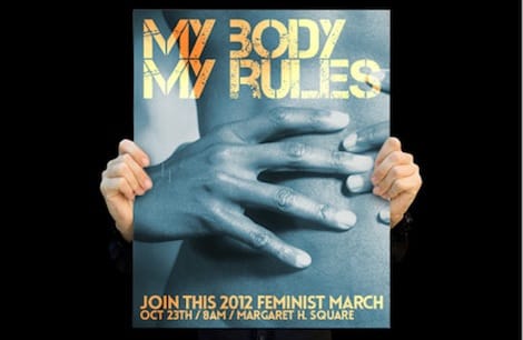
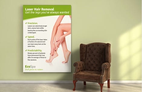
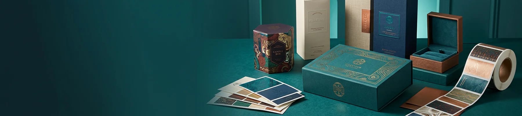
The gallery shows posters from our press at their printed size, so you can judge how thick a letter has to be before the photo inside it still reads from across a room.

Explore more
Where to go next


By the numbers
Black postcards on 32pt to 80pt Midnite Black
Common Questions
Common questions about image-filled text and duotones
What does it mean to fill text with an image in Photoshop?
It means the letters of your headline show a photograph instead of a solid color. You set the text, place an image on the layer directly above it, then create a clipping mask so the picture appears only inside the shapes of the letters. The text stays fully editable, so you can retype the word or change the font and the image re-clips automatically.
What is a duotone, and why use one for print?
A duotone reduces a photograph to two inks, one for the shadows and one for the highlights. It gives an image the bold, graphic look you see on concert posters and album covers, and because it uses fewer inks it prints cleanly and predictably. You build it by converting the image to grayscale, switching to Duotone mode, and assigning two colors.
Do I need Photoshop, or can I do this another way?
Photoshop is the most direct tool for both effects, but you can get a similar image-filled look in Illustrator, Affinity, or even Canva. If you would rather not open design software at all, the 4OVER4.COM Online Designer lets you lay type over an uploaded image in your browser and send the result straight to print.
What resolution and color mode should the file be for printing?
Design at 300 dpi at the final print size and convert to CMYK before you export. Image-filled type crops your photo into thin strips, so any softness shows, and a duotone that looks electric in RGB on screen can go muddy on press if you never switch color modes. If you are printing a true two-color duotone, set it up as spot inks instead.
Can I put image-filled text on business cards, or only posters?
Both work. Posters are the obvious home for a giant image-filled word or a duotone photo, but the same file scales down beautifully onto business cards. A name set in image-filled type on an artist business card, or a duotone portrait on a foil card, makes a small piece of paper feel deliberately designed.
Does 4OVER4 charge extra to print image-filled or duotone designs?
No. The effect lives inside your artwork, so there is nothing special to add at checkout. Your price is set the normal way, by the product, size, paper stock, quantity, and turnaround you choose. Upload the finished file and it prints like any other design.
Get Started
Order 50 black postcards from $25.60
Pick your poster or card, upload the file you built in Photoshop, and we print your image-filled or duotone design crisp and true to screen.
Legal Disclaimer
Gold Standard guarantees apply to all standard orders placed through 4over4.com. Price match requires verifiable proof of a competitor's published price for an equivalent product with matching specifications and turnaround time. Satisfaction guarantee covers manufacturing defects and print quality issues. Contact support with order number and documentation.
