
The History of the Pepsi Logo and What It Teaches Brands


Marcus is our print marketing voice, built from the knowledge of our production team, with over 20 years in printing.
A logo that has been redrawn for 130 years

Few logos have been erased and redrawn as often as Pepsi’s, and almost none have stayed recognizable through all of it. The mark that sits on a can today shares almost no lines with the red script that appeared in 1898, and the big turns came in 1950, 1962, 2008, and 2023, yet the brand never once felt like it started over. That is the trick worth studying. Pepsi treated its logo as a living asset and kept editing it, roughly once a decade.
Your own logo goes through the same edits on a smaller stage. It has to read at 2 by 3.5 inches on business cards, sit across the top of an 8.5 by 11 inch letterhead, and hold its shape in gold, silver, or copper on foil business cards. One cheap test before a redesign goes wide: print 25 logo magnets with the new mark and hand them to regular customers. If they know it is you without reading the name, the edit worked, and you can order the cards.
Most write-ups of this story stop at the timeline, one logo after another with a date under each. That is the easy part. The useful part is what each redesign was actually solving, because every one of those problems shows up for small brands too. So this walk through the eras does two things at once. It tells you what changed, and it hands you one thing you can do to your own logo before you close the tab. If you want the underlying craft first, the ultimate guide to logo design is the companion piece to this history.
1893: Brad’s Drink and the power of a name
The drink came before the logo. In 1893 a pharmacist named Caleb Bradham started serving a fountain mix at his drugstore in New Bern, North Carolina, and called it Brad’s Drink. There was no mark to speak of, just a name written the way anyone would write it. In 1898 he renamed it Pepsi-Cola, a name that leaned on the words pepsin and dyspepsia to suggest the drink settled your stomach. The first real logo followed: a lean, looping red script.
What matters here is the sequence. Bradham did not design a symbol and then find a product to hang on it. He built something people wanted, gave it an honest, descriptive name, and only then dressed that name in type. For a brand starting out today, that order still holds. Your name is doing the heavy lifting long before a logo can, so it has to survive being written plainly, spoken aloud, and read at a glance.
Try this on your own logo
Write your brand name in plain type at three sizes, a billboard, a business card, and a favicon. If it only reads clearly at one of them, your logo is being asked to do work the name should be able to do on its own.
1898 to 1940: red, swirly, and of its time
For its first four decades, from 1898 to 1940, Pepsi wore an elaborate red script that fit right in with the ornate lettering of the early 1900s, with long tails, fine swashes, and tight curls wrapped around the two words Pepsi and Cola. Set that script across a 2 by 3.5 inch business card and the swashes shrink to hairlines. It looked modern the day it was drawn and started to look old-fashioned soon after, the way most heavily decorated logos do. Fashion moved on, and the flourishes that once read as elegant began to read as dated.
The lesson is not that decoration is bad. It is that decoration ages faster than structure. A logo built on a clear, simple shape can be re-skinned for a new decade. A logo built on ornament has to be torn down and rebuilt. This is the exact moment to think about how your mark will actually show up in the world, because a fussy logo that looks fine on screen can fall apart the second it is pressed into foil or embossed into stock. The good news is that the right print finish can add richness without adding clutter, which is where a few 4OVER4.COM products earn their keep.
Print your mark
The closest thing to a physical logo
A refreshed logo deserves a surface worthy of it. Foil pressed into silk stock adds shine an ornate script never could on paper alone.
Try this on your own logo
Strip every flourish, gradient, and hairline from your current mark until only the core shape is left. If that skeleton is still recognizable, you have a logo built to last. If it collapses, you just found the part that will date you.
The 2023 refresh and the logo Pepsi uses today
Skip ahead for a moment, because most people reading a logo history want the current answer first. The logo Pepsi uses today came in with the 2023 refresh, and it reversed the biggest change of the previous two decades: the wordmark went back inside the globe. For 15 years, from 2008 to 2023, the name had sat outside and below the circle. Now PEPSI runs across the middle of the red, white, and blue globe again, set in bolder, wider capitals with a black outline drawn around the letters and around the globe itself.
Two other things moved with it. Black joined the palette as a working color rather than a shadow, and the blue shifted to a brighter, more electric tone that survives a phone screen and a lit cooler door, not just a printed can. The outline is the part a printer notices. A keyline holds a mark together on dark backgrounds, in video, and at the size a logo actually gets used, which is exactly where the 2008 version went soft.
So the one line answer: today Pepsi uses a circular red, white, and blue globe with the PEPSI wordmark centered inside it in bold, black-outlined capitals, adopted in 2023. The rest of this page is how a script drawn for a syrup called Brad’s Drink ended up there, era by era.
Three formats that carry a logo well
Before the next era, a practical detour, because the eras are a story about a logo meeting physical objects. A mark only becomes a brand once it lives on things people hold, keep, and hand to each other. The three below cover the range: a full color logo on 17pt or 35pt indoor magnet stock, a metallic logo in one of 7 foil colors on 16 point silk laminated cards, and a raised logo on 32pt or 48pt board that you can feel with a thumb. Each card shows its live configurator price at 4OVER4.COM.
Put it in hands
Three ways to send your logo into the world
Metallic, tactile, and everyday. Live prices, real configurators, printed and shipped from 4OVER4.COM.
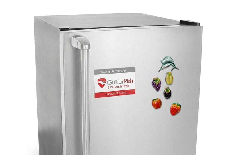
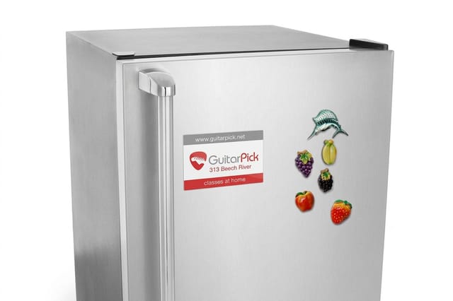 Magnets The cheapest way to leave your logo somewhere it gets seen every single day, printed full color on heavy magnet stock. From $19.68 Configure and order →
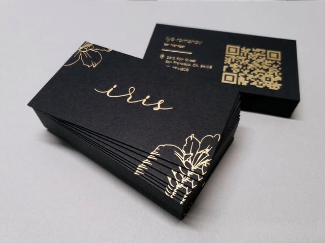
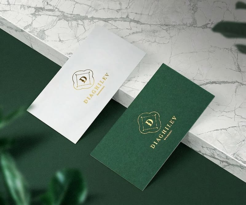
 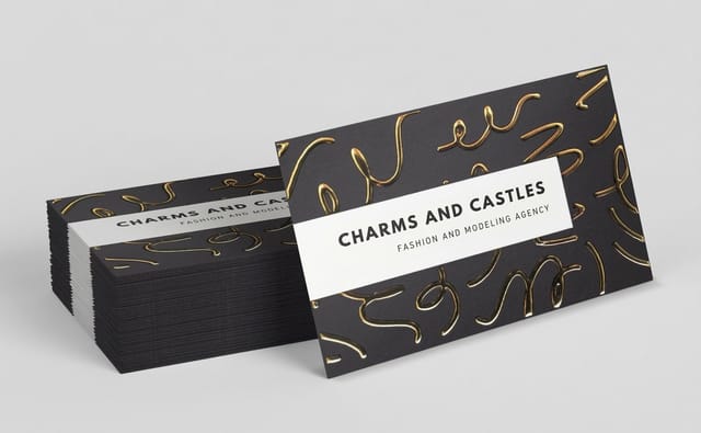 Foil Business Cards Gold, silver, or copper foil turns a flat logo into something people turn over in their hands, in 7 foil colors. From $222.13 Configure and order →
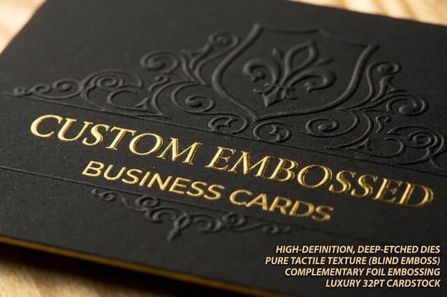
 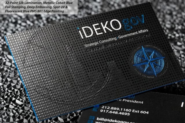 Embossed Business Cards A raised logo you can feel with a fingertip, the tactile version of the confidence Pepsi built into its wordmark. From $251.36 Configure and order →
 A logo is also the start of a service relationship, not just a product order. When a rebrand lands the week of a trade show, same-day printing and rush delivery compress the timeline. And for a flourish the old script masters would have loved, tip-on printing glues a separate printed logo card onto a larger piece, a small, deliberate detail that still turns heads.
1950: a third color changes everything
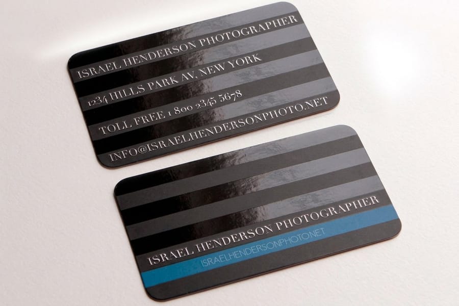
Through the 1940s, as the country moved through the war years, Pepsi wrapped its identity in red, white, and blue and stamped it onto a bottle-cap crown. This was the turning point. The brand stopped being a red script on white and became a color combination people could recognize from across a store before they read a single letter. Once that palette locked in, Pepsi never let it go. Every redesign since has been a negotiation with those three colors.
That is the power of choosing a palette on purpose. Color is the first thing the eye processes, faster than shape and far faster than text, so the brands that claim a palette early get recognized early. The catch is that a color only counts as yours if it holds up everywhere your logo lands, on a screen, on packaging, on a card, on a sign. Which is exactly why a proof matters. Here is what a real product’s pricing and options look like when you go to put a logo into color and finish.
Color, finish, and cost
What ordering a foil logo card actually looks like
Real configurator numbers for foil business cards, from quantity tiers to stock and finish options. The more you order, the lower the per-card cost drops.
| Quantity | Price Per Unit | Total |
|---|---|---|
| 500 | 44.4¢ | $222.13 |
| 1,000 | 26.9¢ | $269.14 |
| 2,500 | 20.2¢ | $504.19 |
| 5,000 | 19.7¢ | $986.04 |
| 10,000 | 16.4¢ | $1,644.19 |
| 15,000 | 14.4¢ | $2,161.30 |
If sustainability is part of your brand color story, the 4OVER4.COM green printing program lets you produce your logo pieces on responsible materials, a choice customers increasingly notice and reward.
Try this on your own logo
Lock your brand to two or three colors and use them everywhere, the way Pepsi committed to red, white, and blue. Then print one proof and check the palette still pops on a card, on packaging, and on a sign, not just on your monitor.
1962: dropping cola from the name
In 1962 Pepsi made its most confident move yet. The wordmark dropped the word Cola, and the name on the logo went from nine letters to five. The logo now said Pepsi and nothing else, set in a cleaner, more modern style beside an evolving bottle-cap shape. On paper it sounds small. In practice it was a company betting that its name had earned enough recognition to stand alone, without the category word propping it up.
That bet only pays off after the recognition exists. A brand nobody knows cannot afford to drop the word that explains what it is. A brand everybody knows cannot afford to keep it, because the clutter starts to look like insecurity. Simplification, in other words, is not a style you copy from a famous logo. It is a privilege you earn, and 1962 is the year Pepsi cashed it in.
Try this on your own logo
List everything crammed into your logo, then remove the one element you only kept out of habit. If recognition survives the cut, keep it gone. If it does not, you just learned which part is still carrying the brand.
Who designed the Pepsi logo
There is no single name, and that is part of the story. The swirly script that carried the brand for about 40 years, from 1898 through the 1930s, was drawn in house at a company that began as one pharmacist’s drugstore in New Bern, North Carolina. It followed the ordinary commercial lettering style of the day, and no signed design studio put its name to it. Attribution only gets clean once branding became a profession.
The 2008 mark, the one that pushed the wordmark outside the globe and tilted the white band into a smile, came from the Arnell Group. It shipped with the longest rationale any soft drink logo has ever carried, and it is the version the 2023 refresh reversed.
The 2023 logo came from PepsiCo’s own in house design team rather than an outside agency, which is why it reads like an edit of the archive instead of a new idea: wordmark back in the middle of the globe, black outline added, capitals made bolder.
Two questions usually ride along with that one. When did Pepsi change its logo? Roughly once a decade since 1898, with the turns that mattered in 1950, 1962, 2008, and 2023. What does the Pepsi logo mean? The disc started life as a bottle cap, the red, white, and blue arrived as a patriotic signal in the 1940s, and every version since has been that same disc getting simpler.
What the redesigns teach about logo evolution
Line the eras up and a pattern appears that has nothing to do with soda. Every Pepsi redesign moved in the same direction, from describing the product toward simply being recognized. The name shed its literal meaning, the script shed its ornament, the palette hardened into a signature, and the wordmark shed the category label. Each step asked the logo to carry less and trusted the audience to carry more.
The other lesson is one of pace. Pepsi almost never redrew from scratch. It refined, roughly once a decade, keeping enough continuity that customers never felt lost. That is the difference between evolving a brand and abandoning it. If you are weighing a change of your own, the rebranding process guide walks through how to move forward without throwing away the recognition you spent years building, and the 6 key principles of logo design keep each edit honest.
Wally reads the logo like a timeline
Every redesign is a lesson you can run on your own mark
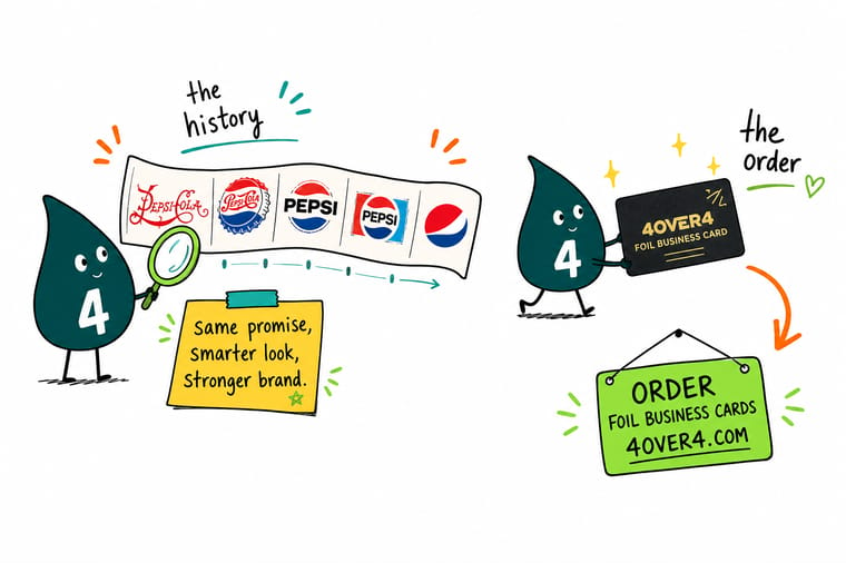
A great logo is never finished, it is edited. Pepsi kept trimming its mark toward pure recognition, and you can borrow the method: start with a name that reads plainly, build on a simple shape, own a palette, and simplify only once people know you. When your logo is ready, 4OVER4.COM presses it into foil, raises it in emboss, and prints it sharp so it lives out in the world.
Print your logo on foil cards →The lessons in one place
How business card finishes carry a logo, side by side
Pepsi’s logo moved from paper to bottle caps to trucks, and each surface asked something different of the mark. Your logo faces the same question in miniature on a 2 by 3.5 inch card. Foil on 16 point silk laminated stock suits a mark with clean, open shapes, and embossing on 32pt or 48pt board suits a bold one, because a fingertip has to find the outline. The table compares the most ordered cards on stock, finish, quantity, and price, so you can match the surface to the mark.
Compare finishes
Popular business cards, side by side
Stock, finish, quantity, turnaround, and from-price across our most-ordered business cards, the surfaces your logo will actually live on.
 free business cards |  Standard Business Cards |  3D Lenticular Business Cards |  Metallic Foil Business Cards | |
|---|---|---|---|---|
| Min price | Free | $17.57 | $690.88 | $222.13 |
| Paper / stock | 14pt Gloss Cover | 14pt Gloss Cover | 31pt Lenticular Lens | 16 Point Silk Laminated |
| Finish | - | Standard Finish | - | - |
| Size | 2" x 3.5" | 2" x 3.5" | 2" x 3.5" - Vertical | 2" x 3.5" |
| Default qty | 200 | 100 | 500 | 500 |
| Turnaround | 5 business days | 3 business days | 22 business days | 7 business days |
| Rating | ||||
| View & customize | View & customize | View & customize | View & customize |
Recognition compounds, and the data backs it up. For the research on how memory and repeat exposure build a brand, see brand loyalty and awareness data.
Go deeper
Guides to design and evolve your own logo
From first sketch to full rebrand, these walk through the craft the Pepsi story only hints at.
 How to Design a Logo The full start-to-finish guide to building a mark that lasts.
  6 Key Principles of Logo Design The rules the best marks never break, Pepsi included.
  The Rebranding Process When to redesign, and how to do it without losing recognition.
  Build a Strong Brand Identity Turn one good logo into a full, consistent brand system.
 Explore more
More ways to design, print, and grow your brand
The cards below open the foil and embossed card stocks, the logo design guide, and the copper foil showcase.
 Shop Business Cards Printing Put your logo on the most-handed print there is.
  Hub Branded Merchandise Every surface that can carry your logo, in one place.
  Product Foil Business Cards Metallic logo cards from $222.13, in 7 foil colors.
  Collection Business Basics Cards, letterheads, and the identity starter set.
  Guide How to Design a Logo The ultimate guide to building your mark.
  Statistics Brand Loyalty Data The numbers behind recognition and repeat business.
  Showcase Copper Foil Cards Real brands that stand out with metallic logos.
  Case study A Restaurant Rebrand How a menu redesign carried a new identity.
  Alternative GotPrint Alternative How 4OVER4.COM compares for logo printing.
  Reviews Business Card Reviews Ratings and feedback from real customers.
  Location Card Printing Austin Local custom business card printing services.
  Benefit Same Day Printing Order today, ship today on rush jobs.
 Ready to put your logo where people can hold it?
Send us your vector logo and 4OVER4.COM prints it sharp, in foil, emboss, or full color, as fast as same day. Give your mark the surface Pepsi spent 130 years chasing.
Common questions about the Pepsi logo and logo design
What is the history of the Pepsi logo in short?
It started in 1893 as Brad’s Drink, named after pharmacist Caleb Bradham, and was renamed Pepsi-Cola in 1898 with a thin, ornate red script logo. Through the 1940s Pepsi adopted red, white, and blue, then dropped the word Cola from the wordmark in 1962 to become simply Pepsi. Later decades refined the mark into the circular globe used today. Each step traded description for recognition. For the deeper design principles behind marks like this, see how to design a logo.
What can a small brand actually learn from the Pepsi logo?
Three things carry over no matter your size. First, build your logo on a simple structure so it survives changing tastes, the way a strong shape outlasts a fussy script. Second, choose a palette on purpose and use it everywhere, since color is what people recognize before they read a word. Third, simplify only after you have earned recognition. The 6 key principles of logo design break each of these down in practice.
How often should I redesign my logo?
Pepsi refreshed its mark roughly once a decade, and most were small evolutions rather than clean-sheet redraws. That is the healthy pattern. Refine when your logo no longer prints well, feels dated next to competitors, or no longer fits where your brand is going, but keep enough continuity that customers still recognize you. The rebranding process guide covers how to change without losing the equity you built.
How do I get my logo ready to print on cards and merchandise?
Supply your logo as vector art (AI, EPS, or PDF) so it scales to any size without going blurry, and confirm your colors in the right mode before you order. Test a single proof at actual size, then print a run. 4OVER4.COM prints logos on foil business cards, embossed cards, and magnets, with same-day printing when a launch cannot wait.
