
The History of Calligraphy From Ancient Scripts to Modern Lettering


Emma is our prepress and print production voice, built from the knowledge of our production team, with over 20 years in printing.
Calligraphy is writing made so the writing itself is the artwork, produced live in single strokes with a tool that creates thick and thin parts. It began independently in several places, because a brush on silk in China, a reed pen on papyrus in Egypt and the Arabic world, and a broad-edge quill on vellum in Europe each force a different letter shape, and every historical style is really a fingerprint of its tool. Today most calligraphy reaches people in print: a lettered name on wedding invitations from $19.77 for 25, a script pressed into 32pt or 48pt stock on letterpress business cards from $251.36 for 250, or a hand-drawn heading on restaurant menus from $57.11. A calligrapher letters a couple's names once, and the press carries them onto every invitation in the run. Our guide covers the calligraphy definition, world history and modern print uses in one place.
Calligraphy tools and the letterforms they produce
| Tool | Where and when | Written on | What decides stroke weight | What it looks like |
|---|---|---|---|---|
| Hair brush | China, Shang dynasty onward | Silk, bamboo, later paper | Pressure and speed of the whole brush | The stroke swells and tapers along its length |
| Reed pen | Egypt, then the Arabic world | Papyrus, then paper | A cut edge held at a fixed angle | Crisp thick and thin, strongly rhythmic |
| Broad-edge quill | Roman and medieval Europe | Parchment and vellum | The pen angle, held constant across the page | Even color on the page, dense blackletter texture |
| Pointed flexible nib | Europe, seventeenth century onward | Smooth sized paper | Downward pressure splaying the nib | Thin hairlines with swells only on downstrokes |
| Brush pen and vector | Twentieth century to now | Paper, tablet, print | Pressure, or a curve you drag by hand | Anything above, plus shapes no nib could make |
Read the table by the fourth column. Once you know whether weight comes from the angle of a fixed edge or from pressure on a point, you can tell most historical hands apart on sight: a broad edge held at a fixed angle gives Carolingian minuscule and italic, and a pointed pen pressed harder gives copperplate, whose hairlines are the thinnest and need the most care in letterpress or foil. If you are choosing a script for a printed piece rather than studying one, our wedding font guide narrows it down faster.
What calligraphy is, and what it is not
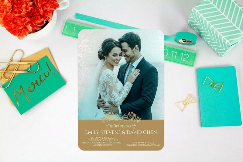
Calligraphy is handwriting made so the writing itself is the artwork. A tool with a shaped tip, held at a controlled angle or pressed with controlled force, turns a plain letter into a stroke with thick and thin parts, and the discipline is in repeating that stroke the same way a thousand times.
It appears independently wherever a culture writes on a smooth surface and cares how the writing looks. Brush on silk in China, reed on papyrus in Egypt and the Arabic world, quill on vellum in a European monastery. Nobody exported the idea; the materials suggested it in each place.
The word comes from Greek, roughly beautiful writing, but the useful definition is narrower than that. Calligraphy is written once, live, in strokes. Lettering is drawn and redrawn until the shapes are right. Type is a set of parts made once and reused endlessly. Our guide to calligraphy for print covers what changes when any of the three has to survive a press.
Calligraphy, lettering and type do three different jobs
Mixing the three up is the most common mistake in a design brief. If you ask a calligrapher for a logo, you get one gorgeous version of it and no way to set a phone number in the same hand. If you ask for a font, you get infinite text and none of the life. If you ask for lettering, you get one drawn piece of artwork that can be redrawn to fit any shape you want.
For print work the practical rule is simple: calligraphy or lettering for the name and the headline, a well-chosen typeface for everything a reader has to actually read. Serif or sans serif is a separate decision, and it belongs to the body text, not the flourish.
The tool decides the letter, not the century
Every calligraphic style is a fingerprint of the tool that made it. A broad edge, whether reed or quill, has a fixed width, so a stroke is thick when it runs across the edge and thin when it runs along it. Hold the pen at one angle for a whole page and thick and thin land in the same places every time. That is why medieval hands look so even.
A pointed nib works the opposite way. It is thin at rest and splays when you press, so weight comes from force rather than direction. That single mechanical difference is why copperplate swells only on the downstrokes and blackletter does not. If you want the feel of it in your own hand, start with a beginner practice sequence before spending money on nibs.
Where calligraphy started, and why it started more than once
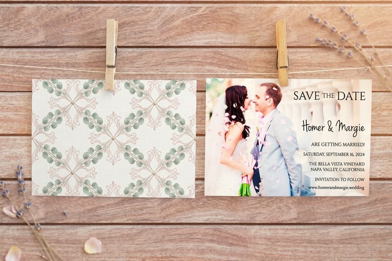
The oldest writing systems were cut, pressed or scratched. Cuneiform was a wedge pushed into wet clay, and Egyptian hieroglyphs were carved into stone. Neither is calligraphy in the strict sense, because the tool was not a pen and the beauty came from carving rather than from a written stroke.
Calligraphy proper begins when a flexible tip meets a surface smooth enough to take a fast stroke. In Egypt that was the reed pen on papyrus, and the running hieratic and demotic hands that scribes used for daily work. Speed created the cursive, and the cursive is what a scribe then made beautiful.
China and East Asia: the brush as the higher art
Chinese calligraphy is traced back to the oracle bone script of the Shang dynasty, and the brush was in use for writing long before paper existed to write on. What makes the tradition unusual is its status. In China calligraphy was not a craft that served painting; it ranked alongside painting and poetry, and a scholar was judged by his hand.
The brush holds no fixed width, so the stroke lives or dies on pressure, speed and the amount of ink left in the hairs. A stroke cannot be gone back over and repaired, which is why the tradition values the single confident gesture and treats hesitation as a visible fault. The same script travelled into Korea and Japan, where kana and the local styles took it in their own directions.
The Islamic world: when the word becomes the ornament
Arabic calligraphy grew into one of the most developed written arts anywhere, in large part because figurative imagery was avoided in religious settings. The decoration had to come from somewhere, and it came from the writing. Kufic, the early angular hand, suited stone and architecture. The later cursive hands, naskh among them, suited the page.
Arabic script is joined by nature, which changes the problem entirely. A letter changes shape depending on what sits either side of it, so the calligrapher is composing a line rather than assembling characters. Proportion systems built on the width of a single rhombic dot governed how tall and how wide each letter could be, which is closer to engineering than to freehand drawing.
Europe, from the scriptorium to the copperplate engraver
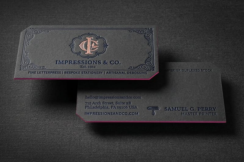
Roman inscriptional capitals, the ones cut into Trajan’s Column, set the proportions Western letters still use. Cut in stone, but drawn first with a flat brush, which is why they already have thick and thin strokes and serifs at the ends.
Through the early medieval centuries the copying of books happened in monastic scriptoria, one page at a time, with a broad-edge quill on parchment. Regional hands drifted apart until Charlemagne’s reforms standardised Carolingian minuscule across his territories. Those rounded lowercase shapes are the direct ancestors of the letters in this paragraph.
Later the hands compressed. Blackletter fitted more words on expensive parchment by making the letters narrow and dense, which is why a page of it reads as a texture rather than as separate words. Gutenberg cut his first type to imitate that hand, so the printing press began by copying calligraphy before it started to replace it. That relationship runs through the whole history of printing methods.
The Renaissance rediscovers the round hand
Italian humanist scribes went looking for classical texts, found them in Carolingian copies, and mistook that ninth century hand for the genuine Roman one. They imitated it, and the italic hand they developed from it was fast, legible and slanted. Printers copied that in turn, which is where italic type comes from.
Writing masters then began publishing manuals, and manuals had to be reproduced. That is the hinge point. A hand that could be engraved and printed spread further than a hand taught face to face.
Copperplate is named after the plate, not the pen
From the seventeenth century onward, writing manuals were engraved into copper plates with a burin, a tool that cuts a line which swells as it is pushed deeper. Students copied the printed result with a pointed flexible nib, chasing an effect that an engraver had made with a cutting tool rather than a pen.
That is the honest limitation of the style. Copperplate asks a pen to imitate engraving, so it demands slow, deliberate downstrokes, smooth paper and a nib that has not been sprung. Spencerian, the American business hand of the nineteenth century, loosened the same principles for speed, because clerks had to write all day and could not stop to admire each letter.
Calligraphy in the modern era
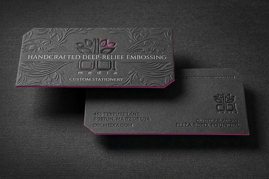
Industrial printing should have finished calligraphy off, and for a while it very nearly did. What saved it was a deliberate revival. William Morris and the Arts and Crafts movement went back to medieval manuscripts, and Edward Johnston reconstructed the broad-edge hand from studying originals in the British Museum, then taught it. His foundational hand is why calligraphy is taught as a living craft today rather than studied as an artefact.
The second shift came from advertising and signwriting. Brush lettering on shopfronts, film titles and packaging kept a written hand in commercial work through the twentieth century, long after nobody needed handwriting to reproduce a book. Then digitisation flattened the distinction again: a lettering artist now draws a curve on a tablet, and the output is a vector that a press can hold at any size.
Modern practice mostly ignores the historical boundaries, which purists dislike and clients do not. A brush pen can fake a pointed-nib swell without the pressure control a real nib demands, and a tablet lets you undo, which no reed pen ever did. That is a genuine trade: you gain freedom and you lose the discipline that made the old hands consistent. If you want the old constraint back, printed practice sheets with the guide lines already ruled are the cheapest way to get it, and worked hand-lettering examples show what the finished thing should look like.
Calligraphy in today’s invitations and print design
Nearly all commercial calligraphy now reaches people as print. Someone writes the piece once, it is scanned, cleaned up and vectorised, and the press does the rest. Wedding and event stationery is where most of it lands, because it is the last common occasion where people still expect a physical, formal object. Invitation and card printing is the pillar that covers the formats.
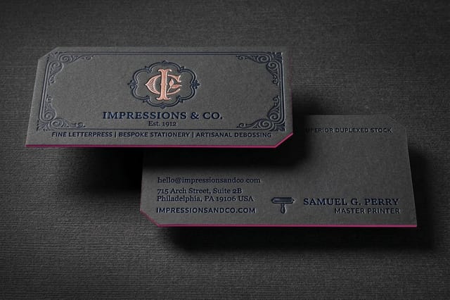
The finish is where the hand really shows. Flat ink on a smooth stock keeps a fine hairline intact and costs the least. Letterpress presses the script into a thick cotton sheet, so you feel the letters with a fingertip. Foil lays metal into the stroke, and raised foil sits proud of the surface. Each one is a different manufacturing process, and each one has a different tolerance for thin lines, which is the practical constraint on how delicate your script can be.
Budget follows the same order. Wedding invitations start at $19.77, raised foil business cards at $86.78, foil business cards at $222.13, and letterpress and embossed cards at $251.36. If you are pricing a whole wedding suite rather than one piece, our breakdown of invitation costs works through the quantities.
Quantity and price
Invitation pricing and specs
Live configurator numbers for wedding invitations, where the per unit cost drops as the guest list grows.
| Quantity | Price Per Unit | Total |
|---|---|---|
| 25 | 79.1¢ | $19.77 |
| 50 | 50.5¢ | $25.27 |
| 100 | 42.8¢ | $42.84 |
| 200 | 25.8¢ | $51.62 |
| 300 | 20.1¢ | $60.42 |
| 400 | 17.3¢ | $69.20 |

You can also earn coins on every order and put them against the next piece in the suite, which helps when the invitation, the menu and the place cards are three separate runs.
Choosing the finish for a written hand
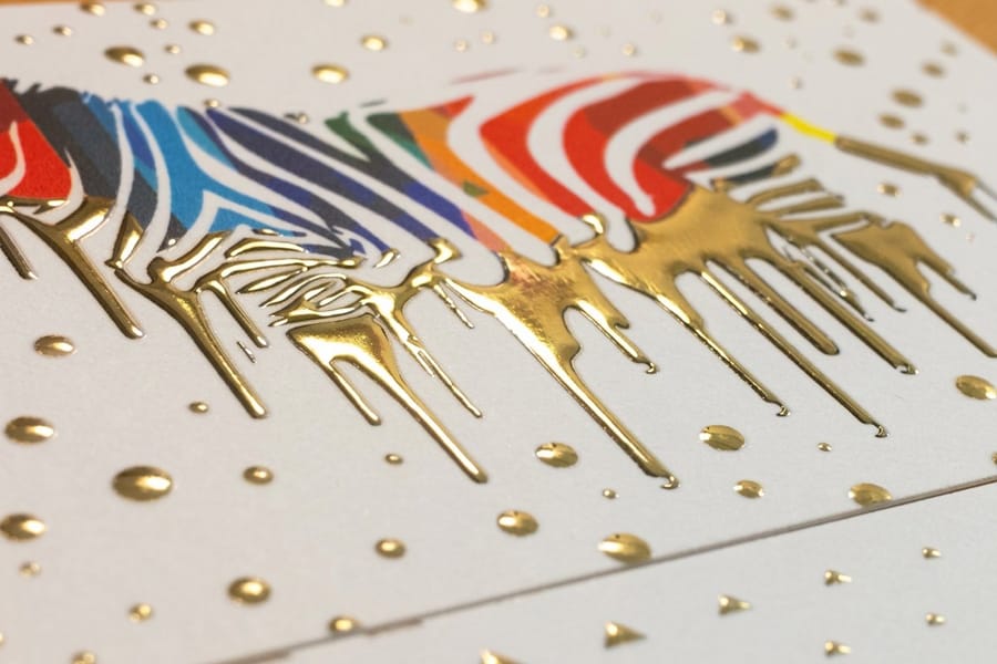
The three pressed and metallic finishes do different things to a script, and the differences are physical rather than decorative. Letterpress pushes a plate into a soft, thick sheet, so a heavy downstroke gets a visible bite and a hairline may barely register. Embossing raises the shape from behind with no ink at all, which reads beautifully on a monogram and disappears on small text.
Foil stamping lays metal leaf into the stroke under heat, giving a hard mirror finish that a metallic ink never matches. Raised foil adds height to it, and the choice between the two turns on whether you want the shine flat or standing proud. Embossed printing covers the die side of the same question.
The limit to keep in mind: every one of these has a minimum stroke weight, and it is heavier than offset. A copperplate hairline that prints perfectly in flat ink can break up under a foil die. Thicken the thin strokes slightly for a pressed finish, or pick a script with less extreme contrast in the first place. The letterpress collection shows which products carry the process, and the Extreme Custom Printing Collection holds the formats beyond paper, such as metal and wood, where a script needs even heavier strokes.
Where calligraphy still earns its keep
The commercial uses cluster in a few places, and the pattern across all of them is the same: the hand does the name, and a typeface does the text.
- Wedding and event stationery. Still the largest commercial use. A script headline on the invitation, the same hand on the place cards and the menu, printed rather than written once the guest count passes a few dozen.
- Restaurants and bars. Chalk-style brush lettering on menus and boards, where the hand suggests something made on the premises that morning.
- Spirits, wine and craft food labels. A drawn wordmark signals small batch in a way a typeface cannot, because a typeface is by definition available to everyone else on the shelf.
- Luxury retail and beauty. A single calligraphic monogram, foiled or embossed, doing all the brand work on an otherwise plain package.
- Certificates and awards. Names filled in by hand on a printed body is the last surviving job where the writing is genuinely done live.
- Tattoo and lettering artists. A working knowledge of historical hands is the trade itself, and print work is how the portfolio gets in front of clients.
For a working example on a small format, calligraphy business card designs show how much script a card can carry before it stops being readable at arm’s length.
Blanks for placing scanned lettering
If you are placing scanned lettering rather than starting from nothing, a blank sized to the exact product saves the guesswork on bleed and trim. 4OVER4.COM sizes its blanks to real product specs, so a flourish that runs to the edge either clears the cut line or shows you that it does not.
Start fast
Invitation templates and print-ready blanks
Invitation design templates and exact size blanks, with bleed and trim already marked.

Print it
Letterpress, for script you can feel
Thick cotton stock with the lettering pressed into the sheet rather than sitting on it.
Keep the artwork vector wherever you can. Scanned lettering left as a bitmap has to be big enough for the final size at 600 dpi, and a script that looks clean at card size will show every scanning artefact when the same file is used on an A5 menu. Vector outlines carry from a business card to a banner without any of that.
Wally reads a script by its tool
Angle or pressure, and what each one does on press
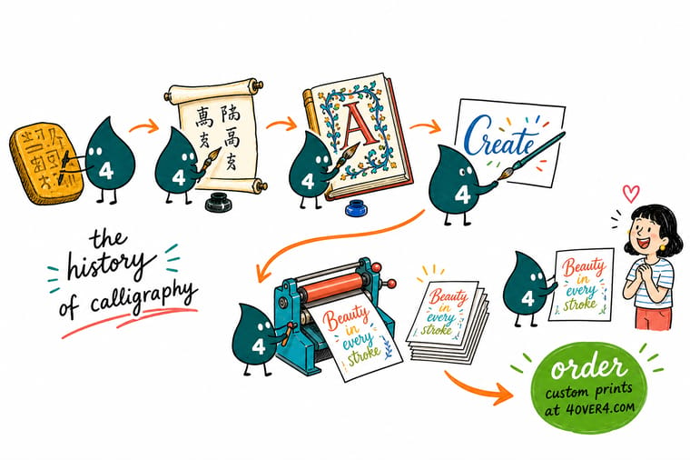
A broad edge gives thick and thin from the angle you hold it, so blackletter stays even. A pointed nib splays under pressure, so copperplate swells only on downstrokes. Before printing either, keep hairlines at 0.25pt or heavier, thicken them for foil and letterpress where the line is pressed, convert lettering to outlines, and proof one on the real stock.
Order wedding invitations →What a written hand needs from a press
Getting a written hand onto a printed sheet
- Give the flourishes room to breathe. Ascenders and swashes need clear space around them or they collide with the line above. Set the line spacing for the tallest flourish on the page, not for the average line.
- Check the thinnest hairline against the press. A copperplate hairline can drop below the minimum stroke a press will hold. Keep fine strokes at 0.25pt or heavier for offset, and thicker still for foil or letterpress, where the line is pressed rather than laid on.
- Convert lettering to outlines before sending. Hand lettering that stays as live text depends on a font the printer may not have. Outlines remove the risk entirely and cost nothing.
- Foil and emboss the name, not the paragraph. A pressed or foiled effect reads as expensive on one short line and as noise on a block of text. Pick the name and leave everything else flat.
- Scan artwork larger than you need it. Scan the original at 600 dpi or better and reduce it. Reducing hides a wobbly edge; enlarging shows every one of them.
- Print one before you print five hundred. Script on screen and script on an uncoated stock are different things, because absorbent paper spreads a fine line. A single proof settles it.
Explore more
Print the modern end of the story
Letterpress and embossed cards both run 250 for $251.36 and take 15 business days.
Product Wedding Invitations The largest modern home for calligraphic script. Product Letterpress Business Cards Script pressed into thick cotton stock you can feel. 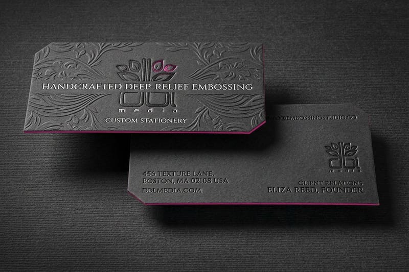 Product Embossed Business Cards A raised monogram with no ink at all.
 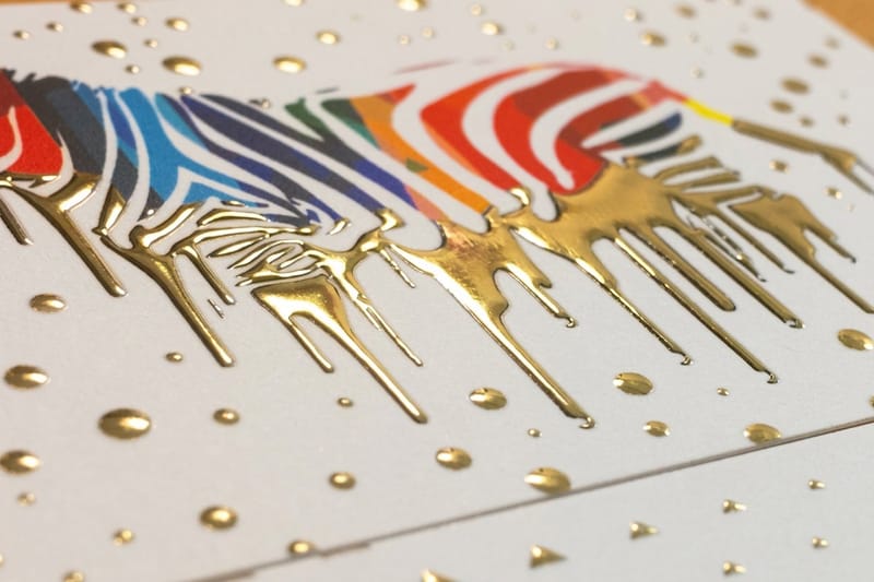 Product Raised Foil Business Cards Metallic script that sits proud of the sheet.
  Category Invitations Printing Every invitation size, stock and finish in one place.
  Guide Calligraphy for Print What changes when a written hand has to survive a press.
 Ready to print your lettering?
Send your outlined artwork or start from a free template, and 4OVER4.COM prints it flat, foiled, embossed or pressed into the sheet.
Common questions about calligraphy
What is the definition of calligraphy?
Calligraphy is handwriting produced so that the writing itself is the artwork rather than only a record of words. The letters are written live, in single strokes, with a tool whose shape creates thick and thin parts: a broad edge held at a fixed angle, a pointed nib that splays under pressure, or a brush that swells with force. The distinction that matters in practice is against lettering and type. Lettering is drawn and redrawn until the shapes are right, and type is a set of characters made once and reused, while calligraphy is written once and lives with the result.
Where did calligraphy originate?
It originated in more than one place, because the materials suggested it independently. In China, brush writing is traced to the oracle bone script of the Shang dynasty and became an art ranked alongside painting and poetry. In Egypt, the reed pen on papyrus produced the running hieratic and demotic hands, and the reed later carried Arabic calligraphy into one of the most developed written arts anywhere. In Europe, the broad-edge quill on parchment produced the Roman and medieval hands that eventually gave us our lowercase letters. Cuneiform pressed into clay came earlier but is closer to carving than to pen work.
What are the main types of calligraphy?
By tradition the three largest families are East Asian brush calligraphy, Arabic calligraphy, and Western calligraphy. Within Western work the useful split is by tool rather than by name. Broad-edge hands include the Roman rustic and uncial styles, Carolingian minuscule, blackletter, italic and modern foundational hands, and they all get their thick and thin from the pen angle. Pointed-nib hands include copperplate and Spencerian, which get their weight from pressure on the downstroke. Modern brush lettering sits outside both, since a brush pen or a drawn vector curve can imitate either.
Is calligraphy still used commercially?
Yes, though most of it now reaches people as print rather than as an original. Wedding and event stationery is the largest use, followed by spirits and craft food labels, restaurant menus and boards, luxury packaging monograms, and certificates where names are still filled in by hand. Artists also earn from teaching and from workshops, and our article on making money with calligraphy covers those routes. The commercial pattern is consistent: the hand does the name, and a typeface does the text.
How do I get hand calligraphy to print properly?
Scan the original at 600 dpi or higher, clean it up, and convert it to vector outlines so nothing depends on a font the printer may not have. Watch the thinnest hairline, because a copperplate upstroke can fall below what a press will reliably hold: keep fine strokes at 0.25pt or heavier for offset, and heavier again for foil or letterpress where the line is physically pressed. Then print one proof on the actual stock, since an uncoated sheet spreads a fine line in a way a screen never shows you. Our invitation printer checklist lists the rest of the questions worth asking before a run.
Why does copperplate look different from blackletter?
Because the two were made with mechanically opposite tools. Blackletter comes from a broad-edge quill of fixed width, where a stroke is thick when it crosses the edge and thin when it runs along it, so holding one angle across a page produces that even, dense texture. Copperplate comes from a pointed flexible nib that is thin at rest and splays only when pressed, so weight appears on downstrokes and hairlines appear everywhere else. Copperplate is also imitating engraved copper plates rather than any earlier pen hand, which is where the name comes from and why it demands smooth paper and a slow, deliberate stroke.
