
Calligraphy Business Card Design Ideas That Actually Print Well


Emma is our prepress and print production voice, built from the knowledge of our production team, with over 20 years in printing.
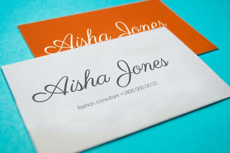
Calligraphy business card design comes down to three choices: a lettering style that holds up at 2 by 3.5 inches, a finish that can carry its thinnest stroke, and file prep that keeps a hairline from disappearing between your screen and the press.
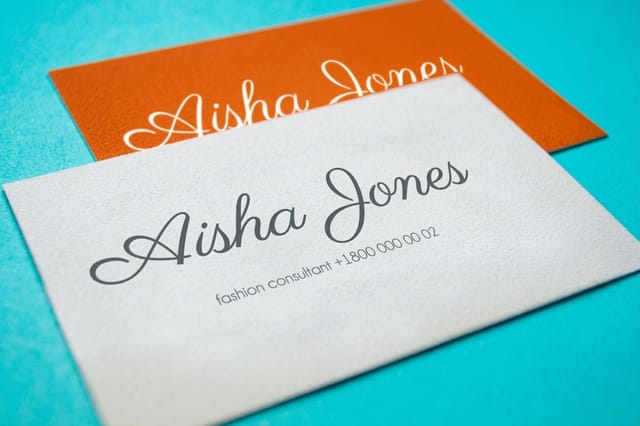
A calligraphy business card works when one line is lettered and the rest is not, and when the thinnest stroke in that lettering is thick enough for the finish you chose. Suede and matte hold hairlines down to about 0.25pt, flat spot UV needs roughly 0.5pt, foil stamping around 0.75pt, and raised foil about 1.5pt. Send the artwork as outlined vector, or as a 600 dpi grayscale scan, with the contact details set in a plain sans at 7 to 8pt. If you searched for a business card design firm, you may need only a letterer: a calligrapher draws the one script line, and you set the rest of the card from one of our business card design templates.
Quick answer
The finish sets the minimum stroke, not the font
Pick the lettering first, then measure its thinnest stroke at 3.5 by 2 inches, then choose a finish that can carry it. Suede and matte laminate hold a hairline down to roughly a quarter point, which is why they suit Copperplate and Spencerian hands. Flat spot UV wants about half a point, foil stamping about three quarters, and raised foil or raised spot UV closer to 1.5pt because the raised layer needs ink area to build on. When the lettering is too fine for the finish you want, thicken the strokes, switch to a monoline script, or apply the finish only to the name and leave the flourishes in flat ink.
Why a Script Card Lands Differently

A business card is handed over, looked at for about two seconds, then pocketed. Calligraphy buys you part of that second, because a drawn letterform reads as made by a person rather than set from a menu.
That works for a specific set of trades. Lettering artists, wedding and event planners, florists, bakers, tattoo artists, boutique salons, jewellers and private chefs all sell taste, and the card is the first proof of it. It works badly for anyone whose customer needs to act on the card fast, which is why a plumber, a clinic or a law firm gets more out of a clean sans and a legible number. Our business card basics guide covers the general hierarchy this sits on top of.
The trap is treating the card like a page of a wedding invitation. An invitation is read seated, in good light, at arm's length. A card is read standing, in a bar, at whatever angle it happens to be held. The lettering has to survive that, and everything below is about making sure it does.
Lettering Styles That Print Well, and the Ones That Fight the Press
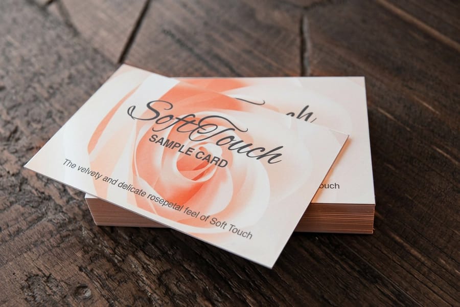
Every calligraphic hand has a thick-to-thin ratio, and that ratio is the practical spec, not the name of the style. Wide ratios look dramatic on paper and lose their upstrokes on press.
| Style | Thick to thin | How it behaves on a card | Best pairing |
|---|---|---|---|
| Copperplate or Spencerian | Extreme, the hairline is close to a pen point | The most elegant option and the most fragile. Hairlines vanish first under gloss and break under foil. | Matte or suede, flat ink, name only |
| Modern brush script | Strong, but the thin strokes stay drawn rather than scratched | The most forgiving of the true calligraphic hands. Survives most finishes if you check the thinnest connector. | Suede or soft touch, optional foil on downstrokes |
| Monoline script | None, one even weight throughout | Prints anywhere and foils cleanly, because there is no hairline to lose. Reads friendlier and less formal. | Any finish, including raised, at 1.5pt or heavier |
| Blackletter | Moderate, with sharp joints and tight counters | Dense. The small enclosed shapes fill in if the ink spreads, so it wants a coated or laminated surface. | Matte laminate, larger size, generous spacing |
| Faux calligraphy | You control it, since the weight is added by hand | The safest route for a first card, because you can thicken every thin stroke to whatever the finish needs. | Anything, including foil and raised finishes |
Read the second column as a warning system. If the style has an extreme ratio, you either accept flat ink on a matte surface, or you redraw the thin strokes heavier before you send the file. Monoline and faux calligraphy exist precisely because designers got tired of losing hairlines, and they are the styles that let you use the loud finishes without compromise.
One more habit worth keeping: set the lettering at final card size on screen, then print it on a home printer and hold it at arm's length. Everything that disappears at that distance will disappear on the finished card too.
Pairing the Lettering With Matte, Suede, Foil or Spot UV
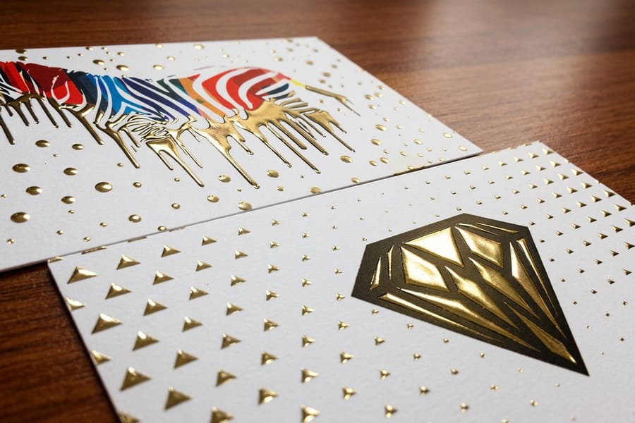
Finish is where most calligraphy cards go wrong, because the finish that photographs best is rarely the one that reads best. Each option below has a minimum stroke weight it can carry, and the diagram above this section plots them side by side.
| Finish | Thinnest stroke it holds | What it does for script | Starting price |
|---|---|---|---|
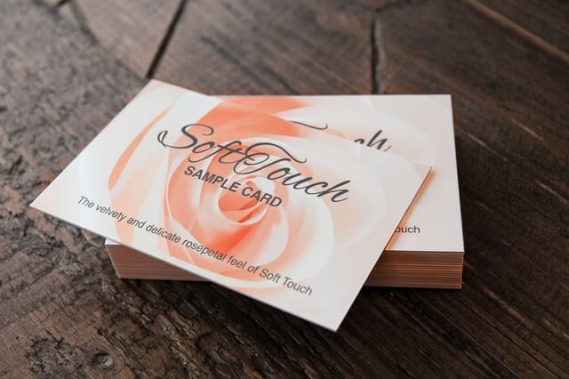
| Suede | Around 0.25pt | A soft velvet surface with no glare at all. The best match for fine ink work, and it feels like the paper a calligrapher would choose. | $87.15 |
| Soft touch | Around 0.25pt | Matte laminate with a slight cushion. Holds hairlines, resists fingerprints better than plain matte, and costs less than suede. | $40.28 |
| Standard gloss or matte | Around 0.25pt matte, 0.4pt gloss | The budget route. Matte is fine for script. Gloss puts a highlight straight across the hairlines and is the weakest pairing here. | $17.57 |
| Flat spot UV | Around 0.5pt | Gloss varnish on a matte card. Beautiful on a monogram or a single swash, muddy when applied across a whole block of lettering. | $76.88 |
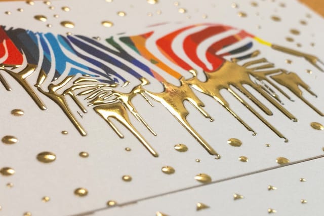
| Raised foil | Around 1.5pt | Metal plus height. Reserve it for the name, an initial or a monoline mark. It will flood a Copperplate hairline shut. | $86.78 |
The pattern is simple once you see it. The more the finish adds to the surface, the more stroke it needs underneath. That is why the strongest calligraphy cards usually mix two treatments: a heavy raised or foiled element carrying the name or monogram, and the delicate flourishes printed flat in ink beside it. The contrast is the design.
If you are choosing between coatings in general rather than for script specifically, our comparison of matte, glossy and soft touch finishes goes deeper on how each one wears in a wallet, and foil stamping versus raised foil explains why the two metallic options behave so differently.
Keeping the Card Readable, Not Just Beautiful

The failure mode of a calligraphy card is not ugliness. It is a card that gets admired and then set aside because the recipient cannot pull a phone number off it.
Give the script one job. The name or the business name is set in lettering, and every other line goes in a plain sans at 7 to 8pt with slightly open letter spacing. Nothing below 6pt should be on the card at all, script or not, because it stops being reliably readable once the ink spreads a little into the sheet. Keep at least 0.125 inches of clear space between the flourishes and the trim, since a swash that runs to the edge can be clipped by normal cutting tolerance.
- Set the name larger than you think. Script has a smaller apparent x-height than a sans at the same point size, so 18pt of calligraphy reads like 12pt of Helvetica.
- Kill the swash collisions. A descender that crosses the line below is charming in an invitation and a smudge on a card.
- Watch the contrast. Light gray script on cream looks refined on screen and disappears in a dim restaurant. Keep the lettering at full strength and let the stock supply the softness.
- Leave one quiet zone. An area with nothing in it makes the lettering look intentional rather than crowded.
If your card also has to carry a QR code, a second business or a social handle, plan the space first. Our guides on cards carrying multiple businesses or logos and cards with social media icons both deal with fitting extra elements without crowding the main line.
Turning Several Artworks Into a Mini Portfolio
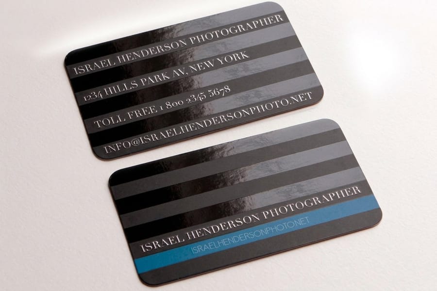
Lettering artists have an advantage most businesses do not: the card can be the work sample. Instead of one design printed a thousand times, print four or five designs in smaller runs and hand out whichever one suits the person in front of you.
Three rules keep a set like that from looking like a mess. Use the same stock and the same finish across every design, so the collection feels deliberate. Keep the back identical on all of them, with the name, the contact details and the handle, so whichever card someone receives they can reach you the same way. And vary only one thing per card: the hand, the ink color, or the composition, not all three.
Practically, each design is its own print-ready file at the same trim size, ordered as its own quantity. If you want to work from a correctly sized starting layout, the blank template library has business card templates with the bleed and safe area already marked, and our online design templates let you drop lettering artwork into a laid-out card without opening Illustrator.
One warning from experience: resist printing a design you are unsure about just because the per-card price drops at higher quantities. A card you dislike after two weeks costs more than the saving, and the smaller run gives you an excuse to keep iterating.
Setting Up Calligraphy Artwork So Nothing Drops Out
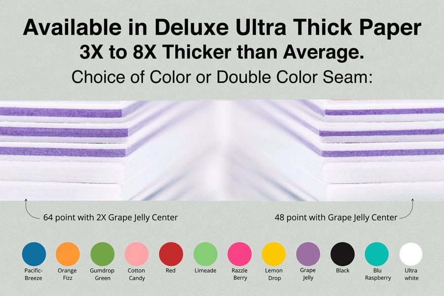
Hand lettering reaches the press in one of two states: drawn on paper and scanned, or built in vector. Each needs a different preparation, and both end the same way.
Scanned artwork. Scan at 600 dpi in grayscale, not 300, and scan the original at a size larger than the card if you drew it large. Hairlines are only a few pixels across, so the extra resolution is what keeps them smooth once you raise contrast. Clean the paper texture out in grayscale before converting anything, then either place the cleaned image at 100 percent or, if the design will be foiled or raised, trace it to vector so the edges stay sharp at any size.
Vector artwork. Draw or trace it, then convert every piece of live type to outlines so no font can substitute. Swash alternates and ligatures are the first things to break when a file opens somewhere else, and they are the whole point of a script face. The step-by-step is in how to convert text to shapes in Illustrator, and business card outline and file setup covers the trim, bleed and safe area around it.
Then the checks that apply to both:
- Measure the thinnest stroke at final size. Zoom to 100 percent and check it against the finish you chose. Below the threshold, thicken it or move the finish.
- Convert color to CMYK unless you are ordering a spot or foil color, and expect a deep black to need a rich black build rather than 100 percent K on a large solid.
- Add 0.125 inches of bleed on all four sides, with nothing important within 0.125 inches of the trim.
- Flatten transparency or export a PDF/X file. Drop shadows behind lettering are a common source of a gray box appearing on the printed card.
- Export at 300 dpi minimum for any raster element that remains, and 600 dpi for a placed line-art scan.
If the resolution side is unfamiliar, the resolution guide explains why line art and photographs have different requirements, and why 600 dpi is the number for lettering.
Wally explains calligraphy cards
The hairline is the part that breaks
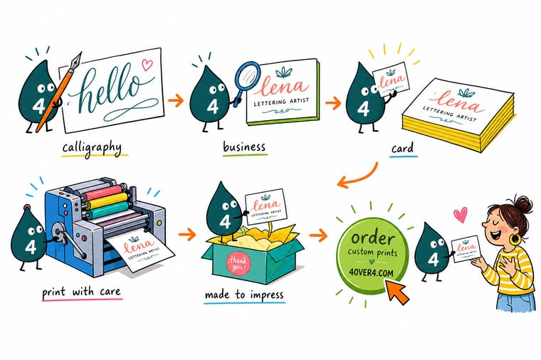
Wally draws the name with a nib, thick on the way down and hair-thin on the way up. Then he puts a magnifier on the thin stroke, because that is the one the finish decides on. On suede it prints. Under raised foil it fills in and turns into a blob. So he raises the capital, keeps the flourish flat, and sets the phone number in a plain sans that anyone can read across a table.
Order suede business cards →
Specs and pricing
Card stocks that suit hand lettering, with live options
Suede cards print on 16pt suede laminated stock in four sizes, 250 for $87.15 in 4 business days, and hold the finest hairline. Raised foil cards print on 16pt velvet laminated cover at 2 by 3.5 inches, 100 for $86.78 in 7 business days, and need the heaviest stroke. Standard cards start at 100 for $17.57 in 3 business days, for a script that is drawn bold.

Print it
Order your calligraphy business cards
Choose suede for a Copperplate or Spencerian hairline, soft touch from 50 for $40.28 on 32pt to 80pt uncoated board for a brush script, and raised foil for a bold monoline name you want people to feel. Send the script as outlined vector or a 600 dpi scan.

Explore more
Where to go next
Compare matte, gloss and soft touch coatings, outline your lettering in Illustrator so no font substitutes, pick a card weight for fine line work, and see how foil stamping and raised foil differ in minimum stroke.


By the numbers
The card printer behind a script design
Common Questions
Your calligraphy card questions, answered
What is the best finish for a calligraphy business card?
Suede or a matte laminate, in most cases. Both hold a fine ink line without the reflection that fights a script face, and suede adds a velvety surface that suits hand lettering. Suede Business Cards start at $87.15 and Soft Touch Business Cards at $40.28 at 4OVER4.COM. Gloss is the weakest match, because the specular highlight sits right on top of the hairlines and breaks them up under overhead light. If you want metal in the design, foil the heavy downstrokes and leave the connectors in flat ink.
Can you foil stamp thin calligraphy strokes?
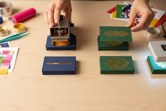
Only down to a point. A foil die carries foil across a line by pressure and heat, and below roughly 0.75pt at final size the foil starts skipping, so the stroke prints broken. Raised foil is stricter still, closer to 1.5pt, because the raised layer needs enough area to build on. The usual fix is to foil the monogram, the initial capital or the thickest downstrokes and print the rest of the lettering flat, which also gives the card contrast rather than one uniform shine.
Do I need to convert calligraphy fonts to outlines before printing?
Yes. A script font that is not outlined can substitute at the printer and turn your lettering into something generic, and swash alternates are the first thing to break. In Illustrator select the type and use Type then Create Outlines, then check that every swash and ligature survived. Our guide on how to convert text to shapes in Illustrator walks through it, and the same applies to hand-drawn work traced into vector.
What resolution should I scan hand lettering at?
Scan at 600 dpi grayscale rather than 300, then work down. Hairlines are only a few pixels wide, so at 300 dpi the thin upstrokes go ragged as soon as you increase contrast or convert to bitmap. Scan the original larger than card size if you can, clean the background in grayscale, then place it at 100 percent. If the artwork will be foiled or raised, trace it to vector instead of placing the raster scan.
How many lines of calligraphy should a business card have?
One, or two at most. The name, or the business name, is the line that earns the script. Contact details set in a plain sans at 7 to 8pt with normal letter spacing stay readable when someone copies the number into a phone. A card with the name, role, phone, email and address all in flowing script looks like art and works like a puzzle.
Can I print several different calligraphy designs in one order?
Yes, that is how most lettering artists and studios order. Print a smaller quantity of each design rather than one large run, so the box becomes a sample set you can hand out selectively. Every design still needs its own print-ready file at the same trim size, and keeping the stock and finish identical across the set makes the collection read as one body of work rather than several unrelated cards.
Get Started
250 suede business cards cost $87.15, or 35 cents each
Pick a suede or soft touch stock that holds a fine ink line, upload outlined artwork or a 600 dpi scan, and we print cards your handwriting survives.
Legal Disclaimer
Gold Standard guarantees apply to all standard orders placed through 4over4.com. Price match requires verifiable proof of a competitor's published price for an equivalent product with matching specifications and turnaround time. Satisfaction guarantee covers manufacturing defects and print quality issues. Contact support with order number and documentation.
