
How to Learn Calligraphy Step by Step as a Beginner


Calligraphy is the art of beautiful, deliberate lettering, and it is far more learnable than it looks. Start with the right tools, drill the basic strokes, and build to full words, then turn your lettering into professionally printed cards and invitations.
To learn calligraphy, start with a few basic tools, master the fundamental strokes before letters, and practice with drills. Pick a beginner-friendly pen or brush, learn the seven basic strokes that build every letter, drill them daily, then move to lowercase letters, words, and phrases. Once your lettering is consistent, scan it and print it on cards, invitations, and stationery at 4OVER4.COM.
Start here
Fifteen minutes a day, starting with strokes
To learn calligraphy, gather a few beginner tools, drill the basic strokes before attempting letters, then build from letters to words to phrases with daily practice. Press for thick downstrokes and lift for thin upstrokes, keep your sessions short and regular, and study one style at a time. When your lettering is consistent, scan it and print it on cards and invitations. The stroke chart below shows the fundamentals.
What you need to start calligraphy
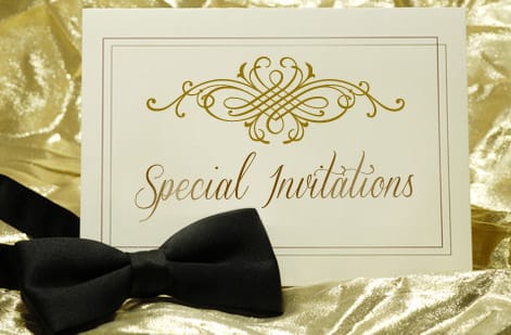
Calligraphy has a reputation for demanding expensive supplies, but a beginner needs almost nothing to start. One forgiving pen, a little ink, and smooth paper will carry you through the first months. The gear matters far less than the habit of showing up to practice.
The friendliest first tool is a brush pen, because it holds its own ink and responds directly to how hard you press. A pointed-nib dip pen gives the classic thick-thin contrast that defines traditional scripts, and it is worth graduating to once the basic strokes feel natural. Either way, use smooth, bleed-resistant paper so the ink stays crisp instead of feathering into fuzzy edges.
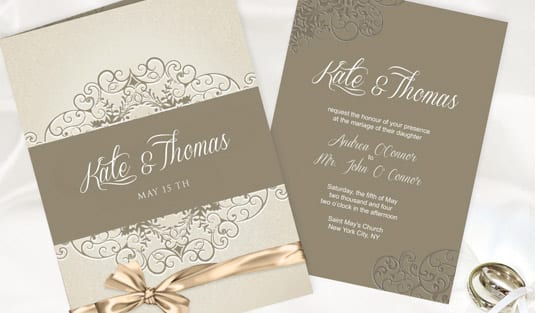
Keep your setup simple and repeatable so nothing stands between you and a quick session. That same clean, high-contrast lettering is exactly what reproduces well later when you scan it and print it on wedding invitations or greeting cards.
Basic strokes and the alphabet
The single most important lesson for a beginner is that letters come second. Every calligraphy letter is assembled from a handful of basic strokes, so those strokes are what you drill first. Master the underturn, overturn, oval, ascending and descending loops, and the compound curve, and you have the raw material for the whole alphabet.
Underneath all of it is one rule: press for a thick downstroke, ease off for a thin upstroke. That contrast is the difference between calligraphy and ordinary handwriting. Move slowly, lift the pen between strokes, and keep a consistent pen angle so the thick and thin lines stay uniform across every letter.
Once the strokes feel reliable, combine them into lowercase letters one at a time. You will start to see the same oval or overturn reappear across many letters, which is exactly why drilling strokes first pays off. The chart above breaks down the core strokes so you can practice them in order.
Practice drills and routines
Skill in calligraphy is built through repetition, so how you practice matters more than how long. Short daily sessions of around fifteen minutes build muscle memory faster than a rare marathon. Always warm up with a few lines of basic strokes before you letter words, the way a musician runs scales.
Structure each session: a few minutes of stroke drills, a few of letters you find tricky, then a short word or phrase to apply it. Use guideline paper so your slant and letter height stay consistent, and resist the urge to rush. Calligraphy is drawn, not written, and neatness comes from control rather than speed.
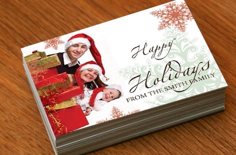
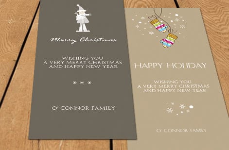
Keep your practice sheets so you can watch your progress over weeks. When a phrase finally looks even and confident, that is the piece worth scanning and printing on a greeting card or a set of invitations so your practice turns into something real.
Common beginner mistakes to avoid

Most early frustration comes from a few predictable mistakes. The biggest is trying to write fast, treating calligraphy like cursive handwriting. Slowing down and lifting between strokes fixes more problems than any tool upgrade. Another is inconsistent pen angle, which makes the thick and thin strokes wander from letter to letter.
Beginners also tend to skip stroke drills and jump straight to full words, which is why their letters look uneven. Pressing too hard on upstrokes is common too, and it flattens the delicate thin lines that give lettering its elegance. Textured or absorbent paper causes feathering that has nothing to do with your skill, so switch to smooth paper before blaming your hand.
None of these are talent problems, they are habit problems, and every one of them dissolves with focused practice. Treat each mistake as feedback, adjust one thing at a time, and your consistency climbs quickly.
Calligraphy styles to explore
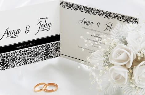
Once you have a foundation, the fun begins: choosing a style to develop. Modern calligraphy is the most beginner-friendly, forgiving about perfect uniformity and built directly on the basic strokes. It is a natural first destination once your drills feel comfortable.
From there the field opens up. Traditional scripts like Copperplate and Spencerian reward precision and give formal, elegant results ideal for weddings. Brush lettering trades the pointed nib for a broader, expressive stroke that suits bold, casual designs. Faux calligraphy, drawn with any pen by manually thickening downstrokes, is a great bridge if you are not ready for a dip pen.
Explore one style at a time rather than sampling several at once, since depth beats breadth early on. Each style you learn expands the range of looks you can bring to a printed invitation suite or a line of custom stationery.
Turning your calligraphy into printed cards and invitations
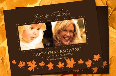
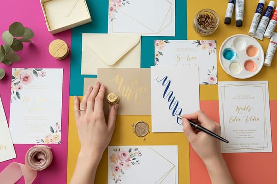
The most satisfying step is seeing your lettering leave the practice pad and land on a real printed piece. Many people who take up calligraphy discover the hobby quickly becomes useful: friends want addressed envelopes, couples want hand-lettered invitations, and small businesses want a personal touch on their stationery.
To make the leap, letter your final piece cleanly, scan it at 300 DPI so it stays sharp at print size, and clean up the background in an editor. Convert the file to CMYK, drop it into the product template with proper bleed and safe margin, and export a press-ready PDF. From there it prints like any professional design.
Print your work on wedding invitations, greeting cards, or a full stationery set, and order a small proof run first to check how your ink work reproduces. Browse the full range in our invitation printing collection to match your lettering to the right stock and finish.
Wally turns your practice into printed pieces
Strokes first, then letters, then a real card
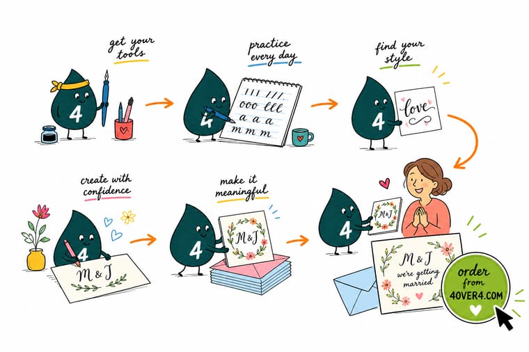
Wally learns the way you should: drill the basic strokes, press thick on the way down and light on the way up, then build letters into words. When a phrase finally looks clean, he scans it sharp and drops it into an invitation template. Your fifteen minutes a day become a card someone keeps, printed on real stock at 4OVER4.
Print your hand lettering →Quick reference
At a glance
Pen, ink, paper, slant and daily drill. Those five carry a beginner further than talent.
| Element | Get it to | Why it matters |
|---|---|---|
| Starter tool | Brush pen or dip pen | A brush pen is the most forgiving start; a dip pen with a pointed nib gives classic thick-thin contrast once you progress. |
| Paper | Smooth, bleed-resistant | Smooth marker or laser paper keeps ink from feathering so your strokes stay crisp while you learn. |
| First skill | The seven basic strokes | Underturn, overturn, oval, and the rest combine into every lowercase letter, so they come before the alphabet. |
| Pressure | Heavy down, light up | Thick downstrokes and thin upstrokes create the contrast that defines calligraphic lettering. |
| Practice | 15 minutes daily | Short, frequent sessions build muscle memory faster than occasional long ones. |
| Finished art | Scan at 300 DPI | Scanning your lettering at full resolution keeps it sharp when you print it on cards or invitations. |
Step by step
Step by step
- Gather a beginner tool kit Start with a brush pen or a pointed-nib dip pen, a bottle of ink, and smooth bleed-resistant paper. Avoid textured paper early, since it snags the nib and frays your strokes.
- Warm up and learn to hold the pen Hold the pen at a consistent angle, keep your grip relaxed, and warm up with loops and lines. A steady angle is what keeps thick and thin strokes uniform.
- Drill the basic strokes Practice the underturn, overturn, oval, ascending and descending loops, and compound curve. These few strokes are the building blocks of every letter.
- Build the lowercase alphabet Combine the strokes into lowercase letters, one at a time. Notice how the same overturn or oval reappears across many letters.
- Connect letters into words Join letters into short words, focusing on even spacing and a consistent slant. Keep the thick-down, thin-up rhythm through every connection.
- Scan and print your best work When a phrase looks consistent, scan it at 300 DPI, clean it up, and print it on invitations, greeting cards, or stationery so your lettering reaches a real audience.
Specs and pricing
"Wedding invitation specs and live pricing"
"Once your calligraphy is scanned and print-ready, size, stock and finish are what is left. Flat wedding invitations run 25 for $19.77, which is $0.79 each."
| Quantity | Price Per Unit | Total |
|---|---|---|
| 25 | 79.1¢ | $19.77 |
| 50 | 50.5¢ | $25.27 |
| 100 | 42.8¢ | $42.84 |
| 200 | 25.8¢ | $51.62 |
| 300 | 20.1¢ | $60.42 |
| 400 | 17.3¢ | $69.20 |
| 500 | 15.6¢ | $77.99 |
| 600 | 15.4¢ | $92.26 |
Print it
Turn your calligraphy into printed cards and invitations
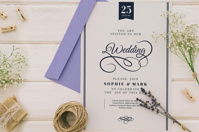
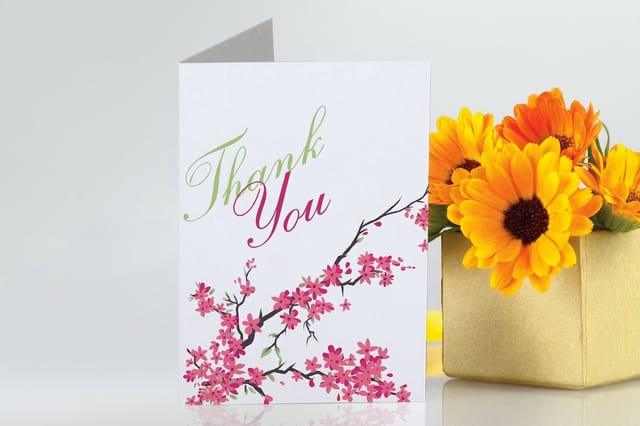
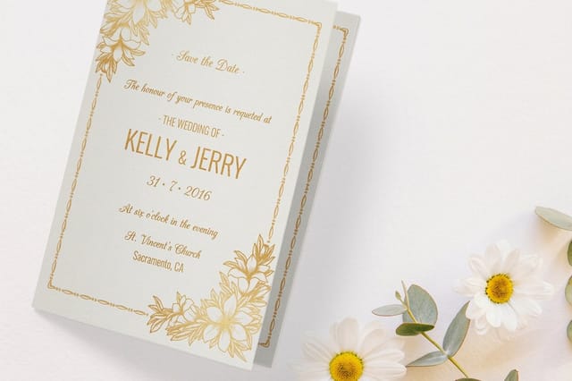
See it in use
Invitations customers lettered and printed
Explore more
Where to go next
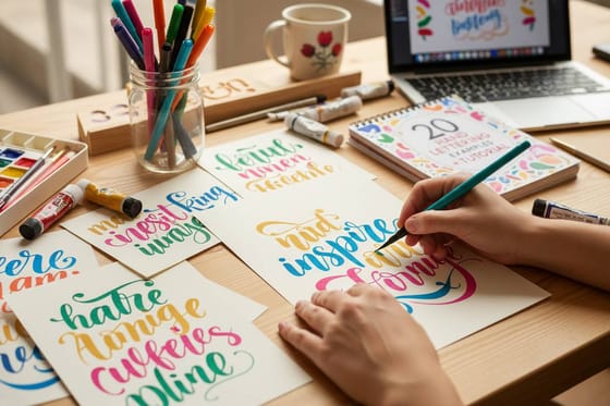

By the numbers
Invitation stocks worth lettering on
Common Questions
Common questions
How long does it take to learn calligraphy?
With short daily practice, most beginners can form consistent lowercase letters within a few weeks and comfortable words and phrases within a couple of months. The pace depends far more on regularity than on talent. Fifteen focused minutes a day, always starting with stroke drills, builds skill faster than an occasional long session. Calligraphy is a muscle-memory skill, so steady repetition is what turns shaky shapes into confident lettering.
What tools do I need to start calligraphy?
A beginner needs surprisingly little: one forgiving pen, some ink, and smooth paper. A brush pen is the easiest entry because it needs no separate ink and responds directly to pressure. A pointed-nib dip pen gives the classic thick-thin contrast once you are ready. Pair either with smooth, bleed-resistant paper so the ink stays crisp instead of feathering. You can add nibs, inks, and guideline pads later, but you do not need them to begin.
What is the difference between calligraphy and hand lettering?
Calligraphy is writing letters in a single, flowing pass, where each stroke is drawn once with a pen or brush and the thick-thin contrast comes from pressure. Hand lettering is closer to drawing letters, building each shape with multiple strokes, fills, and touch-ups so it functions more like illustration. Learning calligraphy first is useful because its stroke discipline and letterforms carry directly into hand lettering and into designing typography for print.
Which calligraphy style should a beginner learn first?
Modern calligraphy is the friendliest starting point because it is forgiving about perfect uniformity and builds directly on the basic strokes. It teaches the core rhythm of thick downstrokes and thin upstrokes without the strict rules of traditional scripts like Copperplate or Spencerian. Once that rhythm feels natural, you can branch into a more formal script or into brush lettering. Learning one style well first is always better than sampling several at once.
How do I turn my calligraphy into printed cards and invitations?
Letter your final piece cleanly, then scan it at 300 DPI so the artwork stays sharp at print size. Clean up the background in an editor, convert the file to CMYK, and place it inside the product template with proper bleed and safe margin. Upload the press-ready PDF and print it on invitations, greeting cards, or stationery. This is how hobby lettering becomes a real product, and it is why many people learning calligraphy end up ordering printed stationery for events.
What does it cost to print calligraphy on cards, and how are prices set?
The lettering costs only your practice time. Printing price scales with quantity, size, paper stock, and finish: more pieces lower the unit price, and heavier or specialty stocks raise it. You set each option in the configurator and the total updates live, so you can see exactly what a premium stock or a larger run does before you commit. Ordering a small proof run first is a low-cost way to check how your ink work reproduces on paper.
Get Started
Order 25 folded wedding invitations at $1.53 each
Scan your best calligraphy, drop it into the right template, and print it on invitations, greeting cards, or stationery at 4OVER4.COM. Adjust size, stock, and finish and watch your price update live.
Legal Disclaimer
Gold Standard guarantees apply to all standard orders placed through 4over4.com. Price match requires verifiable proof of a competitor's published price for an equivalent product with matching specifications and turnaround time. Satisfaction guarantee covers manufacturing defects and print quality issues. Contact support with order number and documentation. On-time delivery rate based on tracked orders 1999 to 2026. Individual results may vary based on shipping carrier performance.
