
The Cracker Barrel Logo Change and the Lesson for Brands


Marcus is our print marketing voice, built from the knowledge of our production team, with over 20 years in printing.
The Cracker Barrel logos come down to one change: in August 2025 Cracker Barrel kept its name and deleted the man leaning on the barrel, and the old mark was back in about a week. The lesson is not that logos should never change. It is that recognition lives in a few specific elements, usually a character, a silhouette and one color, and a redesign that removes those is asking every regular customer to learn the business again. For your own brand, test a changed mark on business cards from $17.57 and menus from $57.11 before it goes on a sign.
What changed, and what did not

The old logo carried two things: the words Cracker Barrel Old Country Store, and a figure in overalls leaning against a barrel. The 2025 version kept the words, tidied them into a gold block on brown, and deleted the man and the barrel.
The name survived. The picture did not, and the picture was the part people could draw from memory. That is the whole story of the backlash in one sentence, and it is the part a small business can actually use.
A logo is not one asset. It is a small set of signals a customer reads in about a second: a shape, a color, a character, a name. Strip out the signal that does the recognising and you have not modernised the mark, you have asked everyone to learn you again. Our 6 key principles of logo design covers which of those signals normally carries the weight.
The memory test, and what it costs to fail it
Recognition is built slowly and spent instantly. A regular who has driven past the same sign for twenty years is not reading the words on it, they are matching a shape at 55 miles an hour. When that shape changes, the sign stops working for a while, even when the new one is better drawn.
This is why the reversal came so fast. A week is not long enough to measure a design opinion, but it is long enough to see whether the people who were coming in still are. Before you change anything, write down what the mark is doing for you and how you would know it stopped. The questions to ask before a logo project are worth going through on paper first.
Simplifying a mark is a trade, not an upgrade
There are honest reasons to flatten an illustrated logo. A detailed drawing turns to mush as a 32 pixel app icon, costs more to digitise for embroidery, and needs a separate one color version for a foil stamp or a screen print. Those are real production problems and every brand with an illustration eventually meets them.
The trade is distinctiveness. A geometric wordmark reproduces everywhere and resembles every other geometric wordmark. The usual answer is to keep both: the full illustrated mark for menus, signage and packaging, a simplified badge for the small stuff. Two lockups from one identity is a normal deliverable, and it is much cheaper than losing the drawing entirely. Best practices for logo design goes through the file set you should have on hand.
Why a company touches a logo this well known
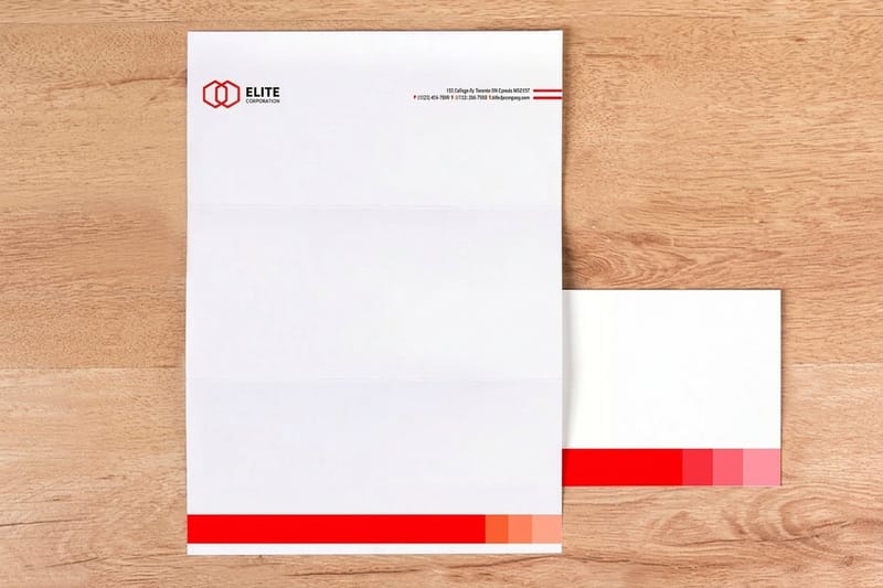
Some of the reasons are boring and correct. Old marks are often trapped in files nobody can edit, drawn for a printed sign and never redrawn for a phone screen, and paired with a typeface the company no longer has a license for. Cleaning that up is maintenance, and it is the work most small businesses need: one vector master that prints the same on a 3.5 x 2 inch card and on the sign over the door, a one color version, and written color values.
The other reason is the one that gets companies into trouble. When traffic is soft and a turnaround plan is running, changing what customers can see is the fastest way to look like something is happening. Interiors, uniforms and logos are visible in a way that supply chain work never is, so they get changed first and carry more weight than they should.
Mastercard is the counter example in the table below. It kept the two circles, which is the part anyone could draw, and only simplified the name underneath. Same instinct, different judgement about which piece was load bearing.
A refresh you can defend
A defensible refresh names the problem before it names a designer. Write it as a sentence: the mark does not hold at small sizes, or we cannot print it in one color, or the type is illegible on a lit sign at night. Then change only what fixes that sentence. Our brand refresh checklist walks the same order.
If the honest sentence is that sales are down, a logo will not fix it, and the redesign will be blamed for the next quarter whatever happens. Fix the sentence with brand messaging and a better offer, and let the mark keep doing its job.
Why the reaction was that loud
Cracker Barrel sells nostalgia with biscuits attached. The old man on the barrel was not decoration on a food brand, he was the product promise in picture form. Removing him edited the promise, and customers read it exactly that way.
It also did not arrive alone. The logo landed in the middle of a remodelling program that had already lightened the paint, cleared objects off the walls and stripped back the cluttered look people came for. One change is a design decision. Three at once reads as a company deciding its customers have the wrong taste.
Then there is who was talking. Plenty of design controversies are argued about by designers and nobody else. This one was argued about by people who eat there, which is the version that shows up in the numbers, and the reversal followed within about a week.
Telling noise apart from a signal
Two questions sort most of it. Are the complaints coming from people who buy from you, or from an audience that was never going to? And can they name the specific thing they lost, rather than saying it looks worse?
Vague dislike fades in a fortnight. Named loss does not: the mascot, the color, the shape on the cup. When people are grieving a specific element, that element was carrying your recognition, and the cheapest fix is to put it back. Food brand mascots shows how much of a food identity a character can hold.
It was never only the logo, the dining rooms changed too
The remodels ran ahead of the logo: lighter walls, fewer antiques hung in the dining room, a cleaner and more current look. In most restaurants that is an improvement. Here the clutter was the point, and taking it down removed the reason the room felt different from every other chain on the same exit.
Any business with a physical room has the same exposure. The identity is not the file in your logo folder. It is the sign over the door, the menu in the hand, the paper the receipt prints on and the sticker on the takeout bag. Change the mark and every one of those surfaces disagrees with the others until it is reprinted, which is a real cost and a real deadline.
Plan the surfaces before the mark is signed off. Count them, price them, and decide what gets reprinted in week one and what waits for the next reorder. A restaurant signage plan and a fresh menu layout usually make up most of the bill.
The surfaces most people forget to count
Menus and signage get counted. What gets missed is everything small and constant: business cards in the drawer, the letterhead on invoices, stickers on packaging, the banner that comes out for the county fair, name badges, vehicle lettering, the loyalty card in a wallet. None of them is expensive alone, and together they are usually the larger number.
The mismatch shows. A customer holding an old card in a room with a new sign reads it as a business that is halfway through something, which is the impression a rebrand is supposed to avoid.
Brands that pulled a rebrand back
Reversals are not rare, and the pattern repeats. In each case the new work removed the element customers used to identify the brand at a glance, and the two that survived kept theirs.
| Brand | Year | What changed | How long it lasted | Where it ended |
|---|---|---|---|---|
| Cracker Barrel | 2025 | Uncle Herschel and the barrel removed, the name kept | About one week | Old mark restored |
| Gap | 2010 | Blue box replaced by the name in Helvetica with a small gradient square | About one week | Old logo restored |
| Tropicana | 2009 | Orange with a straw replaced by a glass of juice on a plainer carton | About two months | Old packaging restored |
| Mastercard | 2016 | Two circles kept, the name simplified and moved below them | Kept | Still in use |
| Jaguar | 2024 | Wordmark, colors and typography all replaced at once | Kept | Still in use, still argued over |
Tropicana is the expensive lesson in the group. The packaging change removed the orange with the straw, sales fell hard enough that the company reversed it, and by then the cartons had already been produced. Gap and Cracker Barrel moved in about a week, before most of the printing was committed. Jaguar took the criticism and kept going, which is a legitimate choice when the point of the change is to reach a different buyer.
What every brand can take from this
Seven checks, in the order they are worth doing. None of them needs a consultancy, and the first two cost nothing.
- Name the problem in one sentence. If the sentence is about small sizes, one color printing or a missing vector file, redesign. If it is about sales, a new mark will not help and will get the blame.
- Run the memory test. Ten regulars, a pen, thirty seconds. Whatever most of them draw is the equity, and it stays.
- Separate the equity from the hygiene. Kerning, clear space, file formats and screen tints are free to change. The character, the shape and the signature color are not.
- Keep two lockups. The full mark for menus, signage and packaging, a simplified badge for app icons, embroidery and one color stamping.
- Change one visible thing at a time. A logo and a room refit in the same month leaves you unable to explain your own numbers.
- Print it before you approve it. Color on a backlit screen is not color on stock. Order the cheapest item that carries the mark and look at it in daylight.
- Write the reversal plan on day one. Decide what result would make you go back, keep the old artwork, and the reversal costs a week instead of a season.
Applying it to your own brand
Once the mark is settled, the job becomes a printing plan. Work outward from the cheapest surface to the most expensive one, because each step tells you something the previous step could not, and mistakes get costly at the signage end. The first steps are quick: 50 menus or 50 letterheads print in 5 business days, so you see the mark on paper within a week of approving it.
Start with business cards at $17.57, since they show the mark at the size most people meet it and in the light they meet it in. Then the paper that goes out unattended: letterheads from $99.95 for invoices and letters, and premium stickers from $29.16 to seal bags and boxes. Menus and packaging come next, and the sign over the door last, once nothing has come back to bite you.
Quantity and price
Business card pricing and specs
Live configurator numbers on standard stock, where the per unit cost drops as the run grows.
| Quantity | Price Per Unit | Total |
|---|---|---|
| 100 | 17.6¢ | $17.57 |
| 200 | 11.5¢ | $23.07 |
| 300 | 9.15¢ | $27.46 |
| 400 | 7.96¢ | $31.86 |
| 500 | 7.25¢ | $36.26 |
| 600 | 6.77¢ | $40.64 |

Every order also builds coins you can redeem against later printing, which helps when a rebrand means several runs in the same quarter. If the change is bigger than a mark, stickers are the cheapest way to put a new identity on existing packaging without reprinting the boxes.
Color, stock and the things a screen hides
Most rebrand regrets in print are color regrets. A brand color picked on a calibrated monitor arrives in CMYK duller than expected, and a bright accent that looked confident on screen can turn muddy on uncoated stock. Print the first 100 business cards on the finish you plan for menus and letterheads, gloss or uncoated, and pick the color with that printed sample in your hand, and if the shade is doing real identity work, ask about a spot color before the first big run. Color combinations that hold up in print is a useful place to start.
Print it
Cards first, then everything else
The smallest run that tells you the truth about a new mark.

Stock matters as much as ink. A mark with fine linework needs a smooth coated sheet to hold detail, while a heavy illustrated mark carries well on uncoated stock and gains a bit of warmth from it. Finish changes the reading too: gloss lifts color and photography, matte reads calmer, and a soft touch laminate makes a simple wordmark feel considered. Browse the full range at business card printing, or menu printing if the room is the priority.
Choosing the right approach for your business
Different businesses carry their recognition in different places, so here is where to be careful by type. Before you change anything, count the printed pieces that carry the old mark, from the 100 cards in your drawer to the 50 menus on the tables and the sign outside, because each one becomes a reprint.
- Restaurants and diners. Your room is part of the mark. Reprint menus and door signage in the same week, because a new logo above the door with an old menu on the table reads as a business mid renovation.
- Retail and food brands. Packaging carries more recognition than the logo sheet does. Keep the color and the shape customers spot from three feet away, and change the typography if you need a change.
- Service businesses. Cards, invoices and vehicle lettering are the whole identity for most trades. Order business cards first, since they are the cheapest way to see the mark at real size.
- Franchises and multi site operators. Roll out to one location before all of them. A single site tells you in a fortnight what a company wide launch will only tell you after every sign is paid for.
- Nonprofits and community groups. Long standing supporters own your mark emotionally, exactly as regulars own a restaurant logo. Show them the change before it is printed, not after.
Where a new mark should be dropped in
If the new artwork is being set up in house, start from a blank sized to the real product, a 3.5 x 2 inch business card, an 8.5 x 11 inch letterhead or a menu at its trim size, so the mark lands inside the cut line with bleed already marked. Grab one from the blank template library, or start from a design template and drop the mark in.
Start fast
Where a new mark should be dropped in
Exact size blanks with bleed and trim marked, so a new logo lands where you placed it.









Wally on which part of a logo you are allowed to change
Keep the drawable bit, print the cheap thing first
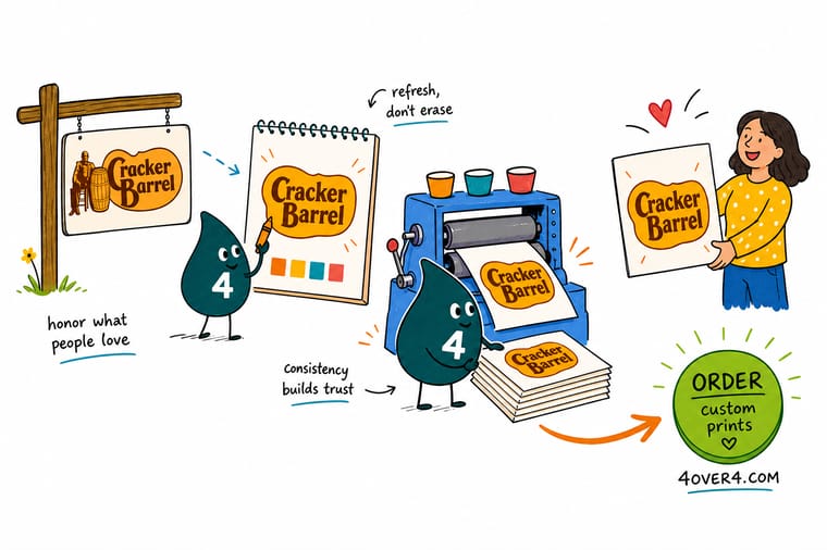
Ask ten regulars to sketch your logo. Whatever most of them draw is your equity, and it survives the redesign. Kerning, clear space, file formats and screen tints are free to change. Then print business cards before signage, look at the color in daylight on real stock, and only commit the expensive surfaces once the small ones came back right.
Order business cards →What to remember about changing a logo
Rules that hold at any budget
- Keep the drawable part. Whatever most people sketch when asked is the equity. Refine it, redraw it, recolour it if you must, but do not delete it.
- Change one thing at a time. A logo plus interiors plus a menu format in the same month gives you no way to tell which change moved traffic.
- Print a proof before you commit. A mark that sings on a monitor can go muddy in CMYK. Order a short run and look at it under the light your customers stand in.
- Keep two lockups. A full version for menus, signage and packaging, a simplified badge for app icons, embroidery and one color stamping.
- Write the reversal plan first. Decide before launch what number would make you go back, and keep the old artwork files where you can find them.
Explore more
Print the rebrand, surface by surface
Standard menus run 50 for $57.11 and letterheads 50 for $99.95, both out in 5 business days.
Product Standard Business Cards The cheapest honest test of a new mark, from $17.57. Product Menus Reprint the menu the same week the sign changes. Product Letterheads Invoices and letters carrying the current identity. Product Premium Stickers Seal bags and boxes with the mark customers keep.  Product Business Banners Announce the change at the door and at events.
  Category Business Card Printing Every stock and finish for the rebrand rollout.
  Guide Brand Refresh Checklist The order to work in before anything gets printed.
  Article Rebranding Tips From a Small Business What a rebrand looks like without a corporate budget.
 Ready to print the new mark?
Start with the cheapest surface, check the color on real stock, then roll it out. 4OVER4.COM sends a free proof before every run.
Common questions about logo changes
Did Cracker Barrel go back to the old logo?
Yes. The simplified wordmark was announced in August 2025 and the company said it would restore the previous mark about a week later, with the man leaning on the barrel back in place. The speed is the interesting part. A week is far too short to judge a design, but it is long enough to see whether regular customers are still coming through the door, and that is the measurement that ended the experiment. Gap made the same call on the same timescale in 2010.
Why do people get so attached to a logo they never chose?
Because recognition is built by repetition, not by preference. A customer who has passed the same sign for years is not reading it, they are matching a shape without thinking, and that shortcut is worth real money to the business. Nostalgia brands feel it hardest, since the mark is not decoration on the product, it is a picture of the promise. When the recognisable element disappears, people describe it as losing something rather than as disliking a design, and that difference in language is the warning sign.
Should a small business ever change its logo?
Yes, when there is a problem a redesign actually solves. Good reasons: the mark falls apart at small sizes, there is no editable vector file, it cannot be printed in one color for embroidery or foil, or the type is unreadable on a lit sign at night. Bad reason: sales are down and the logo is the thing you can change this month. Fix what the sentence names and leave the rest, and keep the element your customers would draw from memory even if everything around it is redrawn.
How much printed material has to be replaced when a logo changes?
More than most owners count. The obvious items are signage, menus and packaging. The ones that get missed are business cards, letterhead and invoices, stickers on bags and boxes, banners kept for events, name badges, vehicle lettering and loyalty cards. Individually they are small. Together they usually cost more than the design work. Make the list before you approve the mark, price it, then decide what is reprinted in the first week and what waits for a natural reorder so the change does not land half finished.
What is the cheapest way to test a new logo before committing?
Print it small and look at it in the real world. Standard Business Cards start at $17.57 at 4OVER4.COM, so a short run shows you how the mark reads in a hand, how the color lands in CMYK rather than on a backlit screen, and whether the detail survives at the size most people meet it. Show that card to customers who already buy from you, not to your design friends. If it needs explaining, it is not finished, and you have found out for the price of one run.
