
21 Hoodie Design Ideas to Inspire Your Merch Line


Jordan is our labels, packaging and sustainability voice, built from the knowledge of our production team, with over 20 years in printing.
Sweatshirt and hoodie design ideas, sleeve prints included, start with the print zone, then the graphic. The front of a pullover gives you about 10 by 8 inches of flat fabric above the pouch, the back gives a clean 11 by 14, and a sleeve gives a column roughly 3 inches wide, so one logo cannot serve all three. The 21 ideas below are grouped by zone, with the print size and the catch for each one.
Sweatshirt, Sleeve and Business Hoodie Ideas in Short
Three searches bring most people to this list, so here are the short answers, each built on the placement sizes below.
- Sweatshirt design ideas. A crewneck has no pouch and no hood, so the chest graphic can run lower than the 10 by 8 inch hoodie front, and the back still takes an 11 by 14 inch piece. Tonal prints and oversized line-art backs from the trends section suit a sweatshirt as well as a hoodie.
- Hoodie sleeve design ideas. Use the column about 3 inches wide and 12 inches long: vertical type down the outside of one sleeve, a cuff band just above the ribbing, or a small icon near the shoulder. Landscape logos do not fit it.
- Business hoodie ideas. A 3 to 4 inch left chest logo on the front, the company name or a role across the back, and a hang tag for clothing on each piece, 50 tags for $25.27 or about $0.51 a hoodie. Matching t shirts start at $21.96 for the staff who need a lighter layer.
Hoodie placement cheat sheet
| Zone | Print size it takes | Why it behaves that way | Best for | Watch out for |
|---|---|---|---|---|
| Left chest | 3 to 4 in wide | Flat single layer, high on the body, clear of the pouch | Logos, wordmarks, small crests | A 4 in mark on an XS reads oversized next to the same mark on a 2XL |
| Center front, above the pouch | About 10 x 8 in | The pouch underneath is a double layer, so the platen stops there | Stacked type, badges, milestone stamps | Artwork that crosses the pouch seam prints uneven or gets sent back |
| Full back | About 11 x 14 in | One flat panel, the biggest printable area on the garment | Large graphics, tour style layouts, a contact line at the hem | Heavy ink coverage stiffens fleece and shows every crease |
| Sleeve | About 3 x 12 in | A narrow tube that needs a sleeve platen fed through it | Vertical text, stripes, a cuff band | The shoulder seam and the cuff ribbing both eat the ends |
| Hood panel | About 4 x 3 in per side | Curved, seamed and split into two panels by the center seam | Small crown marks and edge details | Contrast lining is a garment choice made by the mill, not a print |
| Pouch mouth | About 8 x 1.5 in | The top hem of the pocket is a single flat strip | One line of type, a URL, a run number | Anything taller than the hem falls onto the double layer below |
Sizes are typical adult maximums for screen printing and they move with the blank, so confirm them with your decorator before the artwork is final: send a 10 by 8 inch front file, an 11 by 14 inch back file and a 3 by 12 inch sleeve file, each as vector art at the real size. The same zones apply to a crewneck, minus the pouch and the hood, which is why a printed sweatshirt takes a larger front than a hoodie does. For the rest of a merch line, the custom printed clothing guide covers each garment.
Front hoodie design ideas

The front of a pullover is the zone people design for first and measure last. Above the pouch you have a flat panel of about 10 by 8 inches on an adult size. Below it the fabric doubles, the platen cannot slide under it, and a graphic that crosses the seam comes back printed at two different pressures. Design to the panel and the rest of the front stops being a problem. Our guide to hoodie and pullover printing takes that file to the press.
That constraint is why so many good hoodie fronts are small. A left chest mark at 3 to 4 inches wide costs one screen, survives every size in the run, and leaves the back free for the graphic people actually see across a room. Our print size guide works the same way for tees, with a larger front because there is no pouch in the way.
Before you commit, decide whether the drop is pullover, zip, or both. A zip hoodie has no center front at all, so every idea in this section becomes a left chest or a split pair, one half either side of the zip tape.
Ideas 1 to 5
1. Left chest logo, held at one size. The plainest idea on the list and the one that sells the most. Set the mark 3 to 4 inches wide, place it about 7 inches down from the shoulder seam and 4 inches in from center, and use the same file on every garment you print for the next two years.
2. Small wordmark under the collar. Centered, 5 to 6 inches wide, sitting an inch below the neck ribbing. It reads as a brand rather than a souvenir, and it never fights the pouch because it is nowhere near it.
3. A chest badge or crest. A contained shape, roughly 5 inches square, with the name curved around a symbol. Badges hold up better than free type on fleece, because the outline gives the eye an edge even when the pile softens the detail.
4. A milestone stamp. Founding year, a run number, a city and a date. Small type, one color, centered high. It makes a plain hoodie feel like a limited piece, and it costs nothing extra to print.
5. A split front for zip hoodies. Break one lockup into two halves, one on each side of the zip. Keep both halves able to stand alone, because half a logo on a photograph is still half a logo.
Sizing across a size run
One print size across XS to 3XL is the default and it is the reason chest logos look bloated on small sizes. If the run is large enough to justify a second screen, output two sizes, one for XS to S and one for M upward. Most decorators will do it for the cost of the extra screen rather than a new setup.
On the back the same problem is worse, because a 14 inch graphic on an XS runs past the side seams. Ask for the print scaled to about 85 percent on the smallest two sizes and look at a proof on the actual garment.
Back hoodie design ideas
The back is one flat panel with no pocket, no zip and no seam through the middle, which makes it the most forgiving surface on the garment. It is also the panel a hoodie shows the world, because people wear a hood up and walk away from you.
The trade-off is ink weight. A solid 11 by 14 inch block of plastisol on fleece stiffens the back into a board, and on a dark garment it needs a white underbase first, so you are laying two passes of ink. Open the artwork up, let the fabric show through, and the print stays soft. If you want the density anyway, ask about water based ink, which sits in the fibre instead of on top of it.
Placement is measured from the collar, not the hem, because hem length changes with size. Three inches down from the neck seam for a full back graphic is the usual starting point, and ordering printed apparel goes faster when you state that measurement rather than leaving it to the shop.
Ideas 6 to 9
6. The full back graphic. One image, 11 to 12 inches wide, three inches under the collar. This is where the illustration goes, the tour list, the manifesto, the thing worth turning around for.
7. Logo up top, contact line at the hem. A small mark below the collar and a single line of type just above the hem, with a URL or a phone number. Crew hoodies for a trade business live on this layout, and it works because the hem line is readable from the height a customer stands at.
8. A wrap that carries onto the sleeve. Start a graphic on the back panel and continue it down one sleeve. It has to be printed in two passes on two platens, so expect a small alignment gap at the shoulder seam and design a break into the artwork there rather than pretending it will line up.
9. Vertical spine type. A single word or a name running down the center back, set vertically, an inch or so wide. Cheap to print, reads instantly, and it survives every size in the run without scaling problems.
All-over and pocket design ideas
All-over prints look like the obvious upgrade and they are the one idea on this list with a hard material limit. A true all-over is either dye sublimation onto polyester or cut and sew, where the fabric is printed flat and then made into a garment. Dye sublimation will not bond to cotton, so a 100 percent cotton hoodie cannot take one at any price.
That leaves two honest routes. Print the drop on a high polyester blend and accept a slightly slicker hand, or fake the effect with a large repeating tile placed on the back and one sleeve, which reads as an all-over from a distance for the cost of two screens. The second route is what most small brands actually ship.
The pouch is the opposite problem: it is small, it is doubled, and almost everyone ignores it. The one strip that does print cleanly is the top hem of the pocket mouth, a flat band about 8 inches long and an inch and a half tall.
Ideas 10 to 13
10. A repeating tile. Build one tile that seams on all four edges, then run it large on the back. It carries a brand pattern into the drop without paying for sublimation, and the same tile goes straight onto stickers and packaging later.
11. A photographic panel. Sublimation only, polyester only. Worth it when the image is the product, such as a band photo or a landscape, and not worth it for a logo you could print in one color.
12. A pocket mouth line. One line of type along the hem of the pouch: a URL, a run number, a phrase. It is the detail people find on their own after a week of wearing the thing, which is exactly why it works.
13. A hidden print inside the pouch. Printed on the inner panel before assembly on a cut and sew run, or heat applied on a finished garment. Nobody sees it but the wearer, and that is the point.
Colorful branded hoodie designs
Color on a hoodie is decided by the garment first. Fleece is dyed in bulk and the shade you get is the shade the mill made, so match your brand color to the closest available body rather than expecting an ink to fix it. Then choose ink for contrast, not for accuracy.
Every color you add on a dark garment costs a screen, and on dark fleece the first screen is the white underbase, which prints under everything and does not appear in the artwork. A two color design on black is really three passes. That is the number that decides your unit price, so count passes rather than colors when you compare quotes.
If you want a full color photograph on a dark hoodie, direct to garment is the route, but the fleece face is fuzzy and detail comes out softer than the same file on a smooth tee. The comparison in our DTG and embroidery guide covers where each one stops being the right answer.
Ideas 14 to 16
14. Tonal print, one shade off the body. Charcoal ink on a black hoodie, or bone on off white. It reads as expensive because it does not shout, and it needs no underbase, which keeps the print soft.
15. A two color system held across the range. Pick two inks and use them the same way on every piece: hoodie, tee, tag, sticker. A range that shares a palette reads as a brand, and the pairings in our ink and garment color article transfer straight onto fleece.
16. Puff or high density on one element only. Raised ink on a single word or a single shape, flat ink everywhere else. Puff swells as it cures, so it closes up fine detail and thin serifs, and it belongs on a heavy sans or a solid shape. Keep line weight above about a sixteenth of an inch.
Sleeve and hood design ideas
Sleeves and hoods are where a hoodie stops being a big tee. Both are curved, both are seamed, and both need their own platen, so a shop will quote them as an extra print location rather than folding them into the front price.
The sleeve gives you a column roughly 3 inches wide and 12 inches long once you clear the shoulder seam at the top and the cuff ribbing at the bottom. Landscape logos do not fit it. Vertical type does, and so does a simple band.
The hood is smaller than people expect: two curved panels split by a center seam, around 4 by 3 inches of workable area each. Anything crossing that seam distorts. Most of what looks like hood design in a lookbook is actually a garment specification, chosen when the blank was sourced, and covered in our guide to printing custom sweatshirts.
Ideas 17 to 21
17. Vertical sleeve type. The brand name or a single word running down the outside of one sleeve. It is visible when arms are folded and when a hand is on a coffee cup, which is most of the day.
18. A cuff band. A stripe or a repeated word wrapping the sleeve just above the ribbing. It suits a team or a crew hoodie, where the same band on every arm in the room is the whole idea.
19. Contrast hood lining. A different color inside the hood. Specify it when you source the blank, because no printer can add it afterwards. It shows only when the hood is down, which is where a hoodie is seen most.
20. Patterned lining. The same idea taken further with a printed inner panel, on a cut and sew run only. Expensive per unit, so it belongs on a small drop where the price is already high.
21. A crown mark inside the hood. A small logo printed on the inside of the hood so it sits above the wearer, hidden until the hood goes up. Keep it under 3 inches and off the center seam.
Hoodie design trends for 2026
Four directions keep showing up in the artwork brands are sending in, and each one fits inside the 11 by 14 inch back or the 10 by 8 inch front. Tonal and blind embossed looks, where the print is one shade off the body, so the piece reads as a garment rather than a billboard. Oversized back panels with open artwork, drawn as line work instead of solid fills, which keeps the fleece soft under a large image. Small type used as a design element: run numbers, coordinates, a date on the pouch hem. And range consistency, where the hoodie, the tee, the tag and the sticker all carry the same two inks instead of each piece being its own project.
None of those need a bigger budget than a plain chest logo. Three of them need less ink. If you want the strategy behind the drop rather than the artwork, the clothing brand marketing guide and the merch guide cover the sequencing.
Turning a hoodie design into printed merch
4OVER4.COM does not stock fleece, so for the hoodies themselves you need a garment decorator that carries blanks. We print the pieces around them: t shirts from $21.96 with an 8.5 x 11 inch print area, hang tags for clothing at 50 for $25.27 and premium stickers from $29.16, plus ready-made cotton totes from $5.00. What we print is everything the drop needs around them, and the artwork transfers without a redraw, because the tee, the tag and the sticker all use the same vector file you built for the hoodie back.
Quantity and price
T shirt pricing and specs
Live configurator numbers for the tee half of a drop, where the unit cost steps down as the run grows.
| Quantity | Price Per Unit | Total |
|---|---|---|
| 1 | $21.96 | $21.96 |
| 2 | $16.47 | $32.93 |
| 3 | $16.46 | $49.39 |
| 4 | $15.93 | $63.71 |
| 5 | $15.93 | $79.63 |
| 6 | $15.93 | $95.56 |
You can also earn coins on every order and redeem them against the next print run, which matters when a drop is a series rather than a single order.
File setup that survives the screen
Build the artwork as vector at the finished print size, not scaled up from a small file. Convert every font to outlines before you send it, or the shop rebuilds your type in whatever they have installed, and the walkthrough in creating outlines in Illustrator takes about a minute. If part of the design has to be raster, supply it at 300 dpi at final size with a transparent background.
Print it
Custom t shirts, same artwork
The tee that carries the hoodie graphic, printed on your choice of stock and shipped fast.
Separate the colors yourself if you can, or at least label them. Name each spot color, mark which one is the white underbase, and put the artwork on its own layer with the garment color on a locked layer beneath so everyone is judging contrast against the real body. Halftones below about 10 percent drop out on fleece, so flatten anything that faint into a solid or remove it. If you are still choosing between methods, screen printing against vinyl lays out where each one wins, and vinyl t-shirts are the cheaper route for a run under about two dozen pieces.
Hoodie ideas by business type
The right idea depends on who wears the hoodie and who reads it. The split runs by business type.
- Streetwear and small labels. Back graphic plus a left chest mark, tonal ink on a dark body, and a numbered run on the pouch hem. Pair it with hang tags so the piece looks bought rather than made.
- Gyms and clubs. A crew layout: small chest logo, member name or number on the sleeve, contact line at the back hem. One design, printed each intake.
- Trade and field teams. Company mark on the chest, phone number and service line across the back where a customer reads it from the driveway. High contrast ink, no fine detail.
- Bands, events and campaigns. Full back graphic with dates, single color front, and a matching sticker so the artwork keeps working after the drop sells out.
- Schools and college groups. Wordmark front, year on the sleeve, roster or chapter list on the back. Order to the size curve you actually have, not an even split.
Blanks for the printed pieces around the drop
A hoodie drop needs two kinds of file: the garment art at 10 by 8 inches for the front and 11 by 14 for the back, which goes to your decorator, and the flat pieces we print. For the hang tags, 50 for $25.27, or $0.51 a hoodie, and the stickers, the blanks below already mark the cut line and bleed. Pull one from the blank template library for the tags and stickers that go with the drop, and keep the hoodie artwork at its own print size in a separate file.
Start fast
Blanks for the printed pieces around the drop
Apparel design templates and exact size blanks so your artwork lands inside the cut line.
Wally measures the hoodie before he draws on it
Zone first, artwork second
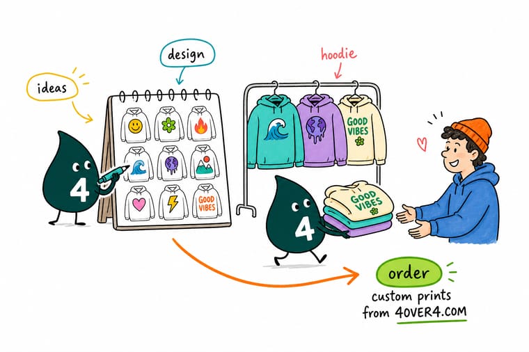
Plan about 10 by 8 inches above the pouch, 11 by 14 on the back, and a 3 inch column on the sleeve. Keep line weight above a sixteenth of an inch so fleece does not swallow it, outline your type, and count the white underbase as a pass when you price a dark garment. Then bring the same artwork to 4OVER4.COM for the tees, tags and stickers that finish the drop.
Order custom t shirts →What a hoodie body does to artwork
Design tips that hold at every placement
- Measure from the collar. Hem length changes with every size, collar position does not. Give your printer a measurement down from the neck seam and the whole run lands in the same place.
- Outline your type. Convert every font to shapes before you send the file, or the shop rebuilds it in whatever they have. Our Illustrator walkthrough covers the exact step.
- Count passes, not colors. On dark fleece the white underbase is a pass. Two colors on black is three passes, and that is the number that sets your price.
- Keep line weight above a sixteenth of an inch. Fleece pile swallows thin lines, and puff ink closes them up entirely. Thicken the strokes before you print, not after you see the proof.
- Print one and wear it for a week. A sample through a wash cycle tells you more about ink choice and placement than any on screen mockup. Do it before the run, not after.
Explore more
More ways to print and promote
Hang tags run 50 for $25.27, which is $0.51 a hoodie, out in 5 business days.
Product Custom T Shirts The tee that carries the same artwork as the hoodie, from $21.96.  Product Hang Tags for Clothing The tag that makes a drop look bought, from $25.27.
  Product Premium Stickers Put the back graphic in the box as a sticker, from $29.16.
  Product Cotton Totes A ready-made cotton tote to pack the order in, from $5.00. Category Custom T-Shirts Printing Every apparel option, stock and quantity in one place.
 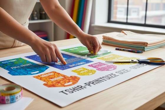 Guide Print Size Guide for Apparel Every placement measured, so the graphic lands where you meant it to.
 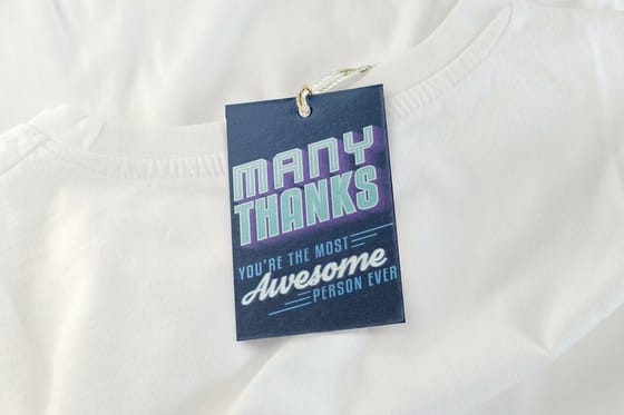 Guide Garment and Merchandise Tags Tag sizes, string choices and what has to be printed on them.
  Article 11 Branded T-Shirt Ideas Sibling ideas for the tee half of the same drop.
 Ready to print the rest of the drop?
Bring the same artwork to 4OVER4.COM for the tees, hang tags, stickers and totes that go around your hoodies, printed sharp and shipped as fast as your launch date needs.
Common questions about hoodie design
What is the biggest design you can print on the front of a hoodie?
On an adult pullover, plan for about 10 inches wide by 8 inches tall in the panel above the pouch. The pouch itself is two layers of fabric sewn to the body, and a screen printing platen has to slide between the front and the back of the garment to sit flat, which it cannot do through a pocket. Artwork that crosses the seam prints at two different pressures and usually comes back for a redraw. On a zip hoodie there is no center front at all, so the same idea moves to a left chest at 3 to 4 inches or splits into two halves either side of the zip.
Can you print an all-over design on a cotton hoodie?
No, not a true all-over. Dye sublimation works by turning ink into a gas that bonds with polyester fibres, and cotton has nothing for it to bond to, so the print washes out. The two real routes are a polyester or high polyester blend body, which prints edge to edge but feels slicker than cotton fleece, or cut and sew, where the fabric is printed flat and the garment is made afterwards. Most small brands get most of the effect for a fraction of the cost by running a large repeating tile on the back and one sleeve instead.
Should a hoodie logo be the same size as the one on a t-shirt?
The chest mark can be, and usually is: 3 to 4 inches wide works on both. The front graphic cannot, because a tee gives you a clear 12 by 14 inches and a pullover gives you roughly 10 by 8 above the pouch. If you are running a tee and a hoodie in the same drop, build the artwork at hoodie size and let it sit small on the tee, rather than scaling a tee graphic down and hoping the type still reads. The print size guide has the tee measurements to compare against.
Does printing on a dark hoodie change the artwork?
It changes the cost and it changes what survives. Dark fleece needs a white underbase printed first so the colors on top stay bright, which adds a screen and a pass, and the extra ink makes the print stiffer and slightly raised. Thin lines and small serif type fill in on fleece more than on jersey, so thicken strokes to at least a sixteenth of an inch and set body type no smaller than about 10 point. Tonal artwork, one shade off the garment color, avoids the underbase entirely and stays the softest print you can get.
How many hoodie designs should a first merch drop carry?
Two, in most cases: one plain chest mark and one back graphic. Small brands lose money on variety rather than on quantity, because every extra design is a new set of screens and a new pile of sizes that has to sell through. Run the two designs, watch which one moves, and put the third into the next drop. Fill the gap with flat merch instead, which costs far less to add: stickers from $29.16 and hang tags from $25.27 both carry the same artwork without another garment order.
