
Why a Logo Is Important and What It Really Does for Your Brand


What a logo does, where it stops, the five traits that separate a usable mark from a pretty one, and how to get yours onto the pieces customers actually hold.
A logo is important because it is the fastest piece of information a business gives anyone: one mark that identifies you in under a second, on a card, a package or a sign, long before a word gets read. Its second job is to accumulate. Every time the same mark appears, it collects the memory of every good experience a customer has had with you, so the card, the sticker and the invoice all reinforce one another instead of starting over. The logo is not the brand, and it cannot rescue a weak one, but nothing else compresses identity into something recognizable that quickly.

Quick answer
One mark, recognized in a second, reused everywhere
A logo matters for two reasons, and both are practical. First, it identifies the business faster than any sentence can, which is the only speed available on a card handed across a counter or a sign passed at 30 miles an hour. Second, it compounds: the same mark on the card, the sticker, the envelope and the banner collects recognition into one place instead of spending it four times. What it cannot do is stand in for the brand, which is built by the product and the service behind it. The test of a good mark is not whether it looks current. It is whether it still identifies you at 16 pixels, in solid black, and in embroidery thread.
What a Logo Is, and What It Is Not

A logo is a fixed graphic mark that identifies one business and no other. That is the whole job. It can be a wordmark set in a specific typeface, an abstract symbol, a pictorial mark, a monogram, or a lockup that combines a symbol with the name.
What it is not is the brand. The brand is what people expect from you after they have dealt with you, and it is built by the product, the price, the turnaround and the way problems get handled. The logo is the hook that memory hangs on. A strong mark on a business that ships late still means late. Our guide to the difference between marketing and branding takes that split further, and building a brand identity for a small business covers what surrounds the mark once you have one.
It is also not a description of what you sell. A shoe logo does not need a shoe in it. The mark identifies; the words next to it explain. Trying to make one shape do both is where most first attempts go wrong.
Why a Logo Is Important: Five Reasons That Hold Up
Each of these is a job the mark does that nothing else on the page does as fast.
- It identifies you before anyone reads. A person walking past a window, scrolling a feed, or taking a card at a counter gives you about a second. A mark is processed in that second; a paragraph is not.
- It signals that the business is real. Right or wrong, a plain typed name on a card reads as provisional. Consistent identification on the card, the invoice and the packing tape reads as a company that has been doing this a while.
- It separates you from the shop next door. In crowded categories the products are close to identical. The mark is often the only thing a customer can use to tell one supplier from another, and it is the thing they will describe when they recommend you.
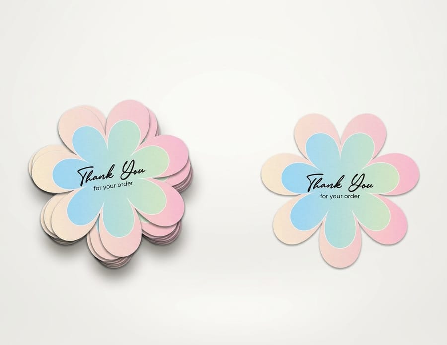
- It compounds. Recognition is cumulative. Every business card, every die-cut sticker on a laptop, every envelope in a mailbox adds to the same account. That is why consistency is worth more than novelty.
- It travels where you cannot. A sticker on a customer laptop and a banner at a trade show keep identifying you when nobody from the business is in the room.
None of that requires a clever mark. It requires a consistent one, applied everywhere, which is a production discipline more than a design one.
The Role a Logo Plays Inside a Brand
Think of the logo as the index of the brand. On its own it carries no meaning; a swoosh meant nothing before the company behind it spent decades attaching meaning to it. What the mark does is give every experience somewhere to land.
That has a practical consequence for how you use it. The mark has to appear in the same form, in the same relationship to the name, in the same colors, on every surface. A logo that is stretched on a banner, recolored on a flyer and cropped on a package is three marks, and three marks accumulate nothing. Fix the lockups up front: a horizontal version, a stacked version, a symbol-only version for small spaces, and a one-color version. Then use only those.
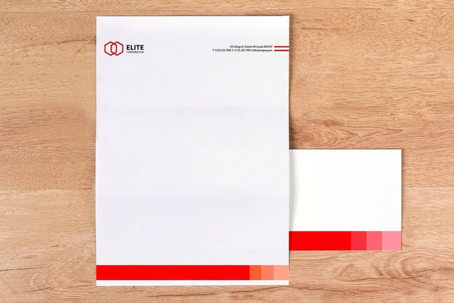
The other half of the role is what surrounds it. A logo sitting on a heavier stock, in a considered layout, with correct trim, is read differently than the same logo on a thin flyer with the mark jammed against the edge. That is why a coordinated stationery set does more for perception than a redesign usually does. See also how company business cards carry branding for the piece people handle most.
Five Traits of a Logo That Actually Works

These five turn up in every serious critique because each one maps to a real failure you can reproduce in an afternoon.
| Trait | How to test it | What failure looks like |
|---|---|---|
| Simple | Print it one inch wide in solid black. | Inner shapes close up, thin strokes disappear, the mark becomes a smudge. |
| Memorable | Show it, wait a minute, ask someone to sketch it. | They can describe the color but not the shape. |
| Timeless | Name the decade it looks like. | You can, because a current effect is doing the work rather than the shape. |
| Versatile | Set it as a 16 pixel favicon, then blow it up to banner size. | It only holds at one of the two, so you end up maintaining two marks. |
| Appropriate | Show it to someone who does not know the business and ask what it sells. | The tone points somewhere else entirely, for example a playful mark on a legal practice. |
Two of those pull against each other, and it is worth naming. Distinctive marks are memorable, and simple marks are versatile, but the simplest shapes are also the least distinctive because someone is already using them. A plain circle reproduces perfectly and identifies nobody. The workable middle is a simple shape with one unusual, specific decision in it, held consistently. The six principles of logo design works through that balance in more detail.
Color, Type and Shape: the Three Decisions That Do the Work
Color. Pick fewer than you want. One or two is enough for the primary mark, and each additional color costs money in methods that charge per color, screen printing among them. Define the colors as Pantone values, not just hex codes, because a vivid RGB green or orange sits outside what CMYK can hit and will come back duller than the screen promised. Then check the pair in solid black, and check it reversed out of a dark panel. Ten color pairings that survive print is a sensible place to start.
Typography. The typeface in a wordmark is half the mark, so choose it for behavior rather than mood: how it holds at small sizes, whether the counters stay open, whether the weights are distinct enough that a bold version does not fill in. Then outline the fonts in the final file, otherwise a printer without the licensed typeface substitutes something and the mark changes shape. Choosing a logo font goes through the selection.
Shape and imagery. Keep strokes at half a point or heavier and knockout gaps at a point or more. Below that, ink spread on uncoated stock closes the gap and the detail is gone. Gradients, drop shadows and thin outlines are the three effects that look fine on a monitor and cause the most trouble on press, on vinyl and in thread. If the mark needs one of them to work, it does not work.
The Mistakes That Cost the Most to Fix Later
Almost every logo problem we see at the file stage is one of these, and every one of them is cheap to avoid and expensive to correct once it is on a thousand pieces.
- Never printing it. The mark gets approved on a big monitor and meets paper for the first time on a live job. Print it at one inch, in black, on plain paper, before anyone signs off.
- Raster-only artwork. A PNG is not a master file. Without vector, every enlargement past its native size is a soft edge, and a banner is a very large enlargement.
- Detail that thread cannot hold. Embroidery is the harshest reproduction you will meet. Detail finer than roughly one sixteenth of an inch does not stitch, so fussy marks come back as a knot on a polo.
- No one-color version. Sooner or later you need a stamp, a foil block, an engraved plate or a single-screen print, and improvising the flat version under deadline gives you a fourth inconsistent mark.
- Colors defined only in hex. Two suppliers, two conversions, two different greens, and no reference to argue from.
- Chasing the category. A mark built to look like the market leader identifies the market leader.
If you are commissioning rather than drawing, the logo design best practices guide lists what to ask for in the handover, and what a logo costs sets expectations before the quotes arrive. There is a longer read on the thinking behind a commission in custom logo design for your company brand.
Putting the Logo to Work in Print
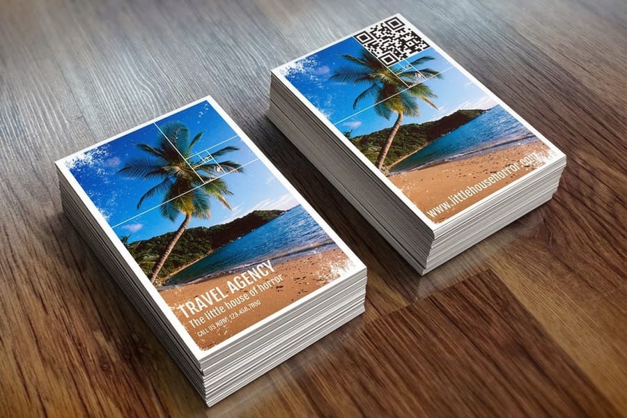
A logo earns nothing sitting in a folder. It starts working on the pieces a customer touches, and the order below is roughly the order of return for a business starting out.
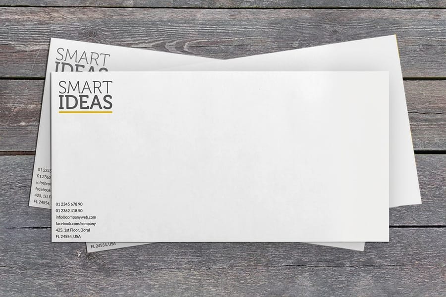
Start with the card. Standard business cards start at $17.57, and they are still the piece most often handed over at the moment someone decides whether to keep your details. Next, the things that follow the customer home: die-cut stickers from $93.37 cut to the silhouette of the mark itself, which is the one application that rewards a clean outline more than any other. Then the paperwork, because it is seen repeatedly by people who already pay you: standard letterheads from $99.95 and printed envelopes from $142.99 put the mark on quotes, invoices and anything you mail.
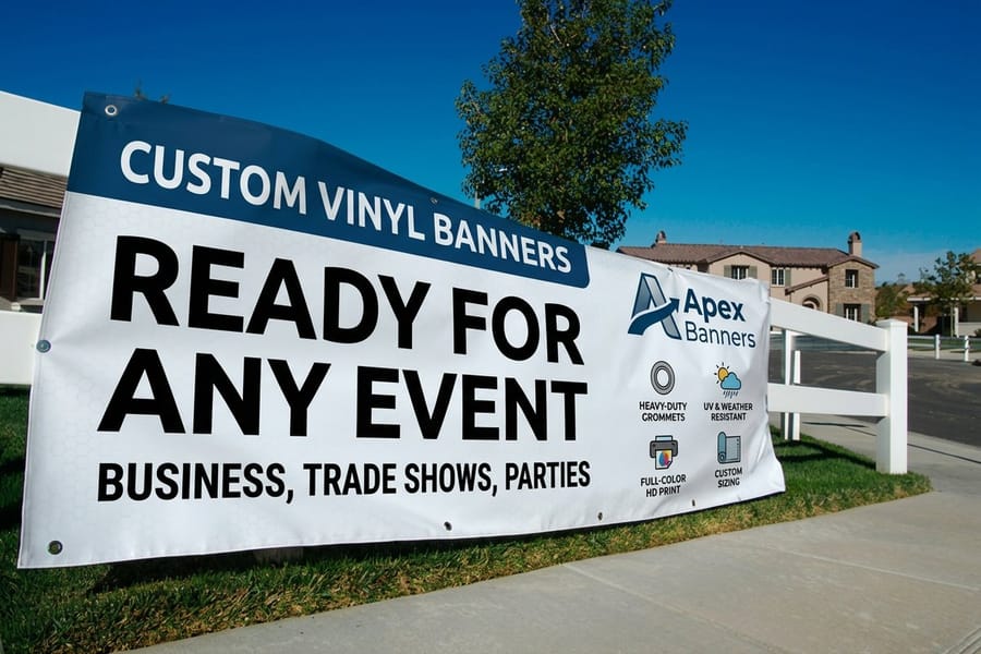
For anything read at distance, size the mark for the viewing distance rather than for the sheet. Vinyl banners start at $79, and a logo that looks generous in a layout window can be unreadable from across a hall. Set the file at full scale and step back from the screen.
If the mark is not drawn yet, you can lay out a correctly sized piece first from the blank template library, or work from a ready layout in the design template library and drop the mark in when it is finished. Everything in business card printing takes the same file.
Wally explains why the logo matters
One mark, recognized in a second, reused on everything
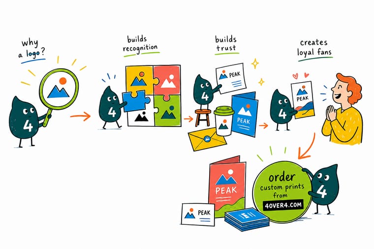
Wally does not ask whether the mark is beautiful. He shrinks it to the size of a browser tab, prints it in solid black, and imagines it stitched onto a polo. If it survives all three it is a logo, and every card, sticker and banner it lands on adds to the same pile of recognition. If it only works big and in full color, it is a picture, and you will end up drawing a second one under deadline.
Print your logo on business cards →Specs and pricing
The three pieces most logos land on first
Cards, stickers and banners test a mark at three very different sizes. Configure each one below with live options and starting prices from the 4OVER4.COM configurator.


Print it
Put the mark where customers can see it

Explore more
Where to go next




By the numbers
Where a logo goes once it is finished
Common Questions
Your logo questions, answered
Why is a logo important for a small business?
Because a small business rarely gets a second look. A logo compresses who you are into something a customer can recognize on a card, a van, an invoice and a package without reading a word, and repetition across those pieces is what turns a stranger into someone who remembers the name. It also settles arguments internally: once the mark exists, every future piece has a fixed starting point instead of a fresh debate about what the company should look like.
Is a logo the same thing as a brand?
No, and confusing the two is expensive. The logo is a mark of identification. The brand is the sum of what people expect from you, built from the product, the price, the service and the way you answer the phone. A logo cannot fix a brand problem, but it does carry the brand: every time someone has a good experience, the mark is what the memory attaches to. A useful way to think about it is that the logo is the label on the jar and the brand is what is in it.
What file formats do I need for printing a logo?
A vector file is the one that matters: AI, EPS or a PDF saved with vector artwork, with all fonts converted to outlines so a printer without your typeface still gets the correct shapes. Vector scales from a lapel pin to a banner with no loss. Keep a high-resolution PNG with a transparent background for screen use, but never send it as the print master. A logo pulled from a website is usually 72 dpi, and placed two inches wide on a card that prints as a soft, stepped edge.
Does a logo need to work in black and white?
Yes, and it is the fastest quality check you can run. Print the mark in solid black at one inch wide. If the shapes still separate and the name is still readable, the design is doing the work. If it turns into a blob, color was carrying it, and the mark will fail on a rubber stamp, a one-color screen print, a foil block, an engraved plate and any faxed or photocopied form.
How many colors should a logo have?
One or two for the primary version, with a single-color variant always on hand. The reason is production, not taste: several print and decoration methods charge per color, screen printing needs a separate screen for each one, and every extra color is another chance for a mismatch between a card run and a banner run on a different substrate. Fix the colors as Pantone values rather than only hex codes, because a bright RGB green or orange can shift noticeably when it is converted to CMYK.
How much should a logo cost, and when is it worth redesigning?
It ranges from a template you configure yourself to a full identity project, and our guide to how much a logo costs breaks the tiers down honestly. On redesigning: change the mark when it genuinely cannot do its job, for example it fails at small sizes, it is unusable in one color, or the business has moved into something the mark no longer describes. Do not change it because it feels stale internally. Customers see it a fraction as often as you do, and every redesign resets the recognition you already paid for.
Get Started
Put the mark on 100 business cards for $17.57
Upload the vector file, pick a stock, and we print cards that show the mark the way it was drawn, with the color held across every reorder.
Legal Disclaimer
Gold Standard guarantees apply to all standard orders placed through 4over4.com. Price match requires verifiable proof of a competitor's published price for an equivalent product with matching specifications and turnaround time. Satisfaction guarantee covers manufacturing defects and print quality issues. Contact support with order number and documentation. On-time delivery rate based on tracked orders 1999 to 2026. Individual results may vary based on shipping carrier performance.
