
Ultimate Guide to Signage Design


Tobias is our voice for cutting, binding and large format, built from the knowledge of our production team, with over 20 years in printing.
Great signage design is not decoration, it is a message engineered to be read at a distance. Set the goal, build a legible layout, size the text to how far away people stand, then match the material to the job and order it sized.
To design a sign, work in four moves: name the single job the sign must do, draft a layout that gives the main line the most weight, size the capital letters to the viewing distance (about one inch of height per ten feet away) with strong dark-on-light contrast, and match the material to the setting. Build the art in CMYK with full bleed, proof it, then order the sized sign at 4OVER4.COM.

Quick tips
Quick tips for designing a readable sign
Design the sign for the distance it will be read from. Name one job per sign, size the main line to roughly one inch of letter height per ten feet away, and keep to one or two typefaces. Use strong dark-on-light contrast, build the file in CMYK with full bleed, and match the material to the setting: coroplast for short outdoor runs, aluminum for years of weather, a banner for big temporary messages. 4OVER4.COM prints every sign in-house so your approved proof is what ships.
Watch it printed
See standard coroplast signs on the press, in 93 seconds
The sign in this video is 4mm white coroplast, printed full color on the front or on both sides, in eight sizes from 11" x 17" to 30" x 40" or any size you set. Grommets and an H-stake for a lawn are the two add ons, and one sign starts at $25 with a 3 business day turnaround.
Do it now
Design your sign online
You do not need design software to design a sign. Open the sign you want, set the size and the material, then take one of two routes: build the artwork in the browser with the online designer, or upload a print-ready file you already have. Both routes finish the same way, with a proof you approve before anything goes on press.
- Start from a sign template in the browser. The canvas opens already set to the size, the bleed and the safe margin of the product you picked, so you type the headline, drop in the logo and the phone number, and drag until the main line fills the panel. This is the fastest route for an open house sign, a weekend sale message or a street run of coroplast yard signs.
- Upload artwork you already have. Send vector art where you can, since it stays crisp at any size, or raster art built at 100 to 150 DPI at the final print size, in CMYK, with full bleed and every line of type pulled inside the safe margin. This is the route for a logo-locked storefront panel on aluminum signs or a property sign that has to match the rest of your kit.
- Check it at distance, then approve the proof. Before you order, measure the capital height of your main line against the distance people actually read from, one inch for every ten feet, and request a free proof. Reading the proof at arm's length is not the test. Standing well back from it is.
If you are still choosing what to print rather than how to lay it out, the families are lined up under signs and banners, and the sections below cover hierarchy, contrast, letter height and material in order. To skip straight to the doing, open the sign product page, pick your size and start the layout there.
What a sign is actually for
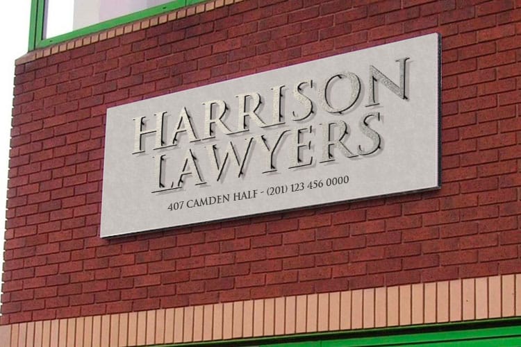
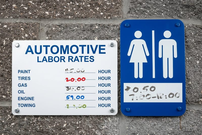
Before you think about fonts or color, answer one question: what is this sign supposed to do? A sign that sells a weekend sale is a completely different object from one that points visitors to a side entrance, even if both are the same size and material. Signage design starts by naming that single job and refusing to add a second one.
Most signs fall into four honest categories. They sell, pulling a passer-by toward an offer. They direct, moving people through a space. They inform, stating hours, prices or rules. Or they brand, repeating a name and color until it sticks. If you find your draft trying to do three of these at once, that is the moment to split it into separate signs. For the bigger picture on why on-premise signs earn their keep, the signage industry data is worth a look.
Everything downstream, the wording, the letter height, the substrate, flows from this one decision. Get it right and the rest of this guide becomes a series of easy choices instead of guesses. When you are ready to build the artwork, the 4OVER4.COM online designer lets you lay it out in the browser and send it straight to print.
The main types of signs and what each one does
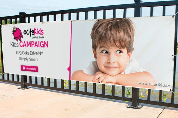
Picking the right kind of sign is half the design. Here is the working vocabulary, matched to the moment each one is built for.
- Rigid panel signs. Flat, self-supporting boards in coroplast, aluminum or PVC. Coroplast is the light, low-cost workhorse for short outdoor runs, while aluminum signs hold up for years. Start with our primer on what coroplast signs are if the material is new to you.
- Banners. Flexible, roll-and-store sheets for large temporary messages on fences, walls and stages. Vinyl carries color richly, mesh lets wind pass through outdoors. See the range of typical banner sizes before you commit to dimensions.
- A-frames and sidewalk signs. Two-sided stands that plant on the pavement and pull in foot traffic near an entrance. Swap the message daily and fold them away at close.
- Flags. Feather and pole flags add motion, which the eye notices before it reads a word. They line driveways, events and grand openings.
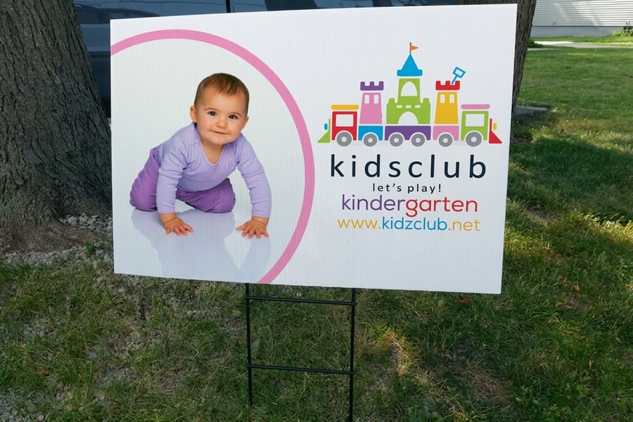
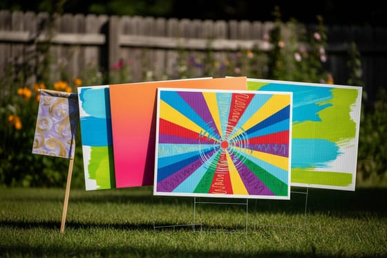
- Yard signs. Small panels on wire stakes for lawns, campaigns and open houses. Our guide to making yard signs covers stake types and layout.
None of these is better than the others. They answer different questions about distance, lifespan and budget, and a strong signage plan often uses two or three together. Browse the full range under signs and banners to see how the families line up.
Designing a sign that lives on an interior wall
Most signage advice is written for the curb, where the reader is moving and far away. An interior wall is the opposite problem. People stand a few feet from a lobby panel, so the letter height rule gives you small type and you can afford more of it.
Three things change indoors.
- Distance. At ten feet a one inch capital is comfortable, so a lobby sign rarely needs more than an inch or two on the main line. Save the big type for the exterior panel.
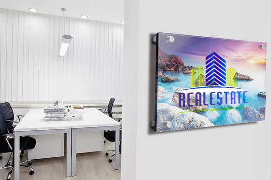
- Material. Acrylic and PVC panels read cleaner and more premium than coroplast in an interior space, where nobody is judging weather resistance.
- Light. A gloss face under a downlight throws glare exactly the way a gloss sign does in sunshine. Check the layout in grayscale, and if the contrast disappears there it will disappear under the spotlight too.
Everything else holds. One job per sign, one or two typefaces, CMYK with full bleed, and the logo kept as vector art.
Four steps to design a sign

Every good sign moves through the same short sequence. Skip a step and it usually shows up later as a blurry proof or a message nobody can read from the road. Each step below is one instruction you can finish before you start the next.
- Step 1. Research the goal and the setting. Write the single job in one sentence, then note where the sign lives, how far away it is read, and how long it must last. These three facts quietly decide size and material: a weekend message can print on coroplast, a marker that has to survive years of weather points at aluminum, and a fence-wide announcement is a banner before it is anything else.
- Step 2. Draft the layout and hierarchy. Rough it out first, at the real proportions of the panel. Give the most important line the most weight, shrink the supporting text, and leave real empty space so the eye lands where you intend. Three levels is the ceiling: the headline, one supporting line, and one action such as a phone number or an arrow. The nine elements of design and the idea of visual balance are useful here.
- Step 3. Design for legibility and contrast. Choose one clean typeface, two at the very most, set letter heights to the viewing distance at one inch of capital height per ten feet, and put dark type on a light field or the reverse. Check the layout in grayscale before you go further: if the words vanish there, they will vanish outdoors at noon. Build the file in CMYK so what you approve is what prints.
- Step 4. Proof, size and order the material. Add full bleed, confirm the resolution at final size, keep every line of type inside the safe margin and clear of stakes, grommets and frame edges, request a free proof, then pick the substrate and finishing and send it to 4OVER4.COM.
Treat these as a loop, not a checklist. A weak proof sends you back to the layout, and that is a feature of good process, not a failure.
Legibility and viewing distance

A sign that cannot be read is just expensive decoration. Legibility is the one rule signage design cannot bend, and it comes down mostly to letter height set against distance.
The dependable rule of thumb is one inch of capital letter height for every ten feet of viewing distance for comfortable reading. A sign meant to be read from 50 feet needs roughly five-inch type on its main line. From across a 100-foot lot, closer to ten inches. When you want a moving audience to catch it, step up to about one inch per four feet.
Height is not the whole story. Keep to one or two typefaces, favor a clean sans-serif for distance reading, and give the letters room to breathe with generous spacing. Trim the message to the fewest words that still make sense, because a driver reads a sign in a second or two, not a paragraph. If you are also making posters, the same discipline runs through our poster design steps.
Color, contrast and print-accurate files
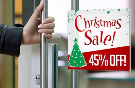
Contrast is what lets the eye separate letters from their background at speed. The strongest pairings put a dark color on a light field or the reverse: black on yellow, white on a deep blue, dark green on cream. Two colors of similar brightness, even if they look different on screen, blur together at distance.
Limit the palette. One or two brand colors plus a neutral is usually all a sign needs, and restraint reads as confidence. For a deeper look at which pairings carry from the curb, see the notes on the best colors for yard signs.
Then there is the gap between screen color and print color. Screens glow in RGB while signs print in CMYK, so a neon blue on your monitor can land duller on vinyl. Design in CMYK from the start, and if you are matching an exact brand color, work from a spot reference. Our guides on CMYK versus RGB and matching Pantone to CMYK cover the handoff so your approved proof matches the finished sign.
Choosing the right material for the job
The best-designed sign fails if it is printed on the wrong stuff. Material is a design decision, not an afterthought, and it hangs on two questions: indoors or out, and for how long.
- Coroplast. Corrugated plastic that is light, cheap and weather-tolerant for weeks to a season. It is the default for yard signs, open houses and short campaigns. Our coroplast signs start at $25.
- Aluminum. Rigid, rust-resistant metal that survives years of sun and rain, ideal for parking, property and permanent storefront signs.
- Vinyl and mesh banners. Flexible, large-format and reusable. Vinyl for solid color and indoor or short outdoor use, mesh where wind would tear a solid sheet.
- Acrylic and PVC. Cleaner, more premium panels for interior lobbies and upscale storefronts, where a thicker, glossier face signals quality.
When durability outdoors is the deciding factor, our guide on the best materials for durable outdoor signs compares lifespans side by side, and the materials guide helps you weigh substrate against budget. You can compare finishing options across the full rigid sign lineup too.
Match the goal to a 4OVER4.COM product
Here is where design turns into an order. Take the goal you named at the start and map it to the product that carries it best. Each product page opens the same online designer, already set to that size and bleed, so the layout you worked out above goes straight onto the panel.
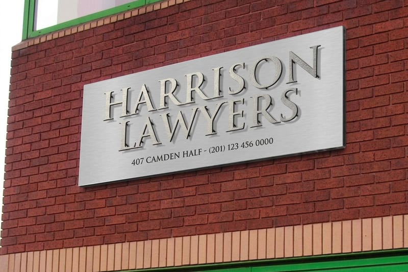
- Permanent outdoor identity. A storefront, parking or property marker that stays up for years points to aluminum signs or a rigid property sign. Size this one for the curb rather than the doorway, keep the logo as vector art so it holds at panel size, and give the headline the full one inch per ten feet of the distance drivers read it from.
- Foot-traffic and daily messages. A changeable message near an entrance is the job of an A-frame from our sidewalk sign lineup. It is read from ten to twenty-five feet on foot, so the type can be smaller, but leave a fixed brand band at the top and open space below for the message that changes.
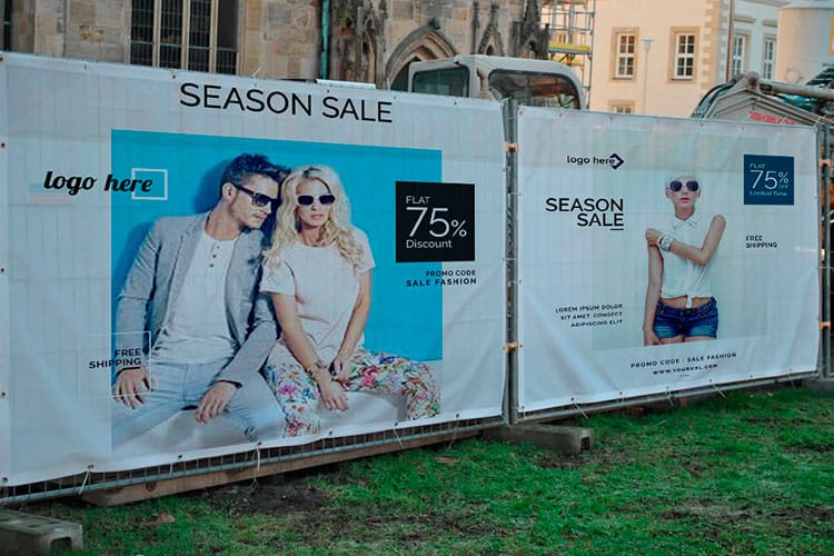
- Big temporary announcement. A grand opening, sale or event banner across a fence or wall calls for an outdoor banner or a vinyl banner. Most of that audience is moving, so use the one inch per four feet headline height, hold the main line to three or four words, and keep type well inside the safe margin so grommets and hems never clip it.
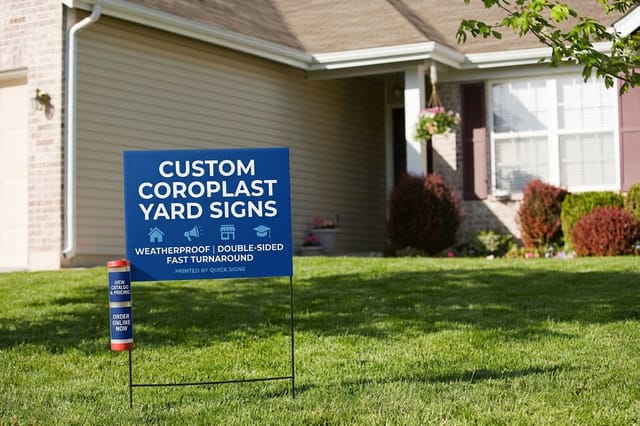
- Lawns, campaigns and open houses. Short-run panels on stakes are exactly what coroplast yard signs are built for. They are read from the sidewalk and the slow lane, so the second-biggest thing on the panel should be the phone number or the address, never the tagline.
- Motion at the roadside. When you need the eye to catch movement, feather flags line a driveway or event better than a flat sign. Design them as one word plus a logo, because the shape curves in wind and anything longer breaks up.
Because the design is already sized to its distance and material, this last step is quick. Real estate teams designing a full kit can also lean on the real estate yard sign rules and see how it played out in one real estate branding case study.
File setup and the mistakes that ruin a sign

A great design can still be undone at the file stage. These are the errors that turn a clean layout into a reprint.
Low resolution at final size. A logo that looks sharp on a business card can pixelate at four feet wide. Build large-format art as vector where you can, and keep raster art at 100 to 150 DPI at print size for close reading. Our note on DPI versus PPI clears up the confusion.
No bleed and text too close to the edge. Extend the background past the trim line and pull important text inside a safe margin, or trimming and grommets will clip your message.
RGB color left in the file. Export in CMYK so the printed color matches your proof instead of surprising you.
Too many words. If a reader cannot grab the message in a couple of seconds, cut it down. Signage rewards the ruthless edit.
When the art is ready, order a free proof and get free paper samples so you can judge material in hand before a full run. 4OVER4.COM prints every one of these in-house, so the sign you approve is the sign that ships.
Wally explains signage design
A sign is a message engineered for distance
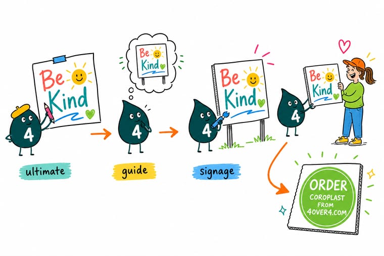
Wally treats a sign like a sentence you have to read while walking past: too small and it disappears, too busy and nobody finishes it. His trick is simple. One job per sign, one clear line sized to how far away people stand, strong dark-on-light contrast, and the right material for the weather. Nail those and the design almost finishes itself. When the layout is locked, skip the guesswork and order it sized and print-ready at 4OVER4.
Order a custom sign →
Specs and pricing
Custom coroplast sign specs and pricing
Coroplast is the workhorse substrate most signage designs land on, so here are its live specs and price-per-unit at 4OVER4.COM, pulled straight from the configurator. Order more of the same sign and the per-unit price drops.

| Quantity | Price Per Unit | Total |
|---|---|---|
| 1 | $25.00 | $25.00 |
Print it
Order signs and banners at 4OVER4


See it in use
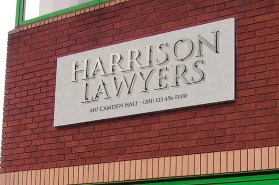
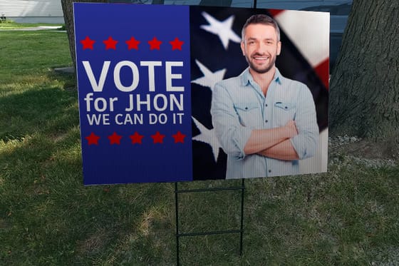
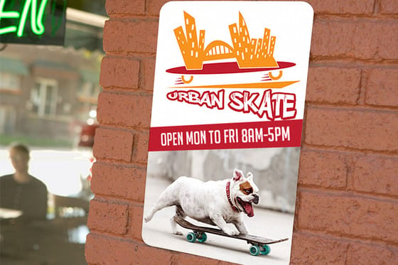
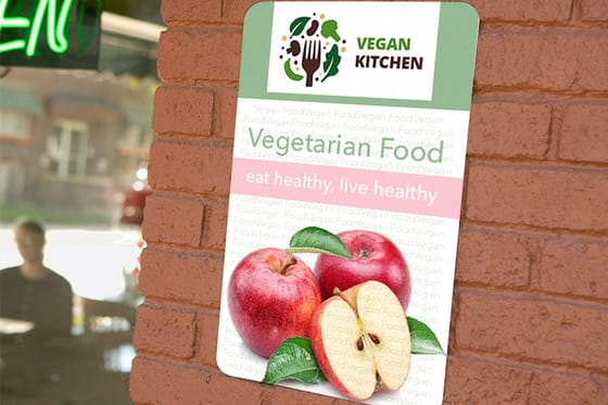
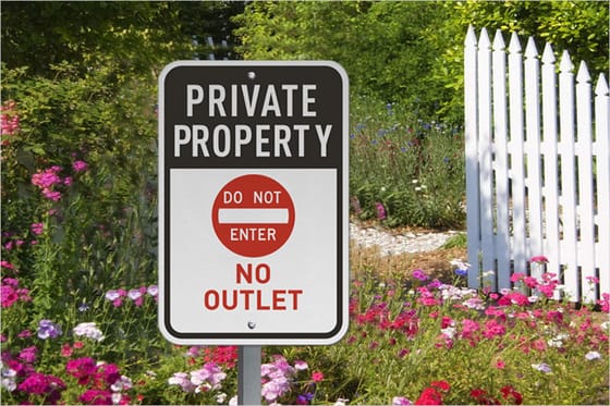
Signs customers designed and printed



Explore more
Where to go next



By the numbers
Materials a designed sign can print on
Common Questions
Common questions about signage design
How do I make my own sign?
Pick the product and the size first, because that sets the canvas. Then take one of two routes. Open the online designer, which loads already set to that size with the bleed and safe margin marked, and type the headline, drop in the logo and drag until the main line fills the panel. Or upload print ready art you already have, built in CMYK with full bleed. Either way, request a free proof and check the capital height against the distance people will read from before you order.
How do I design a sign for a wall?
Work from the reading distance, which indoors is usually only a few feet. That means smaller capitals than an outdoor sign needs, roughly one inch of letter height for every ten feet, so an inch or two on the main line is often plenty. Acrylic and PVC panels suit an interior wall better than coroplast, and a gloss face under a downlight will throw glare, so check the layout in grayscale before you commit to it.
Where can I find free sign design templates?
Every sign product page opens the online designer from a template already set to that product's size, bleed and safe margin, so you are never laying out a blank rectangle. Free design templates are on the site as well if you want a starting layout rather than an empty canvas. Both routes finish the same way, with a free proof you approve before anything goes on press.
What is the purpose of a sign?
A sign does one job at a time. Some signs sell, drawing a passer-by toward a grand opening or a sale. Some direct, guiding people through a building or a parking lot. Some inform, stating hours, rules or safety notices, and some simply build recognition by repeating a logo and color. Naming that single purpose first is the most useful decision in signage design, because it sets the size, the wording and the material for everything that follows.
What are the main types of signs?
The everyday families are rigid panel signs like coroplast, aluminum and PVC for storefronts and yards, flexible banners in vinyl or mesh for large temporary messages, A-frames and sidewalk signs that stand on the pavement, flags such as feather and pole flags that catch motion, and yard signs on wire stakes for lawns and campaigns. Each one suits a different distance, lifespan and budget.
What is signage design?
Signage design is the process of turning a message into a physical sign that reads clearly at the distance and in the environment where it will hang. It combines layout, typography, color contrast, sizing and material choice, and it is finished only when the artwork is print-ready. Good signage design is measured by how fast a stranger understands it, not by how decorated it looks.
How do I choose the right signage design for my business?
Work backward from the goal and the location. Decide how far away people read the sign, then size the largest line to roughly one inch of letter height per ten feet of distance. Keep to one or two typefaces, use a strong contrast, and match the material to the setting: aluminum for a permanent outdoor sign, coroplast or a banner for a temporary push, a flag or A-frame to catch foot traffic. When the layout is locked, our online designer at 4OVER4.COM lets you build it in the browser.
How much does a custom sign cost, and how is the price set?
Price follows the material, the size, the quantity and the finishing, so a small coroplast sign starts around $25 while large-format banners, aluminum panels and flags cost more per piece. Ordering more of the same sign lowers the price per unit, which is why campaign and multi-location runs are cheaper each. The live specs and price table further down this page pull real per-unit numbers straight from the 4OVER4.COM configurator so you can see the tradeoffs before you order.
What size should the text on my sign be?
Match the letter height to how far away the sign is read. The common rule of thumb is one inch of capital letter height for every ten feet of viewing distance for comfortable reading, and closer to one inch per four feet when you want maximum impact for a moving audience. A sign meant to be read from across a 100-foot parking lot needs headline type around ten inches tall, with secondary text stepping down from there.
What file format and resolution do I need to design a sign?
Build large-format artwork as a vector file when you can, since vectors stay crisp at any size. For raster art, work at 100 to 150 DPI at the final print size for signs read up close and as low as 72 DPI for very large pieces read from a distance. Add a bleed, keep important text inside the safe margin, and export in CMYK. Our guide on setting up print files walks through the details.
How do I design a sign?
Work in four passes. First, name the single job of the sign in one sentence and note three facts: indoors or out, how far away it is read, and how long it has to last. Second, rough the layout so the most important line carries the most weight and everything else steps down from it, with one supporting line and one action such as a phone number. Third, set the type: one or two clean typefaces, capital letter height of about one inch for every ten feet of viewing distance, dark on light or light on dark, built in CMYK. Fourth, add full bleed, check the resolution at final size, request a free proof, and match the material to the setting: coroplast for short outdoor runs, aluminum for years of weather, a banner for a big temporary message. You can do the whole layout in the browser with the online designer at 4OVER4.COM, or upload print-ready art if you already have it.
How big should the letters on a sign be?
Size the capital letters to the distance people read from. One inch of capital height for every ten feet is comfortable reading, which puts 2.5-inch type at 25 feet, five-inch type at 50 feet and roughly ten-inch type across a 100-foot lot. For an audience moving past, or a headline you want read without any effort, go to one inch per four feet, which takes that same 50-foot sign to twelve-inch caps. Secondary lines step down from the headline but should never drop below the one inch per ten feet minimum, and cutting words always reads better than shrinking them.
Get Started
Ready to turn your design into a real sign?
Pick your material and size, drop in your print-ready art, and we print a sharp, weather-ready sign that reads clean from across the street.
Legal Disclaimer
Gold Standard guarantees apply to all standard orders placed through 4over4.com. Price match requires verifiable proof of a competitor's published price for an equivalent product with matching specifications and turnaround time. Satisfaction guarantee covers manufacturing defects and print quality issues. Contact support with order number and documentation.
