
Party and Club Flyer Fonts That Grab Attention Across a Dark Room


Which display, script and detail faces hold up on a dark flyer, how to pair them without a clash, and the sizes and licences that keep the job out of trouble.
Give three fonts three jobs: a heavy display face for the event name, one script or retro face for a single mood line, and a condensed sans for the date, venue and door time. Anton, Bebas Neue and Archivo Black are the dependable free headline faces, Monoton, Bungee and Lobster carry the mood, and Oswald or Barlow Condensed hold the details. Judge size by capital height rather than point size, go one weight heavier for anything reversed out of black, and check the licence before the layout.

Quick answer
Three fonts, three jobs, one glance
A party flyer needs a heavy display face for the name, one expressive face for the mood, and a plain condensed sans for the facts. Set the name at roughly four times the cap height of the detail lines and the mood line at about twice, so the three tiers separate at a glance instead of blurring into a block. Anything reversed out of black wants one weight more than the screen suggests, because ink spreads into the white letterforms on press. Free faces cover nearly all of it: the only reason to pay is a specific extended grotesque that a night is building its identity on.
Why Type Decides Whether a Party Flyer Gets Read
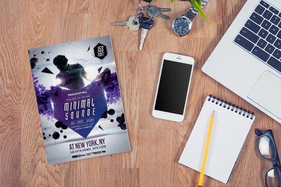
A party flyer is read on a crowded table, under bad light, by someone already holding a drink. Type carries the weight because most nightlife photography looks like every other piece of nightlife photography, so the event name in a heavy display face is what registers from two feet away.
Three failures account for most bad flyers. The event name is set at nearly the same weight as the venue address, so nothing leads and the eye has nowhere to land. The mood font gets used for the details, so the door time turns into a guessing game. Or the whole flyer is reversed out of black in a delicate face, and the press closes up the counters until the a and the e look the same.
Fix it by assigning jobs before you open the font menu. One face carries the name. One face carries the mood, on a single line, nowhere else. One face carries the facts nobody can afford to misread: date, venue, door time, age limit. A font with no job does not go on the flyer.
Everything here assumes ink on paper. A screen forgives thin strokes; a club flyer on gloss stock does not, and the same artwork scaled up to a poster for the venue window exposes every weak choice from ten feet. For the layout that surrounds the type, our nightclub flyer design guide is the companion piece.
Bold Display Fonts That Hold the Event Name
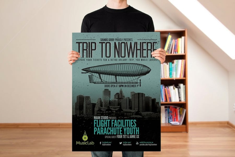
The headline face has one duty: be unmistakable at a glance and stay solid when it is knocked out of a dark background. Weight beats personality here. These five are free under the SIL Open Font License, so they are safe on ticketed work, and each one breaks in a different place.
| Font | Character | Where it wins | The catch |
|---|---|---|---|
| Anton | Very heavy condensed sans, tight sidebearings. | Short one or two word event names that need to fill the width. | Single weight only, so there is no lighter companion inside the family, and long names get cramped fast. |
| Bebas Neue | Tall narrow caps with an even rhythm. | Stacking a long name over three lines without losing height. | No lowercase at all. Any lowercase you type falls back to another font, which is a common flyer bug. |
| Archivo Black | Grotesque with real lowercase and a large x-height. | Mixed-case names, and anything reversed out of black. | Wide. It eats horizontal space quickly, so a long name drops several sizes. |
| Big Shoulders Display | Variable condensed family running from thin to black. | Long DJ lineups where you need to squeeze names without switching fonts. | Below the bold weights it disappears in reverse. Keep it heavy on dark grounds. |
| Rubik Mono One | Geometric, blocky, evenly spaced, one weight. | A hard techno or warehouse look where the grid is the point. | Very wide, and the even rhythm slows down scanning of longer strings. |
The extended grotesque look that runs through most high-end nightlife design comes from paid faces such as Monument Extended and Druk. They are worth the money if the party is a brand rather than a one-off, but they are licensed per desktop user, and the licence does not travel to a freelancer or to the venue's in-house designer. Budget for that before you build a whole identity on one.
One habit saves the headline more often than any font choice: set the name, then print the sheet at full size and look at it from two paces. If the name does not arrive before anything else, the problem is size relationship, not the typeface. The same test works on standard flyers handed out on the street.
Script and Retro Fonts That Set the Night
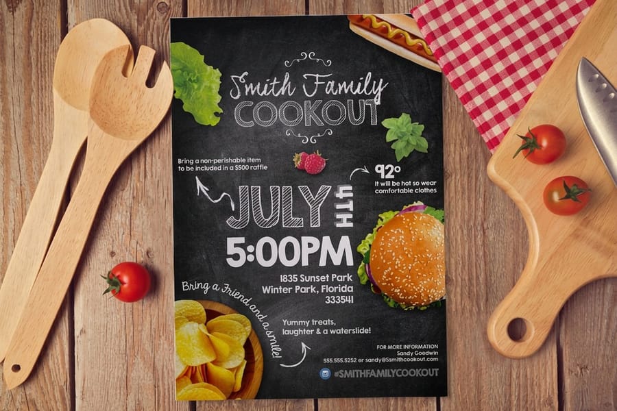
The mood font is the one line that tells you whether the night is a rooftop set, a basement rave or a disco revival. It is also the font most likely to wreck a flyer, because the faces with the most personality are usually the ones with the thinnest strokes.
- Monoton. Single weight with inline strokes cut through the letters, built for the neon-sign look. The inline lines fill in and turn to mush below roughly 30 point in print, so use it large or not at all.
- Bungee. Drawn for signage, with layered styles and a proper vertical-setting variant. It holds its shape when reversed, which most decorative faces do not.
- Lobster. A bold connecting script with enough stroke weight to survive white on black. The safest script on this list for a dark flyer.
- Yellowtail and Pacifico. Brush scripts with medium weight and a relaxed slant. Good for summer, rooftop and beach parties, less convincing for anything hard-edged.
- Alex Brush and Great Vibes. Formal hairline scripts. Beautiful in dark ink on a light sheet, and a mistake reversed out of black, because the thin joins thin further on press until letters break apart.
Two rules keep the mood line out of trouble. Never set a connecting script in all caps: the letters stop joining and the word turns into a pile of shapes. And use the face once, on one line, never for a subhead and never for the details. A script repeated three times stops being a flavour and becomes the flyer's whole voice.
If the night has a strong visual theme, borrow the era rather than the ornament. A disco flyer wants a rounded seventies display face and warm ink; a hardcore night wants a compressed grotesque and no script at all. Start from a correctly sized layout in the blank template library so you are judging the type at real size from the first minute.
Fonts for the Date, Venue and Door Time
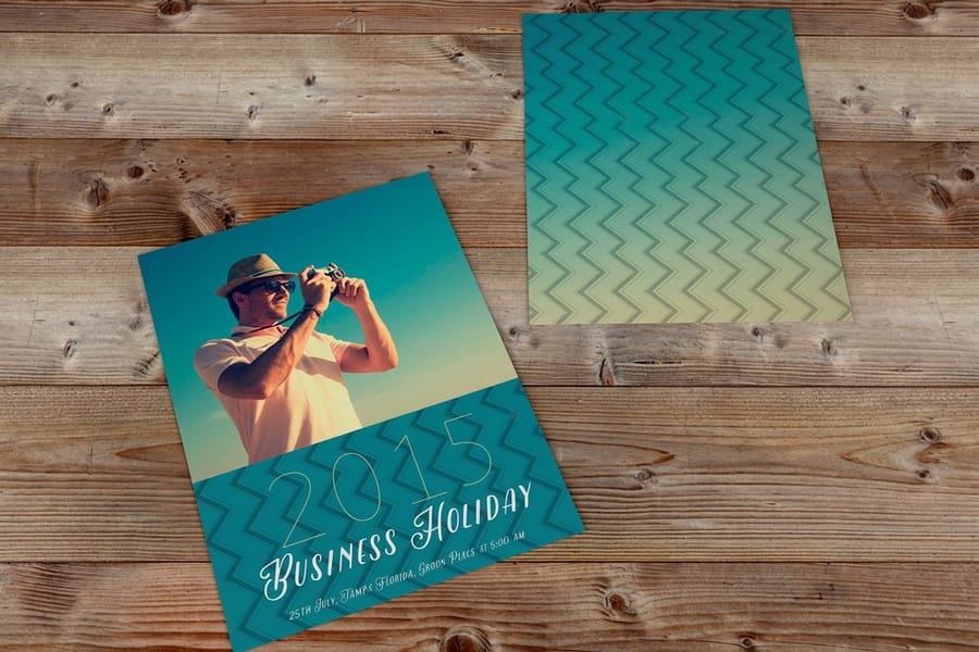
The details block is the part people photograph with their phone. It has to survive a small size, a dark background and a glance. Condensed sans faces do this best because they hold a full address on one line without dropping in size.
Oswald has strong caps and confident figures, which suits a stacked information block. Barlow Condensed is calmer and slightly more neutral, a better match under a loud headline. Roboto Condensed, Inter and IBM Plex Sans all ship tabular figures, so a list of set times lines up in columns instead of drifting. Inter also includes an alternate slashed zero, which is worth switching on when a room number or a time could be misread.
Set caps lines with extra letter spacing. Small caps jammed at default tracking are noticeably harder to read than the same line opened up, and the effect is strongest on a dark ground where each letter is a hole in the ink. Keep the smallest line at 8 point or larger and never go under 6 point for age or licence text.
Two print rules apply to this block specifically. Set small dark type in 100 percent black only, never as a four colour rich black build, or a slight registration shift puts a coloured fringe on every stroke. And when the type is reversed, pick one weight heavier than looks right on screen, because ink creeps into the white letterforms and shaves weight off. Our guide on converting files from RGB to CMYK explains where those black values come from. If the invite goes in the mail rather than a hand, postcards take the same type treatment at a lower postage rate.
Pairing Two or Three Fonts Without a Clash
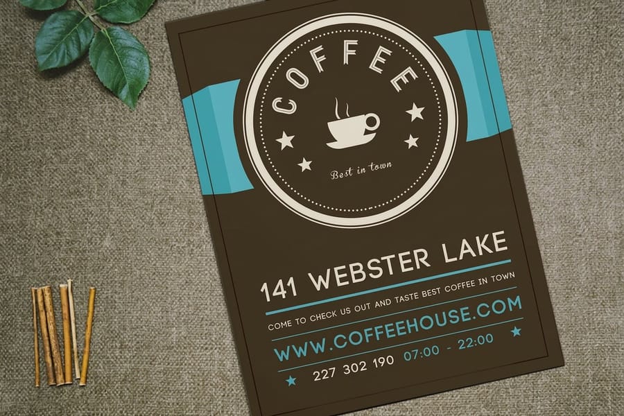
Fonts clash when they do the same job, not when they look different. Two heavy grotesques on one flyer fight each other; a heavy grotesque and a light condensed sans do not, because the eye reads them as headline and detail rather than as two competing voices.
Three combinations that hold up on a dark club flyer:
- Anton with Barlow Condensed. Two fonts, maximum contrast, nothing decorative. The default when the artwork is already loud.
- Bebas Neue with Yellowtail and Roboto Condensed. Caps headline, one brush line for mood, condensed sans for the facts. Works for summer and rooftop nights.
- Archivo Black with Archivo Condensed. One superfamily, so the skeletons match and a clash is impossible. The safest choice when someone else will edit the file later.
The superfamily shortcut is underrated. Families such as Archivo, Barlow and Roboto ship condensed, regular and heavy cuts drawn by the same hand, so you get variety in weight and width without any risk of a mismatch. It is also the fastest way to make a flyer, a poster and a ticket look like one campaign.
Test the pair the way the reader will meet it. Print at 100 percent, hold the sheet at arm's length, then squint until the page blurs. You should still see three distinct blocks: name, mood, facts. If two of them blur into one, the sizes are too close, and no font swap will fix it. The same check catches problems before a run goes out with your flyer distribution plan already booked.
Sizing Type So It Reads Across the Room
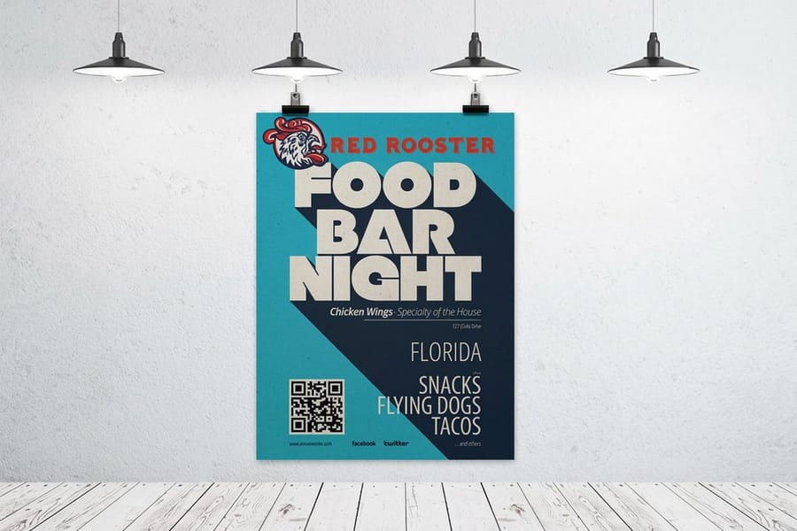
Point size lies. Two faces set at 60 point can differ by a third in actual capital height, because the point size measures the em, not the letter. Measure the capital and set your hierarchy on that.
On a 4 by 6 club flyer the event name usually lands between half an inch and three quarters of an inch of cap height. That puts it around four times the cap height of the detail lines, with the mood line about twice. Those ratios matter more than the absolute numbers, because they are what survive when the artwork is scaled.
Once the flyer becomes a window poster, the sign trade rule takes over: about one inch of cap height for every ten feet of comfortable reading distance. A name that needs to read from thirty feet across a venue wants roughly three inches of capital height, which is why an 18 by 24 poster starting at $108.75 does a job a flyer cannot, even with identical artwork. Keep the ratios, scale the sizes, and check resolution before you enlarge, which our print resolution guide covers.
Stock changes readability too. Gloss makes white type look crisper and colours deeper, and it also throws glare in a lit room, which punishes long paragraphs. Matte reads calmer at the cost of some punch. The trade-off is covered in choosing paper weight for flyers, and club flyers start at $16.48 so you can order a small run in both and judge them under real light.
Where to Find Fonts and What the Licence Lets You Do
Font licensing catches out more flyer designers than any technical issue, and the fix takes five minutes if you do it before the layout instead of after.
| Source | What you pay | Print and ticketed use | What to watch |
|---|---|---|---|
| Google Fonts | Free. | Allowed, including commercial and ticketed events, embedding and outlining. | You cannot sell the font files, and a modified version you redistribute must stay open licensed. |
| Adobe Fonts | Included with a Creative Cloud plan. | Allowed while the plan is active, embedded in your PDF. | You cannot hand the font file to a printer or a collaborator, and access ends with the subscription. |
| Foundry desktop licence | Per user, one off. | Allowed, usually with a seat count written into the licence. | Web and app use are metered separately, and the seat does not cover a freelancer working on your file. |
| Aggregator free download | Free. | Often personal use only, which excludes anything with ticket sales. | Read the licence file in the zip, not the download button. The two frequently disagree. |
Whichever route you take, convert the type to outlines before you export the print PDF. Outlining removes any chance of a substitution at the press, sidesteps embedding permissions on commercial fonts, and freezes your spacing exactly as you set it. Keep a live-text version for yourself, since outlined type cannot be edited or spell checked. The steps are in our walkthrough on converting text to shapes in Illustrator.
No design software and no time? Our online design templates come with the type already licensed and set at print size, so you swap the name, the date and the venue and send it straight to press. Everything in the flyer printing range uses the same file preparation, so a layout that works on one format works on the rest.
Wally sets a club flyer
One face shouts, one face flirts, one face tells the truth
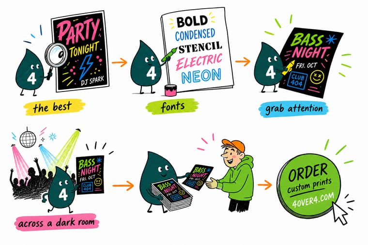
Wally puts the event name in the heaviest face on the sheet, gives the mood exactly one line of script, and hands the date, venue and door time to a plain condensed sans. He measures the capitals instead of trusting the point size, then bumps every reversed line one weight heavier because ink creeps into white letters on press. Three tiers, one glance. If the name and the address look the same size, he starts again.
Print your club flyers →Specs and pricing
Flyer formats, sizes, and starting prices
Compare the formats a party campaign actually uses, with live configuration choices and starting prices straight from the 4OVER4.COM configurator.
Print it
Print the night on stock that holds the type


Explore more
Where to go next


By the numbers
Flyer printing you can count on at 4OVER4
Common Questions
Your flyer font questions, answered
What fonts do most club flyers use?
A heavy condensed or extended display sans for the event name, a script or retro face for one mood line, and a plain condensed sans for the details. The free faces that show up most often are Anton, Bebas Neue and Archivo Black for headlines, Monoton, Bungee and Lobster for the retro or neon line, and Oswald or Barlow Condensed for the date and venue block. The paid look that dominates high-end nightlife design comes from extended grotesques such as Monument Extended and Druk, which are licensed per desktop user rather than given away.
How many fonts should a party flyer use?
Two is safe, three is the practical limit, four is where flyers fall apart. Two fonts already give you the contrast you need: a heavy display face for the name and a condensed sans for the facts. The third font only earns its place if it does something the other two cannot, which is usually setting the mood in a script or a retro face on a single line. If you want variety without risk, take the third voice from the same superfamily instead, for example Archivo Black with Archivo Condensed.
Can I use Google Fonts on a flyer for a ticketed event?
Yes. Google Fonts ship under the SIL Open Font License 1.1, which allows commercial use, embedding in a print PDF and converting the type to outlines. Selling tickets does not change that. The licence forbids selling the font files themselves and requires that any modified version you redistribute keeps an open licence, neither of which affects a flyer. The real trap is font aggregator sites that label a foundry font as free when the download is personal use only.
How big should the headline be on a 4 by 6 club flyer?
Judge it by capital height rather than point size. On a 4 by 6 flyer the event name usually lands between half an inch and three quarters of an inch of cap height, which puts it around four times the cap height of the detail lines. If the name and the venue address look close in size, nothing leads and the flyer reads as a block of text. Print the artwork at 100 percent, put it on a table, and step back two paces before you commit.
Why does white type look thinner in print than on screen?
Ink spreads slightly where it meets an unprinted area, so it creeps into the white letterforms and shaves weight off every stroke. That is why reversed type prints lighter than the screen preview, and why a hairline script that looked elegant in Illustrator can lose its thin joins on a gloss flyer. Pick one weight heavier than looks right, keep reversed text at 8 point or above, and avoid faces with very fine strokes for anything reversed.
Should I outline the fonts before sending a flyer to print?
Yes, for a flyer it is the safest habit. Converting type to outlines removes any chance of a font substitution at the press, sidesteps embedding permissions on commercial fonts, and locks your spacing exactly as you set it. Keep a live-text copy of the file for yourself, because outlined type cannot be edited or spell checked afterwards. Our walkthrough on converting text to shapes in Illustrator covers the steps and the two settings people miss.
Get Started
Ready to print the flyer?
Pick your size and stock, upload the artwork with the type outlined, and we print club flyers that hold their headline under club lighting.
Legal Disclaimer
Gold Standard guarantees apply to all standard orders placed through 4over4.com. Price match requires verifiable proof of a competitor's published price for an equivalent product with matching specifications and turnaround time. Satisfaction guarantee covers manufacturing defects and print quality issues. Contact support with order number and documentation. On-time delivery rate based on tracked orders 1999 to 2026. Individual results may vary based on shipping carrier performance.
