
The Psychology of Colors in Business and Branding


Why Color Matters in Business

Color is the fastest message a brand sends. Before a shopper reads a name or a tagline, the color has already set a mood, calm or urgent, premium or friendly, trustworthy or playful. It is emotional shorthand that lands in an instant, which is why the biggest brands guard a single color as tightly as they guard their logo. You do not think of a soda without a red, or a shipping giant without a brown.
For a small business the lesson is the same at any budget: pick a color and own it. One dominant shade repeated everywhere, on the card, the sign, the packaging, and the storefront, is what a customer's memory latches onto. A different color on every piece reads like a different company each time. If you want the branding foundation underneath this, the guide to logo design best practices pairs well with a color decision.
4OVER4.COM has printed for 150,000+ businesses since 1999, and the one color mistake we see most is a shade that looks great on a screen and prints wrong. This piece covers what each color signals, then the practical part almost every article skips: how to make that color print true. Start with the meanings.
Color psychology at a glance
One line per color: the feeling it triggers, and the kind of business it usually serves. Each one is unpacked further down, with the brands that own it and what it does on press.
- Red. Urgency and appetite. Food, sales signage, entertainment, anything bought fast.
- Blue. Trust and competence. Banks, tech, healthcare, insurance, logistics.
- Green. Growth and health. Wellness, organic, outdoor, sustainable, finance-as-growth.
- Yellow. Optimism and visibility. Signage, family brands, anything read at a distance.
- Orange. Friendly and affordable. Value retail, kids, and the one button you want pressed.
- Purple. Creativity and refined luxury. Beauty, craft, and brands escaping a sea of blue.
- Black. Luxury and authority. Fashion, beauty, high-end services, premium packaging.
- White. Space and clarity. The stock choice that decides how every other color reads.
Print that list, put it next to your logo, and the palette conversation stops being taste and starts being a decision you can defend. The rest of this page turns each line into a color you can actually order.
Shop the range
Business cards printing
The first piece where a brand color meets a customer, printed true to your palette.
What Each Color Means and How to Use It
Color meaning is not superstition, it is a pattern of association most people share. Here is what the core brand colors signal, where each one earns its keep, which brands already own that shade, and what each color does once it hits paper.
Red: energy, urgency, and appetite
Energy, urgency, and appetite. It raises the pulse, which is why it drives sales signage and food brands. Use it to prompt action, sparingly, because too much reads as alarm.
Coca-Cola has run the same red for more than a century, and Target reduced an entire identity to a red bullseye you can read across a parking lot. Both treat red as the whole brand rather than an accent, which works because both sell frequent, low-deliberation purchases. Red is also the shade customers question most on a proof: a process build of magenta and yellow leans warmer on an uncoated sheet than it looks on a backlit screen, so if red is your hero color, set it in CMYK, match it to a Pantone, and approve it on the exact stock you plan to reorder.
Blue: trust, calm, and reliability
Trust, calm, and reliability. The default for banks, tech, and healthcare because it reads safe and competent. Use it when you want a customer to feel secure.
Facebook and IBM chose blue for the reason a bank does: it asks a customer to relax and hand something over, whether that is money or personal data. IBM used one shade so consistently across hardware, letterhead, and signage that the color became the nickname Big Blue. The trap is that blue is the most crowded color in business, so the real decision is not blue or not blue, it is which blue. A deep navy reads institutional and conservative, a bright cyan-leaning blue reads modern and software-first, and those two say very different things on the same business card.
Green: growth, health, and nature
Growth, health, and nature. The go-to for wellness, organic, and finance-as-growth. Use it to signal fresh, natural, or sustainable.
Starbucks uses a soft, cool green that reads calm and everyday, while John Deere uses a saturated agricultural green that reads work and land. Same family, two opposite promises, decided by saturation and by the neutral sitting next to it. Green is also the color most often paired with uncoated or recycled stock, and that pairing changes it: an uncoated sheet absorbs more ink and pulls green slightly darker and duller, which flatters a natural brand and can flatten a bright wellness one.
Yellow: optimism, warmth, and attention
Optimism, warmth, and attention. It grabs the eye fast and reads cheerful, but it needs contrast to stay legible. Use it as an accent that signals happy and bright.
The golden arches are the clearest case: a yellow picked to stay legible from a moving car, then locked against red so it never has to carry text on its own. IKEA does the same job with yellow on blue. That is the discipline yellow forces on you. Yellow type on white is close to unreadable once it is ink instead of pixels, so put yellow behind dark text or use it as a block of color, and always look at a printed sample before committing a large flat yellow area.
Orange: friendly, energetic, and affordable
Friendly, energetic, and affordable. Warm and approachable without red's urgency, great for value brands and calls to action. Use it to feel welcoming and upbeat.
Home Depot turned orange into a uniform, an apron, a store sign, and a bucket, so the color reaches a customer on the staff before it reaches them on an ad. Nickelodeon used the same shade to read fun and unserious for an audience with no interest in prestige. Orange earns its keep on the one thing you want clicked, called, or redeemed, which is why it shows up on buttons and coupon blocks more often than on logos.
Purple: creativity, wisdom, and quiet luxury
Creativity, wisdom, and a touch of luxury. It reads imaginative and premium at once, common in beauty and craft brands. Use it to feel distinctive and refined.
Cadbury has defended its purple as a trademark, which tells you what a color is worth once customers use it as a name. Twitch went the other way and used purple precisely because the technology brands around it were all blue, so the color did the differentiating before the logo did. Purple is also the shade most likely to disappoint in print: deep violets sit outside what a four-color process build can reach, so a purple hero color is the strongest case on this page for a Pantone match rather than a CMYK approximation.
Black: luxury, authority, and sophistication
Luxury, authority, and sophistication. High contrast and premium, ideal for beauty, fashion, and high-end services. Use it when the brand should feel exclusive.
Chanel and Nike both use black as restraint: no gradient, no second color, nothing softening the mark. That only reads premium if the black actually prints deep, and this is where a cheap job gives itself away. A large black panel built from black ink alone comes out flat and slightly gray, so ask for a rich black, black supported by percentages of cyan, magenta, and yellow, on any piece where black is the background. Keep small type in plain black so it stays sharp instead of fuzzing at the edges.
White: space, clarity, and confidence
Space, clarity, and confidence. White is not the absence of a color decision, it is the room that makes a hero color look deliberate instead of loud. Use it when you want the product, not the packaging, to do the talking.
Apple sells white as both a product finish and a packaging language, and Muji built a retail identity out of plain paper and minimal ink. In print, white is almost always the paper rather than an ink, so choosing white means choosing stock: a bright white gloss makes a hero shade pop and photographs cleanly, while a natural or uncoated white warms every color printed on it. If artwork needs white sitting on a dark background, it has to be printed or foiled on purpose, because a knockout shows the stock color, not a true white.
Notice that no color is universally best. The right one is the one whose meaning matches the feeling you want a customer to have. For the business card angle specifically, the best colors for business cards piece goes deeper.
Whichever one you land on, look at it in ink before you commit a whole identity to it. A short run of classic business cards shows your shade at full saturation, in the hand, under the light your customers will actually see it in.
Print picks
Four pieces to carry your palette
Live prices, ready to customize with your brand color across every format.
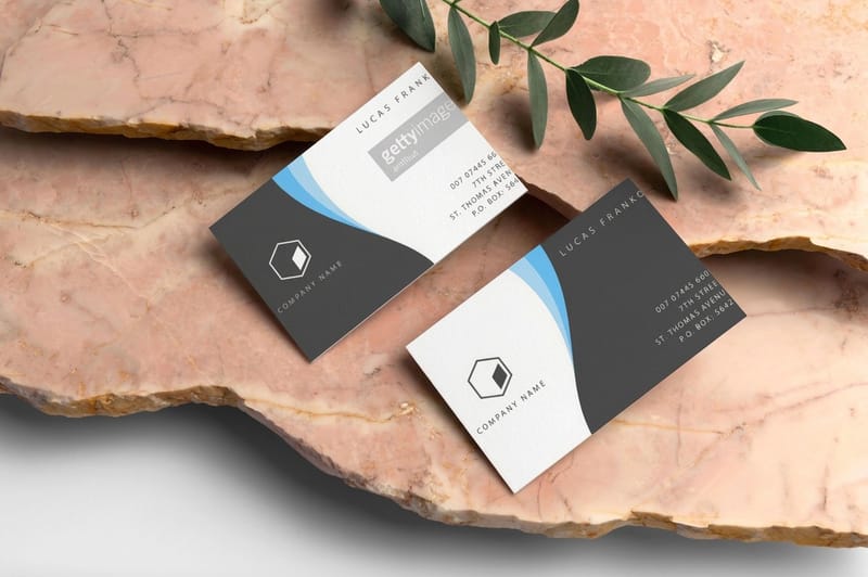 Classic Business Cards From $17.57 The first place a brand color meets a customer, printed clean and true to your palette. Standard Brochures From $57.11 Room to build a full color story across panels, headers, and imagery.
  Standard Posters From $108.75 Big-format color that owns a wall and makes your brand shade impossible to miss.
  Standard Flyers From $57.11 The cheap, high-volume piece to put your palette in a thousand hands.
 Build a Palette, Not a Rainbow
A brand does not need many colors, it needs a system. One hero color you can own, one or two supporting shades, and a neutral for text. That restraint is what makes a brand recognizable, because the eye remembers a single confident color far better than a crowd of competing ones.
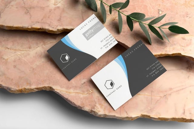
Use the hero color where it matters most, the logo, the primary sign, the header of every piece, so it becomes the shorthand for your name. Let the supporting shades handle accents and backgrounds, and let the neutral carry the fine print so nothing fights the message. Keep the same values everywhere and a customer's brain stitches the pieces into one brand across a card, a brochure, and a storefront. Here is the piece where a palette usually meets a customer first.
Where a palette meets a customer
Classic business cards
The first, cheapest place to put your hero color in someone's hand, printed clean and true.
How to Apply Color on Print So It Stays True
Here is the part color-theory articles almost always leave out: a color on a screen and the same color in ink are not the same thing. Screens glow in RGB, print is mixed in CMYK ink, and a bright screen blue can turn muddy on paper if it is never converted properly. The way to keep a brand color true is to lock its print values from the start.
Set your brand color in CMYK, or better, match it to a specific Pantone so every printer hits the exact same shade batch after batch. The CMYK vs RGB guide explains the conversion, and Pantone to CMYK matching covers the fine control. Then confirm it before a full run: a free proof from 4OVER4.COM lets you check the real ink on the real stock, so the color that ships is the color you chose. Compare the popular pieces below to see where your palette lands best.
Compare pieces
Popular business cards, side by side
Classic cards print in 3 business days on 14pt gloss. Metallic foil takes 7, on 16 point silk laminated.
 free business cards |  Standard Business Cards |  3D Lenticular Business Cards |  Metallic Foil Business Cards | |
|---|---|---|---|---|
| Min price | Free | $17.57 | $690.88 | $222.13 |
| Paper / stock | 14pt Gloss Cover | 14pt Gloss Cover | 31pt Lenticular Lens | 16 Point Silk Laminated |
| Finish | - | Standard Finish | - | - |
| Size | 2" x 3.5" | 2" x 3.5" | 2" x 3.5" - Vertical | 2" x 3.5" |
| Default qty | 200 | 100 | 500 | 500 |
| Turnaround | 5 business days | 3 business days | 22 business days | 7 business days |
| Rating | ||||
| View & customize | View & customize | View & customize | View & customize |
Lock Your Brand Color in Print
Color is the cheapest, fastest brand asset you have, and getting it right costs almost nothing beyond a little care. Pick a hero shade whose meaning fits your business, build a small palette around it, set the print values, and repeat it everywhere. Do that and a customer starts recognizing you by color alone, which is the highest form of brand recall there is.
When you are ready, lay out your pieces in the online design templates, keep the brand values locked, and let 4OVER4.COM print them true across cards, brochures, and signage. Browse the business cards and brochures categories to put your palette to work, and see how a real brand used color to win the shelf in this food brand case study.
Tell the full color story
Standard brochures
Panels, headers, and imagery give a palette room to breathe and a brand room to explain itself.

Wally locks a brand color in print
Pick one hero shade and make it print true
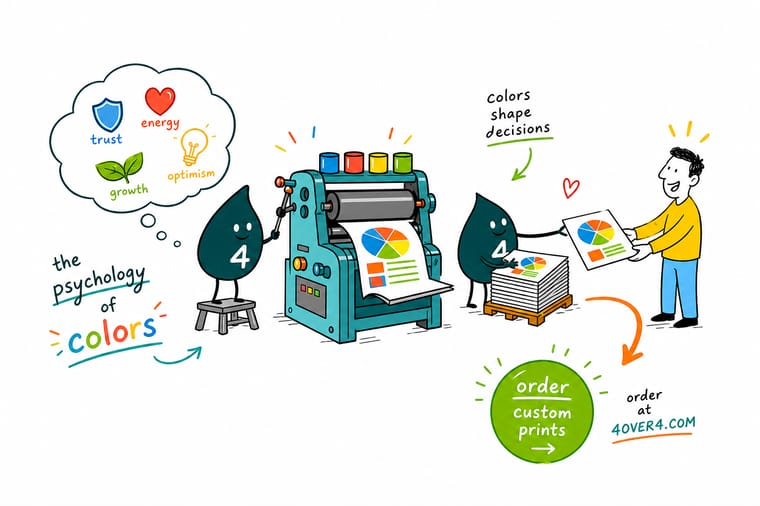
Color lands before words do. Wally picks the one hero color whose meaning fits the brand, builds a small palette around it, then locks the print values in CMYK or a Pantone so the shade never drifts. A free proof confirms the real ink before the run. 4OVER4.COM prints your color true across cards, brochures, and signage, so a customer recognizes you by shade alone.
Print your palette true →Choosing color with intent, not by accident
Explore more
More ways to put your brand color to work
A palette only counts once it is on paper: classic cards at 100 for $17.57 in 3 business days, metallic foil at 500 for $222.13 in 7.
 Category Business Cards Printing Where a brand color meets a customer first. Category Brochures Printing Room to tell a full color story across panels. Product Standard Posters Big-format color that owns a wall. Guide CMYK vs RGB The color mode that keeps print true. Guides Printing Guides Step-by-step guides across every print product.
  Article Card Color Meanings What your card color says about your brand.
  Case study Color on the Shelf How a food brand stood out with color.
 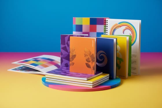 Showcase Brochure Design Guide A gallery of brochure styles and color use.
  Statistics Print Ad Effectiveness The data behind how print color performs.
 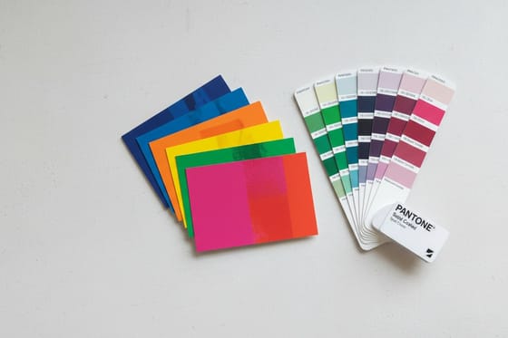 Benefit Pantone Spot Color Match an exact brand shade every run.
  Collection Business Basics Collection The core print pieces every brand needs.
  Kit Salon Launch Suite A color-coordinated print set for a launch.
 Ready to pick a color and make it yours?
Choose a hero shade, lock its print values, and let 4OVER4.COM print it true across every piece. Confirm the exact ink with a free proof first.
How color shapes buying decisions, answered
What color is best for a business?
There is no single best color, only the color whose meaning matches the feeling you want a customer to have in the first second. Blue is the safest default because it reads trustworthy and competent, which is why banks, tech, healthcare, and logistics crowd into it. Red pushes urgency and appetite and suits food and sales signage. Green signals growth, health, and nature. Black signals luxury and authority. Orange reads friendly and affordable and works hardest on the one thing you want clicked or called. Yellow reads optimistic and carries at a distance but needs dark type beside it to stay legible. Purple reads creative and refined and stands out in categories saturated with blue. White is the space that makes the hero color look deliberate. Pick one hero color to own, add one or two supporting shades and a neutral for text, then repeat that hero shade on every card, sign, and package. Testing it is cheap: classic business cards start at $17.57 and brochures at $57.11, and a free proof from 4OVER4.COM confirms the exact shade before a full run.
What does blue mean in branding?
Blue signals trust, calm, competence, and reliability, which is why it is the default for banks, tech companies, insurers, and healthcare brands: it asks a customer to relax and hand something over, whether that is money or personal data. Facebook and IBM both built on it, and IBM used one shade so consistently across hardware, letterhead, and signage that the color became the nickname Big Blue. The catch is that blue is the most crowded color in business, so the real decision is which blue rather than whether blue. A deep navy reads institutional, established, and conservative. A bright cyan-leaning blue reads modern and software-first. Whichever you choose, set it in CMYK or match it to a Pantone before printing, because blue is one of the shades that drifts most between a backlit screen and ink on paper, and a free proof is the only way to confirm the shade you approved is the shade that ships.
Why is the psychology of colors important in business?
Color is the fastest message a brand sends, setting a mood before a customer reads a name or tagline. It works as emotional shorthand: blue reads calm and trustworthy, red reads energetic and urgent, green reads fresh and healthy, black reads premium. Because that reaction is instant and shared by most people, color shapes how a shopper feels about a business in the first moment. The biggest brands guard a single color as tightly as their logo, and small businesses can win the same recall by picking one hero shade and repeating it on every card, sign, and package.
What do the main business colors mean and how do you use them?
Blue signals trust and reliability, the default for banks, tech, and healthcare. Red signals energy and urgency, which drives sales signage and food brands, best used sparingly. Green signals growth, health, and nature, ideal for wellness and sustainable brands. Black signals luxury and authority, suited to beauty, fashion, and high-end services. Purple signals creativity and refined luxury. Orange signals friendly, energetic, and affordable, great for calls to action. Yellow signals optimism and grabs the eye but needs contrast to stay legible. Choose the color whose meaning matches the feeling you want a customer to have.
What is business colors meaning?
Business color meaning is the set of shared associations each color triggers when used in branding, and how those associations shape a customer's snap judgment of a business. It matters because color lands faster than words and drives a large share of first impressions. The practical takeaway is to build a palette, not a rainbow: pick one hero color whose meaning fits your business, add one or two supporting shades and a neutral for text, and repeat the hero color everywhere so it becomes shorthand for your name across cards, brochures, signage, and packaging.
How do I choose the right business colors?
Start from the feeling you want a customer to have, then pick the color whose meaning delivers it: trust points to blue, energy to red, growth to green, luxury to black. Choose one hero color to own, add one or two supporting shades and a neutral, and avoid spreading across too many colors, since a single owned shade is far more memorable. Then make it printable by setting the brand color in CMYK or matching it to a Pantone, so the shade stays true across every printer and batch. Confirm the exact ink with a free proof before your first full run.
What does printing in brand color cost and how are prices set?
Putting your palette in print is inexpensive to start. At 4OVER4.COM classic business cards start at $17.57, brochures and flyers at $57.11, and posters at $108.75. Price depends on the product, the size, the stock and finish, and the quantity, and ordering more brings the per-unit cost down. Matching an exact brand shade with Pantone spot color can add a step for premium color accuracy, but standard full-color CMYK printing is included, and a free proof lets you confirm the color before committing to a full run so you never pay to reprint a shade that drifted.
