
Free Flyer Template Sites and Design Tools Worth Bookmarking


The free flyer templates worth your time come from four places: Canva, Adobe Express, Microsoft Create, and the blank press files your printer publishes. Before you spend an hour inside any of them, open the export dialog and confirm it gives you a PDF at 300 DPI with 0.125 inch of bleed, because that one setting decides whether the flyer prints sharp or soft.
Free flyer template sources at a glance
| Source | What you actually get | What the free tier exports | The catch |
|---|---|---|---|
| Canva | The largest flyer library, edited in the browser, no download needed | PDF Print on the free tier; check the bleed and crop-mark boxes in the dialog | Individual photos and graphics inside a free template can carry their own licence |
| Adobe Express | A smaller, tidier flyer set with better typographic defaults | PDF Print, and it plays nicely with Adobe fonts you already licence | Fewer layouts, so more of the design work lands on you |
| Microsoft Create | Word and PowerPoint flyer files you open in software you already own | Save as PDF, then verify the page size and the image resolution yourself | Office has no bleed concept, so you build the bleed into an oversized page |
| Freepik and Vecteezy | Downloadable AI, EPS and PSD source files with live vector layers | Whatever your own editor exports, which means full prepress control | Free downloads are capped per day and many assets require attribution |
| Printer blank templates | An empty press file at the exact trim size, with bleed and safety already drawn | Built for the press that will print it, so nothing needs converting | No design on it. It is a frame, not a starting layout |
Every one of these can produce a printable flyer and none of them does it by default. The decision is not which site has the prettiest thumbnails, it is which one lets you leave with a 300 DPI CMYK PDF that carries bleed. Start from a print-ready blank when the format is unusual.
What makes a free flyer template printable
A flyer file is print ready when four things are true at once: the artwork resolves to 300 DPI at final size, the document carries 0.125 inch of bleed on every side, the colour is CMYK rather than RGB, and the fonts are embedded or converted to outlines in the exported PDF. Miss one and the file still opens, still looks correct on screen, and still comes back from the press looking like somebody else made it.
Resolution is where most free templates quietly fail. A template built for social media exports a clean 1080 pixel image, and 1080 pixels spread across an 8.5 inch flyer works out near 127 DPI. Raising the export setting afterwards does nothing useful, because the photograph inside the layout was only ever 1080 pixels wide. Pixels you never had cannot be added back.
Bleed is the other one that bites. A press cuts a stack of paper with a guillotine and the blade wanders by a fraction of a millimetre through the lift, so a background colour that stops exactly on the trim line shows a white sliver on part of the run. Push the background 0.125 inch past the edge and the wander lands in the offcut where nobody sees it.
The four numbers to check before you commit an hour
Final trim size, bleed, safety margin, resolution. For a standard 8.5 by 11 inch flyer that means a document set up at 8.75 by 11.25 inches once bleed is included, with nothing important closer than 0.125 inch to the trim line, and every placed photo at 300 DPI at the size it appears on the page. Those four numbers travel with you across every tool on this page.
The safety margin is the one people skip. Type set right up against the trim looks intentional on screen and looks like a mistake on paper, because the cut varies just enough to leave one flyer with a cropped letter. Our free poster template guide walks the same four numbers at a larger format, where the tolerances are more forgiving and the file sizes are not.
Why the colour changes between the screen and the sheet
Your monitor emits light and mixes red, green and blue. A press lays down cyan, magenta, yellow and black ink that reflects light instead. The brightest screen blues, the electric greens and the fluorescent oranges sit outside what four inks can reproduce, so they land duller on paper. That is physics, not a printing fault.
Convert to CMYK while you are still designing, not at the end. Then you see the shift early enough to adjust the design around it, rather than being surprised by a proof. Uncoated stock pulls the ink further down again because the fibres absorb it, which is why the same file looks richer on gloss. If you want the colour to carry the design, flyer design ideas that get noticed covers the layouts that survive that shift.
The template sites worth bookmarking
These fall into three groups, and the group matters more than the individual site. Browser tools give you a library plus an editor and keep the file on their servers. Asset libraries give you a source file you own and edit in your own software. Printers give you an empty, correct frame.
Pick the group that matches how much control you want. If you are printing one flyer for one event, a browser tool is faster and the result is fine. If you are building a look you will reuse across a season of flyers, take the source file.
Browser tools with a library built in
Canva has the deepest flyer library of the three and the shallowest learning curve. The free tier exports a PDF Print file. The bleed and crop-mark options have moved between tiers over the years, so open the export dialog and look rather than trusting any list, including this one. Watch the individual elements too: a template can be free while a photo inside it is not.
Adobe Express has fewer flyer layouts and better typographic defaults, which usually means less work undoing bad line spacing. It sits closest to a real prepress path if you already own Adobe fonts.
Microsoft Create is the one people forget. It hands you Word and PowerPoint flyer files that open in software already on the machine, which for a lot of small offices removes every barrier. The limit is real though: Office has no concept of bleed, so you set up an oversized page and build the bleed in manually.
Asset libraries you download and edit
Freepik and Vecteezy are different animals. They give you the AI, EPS or PSD source file, so every layer is live and you control the export end to end. That is the difference between adapting a template and being stuck inside one.
The catch is the licence, and it varies per asset rather than per site. Free downloads are usually capped per day and many require credit somewhere on the piece. Read the licence on the individual file before you build a campaign on it, because retro-fitting attribution onto 5,000 printed flyers is not possible.
The templates your printer already publishes
The most reliable free files in this whole category are the blank press templates a printer publishes for its own products. They carry the exact trim, the bleed line, the safety line and the correct colour space for the press that will run the job, so there is nothing to convert and no licence to read. Our blank template library covers flyers alongside every other format we print.
The same logic applies past flyers. A door hanger has a die-cut hole the artwork has to dodge, and a trifold has panel widths that are not equal thirds. Both are covered in the free door hanger template guide and the free trifold brochure template guide, and in both cases a printer blank saves an afternoon of measuring.
The design tools most people miss
Everyone names Canva. Fewer people name the free tools that do the part Canva was never built for, which is prepress. These are the ones worth having installed before a deadline, not during one.
Inkscape is a genuine vector editor, free and cross platform. It sets a document size with bleed, keeps type as live vector, and exports a PDF that a press can use. Scribus goes further and is the free tool nobody talks about: it does CMYK separations, colour management and a real preflight check that lists what will fail before you upload. It looks dated and it will tell you the truth about your file. GIMP is the wrong tool for a flyer, because it is raster only and type edges suffer, but it is fine for cleaning up a photograph you are placing into one of the others.
Browser tools tied to an actual printer
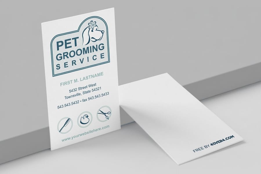
A design tool that lives on a print shop site has one advantage the general ones cannot match: the canvas is already the product. Sizes, bleed and safety are locked to what the press runs, so an export that looks right cannot be the wrong size. Our own version is walked through step by step in how to use the 4OVER4 free business card design tool.
It is also the cheapest way to test whether a template design holds up on paper before you commit to a flyer run, because free business cards cost nothing but shipping. Print the type treatment and the colour on a small piece first, hold it under the light the flyer will live in, and you find out more in a day than a screen proof shows in a week.
If picking between the browser tools is the actual question, 5 free design tools and the easiest one ranks them by how quickly a non-designer gets to a usable file, and the best design tools for beginners and pros splits the recommendation by skill level.
Check the file yourself before you upload it
Open the finished PDF in any reader and do three things. Check the page size reads 8.75 by 11.25 inches rather than 8.5 by 11, which tells you the bleed actually exported. Zoom to 400 percent and look at the edge of the type: crisp means vector, fuzzy means it was flattened into a low resolution image. Then count the pages, because a stray blank page is the most common reason a job pauses.
One more habit worth keeping. Once the flyer artwork works, reuse it rather than redesigning for every channel. The same layout logic carries into a square social crop, and designing an Instagram post template covers what has to change when the flyer becomes a post. Seasonal work is the same story: St Patrick’s Day poster and flyer ideas shows how far one strong layout stretches across a calendar.
The Browser Tools That Did Not Make the List
Three names come up often enough to deserve an answer rather than a silence. None of them is a bad tool. They are built screen first, which changes what you have to check before spending design time in one.
PosterMyWall is organised around event and promo layouts and leans hard on social sizes. VistaCreate covers similar ground with a large stock library attached. Piktochart is really an infographic tool that also does flyers, and it shows in the layouts, which are strong on charts and icons and thinner on the poster style compositions a flyer usually wants.
The test is the same for all three, and for anything else you are tempted by. Open the export dialog before you start designing rather than after. If the free tier will not give you a PDF at 300 DPI with bleed, you are building a screen file, and the fix later is to rebuild it somewhere else.
Flyer templates and print-ready blanks
If you would rather not start from a blank canvas, these are the flyer designs and press files we host. The blanks carry the trim, bleed and safety lines already drawn at the exact size, so the only thing left to do is put artwork inside them.
Start fast
Flyer design templates and press-ready blanks
Editable flyer layouts plus exact-size blanks, so your artwork lands inside the cut line the first time.



When the free library has nothing for your niche
Free template libraries are deep on weddings, club nights and generic sales, and thin the moment you work in a specific trade. Search for a flyer template for an interior design studio, a mobile welder or a paediatric dental practice and you get the same three layouts with a different stock photo dropped in. That is the point where a template stops saving time and starts costing it.
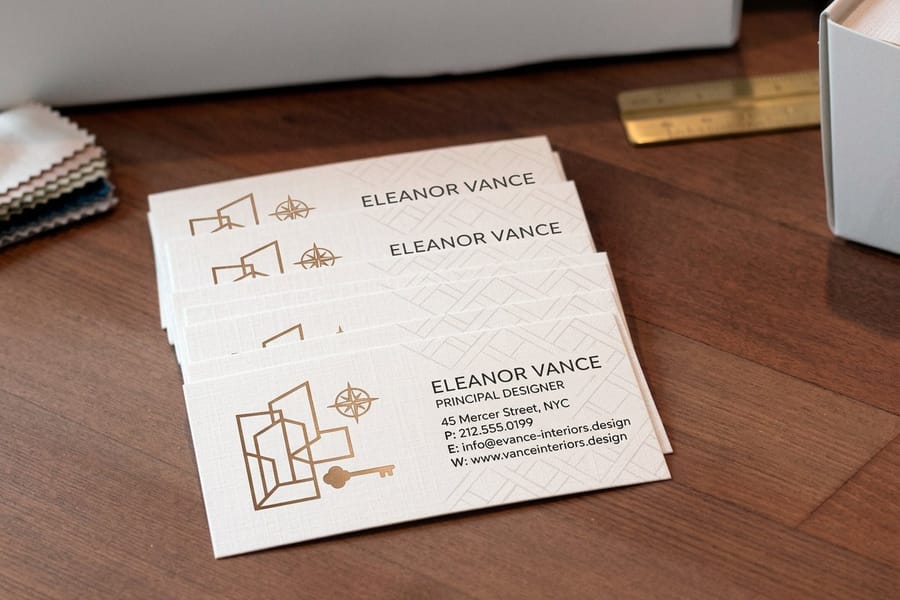
Two ways out. Start from a printer blank and set your own type, which takes longer once and then belongs to you. Or start from the piece that already exists for your trade and carry its type and colour onto the flyer, so the two pieces read as one brand. Interior design business cards start at $17.57 and are a useful example: the layout is already tuned to that industry, and lifting the typeface and palette from it gives the flyer a starting point no generic template offers.
Quantity and price
What a matching printed piece costs
Real configurator numbers, so you can see how far the per unit price drops as the run grows.
| Quantity | Price Per Unit | Total |
|---|---|---|
| 100 | 17.6¢ | $17.57 |
| 200 | 11.5¢ | $23.07 |
| 300 | 9.15¢ | $27.46 |
| 400 | 7.96¢ | $31.86 |
| 500 | 7.25¢ | $36.26 |
| 600 | 6.77¢ | $40.64 |
Test it first
Prove the design on paper
Print the type and colour on a small piece before you commit to a flyer run.

Whichever route you take, print something small before you print something large. Colour, weight and legibility all behave differently on paper than they do backlit on a screen, and the cheapest way to learn that is on a piece that costs almost nothing. You can also earn coins on every order and put them toward the flyer run itself.
Choosing an approach by business type
The right tool depends less on your design skill than on how often the flyer changes and who is going to see it.
- Event promoters. Browser tools win here. The turnaround is short, the design changes weekly, and the flyer is disposable by design. Take the fastest path to a correct PDF and spend the saved time on distribution.
- Restaurants and bars. Photography carries the piece, so resolution is the whole battle. Use your own photos at 300 DPI rather than a template stock shot, and check the colour on uncoated stock before a large run.
- Retail and seasonal sales. One layout with a colour and a headline that swap each season. Build it once in a source file you own, not inside a browser account that could change its export tiers.
- Trades and local services. Free libraries are thin on trade specifics, so start from a printer blank and set your own type. A plain, legible flyer with a real phone number outperforms a decorated one nobody can read.
- Studios and practices. Consistency across pieces matters more than any single flyer. Lock the typeface and the colour, then apply them everywhere, including the cards you hand over in person.
Wally checks the export before the design
The dialog matters more than the template
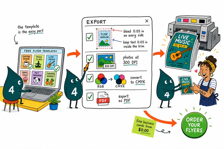
Set the document to your trim size plus 0.125 inch of bleed on every side, keep type and contact details 0.125 inch inside the trim, place every photo at 300 DPI at its final size, and convert to CMYK while you are still designing so the colour shift shows up early. Export as PDF, confirm the page reads 8.75 by 11.25 inches for a standard flyer, then let 4OVER4.COM check the artwork before the run.
Get print-ready blanks →What to remember about free flyer templates
Design tips that hold at any flyer size
- One message, one size up. A flyer is read at arm’s length while somebody is walking. Pick the single thing you want remembered and set it at least one size larger than feels comfortable on screen.
- Kill the placeholder text. Templates ship with filler copy in every block. Delete the blocks you have nothing to say in rather than filling them, because an empty flyer reads better than a padded one.
- Change the typeface first. The fastest way to stop looking like a template is to replace the font. Keep the layout, change the type, and the same file stops reading as stock.
- Put contact details in the safety zone. Phone numbers and addresses near the trim edge are the details most likely to lose a character to the cut. Keep them 0.125 inch inside the line.
- Print one before you print a thousand. A short first run on the real stock tells you about colour, weight and legibility that no screen proof can. Reorder once it has survived contact with real light.
Explore more
More free templates and print guides
Related products and guides on 4OVER4.COM, one card each, so you can keep building the campaign.
 Product Free Business Cards Test a type treatment and a colour on real stock for the cost of shipping.
 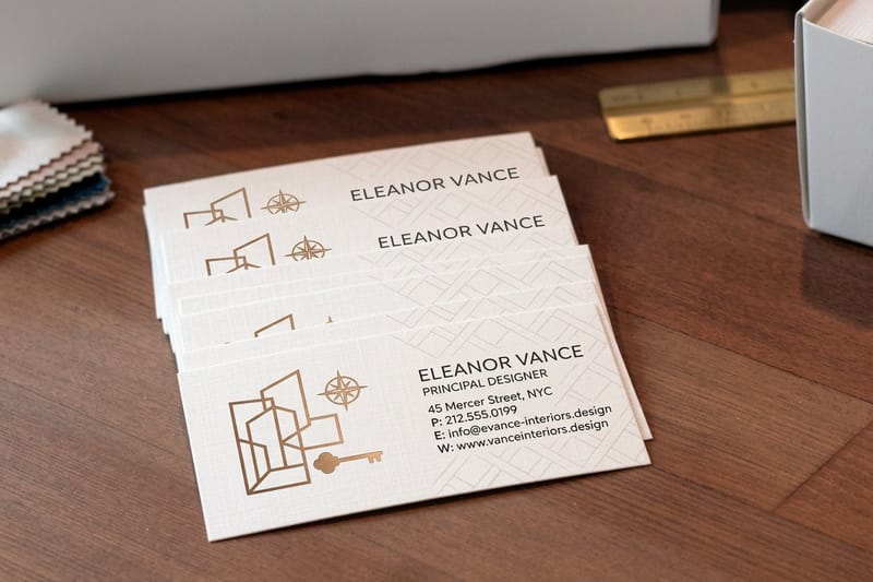 Product Interior Design Business Cards A niche the free template libraries barely cover, printed from $17.57.
  Guide Free Poster Templates That Print Sharp The same four numbers at a larger format, where file size becomes the problem.
 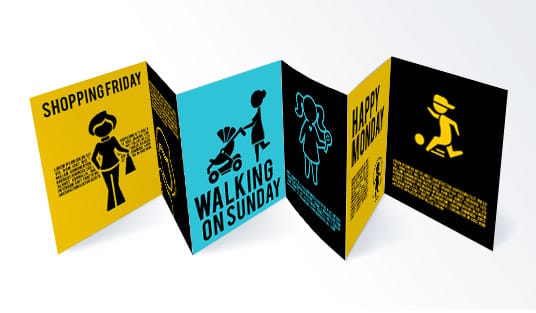 Guide Free Trifold Brochure Templates Panel widths are not equal thirds. Here is why, and what to set.
 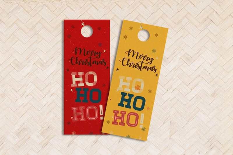 Guide Free Door Hanger Templates Designing around a die-cut hole that the artwork has to dodge.
  Article Creative Flyer Design Ideas Layouts that survive the shift from screen colour to four inks.
 Got the template. Ready to print it?
Grab a print-ready blank at the exact trim size, drop your artwork inside the bleed line, and 4OVER4.COM checks the file before it goes on press.
Common questions about free flyer templates
What is the best website to create flyers?
For most people it is Canva, because it has the deepest flyer library and the shallowest learning curve, and its free tier exports a print PDF. If you care about typography, Adobe Express has better defaults and less bad spacing to undo. If the format is unusual or the deadline is tight, skip the libraries and start from a printer blank, which already has the trim, bleed and safe area drawn for you.
Can ChatGPT create flyers?
It can write the copy and describe a layout, and its image generation can produce something flyer shaped, but that output is a flat raster at screen resolution with no bleed and no live type. Printed at full size it goes soft and the text often breaks down under inspection. Use it to draft the words and the concept, then rebuild the artwork in a tool that exports a 300 DPI PDF with bleed.
Are Canva flyers free?
The layouts are free and the elements inside them are not always. A free template can contain a paid photo, illustration or font, and the charge appears at export or a watermark lands on the file. Click each element and check its licence before a commercial run, and remember that the licence which matters attaches to the element rather than to the template it arrived in.
Can I use a free Canva flyer template for commercial printing?
Usually yes for the template layout itself, and not always for every element inside it. The licence that matters attaches to the individual photos, illustrations and fonts a template pulls in, and a free layout can contain a paid graphic. Before a commercial run, click each element and check its licence rather than assuming the template covers it. Then export as PDF Print rather than PNG or JPG, because a raster export flattens the type and costs you the crisp edges that made the design look sharp on screen.
Do free flyer templates come with bleed already set up?
Most do not. Social-first templates are built to a pixel size with no bleed concept at all, and even print-labelled templates often stop the background exactly at the trim line. Fix it in one of two ways: set the document to the trim size plus 0.125 inch on every side and extend the background into that margin, or start from a printer blank that already has the bleed line drawn. For an 8.5 by 11 inch flyer, the finished PDF page should measure 8.75 by 11.25 inches. If it reads 8.5 by 11, the bleed did not export.
What flyer size should I choose?
The 8.5 by 11 inch flyer is the default because it holds a full offer and fits a standard bulletin board. Half that, 5.5 by 8.5 inches, costs less per piece and is easier to hand out, which makes it the better choice for street distribution and table drops. The 4 by 6 inch and 6 by 9 inch sizes behave more like postcards and are what you want if the flyer will be mailed. Decide how the flyer reaches a person first, then pick the size, because distribution constrains the format more than the design does.
Why did my flyer print darker than it looked on screen?
Two things stack up. A monitor emits light and a sheet of paper reflects it, so the same colour is always brighter backlit. On top of that, RGB covers a wider range than four printing inks, and the brightest blues and greens fall outside what CMYK can reach, so they land duller and often shift in hue. Uncoated stock deepens the effect because the fibres absorb ink. Convert the file to CMYK while you are still designing so the shift shows up early, and use gloss stock when the design depends on saturated colour.
Will a free template make my flyer look like everyone else’s?
It can, and three changes fix most of it. Replace the typeface first, since type is what the eye reads as a brand. Swap the stock photograph for one of your own, even a plain one, because a real photo of a real place beats a generic model shot in local advertising. Then cut the layout back: delete the blocks you have nothing to say in instead of filling them with copy. Keep the grid, change everything sitting on it, and the file stops reading as a template.
