
16 Best Logo Design Tutorials on the Web


Sofia is our design and templates voice, built from the knowledge of our production team, with over 20 years in printing.
How to Get Real Skill Out of a Logo Tutorial
The logo design tutorials to search out first are Adobe's free official Illustrator tutorials, Logos By Nick if you work in Inkscape or Affinity, Will Paterson for sketch-first marks, and Satori Graphics for grids, then The Futur once you can draw cleanly. Each one ends where this article picks up: a finished mark printed on a 2 x 3.5 in business card or a banner, where screen habits show their weak spots. Watching someone draw a beautiful mark in twenty minutes feels like learning, but most of the value sits in the decisions behind the keystrokes: why the counters were opened up, why the wordmark lost a serif, why a version got thrown away at minute nine. Pick tutorials from designers who narrate those choices out loud, and you will start making them yourself.
The second rule is repetition on your own brief. Follow a tutorial once with the instructor, then build the same construction for a fictional client of your own, without the video open. That second pass is where the muscle forms, and it is the step most people skip.
Set a finish line before you start. A logo is not done when it looks good on a dark canvas at 300 percent zoom. It is done when you have a vector master, a one-color version, a knockout version, and a stated minimum size, and when you have seen it printed at least once. A mark that reads well on screen and dies at card size is one of the most common ways a new logo fails.
Judge a tutorial by three things
Does it show the rejected versions? Does it explain the type choice rather than just picking a font? Does it end with an export or handoff step? A tutorial that fails all three is entertainment, and there is nothing wrong with that, but it is not training.
Software is not the skill
Illustrator, Affinity Designer, and Inkscape all draw the same beziers. Learn the shape logic once and the tool becomes a detail. If budget is the blocker, the free-software tutorials in this list will take you just as far.
Build the brief first
Give yourself a real company, a real audience, and one real constraint, such as embroidery on a polo or a single ink on kraft. Constraints are what force a logo to become simple, and simple is what survives.
Print early, not last
A test run of cards costs less than a lunch and will tell you in one glance whether your hairlines hold, whether the counters fill in, and whether the color you chose on a bright screen looks the way you expected on stock.
Print the mark
Business cards for a finished logo
The cheapest honest test of a new identity, printed on real stock.

Beginner Logo Design Tutorials Worth Your First Weekend
If you are starting from zero, you want tutorials that build the vector fundamentals while producing something you can show. These eight do that. They lean free, they lean practical, and none of them assume you already know what a stroke profile is. Work through two or three rather than all eight, and repeat each one on your own brief.
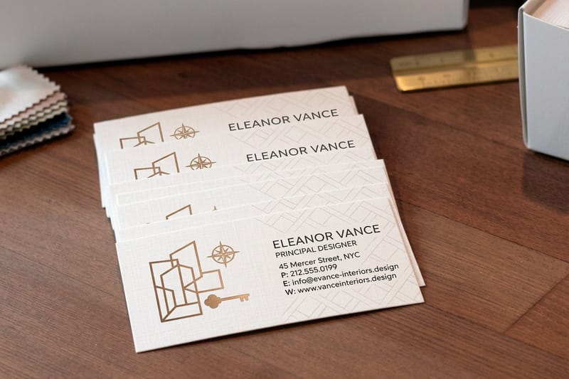
When you have a mark you like, print it. A short run of Interior Design Business Cards, 100 for $17.57, turns an abstract file into an object you can hand someone, and that feedback loop teaches faster than another video.
- Adobe Illustrator official logo tutorials. Free, short, and precise on the tooling: Shape Builder, Pathfinder, and the pen behaviors every other tutorial assumes you know.
- Logos By Nick. Builds real marks in Inkscape and Affinity Designer, which makes it the best starting point if you have no Adobe subscription.
- Will Paterson. Sketch-first process, hand lettering, and vintage badge construction, with the messy paper stage left in where most channels cut it out.
- Satori Graphics. Strong on logo theory and grid construction, and honest about why a version fails, which is the rarest thing on YouTube.
- Yes I Am A Designer with Martin Perhiniak. Structured Illustrator fundamentals from a certified instructor, ideal if random videos have left gaps in your basics.
- Envato Tuts Plus logo series. Written, step-by-step, and skimmable, which suits people who would rather read a procedure than scrub a timeline.
- Canva Design School basics. Not for professional identity work, but genuinely useful for understanding balance, spacing, and type pairing before you open a vector tool.
- Gareth David Studio. Typography-led logo work with clear explanations of letterform spacing, the skill that separates a wordmark from set type.
Related reading while you practice: the six key principles of logo design gives you the checklist to judge your own output against, and where to look for logo design inspiration keeps your references wider than the first page of a search. Once a design leaves the sketchbook, run it through the logo checklist for each stage of the design process.
Print picks
Three surfaces that test a new logo
Live prices, ready to customize with the mark you just drew.
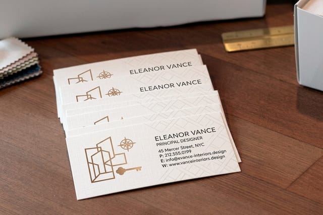 Interior Design Business Cards 100 for $17.57 The fastest honest test of a new logo, printed at the size people hold.
 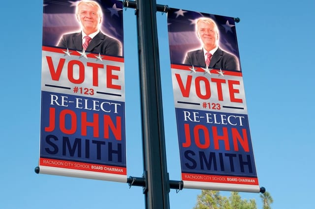 2 Sided Blockout Banners $108.75 each Blows your mark up to booth scale with an opaque core so nothing ghosts through.
 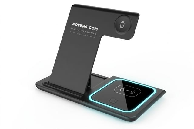 3 in 1 Foldable Wireless Charger $15.00 each A ready-made desk gift to send with your one-color logo on the card.
 Advanced Tutorials That Sharpen Craft and Process
Once you can draw cleanly, the bottleneck moves. It becomes optical correction, systems thinking, and the ability to defend a direction in front of a client. These eight go after that. Several are less about the canvas and more about the conversation, which is exactly where most self-taught designers are weakest.
- The Futur with Chris Do. Process, positioning, and client conversation. Watch the critique sessions rather than the software walkthroughs, they are the real curriculum.
- Aaron Draplin logo walkthroughs. Fast, bold, and unsentimental. Draplin shows how many variations a mark should go through before one gets picked.
- Michael Janda. Identity as a business, covering pricing, presentation decks, and how to move a client from opinion to criteria.
- Dansky. Advanced Illustrator technique, especially blends, gradients, and the geometric construction behind clean symbol marks.
- Emanuele Abrate on grids and construction. Deep on golden ratio and circle grids, and useful precisely because he shows when a grid is a crutch.
- Astute Graphics tutorials. Plugin-driven, but the path handling, smart-remove, and dynamic sketching lessons transfer to plain Illustrator too.
- Affinity Designer official tutorials. Persona switching and export workflows explained by the people who built the tool, which matters when you get to handoff.
- Smashing Magazine identity articles. Long-form pieces on responsive logos, scalable identity systems, and how marks behave at favicon size.
Pair these with best practices for logo design and designing a logo with a tagline or slogan, since lockups with descriptors are where advanced spacing problems actually bite.
The Step Almost No Tutorial Covers
Sixteen tutorials will get you a beautiful artboard. Not one of them typically ends with the file a printer can use. That gap is where good logos go wrong, and it costs beginners their first client relationship more often than bad drawing does.
Print is unforgiving in ways a screen is not. RGB neon does not exist in CMYK ink. A 0.25pt hairline that looks crisp at 400 percent zoom disappears on coated stock. Overlapping shapes set to multiply behave differently once flattened. Live text that was never outlined reflows into a substitute font on a machine that does not have your license.
The print-ready checklist
- Outline all type. Convert every letterform to paths and keep a separate editable copy for future revisions.
- Expand strokes and effects. Anything live can render differently on another machine, so flatten it deliberately rather than letting the RIP decide.
- Set a real color mode. Build a CMYK master and note the closest spot equivalent for jobs that need consistency across suppliers.
- Test at minimum size. Print the mark at one inch wide on a plain office printer. If a counter fills in or a detail vanishes, simplify now.
- Build the one-color version. Solid black, solid white knockout, and no gradients. Merch, stamps, and embroidery will need it eventually.
- Keep bleed and clear space rules. Define the padding that nothing may enter, then apply it every time the mark is placed.
Do those six things and your logo becomes portable. It can go on a card, a banner, a shipping box, or an embroidered cap without a redraw, which is the entire point of building it in vector in the first place.
What It Costs to See Your Logo in Print
The cheapest useful critique of a new logo is a small print run: 100 business cards for $17.57, out in 3 business days. Screens flatter everything: they are backlit, they are sharp, and they hide the weight problems that stock reveals instantly. Hold the card at arm's length, then look at the mark at its stated minimum size on the back, and you know in a second whether it has presence.
The table below pulls live configurator numbers rather than an estimate, and the specs panel next to it lists the stocks, sizes, and finishes available. Per-piece cost drops sharply with quantity, which is why designers who print tests order a hundred rather than ten.
A practical rule: print your top three directions on the same stock, in the same run, and lay them on a desk in daylight. The one that still looks confident from three feet away is usually the answer, and it is often not the one you loved on screen.
Quantity and price
Business card pricing and specs
Real configurator numbers. The more you print, the lower the per-card cost.
| Quantity | Price Per Unit | Total |
|---|---|---|
| 100 | 17.6¢ | $17.57 |
| 200 | 11.5¢ | $23.07 |
| 300 | 9.15¢ | $27.46 |
| 400 | 7.96¢ | $31.86 |
| 500 | 7.25¢ | $36.26 |
| 600 | 6.77¢ | $40.64 |

Scaling the Mark Up to Large Format
A logo that only works at card size is half a logo. The other test is scale, and large format punishes different weaknesses: soft vector joins, muddy gradients, and lettering that was spaced for small sizes and now sits too loose.
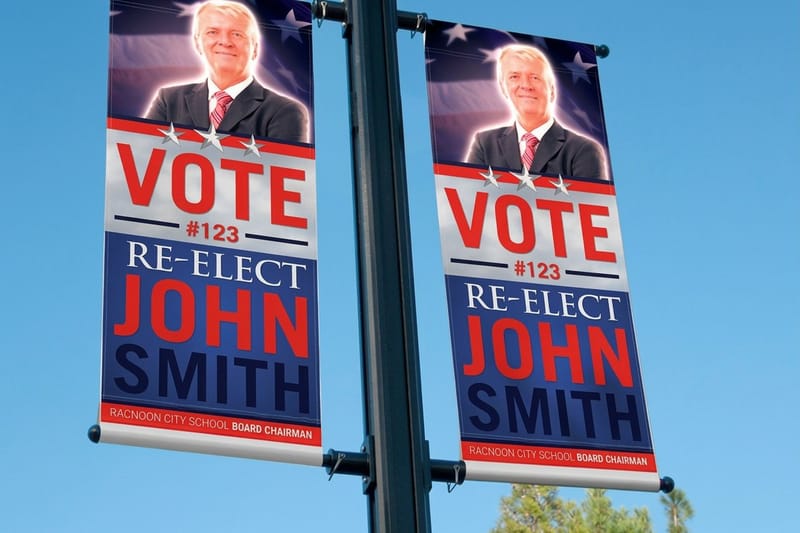
Blockout banner material has an opaque layer in the core, so a double-sided print does not show the artwork from the other face bleeding through. That matters for logos with light backgrounds, which is exactly where cheaper single-layer vinyl fails and makes a clean mark look dirty.
Before you commit to a trade show run, view your artwork at actual size on screen with the zoom set to 100 percent of the finished dimensions. Details you polished for a business card usually need to be simplified, not enlarged.
Large format
2 sided blockout banners
An opaque core layer so a double-sided print never shows the artwork behind it.

Putting the Logo on Objects People Keep
Branded merchandise is the hardest surface a logo will meet. The print area is small, the substrate is rarely white, and there is often only one color available. This is the moment your simplified one-color version earns its existence.
Practical items outlast printed giveaways because they stay on a desk instead of going in a drawer. A folding charger sits in view during every meeting the recipient takes, which is more brand exposure than most flyers ever get.
Design for the constraint: drop the gradient, thicken any stroke below one point, and check the mark against both a dark and a light surface. If it needs a container shape to read, build that container into the merch version rather than improvising at production time.
Branded merch
Logo on a desk object
A folding wireless charger is a ready-made gift the recipient uses in every meeting they take.
Choosing Tutorials by Software and Budget
Pick software by what you can afford and what your collaborators use. Illustrator dominates agency workflows and has Adobe's free official tutorials, Affinity Designer is a one-time purchase with an excellent export system, and Inkscape is free and produces valid SVG and PDF output, with Logos By Nick teaching in both. All three can deliver the print-ready PDF with outlined type that a card or banner order needs.
Match your tutorial list to the tool you will actually open tomorrow. Following an Illustrator video inside Inkscape works, but you will spend half your attention translating menus instead of learning shape logic. Start native, then cross over once the fundamentals are automatic.
Whatever you draw in, the finished deliverable should be the same: a vector master, a flattened print version, a one-color version, and a small raster set for web. That package is what makes you look professional, regardless of what it was built in.
Compare finishes
Popular business cards, side by side
Where a finished logo lands first: 100 cards for $17.57, out in 3 business days.
 free business cards |  Standard Business Cards |  3D Lenticular Business Cards |  Metallic Foil Business Cards | |
|---|---|---|---|---|
| Min price | Free | $17.57 | $690.88 | $222.13 |
| Paper / stock | 14pt Gloss Cover | 14pt Gloss Cover | 31pt Lenticular Lens | 16 Point Silk Laminated |
| Finish | - | Standard Finish | - | - |
| Size | 2" x 3.5" | 2" x 3.5" | 2" x 3.5" - Vertical | 2" x 3.5" |
| Default qty | 200 | 100 | 500 | 500 |
| Turnaround | 5 business days | 3 business days | 22 business days | 7 business days |
| Rating | ||||
| View & customize | View & customize | View & customize | View & customize |
Practice Files and Blank Layouts to Test On
The fastest way to finish a tutorial properly is to drop your new mark straight into a real layout. Free templates give you the correct trim, bleed, and safe area, so you find out immediately whether your logo needs more clear space than you thought.
Blank templates are the same thing at the file level: exact-size documents with the guides already in place, ready for whatever application you drew in. Use them for the print test described above rather than building an artboard from scratch and guessing at bleed.
A simple practice loop
- Pick one tutorial and follow it exactly, no substitutions, no shortcuts.
- Rebuild it on your own brief without the video open, and time yourself.
- Run the print-ready checklist and export the full deliverable package.
- Place it in a template at real size and print one page at home.
- Order a short run once a direction survives all four steps.
Start fast
Card templates and print-ready blanks
Free layouts plus exact-size blanks so your trim, bleed, and safe area are already correct.






Wally sorts the tutorials worth finishing
Learn the craft, then finish the file properly
Every tutorial here ends on a screen, and a logo does not. Wally's rule is simple: after you follow a lesson, rebuild it once from memory on your own brief, then run the print checklist. Outline the type, expand the strokes, build a CMYK master and a one-color version, and print the mark an inch wide. If it still reads at that size, you have a logo. If it does not, you have a drawing.
Print your logo on business cards →Turning a Tutorial Into a Finished Identity
Guides to Read Alongside the Tutorials
 Guide 6 Key Principles of Logo Design The criteria to judge your own tutorial output against.
  Guide Best Practices for Logo Design Working rules for marks that hold up across every surface.
  Guide How to Design a Logo The full walkthrough from brief to finished deliverable.
  Guide Logo With a Tagline or Slogan How to lock a descriptor to a mark without wrecking spacing.
 Explore more
More on logos, branding, and getting them printed
How to design a logo, the six key principles, logos with taglines, logo inspiration, logo sticker uses, and cards and banners to print the mark on.
Product Interior Design Business Cards Print a finished logo at the size people actually hold. Product 2 Sided Blockout Banners Scale the mark up with an opaque core so nothing ghosts through. 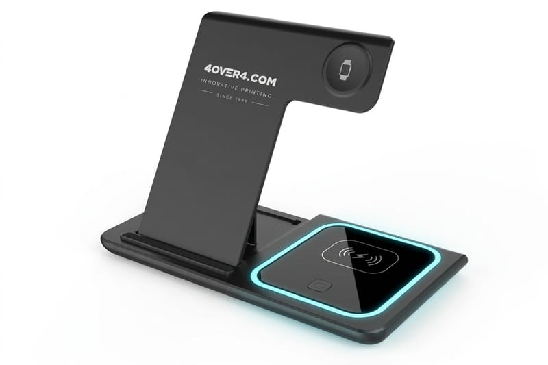 Product 3 in 1 Foldable Wireless Charger A ready-made desk gift, sold with no logo. Guide How to Design a Logo Brief to deliverable, the complete process. Guide 6 Key Principles of Logo Design The criteria every strong mark satisfies. Guide Best Practices for Logo Design Working rules from real identity projects. Guide Logo With a Tagline or Slogan Lockups, descriptors, and the spacing that holds them.
  Article Custom Logo Design for Your Brand What a custom mark should deliver for a company.
  Article Where to Find Logo Inspiration Reference sources beyond the first page of search.
  Article 10 Ways to Use Logo Stickers Cheap, high-visibility placements for a finished mark.
  Article 15 Cool Facts About Logos Origin stories behind marks you see every day.
  Articles All Printing Articles Design, branding, and print explained end to end.
 Finished the tutorial? Now finish the logo.
Run your best direction through the print checklist, then order a short card run and see how the mark holds up in the hand rather than on a backlit screen.
Logo Design Tutorial Questions, Answered
What should a beginner logo design tutorial actually teach?
A good beginner tutorial teaches three things at once: the vector tools, the reasoning behind each shape decision, and a finished export. If a video only shows the clicks, you will be able to reproduce that one logo and nothing else. Look for instructors who sketch before they open the software, who show the versions they threw away, and who end with a real file rather than a glossy mockup. For the criteria to judge your own results, work through the six key principles of logo design.
How do I choose the right logo design tutorials for me?
Choose by three filters, in this order: the software you will open tomorrow, your current level, and the kind of mark you want to make. Someone building lettering-led badges should not start with a geometric symbol tutorial. Pick two tutorials, finish both properly, and repeat each one on your own invented brief before adding a third. Volume is the trap here, since watching ten videos teaches less than rebuilding two of them from memory.
Are free logo design tutorials as good as paid courses?
For craft, yes. The free material published by working designers on YouTube and in official software documentation covers the drawing skills completely, and the Inkscape and Affinity Designer routes remove the subscription barrier entirely. Paid courses earn their price on the other half of the job: structured critique, client conversation, pricing, and presentation. If you are self-taught and stuck, that is usually the gap, not technique.
How do I make a finished logo print-ready?
Outline all type so no machine substitutes your font, expand every stroke and live effect, build a CMYK master alongside your screen version, and create a solid one-color version with no gradients. Then print the mark one inch wide on any office printer and check whether counters fill in or fine details vanish. State a minimum size and a clear space rule, and deliver the vector master with the flattened print file. That package is what a printer needs, and what most tutorials never mention.
What does printing a logo on business cards cost?
Interior Design Business Cards at 4OVER4.COM start at 100 for $17.57, and the per-piece cost falls sharply as the quantity rises, so 500 cards cost $36.26. Price moves with stock, size, finish, and turnaround rather than with your artwork, so a complex logo costs the same to print as a simple one. Use the live price table above to compare quantities before you commit.
