
The Parts of a Logo and How Each One Prints


Every part named, what each one is for, and how each behaves once it prints at business card size instead of on a screen.
A logo is built from six parts: the logomark, the wordmark, the tagline, the established line, the container or background it sits on, and the clear space around it. Most brands use three or four of them. The parts that matter in print are the ones that hold at small size, so the logomark has to work with no words next to it, the tagline needs at least 6 point, and every stroke and gap in the artwork should be 0.5 point or heavier before it goes on paper.

Quick answer
Name the parts, then test what happens when each one goes
The anatomy is short: logomark, wordmark, tagline, established line, container, clear space. The useful work is not naming them, it is knowing which ones you can remove. A logo that only reads with all six intact has exactly one usable size. Build it so the tagline and the established line come off cleanly, so the wordmark can sit beside the mark instead of under it, and so the logomark alone still means something at half an inch, and you end up with a mark that prints on a card, a letterhead, an envelope corner, and a sticker without a redraw each time.
The Six Parts Every Logo Is Built From
Take any logo apart and you find the same short list of components. Not every brand uses all of them, and the ones that do usually keep a reduced version for tight spaces.
| Part | What it does | What it needs in print |
|---|---|---|
| Logomark | The symbol that stands for the brand with no words attached. | Must read at 0.5 in wide and in a single flat color. |
| Wordmark | The company name set as type, often redrawn rather than typed. | Letter spacing opens up as it shrinks, so check it at card size. |
| Tagline | The short promise under the name. | 6 pt is the floor. Below that it stops being words. |
| Established line | Founding year, and sometimes the city, as a trust signal. | The first part to remove when the logo goes small. |
| Container | The circle, shield, or block the lockup sits inside. | Adds ink coverage and eats space on a 3.5 by 2 in card. |
| Clear space | The margin nothing else may enter. | Measured from a letter height in the mark, not guessed. |
The test that matters is subtraction. Cover the tagline: does the mark still work? Cover the container: does anything fall apart? A logo built so each part can be removed gives you a version for every place it has to print, from a business card at $17.57 to a stamped envelope corner. A logo where every part depends on the others gives you one size and constant trouble. The wider design sequence behind that is covered in our complete logo design guide.
The Logomark, and Why It Has To Work Alone
The logomark is the symbol without the name: the apple, the swoosh, the monogram. It is the part that ends up on a favicon, an app tile, a shirt chest, a lapel pin, and the corner of an envelope, which is why it carries the heaviest load in the whole system.
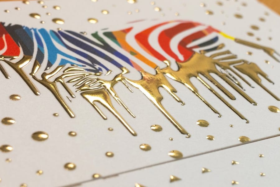
Two things decide whether it survives. The first is stroke weight. A mark drawn with 0.25 point hairlines looks refined on a monitor and disappears on paper, because ink spreads slightly into the fibers and closes anything that thin. Half a point at final printed size is the practical floor, and on a raised or foiled surface you want more, since a stamping die cannot hold a line finer than the foil can release.
The second is what happens when you flatten it. Print a logomark in solid black at 0.5 inch and you learn in one second whether the shape is doing the work or the color was. Gradients and drop shadows do not exist in foil, embossing, or letterpress, and they turn to mud when a mark shrinks. Draw the flat one-color version alongside the full-color one rather than after it. If the logo is a lettermark built from initials, the same rules apply plus one more: check the letters at small size for pairs that collide, because a tight R and N can merge into a single shape when the ink spreads.
Wordmark, Tagline, and the Established Line
The wordmark is the name itself, drawn as artwork. Type it in a font and it is a setting, not a mark: the spacing was optimized for paragraphs, not for a name that has to hold together at an inch wide. Redrawn wordmarks fix the gaps between awkward letter pairs and thicken the strokes that would otherwise drop out.
Under the name sits the tagline, and this is where most logos meet reality. A tagline set at one third the height of the wordmark looks balanced on screen. Put that lockup on a card at 1 inch wide and the tagline lands near 4 point, which prints as a grey band. Keep it at 6 point minimum on coated stock and 7 on uncoated, or build a second lockup with no tagline for small applications. Our guide to designing a logo with a tagline works through the balance point in more detail.
The established line, something like EST. 1998, QUEENS NY, is the smallest text in the mark and the first thing to remove. It is worth having: on a letterhead at $99.95 there is room for it and it does real work as a trust signal. On a name badge it is invisible. Removing it is not a compromise, it is what the reduced lockup is for.
Framing, Background and Negative Space
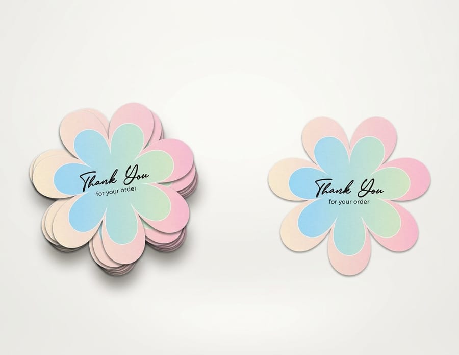
A container is the shape the logo sits in: a circle, a shield, a rounded block, a badge. It gives the mark a consistent silhouette across placements, which is why so many brands with app icons adopted one. It also costs you two things. It fills a chunk of a 3.5 by 2 inch card with solid ink, and it forces every other element to shrink to fit inside it.
Backgrounds bring a related decision. A logo designed to sit on a dark block needs a knockout version where the mark is white and the block is the ink, and reversed artwork behaves differently: ink creeps inward, so thin white lines close and small reversed type fills in. Anything reversed should be a step heavier than the positive version. Keep a transparent version too, since a logo pasted onto a photo with a white box around it is one of the most common file-prep mistakes, and our note on making a logo transparent covers the fix.
Negative space is the shape the ink does not cover, and it is a designed part rather than an accident. That includes the counters inside letters, the gap that turns two shapes into an arrow, and the clear space around the entire lockup. Define clear space against something in the mark, usually the height of the capital letter in the wordmark, so it scales automatically. On a die-cut sticker at $93.37 that rule matters twice over, because the cut line follows the artwork outline and needs breathing room of its own before the blade gets near the ink.
Putting the Pieces Into One Lockup

A lockup is one fixed arrangement of the parts, with the spacing and proportion locked so nobody can rebuild it by eye. Most brands need three: a stacked lockup with the mark above the name, a horizontal lockup with the mark beside it for wide shallow spaces like a website header or a pen, and the logomark by itself for anything tiny or square.
Set the relationships in the mark, not in inches. If the gap between the symbol and the name is defined as half the cap height of the wordmark, it stays correct at every size forever. Written as 8 pixels, it breaks the first time somebody scales the file. The same applies to the tagline width, which usually looks best tracked out to match the width of the name above it.
Then decide the color rules, because they are part of the lockup too. Name the exact values: the Pantone number, its CMYK conversion for four-color printing, the RGB for screen, and a one-color version. Spot colors do not all convert cleanly, and bright oranges, deep blues, and many greens shift visibly when they become CMYK, which is why our walkthrough on converting Pantone to CMYK is worth reading before you approve a proof. The rest of the discipline is in the six principles of logo design.
Printing Your Logo on Cards, Letterhead and Envelopes
Every part of the anatomy behaves differently once it hits paper, and the differences are predictable enough to plan for. Send vector artwork, PDF, AI, or EPS with fonts outlined. If only a raster file exists, it needs 300 dpi at the printed size, so a logo running 1.5 inches wide needs roughly 450 pixels across.
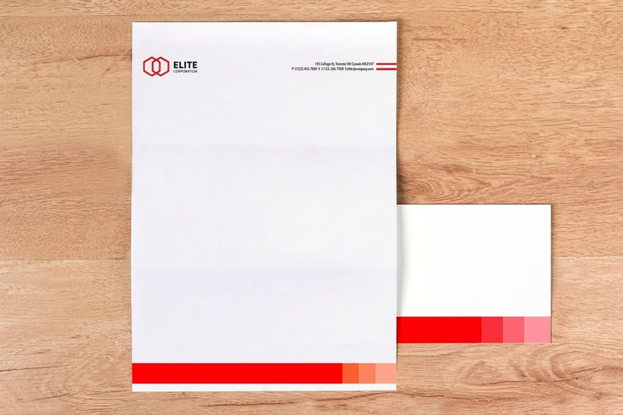
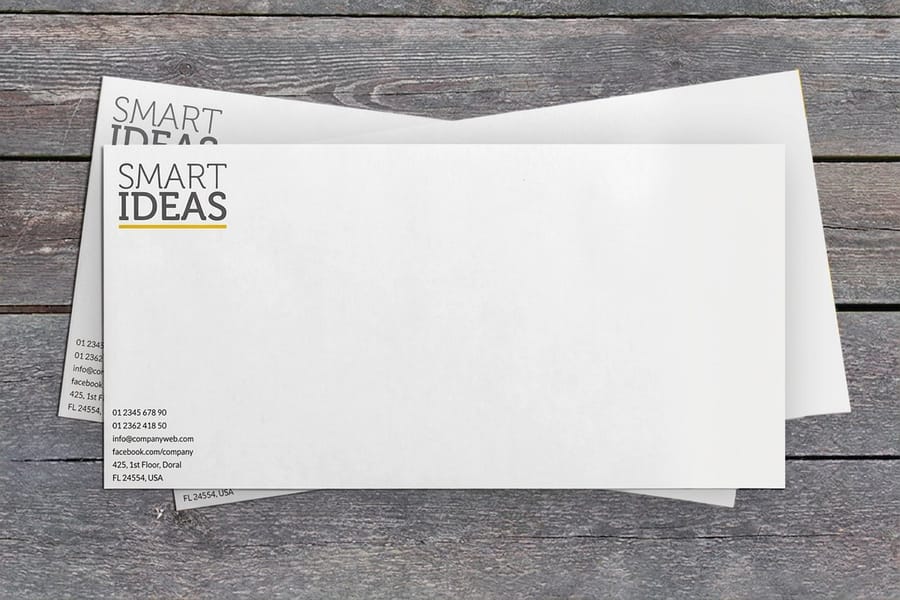
On standard business cards, keep the whole lockup at least 0.125 inch clear of the trim edge, and use 100 percent black rather than a rich black build for small logo type, since a four-ink build can show a hairline of misregistration at that size. On letterheads, the mark usually sits at the top and often prints in one color, which is exactly the case the flat version exists for. On printed envelopes at $142.99, the return address corner is the tightest space in the whole system: the seam and the flap edge are not printable areas, so the reduced lockup or the logomark alone is normally the right call.
Start from a correctly sized layout in the blank template library rather than a blank canvas, and check the mark at final size on screen at 100 percent before uploading. If the logo is heading onto labels or window decals as well, the sticker and decal range takes the same artwork, and the file checks in our logo file prep guide apply across the whole set. When you are ready to order, the business card printing range lists every stock and finish the mark can land on.
Wally takes a logo apart
Six pieces, and the ones that fall off first
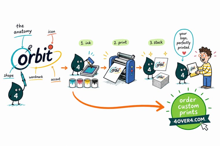
Wally lifts the logo off the card and lays the pieces on the counter: the symbol, the name, the tagline, the established line, the frame it sat in, and the empty margin around the lot. Then he shrinks it to an inch. The established line goes first, the tagline goes next, and the symbol is what he is left holding. That last piece is the one that has to mean something on its own, because it is the one that ends up in the corner of an envelope.
Print your logo on standard business cards →Specs and pricing
Where the logo lands, with sizes and starting prices
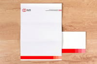
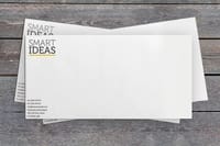
Cards, letterhead and envelopes carry the same mark at three very different sizes. Configure each one and see the live starting price from the 4OVER4.COM configurator.

Print it
Put the finished mark on paper

Explore more
Where to go next




By the numbers
Brand printing you can count on at 4OVER4
Common Questions
Your logo anatomy questions, answered
What are the parts of a logo called?
The symbol is the logomark or brandmark. The company name set as type is the wordmark, and a wordmark built from initials is a lettermark or monogram. Under it sits the tagline, then sometimes an established line carrying the founding year and the city. The shape the whole thing sits inside is the container or background, and the empty margin that nothing may enter is the clear space or exclusion zone. The assembled arrangement of those pieces is the lockup, and most brands keep two or three lockups: a stacked one, a horizontal one, and the logomark by itself.
Does every logo need a tagline?
No, and locking one into the logo file causes more trouble than it solves. A tagline inside the lockup has to shrink whenever the logo shrinks, so on a business card it can land near 4 point, which prints as a grey smear rather than words. Keep the tagline as a separate element you can set at its own size, or build a second lockup without it. If you want the tagline in the mark permanently, design it so the tagline is still 6 point when the logo is 1 inch wide.
What file should I send the printer for my logo?
Vector, in a PDF, AI, or EPS with the fonts converted to outlines. A vector logo redraws itself at any size, so the same file works on a business card and a 4 foot banner. If all you have is a PNG or a JPG, it must be at least 300 dpi at the size it will actually print, which means a logo printing 1.5 inches wide needs about 450 pixels of width, and stretching a 200 pixel web logo to that size gives you soft, stepped edges no press can fix.
How small can my logo be on a business card?
On a 3.5 by 2 inch card, most logos land between 0.75 and 1.5 inches wide, and the limit is set by the thinnest stroke rather than by the overall size. Keep any line, counter, or gap in the artwork at 0.5 point or heavier at final size. Below that, ink spread closes fine gaps on uncoated stock and small reversed type fills in solid. When the mark shrinks past what its strokes can take, use the logomark on its own instead of shrinking the full lockup.
Do I need a black and white version of my logo?
Yes, and you will use it more than you expect. Foil stamping, embossing, letterpress, raised spot UV, a rubber stamp, a fax header, and single-color letterhead all reproduce one ink. Draw the flat version while you still remember why each shape exists, because converting a gradient logo to one color under a print deadline usually ends with a flattened mark that no longer looks like the brand.
Will my logo color match across cards, letterhead and envelopes?
Close, but not identical, because the paper changes the ink. The same CMYK build looks deeper on a coated card than on an uncoated letterhead, where the sheet absorbs more ink and the color reads slightly softer and duller. If exact color matters, specify a Pantone spot color and expect the coated and uncoated versions of the same Pantone number to look different side by side. Order the pieces together so they run on the same schedule rather than months apart.
Get Started
Ready to see the mark on paper?
Upload the vector file, pick your stock and finish, and we print the lockup at the size you designed it for, with the trim and the color where you expect them.
Legal Disclaimer
Gold Standard guarantees apply to all standard orders placed through 4over4.com. Price match requires verifiable proof of a competitor's published price for an equivalent product with matching specifications and turnaround time. Satisfaction guarantee covers manufacturing defects and print quality issues. Contact support with order number and documentation. On-time delivery rate based on tracked orders 1999 to 2026. Individual results may vary based on shipping carrier performance.
