
The 10 Elements of Branding Every Business Needs


Ten decisions, in the order they get made, with the printed piece that turns each one permanent and what it costs to produce.
The 10 elements of branding are the brand name, the logo, the color palette, typography, imagery, the tagline, brand voice, packaging, business stationery, and brand guidelines. The first four are the identity core and force reprints when they change, so settle them before you buy print. The next three set character. The last three deliver the brand into someone’s hands.

Quick answer
Ten elements, and the order they get built in
Name, logo, color palette, typography, imagery, tagline, brand voice, packaging, business stationery, brand guidelines. Build them in that order, because each one inherits from the ones above it. A name change drags the logo along; a logo change reprints every piece that carries it. The last element, the guidelines page, is the only one whose job is to let somebody else reproduce the other nine correctly, which is why a business that skips it ends up with three versions of its own blue.
Branding Versus Marketing, and Why the Difference Costs Money
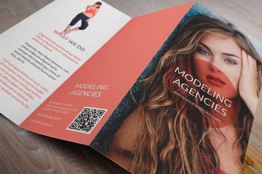
Branding is the set of decisions that stay fixed. Marketing is the activity that changes every quarter. A campaign has a start date and a budget and an end; a brand keeps working on a business card that has been sitting in a stranger’s drawer since March.
The distinction sounds academic until it hits a purchase order. We take calls every week from a business that ran ads for six months, then reordered cards and found the logo file nobody could locate, the blue that never matched the website, and two different fonts across three pieces. Every one of those is a branding decision that was never written down, and each one costs a reprint rather than a redesign.
Why it matters commercially is simpler than most branding writing admits: people buy again from things they recognize. Recognition is repetition, and repetition only works if the thing being repeated is identical. A palette that drifts half a shade between the brochure and the letterhead is not being repeated, it is being approximated, and approximation reads as carelessness even to people who could not tell you why.
That is the whole case for treating branding as ten specific, writable elements instead of a mood. Each one is a decision you make once and then hand to a supplier. The rest of this guide takes them in the order they actually get built, and names the printed piece where each one stops being a decision and becomes permanent.
The 10 Elements of Branding, One at a Time

Each element on the list decides something specific, and each one gets locked at a particular moment. Read the third column first if you are ordering print this month.
| # | Element | What it decides | Where it gets locked |
|---|---|---|---|
| 1 | Brand name | What people say out loud and type into a search bar. | Business cards, and every domain and legal filing behind them. |
| 2 | Logo | The mark that identifies you at a glance and at small sizes. | Cards, folder covers, packaging, anywhere under an inch wide. |
| 3 | Color palette | Recognition before anyone reads a word. | Letterheads and brochures, in CMYK and Pantone, not just hex. |
| 4 | Typography | Tone, and whether small print is readable at all. | Brochure body copy, where 9 to 10 point gets tested for real. |
| 5 | Imagery | Whether photos across pieces look like one company. | Brochures and postcards, at 300 ppi at final printed size. |
| 6 | Tagline | The one line that explains what the name does not. | Under the logo on cards, postcards and signage. |
| 7 | Brand voice | How the copy sounds when nobody is watching. | Brochure copy and the teaser line on an envelope. |
| 8 | Packaging | The first physical contact a customer has with you. | Stickers, boxes, tissue, mailer tape and seals. |
| 9 | Stationery | Whether routine correspondence looks deliberate. | Letterhead, the #10 envelope, notepads, folders. |
| 10 | Brand guidelines | Whether anyone else can reproduce the above correctly. | The one page you send a printer or a freelancer. |
Elements 1 to 4 are the identity core. They are the ones that force reprints when they change, so settle them before you spend anything. The name comes first because a name change drags the logo with it. The logo comes next, and the test that matters is not how it looks in a presentation but whether it still reads at 0.25 inches, in one color, on a pen. Our guide to logo design principles covers what survives that shrink and what does not.
Elements 5 to 7 control character. Imagery, tagline and voice are the ones businesses most often skip, and they are why two companies with equally competent logos can feel completely different. Voice in particular is cheap to define and expensive to leave vague: write three sentences the brand would say and three it never would, and hand that to whoever writes the next brochure. If you want the longer method, read brand messaging for small business.
Elements 8 to 10 are delivery. Packaging, stationery and guidelines are where the brand stops being a design file and starts being an object someone holds. They are also the elements most likely to be produced by someone who has never seen your brand deck, which is exactly why the guidelines page exists.
How Each Element Shows Up on a Printed Sheet
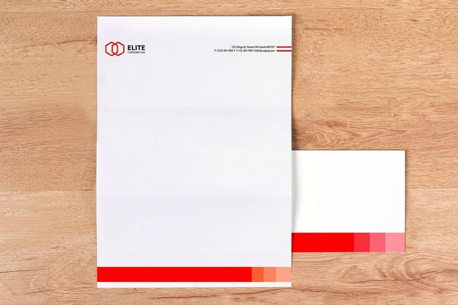
An element that has never been printed is still a hypothesis. Ink behaves differently from a screen, and four of the ten elements change measurably the first time they go on a press.
Color is the big one. A screen emits light; paper reflects it. Bright RGB blues, greens and oranges sit outside the CMYK gamut, so the press prints the nearest reachable color and your brand blue arrives slightly gray. The fix is not a better printer, it is specifying the color properly: a hex value for screen, a CMYK build for four color work, and a Pantone number for anything that has to match across different jobs and substrates. Convert the artwork yourself so you approve the shift instead of discovering it. CMYK versus RGB walks through the conversion, and choosing a color profile covers which profile to embed.
Stock changes the same ink twice. The identical CMYK build looks brighter and denser on gloss coated stock and noticeably softer on uncoated, because uncoated fibers absorb ink and scatter light. If your business cards are coated and your letterheads are uncoated, the brand color will not match between them no matter what the file says. Either accept the difference and pick a color that survives both, or specify a Pantone and print it as a spot color where it matters most.
Typography gets tested at small sizes, not headline sizes. A typeface that looks refined at 40 point on a monitor can close up at 9 point on uncoated stock, particularly if it has thin strokes or tight counters. Print one brochure page at actual size on your office printer before you commit a run. If the phone number is hard to read at arm’s length, the typeface is wrong for body copy regardless of how good the headings look.
Imagery has a hard resolution floor. 300 ppi at the final printed dimension, not at whatever dimension the file happens to be. A 1200 pixel wide photo is fine at 4 inches and soft at 8. Downloading a website hero image and dropping it into a brochure is the single most common cause of a job that looks fine on screen and blurry in the box. Start from a correctly sized layout in the blank template library so the placement dimensions are right from the beginning.
Keeping the Brand Consistent Across Channels and Suppliers
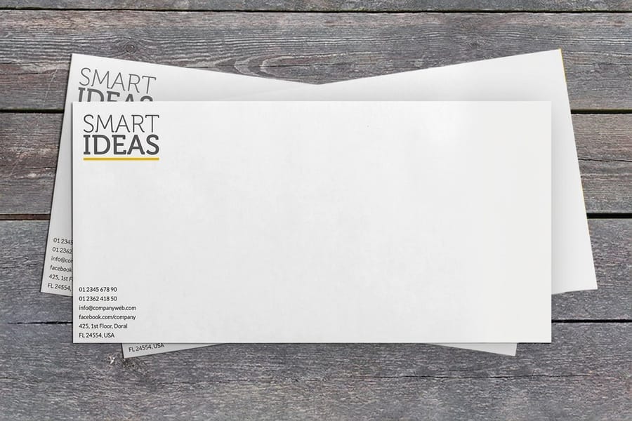
Consistency fails at handoffs, not at design time. It fails when a sign shop, a promotional products vendor and a printer each receive a slightly different logo file, and every one of them does something reasonable with it.
Three habits prevent most of it. First, keep one master logo folder with a vector file (EPS or AI), a one color version, a reversed version for dark backgrounds, and a PNG with transparency for screens. Send the whole folder, not the file that happened to be on your desktop. Second, write the minimum logo width in inches rather than in pixels, because a printer works in inches and a pixel dimension means nothing on a folder. Third, name the fallback: if a supplier cannot use your licensed typeface, tell them which system font to substitute, or they will pick one for you.
Then there is the honest limit. Perfect color matching across every channel is not achievable, and chasing it wastes money. A brand color rendered on a backlit screen, on gloss coated card, on an uncoated letterhead, on a vinyl banner and on an embroidered polo will never be five identical colors, because five different materials are reflecting or emitting light. What you can control is that all five sit in the same family and none of them is obviously wrong. Decide which piece is the reference, print it, and match the rest to that physical sample rather than to a monitor.
Packaging is where consistency pays off most and gets budgeted least. A die cut sticker at $93.37 sealing a plain mailer carries the logo, the palette and the shape language for a fraction of what custom printed boxes cost, and it is the piece a customer touches at the exact moment they are most receptive. For sales meetings, a pocket folder does the same job for a stack of loose sheets that would otherwise arrive as paperwork.
Building a Brand Kit You Can Print On Demand
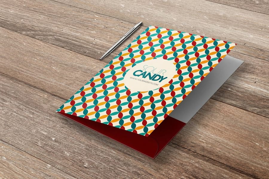
A brand kit is not a document, it is a short list of things you can reorder without a designer. Build it in the order the elements lock, and you can start printing after step two rather than waiting for all ten.
- Start with cards. Standard business cards start at $17.57 and carry four of the ten elements at once: name, logo, palette and typography. They are also the cheapest way to test whether your color and type survive contact with ink.
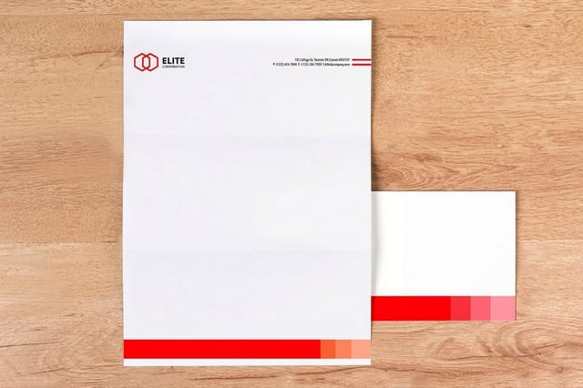
- Add stationery next. Standard letterheads start at $99.95 and printed envelopes at $142.99. Order them together and in the same stock family, because a letterhead that does not match its envelope is the mismatch people notice first.
- Then the piece that explains you. Standard brochures start at $57.11 and are where imagery, tagline and voice get their first real workout. If the copy sounds like three different people wrote it, the voice element is not defined yet.
- Cover the handoff moments. A pocket folder for meetings and die cut stickers for packaging cover the two situations where the brand is physically transferred to someone else.
- Write the one page. Hex, CMYK and Pantone for each color. Two typefaces with the weights you use. Minimum logo width in inches, clear space, and the one color version. One line on tone. That page is element ten, and it is what makes the other nine reproducible by someone who has never met you.
Two notes on sequence. Do not order stationery before the logo is final, because letterheads and envelopes are the pieces most likely to be ordered in quantity and least likely to be used up quickly. And do not order in small quantities to hedge against a logo change; if you are hedging, the logo is not finished, and the right move is to finish it rather than to buy expensive short runs of something you expect to replace.
If you are starting from nothing, our online design templates give you a layout you can put a logo and palette into today, and the business card printing range covers every stock and finish once the identity core is settled. For the branding reading behind all of it, the logo and branding guides hub has the rest.
Wally explains the ten
Four decisions, three flavors, three deliveries
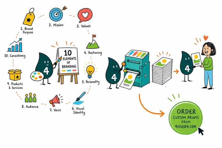
Wally sorts the ten into three piles. The first pile is the identity core: name, logo, palette, typography. Change anything in that pile and every printed piece reprints, so he settles it first and only then orders cards. The second pile is character: imagery, tagline, voice. That is what stops two competent brands from feeling identical. The third pile is delivery: packaging, stationery, and the one page of guidelines that lets a supplier who has never met you get it right the first time.
Print your first brand piece →Specs and pricing
The three pieces a brand kit starts with
Cards, letterhead and brochure carry nine of the ten elements between them. Configure sizes, stocks and finishes with live starting prices from the 4OVER4.COM configurator.

Print it
Put the identity core on paper


Explore more
Where to go next




By the numbers
Brand kits printed by 4OVER4
Common Questions
Your branding questions, answered
What are the 10 elements of branding?
Brand name, logo, color palette, typography, imagery, tagline, brand voice, packaging, business stationery, and brand guidelines. The first four are the identity core, because every other element inherits from them. The middle three control how the brand sounds and looks in use. The last three are the delivery system: what the product arrives in, what your correspondence looks like, and the document that keeps everyone printing the same thing.
What is the difference between branding and marketing?
Branding decides what you are. Marketing decides who hears about it this quarter. A campaign has a start date, a budget and an end; a brand keeps working on a card that sat in a drawer for a year. In practice the split shows up in what you buy: marketing buys reach, branding buys the assets that reach lands on. Get the branding elements settled first, or every campaign pays to distribute an inconsistent identity.
Which branding element should a new business build first?
The name, then the logo, in that order, and both before you print anything. A name change forces a logo change; a logo change forces a reprint of every piece that carries it. Once those two are locked, add the color palette and typography, because those three plus the name are enough to produce a working business card. Tagline, voice, packaging and guidelines can be written after you have customers, and they will be better for it.
How many colors should a brand palette have?
One primary, one secondary, and two or three neutrals is enough for most small businesses, and it prints more reliably than a wide palette. The reason is practical: every additional brand color is another value you have to specify three ways (hex for screen, CMYK for four color print, Pantone for anything that must match exactly) and another chance for two suppliers to interpret it differently. If a color only appears once in the whole system, it is not a brand color.
Do I need brand guidelines if I am a one-person business?
Yes, but not a manual. A single page holding the hex, CMYK and Pantone values, the two typefaces with the weights you actually use, the minimum logo width in inches, the clear space around the logo, and one line on tone will settle almost every question a printer, a sign maker or a freelance designer will ask you. Write it once. The moment you hire anyone or hand a file to a supplier, that page saves a reprint.
Why does my logo look different in print than on screen?
A screen emits light and a printed sheet reflects it, so the two color spaces do not overlap. Bright RGB blues, greens and oranges sit outside what CMYK ink can reach, and the press prints the nearest achievable color instead, which usually reads duller. Stock makes it worse: the same ink build looks brighter on gloss coated stock and softer on uncoated, because uncoated fibers absorb more ink. Convert artwork to CMYK yourself so you approve the shift rather than discover it, and see our guide on choosing between CMYK and RGB before you send files.
Get Started
Letterheads run 50 for $99.95, envelopes 250 for $142.99
Start with the cards, add the letterhead and envelope in a matching stock, and keep the color consistent across every reorder.
Legal Disclaimer
Gold Standard guarantees apply to all standard orders placed through 4over4.com. Price match requires verifiable proof of a competitor's published price for an equivalent product with matching specifications and turnaround time. Satisfaction guarantee covers manufacturing defects and print quality issues. Contact support with order number and documentation. On-time delivery rate based on tracked orders 1999 to 2026. Individual results may vary based on shipping carrier performance.
