
How to Make a Custom Movie Poster That Looks Like a Real One Sheet


The layout, the type, the sizes and the stock that separate a poster people believe from one they do not. Written from the press side, for fan films, festival entries and personal prints.
A custom movie poster looks professional when it follows the one sheet structure: a single strong image, a title treatment held in the lower third, and a compressed billing block along the bottom, each in its own horizontal band. Print it at 27 by 40 inches for the theatrical size or 24 by 36 to fit a standard frame, keep every piece of type as live vector text rather than flattened pixels, and choose gloss for saturation or matte when glare is the problem.
Quick answer
Six bands, one image, and type that never floats
The professional look is a layout rule, not a rendering trick. A one sheet stacks six bands from top to bottom, the key art carries a single subject, the title treatment sits in the lower third and sets the width for everything under it, and the billing block closes the sheet in tightly condensed capitals. Print at 27 by 40 inches for the theatrical format, 24 by 36 if it has to fit a frame you can buy, and keep all type live in the PDF so the smallest credits survive the press.
Anatomy of a Movie Poster, Band by Band
Open any theatrical one sheet and the same skeleton is underneath it. Six horizontal bands, stacked, none of them overlapping. Once you see the bands you cannot unsee them, and copying the structure does more for the professional look than any amount of retouching.
The credit strip runs across the very top, and it is either a review quote or a short list of lead credits. It is optional. When the poster feels crowded, this is the first band to delete.
The key art takes the largest share, usually a little over half the height. One subject, one light source, and enough dead space at its lower edge for the title to sit on.
The tagline is one line, and it lives above the title, never beside it. If it needs two lines it is too long for a poster.
The title treatment owns the lower third. It is the widest element on the sheet, and its width becomes the measure that the tagline and the billing block align to.
The billing block is that dense strip of compressed capitals under the title, and the bottom strip carries the rating box, the release date and the studio and distributor logos, all sitting on one baseline.
The reason this structure looks expensive is discipline, not decoration. Type never floats over a face. Nothing is centred by eye. Every band has a top and a bottom, and the eye travels down them in order. Compare that to a poster where a title is dropped over the middle of a photograph at an angle, and the difference is instant.
Choosing a Layout and a Focal Image
Pick one image and commit to it. The most common mistake on a first poster is three good photographs at 33 percent each instead of one at 100 percent. A cinema poster has about two seconds to work from across a lobby, and two seconds only buys you one idea.
Three layouts cover almost everything. The single figure puts one person, centred or slightly off centre, against a flat or blurred field. The silhouette drops the subject to near black against a bright sky or a hard colour, which is forgiving because it hides skin tone problems and prints cleanly in CMYK. The object layout isolates one prop on a dark ground, and it is the easiest of the three to shoot yourself.
Whichever you pick, build a landing area for the type. Darken the bottom third of the key art with a soft gradient before you set a single word, so the title is reading against an even value instead of against a busy background. Designers who skip this end up adding a drop shadow to rescue legibility, and a drop shadow on a title treatment is the tell that separates a fan poster from a studio one.
Colour needs a decision before you finish, not after. Posters print CMYK, and the saturated cyan blues and electric oranges that look ferocious on a screen come back calmer on paper. Convert and check early. Our walkthrough on converting files from RGB to CMYK covers what shifts and by how much, and the broader poster design walkthrough is worth reading alongside it if this is your first large format piece.
Typography and the Billing Block
The billing block is the detail that convinces people. It is that block of extremely condensed capitals at the foot of the poster, listing studio, producers, cast, department heads and crew, packed so tightly it reads as texture from a distance and as a credit list up close. Nothing else on the sheet says cinema so quickly.
Set it properly. Use a heavily condensed sans in all caps, keep the leading tight enough that the lines nearly touch, and force justify each line to the same measure so the block forms a clean rectangle rather than a ragged paragraph. Match its width to the title treatment above it. On a real one sheet the credit block and the title share an invisible left and right edge, and that alignment is half of why the bottom of the poster feels resolved.
Now the printing limit nobody mentions. Condensed type at 6 points has strokes thinner than a hairline rule, and on an uncoated or matte stock the ink spreads slightly into the paper fibres and starts to close up the counters. On gloss it holds. So if your billing block is going to be genuinely tiny, either bump it to 7 or 8 points or print on a coated stock. And keep it as live vector text in the PDF. Flattening the whole poster into a 150 dpi image destroys type at that size, which is the single most common reason a proof comes back looking muddy at the bottom.
For the title itself, one weight is usually enough. Wide letterspacing, a single case, no outline, no bevel. If you want more depth on the hierarchy above and below the title, the poster typography guide goes through type scale at poster distance, and the smallest font size you can print explains where legibility actually stops.
Standard Movie Poster Sizes and Which One to Print
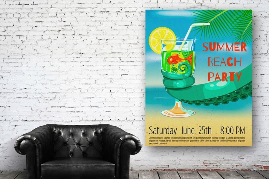
The size you print changes the design, so decide before you lay anything out. A one sheet is 27 by 40 inches. That is what hangs in a cinema and what a collector recognises, and it is the format the six band layout was built for.
| Size | Inches | What it is for | Frame situation |
|---|---|---|---|
| One sheet | 27 x 40 | The theatrical standard. Lobby cases, festival displays, anything that has to look official. | Needs a custom frame or a mount. |
| Common wall size | 24 x 36 | Home and office walls, dorm rooms, merchandise runs. | Fits mass market frames off the shelf. |
| Half sheet | 22 x 28 | Landscape format for counter displays and window cards. | Custom, but small enough to mount cheaply. |
| Bus shelter | 40 x 60 | Street level advertising and large festival banners. | Rarely framed. Mount it or hang it in a case. |
Read the last column first, because it decides more than people expect. A 27 by 40 print and a 24 by 36 frame do not go together, and the gap catches out almost everyone printing their first poster. Both formats sit near the same two to three proportion, so the same artwork usually crops across both with only a small trim, but check where the crop lands on your title before you commit.
If you need a size that is not on this list, we print to your dimensions, and the custom size poster ordering guide covers how to set the file up. The full format history, including the older 27 by 41 sheet and the subway two sheet, is in the standard movie poster sizes guide.
Paper and Finish, and What Each One Does Under Light
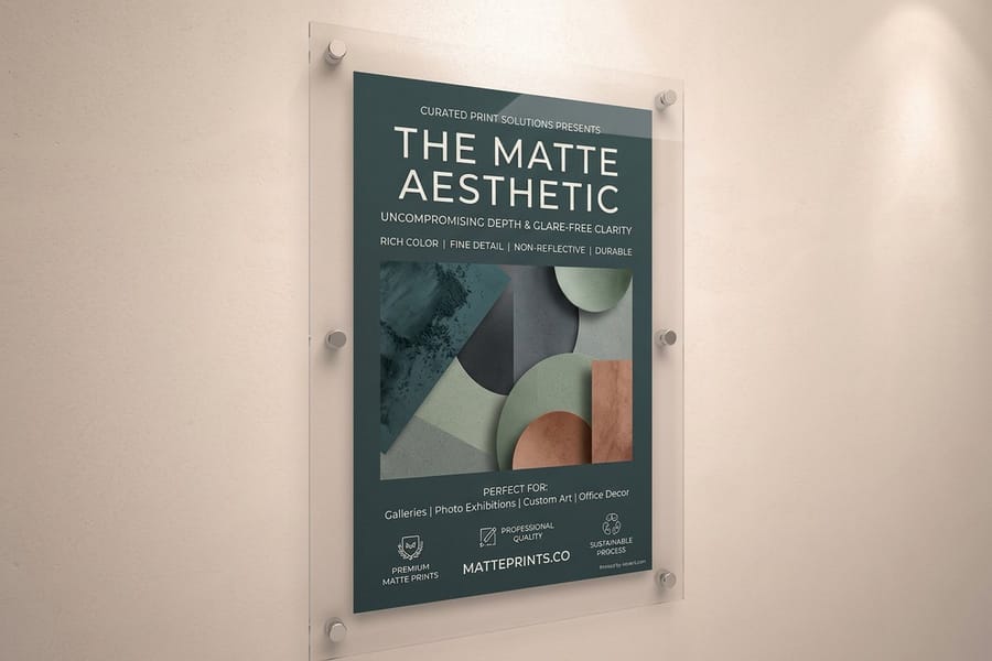
Finish changes a poster more than most people expect, and it is the one decision you cannot undo after the file is printed. Choose it for the room the poster is going to live in.
| Option | How it behaves | Best for | Starts at |
|---|---|---|---|
| Standard posters | Coated poster stock with strong colour and a slight sheen. | The default for a full colour key art poster. | $108.75 |
| Matte posters | Non reflective surface, slightly softer blacks, no glare at any angle. | Daylit rooms and anything going behind glass. | $25.00 |
| Laminated posters | A film over the print that resists scuffs, moisture and fingerprints. | Lobby displays and posters that get handled or travel. | $25.00 |
| Mounted posters | Bonded to a rigid board, so it never curls and needs no frame. | Easels, festival tables, walls you cannot drill. | $39.99 |
| Framed posters | Printed, mounted and framed, ready to hang on arrival. | Gifts and permanent installations. | $87.86 |
Starting prices move with size and quantity, so compare them at the size and run you actually need rather than at the opening figure. A single 24 by 36 print and a hundred of them sit in very different places on the scale.
The gloss and matte decision comes down to reflection versus depth. Gloss gives you deeper blacks and more saturation, which suits dark cinematic art, and it mirrors every light in the room. Matte scatters that reflection and keeps the poster readable from any angle, and it gives up a little density in the shadows. Behind glass, matte almost always wins, because the glass supplies its own reflection and a glossy print underneath doubles it. There is a longer comparison in glossy vs matte poster paper, and if the poster is heading outdoors or into a window, weatherproofing a poster covers lamination and substrates.
Designing the File and Sending It to Print

Build the document at final size from the start. Scaling a poster up at the end is how soft edges happen. Set the page to 27 by 40 inches, add 0.125 inches of bleed on every side, and hold all type at least 0.25 inches inside the trim so nothing lands in the cut. The mechanics of that margin are explained in bleed and trim explained, and a correctly sized starting file is waiting in the blank template library.
Photographic key art at 150 dpi at full size is enough for a poster, because the viewing distance is measured in feet. Push it to 300 dpi and you quadruple the file weight for detail nobody standing in a lobby can resolve. The poster resolution guide shows where the real cutoff sits. Type is the opposite case, as covered above: keep it live and vector, and export a print PDF rather than a flattened image.
Two checks before you upload. First, view the file at 100 percent and read the billing block on screen, because if it is uncomfortable there it will be unreadable on paper. Second, print one page of the bottom third on any office printer at actual size. It will not match for colour, but it tells you in ten seconds whether your smallest type has enough room.
If you do not want to build it in Illustrator or Photoshop, our online design tool lets you lay a poster out in the browser and send it straight to production. Then pick your stock in poster printing, or size up into large format printing if the piece is heading for a wall rather than a frame. When the print arrives rolled, leave it flat under something heavy overnight before you frame it, or order it mounted and skip the problem entirely.
Wally explains the one sheet
Six bands, and the type stays out of the picture
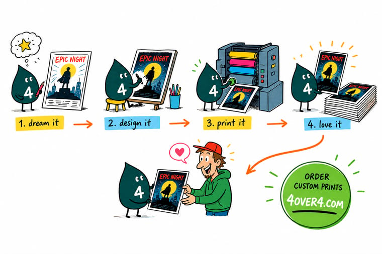
Wally builds the poster from the bottom up. Studio logos and the rating box on one baseline, the compressed credit block above them, then the title treatment across the lower third, a single tagline over that, and the key art filling everything left. Nothing overlaps and nothing is centred by eye. He darkens the base of the photograph before setting a word, so the title reads without a drop shadow, and he keeps the tiny credit type as vector text so it holds on press instead of turning to mush.
Print a 27 by 40 poster →Specs and pricing
Poster stocks, sizes and starting prices
Compare the poster options side by side, with live configuration choices and starting prices straight from the 4OVER4.COM configurator.



Print it
Order the poster once the file is right


Explore more
Where to go next


By the numbers
Large format printing you can count on at 4OVER4
Common Questions
Your movie poster questions, answered
What size is a real movie poster?
The modern theatrical one sheet is 27 by 40 inches. That is the size studios ship to cinemas and the size a collector expects. The catch is framing: mass market frames are made at 24 by 36 inches, so a 27 by 40 print needs a custom frame or a mount. If the poster is going on a wall at home, design at 24 by 36 and you can hang it the day it arrives. If you want the authentic dimension, order 27 by 40 and plan for a custom frame or a foam mount. Our full breakdown of every historical format sits in the guide to standard movie poster sizes.
What font is used for the billing block?
There is no single font you have to use, but every theatrical billing block shares the same characteristics: extremely condensed, all caps, tight leading, and justified to a fixed width. Any heavily compressed grotesque set in caps will read correctly at that size. What matters more than the typeface is the setting. Keep the leading tight, force justify each line to the same measure so the block forms a clean rectangle, and separate roles from names with a small vertical rule or a line break rather than punctuation.
Can I print a poster for a film I do not own?
You can print artwork you created or licensed. You cannot reproduce a studio release poster, a still from a copyrighted film, an actor likeness, or a studio logo without permission, and we do not print those. Fan films, student films, festival submissions and original artwork are all fine, and so is a poster built from photography you shot or stock images you licensed for commercial print. If you are unsure about an element, replace it. A poster held up by one borrowed frame is not worth the risk.
What resolution should the artwork be?
For a poster this size, 150 dpi at full print size is enough for the photographic key art, because nobody reads a 40 inch sheet from six inches away. The exception is type. Keep the title treatment, the tagline and the billing block as live vector text in the PDF instead of flattening them into the image, because condensed type at 6 or 7 points breaks up badly once it is rasterised at 150 dpi. Vector type plus a 150 dpi photograph gives you a sharp poster and a file that actually uploads.
Should I choose gloss or matte for a movie poster?
Choose by lighting. Gloss deepens black and lifts saturation, which is why dark cinematic key art looks best on it, but it mirrors every ceiling light and every window. Matte scatters that reflection and stays legible at any angle, at the cost of slightly lighter blacks. The practical rule from the shop floor: gloss for a lobby or a lit display case, matte for a room with daylight or for anything going behind glass, since glass adds its own reflection and two glossy surfaces fight each other.
How do I get the finished poster ready to hang?
Three options, in order of cost. A rolled poster ships in a tube and needs a frame or clips, and it will want a day flat under a book before it stops curling. A mounted poster is bonded to a rigid board, so it hangs with strips or sits on an easel with no frame at all and no curl. A framed poster arrives ready to hang and costs the most. For a festival table or a lobby easel, mounted is usually the right answer because it survives handling.
Get Started
Ready to see it at full size?
Pick 27 by 40 for the theatrical format or 24 by 36 for a frame you can buy, choose gloss or matte, and we print it sharp enough to read the credit block.
Legal Disclaimer
Gold Standard guarantees apply to all standard orders placed through 4over4.com. Price match requires verifiable proof of a competitor's published price for an equivalent product with matching specifications and turnaround time. Satisfaction guarantee covers manufacturing defects and print quality issues. Contact support with order number and documentation. On-time delivery rate based on tracked orders 1999 to 2026. Individual results may vary based on shipping carrier performance.
