
Draw a Moon and Stars Vector in Illustrator That Prints Clean


Two circles and Minus Front make the crescent. The Star tool takes numbers for the stars. Then comes the part most tutorials leave out, which is getting the file out of Illustrator in a state a press can actually run.
Draw a circle with the Ellipse tool, paste a copy in front with Ctrl+F, nudge it sideways, select both and click Minus Front in the Pathfinder panel. That single subtraction is the crescent. For the stars, click once with the Star tool and type the numbers: 5 points with Radius 2 at 0.382 of Radius 1 is the classic shape, and a scatter brush spreads the small ones. Work in CMYK from the start, build the sky as a rich black rather than 100K, and export as PDF/X-4 with document bleed switched on.
Quick answer
Subtract the crescent, type the star, then set the file up for print
The moon is a circle minus an offset copy of itself, and the star is a numeric polygon. Neither shape is drawn freehand, which is why the artwork scales from a two inch sticker to a three foot poster without a single edit. The work that decides the printed result happens around the drawing: CMYK from the first shape, raster effects at 300 ppi, a rich black sky instead of 100K, brushes expanded, and a PDF/X-4 export with document bleed switched on.
Why the Moon Has to Be Vector Before It Gets Printed
A moon is two circles and a subtraction. A star is a polygon with a numeric inner radius. Both are pure geometry, which is exactly what vector software is for, and it is why the same file can print at two inches on a sticker and at three feet on a poster without a single change.
The arithmetic makes the point faster than any argument. Draw the moon as a raster image at 300 ppi at two inches wide and you have 600 pixels. Scale that up to a 24 by 36 poster and the moon lands somewhere near 25 ppi, and the crescent edge turns into visible stair steps that no amount of sharpening repairs. The vector version has no pixels to run out of. Our resolution guide for printing covers the raster side of that math in full.
Here is the limit nobody mentions. Vector is the right answer for a stylized moon, and the wrong answer for a photographic one. Real lunar surface is continuous tone, so running Image Trace on a moon photo gives you a few thousand muddy paths that rip slowly and still look like a bad photocopy. If the brief wants real craters and a real terminator, keep that element raster at 300 ppi at final size and build the sky and the stars as vector around it.
Everything below assumes the artwork ends up on something we print, so the file is set up for standard posters and die-cut stickers from the first step rather than fixed at the end.
Set Up the Document Before You Draw a Single Shape
Five minutes here saves an hour at export. Start a new document with the Print profile, not Web, and set the artboard to the finished trim size of the piece you are printing.
The Print profile does three things quietly: it sets the color mode to CMYK, it sets units to inches, and it sets Document Raster Effects Settings to 300 ppi. That third one is the trap. People start from the Web profile, switch the color mode later under File then Document Color Mode, and never notice that raster effects are still sitting at 72 ppi. Any Gaussian Blur or Grain they add to the moon then prints as visible squares. Fix it under Effect, then Document Raster Effects Settings, and set it to High at 300 ppi.
Add bleed in the New Document dialog, or later under File then Document Setup. Standard is 0.125 inches on all four sides, and the sky rectangle has to reach it. If you are unsure what bleed is doing for you, bleed and trim explained is the short version.
Then build the layer stack before you draw, because retrofitting layers onto finished art is miserable. Bottom to top: Sky, Moon, Craters, Stars, Cut line. Name them. Turn on Smart Guides with Ctrl+U so shapes snap to each other, and set Preferences then General then Keyboard Increment to 0.05 inches so an arrow key nudge is a predictable distance rather than a guess. If you would rather not build the artboard from scratch, our Illustrator layout template guide and the blank template library hand you a correctly sized file with the guides already in place.
Drawing the Moon With Two Circles and Minus Front
Do not draw a crescent by hand. Draw two circles and remove one from the other, and the result is a single closed path with four anchor points that stays perfect at any size.
- Draw the full moon. Take the Ellipse tool with L, then click once on the artboard instead of dragging. Type the exact width and height, say 6 inches by 6 inches. Typing beats Shift-dragging because it is repeatable next time.
- Copy it in place. Ctrl+C then Ctrl+F pastes a copy directly in front, aligned to the original.
- Offset the copy. Nudge it with the arrow keys, up and to the right for a classic waxing crescent. The distance you move it is the phase of the moon: about a quarter of the diameter leaves a fat gibbous, half leaves a proper half-lit crescent, three quarters leaves a thin fingernail.
- Subtract. Select both circles, open Window then Pathfinder, and click Minus Front. The front circle disappears and takes its overlap with it.
Shape Builder does the same job with more control when several shapes are involved. Select everything, press Shift+M, hold Alt, and drag across the region you want gone. Use it when the moon overlaps a planet or a cloud and Pathfinder would take too much.
One warning about how thin you push it. A very thin crescent tapers to a point, and if that tip narrows below about 0.25 pt it breaks up on press, more so on uncoated stock and on vinyl where ink spreads. Anything thinner than a hairline is not a design decision, it is a gap. Pull the offset circle back a fraction and the tip survives the run.
Adding Craters and Shading That Survive a Press
Craters are ellipses in a slightly darker tone, and the whole trick is stopping them from spilling over the lit edge.
Draw six to ten ellipses of mixed size across the crescent, some overlapping the edge on purpose. Fill them 8 to 12 percent darker than the moon body rather than black, because a black crater on a pale moon reads as a hole. Vary the ellipse ratio a little so they look like impacts rather than dots. Then group them with Ctrl+G, paste a copy of the crescent on top with Ctrl+F, select the group and the copy together, and press Ctrl+7 for Object, Clipping Mask, Make. Everything outside the crescent vanishes and the craters stay editable inside the mask.
For the rim light along the lit edge, skip the blur. Select the crescent, choose Object then Path then Offset Path, enter a negative value such as -0.06 inches, and fill the smaller result in a lighter tone. Two flat tones with a crisp boundary print predictably on every stock we run. A Gaussian Blur is a raster effect, which means it rasterizes at whatever your document setting is, and it becomes a flattening problem the moment the file goes to PDF/X-1a.
Gradient mesh deserves a plain warning. It gives beautiful soft shading and it is also the single most common reason an Illustrator file goes from 400 KB to 40 MB and stalls in prepress. If you use one, keep it small, keep it simple, and expect it to be flattened. Our guide to transparency in Illustrator for printing explains what flattening does to blends, blurs and Multiply modes sitting over a dark background.
Creating Stars That Look Scattered but Are Not Random
The Star tool hides under the Rectangle tool in the toolbar. Click and hold, pick the star, then click once on the artboard rather than dragging, and it asks for three numbers instead of leaving you to eyeball it.
| Shape you want | Points | Radius 2 as a share of Radius 1 | Where it reads well |
|---|---|---|---|
| Classic star | 5 | 0.382 | The default night-sky star, the one people recognize instantly. |
| Chunky star | 5 | 0.50 | Children and holiday work, where a fatter shape prints cleaner small. |
| Sparkle | 4 | 0.15 | Twinkles and glints around the moon, at larger sizes only. |
| Spiky burst | 8 to 12 | 0.20 | A single hero star, never repeated across the field. |
While you are dragging a star out, the keyboard changes it live. The up and down arrows add and remove points. Holding Ctrl keeps the inner radius fixed while the outer one grows, which is how you get long sharp spikes. Holding Shift keeps it upright.
To fill the sky, make one star, drag it into the Brushes panel, and choose Scatter Brush. Set Size, Spacing, Scatter and Rotation to Random with a sensible range on each, then draw three or four loose strokes across the sky and let the brush place the small stars. When the layout is final, select the strokes and use Object then Expand Appearance so the export contains plain paths instead of a brush definition.
The trade-off is worth naming. Scatter looks convincing at sticker size and lazy at poster size, because the eye picks up the repeating shape. On anything above about 18 inches, place the largest eight to twelve stars by hand in a deliberate arrangement and let the brush handle only the small ones behind them.
Building a Night Sky That Does Not Band or Flood the Sheet
Draw a rectangle that covers the artboard and runs past the trim to the bleed edge on all four sides, then send it to the bottom layer. That part is easy. The color underneath it is where dark artwork goes wrong.
Use a rich black, not 100K. Black ink alone over a large area prints as a washed dark grey with a slight brown cast, because one ink cannot lay down enough density. Build the black from all four plates instead, around C60 M40 Y40 K100, and keep the total of the four numbers under 300 percent so the sheet can dry. For a navy sky rather than a neutral one, something like C85 M75 Y30 K30 keeps the blue and stays inside the same ink limit.
Never use Registration. The swatch called Registration is 100 percent of every plate, 400 percent total. It exists for printer marks. Put it on a sky and the ink will not dry, it will offset onto the back of the next sheet, and the job comes back ruined.
Watch gradients over distance. A subtle gradient between two close tones across 36 inches shows visible steps, because there are only so many levels available and the eye picks up each one as a band. Widen the tonal separation between the two ends, or add a light grain, and remember grain is another raster effect that needs the 300 ppi setting. Stock choice helps too: a matte sheet diffuses the transition, while a gloss sheet shows every step and every fingerprint. That is a real reason to compare matte posters against gloss before committing a dark design.
Finally, check the sky is genuinely CMYK before you go further. A rectangle pasted in from another file can arrive as RGB and look identical on screen while separating badly. Converting RGB to CMYK properly takes a minute and prevents a reprint.
Exporting Print-Ready Artwork From Illustrator
This is the section most moon-and-stars tutorials skip, and it is the one that decides whether your file prints the way it looks on screen.
- Outline or embed the type. Select all text and use Type then Create Outlines, or tick Embed Fonts on export. Creating outlines in Illustrator for print explains which of the two to choose and when.
- Expand the brushes. Object then Expand Appearance on every scatter-brush stroke, so the stars are paths rather than a live brush the RIP has to interpret.
- Open Separations Preview. Window then Separations Preview, then switch Overprint Preview on. You should see Cyan, Magenta, Yellow and Black, plus your cut swatch if this is a sticker. Any other plate in that list is a stray spot color or an RGB object you missed.
- Save as PDF. File then Save As, Adobe PDF, and choose PDF/X-4 if the artwork has any transparency, since X-4 carries live transparency through instead of flattening it. Press Quality is fine for flat artwork with no blends.
- Set Marks and Bleeds. Tick Use Document Bleed Settings so the 0.125 inches you set earlier actually leaves the file. Add trim marks only if we asked for them.
For stickers, the die line rides along as a fifth plate. Keep it stroke-only with no fill on its own top layer, give it a spot swatch named for the cut, and switch on Overprint Stroke in the Attributes panel so it does not knock a white line out of the sky underneath. The same discipline applies to any special ink: our white ink and spot color setup guide shows how the extra plate is built. That matters if you order clear stickers, because on transparent film a CMYK moon alone looks like a ghost until a white layer sits underneath it. The full checklist lives in exporting a print-ready PDF.
Putting the Finished Moon on Posters and Stickers
The same artboard feeds several products, and each one asks for a small change rather than a redraw.
Posters are where the vector work pays for itself, because you can output the identical file at 18 by 24 or 24 by 36 with no loss. Standard posters start at $108.75 and matte posters start at $25, and matte is the safer surface for a dark sky under gallery or shop lighting. Sizes and the artboard dimensions that match them are set out in our poster size guide, and the full range sits in poster printing.
Stickers want the die line. Die-cut stickers start at $93.37 and cut around your crescent instead of a rectangle, which is the whole reason to draw the moon as a closed path in the first place. Vinyl stickers start at $25 and hold a dark sky well outdoors. Clear stickers start at $25 and need the white underbase described above. Material behavior is compared side by side in choosing a sticker material, and every option is listed under sticker printing.
If you do not own Illustrator, you are not stuck. Our free online designer runs in the browser with the same trim, bleed and safety guides already set, so you can place a moon, arrange stars and send the job without buying software. It will not do Pathfinder subtraction, so bring a shape you like rather than expecting to build a crescent from scratch.
Wally draws the moon
One circle takes a bite out of another
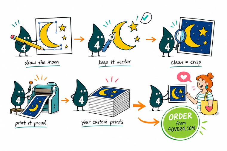
Wally does not draw the crescent. He draws a full moon, drops a second circle on top, shoves it sideways, and hits Minus Front so the second circle eats the overlap. Four anchor points, one closed path, sharp at any size. Then he clicks once with the Star tool and types the numbers instead of dragging, because 0.382 gives the star everyone recognizes and guessing does not. Last job before he sends it: CMYK, a rich black sky, brushes expanded, bleed switched on.
Print your artwork as a poster →Specs and pricing
Sizes, stocks and starting prices for the finished art
The same Illustrator file runs on all three. Check the size and stock options against your artboard before you export, with live pricing straight from the 4OVER4.COM configurator.


Print it
Take the vector off the screen and onto paper


Explore more
Where to go next



By the numbers
Artwork printed by a shop that has seen every file
Common Questions
Moon and stars in Illustrator, answered
How do you make a crescent moon in Illustrator?
Draw a circle with the Ellipse tool, copy it, and paste it in front with Ctrl+F so the copy sits exactly on top. Nudge the copy sideways and up with the arrow keys, select both shapes, then click Minus Front in the Pathfinder panel. The front circle carves the back one and leaves a single closed crescent path. How far you move the copy sets the phase: about a quarter of the diameter gives a fat gibbous, three quarters gives a thin fingernail.
What Star tool settings give a proper five point star?
Select the Star tool, click once on the artboard instead of dragging, and the dialog asks for Radius 1, Radius 2 and Points. Radius 1 is the outer point and Radius 2 the inner valley. Set Points to 5 and Radius 2 to roughly 0.382 of Radius 1 and you get the star shape that comes out of a pentagram, which is the one people read as a star. Push the ratio to 0.5 and it looks chunky. Drop it to 0.2 and it turns into a spike.
Should I work in CMYK or RGB while I draw the moon?
CMYK, from the first shape. Start a new document with the Print profile, or switch with File then Document Color Mode. Drawing in RGB and converting at the end is where a bright indigo sky turns into a dull slate, because the vivid blues and violets that make a night sky sit outside the CMYK gamut. Converting early means the color you approve on screen is the color the press can actually reach.
Can I trace a photograph of the moon into vector art?
You can run Image Trace on it, and the result is usually worse than the photograph. Real lunar surface is continuous tone, so the tracer returns thousands of small muddy paths that take longer to rip and still look like a bad photocopy. If you want genuine crater texture, keep that element as a raster image at 300 ppi at final printed size and draw the stars and the sky as vector around it.
How small can a star or a crescent tip get before it stops printing?
Keep any stroke or tapered tip at 0.25 pt or heavier, and keep small sparkle shapes above roughly 0.05 inches across. Below that the tip of a thin crescent breaks up, and on uncoated stock or vinyl the ink spreads enough to fill in the valleys between star points. White shapes on a dark sky are the strictest case, because white knocks out of all four plates and any slight misregistration shows as a colored fringe along the edge.
How do I set up the die line so a sticker cuts around the moon?
Put the cut path on its own top layer, stroke only with no fill, and color it with a new spot swatch named for the cut so it stays off the four process plates. Turn on Overprint Stroke in the Attributes panel so the line does not knock a white gap out of the artwork underneath. Then extend the sky and the moon at least 0.125 inches past that path, and keep anything you cannot lose 0.0625 inches inside it. Check the whole file in Separations Preview before you export.
Get Started
Ready to see the moon on paper?
Send the PDF/X-4 you just exported, pick a size and a stock, and we print it with the bleed, the rich black and the die line exactly as you set them up.
Legal Disclaimer
Gold Standard guarantees apply to all standard orders placed through 4over4.com. Price match requires verifiable proof of a competitor's published price for an equivalent product with matching specifications and turnaround time. Satisfaction guarantee covers manufacturing defects and print quality issues. Contact support with order number and documentation. On-time delivery rate based on tracked orders 1999 to 2026. Individual results may vary based on shipping carrier performance.
