
How to Design Caution Labels That Meet ANSI Rules and Survive Outdoors


Signal word, color, symbol, material, in that order. Get the ANSI pairing right first, because a beautiful label carrying the wrong word is a liability problem rather than a design one.
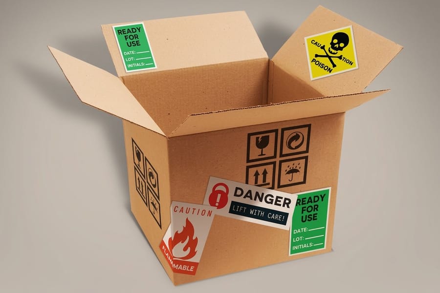
A caution label is the word CAUTION in black on safety yellow, carrying the safety alert triangle, and it is reserved for a hazard that could cause minor or moderate injury. Anything that could cause death or serious injury takes WARNING on safety orange or DANGER in white on safety red, and choosing the wrong tier is the most common mistake on a shop-made label. Below the signal word sit two more panels: a message that names the hazard, the consequence and the way to avoid it, then a pictogram. Print it on vinyl with an overlaminate if it lives outdoors, because safety yellow fades before the black type does.
Quick answer
Yellow, black, a triangle, and three panels in a fixed order
The color is decided by the severity, not by the designer. CAUTION means a hazard that could cause minor or moderate injury, and it prints as black type on safety yellow with the safety alert triangle. Under that panel goes the message, which names the hazard, states the consequence, then gives the action that avoids it. A pictogram sits at the bottom for anyone who will not read the English. Material comes last and matters most for how long the label stays readable: paper indoors, vinyl or a waterproof synthetic with an overlaminate anywhere the label meets sun, water or a cleaning chemical.
Pick the Signal Word First, Then Everything Else Follows
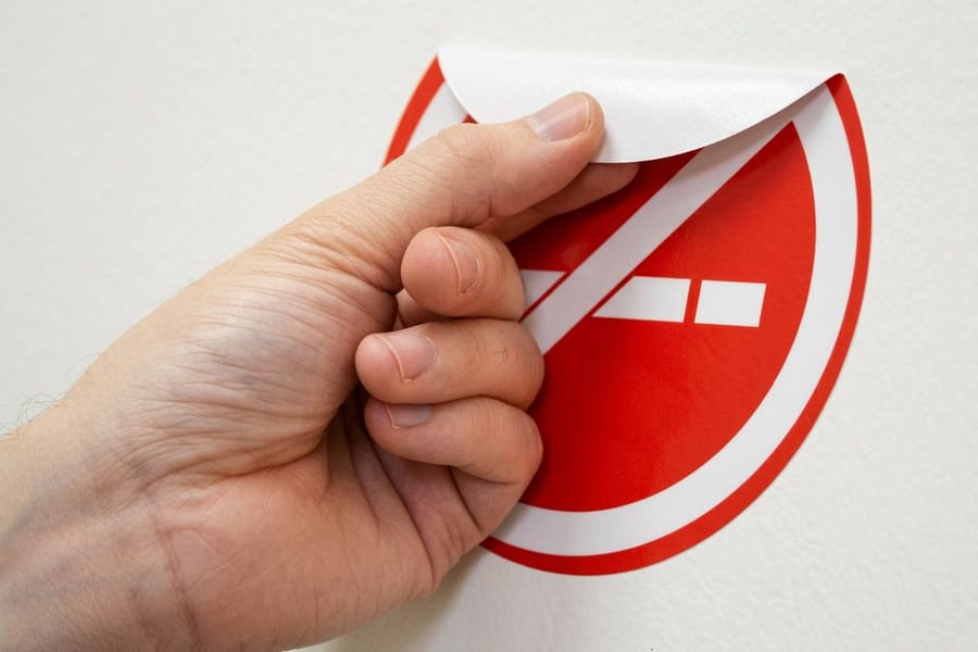
The signal word is the only decision on a caution label that is not yours to make. ANSI Z535.4 assigns each word a severity and a color, and once you have honestly rated the hazard, the color, the type color and the alert symbol are all decided for you.
| Signal word | Panel color | Type color | What it means | Alert triangle |
|---|---|---|---|---|
| DANGER | Safety red | White | Will result in death or serious injury if not avoided. | Yes |
| WARNING | Safety orange | Black | Could result in death or serious injury. | Yes |
| CAUTION | Safety yellow | Black | Could result in minor or moderate injury. | Yes |
| NOTICE | Safety blue | White | A practice or property risk, not a personal injury hazard. | No |
Two traps sit in that table. The first is inflation: a hot guard that leaves a red mark is a CAUTION, and printing it as WARNING trains the floor to skim orange. The second is the triangle. Under Z535.4 the safety alert symbol is what declares a personal injury hazard, so CAUTION set on yellow without the triangle is the correct way to flag a property damage risk, and setting it with the triangle by habit changes the claim you are making. Our guide to OSHA safety colors and ANSI color codes covers the wider color system, including the green and blue that never appear on a hazard label.
One more thing worth knowing before you open the file: safety yellow is a defined color, not a mood. Match it across every label on the same asset, because a wall of near matches reads as sloppy and undermines the one label that matters.
The Three Panels, and the Sentence Order Inside Them
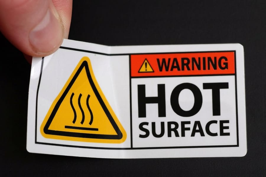
A compliant caution label is three stacked panels: the signal word panel, the message panel, and a symbol panel. The layout looks obvious once you have seen it, and almost every homemade label gets the middle panel wrong.
The message has to answer three questions in a fixed order. Skip one and the label is decoration.
- What is the hazard? Name the thing. "Hot surface", not "risk of injury".
- What happens if you ignore it? The consequence, in plain words. "Contact can burn skin."
- How do you avoid it? The action, phrased as an instruction. "Let the guard cool before you remove it."
Put the avoidance line first and the reader gets an order without a reason, which is the fastest way to be ignored. Keep each line short enough to read in one glance, and use sentence case for the message even though the signal word is set in capitals, because a block of all caps slows reading down measurably.
The symbol panel earns its space when the label will be read by people who do not share a first language, or in the split second before someone reaches into a machine. Use one pictogram, not three. If your artwork needs a die cut shape to fit a curved housing or a control panel, our explainer on die cutting and custom die cut printing covers what the cutter can and cannot do, and you can start from a correctly sized layout in the blank template library.
Choosing a Material That Outlives the Hazard

A caution label is only doing its job while it is still legible, so the material question is a safety question, not a budget one. The failure sequence is nearly always the same: an edge lifts, water or solvent gets under the face, and the print goes cloudy before it goes missing.
| Face stock | Where it holds up | What kills it | Start from |
|---|---|---|---|
| Coated paper | Indoor cabinets, packaging, storerooms, short campaigns. | Any moisture at all, plus abrasion from handling. | Standard Warning Labels, $23.88 |
| Vinyl | Outdoor equipment, vehicles, curved and textured housings. | Strong solvents, and application below roughly 50F. | Premium Vinyl Labels, $29.16 |
| Waterproof synthetic | Washdown areas, coolers, drums, anything hosed or wiped daily. | Sustained heat and heavy scuffing without a laminate. | Premium Waterproof Labels, $84.68 |
| Premium coated | Indoor plant labels that need better ink hold and rub resistance. | Standing water and outdoor UV. | Premium Warning Labels, $29.16 |
Two specs decide most of the outcome. The adhesive should be permanent acrylic for anything that has to stay put, and the face should carry an overlaminate wherever UV, cleaning chemicals or gloves are involved. Yellow fades first, which is the awkward part for caution labels specifically: an unlaminated yellow panel goes cream long before the black type gives up, and a cream panel no longer reads as a safety color.
Surface prep is the part people skip. Wipe with isopropyl alcohol rather than a household cleaner, because most sprays leave a silicone film that adhesive will not grip. Apply at room temperature. Press from the centre outward so no air pocket ends up at an edge. If you are weighing face stocks in general, the comparison of paper, vinyl and clear labels lays out the trade-offs beyond safety work.
Sizing, Quantity, and What to Actually Order
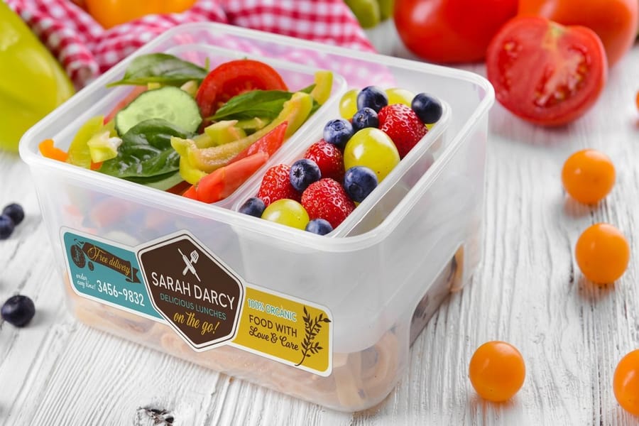
Size the label for the reading distance, then check it fits the part, and not the other way round. A caution label read at arm length needs a signal word that dominates the panel and message type around 10 point or larger, because it gets read in poor light by someone wearing safety glasses. When the part is too small to hold that, the honest answer is a symbol-only label plus a full-text label on the enclosure, not shrinking the type until it disappears.
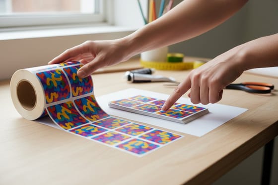
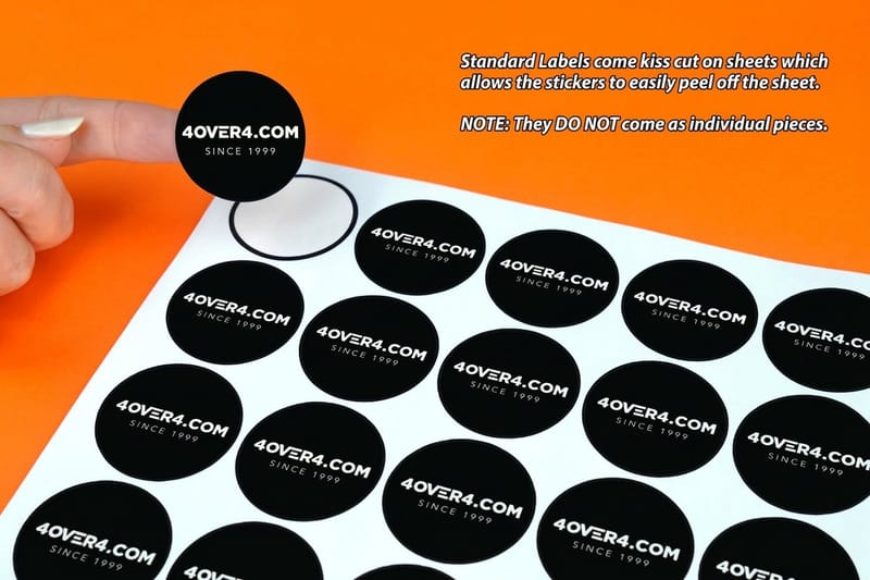
Quantity decides the format. Sheets suit a maintenance run, a handful of machines, or a first article you want to check before committing. Rolls suit a production line where an operator applies labels all shift, and the die and minimum run behind Roll Warning Labels at $322.98 only pay off at that scale. The break point is covered properly in our comparison of roll labels versus sheet labels.
Order a proof and put it on the actual asset before you print the full run. Take a photo from where the operator stands. If you cannot read the message panel in that photo, the label is too small, and no material will fix that. For file setup, artwork behaves the same as any other label job, and how label printing works covers stock, adhesive, liner and die end to end.
When the run is mixed, keep the family consistent: the same yellow, the same border weight, the same typeface across every caution label on the site. Browse the full label printing range to see stocks and shapes side by side, or go straight to die-cut labels at $93.37 if the shape has to follow a housing.
Wally explains caution labels
Rate the hazard first, then the color picks itself
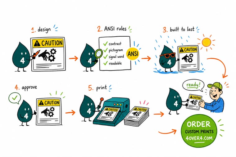
Wally asks one question before he draws anything: what happens if somebody ignores this? Minor or moderate injury gets CAUTION in black on safety yellow. Death or serious injury gets WARNING on orange, or DANGER in white on red. The triangle with the exclamation point says a person can get hurt, so it goes on all three and never on NOTICE. Then he stacks the message: what the hazard is, what it does to you, and how to stay clear of it. Last, he picks the stock. Indoors, paper is fine. Outdoors, vinyl with a laminate, because yellow fades before the black does and a cream label stops looking like a warning.
Order caution and warning labels →Specs and pricing
Safety label stocks, sizes, and starting prices
Compare the paper, premium and waterproof options side by side, with live size and quantity choices and starting prices straight from the 4OVER4.COM configurator.

Print it
Order caution labels that stay readable

Explore more
Where to go next

By the numbers
Safety labels you can count on at 4OVER4
Common Questions
Your caution label questions, answered
What is the difference between a caution label and a warning label?
Severity, and the standard is explicit about it. CAUTION covers a hazard that could result in minor or moderate injury, and it prints as black type on safety yellow. WARNING covers a hazard that could result in death or serious injury, and it prints as black type on safety orange. DANGER, in white on safety red, is reserved for a hazard that will cause death or serious injury if someone ignores it. Designers reach for WARNING because it sounds more serious, and that is exactly the habit that dilutes the system: if every pinch point is orange, nobody looks twice at the one that is genuinely orange.
Do caution labels legally have to follow ANSI Z535?
ANSI Z535.4 is a voluntary consensus standard, not a statute. What makes it matter is that OSHA 29 CFR 1910.145 governs accident prevention signs and tags in US workplaces, and OSHA has said that signs and labels meeting the ANSI Z535 series satisfy the intent of that rule. So Z535 is the safe path rather than the only legal path. Regulated products carry their own layer on top: consumer chemicals, medical devices and machinery each have sector rules that specify wording, and a label that satisfies ANSI can still be wrong for a specific product family. If liability is on the table, have the wording reviewed before you have it printed.
What color should a caution label be?
Safety yellow with black type and a black border. The important detail is that safety yellow is a specified color, not any yellow you like the look of, so a caution label that drifts orange in print stops matching the labels next to it on the same machine. Build the artwork in CMYK for our presses, and if you are matching an existing plant standard, send the spot color reference and a printed sample of what is already on the floor. Our guide to OSHA safety colors and ANSI color codes covers the full color set, including where green and blue belong.
How big should the type on a caution label be?
Size it for the distance the person is standing when they need to read it, not for the space on the part. For a label read at arm length, keep the signal word large enough to dominate the panel and hold the message text at roughly 10 point or above, because caution labels are read in bad light by people wearing safety glasses. For anything read from across an aisle, you are past label territory and into signage. If the artwork will not hold legible type at the size the part allows, make the label bigger before you make the type smaller.
Will a caution label survive outdoors or in a washdown?
A paper label will not. Paper wicks water at the cut edge, the face lifts, and within one season the label is a grey smudge. For outdoor equipment, chemical drums, or anything that gets hosed down, the spec is a vinyl or synthetic face stock with a permanent adhesive and an overlaminate, which is what Premium Waterproof Labels at $84.68 and Premium Vinyl Labels at $29.16 are built for. Solvent exposure is the one case where you should send us the chemical, because a laminate that shrugs off rain can still be softened by a cleaning agent.
Should I order caution labels on a roll or on sheets?
Rolls if a person is applying them all day, sheets if the labels go on in ones and twos. Roll Warning Labels start at $322.98 because rolls carry a die and a minimum run, and that cost only makes sense at volume, where the applicator speed pays it back. Standard Warning Labels start at $23.88 on sheets, which is the right call for a maintenance cupboard or a short equipment run. Our comparison of roll labels versus sheet labels walks through the break point in detail.
Get Started
Ready to print labels people actually read?
Pick a size, choose paper for indoors or a waterproof synthetic for the yard, and we print safety labels in the right yellow with the black type holding its edge.
Legal Disclaimer
Gold Standard guarantees apply to all standard orders placed through 4over4.com. Price match requires verifiable proof of a competitor's published price for an equivalent product with matching specifications and turnaround time. Satisfaction guarantee covers manufacturing defects and print quality issues. Contact support with order number and documentation. On-time delivery rate based on tracked orders 1999 to 2026. Individual results may vary based on shipping carrier performance.
